
TL;DR
Text fields let people enter or edit text. Use a single-line input for short values, purpose-specific inputs for email addresses or passwords, a search input for queries, and a textarea for multiline answers. Across these variants, keep labels, descriptions, keyboard behavior, and error relationships consistent. We recommend documenting the shared contract alongside each variant’s differences, then reviewing combinations such as populated, focused, and invalid rather than treating every state as an exclusive visual option.
A design system can contain several controls that look like the same rectangle but make different promises. A project name accepts an open value. An email field expects a particular kind of value. A search field starts a discovery task. A support message needs room for an explanation.
We should not flatten those differences into one generic component, or rebuild the basic field contract for every variant. This guide explains how to classify text fields, specify their shared behavior, and make those decisions inspectable. For a closer examination of one control’s parts, our companion text field anatomy and validation guide covers that narrower subject.
Table of contents
- What counts as a text field?
- Choose text fields by purpose and answer shape
- Keep one shared content and accessibility contract
- Specify states as independent dimensions
- Preserve keyboard behavior and define feedback timing
- Document metadata that explains the field, not just its appearance
- Use a cross-variant review matrix
- Make the family consistent without making it identical
- Sources
- Recommended Reads
What counts as a text field?
In this guide, text fields are the family of controls used to enter and edit textual values, including single-line inputs and multiline textareas. Some systems reserve “text field” for a single-line control. Either naming convention can work if the component catalogue makes its scope explicit.
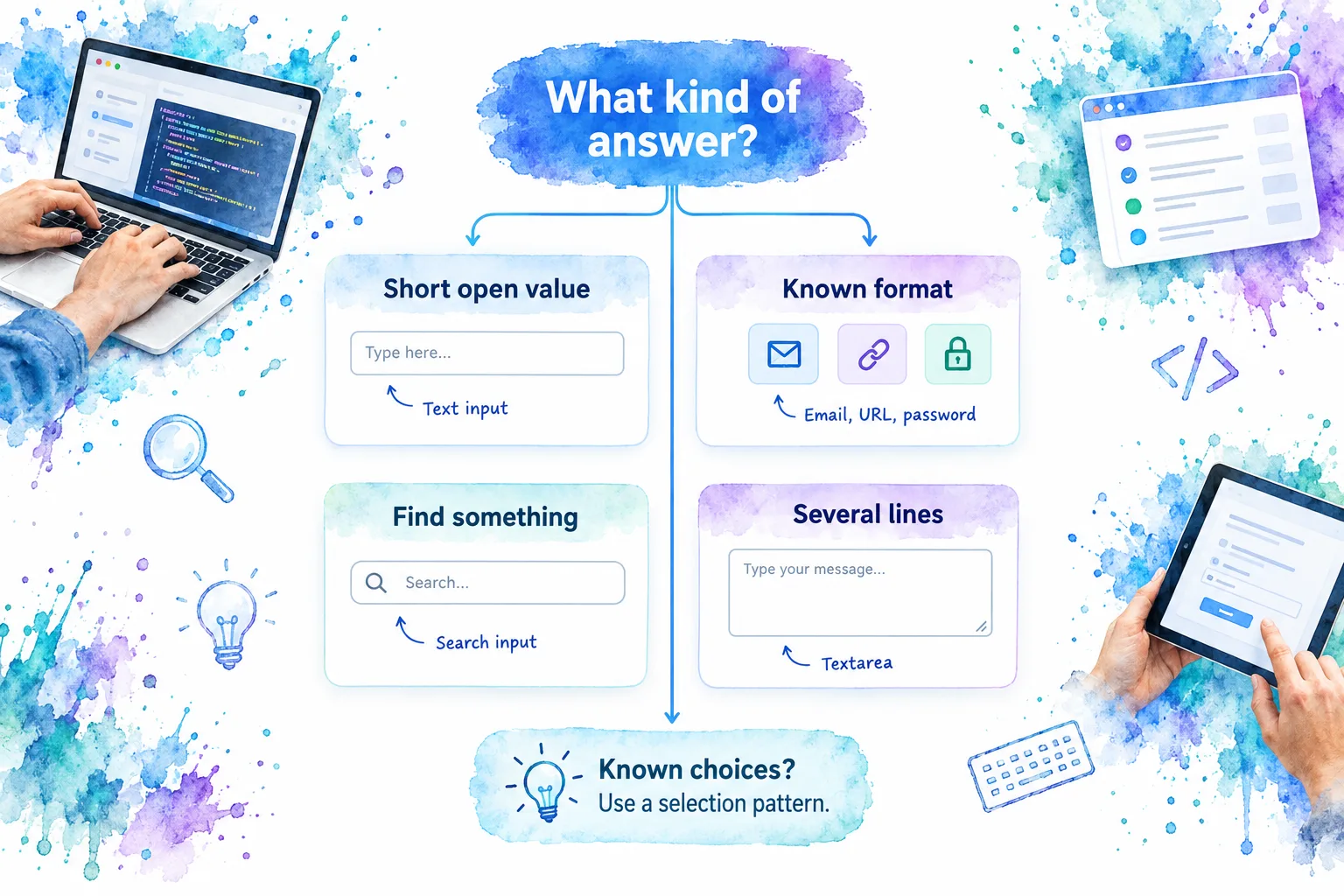
Distinguish three questions when choosing a member of the family:
- Answer shape: Is this one short value or several lines?
- Purpose: Is the value ordinary text, an email address, a password, or a query?
- Allowed answers: Can someone write their own answer, or must they select a known option?
These questions describe different dimensions. An open answer can still have a length limit, and a search query can still be short. A component’s name should not be the only place its boundaries are explained.
Choose text fields by purpose and answer shape
The WHATWG input reference distinguishes text, search, telephone, URL, email, and password inputs. A textarea is a separate multiline plain-text control, not simply a taller text input.
| Field family | Appropriate use | Difference to document |
|---|---|---|
| Single-line text | Project titles, display names, short identifiers | Accepted content and meaningful limits |
| An email address | Address-format expectations and required status | |
| URL | A web address | Accepted URL format and application restrictions |
| Telephone | A phone number | Supported international formats and examples |
| Password | Password entry | Obscured presentation and any reveal action |
| Search | A query used to find content | How searching starts and what clearing does |
| Textarea | Notes, explanations, descriptions | Line breaks, initial size, and overflow behavior |
Use the same comparison criteria in your catalogue: purpose, expected value, constraints, interaction, and alternatives. Consumers should not have to compare a visual description on one page with an implementation detail on another.
Purpose-specific does not mean fully verified
A browser’s email-format check is not an account-verification workflow. Keep the specification explicit about what the field checks and what the wider application must establish. W3C’s validation guidance describes native checks for common input types and explains why server-side validation remains necessary.
For passwords, distinguish entering an existing password from creating a new one. HTML provides different autofill purposes through current-password and new-password, documented in the autofill reference. Record the intended purpose instead of leaving every consumer to infer it from a label.
Digits do not automatically mean a number input
A postal code or membership identifier may contain only digits without representing a quantity. Ask whether incrementing the value would make sense.
WHATWG specifically distinguishes numeric quantities from digit-based identifiers. For an identifier, document its textual format and preserve meaningful leading zeroes. Do not choose a number input merely to request a numeric-looking keyboard.
This is also an important mobile distinction: the keyboard shown is not a substitute for the field’s semantic purpose, instructions, or validation policy.
Multiline entry and message composition are different patterns
For an ordinary explanation field, we recommend keeping Enter available for a new line. A chat-style composer may deliberately use Enter to send, but that is an additional interaction contract, not a consequence of drawing a multiline box.
Document the submit action, alternative newline shortcut, and discoverable instructions when introducing that behavior. A visible send button should remain part of the review.
Likewise, a field that searches a catalogue and requires a selected result is not adequately specified as “search input”. Record whether arbitrary text is accepted, whether suggestions appear, and which selection pattern owns their interaction. That boundary prevents a simple text-field reference from silently becoming an incomplete composite-widget specification.
Keep one shared content and accessibility contract
The field’s surrounding content should have stable responsibilities across the family:
The label identifies the requested information. Prefer “Workspace name” to “Name” when several kinds of names appear together. Keep a visible label as the default. For native controls, W3C recommends associating labels explicitly by matching the label’s for value to the control’s id.
The description explains what someone needs before answering. Examples include “Shown to everyone in your workspace” or an accepted format. W3C’s form-instructions guidance explains how aria-describedby associates supplementary instructions with a control.
The placeholder offers an optional example. It is not the label or the only place for essential instructions. Once a value appears, placeholder guidance disappears, making review harder.
The error identifies a problem and a recovery. “Enter a workspace name” is more useful than “Invalid”. W3C’s notification guidance recommends clear messages that explain how to resolve mistakes.
Keep these responsibilities separate even if your implementation distributes them across a field wrapper, control, and form provider. During review, inspect the rendered relationships rather than assuming a prop named “label” guarantees an accessible name.
Specify states as independent dimensions
We recommend separating value, focus, availability, and validation in the specification. “Required” is a constraint layered onto the field, not evidence that it has failed validation.
| State or condition | What people should understand visually | What to inspect beyond appearance |
|---|---|---|
| Default | The field is available and its purpose is clear | Name, description, and initial value are appropriate |
| Focused | This is the current keyboard position | Focus is visible and navigation remains usable |
| Populated | The current value is readable | The label remains available; a value does not imply success |
| Disabled | Entry is unavailable | Native disabled behavior, including tab navigation and submission consequences |
| Read-only | The value can be reviewed but not edited | Native read-only behavior and the intended review or copying task |
| Invalid | Something needs correction | Invalid state and an associated explanation |
| Required | An answer is necessary | Understandable wording and programmatic required status |
The HTML reference distinguishes read-only from disabled controls. Disabled controls are non-interactive and excluded from native submission; read-only is a different contract. Do not use the two treatments interchangeably just because both prevent editing.
For required status, W3C describes the native required attribute and visible identification. An unexplained asterisk is not a complete specification.
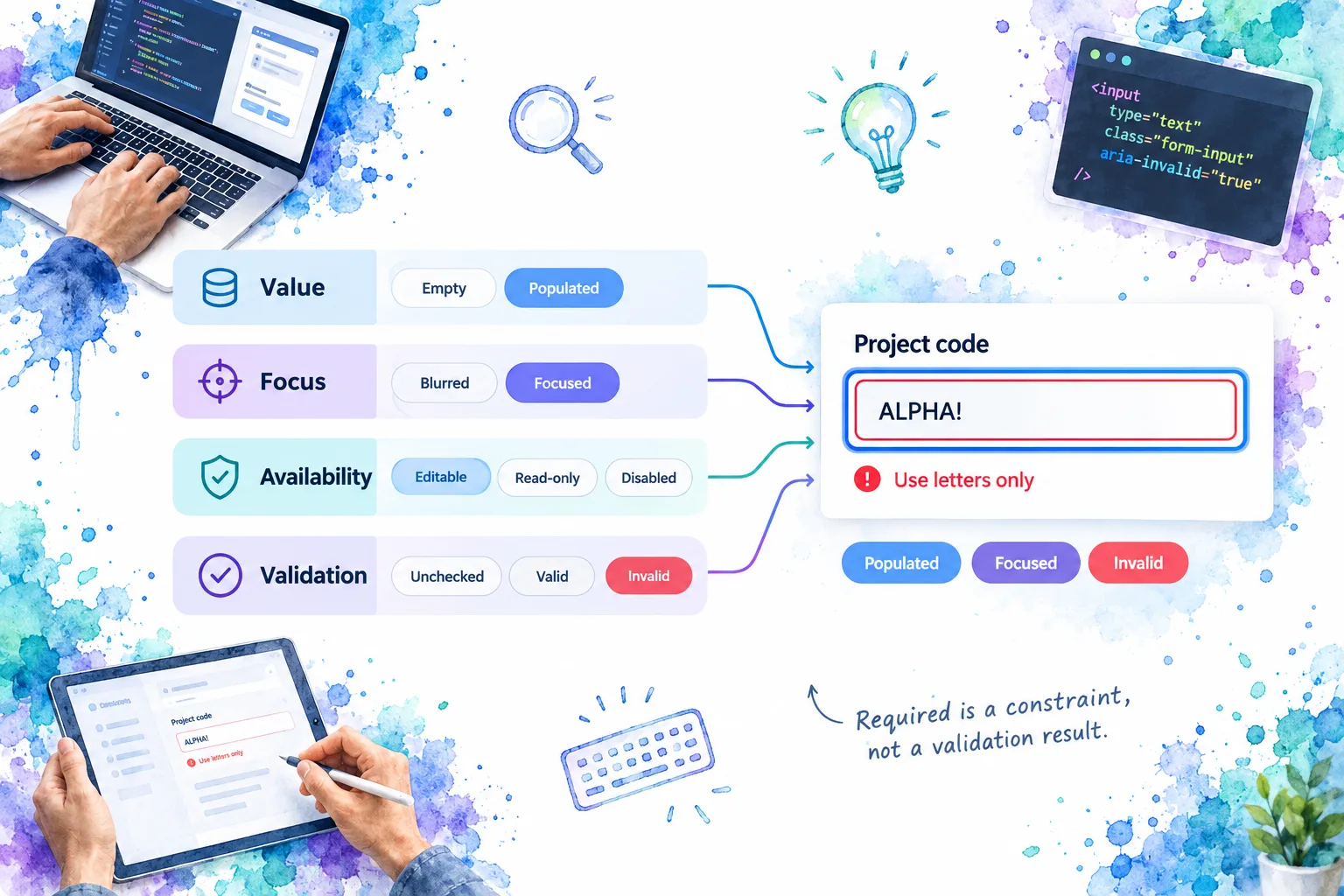
The important examples are combinations. Show an invalid field while focused, not only after focus has left. Show a populated read-only value, not just a grey empty rectangle. Make sure the focus treatment remains distinguishable when an error border appears.
For custom validation, W3C’s ARIA21 technique demonstrates aria-invalid and associated error text. It also advises against setting aria-invalid to true before validation occurs. A blank required field can therefore begin with neutral feedback without being declared valid.
Do not rely on red or green alone to communicate meaning. Include meaningful visible text or another appropriate cue, following W3C’s Use of Color guidance.
Preserve keyboard behavior and define feedback timing
Start with native input or textarea semantics and retain ordinary text editing. We recommend checking typing, selection, paste, moving the caret, and leaving the control before adding shortcuts or formatting behavior.
W3C’s guidance on typing, writing, and clicking explains the importance of full keyboard support, visible focus, clear labels, instructions, and recoverable errors. A field should remain understandable when someone is not using a mouse or is entering text through a different input method.
Keep these review questions concrete:
- Can someone reach and leave every enabled field without a keyboard trap?
- Does the accessible name match the intended visible label?
- Are hints and errors associated with the correct control?
- Does a newly displayed message need an announcement, a focus change, or neither?
- Can someone recover without losing their answer?
Associating an error with a field is not the same decision as announcing a dynamically inserted message. Specify both where needed. W3C’s notification tutorial discusses inline feedback, focus after submission, and error summaries linking to affected controls.
Validation timing deserves its own policy. For a typical settings form, we would avoid showing errors immediately on opening, check attempted answers at an appropriate point, validate submission, and define how errors clear during correction. This is a starting policy, not a universal rule for every field.
For an accompanying educational session, watch Accessible Forms (AAAD 2023), linked from Arizona State University’s forms accessibility resources.
Document metadata that explains the field, not just its appearance
A component reference should let someone determine which field fits, which behavior is shared, and where to inspect an approved example. We recommend documenting the following information without prescribing one universal schema:
- Identity and scope: stable component name, field family, purpose, and alternatives.
- Value contract: one line or multiple lines, expected value shape, empty-value policy, and transformations.
- Constraints: required status, length limits, accepted format, and ownership of business rules.
- Content surfaces: label, description, placeholder, error region, and supported content slots.
- State inputs: editing availability and how validation presentation is controlled.
- Interaction: keyboard expectations, search or submit triggers, clearing, and additional actions.
- Evidence: canonical examples, implementation location, package version, review owner, and verification status.
Distinguish authored configuration from runtime observations. “This field is required” can be a configured fact. “This field currently has focus” describes a running instance. An inspector should not encourage consumers to save a temporary error as a permanent component default.
Example: a workspace settings field family
Consider three illustrative fields: Workspace name, Contact email, and Workspace description.
All three inherit the same expectations for labels, descriptions, focus presentation, and error association. Their records then document the differences:
- Workspace name is a single-line open value. Its hint explains where the name appears.
- Contact email has an email purpose. Its record distinguishes formatting checks from any application verification process.
- Workspace description accepts multiline text. Its record defines line-break behavior, initial height, and how long content remains usable.
For each record, link a normal example and one meaningful edge case. For the name, that might be a long populated value. For email, a correction after rejection. For the description, a pasted paragraph at a narrow viewport.
Add a source hint pointing to the actual implementation used by the example, ideally with a release or revision. A similarly named component elsewhere in the repository is not sufficient evidence. The goal is traceability: a reviewer can connect the documented promise, rendered example, and implementation without guessing.
These are proposed documentation responsibilities, not DOM Studio API fields or a claim that metadata proves accessibility.
Use a cross-variant review matrix
A shared contract becomes useful when it can be checked across real variants. The following matrix is a starting point for a design-system review, not a conformance certificate.
| Review criterion | Single-line text | Email or password | Search | Textarea |
|---|---|---|---|---|
| Purpose and naming | Clear requested value | Specific data-entry purpose | Search scope is clear | Expected explanation is clear |
| Persistent guidance | Label and necessary hint | Format or task guidance | Instructions for starting search | Guidance survives populated content |
| Keyboard review | Edit and move onward | Edit plus any extra action | Trigger and clear behavior | Newlines and submit behavior |
| Feedback | Missing or rejected value | Task-specific rejection | Distinguish no matches from errors | Explain missing or excessive content |
| Stress example | Long value | Correction and autofill | Long query and no results | Pasted paragraphs and overflow |
Run this review in a small realistic form rather than four isolated empty previews. Include adjacent fields so reviewers can spot ambiguous hints, incorrect associations, and inconsistent spacing.
Record each outcome as verified, needs work, or not applicable, with a short evidence note. “Verified” should identify what was checked, on which example, and in which environment. A screenshot establishes appearance, not keyboard operation or an accessible-name relationship.
For a field backed by an asynchronous check, add pending, rejected, and unavailable outcomes to the relevant example. We recommend rejecting stale feedback when the value has changed and explaining a failed check separately from an invalid answer. Those requirements belong in the review even when the application, rather than the reusable control, owns the request.
The matrix should reveal intentional differences. A textarea and search input need not use identical Enter behavior, but both need a documented, reviewable interaction contract.
Make the family consistent without making it identical
Consistency means reusing dependable decisions about naming, guidance, focus, availability, and feedback. It does not mean forcing passwords, search queries, and paragraphs through the same interaction.
Start with three fields from one application screen. Classify their purposes, identify their shared contract, and document only the differences that matter. Then connect each example to its metadata and source hint.
To examine a concrete single-line reference, open our text input playground, where label and description settings can be explored. Use the review matrix to frame your questions, then verify the behavior of your own integration.
Sources
- WHATWG: Input types and attributes
- WHATWG: The textarea element
- WHATWG: Form control infrastructure and autofill
- W3C WAI: Labeling Controls
- W3C WAI: Form Instructions
- W3C WAI: Validating Input
- W3C WAI: User Notification
- W3C: Using aria-invalid to Indicate an Error Field
- W3C: Understanding Use of Color
- W3C WAI: Input, Typing, Writing, and Clicking
- Arizona State University: Forms accessibility resources
- DOM Studio: Text Field Anatomy, States, and Accessible Validation
- DOM Studio: Vue Text Input Component