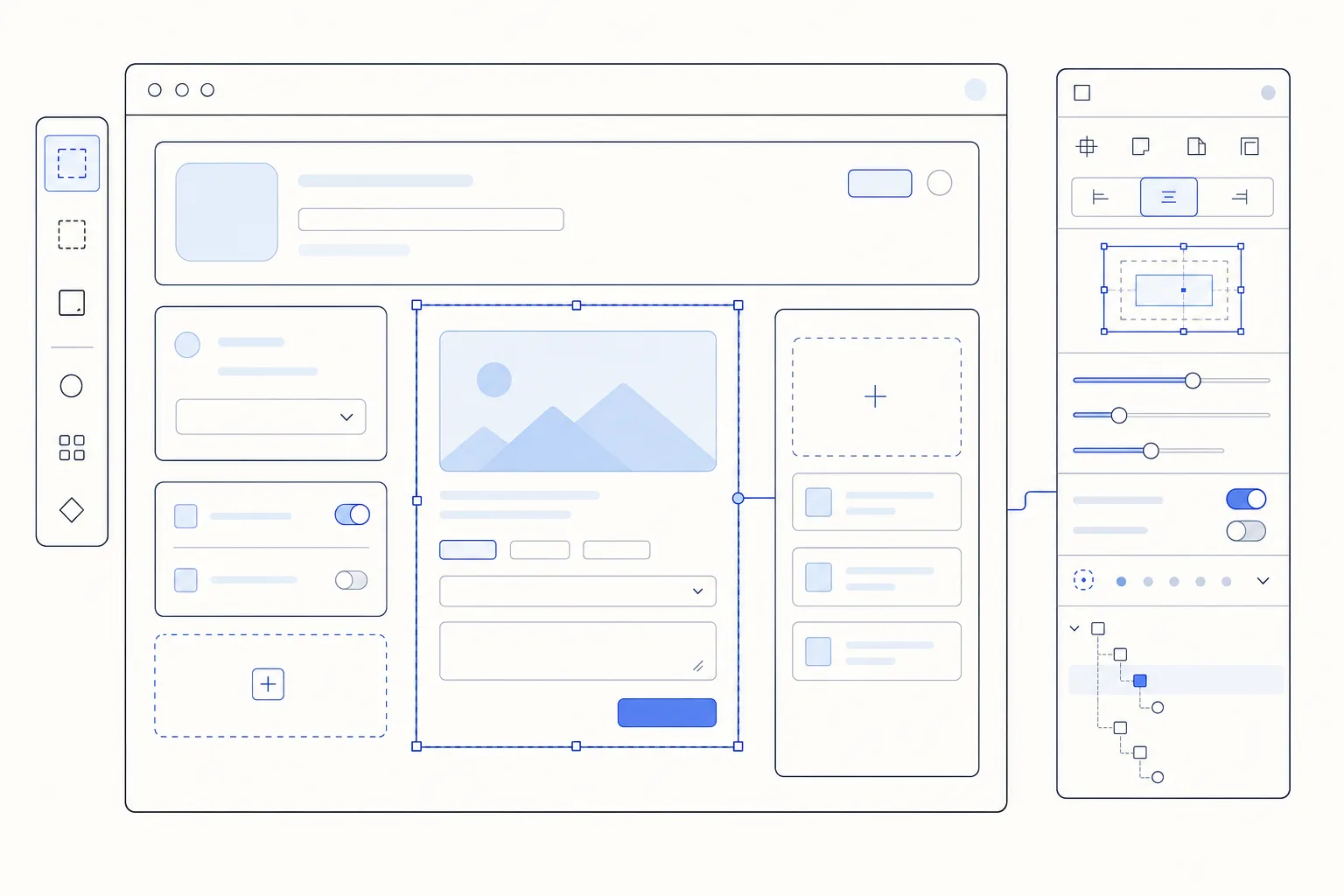
Inspectable UI components make an interface easier to understand, test, document, edit, and extend. Instead of treating a rendered component as an opaque box, they expose the information a developer, designer, QA engineer, visual editor, or AI agent needs to answer practical questions:
-
What component is this?
-
Which properties control it?
-
What state is it in?
-
Where does it sit in the component tree?
-
Which events, slots, and accessibility behaviors does it support?
-
Where can I find its source and examples?
We believe inspectability should be designed into a UI system rather than added as an afterthought. In this guide, we’ll define the concept, show the layers involved, compare common inspection tools, and outline a practical implementation for Vue and component-driven applications.
Table of contents
- What are inspectable UI components?
- Why inspectability matters
- Faster debugging
- Better design-system adoption
- More useful documentation
- Stronger collaboration
- Safer AI-assisted development
- The anatomy of an inspectable component
- 1. Identity
- 2. Props and editor controls
- 3. State and events
- 4. Structure and accessibility
- 5. Source and examples
- Five levels of UI inspection
- How to build inspectable UI components
- Start with stable component identities
- Make props the primary behavior contract
- Infer the simple controls
- Add hints progressively
- Preserve a meaningful layer tree
- Keep preview, controls, and source synchronized
- Keep metadata close to the component
- Validate the inspection contract
- A Vue implementation pattern
- How DOM Studio approaches inspectability
- Common failure modes
- Treating the DOM as the component model
- Requiring too much metadata
- Exposing every internal detail
- Letting docs and controls drift
- Flattening edited output
- Ignoring accessibility during inspection
- Implementation checklist
- Frequently asked questions
- Are inspectable UI components the same as browser-inspectable elements?
- Do I need Storybook to make components inspectable?
- Should every prop be editable?
- Can Web Components be inspectable?
- How do inspectable components help AI tools?
- Build interfaces that remain understandable
What are inspectable UI components?
Inspectable UI components are components whose identity, configuration, structure, state, documentation, and source relationships can be discovered through tooling.
That definition is broader than “Inspect Element.” Browser developer tools are excellent at revealing the current DOM, computed CSS, dimensions, and accessibility information. But the DOM alone may not tell you that a group of nested elements represents a BillingPlanCard, which props are officially supported, or which source file and canonical example define its intended use.
A complete inspection experience connects the rendered result to the component-level contract behind it.
For example, selecting a button should ideally reveal:
-
Its stable component name
-
Its current
variant,size,loading, anddisabledvalues -
Allowed values and useful descriptions
-
Its position in the component tree
-
Relevant slots and emitted events
-
A live preview of changes
-
Generated or nearby source
-
Links to deeper documentation
The objective is not to expose every internal variable. It is to make the component’s supported interface legible.
Why inspectability matters
Faster debugging
Developers spend less time tracing rendered markup back through wrappers, slots, and files. A selected visual element can lead directly to the meaningful component node and its public configuration.
Better design-system adoption
A component library is easier to trust when developers can explore real states instead of relying on screenshots or memory. Inspectable props also make supported choices more obvious, reducing one-off markup and undocumented variants.
More useful documentation
When docs are generated from the same prop definitions and metadata used by the component, the reference is less likely to drift. Live controls can turn a static reference page into an executable specification.
Stronger collaboration
Designers and product engineers can discuss named components and states rather than vague screen coordinates. QA teams can record the exact component configuration that produced a defect.
Safer AI-assisted development
AI tools work better with constrained, named choices than with an unlimited field of arbitrary markup. A component registry with props, allowed values, examples, and composition rules gives an agent a smaller and more reliable vocabulary.
Inspectable output also improves human follow-through. If generated UI remains a named tree of components, props, and children, a developer can review and edit its intent rather than reverse-engineering a wall of HTML.
The anatomy of an inspectable component
A useful inspection contract has several connected parts.

1. Identity
Every component needs a stable machine name and a clear human label. Routes, source paths, categories, icons, and descriptions can be derived or attached as metadata.
Identity answers: “What is this, and where does it belong?”
2. Props and editor controls
Prop names and types are the foundation, but good inspection goes further. It includes defaults, descriptions, allowed values, constraints, and a suitable editor.
A boolean should render as a toggle. A constrained variant should render as a select or segmented control. Structured arrays may need a schema-aware list editor rather than an unhelpful JSON blob.
3. State and events
The inspector should distinguish configurable props from temporary runtime state. It should also make important events visible, especially when interaction changes the component.
Two-way synchronization matters: editing a control should update the preview, and supported interaction inside the preview should keep inspector state accurate.
4. Structure and accessibility
A flat DOM tree is not always the most useful representation. A component-aware layer tree can preserve meaningful nodes, parent-child relationships, slots, and stable IDs.
Accessibility belongs in the same inspection workflow. Roles, names, focusability, keyboard behavior, and contrast risks should be easy to verify alongside visual properties.
5. Source and examples
The final layer connects the current state to implementation. Useful outputs include a generated usage snippet, a source path, canonical examples, and documentation.
This connection turns inspection into action: the user can discover a component, experiment safely, and then implement or edit it with confidence.
Five levels of UI inspection
Different tools inspect different layers. They are usually complementary rather than interchangeable.
Level
Typical tool
Best for
Limitation
Rendered document
Chrome DevTools
DOM, CSS, dimensions, accessibility, live page edits
May lose the component’s product-level identity
Framework runtime
Vue DevTools
Vue component tree and runtime component data
Primarily a development and debugging surface
Isolated workbench
Storybook Controls
Exploring story args, states, docs, and isolated examples
Requires a maintained story workflow
Metadata-driven inspector
A custom inspector or DOM Studio playground
Editing declared props, layers, examples, and generated usage
Quality depends on the metadata contract
Round-trip visual editor
Schema or spec-based Studio
Editing complete named component trees and saving them without flattening intent
Requires a serializable component model
Chrome DevTools remains essential because it reveals what the browser actually rendered. Vue DevTools adds framework context, while Storybook provides a mature isolated-component workflow with dynamically editable args. A metadata-driven inspector can bring those ideas directly into a component library or application-specific builder.
The following video demonstrates the core Storybook pattern of connecting component props to visual controls:
The important architectural lesson is that an inspector should operate on a deliberate interface. It should not guess everything from arbitrary rendered markup.
How to build inspectable UI components
Start with stable component identities
Choose names that survive visual redesigns. DomCombobox or AccountStatusBadge is more durable than a name based on color, position, or one screen.
Assign stable IDs to nodes that must survive serialization, selection, duplication, or AI editing. Keep human labels separate from machine IDs so labels can improve without breaking references.
Make props the primary behavior contract
Prefer explicit props for supported behavior. A component is easier to inspect when concepts such as tone, size, placement, loading, items, duration, or selection mode have named inputs.
Avoid hiding important behavior inside undocumented class combinations. Classes are useful for layout and spacing, but a product-level behavior should usually have a product-level prop.
Infer the simple controls
Many inspector controls can be generated automatically:
-
Booleanbecomes a toggle -
A string becomes a text input
-
A numeric value becomes a number input
-
A union or options list becomes a select
-
A color value becomes a color control
Inference keeps the first pass inexpensive. Authors should add metadata only when the inferred editor is ambiguous or insufficient.
Add hints progressively
Do not require a large schema before a component can appear in documentation. Begin with the component name, prop definitions, and defaults. Add descriptions, constrained options, custom editors, slots, and event documentation as the component matures.
This progressive model avoids a common failure: teams postpone documentation because the setup feels larger than the component itself.
Preserve a meaningful layer tree
A visual editor needs more than rendered pixels. Represent important UI as named nodes with components, props, children, and IDs. Preserve slots and accepted-child rules when they affect composition.
A stable tree allows selection from either the canvas or a layer list. It also makes duplication, reordering, validation, and round-trip editing possible.
Keep preview, controls, and source synchronized
The most convincing inspection experience is immediate:
-
Select a component on the canvas.
-
Change a supported property.
-
See the preview update.
-
See the generated usage or serialized spec update.
-
Interact with the component and observe relevant state changes.

A one-way demo is helpful. A synchronized system becomes a practical development tool.
Keep metadata close to the component
Metadata is more likely to remain accurate when it lives beside the implementation. The component folder can contain the component, examples, optional authored documentation, and lightweight metadata used by docs or Studio tooling.
A registry can then discover components and decorate them with labels, props, events, slots, groups, icons, and editor hints.
Validate the inspection contract
Treat inspectability as testable infrastructure. Useful checks include:
-
Duplicate or missing component IDs
-
Unknown component names
-
Invalid prop options
-
Missing required props
-
Illegal child placement
-
Stale examples
-
Inspector controls that cannot serialize their values
-
Inaccessible names or focus order
-
Generated source that does not reproduce the preview
A Vue implementation pattern
In Vue, we can combine ordinary prop definitions with lightweight documentation and editor metadata. The exact field names are up to the system; what matters is maintaining one coherent contract.
<script setup>
defineOptions({
  __doc: {
    name: 'Status badge',
    description: 'Shows the current workflow state.',
    studio: { group: 'Feedback' },
    events: [
      { name: 'click', description: 'Fired when the badge is activated.' }
    ]
  }
})

const props = defineProps({
  tone: {
    type: String,
    default: 'neutral',
    _edit: {
      options: ['neutral', 'success', 'warning', 'danger'],
      description: 'The semantic state represented by the badge.'
    }
  },
  label: {
    type: String,
    default: 'Draft'
  }
})
</script>

<template>
  <button class="status-badge" :data-tone="tone">
    {{ label }}
  </button>
</template>
A component manager can discover this file. An inspector can read its metadata and props. A generated page can produce a live playground and reference table. A visual editor can place it in a palette and offer a constrained control for tone.
The key is reuse: docs, navigation, playgrounds, visual editing, and machine-readable context should consume the same underlying facts.
How DOM Studio approaches inspectability
DOM Studio is a Vue and Web Component UI system designed to be owned, edited, and shipped. Inspectability connects its component library, generated documentation, playground, Studio workspace, and AI guidance.
In the DOM Studio component playground, a user can select a component, edit live properties, navigate layers, and see changes reflected in the stage. When no custom schema is declared, the inspector can infer a practical schema from Vue props and registry hints.
The component metadata contract describes a progressive workflow. A component can be discovered from its folder and prop definitions first; authors can then add documentation metadata or richer editor hints only where needed. The same decorated component record can support generated docs, navigation, and the Studio palette.
For AI-authored interfaces, our AI builder guide recommends preserving a named tree of components, props, children, stable IDs, and human labels when the result must remain visually editable. That is a different output contract from ordinary Vue markup, and the distinction is important.
This approach does not replace Chrome DevTools, Vue DevTools, or Storybook. It focuses on another layer: keeping the component system itself discoverable and editable from source to rendered interface.
Common failure modes
Treating the DOM as the component model
Rendered elements are necessary evidence, but they may be implementation details. Reconstructing a component system from the DOM can lose semantic identity, prop boundaries, slots, and intent.
Requiring too much metadata
If every component needs a large hand-written schema, inspectability becomes a documentation tax. Infer the obvious parts and reserve explicit metadata for better labels, constraints, and complex editors.
Exposing every internal detail
An inspector is not a raw object dump. Prioritize the supported public contract. Internal reactive values may be useful in framework debugging tools, but they do not all belong in a product-facing visual editor.
Letting docs and controls drift
If the prop table, playground controls, examples, and implementation use separate definitions, inconsistencies are inevitable. Generate as much as possible from shared component facts.
Flattening edited output
A visual editor that saves only HTML or screenshots destroys component identity. Preserve component names, props, children, slots, and stable IDs when round-trip editing is a requirement.
Ignoring accessibility during inspection
A component can look correct while exposing the wrong role, name, focus behavior, or contrast. Visual and accessibility inspection should be adjacent parts of the same review process.
Implementation checklist
Use this checklist when evaluating inspectable UI components:
-
Every public component has a stable machine name.
-
Human labels and concise descriptions are available.
-
Props expose types, defaults, and allowed values where applicable.
-
Simple inspector controls are inferred automatically.
-
Complex props can provide custom editor hints or schemas.
-
Slots and important events are documented.
-
The canvas and layer tree select the same stable node.
-
Property edits update the live preview immediately.
-
Generated source or a serialized spec reflects the current state.
-
Canonical examples live near the component.
-
Accessibility data is visible during inspection.
-
Invalid component trees and prop values can be detected.
-
Visual edits preserve component identity when saved.
-
AI tools receive a constrained component vocabulary and examples.
Frequently asked questions
Are inspectable UI components the same as browser-inspectable elements?
No. Browser DevTools inspect the rendered document and are indispensable for DOM, CSS, layout, and accessibility debugging. Inspectable UI components add component-level identity, supported props, metadata, examples, and source relationships.
Do I need Storybook to make components inspectable?
No. Storybook is a strong option for isolated stories, controls, and documentation, but the underlying principles can be implemented in a custom docs site, development playground, application builder, or component registry.
Should every prop be editable?
No. Expose the supported configuration that helps users understand and compose the component. Read-only derived values, sensitive information, and unstable internals should remain hidden or appear only in specialized debugging tools.
Can Web Components be inspectable?
Yes. Custom elements already expose a browser-visible element boundary. A richer system can add manifest data, attributes and properties, events, slots, examples, source hints, and visual-editor metadata.
How do inspectable components help AI tools?
They turn a design system into a constrained, machine-readable vocabulary. Stable names, prop options, examples, child rules, and semantic tokens reduce invention and make generated UI easier for people to review and edit.
Build interfaces that remain understandable
A component library should not become opaque the moment it renders. When identity, props, structure, examples, accessibility, and source stay connected, the UI becomes easier to debug today and easier to evolve tomorrow.
We built DOM Studio around that principle: own the components, inspect their contracts, compose real application surfaces, and preserve editability from code to canvas.
Ready to explore an editable component system? Get DOM Studio and start with primitives that are designed to remain understandable.