
TL;DR
A text field lets someone enter or edit a short, single-line value. A complete field includes more than an input box: it needs a persistent label, any necessary instructions, clear interaction states, and understandable validation feedback. We recommend specifying these parts as one component contract, then reviewing their rendered relationships with a keyboard and assistive technology. Filled does not mean valid, and read-only does not mean disabled.
A field can look finished in a design file while leaving crucial questions unanswered. Where does its hint belong? What happens when an invalid field receives focus? Can someone still copy a value they cannot edit?
For a design systems team, those are component decisions, not finishing touches. In this guide, we focus on the framework-neutral contract behind a text field: its anatomy, labeling, states, and feedback. We will leave installation and framework APIs to component documentation.
Table of contents
- What is a text field?
- Text field anatomy: the input is only one part
- Labels, hints, and placeholders have different jobs
- Define states as behavior, not just visual variants
- Validation should explain the problem and the recovery
- Turn the specification into an inspectable component contract
- A practical text field review checklist
- Make one field’s contract explicit
- Sources
- Recommended Reads
What is a text field?
A text field is an interface control for entering and editing text. Here, we use the term for a single-line input, such as a display name, project title, or short identifier. Some design systems use “text field” more broadly to include multiline controls, so make the intended scope explicit in your own documentation.
The answer’s shape should determine the control:
- Single-line text field: a short value that people type or paste.
- Textarea: an explanation, note, or other answer that needs multiple lines.
- Choice control: a value selected from a defined set, using an appropriate select, radio group, or searchable selection pattern.
The CMS Design System’s text-field guidance makes these distinctions practical: use a textarea for paragraphs and consider choice controls when the valid answers are predefined.
“Text box” and “text field” are often used interchangeably. Rather than relying on the name, document whether your component accepts one line or multiple lines and whether it accepts arbitrary text or requires a known choice.
A component called “Text Field” should not make consumers guess those boundaries.
Text field anatomy: the input is only one part
We treat the field as a small, coordinated interface with four core regions:
| Part | Question it answers | Example |
|---|---|---|
| Persistent label | What information belongs here? | Display name |
| Input control | Where do I enter or review the value? | Alex Morgan |
| Supporting description | What do I need to know before answering? | Shown publicly on your profile. |
| Feedback region | What needs attention or has changed? | Enter a display name. |
The feedback example applies when the required value is missing, not when the example value is present. A specification should show both situations separately.
Additional elements may include a required indicator, prefix, suffix, character count, or action. Add them only when they explain or support the task. For each one, record whether it conveys information, performs an action, or is decorative.
Spacing belongs in this contract too. A hint that sits closer to the next field can appear to describe the wrong input. CMS explicitly recommends keeping labels and hints visually associated with their controls in its accessibility guidance.
Our text input playground provides a concrete example: a visible label, editable input, and description appear together, with an inspector for exploring field properties.
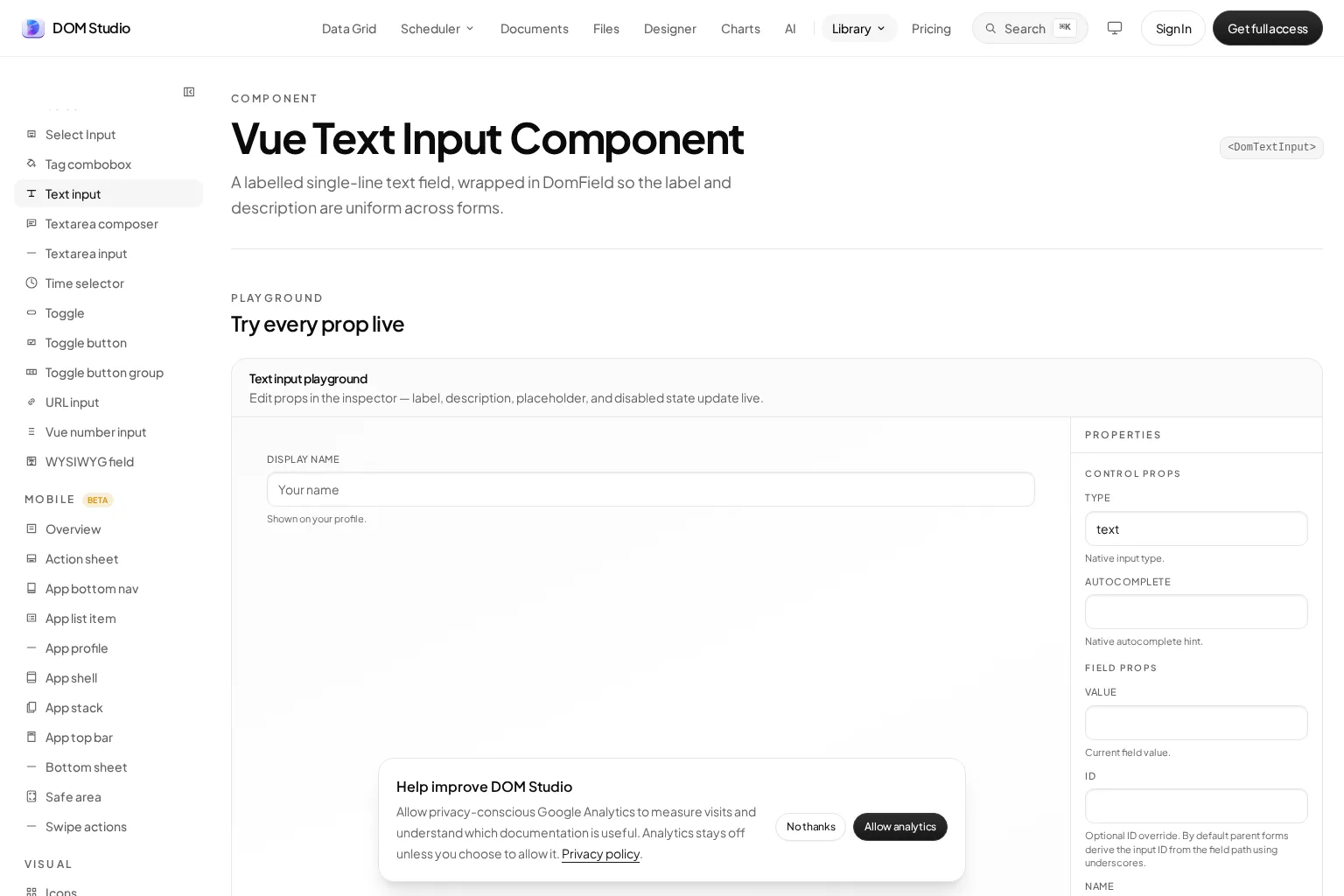
Use the example to discuss each region’s responsibility, not just its appearance. The label identifies the value; the description explains it; an error describes a problem with it.
Labels, hints, and placeholders have different jobs
Keep the field’s purpose visible
A persistent label remains available after someone starts typing and while they review the completed form. Prefer specific wording such as “Project name” over vague wording such as “Information”.
For native HTML controls, explicitly associating a label means its for value matches the input’s id. W3C’s Labeling Controls tutorial explains this relationship and the alternative of wrapping the control inside its label.
In component review, inspect the rendered result. A label placed above an input is not proof that the two are programmatically associated.
A floating label can work if it remains visible and associated with the control. We recommend including empty, focused, filled, and zoomed examples in its review, particularly where the label moves or becomes smaller.
Put essential instructions outside the placeholder
A placeholder disappears when a value is entered. It cannot carry the only explanation of what the field means or which format is accepted. W3C’s Form Instructions guidance distinguishes placeholders from labels and explains using aria-describedby to associate additional instructions with a field.
Compare these two specifications:
- Ambiguous: an unlabeled box containing the placeholder “Workspace”.
- Explicit: the label “Workspace name” and the persistent hint “Shown to everyone in your team”.
The second still makes sense after the box contains “Operations”.
State required or optional input consistently. If your interface uses an asterisk, explain its meaning rather than expecting everyone to infer it. Required status also needs programmatic representation, not merely a visual marker, as described in W3C’s required-input guidance.
Define states as behavior, not just visual variants
A useful state specification says what people see, what interaction is possible, and what information is available beyond appearance.
| State | Visible presentation | Behavioral contract to document |
|---|---|---|
| Default | Empty, enabled control with a visible label | The field is available for input; no premature error is shown. |
| Focused | A clearly identifiable focus treatment | Keyboard users can locate the active field and continue navigating. |
| Filled | The entered value remains readable | The label stays available; a value alone does not imply validation success. |
| Disabled | Distinct unavailable treatment | Native disabled controls cannot receive focus and are omitted from native form submission. |
| Read-only | A readable value with an appropriate noneditable treatment | Native read-only text controls remain focusable but cannot be edited by the user. |
| Invalid | Error text plus a distinguishable visual treatment | The validation failure and its explanation are programmatically available. |
The native disabled and read-only distinctions are documented in MDN’s references for disabled and readonly. Do not assume a custom component reproduces them simply because its styling looks similar.

These states can overlap. A field can be filled, focused, and invalid at the same time. Treating those as mutually exclusive variants leaves an important interaction undefined: someone correcting a rejected value.
We recommend specifying focus as its own visible layer, so an error border does not erase the indication of keyboard position. CMS includes visible focus and keyboard navigation in its text-field accessibility checks.
Also distinguish “not checked yet” from “valid”. A blank required field can initially have a neutral presentation without pretending it satisfies the rule. W3C’s ARIA21 technique advises against setting aria-invalid to true before validation has occurred.
For disabled fields, explain an important prerequisite in nearby content rather than hiding it inside an interaction the user cannot reach. For read-only fields, ask whether the task is reviewing a value, copying it, or following a separate edit route. Those decisions should shape the example.
Validation should explain the problem and the recovery
An error is not a decorative red state. It is a message that helps someone complete the task.
For a required project name, “Enter a project name” identifies the missing information. For an illustrative 40-character limit, “Use 40 characters or fewer” gives a specific correction. “Invalid input” does neither.
W3C’s User Notification guidance recommends concise feedback that identifies errors and explains how to resolve them. Place field-specific feedback at or near the relevant control, where people can use it while correcting the value.
Give people a chance to answer
We recommend documenting validation timing separately from validation rules. For a typical settings form, a reasonable starting policy is:
- Do not show errors merely because the form has opened.
- Check an attempted answer when the person leaves the field, where appropriate.
- Validate relevant fields when they submit.
- Define how an existing error updates while they correct it.
This is a policy to evaluate, not a universal timing rule. W3C discusses both typing-time and focus-change feedback, noting that format checks can be inappropriate while someone is still entering a value in its notification examples.
Connect visual feedback to accessible information
For a custom validation pattern, document how the field exposes its invalid state and how its error message is associated. W3C’s ARIA21 examples combine aria-invalid with an error linked through aria-describedby.
That association does not, by itself, specify how every newly inserted message will be announced immediately. Define and review dynamic notification and focus behavior as separate requirements. For forms with several errors, consider an error summary linking to the affected controls, following W3C’s notification guidance.
Color must not be the only visible signal. Include meaningful text and, where useful, an additional shape or icon. This follows WCAG’s Use of Color guidance.
Separate rejection from an incomplete check
For server-backed checks, specify pending, unavailable, and rejected outcomes. We would not describe a network timeout as “This project name is invalid”. Instead, provide a retryable explanation that reflects the actual problem.
Also document what happens if the value changes before a response arrives. The requirement should be that feedback describes the current value, not an earlier attempt.
Client-side feedback is not a security boundary. W3C’s Validating Input tutorial explains why validation must also occur on the server. Your component can present a server rejection, but it does not own every business rule.
Turn the specification into an inspectable component contract
A row of screenshots is useful, but it cannot fully describe the component. We recommend keeping the following information discoverable alongside its reference and examples:
- Purpose and boundaries: short text entry, with clear alternatives for longer or predefined answers.
- Public inputs: value, label, description, required status, editing availability, and validation presentation.
- Relationships: how the control receives its name and references descriptions and errors.
- State combinations: especially focused plus invalid, filled plus read-only, and pending plus edited.
- Examples and source hints: where the approved examples live and which component implementation they demonstrate.
- Ownership: who reviews changes to behavior, content rules, and accessibility expectations.
These are suggested documentation responsibilities, not a proposed API or mandatory schema. Your library may split them across a field wrapper, input primitive, and form layer.
A concrete acceptance statement is more useful than “supports accessible errors”. For example: “After an unsuccessful submit, the project-name field displays its error, exposes its invalid state, and has an associated explanation.” Pair that statement with the rendered example and a review procedure.
Keep product rules separate from the reusable field’s responsibility. A component should know how to display an error; the product decides whether a particular workspace name is allowed. Making that boundary visible helps consumers reuse the field without inheriting unrelated policy.
A practical text field review checklist
Before approving the component, review a realistic form rather than only an isolated empty input.
Content and anatomy
- Is a single-line answer genuinely appropriate?
- Does the label describe the information being requested?
- Are necessary instructions visible after a value is entered?
- Are optional, required, and unavailable conditions understandable?
- Do label, hint, and feedback regions remain visually grouped?
Interaction and accessibility
- Can someone reach, edit, and leave the enabled control using a keyboard?
- Is focus still visible when the field is invalid?
- Does the rendered control have the correct accessible name?
- Are descriptions and errors associated with the intended input?
- Does a read-only example behave differently from a disabled one?
Feedback and resilience
- Does each error explain a correction rather than just a failure?
- Is important meaning available without color?
- Is validation timing documented, including correction after an error?
- Are pending checks and network failures distinguished from rejected values?
- Have long values, zoom, and a narrow viewport been reviewed?
Use the CMS testing guidance as a baseline for keyboard, screen-reader, and magnification checks. We also recommend reviewing combinations that isolated variants miss: two adjacent fields, long translated hints, multiple validation failures, and a server response arriving during editing.
For a complementary developer perspective, watch Kateryna Porshnieva’s Practical guide to building accessible forms in React. Its implementation context is React; the specification in this article remains framework-neutral.
Make one field’s contract explicit
A dependable text field makes three things clear: what belongs in it, what the user can do now, and how to recover when something is wrong. We get there by coordinating content, semantics, interaction, and feedback, not by adding more visual variants.
Start with one field in a real form. Document its anatomy, review focused-plus-invalid behavior, and verify its label and error relationships. Then carry those decisions into your shared examples and metadata.
To explore the anatomy in a working reference, open our text input playground and component documentation. Use this checklist to guide the review rather than treating the preview as proof that every application integration is complete.
Sources
- CMS Design System: Text Field
- W3C WAI: Labeling Controls
- W3C WAI: Form Instructions
- W3C WAI: Validating Input
- W3C WAI: User Notification
- W3C: Using aria-invalid to Indicate an Error Field
- W3C: Understanding Use of Color
- MDN: disabled HTML attribute
- MDN: readonly HTML attribute
- DOM Studio: Vue Text Input Component
- Kateryna Porshnieva: Practical guide to building accessible forms in React