
Design system metadata is the structured information that explains what a component is, how it behaves, when to use it, and how other tools should handle it. When we keep that information close to the component, one contract can power documentation, navigation, visual editing, testing, and AI-assisted development.
This guide shows us how to create a practical metadata model without turning every component into a documentation project.
Table of contents
- Before you start: prerequisites and a clear boundary
- 1. Define the consumers before you define the fields
- 2. Separate discovery, contract, editor, and token metadata
- 3. Create a minimum viable component schema
- 4. Keep metadata beside the component source
- 5. Generate references, but preserve authored guidance
- 6. Treat behavior and accessibility as first-class metadata
- 7. Add ownership, lifecycle, and validation rules
- 8. Make the metadata useful for AI without overloading it
- Your completed outcome
Before you start: prerequisites and a clear boundary
Before we add fields, we need four inputs:
- A small set of real components to pilot, ideally a button, a form field, and a composite control.
- Access to the component source and the place where documentation or a component catalog is built.
- A predictable discovery convention, such as one component per folder.
- Agreement on the consumers of metadata: documentation, a component browser, a visual editor, test tooling, or AI context.
Keep component metadata separate from implementation details that consumers do not need. A component’s internal refs, layout calculations, and temporary migration code should not become part of the contract.
1. Define the consumers before you define the fields
Start by listing every surface that needs to understand a component. In a mature system, the same component may appear in a documentation page, sidebar, editor palette, live playground, application UI, and machine-readable reference.
For each consumer, write one question it must answer:
- Documentation: What problem does this component solve, and how do we use it safely?
- Navigation: What is its human-friendly name, group, icon, and order?
- Visual editor: Which props are editable and which control should edit them?
- Runtime and tests: Which props, slots, events, states, and accessibility expectations are public?
- AI workflow: Which examples and constraints make the preferred implementation unambiguous?
Expected result: we can explain why every metadata field exists. If a field has no consumer, leave it out until a real need appears.
Troubleshooting: do not start with a large generic JSON schema. That usually creates fields nobody maintains. Start from the questions your team already asks while shipping components.
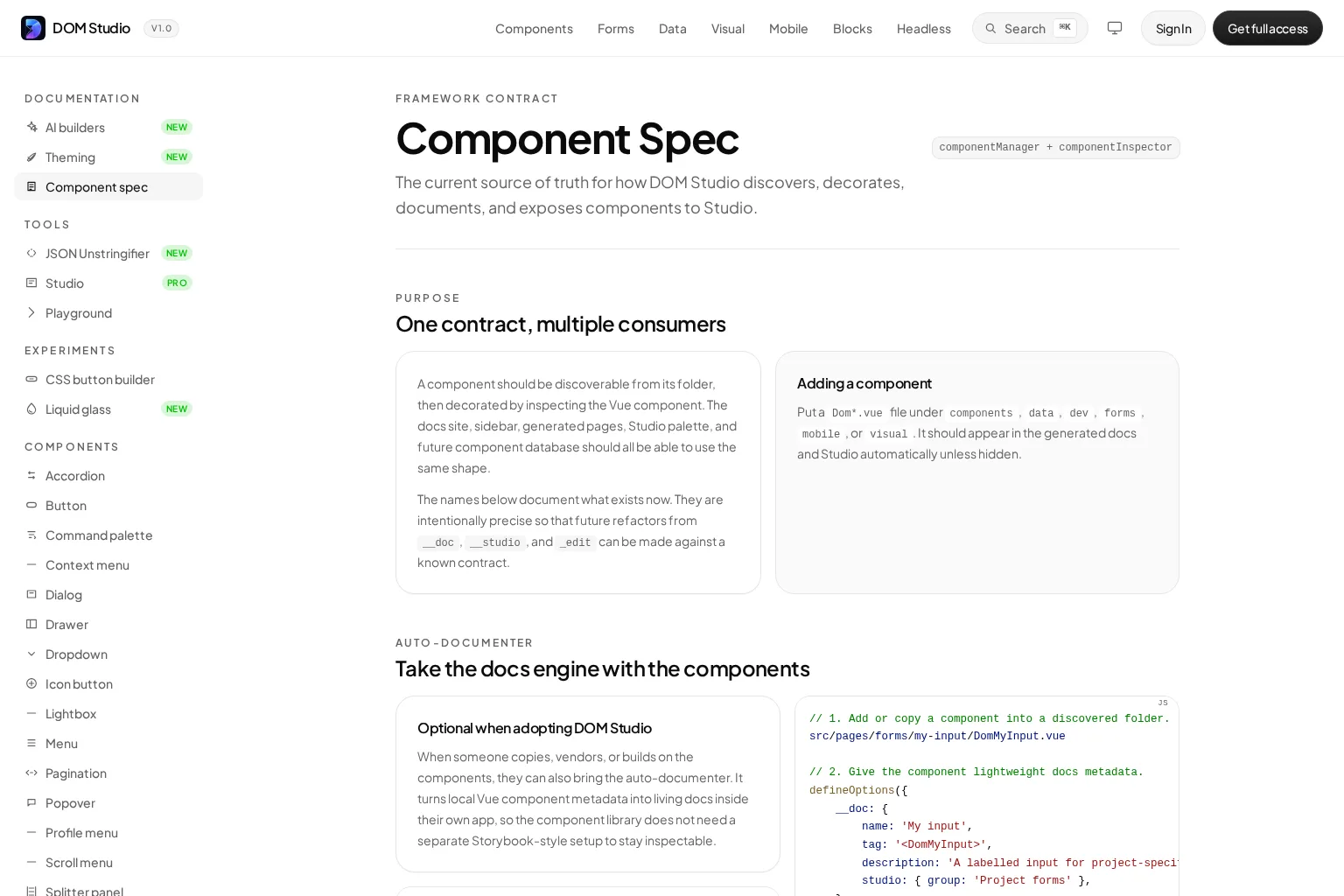
For DOM Studio, the component specification illustrates this one-contract approach: discovered component facts are decorated with documentation, navigation, and Studio-specific information rather than copied into separate records.
For a complementary walkthrough of documenting real component decisions in a design file, watch the video below.
2. Separate discovery, contract, editor, and token metadata
Metadata becomes easier to govern when we organize it into layers instead of placing every fact in one flat object.
- Discovery metadata identifies the source: ID, path, section, export name, and route.
- Component contract metadata explains the public API: purpose, props, slots, events, states, and accessibility expectations.
- Presentation metadata helps people find and understand the component: label, description, tags, icon, status, owner, and ordering.
- Editor metadata describes how a visual tool should present an editable prop, such as a select, JSON editor, range, or repeatable list.
- Token metadata documents shared design decisions such as type, description, aliases, and deprecation state.
Token metadata deserves its own layer because token formats solve a different problem from component contracts. The Design Tokens Community Group format provides interoperable fields such as type and description, plus namespaced extensions for additional tool data. It is useful for portable design decisions, but it does not replace component-level usage and behavior metadata.
Expected result: we can change a sidebar label or editor control without altering the component’s runtime API.
Troubleshooting: if the visual editor needs to know a prop’s valid options, store that as editor metadata or derive it from the prop definition. Do not make the documentation page parse UI-specific behavior from prose.

3. Create a minimum viable component schema
A good first schema is compact, explicit, and easy to review in a pull request. Here is a framework-neutral shape we can adapt:
export const buttonMeta = {
  id: 'actions/button',
  name: 'Button',
  description: 'Triggers a user action.',
  status: 'stable',
  owner: 'design-systems',
  tags: ['action', 'form'],
  props: {
    tone: {
      type: 'string',
      default: 'primary',
      options: ['primary', 'secondary', 'danger'],
      description: 'Sets the visual intent.'
    },
    disabled: {
      type: 'boolean',
      default: false,
      description: 'Prevents user interaction.'
    }
  },
  slots: [
    { name: 'default', description: 'Visible button label or content.' }
  ],
  events: [
    { name: 'click', payload: 'MouseEvent', description: 'Fired on activation.' }
  ],
  accessibility: {
    semanticRole: 'button',
    keyboard: ['Enter', 'Space'],
    notes: ['Use a clear accessible name.']
  },
  examples: ['basic', 'loading', 'destructive-action']
}
The exact field names can vary. The important part is that we include enough information to answer the common implementation and usage questions, while keeping machine-readable values normalized. Use a controlled value such as stable, beta, or deprecated instead of scattered status labels.
Verification check: choose one existing component and generate a short component reference from its metadata. A developer who has not seen the source should be able to identify its purpose, API, states, and primary accessibility expectations.
4. Keep metadata beside the component source
Metadata stays accurate when the person changing a component sees the contract in the same review. We recommend colocating the component, examples, tests, and metadata in one folder or module boundary.
DOM Studio supports a lightweight Vue pattern that keeps __doc metadata inside defineOptions() and lets the inspector read prop definitions. It can then generate a page, navigation entry, playground details, and Studio controls from the component rather than requiring a separate documentation setup.
<script setup>
defineOptions({
  __doc: {
    name: 'Status pill',
    tag: '<DomStatusPill>',
    description: 'A compact label for workflow state.',
    order: 40,
    studio: { group: 'Feedback', icon: 'Circle' },
    slots: [
      { name: 'default', description: 'Status label content.' }
    ],
    events: [
      {
        name: 'update:modelValue',
        payload: 'string',
        description: 'Fired when the status changes.'
      }
    ]
  }
})

const props = defineProps({
  tone: {
    type: String,
    default: 'neutral',
    _edit: {
      options: ['neutral', 'success', 'warning', 'danger'],
      description: 'Visual state shown by the pill.'
    }
  }
})
</script>
Expected result: the component can be discovered and documented from its source, with richer documentation added only when it earns the complexity.
Troubleshooting: avoid making generated documentation your only form of guidance. When a component has non-obvious composition rules or product-specific decision-making, add a nearby authored example that explains the why.
5. Generate references, but preserve authored guidance
Once the minimum contract exists, generate the repetitive parts of documentation: prop lists, defaults, slots, events, status, and source location. This prevents drift between code and reference material.
Then reserve authored content for decisions that metadata alone cannot express well:
- When to choose this component instead of another one.
- Correct and incorrect compositions.
- Responsive behavior and loading, empty, or error states.
- Content guidance and accessibility rationale.
- Migration notes and deprecation paths.
This division makes documentation more useful than a prop dump. It also helps us document application-facing controls, such as the fields and schemas in a form system, without repeating implementation facts manually.
Verification check: change a prop default in code. The generated reference should change with it, while the authored usage notes remain intact.
6. Treat behavior and accessibility as first-class metadata
Visual properties alone do not make a component reusable. We need to document the behaviors that consumers rely on: keyboard support, focus behavior, ARIA relationships, emitted events, disabled states, loading states, and public styling hooks.
For simple components, a concise accessibility note may be enough. For interaction-heavy controls such as dialogs, menus, comboboxes, tabs, and popovers, document the behavior as a testable contract. DOM Studio’s guide to headless web components demonstrates why state, keyboard interaction, ARIA wiring, focus handling, and events should remain inspectable even when each product owns the presentation.
Expected result: a test author can turn the public behavior into checks without reverse-engineering the component.
Troubleshooting: if your metadata merely says “accessible,” it is not actionable. Replace it with observable expectations, such as focus returns to the trigger when a dialog closes, or a status message is announced after an asynchronous action completes.
7. Add ownership, lifecycle, and validation rules
Metadata only scales when it has a maintenance path. Add a few governance fields early:
- Owner: the team or group responsible for decisions and support.
- Status: draft, beta, stable, deprecated, or retired.
- Introduced and deprecated versions: useful when the system is published as a package.
- Replacement: required for a deprecated component or prop.
- Review date: optional for patterns affected by platform changes or policy.
Next, turn these rules into automated checks. For example, CI can fail when a public component has no description, a documented event lacks a payload shape, a deprecated item has no replacement, or an editor option does not match the component’s allowed values.
Verification check: intentionally remove a required field from one pilot component. The validation should identify the component, missing field, and remediation clearly.
8. Make the metadata useful for AI without overloading it
AI tools need clear component names, valid prop shapes, allowed values, event payloads, semantic tokens, and short canonical examples. They do not need every internal implementation detail.
We recommend exposing a compact machine-readable view that includes stable identity, public API, constraints, and approved examples. Keep editor-only metadata separate unless the AI is explicitly creating a visual editor spec. DOM Studio’s AI guidance takes the same approach: prefer known primitives and blocks, use props for behavior, and use Studio specs when the output must remain visually editable.
Tools such as Storybook, a token transformation pipeline, or an internal component catalog can consume this same core information. The goal is not to force every tool into one schema. The goal is to maintain one authoritative component contract and create focused adapters where necessary.
Expected result: an AI assistant or new team member can choose a valid component and compose it with fewer invented props or ad hoc markup.
Troubleshooting: if generated UI repeatedly chooses the wrong component, improve the component description and add a short example that shows the preferred alternative. Do not try to solve an ambiguous contract with a longer prompt alone.
Your completed outcome
We now have a design system metadata model that identifies components, defines their public behavior, documents editable controls, and supports generated references without losing human guidance. Start with three representative components, validate the schema against real docs and tests, then expand only when a new consumer has a concrete need.
The next useful action is to make one metadata field required in code review this week, beginning with a clear description, public status, and one testable accessibility expectation.