Headless web components let us reuse difficult interaction behavior without forcing every product surface into the same visual design. In this guide, we will build a small headless disclosure primitive, verify its contract, and learn where a production-ready headless library should take over for more complex controls.
A headless component owns behavior such as state, keyboard interaction, ARIA relationships, focus handling, and events. The consuming application owns markup composition and styles. Web Components provide the browser-native building blocks for this approach: custom elements, Shadow DOM, and templates or slots.
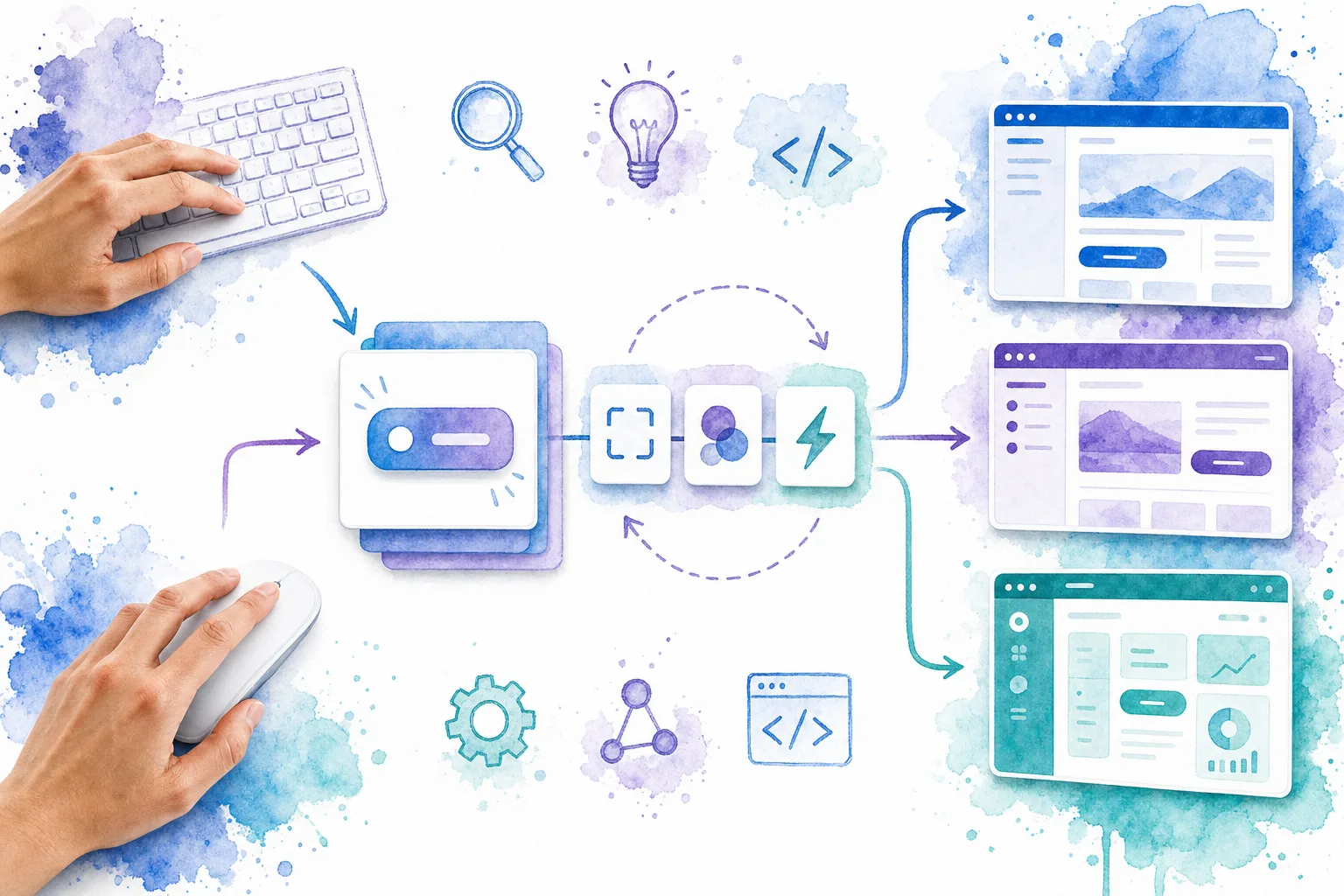
If you want a quick standards refresher before building, this short video explains the custom-element foundation behind the approach.
Table of contents
- Before you start: prerequisites and the component contract
- 1. Start with semantic HTML that works without JavaScript
- 2. Add behavior inside a custom element, not presentation
- 3. Verify the component contract in the browser
- 4. Apply product styling outside the component
- 5. Use a production control when the interaction is complex
- 6. Decide when to use light DOM, Shadow DOM, slots, and parts
- 7. Test the behavior across real product contexts
- Build the behavior once, let every product own the design
Before you start: prerequisites and the component contract
You need a modern browser, a local HTML page or application sandbox, and a way to inspect the DOM and console. We also recommend choosing one simple interaction first. A disclosure is ideal because a native button already supplies reliable Enter and Space keyboard behavior.
Write the contract before writing code:
- Inputs: an
openattribute and a trigger button. - State: open or closed.
- Outputs:
aria-expanded, the panel’shiddenstate, and a bubblingdisclosure-changeevent. - Non-goals: visual classes, colors, spacing, icons, animation, and product-specific copy.
Verification check: another developer should be able to describe the component’s behavior without mentioning its appearance.
1. Start with semantic HTML that works without JavaScript
Put the trigger and content in ordinary HTML. This gives us a usable baseline, keeps the component easy to inspect, and lets the application attach its own classes freely.
<x-disclosure>
  <button
    type="button"
    data-trigger
    aria-controls="account-details"
    aria-expanded="false"
  >
    Show account details
  </button>

  <section id="account-details" data-panel hidden>
    <p>Account details appear here.</p>
  </section>
</x-disclosure>
Use a real <button> for the trigger. Do not replace it with a clickable <div>, because that creates keyboard and semantic work the browser already solves.
Expected result: the page renders a button and a hidden panel, even before the custom element is registered.
Troubleshooting: if the panel flashes during initial render, keep the hidden attribute in the authored HTML rather than adding it later with JavaScript.
2. Add behavior inside a custom element, not presentation
Register a custom element that only coordinates state, ARIA, and the event contract. The example deliberately uses light DOM, so application styles can cascade onto the button and panel without a styling API.
class XDisclosure extends HTMLElement {
  static observedAttributes = ['open'];

  connectedCallback() {
    this.trigger = this.querySelector('[data-trigger]');
    this.panel = this.querySelector('[data-panel]');

    if (!this.trigger || !this.panel) {
      throw new Error('x-disclosure needs [data-trigger] and [data-panel].');
    }

    this.trigger.addEventListener('click', () => this.toggle());
    this.sync();
  }

  attributeChangedCallback() {
    if (this.trigger) this.sync();
  }

  get open() {
    return this.hasAttribute('open');
  }

  toggle(nextOpen = !this.open) {
    this.toggleAttribute('open', nextOpen);

    this.dispatchEvent(new CustomEvent('disclosure-change', {
      bubbles: true,
      composed: true,
      detail: { open: nextOpen },
    }));
  }

  sync() {
    this.trigger.setAttribute('aria-expanded', String(this.open));
    this.panel.hidden = !this.open;
  }
}

customElements.define('x-disclosure', XDisclosure);
This is the essential headless split: the element coordinates interaction, while the application supplies the visible UI. bubbles: true lets a parent listen once for events from many instances. composed: true also allows the event to cross a Shadow DOM boundary if we later change the implementation.
Expected result: clicking the button opens and closes the panel, updates aria-expanded, and dispatches disclosure-change.
Troubleshooting: a NotSupportedError usually means the same custom-element name was registered twice. Register each tag name once, ideally from a single module entry point.
3. Verify the component contract in the browser
Test the behavior where it matters: in the rendered page and in the event stream. Add this listener temporarily:
document.addEventListener('disclosure-change', (event) => {
  console.log(event.target, event.detail.open);
});
Then run these checks:
- Click the trigger twice and confirm that the
openattribute appears and disappears. - Tab to the trigger and press Enter and Space. A native button should activate in both cases.
- Inspect the trigger and confirm that
aria-expandedmatches the visible state. - Place two disclosures on the page and confirm each event reports the correct
event.target.
Expected result: behavior is predictable, inspectable, and independent of your CSS.
Troubleshooting: if a state update is visible but assistive technology receives stale information, check that sync() runs after every route that changes open, including programmatic calls.
4. Apply product styling outside the component
Now style the authored elements from the consuming application. The component does not need to know whether it appears in a dashboard, a marketing site, or a mobile shell.
.settings-disclosure [data-trigger] {
  display: flex;
  justify-content: space-between;
  width: 100%;
  padding: 0.75rem 1rem;
  border: 1px solid currentColor;
  border-radius: 0.5rem;
  background: transparent;
}

.settings-disclosure [data-panel] {
  padding: 1rem;
}
<x-disclosure class="settings-disclosure">
  <button
    type="button"
    data-trigger
    aria-controls="account-details"
    aria-expanded="false"
  >
    Show account details
  </button>
  <section id="account-details" data-panel hidden>
    <p>Account details appear here.</p>
  </section>
</x-disclosure>
The same behavior can now wear a different design system without a fork. That is the practical value of headless web components: behavior changes slowly, but visual requirements often change by product, brand, or context.

Expected result: changing classes or CSS changes appearance only. The event name, state attribute, and accessibility behavior remain stable.
Troubleshooting: avoid styling based only on fragile internal structure. Keep consumer-facing hooks intentional, such as host attributes, data-* attributes, slots, CSS custom properties, or documented parts.
5. Use a production control when the interaction is complex
A disclosure is a safe learning exercise. Dialogs, menus, comboboxes, tabs, tooltips, and floating panels are not equivalent. They involve focus return, roving tabindex, light dismiss, collision handling, scroll locking, viewport changes, and ARIA relationships.
For those controls, we recommend adopting and testing a mature headless implementation rather than rebuilding the interaction contract from scratch. DOM Studio’s headless component reference exposes framework-neutral custom elements for components such as dialogs, popovers, tabs, tooltips, and comboboxes. Its headless layer documents keyboard behavior, ARIA wiring, bubbling dom:* events, and editable styling boundaries.
The basic installation pattern is intentionally small:
<script type="module">
  import '@getdom/studio/headless/dialog.js';
  import '@getdom/studio/headless/dropdown.js';
</script>
Use the component documentation to validate the specific interaction contract before you customize it. For example, the dialog control describes its open and close behavior, while the floating layer guide covers the positioning concerns that affect popovers, dropdowns, autocomplete lists, and tooltips.
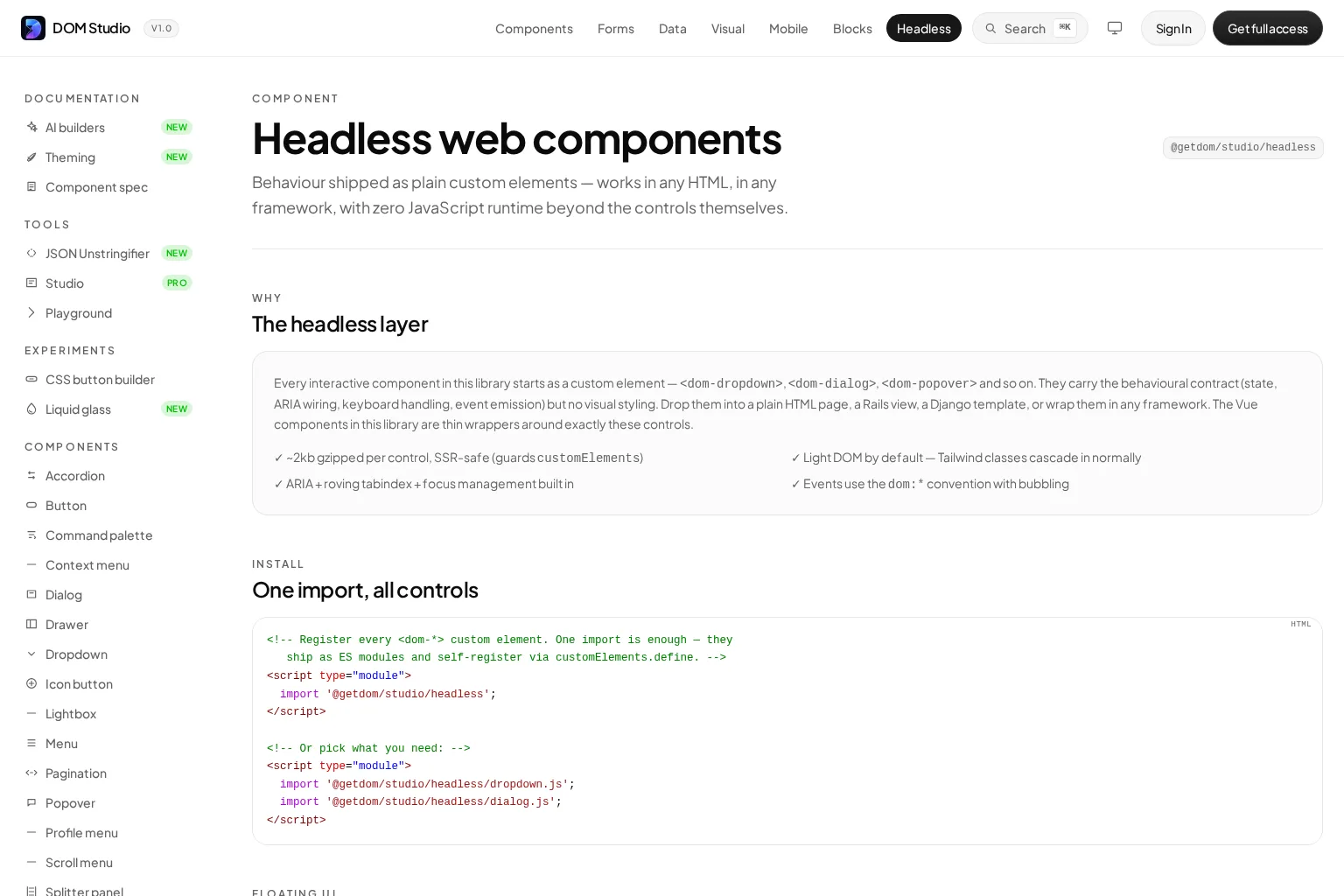
Expected result: the library owns the hard interaction mechanics, while your application retains control over classes, layout, content, and visual design.
Troubleshooting: do not treat every selection control as a menu. If a choice represents a form value, use a control with form semantics. DOM Studio’s Vue dropdown wrapper makes the same distinction in its examples.
6. Decide when to use light DOM, Shadow DOM, slots, and parts
Choose the encapsulation boundary deliberately:
- Light DOM works well when consumers need ordinary CSS utilities, such as Tailwind classes, to cascade into the component structure.
- Shadow DOM protects implementation details and reduces style collisions. It is useful when the component must be portable across unrelated pages.
- Slots let consumers provide meaningful markup while the component controls placement and behavior.
- CSS custom properties and
partattributes create stable styling hooks when Shadow DOM is necessary.
Do not equate Shadow DOM with headless design. A component can be headless with light DOM or Shadow DOM. The test is whether it ships a visual opinion that consumers cannot reasonably replace.
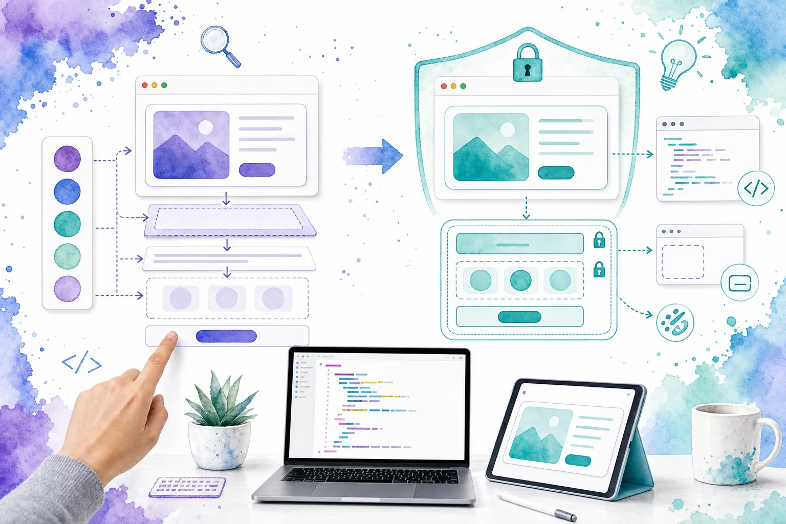
Expected result: your team can explain which parts of a component are public API: attributes, properties, events, slots, and styling hooks.
Troubleshooting: if consumers need to query internal nodes to style or control the component, the public API is incomplete. Add a documented hook instead of making internal selectors part of the contract.
7. Test the behavior across real product contexts
Before calling a headless component reusable, test it in more than one surface:
- A dense dashboard with utility classes and responsive layout.
- A form with validation and server-rendered HTML.
- A page inside another framework boundary, such as Vue or a server template.
- Keyboard-only use at narrow viewport widths.
For each context, verify initial state, pointer interaction, keyboard interaction, focus order, event payloads, disabled or unavailable states, and styling overrides. For floating UI, also test nested scroll containers, narrow viewports, and clipping parents.
Expected result: the component behaves consistently even when its surrounding application changes.
Troubleshooting: when a problem appears in only one host application, separate the behavioral failure from the integration failure. Inspect event listeners, duplicate element registrations, CSS containment, overflow, and application hydration before changing the component contract.
Build the behavior once, let every product own the design
We now have a repeatable approach: define a narrow interaction contract, start with semantic HTML, keep presentation outside the behavioral primitive, emit observable events, and move to proven headless controls as complexity grows. The result is a component system that can serve multiple products without forcing them into the same visual language.
Next action: choose one repeated interaction in your product, preferably a disclosure or a simple toggle, and document its inputs, state, events, and styling hooks before implementation. When you reach dialogs, menus, or floating controls, begin with DOM Studio’s headless primitives and validate the documented contract in your own application.