
TL;DR
A chatting bubble can mean a message, a floating button that opens chat, or a reply anchored to work on the screen. For a quick question about a form, keep the reply beside the field. For optional support, use a discoverable launcher. For ongoing analysis or long histories, give the conversation a panel or its own workspace. The five real interfaces below show how to make that placement decision before building the bubbles.
A rounded message is only one piece of a conversational interface. Where the exchange lives determines whether someone can finish a form, keep a dashboard in view, find an earlier answer, or dismiss help they did not request. We use chatting bubble here as an umbrella term for these related surfaces, not as the name of a single component. A message bubble holds a reply; a thread keeps replies in order; a launcher opens a conversation; and an assistant panel keeps chat beside another task.
This guide focuses on choosing the surface and transferring its design lesson to a product UI. For the Vue message contract, streaming implementation, and code-level screen-reader behavior, use our separate accessible AI chat messages guide.
Table of contents
- What makes these useful examples?
- Match the placement to the job
- 1. Google Docs comments: attach the exchange to its subject
- 2. Intercom Messenger: let a launcher open optional help
- 3. Copilot in Excel: keep an assistant beside the data
- 4. DOM Studio’s Chat block: give a persistent thread its own workspace
- 5. DOM Studio’s Agent Chat: use multiple panes for richer responses
- Turn the examples into a build decision
- A small implementation plan
- FAQ
- Start with the task, then adapt the surface
- Sources
- Recommended Reads
What makes these useful examples?
Each example is a documented product interaction or a working component example, not a fabricated mockup. Google Docs provides a conversation attached to content; Intercom documents an on-demand launcher; Excel puts questions beside data; and two DOM Studio examples show progressively more dedicated chat workspaces. We describe what each source actually demonstrates, then make a separate design recommendation. None of the examples establishes a measured improvement in engagement or productivity.
Look for four decisions as you read: what starts the conversation, what remains visible while it runs, how long the history must last, and where the reader goes when the answer gets bigger. A comment beside a form and an AI chat app can share message styling without sharing navigation, scrolling, or persistence rules.
Match the placement to the job
| Placement | Surrounding task and space | Conversation and persistence | Discovery and interruption |
|---|---|---|---|
| Anchored reply | A specific field, document selection, or chart remains primary | Short, object-linked exchange; retain the anchor when revisiting | Easy to find at the point of work; avoid covering the control |
| Floating launcher | The underlying page stays primary until help is requested | Optional conversation that may continue across pages | Needs an understandable label and predictable open/close behavior; keep interruptions restrained |
| Side assistant | Data or a form must remain visible alongside the answer | Several follow-ups tied to current context | Visible in the work area, but consumes width and can compete for focus |
| Dedicated thread | Conversation itself is the task | Long, revisitable history with a composer and thread navigation | Explicit destination with little surprise, but requires leaving the original screen |
| Multi-pane agent workspace | Conversation and supporting context are both substantial | Persistent, potentially multipart answers and additional panels | More controls and screen space; unsuitable for a one-question helper |
These are choices, not mandatory breakpoints. On a narrow phone, an anchored reply may open in a focused view; a desktop side assistant may become a single-column route. Ask whether the person must see the original task at the same time as the answer. That question resolves many placement debates faster than adjusting bubble width.
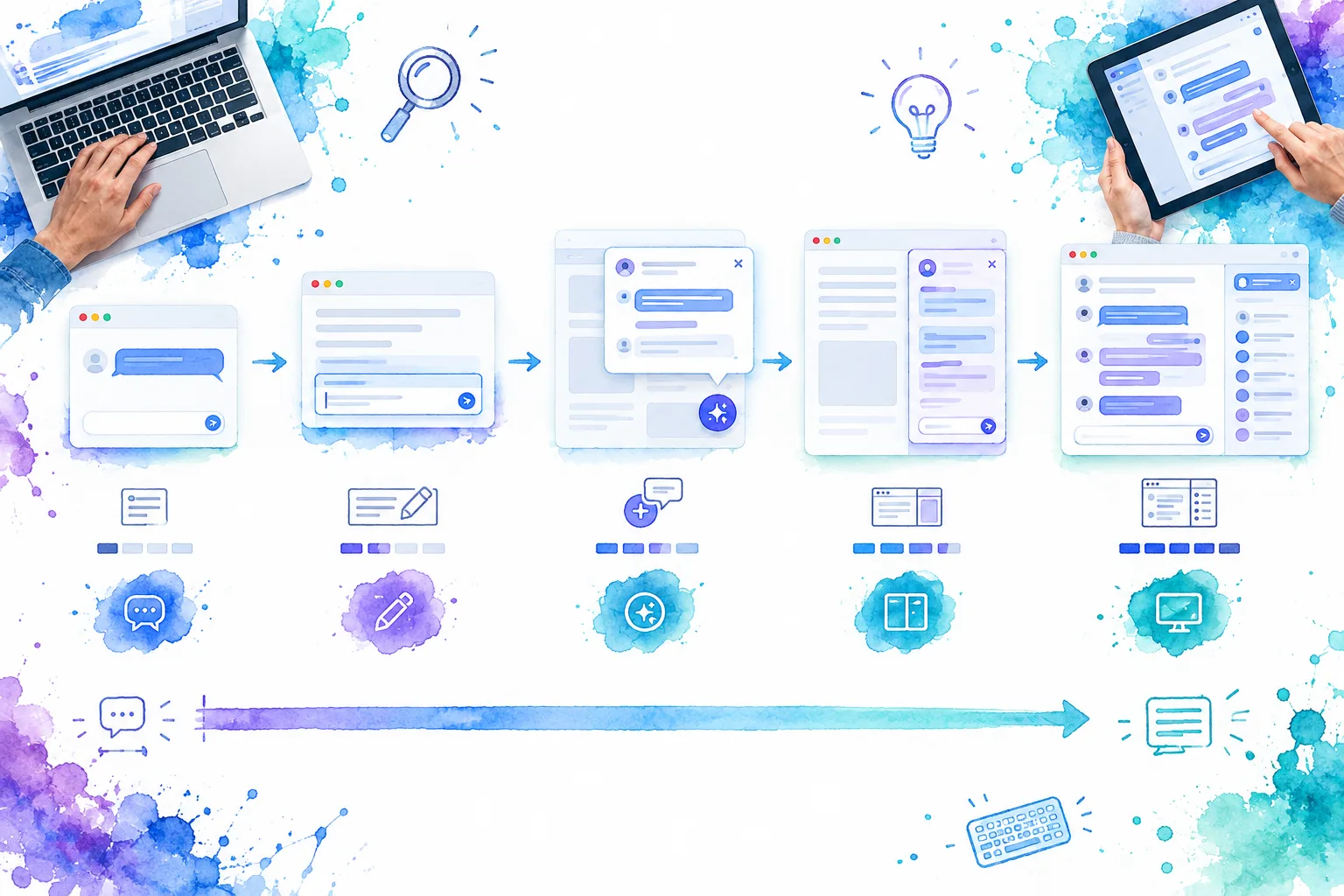
Illustrative placement map, not screenshots of the products below. The silhouettes show how available space and conversational depth can change together.
1. Google Docs comments: attach the exchange to its subject
Google Docs comments can be added to highlighted text, images, or other selected content. People can reply, resolve the discussion, and open a comments panel to find comments and their locations. That makes the comment a useful real-world example of a contextual conversation, even though a document comment is not a general-purpose AI chat bubble.
Imagine a product engineer reviewing a dashboard configuration form. A teammate asks, “Why is this metric excluded?” next to the affected setting. If the question sits only in a global chat feed, the answer loses its referent when the team switches screens. A contextual bubble can carry an object identifier behind the scenes, show the author and reply state, and offer a way back to the exact field. The implementation lesson is to persist the association with the object, not just the text of the exchange.
For a form, favor an anchored question or a small comment indicator over a permanently open transcript. When the reply becomes long, open a panel that still identifies the field being discussed. Plan what happens if the field is renamed, removed, or hidden by validation, and distinguish a resolved conversation from an unread one. This is our proposed adaptation of the documented comment pattern, not a claim about Google Docs’ handling of application forms.
Choose this when: the conversation only makes sense in relation to a specific item, and keeping that item identifiable is more valuable than displaying a long transcript.
2. Intercom Messenger: let a launcher open optional help
Intercom’s custom-launcher documentation describes opening its Messenger from a chosen button, link, or other element on a site or in an app. This is a distinct pattern from the messages inside Messenger: the launcher is the entry point, not a miniature chat thread. Intercom also documents a support-email destination as one possible fallback for a launcher link when JavaScript is unavailable.
For a dashboard, an always-floating circle is easy to add but not necessarily easy to understand. Nielsen Norman Group’s qualitative study of site AI chatbots found that participants sometimes missed small, unlabeled chatbot icons or could not tell what the bots could do. That finding supports a practical design choice, not a universal rule that every launcher needs the same position: label the action for its actual purpose, such as “Ask about this report” or “Contact support,” and place it where it does not hide the primary action.
A launcher makes sense if the user is likely to need help on several screens but usually wants to continue the current task uninterrupted. Decide whether opening it preserves page context, whether a partly written message survives closing, and what happens when a person navigates to another route. Give the opened surface a visible close control and a sensible keyboard return path. If help is essential to finish a particular field, a nearby contextual entry point may be more discoverable than a generic corner button.
Choose this when: chat is optional, the page must remain usable without it, and the entry point can explain what kind of help awaits.
3. Copilot in Excel: keep an assistant beside the data
Microsoft’s Copilot in Excel guidance documents opening a chat pane to ask questions about workbook data, review an answer, and ask follow-ups. It describes optional code detail and, in applicable cases, static tables or charts that can be inserted into the sheet. That is an example of a side assistant: the question is conversational, but the work still revolves around the spreadsheet.

Conceptual dashboard and assistant-panel illustration, not a capture of Excel. It shows why a short user request and a roomier answer may need different surfaces.
The transferable decision for a dashboard is to keep the chart, filters, or record visible when interpreting the answer. Put the user’s brief question in a compact message, but let a multi-paragraph explanation or a cited result use a wider, calmer response surface. Give the assistant enough width to display attachments, long links, and code without making the underlying dashboard unusable. Mark clearly what data the answer refers to and separate “explain” from any action that changes the application.
A narrow form has the opposite constraint. If the form and the panel would each become too small, switch to a dedicated mobile view with a clear way back to the original field and its unsaved values. Do not treat a side panel as proof that the AI knows the current selection; pass and show the scope deliberately. This is our dashboard adaptation, not a claim that Copilot uses these exact responsive rules.
Choose this when: the original data must stay in view, the user expects several follow-ups, and both work area and answer have room to remain readable.
4. DOM Studio’s Chat block: give a persistent thread its own workspace
Our Assistant chat block shows a thread list beside a message stream and a composer. Its example uses card surfaces for user and assistant messages, with the thread list shown on wider screens and omitted from the example’s narrower layout. It is a working starting point for a conversation-led screen, not evidence that a full-screen chat is the best fit for every app.
Here the user has deliberately entered a place to converse. A dashboard’s compact help popup would struggle to hold multiple topics, past answers, and a multiline composer. In a dedicated workspace, we can make selecting an older thread an explicit action and give long responses enough width. Short user turns can remain compact while assistant answers expand when the content needs it. A timestamp may help when history matters; delivery, failure, and retry controls belong with the affected message rather than in a generic page-level banner.
Before adapting this block, define how someone returns to the original dashboard or form and whether a newly created thread inherits that screen’s context. On mobile, replace the persistent sidebar with an accessible thread picker rather than squeezing navigation and conversation into narrow columns. The published block demonstrates the composition; your product still needs its own persistence, API wiring, and message behavior.
Choose this when: conversation history and thread switching are primary tasks, not incidental help alongside another task.
5. DOM Studio’s Agent Chat: use multiple panes for richer responses
Our Agent Chat reference documents a store-backed shell with a conversation sidebar, a central message view, and a closable contextual pane. Its documented message parts include text, audio, handoffs, tool calls, and tool results; the conversation exposes streaming and stop controls. This illustrates a multi-pane agent workspace rather than simply a wider message bubble.
The extra pane earns its place when a product engineer must inspect a report, tool result, or selected record while following a longer exchange. Imagine asking an assistant to explain a revenue discrepancy: the central response can state the finding, while supporting query details stay inspectable in another region. Do not convert every intermediate event into an equally prominent bubble. Let the answer lead, keep evidence attributable, and make interruption or retry states specific to the response in progress. Those are proposed UX rules for an adapted application, not measured outcomes of the DOM Studio demo.
The trade-off is complexity. Independent scrolling, a thread picker, a contextual pane, and a composer all need deliberate focus order and responsive transitions. On a phone, prioritize one active task, then offer explicit navigation between conversation and supporting details. Reserve this surface for workflows in which the extra context is regularly useful; a single field-level hint does not need an agent console.
Choose this when: the conversation is durable, rich outputs need inspection, and people need more than one relevant context region while working.
Turn the examples into a build decision
We would start with a one-sentence task: “Explain this validation error beside the field,” “Help me from any page,” or “Work through this report over several turns.” Then choose the smallest of the five placements that preserves what the person needs to see. The table and illustration above are a selection aid, not a substitute for testing the actual application.
Before implementation, run one representative short exchange and one inconvenient exchange through the chosen surface. Include a long answer, a timestamp that must remain understandable, a filename or attachment, a wide code sample, a failed response with Retry, and a streamed answer that can be stopped. Decide whether the user can keep reading older messages while a new answer arrives. If the design fails only in its non-ideal state, the design is not finished.
For any pattern with a changing conversation, keep the document’s reading order and keyboard focus order understandable. W3C’s role="log" technique describes one way to expose newly appended chat messages to assistive technology; it is an example technique, not a complete chat accessibility recipe. Announce meaningful progress and failure without flooding the listener with every partial token. Measure text contrast on the actual bubbles and labels: WCAG 2.2’s minimum-contrast guidance specifies 4.5:1 for ordinary text and 3:1 for large text, subject to its exceptions.
Finally, test the layout at a width equivalent to 320 CSS pixels, including long unbroken strings and any panel that opens over a form. WCAG’s reflow guidance expects ordinary vertical content to remain usable without two-dimensional scrolling at that equivalent width, with exceptions for material that requires two-dimensional layout. Let wide code or a data grid scroll within its own bounded region where necessary; do not make the entire conversation pan sideways to read a paragraph.
Kate Moran’s talk on why useful AI features can go undiscovered is a useful companion when deciding whether an assistant should live in a launcher or next to the task. It addresses discovery and value, not bubble styling.
A small implementation plan
- Name the entry point and exit. Write the trigger label, the first screen shown, the close behavior, and where focus returns. If the surface is anchored, record which field or item owns it.
- Set the space budget. Sketch desktop, narrow dashboard, and phone layouts with the longest plausible answer. Decide whether a sidebar closes, becomes a picker, or becomes a route.
- Define the visible states. Specify author, timestamp policy, loading or streaming, stopped, failed, retried, and complete states. Plan how code, links, and attachments are displayed without turning every response into a tiny pill.
- Test continuity. Change routes with a draft in progress, reopen a conversation, and switch between two records. Verify that context, scroll position, and the intended history survive only where the product promises they will.
- Validate with real interaction. Use keyboard and touch, zoom the page, check the screen-reader announcement cadence, and test the unanswered or failed case. Keep a clear path back to the work the conversation supports.
This sequence selects the product interaction first. Once the placement is settled, implement its message renderer and composer with the behavior your application actually needs rather than copying a visual bubble from another product.
FAQ
Is a floating chat icon the same as a chat bubble?
No. The icon or button is a launcher; a message bubble is content inside a conversation. A launcher can open a popover, panel, or full page, and each destination has different focus and persistence needs.
When should I use an inline reply instead of a side panel?
Use an inline reply when a short answer depends on one visible field or object. Choose a panel when the person needs follow-ups or a longer answer while keeping broader screen context. If both regions cannot remain usable on mobile, switch to a focused view.
Does an assistant response have to look like a speech bubble?
No. A short user turn can use a compact bubble, while long AI output with code, citations, or attachments may be clearer in a wider card. Maintain clear author and state identification either way.
Start with the task, then adapt the surface
For a conversation-led Vue screen, inspect our Chat block; for multi-pane work, explore the Agent Chat reference. Then use our accessible chat bubble implementation guide to build the messages inside the surface you chose. We would test one short exchange and one difficult failure state before refining the colors or corner radii.
Sources
- Google Docs Editors Help, Use comments, action items, & emoji reactions
- Intercom Help, Create a custom launcher
- Nielsen Norman Group, What Is Your Site’s AI Chatbot for? Users Can’t Tell
- Microsoft Support, Get direct answers to your data analysis questions
- DOM Studio, Assistant chat block
- DOM Studio, Agent Chat reference
- DOM Studio, Chat Bubble UI: How to Build Accessible AI Chat Messages in Vue
- W3C WAI, Using role=log to identify sequential information updates
- W3C WAI, Understanding Contrast (Minimum)
- W3C WAI, Understanding Reflow
- Future Product Days, The AI Adoption Gap: Why Great Features Go Unused