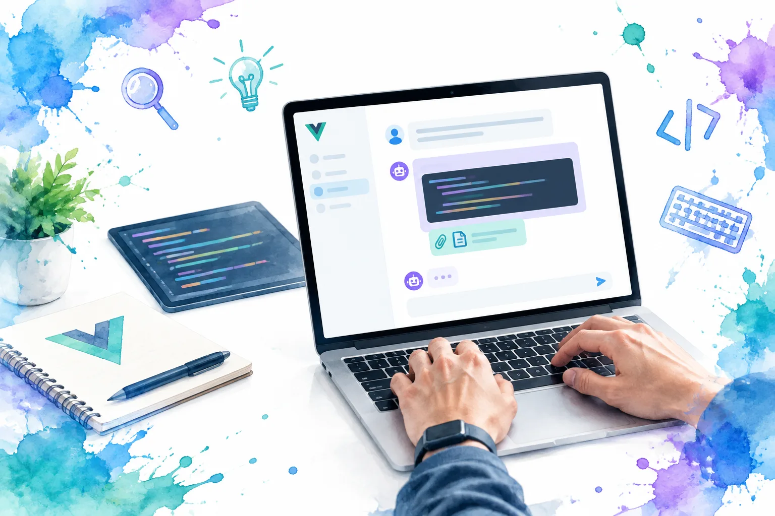
An AI chat bubble is more than a rounded container with left and right alignment. In a production Vue interface, it needs a message contract, predictable streaming behavior, readable rich content, a responsive layout, and announcements that do not overwhelm screen-reader users.
In this guide, we will build that foundation in Vue 3. The result supports user and assistant messages, pending and failed responses, code, attachments, retries, and keyboard-friendly composition.
Table of contents
- Before you start
- 1. Define a message contract that covers real chat states
- 2. Build user and assistant bubble variants
- 3. Render streaming, loading, error, and retry states deliberately
- 4. Support markdown, code, attachments, and narrow screens
- 5. Add a composer that works from the keyboard
- 6. Assemble the thread and make scrolling intentional
- 7. Verify the chat bubble before release
- Use a production-shaped Vue chat block as your starting point
- FAQ
- Build the chat bubble, then ship the conversation
Before you start
You need Vue 3 with Single-File Components, a message API or mock data source, and a sanitizer if assistant responses are rendered as HTML. Treat assistant output as untrusted content, and keep the message model separate from bubble presentation.
1. Define a message contract that covers real chat states
Action: Model each bubble with a stable ID, role, content, delivery state, and optional attachments. A role alone is not enough for AI chat. The UI must also know whether a response is streaming, complete, interrupted, or retryable.
// chat.types.ts
export type ChatRole = 'user' | 'assistant' | 'system'
export type MessageStatus = 'complete' | 'streaming' | 'error'

export type Attachment = {
  id: string
  name: string
  sizeLabel?: string
  url?: string
}

export type ChatMessage = {
  id: string
  role: ChatRole
  content: string
  status: MessageStatus
  createdAt: string
  attachments?: Attachment[]
  errorMessage?: string
}
When someone submits a prompt, add the user message immediately, then add an empty assistant message with status: 'streaming'. Append incoming tokens to that message rather than creating a bubble for every chunk.
import { ref } from 'vue'
import type { ChatMessage } from './chat.types'

const messages = ref<ChatMessage[]>([])

function appendToken(id: string, token: string) {
  messages.value = messages.value.map((message) =>
    message.id === id
      ? { ...message, content: message.content + token }
      : message,
  )
}
Expected result: The thread can render all conversation states from one typed array.
Troubleshooting: If a streamed response does not update, replace the changed object in the array instead of mutating a disconnected copy.
2. Build user and assistant bubble variants
Action: Create one focused ChatBubble.vue component. Use semantic labels to expose who sent the message, and use classes for visual variants rather than separate markup trees.
<script setup lang="ts">
import { computed } from 'vue'
import type { ChatMessage } from './chat.types'

const props = defineProps<{ message: ChatMessage }>()
const isUser = computed(() => props.message.role === 'user')
const authorLabel = computed(() =>
  isUser.value ? 'You' : props.message.role === 'assistant' ? 'Assistant' : 'System',
)
</script>

<template>
  <article
    class="chat-row"
    :class="{ 'chat-row--user': isUser }"
    :aria-label="`${authorLabel} message`"
  >
    <div class="chat-bubble" :class="isUser ? 'chat-bubble--user' : 'chat-bubble--assistant'">
      <p class="chat-bubble__author">{{ authorLabel }}</p>
      <div class="chat-bubble__content">{{ message.content }}</div>
    </div>
  </article>
</template>

<style scoped>
.chat-row { display: flex; justify-content: flex-start; padding-block: 0.5rem; }
.chat-row--user { justify-content: flex-end; }
.chat-bubble { inline-size: fit-content; max-inline-size: min(44rem, 88%); border-radius: 1rem; padding: 0.875rem 1rem; }
.chat-bubble--user { background: #1d4ed8; color: white; border-end-end-radius: 0.25rem; }
.chat-bubble--assistant { background: #f1f5f9; color: #0f172a; border-end-start-radius: 0.25rem; }
.chat-bubble__author { margin: 0 0 0.375rem; font-size: 0.75rem; font-weight: 700; }
.chat-bubble__content { overflow-wrap: anywhere; white-space: pre-wrap; }
</style>
Use max-inline-size instead of a fixed width. Short replies remain compact, while long answers retain readable line lengths. overflow-wrap: anywhere prevents a URL, token, or long generated identifier from pushing the thread beyond the viewport.
Expected result: User bubbles align to the end of the row, assistant bubbles align to the start, and unbroken strings do not create horizontal scrolling.
Troubleshooting: Do not rely on color alone to convey the author. The visible author label, alignment, and accessible label should all identify the sender.
3. Render streaming, loading, error, and retry states deliberately
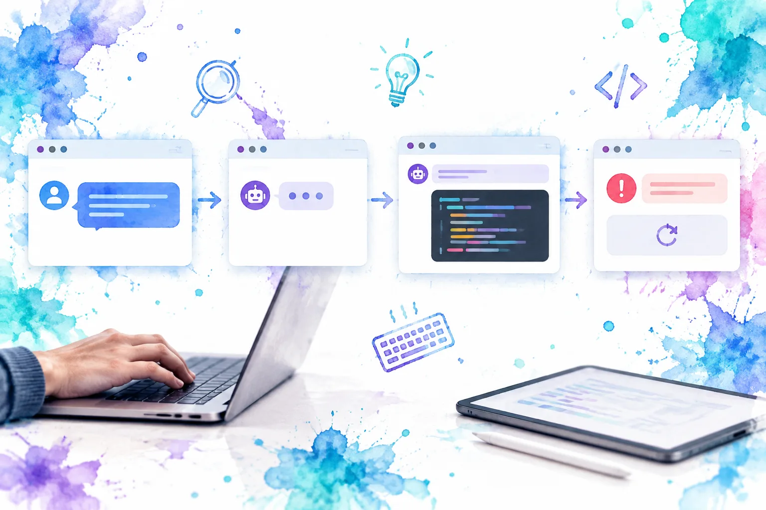
Action: Give a streaming assistant bubble a small status indicator, and give failed messages an actionable retry control.
The conversation is a useful log. Initialize a polite live region in the initial markup, then update concise status text such as “Assistant is responding” or “Response stopped. Retry available.” This avoids reading every streamed token aloud while still communicating meaningful state changes.
<script setup lang="ts">
import { computed } from 'vue'
import type { ChatMessage } from './chat.types'

const props = defineProps<{ message: ChatMessage }>()
const emit = defineEmits<{ retry: [id: string] }>()
const isStreaming = computed(() => props.message.status === 'streaming')
const hasError = computed(() => props.message.status === 'error')
</script>

<template>
  <article class="chat-row" :class="{ 'chat-row--user': message.role === 'user' }">
    <div class="chat-bubble" :class="message.role === 'user' ? 'chat-bubble--user' : 'chat-bubble--assistant'">
      <p class="chat-bubble__author">{{ message.role === 'user' ? 'You' : 'Assistant' }}</p>
      <div v-if="isStreaming" class="typing-state" aria-hidden="true"><span></span><span></span><span></span></div>
      <p v-if="message.content" class="chat-bubble__content">{{ message.content }}</p>
      <div v-if="hasError" class="message-error">
        <p>{{ message.errorMessage || 'The response could not be completed.' }}</p>
        <button type="button" @click="emit('retry', message.id)">Retry response</button>
      </div>
    </div>
  </article>
</template>
At the thread level, keep status announcements separate from full message text:
<p class="sr-only" role="status" aria-live="polite" aria-atomic="true">
  {{ chatStatus }}
</p>

<section aria-label="Conversation" role="log" aria-live="polite" aria-relevant="additions">
  <ChatBubble v-for="message in messages" :key="message.id" :message="message" @retry="retryMessage" />
</section>
Set chatStatus when a request starts, completes, or fails. Do not use an assertive live region for ordinary token streaming.
Expected result: Sighted users see progress and a retry option, while screen-reader users receive concise state changes.
Troubleshooting: If a status update is not announced, ensure the live region exists before the first update instead of mounting it only when an error occurs.
4. Support markdown, code, attachments, and narrow screens
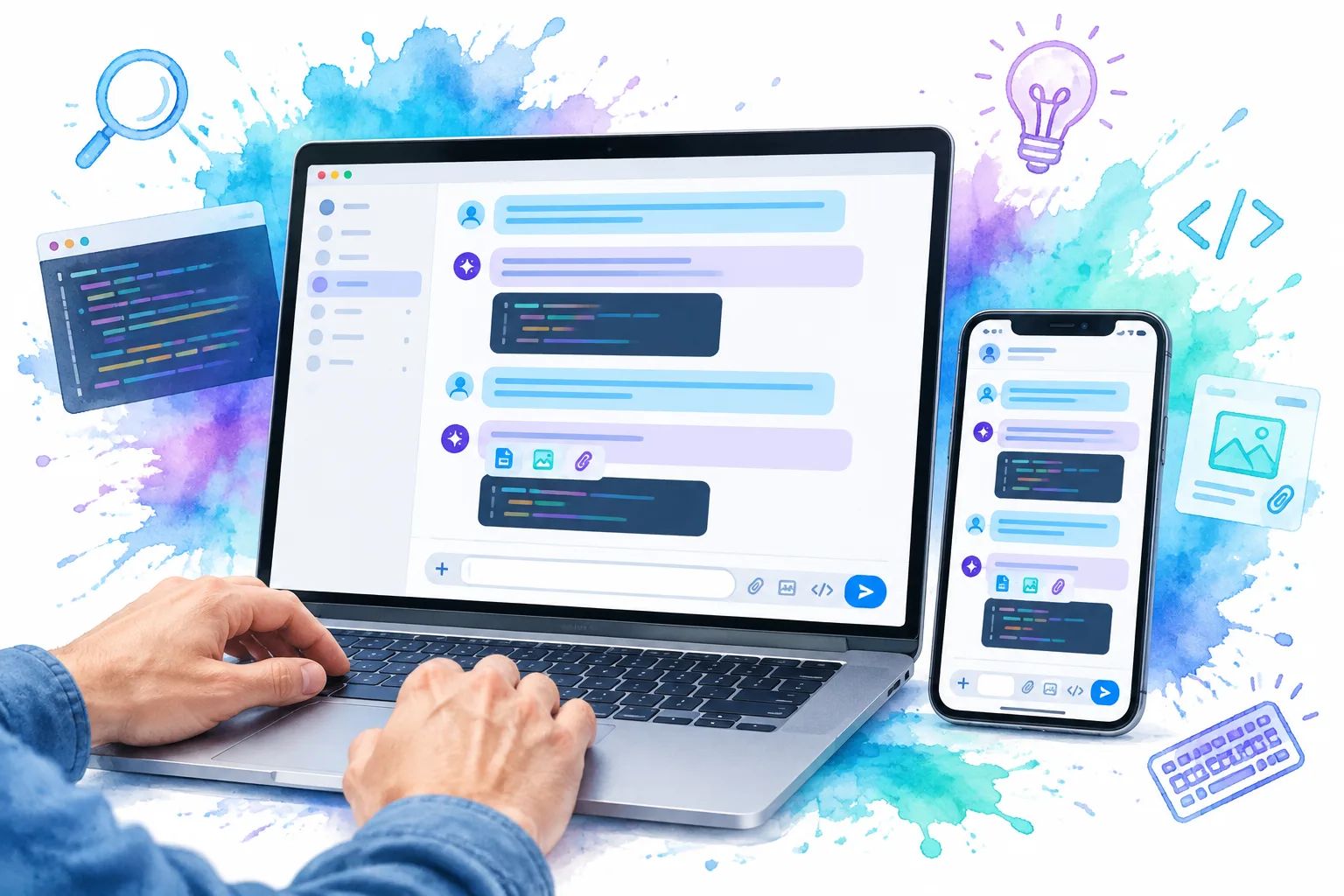
Action: Split rich message content into safe renderers. Text, markdown, code, and attachments each need distinct constraints.
For plain text, interpolation is safe and simple. For markdown, parse the response and sanitize the resulting HTML. For code, give the code block its own scroll container instead of allowing the page to overflow.
<template>
  <div class="chat-bubble__content markdown-body" v-html="sanitizedHtml"></div>

  <pre v-if="messageCode" class="chat-code"><code>{{ messageCode }}</code></pre>

  <ul v-if="message.attachments?.length" class="attachment-list" aria-label="Attachments">
    <li v-for="file in message.attachments" :key="file.id">
      <a v-if="file.url" :href="file.url" target="_blank" rel="noreferrer">
        {{ file.name }}<span v-if="file.sizeLabel">, {{ file.sizeLabel }}</span>
      </a>
      <span v-else>{{ file.name }}<span v-if="file.sizeLabel">, {{ file.sizeLabel }}</span></span>
    </li>
  </ul>
</template>

<style scoped>
.chat-code { max-inline-size: 100%; overflow-x: auto; border-radius: 0.75rem; padding: 0.875rem; background: #0f172a; color: #e2e8f0; }
.attachment-list { display: grid; gap: 0.5rem; margin: 0.75rem 0 0; padding: 0; list-style: none; }
.attachment-list a, .attachment-list span { overflow-wrap: anywhere; }
@media (max-width: 40rem) { .chat-bubble { max-inline-size: 94%; } }
</style>
Keep copy, download, retry, and regenerate actions as visible <button> or <a> elements with accessible names. Do not attach click handling to a noninteractive bubble.
Expected result: Long code lines scroll only inside the code block, filenames wrap safely, and the conversation remains readable on a small screen.
Troubleshooting: If markdown styling leaks into the application, scope typography rules to .markdown-body and test headings, tables, lists, links, and inline code.

5. Add a composer that works from the keyboard
Action: Use a real form, label the textarea, and make the send shortcut predictable.
Enter should normally insert a line break. Meta+Enter on macOS and Ctrl+Enter elsewhere can send. Always provide a visible Send button because shortcuts are optional accelerators, not the only path.
<script setup lang="ts">
import { ref } from 'vue'

const draft = ref('')
const isSending = ref(false)
const emit = defineEmits<{ send: [content: string] }>()

function submit() {
  const content = draft.value.trim()
  if (!content || isSending.value) return
  emit('send', content)
  draft.value = ''
}

function onKeydown(event: KeyboardEvent) {
  if ((event.metaKey || event.ctrlKey) && event.key === 'Enter') {
    event.preventDefault()
    submit()
  }
}
</script>

<template>
  <form class="composer" @submit.prevent="submit">
    <label for="chat-prompt">Message</label>
    <textarea id="chat-prompt" v-model="draft" rows="3" placeholder="Ask a question" :disabled="isSending" @keydown="onKeydown" />
    <button type="submit" :disabled="!draft.trim() || isSending">{{ isSending ? 'Sending' : 'Send' }}</button>
  </form>
</template>
Expected result: Tab reaches the textarea and Send button in a logical order, Enter creates a new line, and modified Enter sends.
Troubleshooting: Do not move focus into every assistant response. Preserve the user’s current focus unless they explicitly trigger an action that changes it.
6. Assemble the thread and make scrolling intentional
Action: Compose the thread from message data, one bubble component, and one composer. Auto-scroll only when the reader is already near the bottom.
<script setup lang="ts">
import { nextTick, ref, watch } from 'vue'
import ChatBubble from './ChatBubble.vue'
import ChatComposer from './ChatComposer.vue'
import type { ChatMessage } from './chat.types'

const messages = ref<ChatMessage[]>([])
const thread = ref<HTMLElement | null>(null)
const chatStatus = ref('')

function isNearBottom(element: HTMLElement) {
  return element.scrollHeight - element.scrollTop - element.clientHeight < 96
}

watch(messages, async () => {
  const element = thread.value
  if (!element || !isNearBottom(element)) return
  await nextTick()
  element.scrollTop = element.scrollHeight
}, { deep: true })
</script>

<template>
  <section class="chat-shell" aria-label="AI assistant">
    <p class="sr-only" role="status" aria-live="polite" aria-atomic="true">{{ chatStatus }}</p>
    <div ref="thread" class="chat-thread" role="log" aria-live="polite" aria-relevant="additions">
      <ChatBubble v-for="message in messages" :key="message.id" :message="message" />
    </div>
    <ChatComposer @send="sendMessage" />
  </section>
</template>
If someone has scrolled upward to read an older response, do not pull them back to the newest token. Show a “Jump to latest” control instead.
Expected result: New replies stay visible during an active conversation, while readers can inspect history without the interface fighting their scroll position.
Troubleshooting: Wait for Vue’s DOM update with nextTick() before reading scrollHeight.
7. Verify the chat bubble before release
Test with a real long response, a failed request, and a narrow viewport:
- Send a prompt and confirm the user bubble appears immediately.
- Confirm the assistant message retains one stable ID while tokens stream into it.
- Test a long URL, a 100-character identifier, and a wide code line. The page should not gain horizontal scrolling.
- Navigate with only a keyboard. Retry, attachments, copy actions, and Send must be reachable and usable.
- Use a screen reader to check that it announces concise response status, not every streamed token.
- Simulate a network failure and confirm the error is understandable and the retry action says what it will retry.
- Scroll upward while a response streams. The thread should not force you back to the bottom.
Vue’s accessibility guidance emphasizes semantic content structure and labeled form controls. MDN’s ARIA guidance recommends polite live-region updates for nonurgent dynamic changes, which fits a chat response lifecycle.
Use a production-shaped Vue chat block as your starting point
The bubble component is only one layer of a useful AI chat interface. A complete screen also needs a thread layout, composer, navigation behavior, responsive boundaries, and dependable controls.
DOM Studio’s Chat block is a practical editable starting point. It demonstrates a ChatGPT-style shell with a thread sidebar, message stream, and composer using Vue components. We can adapt its composition while keeping the message contract and accessible behaviors from this guide. Pair it with DomCard for bubble surfaces, DomButton for explicit actions, and the wider Vue application blocks guide when the chat screen needs a durable product shell.
The goal is not to mimic a messaging app or draw a speech-bubble icon. It is to make every AI conversation state legible, operable, and maintainable in Vue.
FAQ
Should every streamed token be announced to screen readers?
No. Announcing every token is noisy and disruptive. Announce meaningful status changes, then expose the completed answer in the conversation log.
Should assistant responses use v-html?
Only after parsing and sanitizing content you control. For plain text, Vue interpolation is safer. If you support markdown, use a sanitizer configured for your allowed elements and attributes.
What is the best maximum width for a chat bubble?
Use a responsive maximum rather than a fixed pixel value. A cap near 88% to 94% of the available width, combined with a comfortable desktop maximum, is a sound starting point. Test it with your typography and code samples.
When should the thread auto-scroll?
Auto-scroll when the reader is already near the newest message. If they have moved up the history, preserve their position and offer an intentional way to return to the latest response.
Build the chat bubble, then ship the conversation
You now have a Vue 3 chat bubble architecture that distinguishes message roles, supports streamed AI responses, handles failures, protects layouts from long content, and respects keyboard and screen-reader users.
Next, adapt the structure to your application and explore DOM Studio’s editable chat interface block alongside its reusable Vue primitives. Start with the state contract, test failure cases early, and keep the conversation accessible as the feature grows.