
Vue Application Blocks: A Practical Guide to Composable Product UI
Vue application blocks are reusable, production-shaped interface sections that combine multiple Vue components into a meaningful product surface, such as a dashboard, application shell, settings area, login flow, or inbox. They sit above individual components in the reuse hierarchy, helping us ship coherent interfaces without rebuilding layout, responsive behavior, and interaction patterns for every screen.
In Vue, components let us split a UI into independent, reusable pieces. Application blocks apply that same principle at a larger, product-focused level: they compose those pieces into a feature-ready starting point. Vue’s component model, props, and slots give us the boundaries needed to make both layers adaptable rather than rigid.
Table of contents
- What makes a Vue application block different?
- The anatomy of an effective application block
- How blocks compose in Vue
- A concrete example: the application shell
- When to create a block instead of another component
- Common misunderstandings about Vue application blocks
- Choosing a Vue block library or approach
- Build faster without losing control
- Watch: Vue components as the foundation for blocks
What makes a Vue application block different?
A component is usually a focused UI primitive: a button, text input, dropdown, dialog, card, or tab set. It should have a clear responsibility and a small public API.
An application block is a deliberate composition of those primitives. It includes the visual structure and the interaction decisions that make a product area feel complete. A customer-health workspace, for example, can bring together persistent navigation, filters, summary metrics, an activity feed, responsive breakpoints, and empty or loading states.
We use blocks when the team needs more than a component catalog. They reduce the gap between “we have a card” and “we have a dependable workspace users can work in.”

The reuse hierarchy
A practical hierarchy looks like this:
- Primitives: buttons, inputs, cards, status indicators, menus, and dialogs.
- Patterns: filter bars, form groups, table toolbars, account rows, and confirmation dialogs.
- Application blocks: dashboards, app shells, settings stacks, chat layouts, authentication screens, and mobile navigation.
- Product flows: connected routes and states that solve a user task, such as reviewing accounts or completing onboarding.
The distinction matters because each layer answers a different question. Primitives answer, “How does this control behave?” Blocks answer, “How do these controls work together in a real application surface?”
The anatomy of an effective application block
A strong Vue application block is not just a static layout copied from a design file. It has a clear composition contract.
Stable frame
The block defines what stays mounted while the route or work area changes. On desktop, that might be a sidebar, global actions, and a scrollable main panel. On mobile, it might be a top bar, one content region, bottom navigation, and an overlay layer.
Replaceable content regions
A block should make the parts that vary explicit. Vue slots are well suited to this: the block owns durable layout and behavior, while a consuming screen supplies route-specific content. Props should configure meaningful variations, such as density, selected navigation state, or compact mode, rather than exposing every internal CSS decision.
Responsive behavior
Application interfaces need to state what changes at narrower widths. A desktop sidebar may become a drawer, dense metric groups may stack, and a full toolbar may collapse into one primary action plus an overflow menu. This behavior belongs in the block so every route does not solve it differently.
Interaction and accessibility defaults
Focus management, keyboard behavior, status feedback, touch target size, scroll ownership, and semantic labels are part of the product surface. We should not treat them as a final polish pass. Keeping these rules inside reusable components and blocks prevents gradual inconsistency across the application.
How blocks compose in Vue
Vue blocks work best when they are assembled from normal, inspectable Vue components, not hidden behind a single oversized abstraction. We recommend a thin block boundary that defines the frame, plus composition points for data and content.
<script setup>
import { ref } from 'vue'
import {
  DomButton,
  DomCard,
  DomDropdown,
  DomNativeSelect,
} from '@getdom/studio/vue'

const range = ref('30')
</script>

<template>
  <section class="workspace-block">
    <aside class="workspace-block__nav">
      <!-- persistent application navigation -->
    </aside>

    <main class="workspace-block__content">
      <header class="workspace-block__toolbar">
        <DomNativeSelect v-model="range" />
        <DomButton variant="secondary">Export</DomButton>
        <DomDropdown label="More actions" :items="[]" />
      </header>

      <DomCard>
        <!-- screen-specific metrics, tables, forms, or feeds -->
      </DomCard>
    </main>
  </section>
</template>
This is not a prescribed implementation. The key idea is that the block owns the layout relationship between navigation, toolbar, and work area, while the screen retains control of its data and domain-specific content. Local component registration is also a useful default for application blocks because it keeps dependencies explicit and supports removal of unused code by build tooling.
A concrete example: the application shell
The application shell is one of the highest-value block types because it establishes navigation, scrolling, and page chrome for many routes. DOM Studio’s Application Layout block demonstrates this approach with a persistent left panel and an independently scrolling work area. Its companion Dashboard block applies the same product-minded composition to responsive metrics, reporting controls, and mobile navigation fallback.
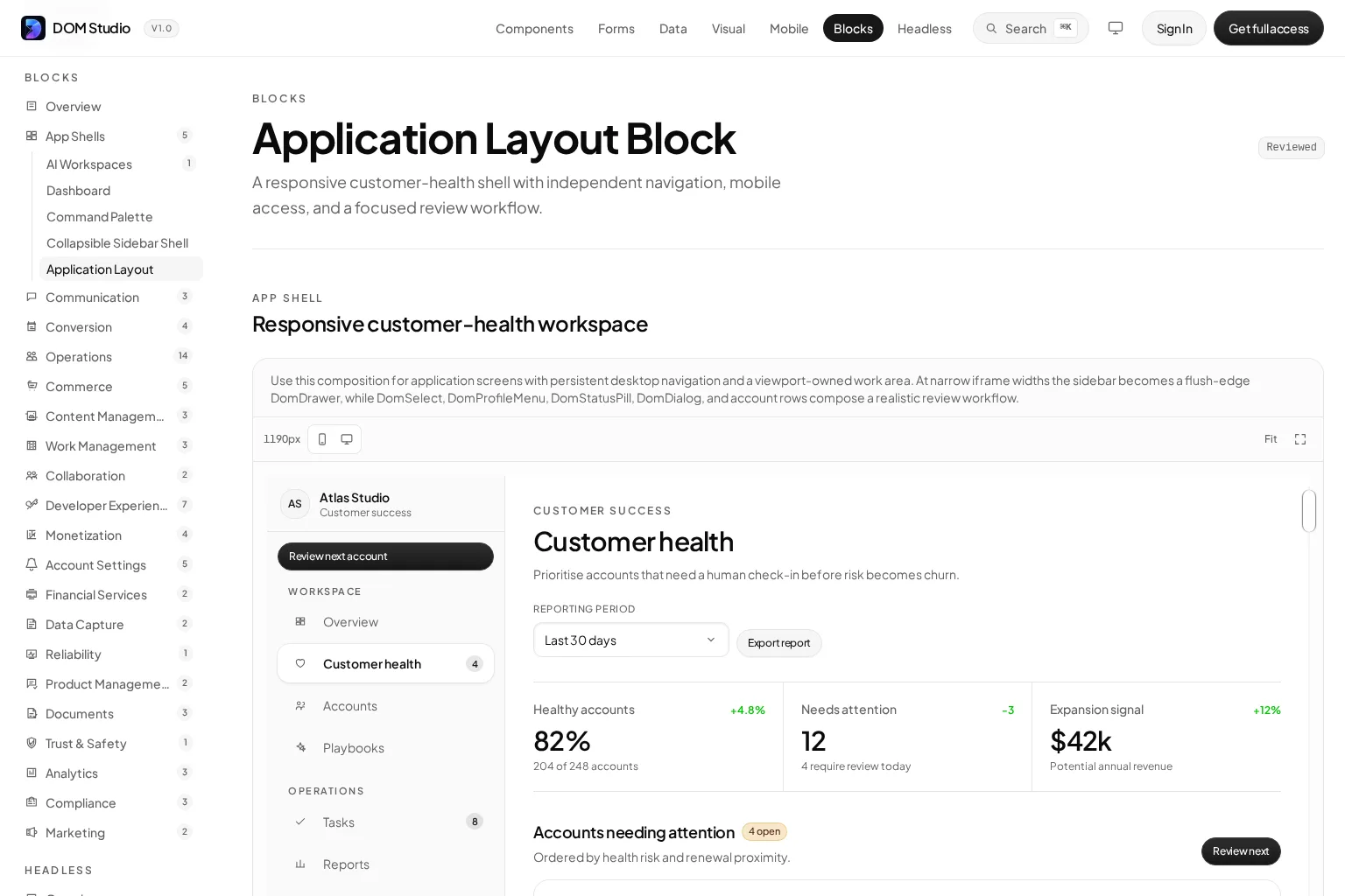
When we standardize the shell first, we avoid a familiar failure mode: every new route invents its own padding, scroll behavior, breakpoint rules, and action placement. Instead, feature teams work within predictable boundaries and concentrate on the content unique to their workflow.
For phone-first products, the same principle applies with different constraints. A mobile block should make safe-area-aware chrome, one intentional scroll container, thumb-friendly navigation, and temporary overlays first-class concerns. Our Vue mobile web app shell guide shows why that durable frame should be established before screen-by-screen styling.
When to create a block instead of another component
Create a Vue application block when a composition recurs across routes or products, when it carries behavior that must remain consistent, or when recreating it from individual components repeatedly slows delivery.
Good candidates include:
- Admin or customer workspaces with navigation, filters, summaries, and content panels.
- Form workflows with field groups, validation feedback, review states, and sticky actions.
- Settings areas with nested navigation and a stable detail panel.
- Authentication screens with consistent provider actions, recovery paths, and status messaging.
- Inbox, chat, or task interfaces where responsive layout and empty states are part of the experience.
Keep the block smaller when its variations are genuinely unrelated. A single “universal dashboard” with dozens of props often becomes difficult to understand, test, and evolve. In that case, share the primitives and patterns, then create two focused blocks.

Common misunderstandings about Vue application blocks
“A block is just a big component”
A block can be delivered as one top-level Vue file, but its value is not its size. It is a documented composition with clear boundaries, reusable internal pieces, and intentional extension points. If it cannot be adapted without editing a maze of conditionals, it is not a healthy block.
“Blocks eliminate the need for a design system”
Blocks depend on a design system. Tokens, component APIs, accessibility conventions, and interaction states make blocks consistent and safe to customize. Blocks turn that foundation into faster-to-ship product surfaces.
“Copying a block means the UI will look generic”
Only if we stop at the starter composition. A good block accelerates structural decisions while leaving brand, content hierarchy, data, and workflow rules in our control. Editable source is especially useful here because we can change the implementation rather than override a black box.
“Every block should be globally available”
Not necessarily. Most application blocks are best imported where they are used. This makes dependencies visible, reduces accidental coupling, and supports sensible code splitting for larger product areas.
Choosing a Vue block library or approach
We recommend evaluating blocks with the same care as a component library. Start with the product surfaces your team actually ships, then assess:
- Source ownership: Can we inspect and modify the implementation when requirements change?
- Composition model: Are props and slots clear, or does customization require fragile overrides?
- Responsive behavior: Does the block define useful desktop and mobile states?
- Accessibility: Are keyboard interactions, focus movement, labels, and status feedback considered?
- System fit: Does it work with our existing components, tokens, routing, forms, and data patterns?
- Documentation: Can developers find examples, supported APIs, and source context quickly?
Tools such as shadcn-vue, Vuetify, PrimeVue, and Nuxt UI can be useful depending on the team’s preferred component model and ecosystem. For teams that want editable Vue wrappers, headless elements, form tooling, mobile shells, and application blocks in one system, DOM Studio’s UI library is designed to keep those layers connected.
Build faster without losing control
Vue application blocks let us reuse more than visual fragments. They capture the layout, responsive behavior, and interaction conventions that make a screen feel like part of a working product.
Start with a block for a surface your team rebuilds often, such as an application shell, dashboard, or settings area. Keep the API focused, compose it from stable primitives, and leave clear slots for domain content. That balance gives us speed today and room to adapt tomorrow.
To explore this approach in practice, browse DOM Studio’s application blocks and assemble your next product surface from editable Vue primitives.
Watch: Vue components as the foundation for blocks
This brief video explains the component thinking that underpins reusable Vue application blocks.