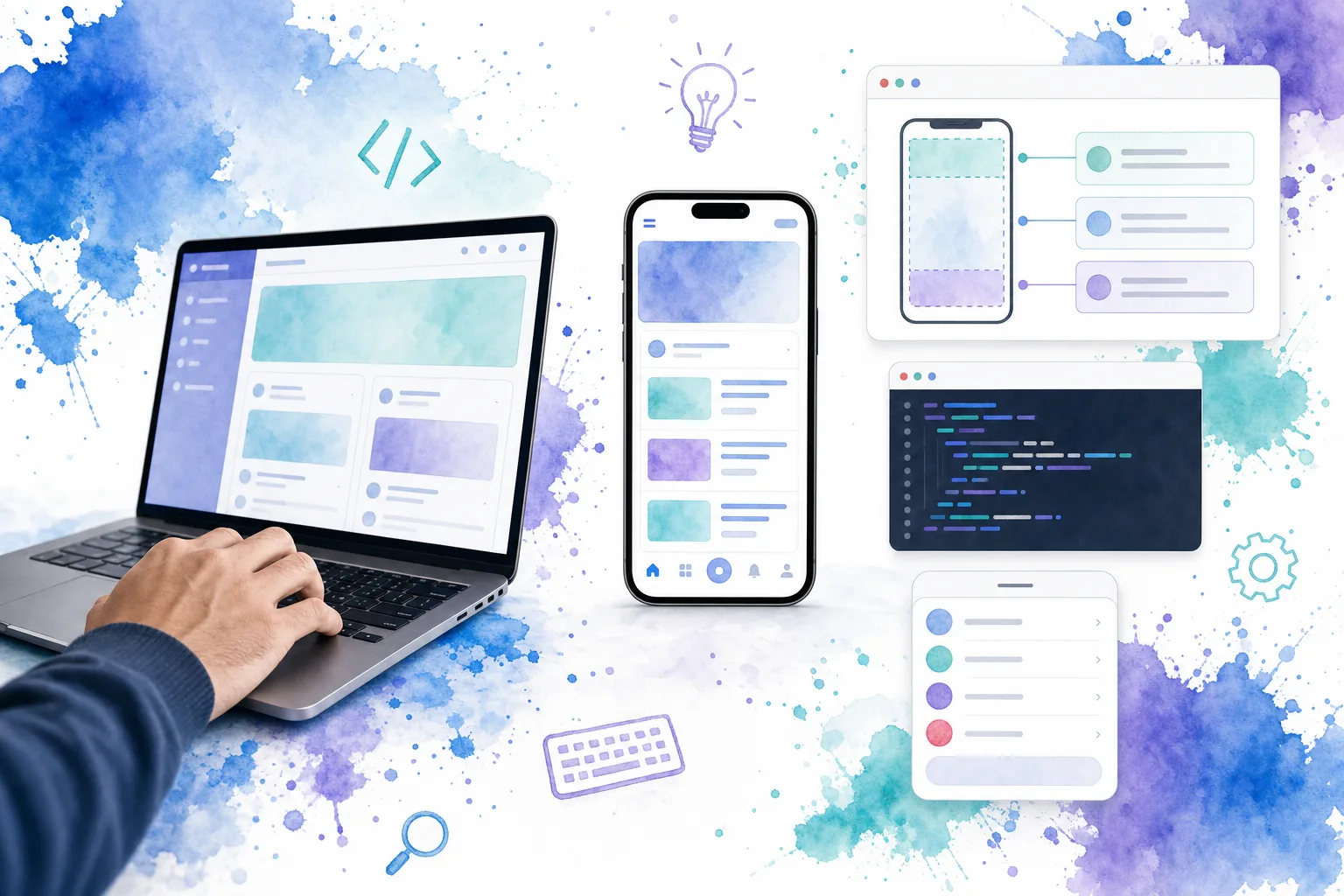
A mobile web app shell is the persistent frame around a phone-first interface: the top bar, one dependable content region, bottom navigation, and temporary overlays such as action sheets. Build those boundaries before you build individual screens, and every route inherits the same scrolling, touch, and safe-area behavior.
In this guide, we build that foundation with Vue and DOM Studio. The result is a shell that works as a responsive web interface, can support an installed PWA, and can be used inside a Capacitor project when native device features are needed.
Table of contents
- What we are building
- Prerequisites
- 1. Define the shell contract before styling screens
- 2. Reserve space for device safe areas and one scroll region
- 3. Assemble the Vue shell from reusable app primitives
- 4. Make tap targets and overlays deliberate
- 5. Test the shell as a system, not as screenshots
- 6. Choose the delivery model after the UI is solid
- Ship the first dependable shell
What we are building
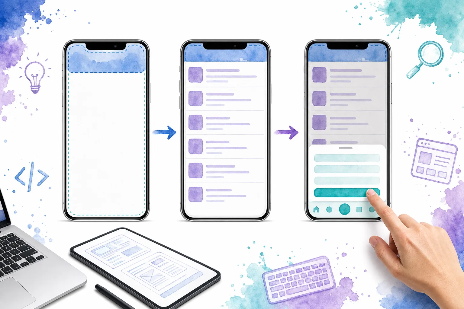
Our shell has four responsibilities:
- A safe-area-aware top bar for context and high-priority actions.
- One scrollable work area for each screen’s content.
- A fixed, thumb-friendly bottom navigation for primary destinations.
- An overlay layer for temporary UI such as an action sheet.
This is a UI shell, not a cache strategy. If you also mean the PWA app-shell architecture, add offline caching after the visual shell is stable.
Prerequisites
Before we start, we need:
- A Vue application with routing or a simple screen state.
- DOM Studio’s Vue package and its stylesheet installed in the project.
- A mobile viewport meta tag in the document head.
- At least three primary destinations, such as Home, Inbox, and Settings.
- A real phone or browser device emulator for testing touch, safe areas, and the on-screen keyboard.
We also decide which actions belong in persistent chrome. Keep primary destinations in the bottom navigation. Put contextual or destructive commands in an action sheet, not beside every page title.
1. Define the shell contract before styling screens
First, list what must remain visible while a user changes routes. In most mobile products, that means a top bar and bottom navigation. The content between them changes by route and is the only region that should normally scroll.
This separation prevents two common failures: a page body that scrolls underneath fixed controls, and nested scroll areas that trap the user’s gesture. We recommend writing the shell contract as a short checklist:
- Top bar: title, optional back action, one or two contextual actions.
- Content: route-specific screen, loading state, empty state, and form content.
- Bottom navigation: three to five primary destinations.
- Overlay: sheets, dialogs, menus, and transient feedback.
For the mobile-specific primitives and a working phone preview, start with the DOM Studio mobile documentation. If the same product also needs a desktop workspace, review the scrollable application layout block before inventing a separate layout model.
Expected result: every team member can identify which UI belongs to the shell and which belongs to a route.
Troubleshooting: if a destination needs its own persistent navigation, it is probably a nested workflow. Keep the outer shell stable, then render that workflow inside the content region or use a settings stack.
2. Reserve space for device safe areas and one scroll region
Modern phones can have cutouts, home indicators, and dynamic browser controls. We protect fixed chrome with safe-area padding and use dynamic viewport units so the shell is less likely to jump when browser UI changes.
:root {
  --shell-top: max(3.5rem, env(safe-area-inset-top));
  --shell-bottom: max(4.5rem, env(safe-area-inset-bottom));
}

.mobile-shell {
  min-height: 100vh;
  min-height: 100dvh;
  display: grid;
  grid-template-rows: auto minmax(0, 1fr) auto;
  overflow: hidden;
}

.mobile-shell__content {
  min-height: 0;
  overflow-y: auto;
  overscroll-behavior-y: contain;
  padding: 1rem;
  padding-bottom: calc(1rem + var(--shell-bottom));
}
The env() values fall back safely to zero where a browser has no inset to report. The critical line is minmax(0, 1fr): it lets the middle track shrink and scroll instead of forcing the entire page to grow.
Expected result: the top and bottom chrome remain visible, content does not sit under the home indicator, and a long screen has one predictable scrollbar.
Troubleshooting: if the document itself scrolls as well as the main region, check for a missing height constraint on a parent. If a bottom control is hidden behind the keyboard, test the focused field on a physical phone and add keyboard-aware behavior only where the device runtime requires it.
3. Assemble the Vue shell from reusable app primitives
DOM Studio provides the core pieces for this structure: DomAppShell, DomAppTopBar, DomAppBottomNav, list items, safe-area utilities, and DomActionSheet. We can make the persistent areas explicit in one Vue component.
<script setup>
import { ref } from 'vue';
import {
  DomActionSheet,
  DomAppBottomNav,
  DomAppShell,
  DomAppTopBar,
} from '@getdom/studio/vue';

const activeTab = ref('home');
const sheetOpen = ref(false);

const navItems = [
  { value: 'home', label: 'Home', icon: '<svg viewBox="0 0 24 24"></svg>' },
  { value: 'inbox', label: 'Inbox', icon: '<svg viewBox="0 0 24 24"></svg>', badge: '3' },
  { value: 'settings', label: 'Settings', icon: '<svg viewBox="0 0 24 24"></svg>' },
];

const actions = [
  { value: 'share', label: 'Share project' },
  { value: 'duplicate', label: 'Duplicate screen' },
  { value: 'delete', label: 'Delete draft', variant: 'danger' },
];
</script>

<template>
  <DomAppShell class="mobile-shell">
    <template #top>
      <DomAppTopBar title="Workspace" subtitle="Today">
        <template #trailing>
          <button type="button" class="icon-button" aria-label="More actions" @click="sheetOpen = true">
            <span aria-hidden="true">•••</span>
          </button>
        </template>
      </DomAppTopBar>
    </template>

    <main class="mobile-shell__content" aria-label="Workspace content">
      <RouterView />
    </main>

    <template #bottom>
      <DomAppBottomNav v-model="activeTab" :items="navItems" />
    </template>

    <template #overlay>
      <DomActionSheet
        v-model="sheetOpen"
        title="Project actions"
        description="Choose an action for this workspace."
        :actions="actions"
      />
    </template>
  </DomAppShell>
</template>
Replace the placeholder SVG values with your project’s icon markup or icon component output. Then map activeTab to Vue Router destinations, or replace the RouterView with your own screen switcher.
Use the dedicated App Shell reference, Top Bar reference, and Bottom Nav reference as you tune props and styling in your implementation.
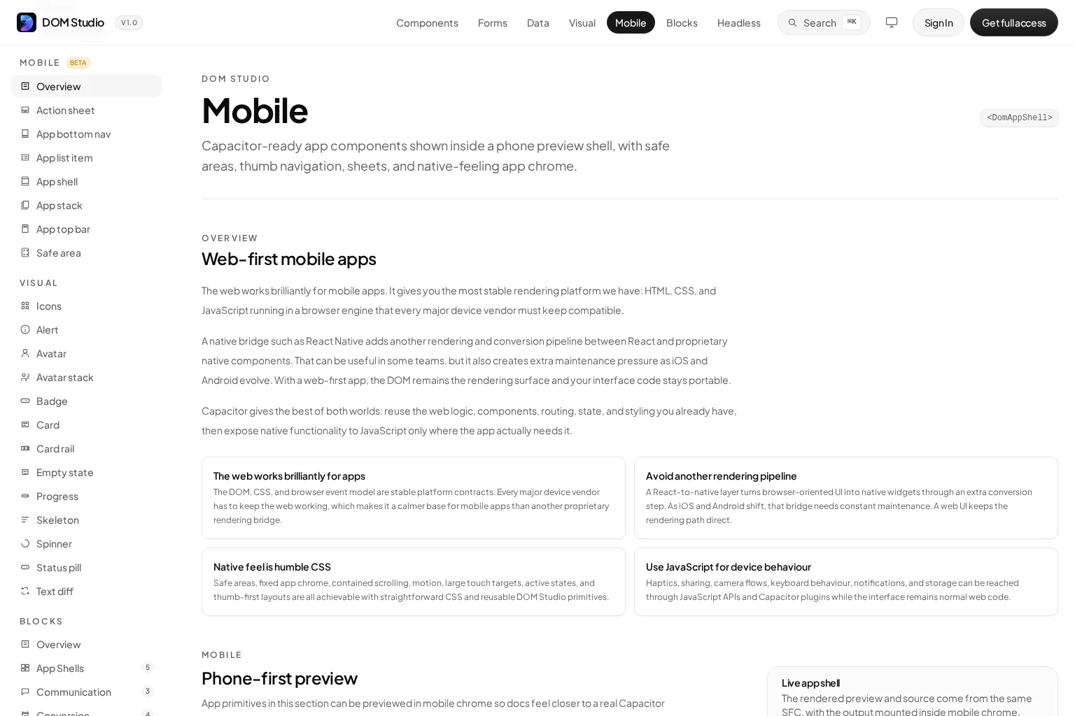
Expected result: switching tabs changes only the content area, while the top bar and bottom navigation stay mounted.
Troubleshooting: if each tab reloads its data unnecessarily, keep route-level cache or state above the route view. If the active tab does not update after browser back navigation, derive it from the current route rather than treating it as an isolated local state.
4. Make tap targets and overlays deliberate
Phone interfaces are not desktop dashboards compressed into a narrow column. Every primary action needs a comfortable target, visible pressed feedback, and enough separation from adjacent controls. Aim for an interactive area of about 48 by 48 CSS pixels, even when the icon itself is smaller.
For destructive, secondary, or multi-step commands, open an action sheet from a clear trigger. Keep the action sheet’s choices short, include a descriptive title when context is ambiguous, and make the destructive action visually distinct. Do not use a bottom sheet as a substitute for a full route when users need to review complex information or complete a long form.
Expected result: a user can operate the shell with one thumb without accidentally opening a neighboring item.
Troubleshooting: if a compact icon button feels difficult to hit, increase the button’s padding and preserve the icon size. If an overlay is inaccessible by keyboard, verify focus moves into it when opened and returns to the trigger when closed.
5. Test the shell as a system, not as screenshots
A mobile web app shell needs behavior checks that a static design review will miss. We test these flows before adding more screens:
- Open every navigation destination and confirm the selected bottom tab is correct.
- Scroll a long screen, then open and close the action sheet. Confirm the scroll position stays where it was.
- Focus the lowest field in a form. Confirm the keyboard does not block the field or the submit action.
- Rotate the device, narrow the browser viewport, and test an installed or standalone mode if your product supports it.
- Enable a screen reader and keyboard navigation. Confirm labels, focus order, visible focus, and sheet dismissal behavior work.
- Test with a notch or home-indicator device. Confirm fixed controls do not overlap protected device areas.
At the product level, we also verify that route titles are short enough for the top bar and that badge counts do not make bottom navigation unstable. For desktop-to-mobile transitions, use a responsive fallback such as a compact header or drawer rather than trying to preserve a full desktop sidebar at phone widths.
6. Choose the delivery model after the UI is solid
A well-built shell can run in a normal browser, as an installed PWA, or inside a native container. The right choice depends on the capability your product needs, not on visual preference.
- Responsive web app: use this when browser access, fast deployment, and linkability are the priorities.
- Installed PWA: add a web app manifest, icons, and the appropriate offline strategy when you want an app-like launch surface.
- Capacitor app: keep the UI in Vue and add native plugins only for capabilities such as camera access, haptics, sharing, notifications, or device-specific keyboard behavior.
DOM Studio’s mobile guidance follows this web-first approach, with Capacitor as a path for selectively adding device features while keeping interface code in the web stack. Teams comparing DOM Studio with mobile-oriented systems such as Ionic, Quasar, Vuetify, or PrimeVue should assess the actual shell behavior: editability, safe-area handling, navigation composition, component accessibility, and how easily the design system fits their Vue codebase.
For a broader introduction to progressive web app shell architecture and performance, watch this session before planning offline behavior:
Expected result: you have a delivery decision tied to genuine platform requirements, not a rewrite of the UI for each target.
Troubleshooting: do not assume browser installation or native APIs work identically on every operating system. Test the exact devices and browser combinations your customers use, then document any platform-specific fallback.
Ship the first dependable shell
At this point, we have a mobile web app shell with protected device edges, one content scroller, persistent thumb navigation, and a dedicated overlay layer. That is enough structure to build screens quickly without re-solving mobile layout mechanics on every route.
Our next action is to build one real end-to-end flow inside the shell, such as inbox triage, settings, or a form submission. Test it on a physical phone, fix the first scrolling or keyboard issue we find, then turn the shell into the shared foundation for the rest of the product.
Ready to start? Explore DOM Studio’s mobile components and build the shell from editable Vue primitives.