
A Vue application layout is the durable frame around a product screen: navigation, page chrome, content regions, responsive rules, and scrolling behavior. It should stay consistent while route-specific views, data, and workflows change inside it.
For most Vue 3 applications, we recommend treating the layout as a composition boundary rather than a large page component. The shell owns the experience that repeats. Feature views own the product-specific work. Vue Router connects the two by rendering the matched view into RouterView.
This approach makes dashboards, settings areas, admin workspaces, inboxes, and mobile web apps easier to extend without duplicating sidebars, toolbars, breakpoint logic, and accessibility decisions across every route.
Table of contents
- What belongs in a Vue application layout?
- Use routes to express layout hierarchy
- Build the layout from layers, not one oversized component
- Choose one intentional scroll model
- Make responsive behavior part of the contract
- Design the layout as an accessibility boundary
- When to use a layout component, route metadata, or named views
- Common Vue application layout mistakes
- A practical decision checklist
- Build an app shell that stays useful
- Watch: multi-layout Vue 3 application
- Frequently asked questions
What belongs in a Vue application layout?
A layout is not simply a CSS grid around a page. It is the part of the interface that establishes a predictable working environment.
A useful application layout commonly owns:
- Global or workspace navigation, including active state and collapse or drawer behavior.
- Application chrome, such as a header, account menu, breadcrumbs, page actions, or notifications.
- Content placement, defining where the routed screen, secondary panel, or utility region appears.
- Responsive transitions, for example when a desktop sidebar becomes a temporary mobile drawer.
- Scroll ownership, so users have one clear page-level scroll region or a deliberate independently scrolling work area.
- Accessible structure, including meaningful
header,nav,main, and complementary regions where appropriate.
The layout should not own customer-specific queries, invoice approval rules, or the internal state of an individual feature. Those responsibilities belong in feature components and route views.

The stable frame and the changing screen
The simplest mental model is stable frame plus replaceable content. The stable frame might include a sidebar and top bar. The changing screen might be a customer list, project board, or account settings form.
Vue slots work well when a layout needs caller-provided regions. RouterView works well when the changing region is determined by the route. We often combine both: a layout component provides slots for durable regions such as navigation or utility actions, then places a RouterView in its main content region.
<!-- layouts/WorkspaceLayout.vue -->
<template>
  <div class="workspace-layout">
    <aside class="workspace-layout__sidebar">
      <slot name="sidebar" />
    </aside>

    <section class="workspace-layout__frame">
      <header class="workspace-layout__header">
        <slot name="header" />
      </header>

      <main class="workspace-layout__main">
        <RouterView />
      </main>
    </section>
  </div>
</template>
The result is a clear contract: the layout controls the relationship between sidebar, header, and main area, while child routes control the screen rendered in the main area.
Use routes to express layout hierarchy
A durable Vue application layout usually aligns with route hierarchy. Vue Router supports nested routes, which lets a parent route render a layout and child routes render into its nested RouterView.
// router/index.ts
import { createRouter, createWebHistory } from 'vue-router'
import WorkspaceLayout from '@/layouts/WorkspaceLayout.vue'

const router = createRouter({
  history: createWebHistory(),
  routes: [
    {
      path: '/workspace',
      component: WorkspaceLayout,
      children: [
        {
          path: '',
          component: () => import('@/views/WorkspaceOverviewView.vue'),
        },
        {
          path: 'customers',
          component: () => import('@/views/CustomersView.vue'),
        },
        {
          path: 'settings',
          component: () => import('@/views/SettingsView.vue'),
        },
      ],
    },
  ],
})

export default router
This structure communicates an important product decision: /workspace owns the shared working context, and its children are screens within that context. It also keeps the route view from having to recreate the shell every time it is visited.
For layouts that truly need parallel regions, such as a route-specific sidebar beside a default page view, Vue Router also supports named views. We reserve that option for cases where the router is genuinely responsible for coordinating multiple route-driven regions. For most application shells, a normal nested RouterView plus component slots is easier to reason about.
Build the layout from layers, not one oversized component
A scalable layout is assembled from smaller pieces with clear responsibilities. We use four layers:
- UI primitives: buttons, cards, dialogs, fields, menus, and status indicators.
- Reusable patterns: filter bars, empty states, table toolbars, form sections, and confirmation flows.
- Feature components: customer health panels, project pickers, billing forms, and other domain-specific UI.
- Layouts and route views: the shell defines the frame, while route views assemble features for one route.

This direction of dependency matters. Pages and features may depend on patterns and primitives. Primitives should not import a route, reach into a feature store, or know what a customer account means. When we preserve those boundaries, layout code remains adaptable instead of becoming a dependency hub.
A component API should reflect the same separation. Props configure known behavior, events report user intent, and slots accept content the parent owns. For example, a generic panel can accept a density prop and provide header and actions slots. It should not load account data or decide which permission enables an export button.
For a deeper treatment of this responsibility-first model, see our guide to organizing reusable Vue application components.
Choose one intentional scroll model
Scrolling is one of the easiest parts of a Vue application layout to get wrong. A visually correct interface can still feel broken if the body, sidebar, and work area all scroll unexpectedly.
Choose the scroll model before styling individual screens:
- Document scroll: the browser window scrolls, while header and navigation are normal or sticky elements. This is a good default for simpler content-heavy products.
- Viewport-owned application shell: the shell fills the viewport, navigation can remain persistent, and the main work area has its own scroll container. This often fits dense dashboards, editors, and operational tools.
- Split-pane workspace: separate panes scroll independently only when users need to compare or work in more than one long region at once.
Do not add overflow: auto to every nested card or page section. That creates competing scroll containers, hidden content, and keyboard-navigation friction. If the main work area owns the scroll, give it a bounded height through the shell and use min-height: 0 on flex or grid children that need to shrink.
DOM Studio’s Application Layout block is a practical example of a fixed shell with a persistent left panel and an independently scrolling main work area.
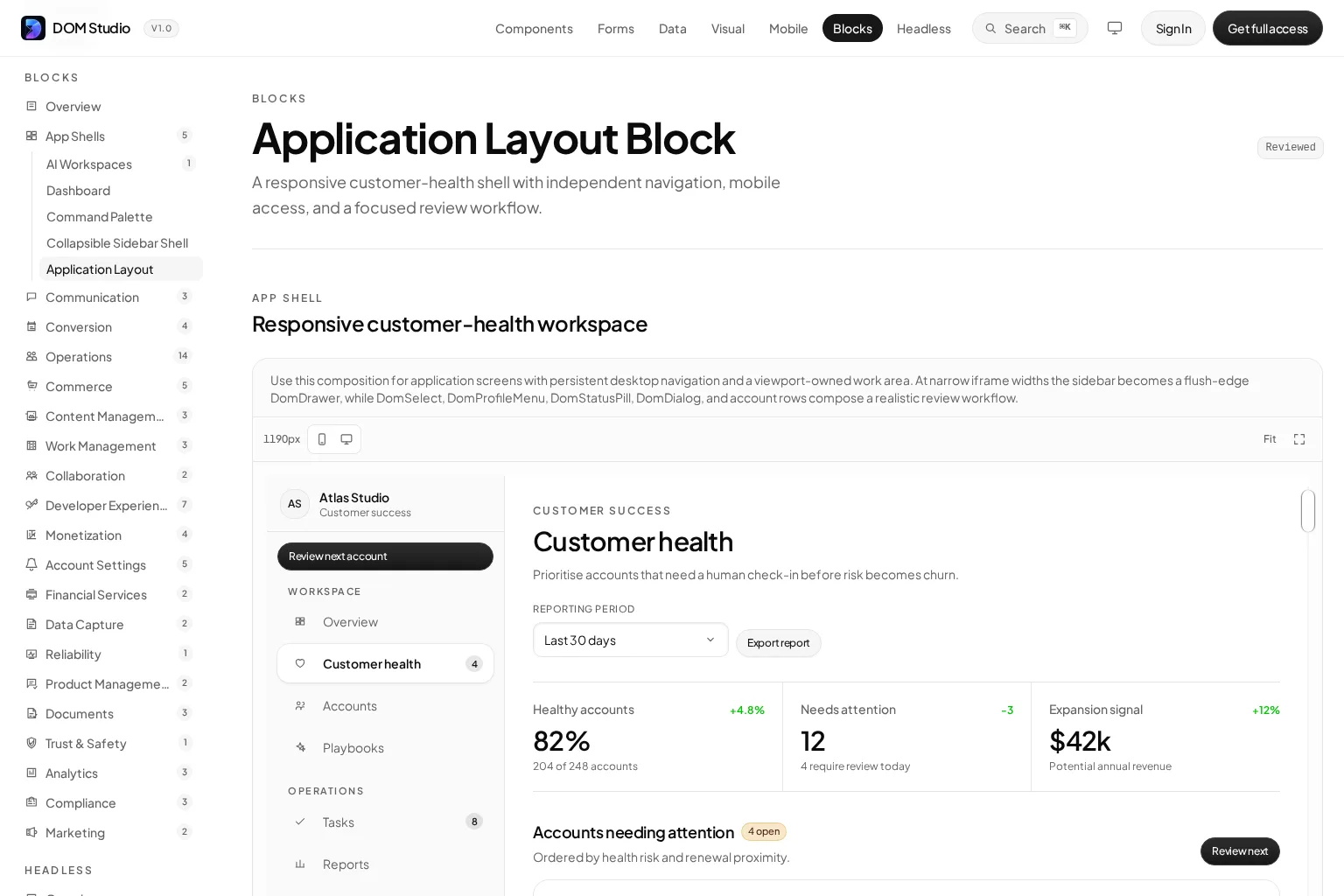
Its related Dashboard block illustrates the same principle in a responsive product dashboard: persistent navigation on larger screens, compact metrics, reporting controls, and a mobile navigation fallback.
Make responsive behavior part of the contract
A layout is not responsive merely because columns stack at a smaller width. The layout needs defined behavior for hierarchy, navigation, actions, and focus.
We recommend documenting these decisions for every application shell:
- When does a sidebar collapse, become an icon rail, or move into a drawer?
- Which actions remain immediately visible, and which move into an overflow menu?
- Which content must be prioritized when a multi-column workspace becomes one column?
- Where does focus go when a mobile navigation drawer opens and closes?
- Does the mobile version have one clear vertical scroll region?
Start from the task, not the desktop grid. A user reviewing account health on a phone may need search, account status, and the next action before they need secondary metrics or a wide persistent navigation rail.
Design the layout as an accessibility boundary
Application layouts contain repeated navigation and regions, so they are a high-leverage place to establish accessible conventions. Use semantic HTML before adding ARIA. A main element identifies the page’s central content, while nav, header, aside, and section headings communicate the larger structure to assistive technology.
Then define interaction behavior that applies across every route:
- Give navigation controls clear accessible names and an obvious current state.
- Keep keyboard focus visible against every supported surface and color scheme.
- Move focus into temporary overlays such as mobile drawers and dialogs, then restore it when they close.
- Ensure the primary work region is reachable without tabbing through repeated navigation on every route.
- Avoid using color alone to communicate selected, invalid, or urgent states.
These defaults belong in shared layout, primitive, and pattern code because reproducing them page by page is unreliable.
When to use a layout component, route metadata, or named views
There is no single Vue application layout pattern that fits every product. The right choice follows the kind of variation you need.
Layout component with nested routes
Use this as the default for a group of routes that share a durable frame. A workspace with navigation, a header, and multiple child screens is the clearest example. It gives us explicit ownership and a direct connection between URL structure and UI structure.
Route-driven layout selection
Use route metadata or a lightweight app-level selector when whole route groups need fundamentally different frames, such as a marketing area, an authenticated workspace, and an authentication flow. Keep the mapping simple and documented. If every individual route selects a bespoke layout, the system is likely missing a more useful route group or shared shell.
Named views
Use named views when a single route must render multiple independently selected route components at once. They can be effective for specialized multi-region screens. They are not necessary just to show a standard sidebar beside a page, because that sidebar usually belongs to the layout component.
Common Vue application layout mistakes
Putting the entire product in App.vue
App.vue is a reasonable place for application-wide providers, a global notification layer, or the top-level RouterView. It is rarely the right place to hard-code every sidebar, toolbar, and route exception. That approach makes public pages, authentication routes, and workspace screens tightly coupled.
Treating a layout as a generic dumping ground
A layout should be stable enough to repeat. If it receives dozens of props for feature-specific controls, permissions, entity types, and API states, move the domain-specific parts into feature components or slots. A smaller, clearer layout contract is easier to evolve.
Duplicating application chrome in each route view
Copying a header and sidebar into every view feels fast until navigation behavior, padding, responsive breakpoints, and focus treatment diverge. Centralize the shared frame, then let route views focus on the work users came to do.
Using global state for every layout detail
Keep application-wide concerns, such as authenticated identity or global notification state, at an appropriate shared boundary. Do not turn every selected tab, local panel state, or layout variation into global state. Local state keeps a feature portable and easier to test.
Confusing an application block with a locked template
A well-designed application block is a composition starting point, not a black box. It should help us reuse layout structure, responsive behavior, and interaction defaults while preserving control over content, data, and brand decisions.
Our Vue application blocks guide explains how blocks sit above individual components in the reuse hierarchy and can accelerate product surfaces such as shells, dashboards, settings areas, and inboxes.
A practical decision checklist
Before committing to a Vue application layout, ask:
- Which navigation, chrome, and regions persist across this route group?
- Does the route hierarchy reflect the user experience hierarchy?
- What is the single intended scroll owner at desktop and mobile widths?
- Which areas are stable, and which should be provided through slots or routed child views?
- What are the layout’s breakpoint, overlay, and focus-management rules?
- Which UI pieces are primitives, patterns, features, and route composition?
- Can a new developer find the layout contract without reading every feature screen?
If the answers are clear, the layout will support new screens instead of slowing them down.
Build an app shell that stays useful
A strong Vue application layout creates a stable environment for changing product work. We recommend using nested route layouts for shared route groups, slots for caller-owned regions, and small component layers for reusable UI behavior. Define scrolling, responsive changes, and accessibility conventions at the shell boundary, then keep domain logic inside features and views.
When we build the frame first, every new route starts with proven navigation, structure, and interaction behavior instead of another round of page-specific fixes. Explore DOM Studio’s editable Vue application blocks and use them as a starting point for your next dashboard, workspace, or settings surface.
Watch: multi-layout Vue 3 application
This video demonstrates creating multiple Vue 3 layouts with Vue Router and is a useful companion to the route-driven layout concepts in this guide.
Frequently asked questions
What is a Vue application layout?
A Vue application layout is the shared structural frame around one or more application routes. It commonly contains navigation, headers, content regions, responsive behavior, and scrolling rules, while the route view supplies the screen-specific content.
Should Vue layouts use slots or RouterView?
Use slots for content regions the parent component explicitly supplies. Use RouterView for content selected by the current route. Many product shells use both: slots for navigation or header regions, and a nested RouterView for child screens.
How do nested routes help with layouts in Vue?
Nested routes allow a parent route component to provide a shared frame and render matching child route components in its nested RouterView. This aligns shared UI with a route group and reduces duplicated application chrome.
What is the best folder structure for Vue layouts?
Use a structure your team can predict. A common approach separates layouts/, reusable components/ui/, shared components/patterns/, domain features/, composables, and route views. The important part is dependency direction: route views compose features, and generic UI remains independent of routes and product domains.
Can I use Vuetify, PrimeVue, or shadcn-vue with this architecture?
Yes. A component library can provide primitives, while your application still defines its own patterns, features, shells, and route composition. The architecture is about responsibility boundaries, not a requirement to use one specific UI library.