
Vue application components become easier to extend when we organize them by responsibility, not by the page where they first appeared. The practical model is simple: keep reusable UI primitives independent, compose them into shared patterns, keep domain rules in feature components, and let pages assemble the result.
In this guide, we will build that structure step by step. By the end, you will have a testable component hierarchy that can grow from a button or form field to a responsive application shell without turning every component into a dependency hub.
Table of contents
- Before you start
- 1. Draw the component boundary before creating files
- 2. Create four predictable component layers
- 3. Make props, events, and slots your component contract
- 4. Move reusable behavior into composables, not visual components
- 5. Compose features into application layouts
- 6. Verify reuse with a component acceptance test
- 7. Document the system where developers make choices
- Build the next screen from the system, not from scratch
- Frequently asked questions
Before you start
You need a Vue 3 project using Single-File Components, a working test runner, and an agreed import alias such as @/. We also recommend TypeScript for public component props and emitted events, although the folder structure works without it.
For the examples below, create a src/components directory and choose one screen that has repeated UI, such as an account list, dashboard, or settings form. Do not start by migrating the whole application.
1. Draw the component boundary before creating files
Start with a screen and identify what changes for each instance.
A component belongs in a reusable layer when it has a stable responsibility and can receive its variation through an explicit API. A customer row, for example, may be a feature component if it knows about account health. A card, status pill, button, dialog, or field should not know about that business concept.
Use this quick decision test:
- Does it render a repeatable interaction or visual pattern? Make it a candidate primitive or shared pattern.
- Does it contain domain language, API calls, or feature-specific permissions? Keep it in the feature layer.
- Is it only arranging feature components for one route? Keep it in the page or route layer.
Expected result: each component has one obvious owner and a short sentence that explains its job.
Troubleshooting: if your proposed component name contains two unrelated nouns, such as CustomerTableDialog, you are probably combining responsibilities. Extract the generic dialog behavior and let the customer feature compose it.

2. Create four predictable component layers
We recommend a shallow, responsibility-first structure:
src/
  components/
    ui/             # generic primitives
    patterns/       # reusable compositions
    features/       # domain-specific UI
  composables/      # reusable stateful logic
  pages/            # route-level composition
ui/: application primitives
Put generic application components here: AppButton, AppDialog, AppCard, AppField, AppTabs, and AppToast. Their public APIs should describe appearance, behavior, and accessibility needs, not product entities.
<!-- components/ui/AppButton.vue -->
<script setup lang="ts">
defineProps<{
  variant?: 'primary' | 'secondary' | 'ghost'
  loading?: boolean
  disabled?: boolean
}>()

const emit = defineEmits<{
  click: [event: MouseEvent]
}>()
</script>

<template>
  <button
    class="app-button"
    :disabled="disabled || loading"
    @click="emit('click', $event)"
  >
    <span v-if="loading" aria-hidden="true">Loading</span>
    <slot />
  </button>
</template>
patterns/: common compositions
Patterns combine primitives into a reusable UI arrangement. Examples include FilterBar, ConfirmDialog, EmptyState, and DataTableToolbar. They can use slots when callers need to supply content without changing the pattern’s implementation.
features/: product language and workflows
Feature components own concepts such as CustomerHealthPanel, ProjectMemberPicker, or InvoiceApprovalForm. They can use composables and call feature services, but should consume primitives and patterns rather than duplicate them.
pages/: route composition only
A page should mostly select a layout, load route-level data, and compose features. If the page contains low-level keyboard handling, dialog state, and row rendering, move that work down to the appropriate layer.
Expected result: a new team member can predict where a component lives from its responsibility.
Troubleshooting: do not create a shared/ folder that becomes a second junk drawer. If a component is generic, it belongs in ui/ or patterns/. If it speaks the product’s domain, it belongs in features/.
DOM Studio follows a related layered model with headless elements, Vue wrappers, forms, and application blocks. Its component library is a useful reference for separating generic interface building blocks from product-specific screens.
3. Make props, events, and slots your component contract
Vue components are reusable when their boundaries are intentional. We treat props as inputs, events as outward notifications, and slots as caller-provided content.
For example, a reusable card should accept layout options and expose regions for content. It should not fetch an account record itself or decide what a customer health score means.
<!-- components/patterns/PanelCard.vue -->
<script setup lang="ts">
withDefaults(defineProps<{
  padded?: boolean
}>(), {
  padded: true,
})
</script>

<template>
  <section :class="['panel-card', { 'panel-card--padded': padded }]">
    <header v-if="$slots.header" class="panel-card__header">
      <slot name="header" />
    </header>

    <div class="panel-card__body">
      <slot />
    </div>

    <footer v-if="$slots.actions" class="panel-card__actions">
      <slot name="actions" />
    </footer>
  </section>
</template>
Use this contract checklist before you publish a component:
- Name props after what the caller controls, such as
size,selected, orloading. - Emit an event when a user intent occurs, such as
save,close, orupdate:modelValue. - Use a slot when callers need to supply markup or another component.
- Keep API calls, route navigation, and store mutations outside generic UI components.
Expected result: the component can be shown in a story, playground, or isolated test with mock data.
Troubleshooting: if a prop list grows to include showHeader, headerText, headerIcon, headerActionLabel, and several callback props, replace the configuration cluster with one or more slots.
DOM Studio’s component playground demonstrates why inspectable props and schemas matter: they make the component contract easier to understand, test, and edit without reading every implementation detail.
4. Move reusable behavior into composables, not visual components
A component should own rendering and interaction wiring. Reusable stateful behavior belongs in a composable when it can serve more than one component or needs focused tests.
Here is a simple example for async saving:
// composables/useSaveAction.ts
import { ref } from 'vue'

export function useSaveAction<T>(save: (value: T) => Promise<void>) {
  const isSaving = ref(false)
  const error = ref<Error | null>(null)

  async function run(value: T) {
    isSaving.value = true
    error.value = null

    try {
      await save(value)
    } catch (caught) {
      error.value = caught instanceof Error ? caught : new Error('Save failed')
      throw error.value
    } finally {
      isSaving.value = false
    }
  }

  return { isSaving, error, run }
}
Then a feature component decides what is being saved, while a primitive button only receives loading and emits a click.
<script setup lang="ts">
import AppButton from '@/components/ui/AppButton.vue'
import { useSaveAction } from '@/composables/useSaveAction'

const { isSaving, error, run } = useSaveAction(saveCustomer)
</script>

<template>
  <AppButton :loading="isSaving" @click="run(customerDraft)">
    Save customer
  </AppButton>
  <p v-if="error" role="alert">{{ error.message }}</p>
</template>
Expected result: the same async state pattern can support a settings form, bulk action, or onboarding step without duplicating it.
Troubleshooting: do not move template markup into a composable. If the reusable unit renders a visible interface, it is usually a component. If it coordinates reactive state and functions, it is usually a composable.
5. Compose features into application layouts
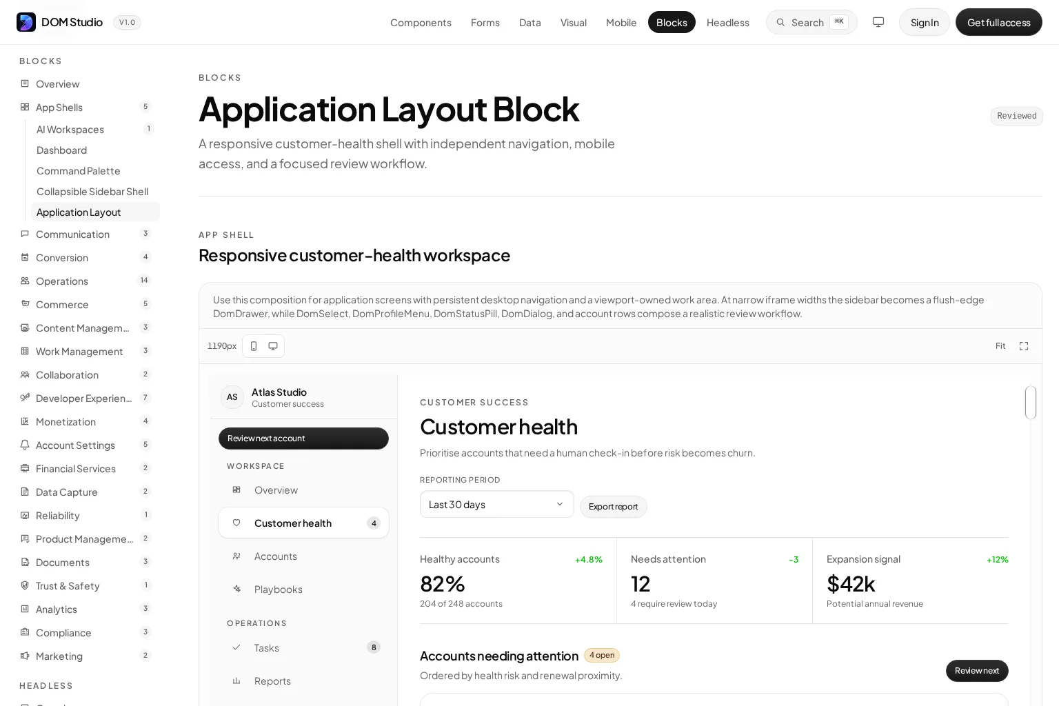
Once primitives and feature components have clean boundaries, use layouts to create product surfaces. A dashboard page may compose navigation, filters, metrics, a table, and a detail panel, while each piece keeps its own responsibility.
<!-- pages/CustomerHealthPage.vue -->
<script setup lang="ts">
import AppShell from '@/components/patterns/AppShell.vue'
import CustomerHealthFilters from '@/components/features/customer-health/CustomerHealthFilters.vue'
import CustomerHealthSummary from '@/components/features/customer-health/CustomerHealthSummary.vue'
import CustomerHealthTable from '@/components/features/customer-health/CustomerHealthTable.vue'
</script>

<template>
  <AppShell>
    <template #sidebar>
      <WorkspaceNavigation />
    </template>

    <CustomerHealthFilters />
    <CustomerHealthSummary />
    <CustomerHealthTable />
  </AppShell>
</template>
Keep cross-cutting context narrow. For a deeply nested component family, provide and inject can reduce prop drilling for a local concern such as a form field group or tab registry. Do not use them as a hidden replacement for every explicit prop. If many unrelated features depend on the same data, evaluate a dedicated store or service boundary instead.
Expected result: changing the customer-health feature does not force changes to the base card, button, or shell components.
Troubleshooting: if your AppShell accepts dozens of business-specific props, it is no longer a layout primitive. Move the business UI into its feature components and give the shell slots or focused layout props.
For a concrete composition reference, see DOM Studio’s responsive application layout block. It shows a persistent navigation area and an independently scrolling work area built from smaller components.

6. Verify reuse with a component acceptance test
Do not call a component reusable because it appears twice. Prove it by rendering it in at least two contexts with different content, states, or layouts.
Use this minimum acceptance test for every component in ui/ or patterns/:
- Render it with default props.
- Render it with every meaningful variant or slot.
- Verify keyboard interaction and disabled or loading behavior where applicable.
- Verify emitted events and accessible names.
- Confirm the component has no import from a feature, page, or route module.
For an AppDialog, that means testing a confirmation flow and a destructive-action flow. For a PanelCard, it means testing it with and without a header or actions slot. For a CustomerHealthTable, test domain behavior within its feature directory, not as a supposedly generic table.
Expected result: dependency direction stays clear: pages depend on features, features depend on patterns and primitives, and primitives do not depend on pages.
Troubleshooting: if the second use case needs a special prop that only makes sense for one feature, do not add it to the shared component. Compose a feature wrapper around the shared component instead.
7. Document the system where developers make choices
The final step is operational: document each shared component’s purpose, API, examples, and boundaries. A small component index or playground prevents duplicate work because developers can discover the existing primitive before building another version.
Document these details for each reusable component:
- what problem it solves
- public props, events, and slots
- accessibility and keyboard expectations
- two realistic examples
- known non-goals
- source location and owner
For forms, make validation, field metadata, and error behavior part of the same documented contract. DOM Studio’s form components illustrate the value of keeping form controls and schema-ready behavior close to the application UI system.
Watch: component reusability patterns
This talk explores a progression from basic reuse to more adaptable component design. Use it as a companion to the implementation steps above, then apply the ideas to a single component in your own codebase.
Build the next screen from the system, not from scratch
You now have a practical structure for Vue application components: primitives for stable UI behavior, patterns for recurring compositions, feature components for product workflows, composables for shared logic, and pages for route assembly.
Our next action is to pick one repeated screen, map its current components to the four layers, and extract only the smallest proven primitive first. If you are evaluating an editable system instead of building every layer manually, explore DOM Studio’s library of Vue wrappers, headless elements, form tools, and application blocks. The same architecture also applies when you use tools such as Vuetify, PrimeVue, or shadcn-vue: keep generic UI contracts separate from domain workflows, then compose upward.
Frequently asked questions
How small should Vue application components be?
Make a component as small as its stable responsibility allows. A button can be a primitive. A filter bar can be a shared pattern. A customer health table is a feature component. Splitting a tightly coordinated group into several files without a reuse or testing benefit adds indirection rather than flexibility.
When should I use a slot instead of a prop?
Use a prop for a known value or behavior that the component owns. Use a slot when the caller needs to provide arbitrary markup or another component. For example, loading is a prop, while a custom dialog footer is usually a named slot.
Should generic Vue components access a store?
Usually no. Generic primitives should receive the state they need through props and emit user intent. Feature components can connect to a store, service, or composable, then pass focused data and handlers down to UI components.
Is DOM Studio a replacement for Vue UI libraries?
DOM Studio provides editable Vue and Web Component UI layers, including headless elements, Vue wrappers, application blocks, form tooling, metadata, and documentation. Whether it replaces or complements another UI library depends on your existing component system, styling needs, and migration plan.