
Vue component metadata is the structured, machine-readable context that makes a component easier to find, understand, test, document, and safely reuse. For design system teams, it turns a Vue Single-File Component from a rendering unit into an inspectable public contract.
This reference covers metadata for the component itself, not HTML head tags or SEO page metadata. We focus on the facts that help a developer, documentation site, playground, visual editor, or AI assistant answer: What is this component for? How do we use it? What can we configure? Where does the source live?
Table of contents
- What belongs in Vue component metadata
- Vue facts to infer before writing custom metadata
- Vue component metadata field reference
- A practical Vue metadata example
- How to keep the contract inspectable in DOM Studio
- What metadata can power
- Tools that complement Vue component metadata
- Vue component metadata checklist
- Build metadata that stays useful
What belongs in Vue component metadata
Keep metadata close to the component, but do not force every detail into one object. We recommend five groups:
| Group | What it answers | Typical fields |
|---|---|---|
| Identity and discovery | Which component is this and where is it defined? | id, name, tag, path, exportName, group, tags |
| Public API | What can consumers pass in or receive? | props, types, required state, defaults, accepted values, slots, events |
| Usage guidance | When and how should teams use it? | description, examples, do and do not guidance, related components |
| Behavior and accessibility | What observable behavior can users rely on? | semantics, keyboard behavior, focus, states, ARIA relationships |
| Lifecycle and tooling | Who owns it and how can tools work with it? | status, owner, source hint, deprecation, editor controls |
A useful test is simple: every field should have a consumer. If no one uses a field in docs, navigation, tests, an editor, or an AI workflow, do not add it yet.

Vue facts to infer before writing custom metadata
Vue already exposes valuable parts of a component contract. We should derive these when possible rather than copying them into a separate record.
- Props: infer the name, runtime type or TypeScript type, required state, default, and validation constraints from
defineProps()or thepropsoption. - Events: capture declared event names and payload types from
defineEmits()oremits. - Slots: document each default or named slot, plus any scoped slot props and fallback behavior.
- Exposed methods: include only intentionally public methods, never incidental implementation details.
The output still needs human context. Vue can tell a tool that a tone prop is a string, but it cannot reliably explain when to use danger, which state takes priority, or whether a value is safe for a visual editor.
Vue component metadata field reference
Identity and discovery fields
Use stable identity to prevent documentation, source links, and generated catalogs from drifting when labels change.
| Field | Recommendation |
|---|---|
id |
Use a stable, namespaced identifier such as feedback/status-pill. Do not derive long-lived references from a display name. |
name |
Provide a human-friendly label such as Status pill. |
tag |
Show the intended component tag, such as <DomStatusPill>. |
path or source |
Point to the authoring file or repository location. Treat this as a source hint, not a promise that a production browser can reconstruct the original SFC. |
group and tags |
Use controlled labels that improve browsing and search, such as Feedback and status. |
order |
Use only for presentation ordering. It should not affect runtime behavior. |
Prop metadata
Props are the core input contract. In a reference view, each public prop should make the safe values obvious.
Include:
- Name, type, required state, and default.
- Accepted values or value range when a broad type such as
stringis too permissive. - A concise description of the user-facing effect.
- Dependency or precedence notes, such as
loadingdisables activation. - Whether a prop is intended for consumers, advanced integration, or internal use.
Avoid duplicating a value that can be inferred from code. Instead, add the constraints and intent code cannot express clearly.
Slots and events
Slots and events are public composition points, so they need the same documentation quality as props.
For each slot, record its name, purpose, fallback content, and scoped values it exposes. For each event, record the event name, payload shape, trigger condition, and whether it reflects a user action or a state change.
A weak event description says, “emits on change.” A usable one says, “update:modelValue emits the selected status string after a user chooses a new option.” That wording gives docs, tests, and AI tools an observable contract.
Usage, accessibility, and lifecycle fields
These fields make a component reference useful beyond a prop dump.
| Field | Include it when | Example |
|---|---|---|
description |
Every public component | “A compact label for workflow state.” |
examples |
A default use case or composition needs explanation | basic, with-icon, in-table-row |
accessibility |
Interaction, focus, semantics, or announcement behavior matters | “Uses button semantics; Enter and Space activate it.” |
status |
The library has a release or adoption lifecycle | draft, beta, stable, deprecated |
owner |
A team needs a maintainer or escalation path | design-systems |
replacement |
A component or prop is deprecated | DomNotice replaces DomAlert |
editor |
A visual editor needs a safe control for a prop | select options, numeric bounds, JSON schema |
A practical Vue metadata example
The following pattern combines Vue’s native prop and event declarations with an application-specific documentation layer. The __doc and _edit keys shown here are conventions, not built-in Vue APIs, so define and validate the shape your own tooling needs.
<script setup>
defineOptions({
  __doc: {
    id: 'feedback/status-pill',
    name: 'Status pill',
    tag: '<DomStatusPill>',
    description: 'A compact label for workflow state.',
    status: 'stable',
    owner: 'design-systems',
    tags: ['feedback', 'status'],
    studio: { group: 'Feedback' },
    slots: [
      {
        name: 'default',
        description: 'The visible status label.',
      },
    ],
    events: [
      {
        name: 'update:modelValue',
        payload: '"neutral" | "success" | "warning" | "danger"',
        description: 'Emits after the status value changes.',
      },
    ],
    accessibility: {
      notes: ['Do not communicate critical status through color alone.'],
    },
    examples: ['basic', 'status-in-a-table'],
  },
})

const props = defineProps({
  modelValue: {
    type: String,
    default: 'neutral',
    _edit: {
      options: ['neutral', 'success', 'warning', 'danger'],
      description: 'Visual state shown by the pill.',
    },
  },
  label: {
    type: String,
    required: true,
  },
})

const emit = defineEmits(['update:modelValue'])
</script>
This approach gives us one authoritative location for the component’s purpose, composition points, editable choices, and lifecycle details. It also leaves Vue as the authority for native component behavior.
How to keep the contract inspectable in DOM Studio
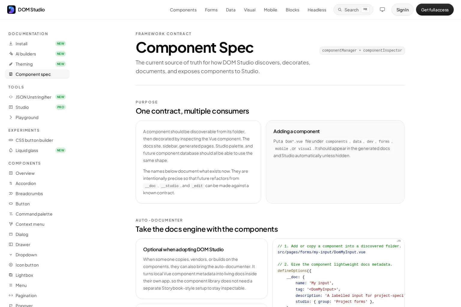
DOM Studio’s component specification separates discovery facts from inspected component details. A component can be discovered from its folder, then decorated with documentation, navigation, and Studio-specific information from the Vue component itself.
In practice, this creates a progressive workflow:
- Build a normal Vue SFC with clear props, slots, and emitted events.
- Let tooling infer routine facts such as prop definitions and defaults.
- Add
__docfor a human name, description, navigation details, slots, events, and Studio grouping. - Add prop-level
_edithints only when a live inspector needs a more precise control. - Keep authored examples beside the component when teams need guidance that generated reference material cannot express.
This model is useful when we want docs and tooling to stay near source without making every component a documentation project. For broader schema design decisions, see our design system metadata guide.
What metadata can power
A disciplined metadata model should make several product surfaces better from the same contract:
- Documentation: generate prop, slot, event, status, and source reference sections, then add authored guidance for component choice and composition.
- Search and navigation: group components with consistent names, tags, icons, and ordering.
- Live examples: bind known props to a preview without manually rebuilding every control. DOM Studio’s live playground demonstrates how a component’s props can drive an inspector and preview.
- Visual editors: map editable props to safe controls such as a select, toggle, number input, or structured list.
- Tests and CI: require public descriptions, event payload documentation, deprecation replacements, and observable accessibility expectations.
- AI assistance: supply stable component IDs, allowed prop values, constraints, and approved examples so generated UI is less likely to invent an API.
The key distinction is between generated reference facts and authored judgment. Generate the repetitive information that changes with code. Write the guidance that explains component choice, tradeoffs, product conventions, and accessibility rationale.
Tools that complement Vue component metadata
Tool choice depends on where the metadata must travel.
- DOM Studio fits teams that want colocated Vue component metadata, generated references, source hints, and editable application UI. Its model can inspect component props and enrich them with local documentation and editor metadata.
- Vue Language Tools and
vue-component-metaare useful when we need extracted type information for component props, events, and slots. - Storybook Autodocs fits a story-driven workflow. It can generate documentation from story metadata such as args, arg types, and parameters, then teams can extend the result with custom documentation.
These tools are complementary. We should avoid keeping competing copies of descriptions, prop constraints, and lifecycle information in each one. Pick one source of truth, then create focused adapters for a catalog, package manifest, or editor.
For a source-first perspective on organizing the files around a reusable SFC, read our Vue component source guide.
Vue component metadata checklist
Before we publish or scale a component, we check that:
- It has a stable ID, clear name, short description, and source hint.
- Props expose types, defaults, required state, and meaningful constraints.
- Every public event has a name, payload description, and trigger condition.
- Slots identify their purpose, fallback behavior, and any scoped values.
- At least one approved example shows the normal use case.
- Accessibility notes describe observable semantics, keyboard behavior, focus behavior, and state announcements when relevant.
- Status, owner, and replacement information exist for governed or deprecated components.
- Visual-editor hints are separate from the runtime API and allow only safe values.
- A validation step catches missing or contradictory public facts before release.
Build metadata that stays useful
The best Vue component metadata is concise enough to maintain and rich enough to remove guesswork. Start with identity, props, slots, events, a short example, and one testable accessibility expectation. Then add editor, lifecycle, and AI-specific fields only when a real consumer needs them.
If we want an editable Vue system where component documentation, examples, and source-aware controls stay close to the implementation, DOM Studio provides a practical foundation for building that contract into the UI system from the start.