
A Vue component source is the code and context that define a reusable part of a Vue interface. In a modern application, that usually starts with a .vue Single-File Component (SFC), then expands to include its public API, examples, documentation, styles, tests, and any metadata that helps people safely reuse or edit it.
For us, the important distinction is simple: a component is not just what renders in the browser. Its source is the durable contract that tells a team what the component does, how to configure it, and how it should fit into the product.
Table of contents
- What “Vue component source” can mean
- The source file is the center of the component contract
- A Vue component source has both implementation and interface
- Why source-aware documentation scales better
- How DOM Studio keeps component source close to the UI
- Source code, rendered output, and source maps are not the same thing
- A practical model for organizing Vue component source
- When to use a component library instead of writing from scratch
- Common misconceptions about Vue component source
- A useful video introduction to Vue components
- Build components your team can understand and change
What “Vue component source” can mean
The phrase is used in a few different ways, and separating them prevents confusion.
- The authoring file: the
.vuefile, often containing a<script setup>,<template>, and<style>block. - The component API: declared props, emitted events, slots, exposed methods, defaults, and TypeScript types.
- The component’s supporting context: examples, documentation, tests, accessibility decisions, and design-system metadata.
- The compiled output: JavaScript and CSS produced by the Vue build process for the browser.
When developers ask for a component’s source, they usually need the first three. Compiled output is useful for debugging, but it is not the maintainable representation we should design around.
The source file is the center of the component contract
Vue SFCs colocate the template, behavior, and optional styles for one component. That makes a component file a natural place to begin, but it should not become a dumping ground for unrelated application logic.
A healthy source file answers four questions quickly:
- What does this component render? The template shows its structural responsibility.
- What can a parent configure? Props describe inputs and defaults.
- How does it communicate outward? Emits and callbacks define observable changes.
- How can consumers compose it? Slots make room for controlled customization.

Here is a compact example of a component source that makes those boundaries visible:
<script setup lang="ts">
type Tone = 'neutral' | 'success' | 'warning'

withDefaults(defineProps<{
  label: string
  tone?: Tone
}>(), {
  tone: 'neutral',
})

const emit = defineEmits<{
  activate: []
}>()
</script>

<template>
  <button class="status-action" :data-tone="tone" @click="emit('activate')">
    <slot name="icon" />
    <span>{{ label }}</span>
  </button>
</template>
This is source we can reason about. A consumer can identify the required label, the available tone options, the activate event, and the optional icon slot without reading implementation details elsewhere.
A Vue component source has both implementation and interface
The implementation is how the component works internally. The interface is what other parts of the app are allowed to rely on. Treating them as separate concerns helps us avoid brittle UI code.
For example, a DomDialog component might internally manage focus, keyboard handling, overlays, and transitions. Its public interface can stay much smaller: a title, an open state, a close event, and slots for content or actions. Consumers should depend on the interface, not on a particular DOM structure or internal CSS class.
This is why inspecting rendered HTML rarely answers the full question of how to use a Vue component. The browser can show the final DOM, but it cannot reliably show intent, prop types, slot guidance, defaults, or the component’s source-level abstractions.
The public API should be easy to discover
For shared components, we recommend documenting these items alongside the source:
- Props, types, defaults, and constraints
- Events and their payloads
- Named and default slots
- Accessible behavior and keyboard expectations
- A minimal example plus one realistic composition example
- Any behavior that is intentionally private or unstable
The goal is not to document every line. It is to make the safe path obvious.
Why source-aware documentation scales better
A component catalog often falls out of date because the documentation is maintained in a separate place from the component. Source-aware documentation reduces that gap by reading the information already present in the component and generating the repeatable parts of a reference page.
In Vue, prop definitions are particularly valuable because they can power more than one experience. The same API information can inform a props table, a live playground, an editor control, a component registry, and AI-assisted development context.

The flow is straightforward:
- We author a focused Vue component.
- We expose its stable inputs and composition points.
- We add lightweight metadata only where automatic inference is not enough.
- Tooling uses that source to create discoverable docs, previews, and controls.
- We keep authored examples beside the component when a richer explanation is necessary.
This approach preserves a single source of truth without pretending every component needs a fully generated page. Automation should cover the standard contract. Authored documentation should explain product-specific decisions, patterns, and tradeoffs.
How DOM Studio keeps component source close to the UI
DOM Studio is built around editable UI primitives for Vue and Web Components. Its library keeps visible components connected to prop controls, slots, examples, and source hints, so teams can inspect a component before they decide whether to use or modify it. Explore the component library to see the available primitives.
For components added to a discovered folder, DOM Studio can infer a documentation route, navigation item, generated playground, and props reference. Developers can then add a __doc object for a human name, description, slots, events, navigation details, or Studio grouping. The component spec explains this contract in detail.
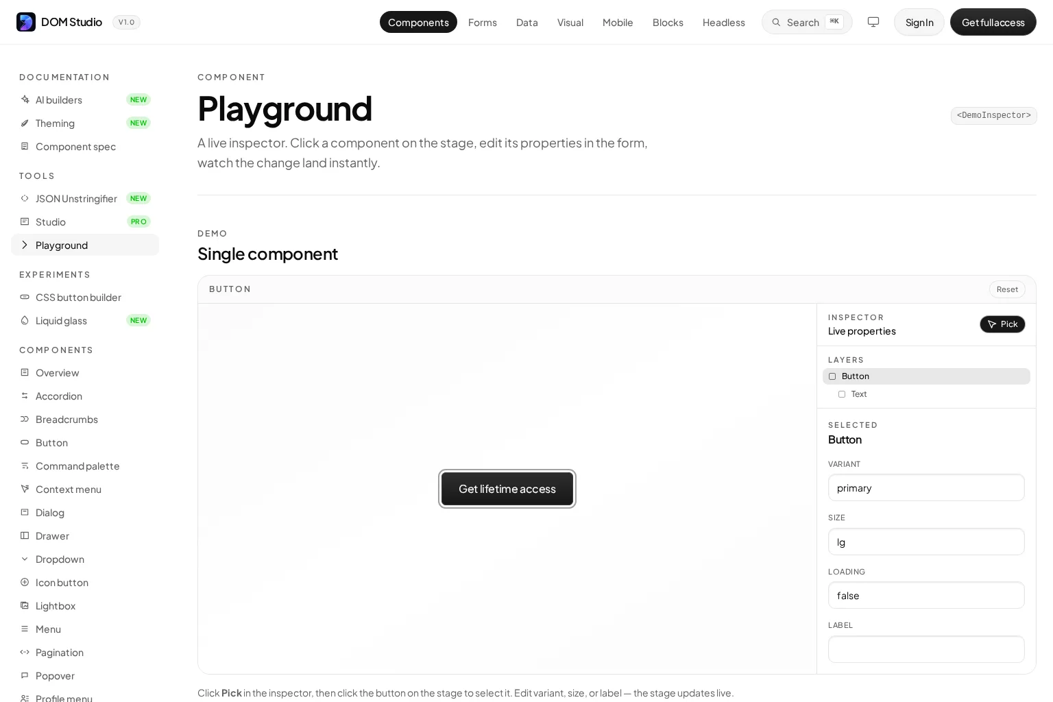
That combination supports a practical progression:
- Start with a normal Vue component and a clear public API.
- Let the basic source information make the component discoverable.
- Add metadata when the inferred labels or controls need refinement.
- Create an authored page only when the component needs deeper guidance.
The result is more flexible than a locked component framework and more maintainable than a directory of unannotated source files. It is also useful for teams that need to vendor or edit their UI system instead of treating it as a black box.
Source code, rendered output, and source maps are not the same thing
A common misunderstanding is that component source can be reconstructed perfectly from a live page. It usually cannot.
A .vue file is compiled into JavaScript and CSS during the build. The browser receives the compiled result, which may be bundled, optimized, transformed, and minified. DevTools can inspect the rendered DOM and runtime behavior, while source maps can sometimes help developers trace output back to authoring files during debugging. Neither is a substitute for an intentional source repository and component documentation.
For a reusable component, we should preserve the authoring source, the API contract, and the examples that communicate intended usage. That is what enables dependable maintenance, code review, and migration work.
A practical model for organizing Vue component source
We find that a small, predictable folder shape makes component source easier to own:
components/
  status-pill/
    DomStatusPill.vue
    StatusPill.examples.vue
    StatusPill.spec.ts
    README.md
The exact names can vary, but the principle matters: keep the code that defines, verifies, and explains a component close together. If the project uses generated documentation, component-level metadata can live in the SFC while longer guidance stays in an adjacent authored page.
For large application surfaces, group components by user-facing capability rather than by technical file type alone. For instance, form controls can live together with schemas and validation patterns, while mobile components can live with app-shell and safe-area conventions. DOM Studio offers dedicated form components and application blocks that follow this product-oriented approach.
When to use a component library instead of writing from scratch
Writing a component source from scratch is appropriate when the interaction is specific to your product or when it expresses a reusable internal pattern. A library is often the better starting point when the behavior is broadly understood but difficult to implement well, such as dialogs, menus, popovers, date pickers, comboboxes, tree views, and toast notifications.
The decision should not be “library versus source.” The stronger choice is a library whose source and contract your team can inspect, adapt, and ship with confidence. That is especially important when design requirements, accessibility expectations, or product workflows outgrow a generic default.
For an example of a live component surface connected to its editable properties, see the DOM Studio Playground. It shows how a component’s props can drive an inspector and live preview.
Common misconceptions about Vue component source
“A component is just a template”
A template is only the rendering portion. The reusable component includes behavior, inputs, outputs, composition points, and the usage guarantees it makes to the rest of the application.
“We can document components later”
We can, but delayed documentation often means the original assumptions have already been lost. Capture the API and one good example when the component is introduced. Refine the explanation as the pattern becomes more widely used.
“Every component needs extensive metadata”
No. Inference should handle ordinary props and simple components. Add metadata when it improves discoverability, editor controls, naming, slots, events, or product-level guidance.
“If it is open source, it is automatically easy to customize”
Availability of code is not the same as usability of code. Customization depends on a legible component API, local examples, predictable structure, and documentation that stays synchronized with the implementation.
A useful video introduction to Vue components
The following video is a helpful conceptual refresher on Vue components. For current Vue 3 syntax and production guidance, pair it with the official Vue documentation.
Build components your team can understand and change
The best Vue component source is not merely valid code. It is a compact, trustworthy agreement between the person who builds a component and everyone who will use it later.
We recommend starting with a focused SFC, defining a deliberate public API, keeping examples near the implementation, and using source-aware tooling to surface the contract wherever your team works. If you want an editable system of Vue primitives, forms, and application blocks with inspectable metadata and live controls, explore DOM Studio and build from components you can truly own.