
TL;DR
Build a collapse component around one parent-owned Boolean. Use a native button with synchronized aria-expanded and aria-controls, preserve the panel with v-show, and make it inert while closing. Return focus to the trigger if closing would hide the focused control. We will use a reduced-motion-aware fade, not a guessed maximum height.
A collapse component reveals or hides a region of content without navigating away. For one expandable region, the interaction is a disclosure: a button controls the visibility of associated content. That is the model described by the W3C disclosure pattern.
In this guide, we will build an editable Vue primitive for optional report filters. The parent controls whether it is open; the component owns the trigger, panel visibility, and local focus recovery. We will keep application rules out of the primitive and make animation a presentation detail rather than a second state system.
Table of contents
- Before you start
- 1. Define one controlled state contract
- 2. Build the accessible trigger and persistent panel
- 3. Connect the collapse component to parent state
- 4. Keep transition timing separate from interaction state
- 5. Check keyboard access, announcements, and focus recovery
- 6. Define the production integration limits
- Put the component into one real screen
- Sources
- Recommended Reads
Before you start
Use an existing Vue 3.5 project with Single-File Components and TypeScript support. The implementation uses documented Vue 3 APIs, with DOM behavior checked against Vue 3.5.45 source. It is not a claim that this is the latest Vue release.
Create two files:
src/components/AppCollapse.vue, the reusable disclosure.src/App.vue, a complete parent example you can use in a development project.
You also need browsers that support native inert, or a separately verified compatibility solution. MDN explains that inert content is excluded from interaction and the accessibility tree.
No component-library package is required. Project creation, application mounting, persistence, API requests, and form validation are outside this example. Keep your Vue runtime and SFC compiler versions aligned, and run the examples through your project’s type checker and browser checks before adopting them.
1. Define one controlled state contract
Write the contract before adding animation:
| Component input or output | Responsibility |
|---|---|
modelValue: boolean |
The parent’s authoritative open state. |
update:modelValue |
A request from the trigger to change that state. |
id: string |
A unique, stable ID for the controlled panel. |
label: string |
The trigger’s visible, accessible name. |
| Default slot | The optional content supplied by the caller. |
Vue’s default component v-model connects a modelValue prop with an update:modelValue event. Its component v-model documentation explains that contract, including the newer defineModel() shorthand. We use explicit props and emits to make ownership easy to inspect.
The child does not maintain a second isOpen ref. It emits the requested next value and renders whatever value the parent supplies. A parent can therefore open the panel from another action without calling an imperative component method.

Check the boundary: this component controls one disclosure. It does not coordinate a set of headings or enforce a single-open group policy. If your requirement is a grouped interface, compare it with our Vue Accordion reference rather than adding group behavior accidentally.
If the trigger changes nothing, inspect the parent binding first. Passing only :model-value="false" without accepting updates intentionally leaves the component closed.
2. Build the accessible trigger and persistent panel
Save this complete component as src/components/AppCollapse.vue. The typed props, emitted event, and nullable DOM refs follow Vue’s TypeScript Composition API guidance.
<script setup lang="ts">
import { ref, watch } from 'vue'

const props = defineProps<{
  modelValue: boolean
  id: string
  label: string
}>()

const emit = defineEmits<{
  'update:modelValue': [value: boolean]
}>()

const trigger = ref<HTMLButtonElement | null>(null)
const panel = ref<HTMLDivElement | null>(null)

watch(
  () => props.modelValue,
  (isOpen) => {
    if (isOpen) return

    const content = panel.value
    if (
      content &&
      content.contains(content.ownerDocument.activeElement)
    ) {
      trigger.value?.focus()
    }
  },
  { flush: 'pre' }
)
</script>

<template>
  <div class="collapse">
    <button
      ref="trigger"
      class="collapse__trigger"
      type="button"
      :aria-expanded="props.modelValue"
      :aria-controls="props.id"
      @click="emit('update:modelValue', !props.modelValue)"
    >
      <span>{{ props.label }}</span>
      <span class="collapse__chevron" aria-hidden="true"></span>
    </button>

    <Transition name="collapse-fade">
      <div
        v-show="props.modelValue"
        :id="props.id"
        ref="panel"
        :inert="!props.modelValue"
      >
        <div class="collapse__body">
          <slot />
        </div>
      </div>
    </Transition>
  </div>
</template>

<style scoped>
.collapse {
  border: 1px solid #9aaac1;
  border-radius: 0.75rem;
  color: #17243d;
}

.collapse__trigger {
  display: flex;
  align-items: center;
  justify-content: space-between;
  gap: 1rem;
  width: 100%;
  padding: 1rem;
  border: 0;
  border-radius: 0.75rem;
  background: #f4f7fc;
  color: inherit;
  font: inherit;
  font-weight: 600;
  text-align: left;
  cursor: pointer;
}

.collapse__trigger:focus-visible {
  outline: 3px solid #2563eb;
  outline-offset: 3px;
}

.collapse__chevron {
  width: 0.5rem;
  height: 0.5rem;
  flex: none;
  border-right: 2px solid currentColor;
  border-bottom: 2px solid currentColor;
  transform: rotate(-45deg);
}

.collapse__trigger[aria-expanded='true'] .collapse__chevron {
  transform: rotate(45deg);
}

.collapse__body {
  padding: 1rem;
}

@media (prefers-reduced-motion: no-preference) {
  .collapse-fade-enter-active,
  .collapse-fade-leave-active {
    transition: opacity 140ms ease;
  }

  .collapse-fade-enter-from,
  .collapse-fade-leave-to {
    opacity: 0;
  }
}
</style>
The button’s text supplies its name. The chevron is decorative, so it is hidden from assistive technology. type="button" avoids accidentally submitting an enclosing form, as documented in MDN’s button reference. Do not add separate Enter or Space handlers: the native button already provides activation.
The same prop drives the expanded state, visibility, and inertness. aria-controls points to the panel’s ID, which remains present even when the panel is closed. The W3C pattern requires an accurate expanded state and describes aria-controls as an optional association; we include it explicitly.
Focus recovery runs before this component’s DOM updates. That timing lets us detect a focused descendant before the panel becomes inert or hidden. Vue documents this pre-update behavior in its watcher flush timing guidance. The callback moves focus only when it is inside the closing panel, not whenever any close occurs.
Expected result: the trigger stays available in both states. If you see a missing-import error for defineProps or defineEmits, check that the file uses <script setup>: these are compiler macros, not runtime imports.
3. Connect the collapse component to parent state
Use this as src/App.vue in your development project. Replace the example content after verifying the interaction.
<script setup lang="ts">
import { ref } from 'vue'
import AppCollapse from './components/AppCollapse.vue'

const filtersOpen = ref(false)
const owner = ref('')
</script>

<template>
  <main class="demo">
    <h1>Report settings</h1>

    <AppCollapse
      id="report-advanced-filters"
      v-model="filtersOpen"
      label="Advanced filters"
    >
      <label class="field">
        Report owner
        <input v-model="owner" type="text" />
      </label>
      <button type="button" @click="filtersOpen = false">
        Done with filters
      </button>
    </AppCollapse>

    <button type="button" @click="filtersOpen = true">
      Open filters from parent
    </button>
    <p>Selected owner: {{ owner || 'Anyone' }}</p>
  </main>
</template>

<style scoped>
.demo {
  max-width: 36rem;
  margin: 3rem auto;
  padding: 0 1rem;
  font: 1rem/1.5 system-ui, sans-serif;
}

.demo > button {
  margin-top: 1rem;
}

.field {
  display: grid;
  gap: 0.5rem;
  margin-bottom: 1rem;
}
</style>
Open the panel, enter an owner, and activate “Done with filters.” Reopen it. The entered value should still appear, and closing from the internal button should return focus to “Advanced filters.” The external opener demonstrates that state belongs to the parent rather than to a click handler buried inside the child.
We use v-show deliberately. It retains the rendered subtree and changes its display instead of destroying and recreating child components. Vue’s conditional rendering guide explains the lifecycle and rendering-cost tradeoff. Keeping components mounted preserves their local state across disclosure toggles, but it does not pause their watchers or background work.
For multiple instances, give each panel a different ID and its own Boolean. In a list, derive IDs from stable record identifiers, not random values generated separately during server and client rendering. If one panel opens when another should, check shared parent refs and duplicate IDs before changing the primitive.
4. Keep transition timing separate from interaction state
The example intentionally fades opacity. It does not animate the panel’s height. Opening allocates the content’s natural layout space; closing removes that space after the leave transition. This can produce a layout change, so evaluate it in the actual screen rather than calling it a sliding animation.
This choice avoids guessed max-height limits that can clip longer translations, validation messages, or asynchronously loaded content. Vue’s Transition guide supports v-show and named transition classes, and explains why opacity is generally less expensive to animate than layout properties such as height.
There is an important interval during closing: the panel is still painted while it fades. Vue 3.5.45’s v-show implementation applies display: none through the leave-completion callback. Opacity alone would not make its controls unavailable.
That is why inert follows modelValue, not the animation’s completion. The closing panel becomes non-interactive and unavailable to assistive technology while the visual fade finishes. MDN documents inert behavior; Vue’s DOM property handling supports updating the native Boolean property. Do not write the static attribute inert="false": a Boolean attribute’s presence still enables it.
We place the animation rules inside prefers-reduced-motion: no-preference. When reduced motion is requested, there is no CSS fade duration, but the disclosure still opens and closes. See MDN’s reduced-motion reference.
Verify it: enable reduced motion and repeat several toggles. Then disable it and try rapid open-close-open actions. The final visibility and expanded state must agree, without application timers competing with Vue’s transition lifecycle. If content remains hidden, inspect conflicting display rules and confirm the transition name matches the CSS prefix.
For a visual introduction to enter and leave classes, use this verified tutorial as a companion. It explains animation mechanics, not the complete accessibility contract above.
5. Check keyboard access, announcements, and focus recovery
Test the actual rendered application, including its global CSS. The important distinction is not whether a panel looks closed, but whether its controls are unavailable when closed and reachable when open.
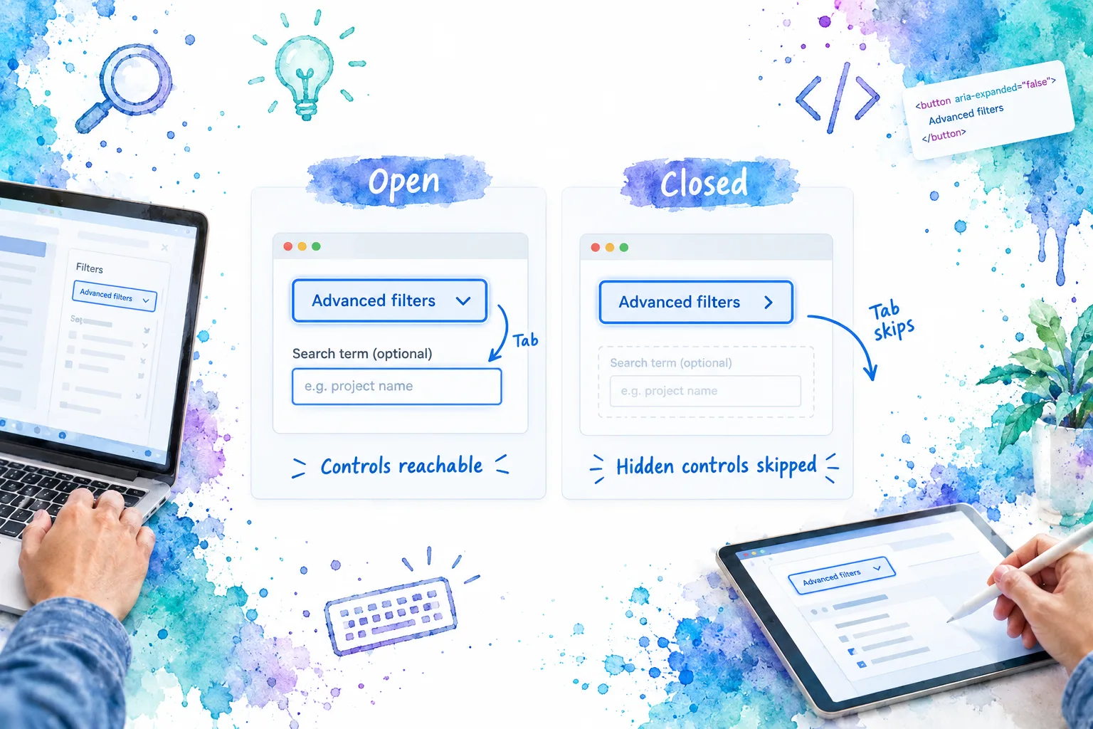
Run these checks with representative content:
- Closed on load: Tab reaches “Advanced filters” but skips the owner field and internal button. Inspect the trigger:
aria-expandedisfalse, andaria-controlsmatches the panel’s unique ID. - Native activation: test both Enter and Space on the trigger. Each activation changes state once. A double toggle often means a custom keyboard handler is duplicating the native button’s click.
- Open navigation: Tab moves into the owner field and then onward normally. Shift+Tab reverses that order. We do not move focus automatically into ordinary disclosure content or trap it there.
- Closing from inside: activate “Done with filters” while it has keyboard focus. Focus should return to the visible trigger. Closing while focus is elsewhere should not pull focus away from that location.
- Screen-reader state: check the trigger’s name and expanded/collapsed announcement with a supported browser and screen reader. In browse mode, closed content should be absent, including during the leave fade. Compare the result with the W3C disclosure pattern.
- Content and motion: try long labels, narrow widths, high zoom, and reduced motion. Labels should wrap, content should fit its natural height, and focus outlines should not be clipped by surrounding cards.
For automated coverage, assert the emitted Boolean, parent-driven opening and closing, ID association, retained field values, and focus return. Include a real-browser check for inertness and keyboard order. A DOM assertion that finds the inert attribute is not enough to prove that a browser actually prevents focus.
If a closed control remains reachable, investigate native inert support, a compatibility layer, or content rendered outside the panel. If the browser lacks the required support, remove the fade and use immediate visibility changes until you have a verified alternative. Do not substitute opacity or an ARIA label for actual interaction blocking.
6. Define the production integration limits
The completed primitive handles an in-place disclosure whose trigger remains mounted. Its focus check covers descendants of the panel. It does not manage a teleported popup, a modal opened by a field, or focus recovery after the entire disclosure is removed. Those surfaces need their own close and focus policies.
Keep server requests and validation decisions in the feature or parent component. If an error belongs inside a closed panel, open it before attempting to focus the field. Do not close the panel merely because a stale asynchronous response finished; the parent should decide whether that response still applies to the current task.
Also distinguish hiding from unloading. Expensive mounted content can keep doing work under v-show, and content in the DOM is not protected by being visually collapsed. Authorization belongs outside this visibility primitive. If you switch to v-if to unload expensive content, revisit child-state retention, ref availability, and focus behavior using Vue’s conditional rendering guidance.
For server-rendered screens, keep IDs and initial open state consistent across server and client. A closed Vue panel is not a no-JavaScript disclosure control; if that baseline matters, consider the native approach in our CSS expand/collapse example.
Put the component into one real screen
You now have a parent-controlled collapse component with an accessible trigger, persistent content, and an explicit closing-state policy. Our next step is to replace one optional settings region, run the checks with real content, and document the accepted behavior. If the requirement grows into grouped sections, use our Vue Accordion reference to evaluate that different contract before expanding this primitive.
Sources
- W3C WAI: Disclosure (Show/Hide) Pattern
- Vue: Component v-model, TypeScript with Composition API, and script setup macros
- Vue: Conditional Rendering, Watcher Flush Timing, and Transition
- Vue 3.5.45 source: v-show lifecycle and DOM property handling
- MDN: button element, inert attribute, and prefers-reduced-motion
Recommended Reads
- Expansion Panels in Application UI: When to Use Them and How to Make Them Accessible, for choosing what should remain visible and when grouped panels fit.
- How to Organize Vue Application Components for Reusable UI Systems, for placing this primitive below feature-specific behavior.
- CSS Expand/Collapse Div Example: Accessible HTML and a Custom Button, for a native HTML alternative without Vue-controlled state.