
A Vue action sheet is a temporary, mobile-first surface that presents a short list of actions related to the screen or item a user is viewing. In Vue 3, we treat it as controlled overlay state: a clear trigger opens it, an action runs in the current context, and the sheet closes without competing with the primary task.
The pattern is most effective for contextual commands such as Share, Duplicate, Move, Archive, or Delete. It is not a substitute for navigation, a long form, or a dense settings screen.
Table of contents
- What makes an action sheet different?
- The Vue action sheet mental model
- Put the overlay in the right DOM layer
- Treat a blocking action sheet as a modal dialog
- Design action lists for quick decisions
- Choose the right pattern for the task
- Common Vue action sheet mistakes
- A practical review checklist
- Build action sheets as part of the app system
What makes an action sheet different?
An action sheet is usually displayed from the bottom edge of a small screen, but its purpose matters more than its position. A bottom sheet is a broad visual container that can hold almost anything. An action sheet is a focused kind of bottom sheet that asks, “What do you want to do with this item?”
We use an action sheet when all of these are true:
- The user has already selected the relevant object or context.
- The available choices are short, distinct commands.
- The task can be completed with one decision, or with a follow-up confirmation for a risky action.
- Closing the sheet leaves the user in the same place.
A sheet is the wrong choice when users need to compare detailed information, edit multiple fields, or navigate to a different part of the product. In those cases, a full screen, a dedicated settings stack, or a compact menu is more predictable.
The Vue action sheet mental model
A dependable implementation has four responsibilities:
- Trigger: A real button opens the sheet and conveys its purpose, for example, “More project actions.”
- State: Vue owns one open or closed value, typically through
ref()andv-model. - Action data: Each row has a stable value, a concise label, and an optional destructive variant.
- Overlay behavior: The sheet appears above application content, closes intentionally, and restores the user to a sensible place.
This keeps rendering separate from product logic. The component displays an action list, while the parent decides what Share, Archive, or Delete means for the active record.
Here is the compact shape we aim for with DOM Studio’s mobile primitive:
<script setup>
import { ref } from 'vue';
import { DomActionSheet } from '@getdom/studio/vue';

const sheetOpen = ref(false);

const actions = [
  { value: 'share', label: 'Share project' },
  { value: 'duplicate', label: 'Duplicate screen' },
  { value: 'delete', label: 'Delete draft', variant: 'danger' },
];
</script>

<template>
  <button
    type="button"
    aria-label="More project actions"
    @click="sheetOpen = true"
  >
    More
  </button>

  <DomActionSheet
    v-model="sheetOpen"
    title="Project actions"
    description="Choose an action for this workspace."
    :actions="actions"
  />
</template>
The important design choice is not the array syntax. It is that the component receives a concise, context-specific action model and the parent retains ownership of the open state and outcome. DOM Studio includes DomActionSheet alongside app shells, top bars, bottom navigation, touch-sized list rows, and safe-area utilities for this sort of mobile composition. Explore the DOM Studio mobile primitives when we want editable Vue building blocks rather than an isolated overlay.
Put the overlay in the right DOM layer
An action sheet may be logically part of a route component, but it needs to render above headers, scrolling panels, and other positioned elements. Vue’s built-in <Teleport> lets us render overlay markup elsewhere in the document while preserving its logical component relationship. This is particularly useful when nested layout styles or z-index values would otherwise cover the sheet.
We normally combine that DOM placement with a short enter and leave transition. Motion should clarify that the sheet has arrived from the bottom and should never be the only cue that it opened. Honor reduced-motion preferences by shortening or removing nonessential movement.
Treat a blocking action sheet as a modal dialog
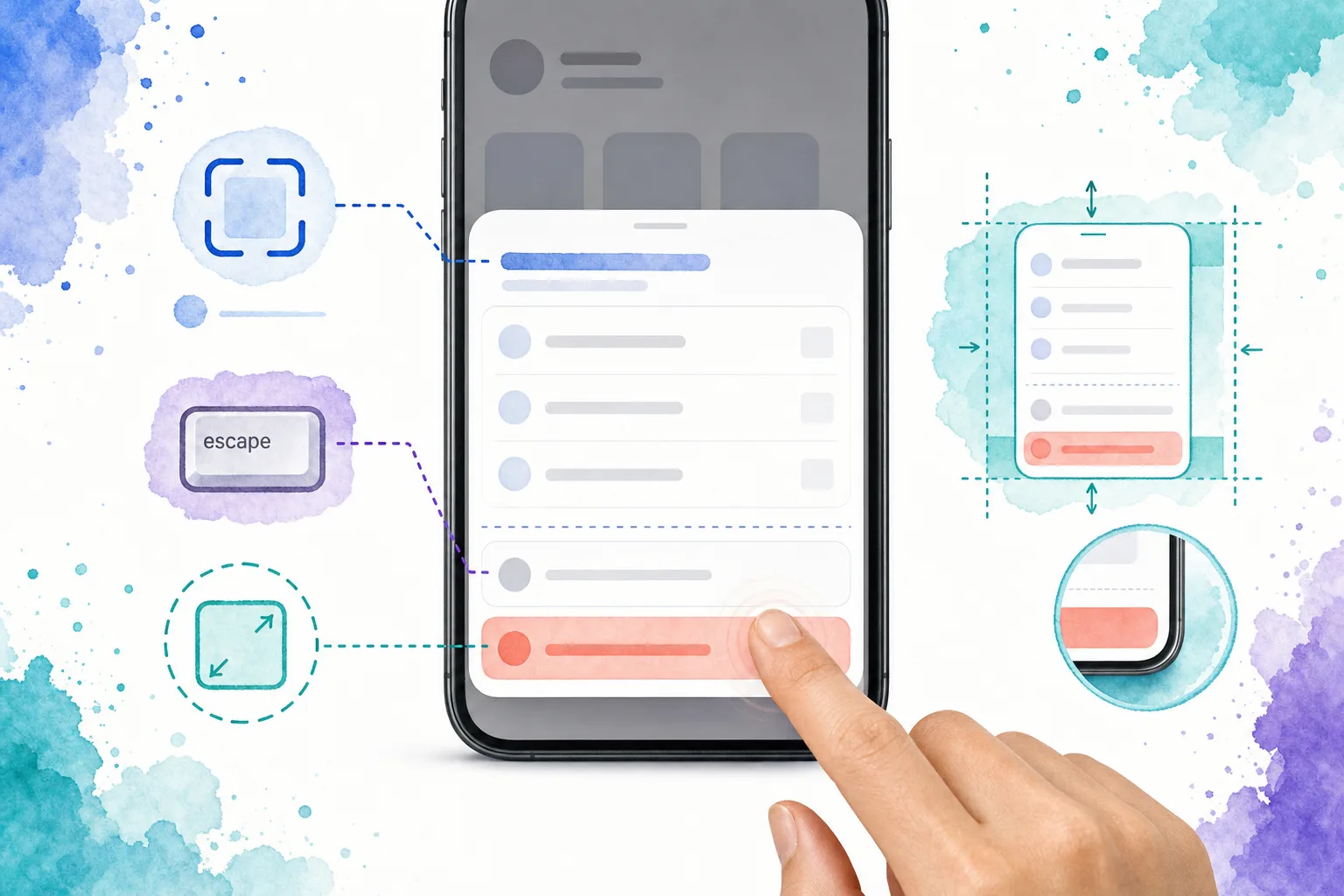
If users cannot interact with the content behind an open action sheet, it needs modal behavior, not merely a high z-index. That means focus moves into the sheet when it opens, keyboard focus does not drift into the obscured page, Escape can dismiss it when appropriate, and focus returns to the invoking control when it closes.
A visible title is valuable whenever the choices could be ambiguous out of context. For example, “Project actions” tells users whether Delete applies to a project, a comment, or a draft. Add a description only when it makes the choice clearer, not as repeated interface text.
For a custom implementation, we need to account for these details explicitly. A native HTML <dialog> opened modally can provide browser handling for focus movement, inert background content, Escape behavior, and focus return. We can style its contents as a bottom-anchored sheet, or use a well-tested component that provides the same behavior. The visual presentation is mobile-oriented, but the accessibility contract is a dialog contract.
Design action lists for quick decisions
Action-sheet quality is mostly information architecture. We keep the list short enough to scan at a glance and order choices by likely use, not by internal API order.
A useful sequence is:
- Put the most common contextual action first.
- Group actions that have similar consequences.
- Separate a destructive action visually from routine actions.
- Use direct verbs such as “Archive draft” rather than vague labels such as “Manage.”
- Offer Cancel or a clear dismissal path when the context needs it.
Destructive operations deserve extra care. Styling Delete differently helps users notice risk, but color alone is not a safeguard. For irreversible actions, we follow the sheet with a focused confirmation that names the object and consequence. For reversible operations, an undo message is often less disruptive than a confirmation dialog.
Choose the right pattern for the task
The key question is not “Can this fit in a sheet?” It is “What decision does the user need to make next?”
- Action sheet: A few contextual actions for the current item or screen.
- Dialog: A compact confirmation or an interruption that needs an explicit response.
- Menu: A set of commands connected to a visible control, often without taking over the whole mobile viewport.
- Full screen or stack: A task requiring review, data entry, multiple steps, or nested settings.

We use this distinction throughout mobile architecture. In a Vue mobile app shell, an action sheet belongs in the temporary overlay layer, while top bars and bottom navigation remain persistent chrome. For route collections, use the appropriate mobile navigation pattern instead of putting destinations into an action sheet. Our Vue mobile navigation guide explains when a responsive menu, drawer, or bottom navigation is the better fit. If the product also has a desktop workspace, review the responsive dashboard app shell to keep the mobile fallback intentional.
Teams already using Ionic, Framework7, Vuetify, or Kendo UI for Vue can evaluate their maintained action-sheet or bottom-sheet primitives. We still apply the same product checks: controlled state, meaningful action labels, modal accessibility where needed, and an appropriate pattern for the task.
Common Vue action sheet mistakes
Using it as a navigation drawer
A sheet of destinations becomes hard to scan and conflicts with user expectations for primary navigation. Keep frequent destinations in bottom navigation, a drawer, or a menu designed for routing.
Putting a long form in the sheet
A sheet is not automatically a lightweight screen. Long forms, complex validation, and keyboard-heavy tasks need enough space and a stable focus sequence. Move them to a dedicated route or settings stack.
Treating backdrop dismissal as the only exit
Pointer users may tap outside a sheet, but keyboard and assistive technology users need an equally reliable close control and predictable focus behavior.
Leaving destructive actions unqualified
A generic Delete option can be unclear when a screen contains several objects. Include the object in the action label or the sheet title, then confirm an irreversible consequence when necessary.
Allowing overlay state to fragment
Do not let a trigger, a row component, and a parent route each maintain separate ideas of whether the sheet is open. One controlled value prevents stale overlays and makes route changes easier to handle.
A practical review checklist
Before shipping, we test an action sheet in the real mobile shell, not only in a component preview:
- The trigger is a native button with an accessible name.
- The selected item or screen context is clear in the title or labels.
- The action list is short and ordered for the user, not the data model.
- Destructive actions are distinct and get an appropriate follow-up safeguard.
- Opening the sheet does not create a second scrolling experience behind it.
- Keyboard users can open, operate, and dismiss the sheet without reaching obscured content.
- Focus returns logically after dismissal.
- Motion respects reduced-motion preferences.
- The layout is checked on a physical phone, including safe areas and the on-screen keyboard.
Build action sheets as part of the app system
A Vue action sheet works best when it is part of a deliberate mobile shell, not a one-off overlay. We keep actions contextual, place the component in the overlay layer, and uphold modal behavior whenever it blocks the rest of the interface. That produces faster decisions for users and a component we can reuse across screens without re-solving state and accessibility every time.
Ready to compose a mobile workflow from editable Vue primitives? Start with DOM Studio’s mobile component system, then add the action sheet only where contextual choices genuinely belong.