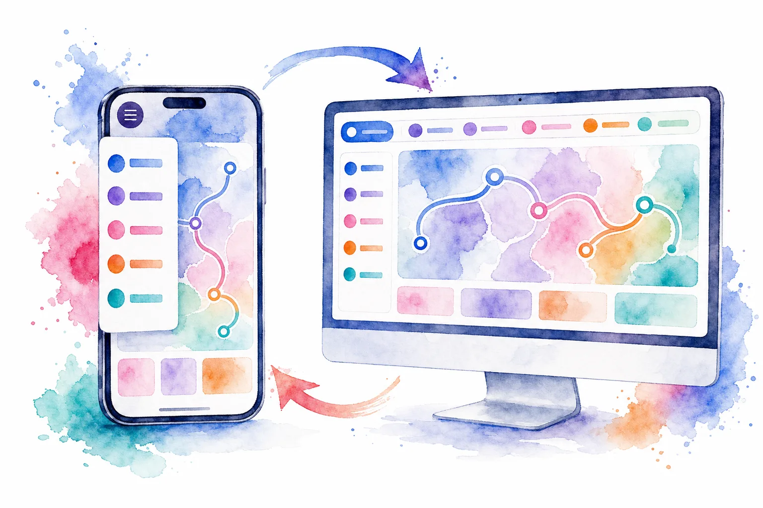
A reliable Vue mobile navigation component does two jobs well: CSS adapts the layout for a narrow viewport, while Vue manages the menu’s open state and route-aware behavior. In this guide, we will build a responsive top navigation that stays semantic, keyboard-friendly, and easy to reuse.
You will finish with a desktop link row that becomes a mobile menu button below a breakpoint. The mobile menu will expose its state with aria-expanded, close with Escape or the backdrop, and close after a route change.
Table of contents
Before you start
We assume a Vue 3 application using Vue Router 4 and single-file components. You need route paths for your primary destinations, plus a CSS setup that supports a breakpoint near your design’s tablet threshold. We use 48rem in this example, but the breakpoint should follow when the links no longer fit, not a device label.
Use a native <nav> for groups of navigation links and a native <button> for the control that opens and closes the mobile menu. This gives us the appropriate semantics and keyboard behavior before adding any ARIA state.
For a production app, decide which mobile navigation pattern matches the information architecture:
-
Top-menu disclosure: Best for a small marketing or documentation route list.
-
Side drawer: Best when the menu needs account actions, secondary links, or a longer route list.
-
Bottom navigation: Best for three to five primary, frequently switched app destinations.
1. Define a single source of truth for routes
Put navigation data in one array and render it in both the desktop and mobile layouts. We avoid duplicating labels, paths, and active-state logic in separate components.
Expected result: Changing a label or path in links updates both versions of the navigation.
<script setup>
import { ref, onMounted, onBeforeUnmount, watch } from 'vue';
import { RouterLink, useRoute } from 'vue-router';

const route = useRoute();
const isOpen = ref(false);
const menuButton = ref(null);

const links = [
  { label: 'Home', to: '/' },
  { label: 'Products', to: '/products' },
  { label: 'Pricing', to: '/pricing' },
  { label: 'Contact', to: '/contact' },
];

function toggleMenu() {
  isOpen.value = !isOpen.value;
}

function closeMenu({ restoreFocus = false } = {}) {
  isOpen.value = false;

  if (restoreFocus) {
    requestAnimationFrame(() => menuButton.value?.focus());
  }
}

function onKeydown(event) {
  if (isOpen.value && event.key === 'Escape') {
    closeMenu({ restoreFocus: true });
  }
}

watch(
  () => route.fullPath,
  () => {
    isOpen.value = false;
  },
);

onMounted(() => window.addEventListener('keydown', onKeydown));
onBeforeUnmount(() => window.removeEventListener('keydown', onKeydown));
</script>
Troubleshooting: If your app does not use Vue Router, replace RouterLink with normal <a> elements and remove the useRoute() and watch() lines. Keep the open state in the component.
2. Build the semantic navigation shell
Add the template below after the script. The desktop navigation is always available at large widths. The menu button controls a separate mobile <nav> and reports the actual open state through aria-expanded and aria-controls.
Expected result: At mobile widths, screen readers can identify the menu button and whether its controlled navigation region is open.
<template>
  <header class="site-header">
    <div class="nav-row">
      <RouterLink class="brand" to="/">Acme</RouterLink>

      <nav class="desktop-nav" aria-label="Primary navigation">
        <RouterLink
          v-for="item in links"
          :key="item.to"
          :to="item.to"
          :aria-current="route.path === item.to ? 'page' : undefined"
        >
          {{ item.label }}
        </RouterLink>
      </nav>

      <button
        ref="menuButton"
        class="menu-button"
        type="button"
        :aria-expanded="isOpen"
        aria-controls="mobile-site-nav"
        @click="toggleMenu"
      >
        <span aria-hidden="true" class="menu-icon">
          <span></span><span></span><span></span>
        </span>
        <span>{{ isOpen ? 'Close' : 'Menu' }}</span>
      </button>
    </div>

    <Transition name="mobile-menu">
      <div v-if="isOpen" class="mobile-layer">
        <button
          class="menu-backdrop"
          type="button"
          aria-label="Close navigation menu"
          @click="closeMenu({ restoreFocus: true })"
        ></button>

        <nav id="mobile-site-nav" class="mobile-nav" aria-label="Mobile navigation">
          <RouterLink
            v-for="item in links"
            :key="item.to"
            :to="item.to"
            :aria-current="route.path === item.to ? 'page' : undefined"
            @click="closeMenu()"
          >
            {{ item.label }}
          </RouterLink>
        </nav>
      </div>
    </Transition>
  </header>
</template>
Troubleshooting: Do not use a clickable <div> for the trigger. A real button supplies the expected interaction model, while the aria-expanded value describes the state of the menu it controls.
3. Make the layout responsive with CSS, not viewport JavaScript
We keep the layout decision in CSS media queries. Vue only owns interactive state. This avoids JavaScript breakpoint listeners and prevents a menu implementation from drifting away from the visual layout.
.site-header {
  position: relative;
  z-index: 20;
  border-bottom: 1px solid #e5e7eb;
  background: #ffffff;
}

.nav-row {
  display: flex;
  min-height: 4rem;
  align-items: center;
  justify-content: space-between;
  gap: 1rem;
  max-width: 72rem;
  margin: 0 auto;
  padding: 0 1rem;
}

.brand,
.desktop-nav a,
.mobile-nav a {
  color: #111827;
  font-weight: 600;
  text-decoration: none;
}

.desktop-nav {
  display: flex;
  align-items: center;
  gap: 1.25rem;
}

.desktop-nav a[aria-current='page'],
.mobile-nav a[aria-current='page'] {
  color: #4338ca;
}

.menu-button {
  display: none;
  align-items: center;
  gap: 0.5rem;
  border: 0;
  border-radius: 0.5rem;
  padding: 0.625rem 0.75rem;
  background: #eef2ff;
  color: #1f2937;
  font: inherit;
  font-weight: 700;
  cursor: pointer;
}

.menu-icon {
  display: grid;
  gap: 0.1875rem;
}

.menu-icon span {
  display: block;
  width: 1.125rem;
  height: 0.125rem;
  border-radius: 99px;
  background: currentColor;
}

.mobile-layer,
.menu-backdrop {
  position: fixed;
  inset: 0;
}

.menu-backdrop {
  border: 0;
  background: rgb(17 24 39 / 0.38);
}

.mobile-nav {
  position: absolute;
  top: 4.5rem;
  right: 1rem;
  left: 1rem;
  display: grid;
  overflow: hidden;
  border: 1px solid #e5e7eb;
  border-radius: 0.75rem;
  background: #ffffff;
  box-shadow: 0 1.25rem 3rem rgb(17 24 39 / 0.18);
}

.mobile-nav a {
  padding: 1rem;
  border-bottom: 1px solid #e5e7eb;
}

.mobile-nav a:last-child {
  border-bottom: 0;
}

.mobile-menu-enter-active,
.mobile-menu-leave-active {
  transition: opacity 180ms ease;
}

.mobile-menu-enter-active .mobile-nav,
.mobile-menu-leave-active .mobile-nav {
  transition: transform 180ms ease;
}

.mobile-menu-enter-from,
.mobile-menu-leave-to {
  opacity: 0;
}

.mobile-menu-enter-from .mobile-nav,
.mobile-menu-leave-to .mobile-nav {
  transform: translateY(-0.5rem);
}

@media (max-width: 47.99rem) {
  .desktop-nav {
    display: none;
  }

  .menu-button {
    display: inline-flex;
  }
}

@media (min-width: 48rem) {
  .mobile-layer {
    display: none;
  }
}
The Transition wrapper is appropriate here because the mobile layer is conditionally rendered. We animate only opacity and transform, which keeps the interaction compact and avoids layout-heavy animation.

Troubleshooting: If the overlay scrolls with the page, inspect any ancestor that has transform, filter, or contain applied. Those properties can change how position: fixed behaves. For an app shell, move the overlay close to the root app container.
4. Verify the open, close, and route-change behavior
Test the component before you style it further. We use this short acceptance path:
-
Reduce the viewport below
48rem. The desktop links disappear and the Menu button appears. -
Activate Menu with a pointer and with Enter or Space.
aria-expandedchanges fromfalsetotrue. -
Press Escape. The layer closes and focus returns to the Menu button.
-
Activate a link. The router changes route and the menu closes.
-
Click the dimmed backdrop. The menu closes without activating a navigation link.
Expected result: There is no route where a transparent backdrop blocks the page after the menu has closed.

Troubleshooting: If the menu stays open after navigation, make sure the component remains mounted where it can observe route.fullPath. A header placed outside the router view is a straightforward location.
5. Choose the right mobile pattern as the app grows
A short site menu can remain a disclosure like the one we built. For application navigation, we choose a component that matches the task, then keep its controlled state in Vue.
-
Use the DOM Studio Drawer when navigation needs a side panel. Its Vue example supports
v-model, Escape, backdrop dismissal, and focus containment. -
Use DOM Studio mobile app primitives when you are building a web-first mobile app. The mobile shell includes safe-area-aware regions and thumb-oriented navigation patterns.
-
Consider DOM Studio Bottom Nav for a compact, primary tab set with a small number of destinations.
-
Review the responsive dashboard app shell for an example that pairs persistent desktop navigation with a mobile navigation fallback.
If your team already standardizes on a library such as Vuetify or PrimeVue, use its drawer or navigation primitives rather than building a parallel pattern. The checks remain the same: native controls, a clear open state, keyboard dismissal, visible current route, and touch-sized destinations.
6. Test at the boundaries that matter
Do not stop at a single phone width. We test the component at the exact breakpoint, just above it, and with browser zoom or large text enabled. We also check keyboard-only navigation and a screen reader announcement for the menu control.
Expected result: The menu is usable at narrow widths, the desktop links do not wrap unexpectedly near the breakpoint, and the active route has both visual and programmatic indication.

Use this final checklist:
-
The trigger is a
<button>, not a generic element with a click handler. -
aria-expandedalways reflects the actual state. -
aria-controlspoints to the mobile navigation element. -
Escape, backdrop click, and route navigation close the menu.
-
The current destination uses
aria-current="page". -
Links and controls have comfortable touch targets, and focus remains visible.
-
Motion is brief and can be reduced with a
prefers-reduced-motionrule if your design system does not already provide one.
Your completed Vue mobile navigation
We now have a reusable Vue mobile navigation component with a single route model, a CSS-led responsive layout, semantic landmarks, controlled open state, and testable close behavior. The most useful next step is to drop it into your shared application shell, then evaluate whether a drawer or bottom navigation is a better fit for your product’s route hierarchy.
When we need editable Vue and web component building blocks for that next step, DOM Studio gives us components, app shells, and mobile patterns we can adapt to the product instead of working around a locked UI kit.