
TL;DR
A UI spinner communicates an ongoing operation with unknown duration, not a percentage complete. In an AI interface, distinguish waiting for a response, receiving streamed content, and running a tool. Pair animation with a specific, persistent status, keep useful partial output visible, and replace the busy state with a clear outcome. We recommend documenting these behaviors as a shared interaction pattern, not leaving them to the spinner component.
An assistant can acknowledge a request, search documents, start writing, pause for another lookup, and return a draft. One spinning ring cannot explain all of those moments.
The useful question is not which loading animation looks most intelligent. It is what the interface can truthfully tell someone about the work happening now, the content already available, and the next action they can take.
This guide focuses on that AI-specific interaction contract. It complements general spinner selection and Vue implementation guidance rather than repeating them.
Table of contents
- What a UI spinner can honestly promise
- Separate waiting, streaming, and tool execution
- Use status text that describes observable work
- A practical assistant interaction
- Give completion, failure, and cancellation different endings
- Document the pattern, not just the spinning ring
- Keep meaningful statuses accessible
- Build one loading-state contract your team can reuse
- Sources
- Recommended Reads
What a UI spinner can honestly promise
A spinner is an indeterminate activity indicator. It signals an ongoing operation without claiming a known remaining duration. Open UI’s spinner documentation makes this distinction explicit.
In an assistant, that promise needs context. A ring beside an empty answer might mean the request is waiting for a response. The same ring inside a search card can refer to a document lookup. Neither means the answer is nearly finished or that its claims are correct.
We recommend treating the indicator as a representation of the application’s known task state, not proof that a remote service is healthy. If the connection becomes uncertain, say so rather than letting animation imply confirmed activity indefinitely.
Separate waiting, streaming, and tool execution
Cloudscape’s generative AI loading guidance distinguishes processing before output arrives from generation with incrementally displayed output. For an assistant that uses external tools, we recommend making tool activity a distinct user-facing state too.
Waiting: acknowledge the request
Before usable output arrives, keep the submitted prompt visible and put a compact spinner beside a status such as “Waiting for a response.” If the application knows the request is queued, “Queued” is more accurate than “Writing your answer.”
Avoid inventing activity to make the delay seem productive. A timer does not establish that the assistant is checking sources or evaluating alternatives. Keep Stop or Cancel available only when its behavior is supported and clearly defined.
Streaming: show the answer, not another placeholder
Once usable text arrives, let it become the primary feedback. Cloudscape describes streaming as incrementally displaying generated output, rather than waiting for the complete response.
A small activity cue can still explain that writing continues, especially during pauses. It should not cover the text or replace it with an empty loading bubble. We recommend a stable label such as “Writing the comparison” beside the developing answer.
Keep earlier messages readable. If someone scrolls back to inspect a source, do not repeatedly pull them to the newest sentence. Our AI interface design guidance recommends preserving that reading position and offering a way to jump to the latest response.
Tool execution: name the external work
When a known tool starts, identify the task: “Searching selected documents” or “Checking availability.” Put its activity indicator beside that task, rather than making the entire conversation appear blocked.
Cloudscape’s progressive steps pattern separates work steps from their statuses and distinguishes sequential from concurrent work. That is a useful foundation for assistants with several tool calls.
We recommend showing a compact overall summary with inspectable task details underneath. If two lookups run independently, each needs its own outcome. One successful lookup should not make a still-running or failed lookup appear complete.
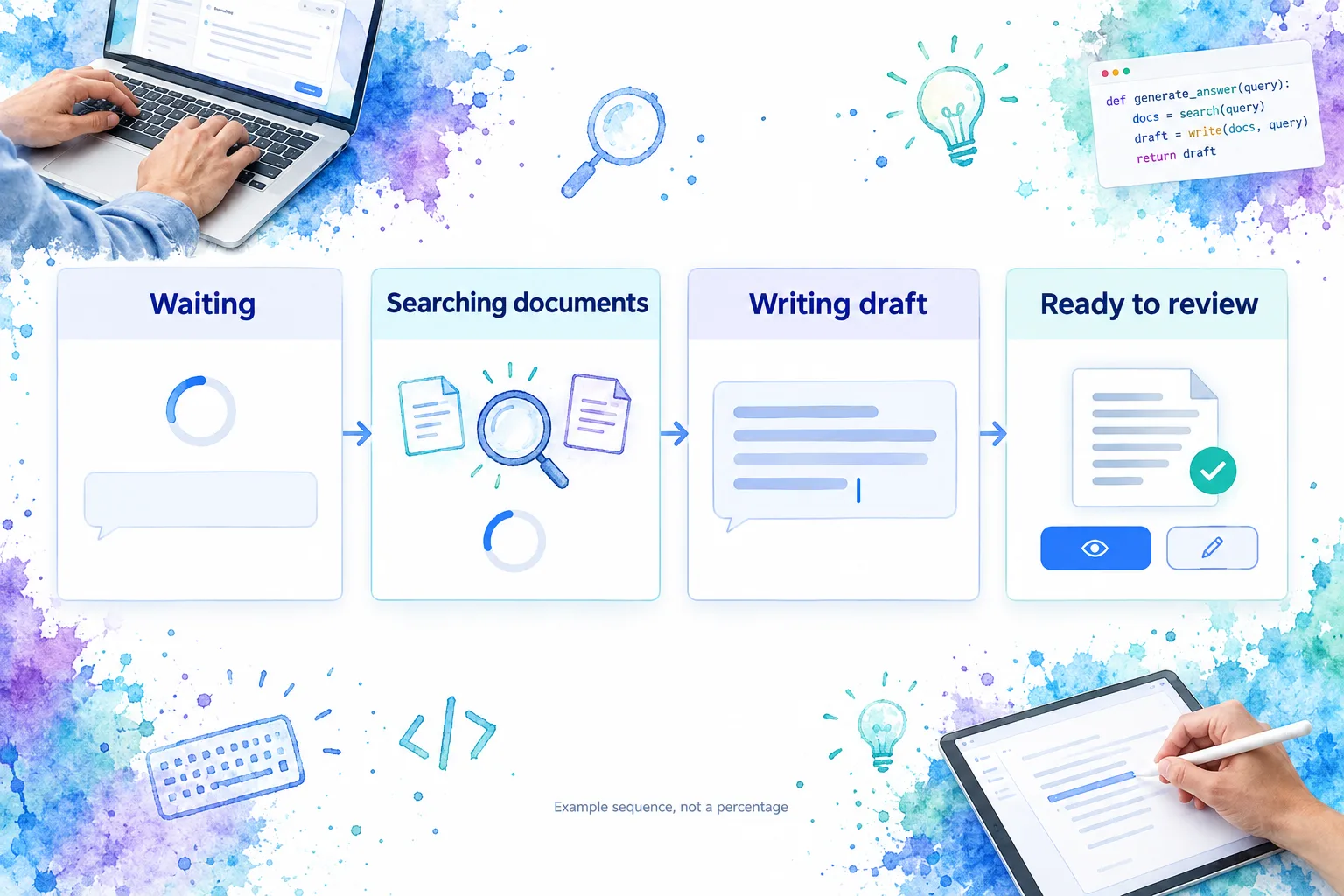
These phases are not a mandatory pipeline. Tools can run before writing, between passages, or alongside other tasks. The following illustration shows one possible sequence, not a progress calculation.
Use status text that describes observable work
A good status combines an action with its object: “Reading the selected contract,” “Finding matching records,” or “Writing the summary.” Keep it present long enough to understand, and change it when the underlying state changes, not according to a scripted sequence.
We use three questions when reviewing a label:
- What supports it? A tool-start event can support “Searching documents.” Elapsed time alone cannot.
- What does it leave unknown? “Still waiting for a response” is preferable to an invented explanation for a delay.
- Does it imply progress we cannot measure? Avoid percentages or countdowns without a meaningful measurement.
Completed task counts can be useful without representing remaining time. Reading two of three files does not establish that the whole answer is two-thirds finished; writing and additional lookups may remain.
For a short introduction to feedback during interface delays, this Nielsen Norman Group video explains progress indicators. Apply the principle without manufacturing a percent-complete value for model generation.
A practical assistant interaction
Consider an illustrative request: “Compare the cancellation terms in these two contracts.” The application can read the selected files and stream a comparison, but it does not automatically edit or save either contract.
| Moment | Visible status | What remains available |
|---|---|---|
| Request acknowledged | Waiting for a response | Submitted prompt, attachments, earlier messages |
| File-reading tool starts | Reading the two selected contracts | Prompt and conversation; inspectable tool details |
| Usable answer text arrives | Writing the comparison | Partial answer and any available source references |
| Another lookup is needed | Checking the notice-period clause | Existing comparison text and the specific lookup status |
| Generation completes | Comparison ready to review | Full answer, cited clauses, and review actions |
Each transition needs evidence from the application. Do not show “Reading the two selected contracts” simply because the prompt mentions contracts. The tool must actually have started that work.
When the extra lookup begins, preserve the comparison already written. If the lookup fails, identify which clause remains unverified. Do not hide the entire answer behind another spinner or present the incomplete comparison as fully checked.
The final label also matters. “Comparison ready to review” reports an available answer. “Contracts updated” would report a different event that this example never performed. Our AI interface guidance distinguishes generated output, approved changes, and confirmed saved results; keep those boundaries visible.
If the product later adds an Apply changes action, that action needs its own pending state and confirmed outcome. Completing generation must not silently stand in for completing a write operation.
Give completion, failure, and cancellation different endings
A pending state is unfinished design until its exit is defined. Removing the ring is not always enough to explain what happened.
Completion should name the result. Replace “Writing the summary” with “Summary ready,” then make the output available. If approval is required, show the review action. If persistence is a separate operation, keep “Saved” reserved for its confirmed success.
Failure should identify the affected work. A document-search error may leave useful text available while making part of the answer incomplete. Cloudscape’s progressive steps guidance recommends contextual errors and appropriate retry actions, including local errors for independent tasks. We recommend preserving useful output, marking its limitations, and offering recovery at the failed task.
A deliberate stop should not look like a crash. Keep the available draft and label it as partial. Explain whether Stop ends generation, stops receiving output, or requests cancellation of a remote task. Those are different promises; use the one the application can honor.
An uncertain outcome needs an uncertain label. If a connection drops during a tool that changes data, do not assume the action failed or was undone. A useful message is “The result could not be confirmed. Check the record before trying again.” The application needs a way to verify the outcome before offering a potentially duplicate action.
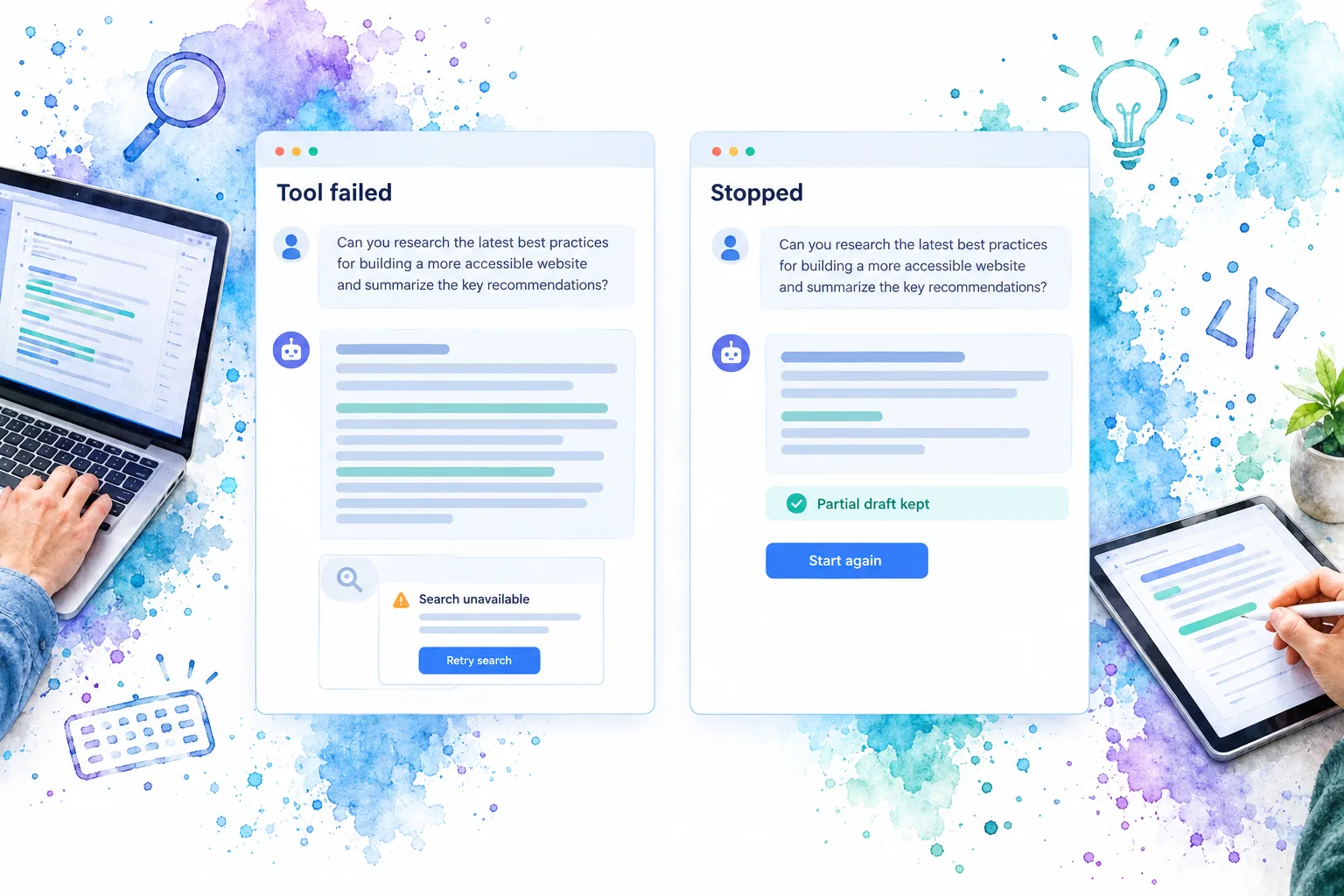
The conceptual mockups below distinguish a local tool failure from a user-requested stop. Neither leaves an activity ring running after its reported operation has ended.
Document the pattern, not just the spinning ring
For a design systems team, size and color are only part of the contract. The surrounding pattern also needs an owner, permitted labels, transitions, and examples that explain what the visual primitive cannot decide.
We recommend an inspectable pattern record covering:
- Purpose and scope: Whether the status describes the whole response, one tool, or one pending result.
- State evidence: Which application event supports each label, including queued, running, interrupted, and complete.
- Content policy: Which partial results stay visible and how incomplete or unverified sections are identified.
- Action policy: What Stop, Retry, Review, and Apply mean in this integration.
- Source hints: The location of the owning feature, relevant component reference, and canonical interaction examples.
- Outcome boundaries: Whether ready means generated, approved, executed, or saved.
These are documentation categories, not required API fields or DOM Studio component props. Keep the application’s task model separate from the spinner’s presentation options.
Make examples inspectable across the important transitions: a response that starts streaming quickly, a tool that pauses generation, a recoverable lookup failure, and a stopped partial draft. A gallery of different ring sizes cannot explain those behaviors.
Keep meaningful statuses accessible
The status must make sense without seeing motion. Keep specific text alongside the visual indicator and make important changes available to assistive technology without moving focus unnecessarily.
W3C’s guidance on status messages covers waiting, progress, results, and errors. It also warns that excessive live feedback can make an interface too chatty. Removing a waiting message can communicate an outcome visually without making that outcome apparent to a screen-reader user.
We recommend announcing meaningful phase changes and outcomes rather than every streamed token. Keep the developing answer available to read separately from the short status summary. Evaluate the announcement frequency with a screen reader, not just by checking that an accessibility attribute exists.
The design review question is simple: without the animation, can someone tell what is happening, what is ready, and what they can do next?
Build one loading-state contract your team can reuse
Start with one assistant interaction and map its real events to understandable states. Preserve partial output, keep tool activity local, and distinguish an available answer from a completed action.
Open our Spinner playground and reference to inspect the visual primitive, then document the application behavior around it. The goal is not a more elaborate spinner. It is a waiting experience that tells the truth.
Sources
- Open UI: Spinner
- Cloudscape: Generative AI loading states
- Cloudscape: Progressive steps
- W3C: Understanding Status Messages
- Nielsen Norman Group: Mask Interaction Delays with Progress Indicators
- DOM Studio: Designing AI Interfaces