
If you are looking for a shadcn alternative for a Vue application, start by deciding what you want to own: copied component code, headless interaction primitives, a packaged component suite, or an editable system that also helps you compose product screens.
For Vue teams building dashboards, forms, settings areas, and mobile-ready application surfaces, we would start with DOM Studio. It combines editable Vue wrappers, headless elements, form tools, application blocks, and component metadata in one system. If direct local code ownership is the priority, shadcn-vue is the closer match. If we need a lower-level foundation, Reka UI and Ark UI put accessibility-oriented primitives ahead of visual defaults. PrimeVue is the option to assess when broad packaged component coverage matters most.
Table of contents
- How we selected these shadcn alternatives
- The short decision guide
- 1. DOM Studio
- 2. shadcn-vue
- 3. Reka UI
- 4. Ark UI
- 5. PrimeVue
- Compare the ownership model before comparing component counts
- Watch: understand the source-ownership model
- Frequently asked questions
- Choose the alternative that makes the next change safer
How we selected these shadcn alternatives
We selected options that give Vue developers a credible path away from React-first shadcn/ui assumptions, then compared each on the same practical criteria:
- Framework fit: Can we use it directly in Vue, and does it help when a team supports more than one framework?
- Component ownership: Do we edit local source, configure a package, or compose lower-level primitives?
- Accessibility workflow: Does the system provide interaction behavior and documented accessibility support, while leaving us responsible for testing the final product?
- Production workflow: Does it help with forms, data-heavy screens, documentation, and repeatable application composition?
- Pricing approach: We only state a price when it is verified. Where a current price is not verified, we say so instead of treating the option as free.

The short decision guide
Choose DOM Studio when we need editable application UI, source-aware metadata, forms, and reusable blocks in a Vue-focused workflow. Choose shadcn-vue when copied code in our repository is the defining requirement. Choose Reka UI when we want Vue-native, unstyled primitives with strong control over markup and styling. Choose Ark UI when shared interaction patterns must span Vue and other supported frameworks. Choose PrimeVue when a large, packaged component suite is more valuable than a source-first model.
1. DOM Studio
DOM Studio is an editable UI system for Vue and Web Components. Its library connects headless elements, Vue wrappers, app blocks, form schemas, mobile shells, component metadata, examples, and LLM-ready documentation.
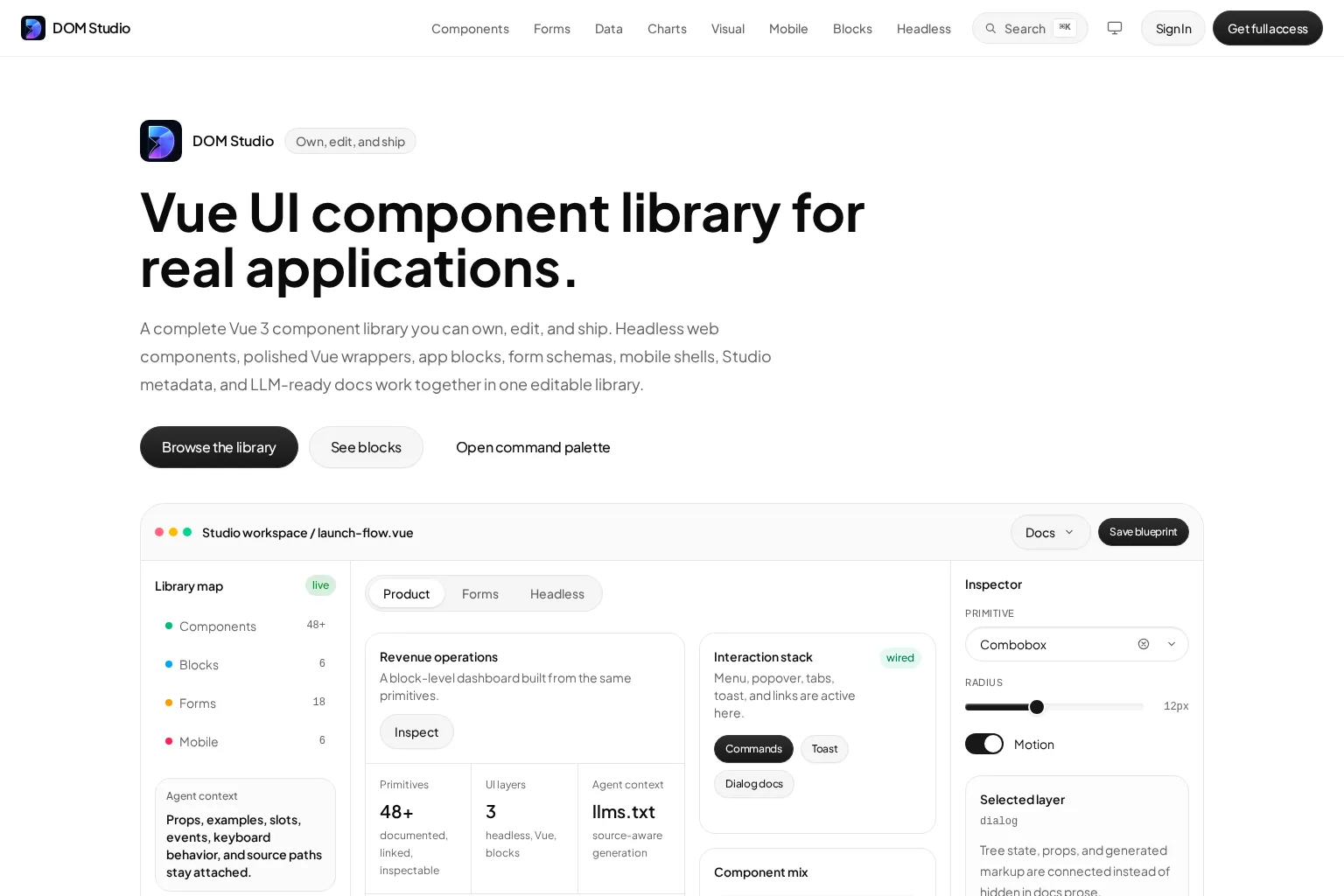
Best use case: Building configurable, production application interfaces where teams need more than isolated buttons and cards.
Key capabilities: DOM Studio provides documented primitives, Vue components, forms, mobile patterns, and application blocks. Its component metadata and live editing workflow make supported props, slots, examples, and source hints easier to inspect in context. We can explore the component playground when assessing how those controls map to a rendered interface.
Limitations: The strongest value comes from using its connected layers together. A team that only wants to copy a few presentational components into an existing design system may prefer a narrower source-copy or headless approach.
Pricing approach: Verify current plans directly with DOM Studio before committing. This comparison does not quote a price because no verified price is available for this article.
Who should choose it: Vue product teams building dashboards, workflow screens, schema-driven forms, or mobile application shells that benefit from editable component contracts and production-shaped composition. For a deeper evaluation checklist, see our guide to editable UI components.
2. shadcn-vue
shadcn-vue adapts the shadcn approach for Vue. It describes itself as accessible components plus a code distribution platform, with the component code available for teams to modify and extend.
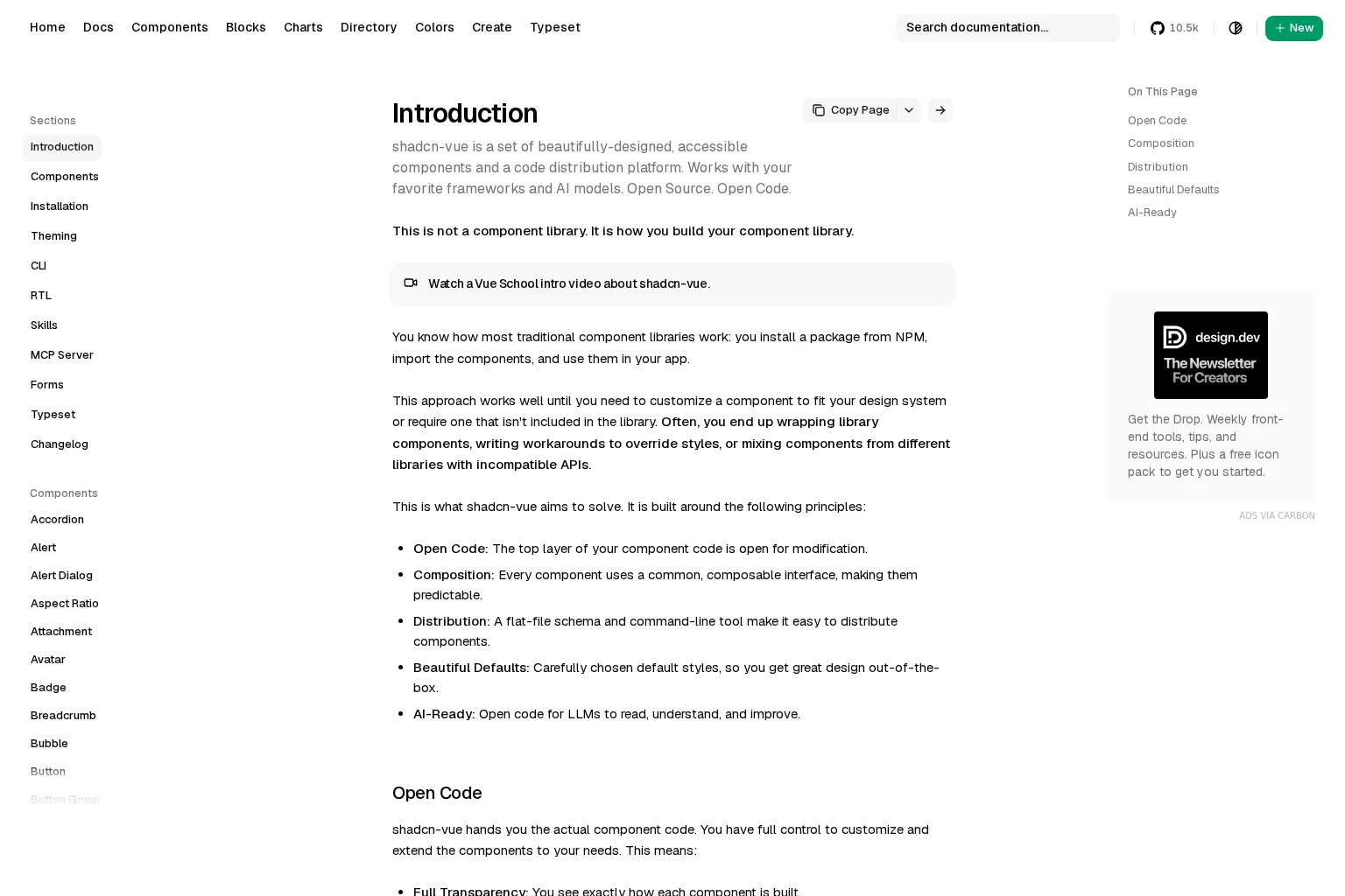
Best use case: Teams that want component source in their own repository and are prepared to establish the surrounding design-system conventions.
Key capabilities: Its open-code model supports direct implementation changes instead of forcing teams to work only through package-level APIs. It also provides a composable interface and a schema plus CLI approach for distributing components.
Limitations: Source ownership transfers responsibility with it. We still need to define documentation, form patterns, accessibility checks, composition rules, and an upgrade strategy for our own implementation.
Pricing approach: The official documentation describes shadcn-vue as open source and open code. We should still budget engineering time for adoption, customization, testing, and long-term maintenance.
Who should choose it: Vue teams with a mature design system or a firm policy that application components must live as editable local code.
3. Reka UI
Reka UI is an open-source Vue component library, formerly known as Radix Vue. It is positioned as a low-level foundation for accessible design systems and web applications.
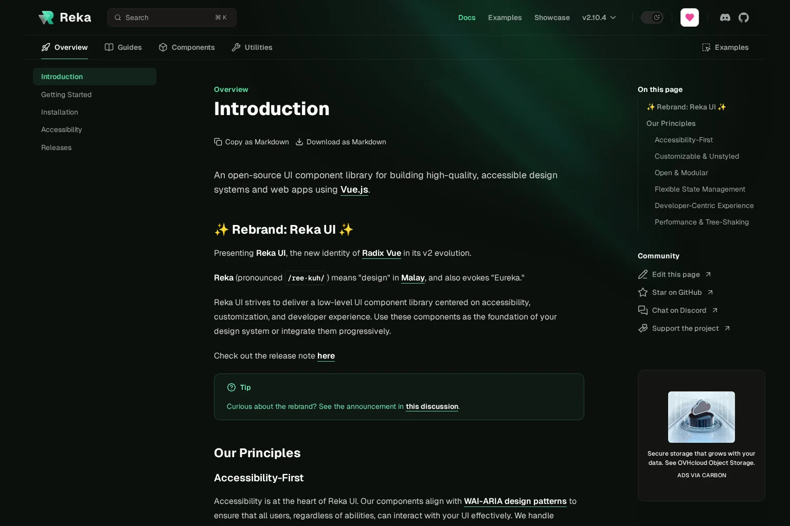
Best use case: Creating a custom Vue design system when we want unstyled primitives and detailed control over rendered structure.
Key capabilities: Reka UI is unstyled, modular, typed, and designed for progressive adoption. Its documentation describes accessibility support around ARIA attributes, keyboard navigation, and focus management, while allowing controlled or uncontrolled state when appropriate.
Limitations: It is intentionally a primitive layer, not a complete visual system or application-block library. We must supply the visual language, higher-level patterns, and product-specific composition ourselves.
Pricing approach: The official introduction describes Reka UI as open source. We should evaluate the engineering work required to create and maintain our styled layer rather than assuming the total cost is zero.
Who should choose it: Vue teams that view accessibility-oriented primitives as a foundation, have design-system capacity, and want styling freedom without committing to prebuilt visuals.
4. Ark UI
Ark UI is a headless component library built on Zag.js state machines. It supports Vue alongside React, Solid, and Svelte, making it useful when interaction behavior must travel across framework boundaries.
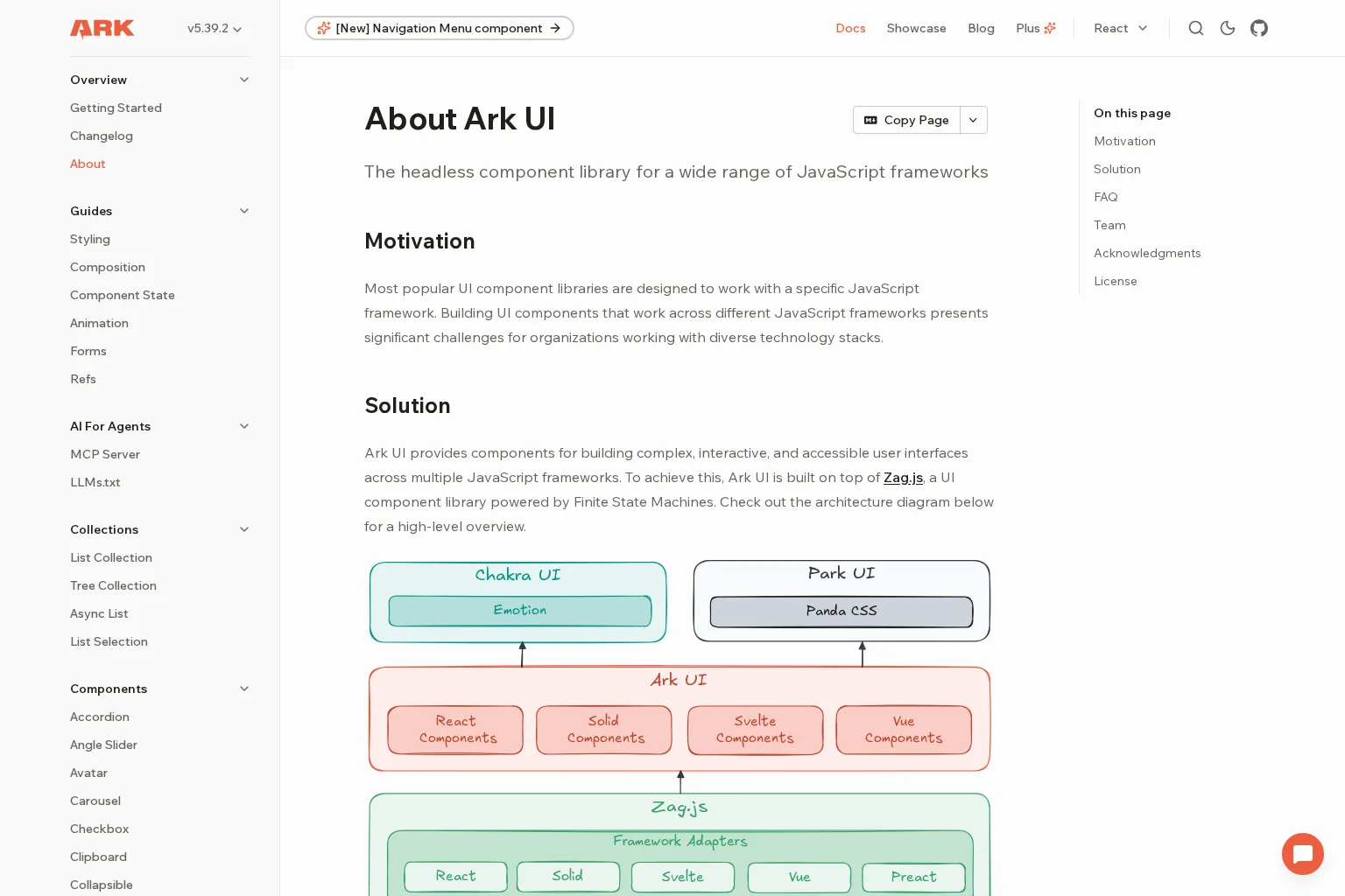
Best use case: Design-system teams that need accessible, complex interaction primitives in Vue and other JavaScript frameworks.
Key capabilities: Ark UI offers more than 40 headless components and uses framework adapters over shared finite-state-machine behavior. It supports custom styling rather than shipping a default visual language, so the design system retains control of the final UI.
Limitations: Multi-framework support does not remove implementation work. We still need to create a visual layer, establish Vue-facing composition patterns, and validate that our customizations meet the product’s accessibility requirements.
Pricing approach: Ark UI is licensed under MIT according to its official documentation. No plan or price is quoted in this comparison.
Who should choose it: Teams maintaining a shared component strategy across Vue and other supported frameworks, especially when consistent behavior matters more than ready-made app screens.
5. PrimeVue
PrimeVue is a Vue UI suite with a broad collection of packaged components. Its current site highlights a design-token system, typed APIs, tree-shaking, accessibility support, and more than 90 components.
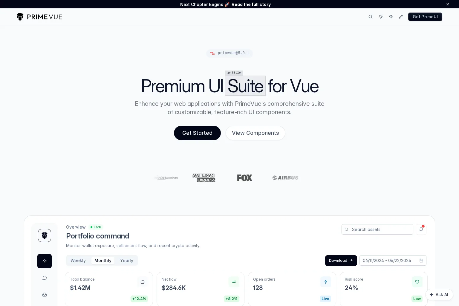
Best use case: Shipping feature-rich Vue interfaces quickly when broad component coverage and packaged defaults are the priority.
Key capabilities: PrimeVue provides a large component catalog, design-token customization, TypeScript support, and a workflow built around importing the components we need. It is a practical option for data-heavy applications that need established controls, dialogs, menus, and related UI pieces without building every primitive from scratch.
Limitations: We should test the extension boundary for the components that define our product experience. A package-first workflow can be efficient, but it is a different ownership model from copying and evolving source in our own repository.
Pricing approach: Verify current commercial terms, add-ons, and support options directly with PrimeVue. This comparison does not quote a price or package level.
Who should choose it: Vue teams that need a wide packaged toolkit soon and can standardize the visual tokens, wrappers, and customization conventions used across the application.
Compare the ownership model before comparing component counts
A component library decision gets clearer when we test the next change rather than the first demo. Build the same small product surface with each finalist: a validated form, an overlay, loading and error states, navigation, a data view, and one responsive breakpoint. Then ask which changes use documented props, slots, tokens, metadata, or source edits.
Use this practical sequence:
- Test a realistic form. Include server feedback, disabled states, conditional fields, and an asynchronous submit. Our Vue UI components guide explains why form behavior must be evaluated alongside visual components.
- Test a complex interaction. Use a dialog, combobox, menu, or command palette with keyboard navigation and focus behavior.
- Test a product screen. Assemble navigation, content density, empty states, and responsive behavior instead of judging components in isolation.
- Test a change boundary. Make a routine style or content change, then make one deeper structural change. Record whether the path is intentional and understandable.
- Test team discovery. Ask someone who did not build the pilot to find the intended component, understand its API, and add a supported variation.
No library removes the need to test the composed interface. Accessible primitives and documented APIs reduce repeated work, but labels, focus order, error messages, responsive layouts, and custom interactions still need product-level review.
Watch: understand the source-ownership model
This introductory shadcn UI video is useful for understanding the source-ownership model that informs many shadcn alternative decisions. It uses React rather than Vue, so we should treat it as a conceptual overview, not a Vue implementation guide.
Frequently asked questions
Is shadcn-vue the best shadcn alternative for Vue?
It is the closest choice when copied, editable component code is the main goal. It is not automatically the best option when we also need application blocks, visual inspection, structured forms, or multi-framework support.
Should we choose a headless library or a packaged suite?
Choose a headless library when your team has the capacity to own the visual system and wants maximum control over structure and styling. Choose a packaged suite when broad, ready-to-use coverage and a faster initial path matter more than direct source ownership.
Which option is best for editable Vue application interfaces?
We would start with DOM Studio when editable Vue components, metadata, forms, and application-level composition need to work together. Validate that fit by building one realistic product workflow, not only a component gallery.
How should we evaluate accessibility in a UI library?
Check the components that carry interaction complexity, then test the composed product flow with a keyboard and assistive technology. Review visible focus, accessible names, dialog dismissal, validation feedback, and navigation order after customization.
Can we mix these libraries?
We can, but do it intentionally. Mixing a headless primitive layer with a visual system can work well. Mixing overlapping dialogs, menus, form controls, and token systems without clear boundaries usually creates inconsistent APIs and maintenance work.
Choose the alternative that makes the next change safer
The best shadcn alternative is not necessarily the one with the largest catalog. It is the option whose ownership model matches how we build, customize, document, and test product interfaces.
If your team needs Vue primitives, editable component metadata, forms, and production-shaped blocks in one workflow, explore the DOM Studio form system and build a representative screen before standardizing on any UI foundation.