
Editable UI Components: What They Are and How to Choose Them
Editable UI components are reusable interface building blocks that we can adapt without rebuilding their behavior from scratch. In code, that usually means controlled changes through props, slots, tokens, component metadata, or editable source. In a visual environment, it can also mean selecting a component, changing approved properties, and seeing the result update immediately.
The important distinction is that editability is not the same as unlimited customization. A genuinely editable component preserves a dependable contract while giving us deliberate places to change presentation, content, data, and composition. That balance is what makes a UI system scalable.
Search results for this topic often mix editable Figma assets with coded component libraries. Both are useful, but they solve different problems. A Figma component helps us explore and communicate a design. An editable code component must also preserve runtime behavior, application state, accessibility, and maintainability after the design becomes a product.
Table of contents
- What makes a UI component editable?
- Editable does not mean unrestricted
- The component contract is the foundation
- Metadata makes components discoverable and editable
- A live inspector closes the gap between intent and output
- Which UI components benefit most from editability?
- Accessibility must travel with the component
- How editable code components compare with design kits and libraries
- How to evaluate editable UI components
- Build for the next change
- Video: Vue component foundations
What makes a UI component editable?
A component becomes editable when its authors make the important variation points explicit. We should be able to answer four questions before changing it:
- What can change? Examples include label, tone, size, loading state, options, validation rules, and layout density.
- How does it change? The interface may expose props, slots, design tokens, structured configuration, or source code.
- What must stay stable? Semantics, keyboard behavior, state flow, and required data constraints should not be accidentally removed by routine edits.
- Where is the source of truth? The edit should map back to understandable source, a saved UI specification, or both.
This produces a system with connected layers: the component implementation does the work, its API defines supported variation, metadata explains the intent, and an inspector or editor exposes safe controls. When these layers agree, teams can make changes quickly without treating every screen as a one-off.

Editable does not mean unrestricted
The most useful editable UI components are opinionated about the decisions they allow. A button may expose variant, size, loading, and label content, but it should not force every consumer to reproduce its internal markup or focus behavior. A dialog may allow a custom body through slots, while keeping its dismissal and focus-management rules intact.
We find it helpful to separate four levels of editing:
- Content editing: Change text, icons, images, options, or data.
- Configuration editing: Change known states such as size, visual role, validation, spacing, or responsive behavior.
- Composition editing: Arrange approved components into a form, panel, dashboard, or mobile shell.
- Source editing: Modify or vendor the component implementation when product requirements call for a deeper change.
A strong system supports the first three levels without making the fourth necessary for ordinary work. It also keeps source editing available when long-term ownership matters.
The component contract is the foundation
A coded UI component needs a compact, legible contract. In Vue, that contract commonly includes props for inputs, emitted events for user intent, and slots for deliberate structural extension. Vue requires props to be declared explicitly, and its one-way data flow keeps parent-owned state from being silently mutated by a child component.
For editable UI, this leads to a practical rule: expose product decisions as named controls, not as fragile implementation details. For example:
- A button can expose intent, size, loading, disabled state, and content.
- A form field can expose value, label, help text, validity, and input configuration.
- A data card can expose its data, display density, actions, and empty state.
- An application shell can expose navigation regions, responsive behavior, and page slots.
This is more sustainable than relying on deep CSS overrides or copied markup. If a team repeatedly needs an override, that is evidence that the component contract needs a new extension point.
Metadata makes components discoverable and editable
A useful component should not be a black box. Metadata gives a component a human name, description, prop guidance, slots, events, examples, navigation placement, and editor-specific hints. It turns the same code artifact into something that documentation, a component browser, a visual editor, and an AI-assisted workflow can understand consistently.
DOM Studio uses this source-local approach in its component specification. Component metadata can be inspected to build generated documentation and Studio controls, while custom documentation remains available for components that need deeper explanation. That allows us to start with normal Vue components, then add richer descriptions or constrained editor options as the system matures.
The value is not merely better documentation. When component names, valid props, and examples are discoverable, teams are less likely to invent duplicate patterns or edit a component in ways that violate its intended behavior.
A live inspector closes the gap between intent and output
A visual inspector becomes valuable when it edits the same contract the component uses at runtime. Rather than manipulating an unrelated mockup, we can select a rendered component, adjust supported controls, and review the actual interface in context.
DOM Studio’s component playground demonstrates this model with selectable component layers and live property editing. It can infer basic editor controls from component props, then use declared configuration to offer richer, more constrained controls where they help. Its Studio workflow also supports building layout trees and rendering them back through a shared renderer.
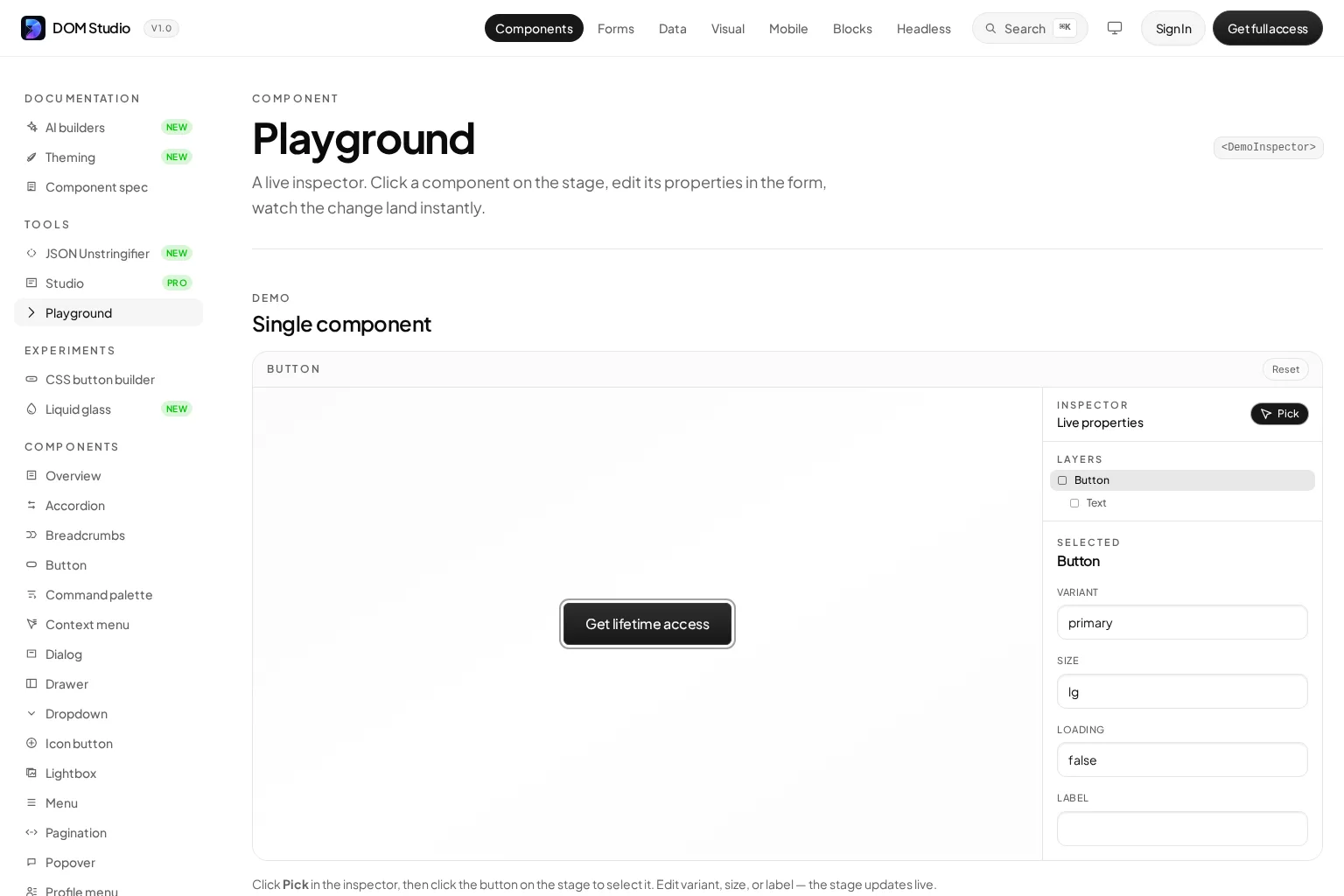
That feedback loop is particularly useful for product teams working on dense application interfaces. A designer or product engineer can validate a label, spacing choice, state, or hierarchy in context, while developers retain a clear mapping to component APIs and source.
Which UI components benefit most from editability?
Almost any component can expose useful configuration, but the biggest payoff usually comes from components that recur across screens or carry complex behavior.
Forms and data-entry controls
Forms often need labels, help text, validation, option lists, defaults, and domain-specific rules. Editable configuration is valuable when the component can adapt to a structured field definition without losing predictable data handling. DOM Studio’s form system is designed around fields, schema adapters, validation, and generated form layouts, which is a strong fit for configurable product workflows.
Overlays and navigation
Dialogs, popovers, menus, command palettes, tabs, and navigation shells often look simple until we account for focus movement, keyboard use, dismissal, and state changes. These are good candidates for controlled editability because their behavior should stay consistent even while content and styling vary.
Product blocks and page composition
Dashboards, onboarding flows, inboxes, settings areas, and mobile shells benefit from editable composition. We can adapt a working application pattern to a product domain rather than reassemble every screen from isolated controls. DOM Studio combines headless elements, Vue wrappers, form tools, mobile shells, and application blocks in its component library, giving teams layers to use at the right level of abstraction.
Accessibility must travel with the component
Editable controls cannot make accessibility optional. When we change a component, the semantic role, accessible name, visible focus treatment, and keyboard interaction still need to match the job the component performs. The W3C ARIA Authoring Practices Guide provides patterns and functional examples for common widgets, including the keyboard support and accessibility semantics they require.
This is one reason we should prefer editing approved properties over copying a component into a new implementation. A constrained inspector can protect important behavior. It can also make accessibility-relevant choices visible, such as label text, disabled state, error messaging, or whether an action opens another context.
We should still test the composed interface. A component can be well designed in isolation and become confusing when it is placed in a poor heading structure, given an unclear label, or combined with an inaccessible custom interaction.
How editable code components compare with design kits and libraries
Different tools address different points in the UI workflow:
- Figma component libraries and UI kits are excellent for layout exploration, collaboration, and visual consistency. Their editable instances do not automatically create production behavior.
- Prebuilt libraries such as Material UI provide a broad collection of coded controls and strong defaults, but the degree of source ownership and visual editing varies by library.
- Headless libraries provide behavior and accessibility-oriented primitives with little or no visual design. They maximize styling freedom but shift more composition work to our team.
- Source-owned systems such as DOM Studio aim to combine reusable behavior, application-ready building blocks, and editable source or metadata-driven controls.
There is no universal winner. We should choose based on the product surface we are building, the amount of ownership we need, and whether our team benefits more from visual editing, detailed APIs, or production-shaped blocks.
How to evaluate editable UI components
Before adopting a system, we recommend reviewing a few representative components, not only its marketing gallery. Use this checklist:
- Behavior: Do dialogs, menus, forms, and navigation handle real interaction states well?
- Editing model: Can we change common product decisions through documented props, tokens, metadata, or inspectors?
- Constraints: Does the system prevent invalid or unsupported combinations where possible?
- Source ownership: Can we inspect, copy, vendor, or modify the implementation when requirements outgrow defaults?
- Documentation: Are props, events, slots, examples, and component relationships easy to find?
- Composition: Does the library help us build complete application surfaces, not only isolated demos?
- Accessibility: Are semantics, keyboard behavior, focus handling, and names treated as part of the component contract?
- Team fit: Will the system work for developers, designers, and AI-assisted workflows without creating a separate, drifting inventory?
A useful test is to take one realistic screen, such as a settings page or admin form, and see how many changes require a fork. The right editable component system lets us make common changes intentionally, while making deeper changes understandable.
Build for the next change
Editable UI components are not about giving every user a limitless set of knobs. They are about making the right changes safe, visible, and durable. When component source, API contracts, metadata, live previews, and accessible behavior work together, we can move faster without trading away consistency.
If we need editable Vue and Web Component building blocks for real product interfaces, DOM Studio is designed to let us own, inspect, adapt, and ship the system. Start by exploring a primitive or application block, then use the available metadata and examples to shape it around the workflows our product actually needs.
Video: Vue component foundations
This independent Vue course is a useful companion for teams that want a refresher on components, props, events, and slots before evaluating an editable component architecture.