
Vue UI components are reusable interface units that combine markup, behavior, and an API into building blocks for an application. For production work, however, a component library must do more than offer buttons and cards. It should help us compose accessible interactions, manage real form state, create application layouts, and keep the implementation understandable enough to adapt over time.
Vue’s component model makes this approach natural: components can encapsulate UI and logic, accept props, emit events, and nest into a tree of larger product surfaces. The practical question is not simply which components a library includes. It is whether those components give our team a dependable system for shipping and evolving a real product.
Table of contents
What are Vue UI components?
A Vue UI component is a reusable Vue component that represents a piece of an interface, such as a button, dialog, select, data view, or application navigation area. In a typical Vue application, we author components as Single-File Components, then import and compose them where they are needed.
The best components establish a clear contract:
-
Props configure finite variations, such as size, tone, loading state, or an array of options.
-
Events communicate user intent, such as submission, selection, dismissal, or value changes.
-
Slots provide deliberate escape hatches when callers need to supply their own content or sub-layout.
-
Defaults and semantic markup make the common case quick without preventing careful customization.
A component is not automatically useful because it is reusable. Its API needs to be predictable enough that a team can use it consistently across many screens.
The three layers of a production Vue UI system
We recommend evaluating Vue UI components as a connected system rather than a flat catalog. Most production interfaces need three complementary layers.
-
Interaction primitives handle difficult behaviors such as focus movement, keyboard interaction, dismissal, positioning, and ARIA patterns.
-
Vue components provide an ergonomic API and visual surface that fits the application.
-
Application blocks combine components into recognizable product patterns, including dashboards, settings pages, onboarding flows, and navigation shells.
A library with only styled controls can still leave us rebuilding the hard interactions. A library with only low-level primitives can make every product screen feel like a fresh assembly project. Blocks are not a replacement for components, but they shorten the path from a reliable primitive to a useful screen.

This layered view also clarifies ownership. We can replace visual styling without rewriting dialog behavior, or customize a block while preserving the components that make its interactions consistent.
A component API should make the right customization easy
A strong Vue component is opinionated about common behavior and flexible at intentional extension points. The goal is not to expose every CSS property or implementation detail. It is to give consumers a small API that maps to real product decisions.
For example, a button might offer a variant, size, loading, and disabled prop, plus a default slot for its label. A form field might support v-model, a label, validation state, help text, and prefix or suffix slots. These boundaries help us change an interface without forking the underlying component.
We should favor props for stable behavioral choices and slots for meaningful structural variation. Recreating the internal DOM of a component through ad hoc overrides is usually a warning sign that the component contract needs refinement.
Vue gives us the building blocks for this style of API design. Explicit prop declarations document what a component accepts, while typed props and emitted events make intended use clearer for both people and tooling.
What production-ready Vue UI components need
When a component moves beyond a prototype, visual polish is only one part of the requirement. We look for these characteristics:
Reliable interaction behavior
Menus, popovers, dialogs, comboboxes, tabs, and toasts involve more than styling. They need sensible focus behavior, keyboard support, dismiss controls, and predictable state transitions. It is more sustainable to reuse tested interaction primitives than to repeatedly recreate these details in feature code.
Consistent customization
Theme tokens, class hooks, and variant props should allow visual adaptation without producing a separate implementation for every screen. The aim is controlled variation, not unlimited freedom that erodes consistency.
Form support that matches application data
Production forms often need validation, nested values, server feedback, generated fields, and integration with application state. DOM Studio’s form system illustrates this broader responsibility: named fields register with a form provider, and its documented adapters can turn Zod-like or JSON Schema definitions into renderable field records.
This is useful when the same data shape must support hand-authored fields today and schema-driven interfaces later. It also keeps the distinction clear between a field definition and the values a user enters.

Composition for complete screens
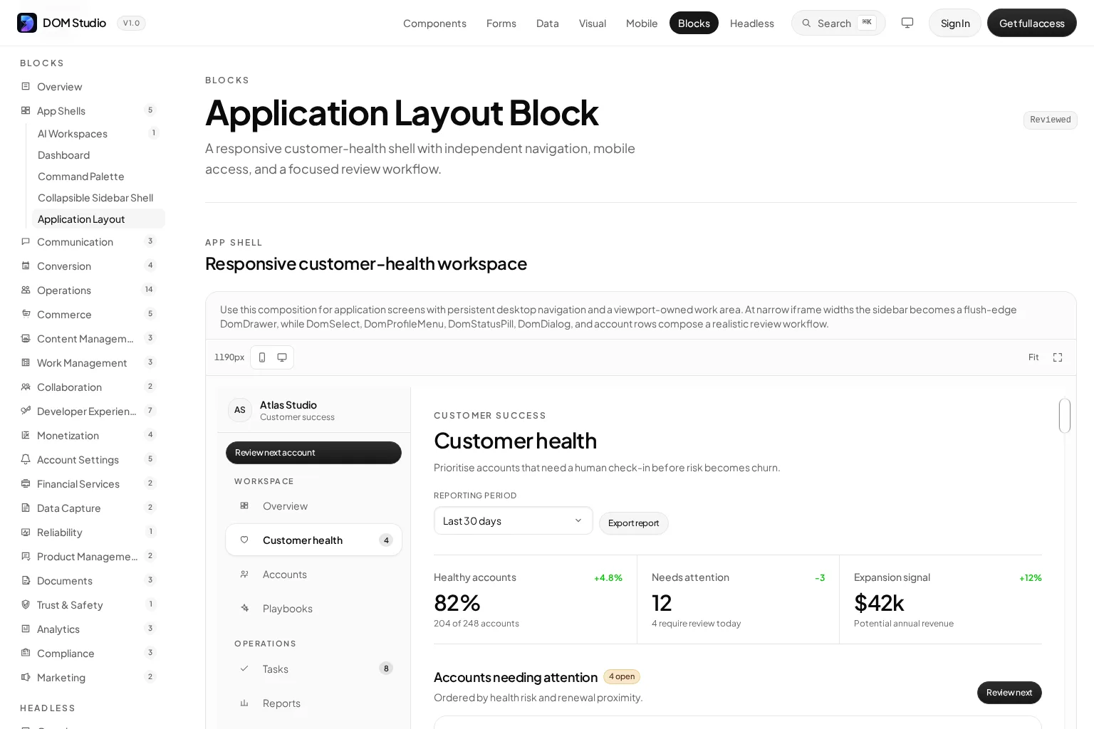
A dashboard, inbox, mobile shell, or account settings view should not force a team to start from a blank canvas. Production-shaped blocks give us a working composition to inspect and adapt. For example, DOM Studio’s application layout block demonstrates a persistent navigation area alongside a separately scrolling work panel, a common pattern in business applications.
Why metadata matters for editable and AI-assisted UI
Component metadata is often treated as documentation work that happens after the component is built. We see it as part of the component contract.
Metadata can describe a component’s human label, props, slots, events, examples, navigation placement, and visual editor settings. When it lives close to the Vue component, the same information can serve documentation, a component palette, a playground, and inspection tools.
DOM Studio’s component metadata specification describes this source-local approach. Its auto-documenter can inspect Vue props and metadata to generate a playground, prop reference, slot and event details, and a navigation entry, while a bespoke documentation page remains optional when a component needs deeper guidance.
That model has a practical benefit: a component can remain discoverable and editable without maintaining a separate, drifting inventory. It also gives AI-assisted workflows a more reliable vocabulary. Instead of asking an assistant to invent markup for a familiar interaction, we can guide it toward known components, documented props, examples, and design tokens.

For AI-assisted UI generation, metadata is helpful but it is not magic. Clear examples, constrained prop values, and explicit validation remain essential. A tool should still check for invalid component names, missing required props, unsupported children, overflow, contrast, and other implementation risks before a generated interface reaches users.
A real application block is a better test than an isolated demo
We can learn a lot from a button demo, but a product UI system proves itself when components work together under realistic constraints. Look for examples with navigation, responsive behavior, dense information, forms, feedback, and repeated actions.
The DOM Studio application layout below is one example of a production-shaped composition: it brings a persistent left rail, workspace controls, metrics, and a detailed content area into one responsive pattern. Examining a complete block helps us assess spacing, hierarchy, component interoperability, and how readily the source can be adapted to a product’s own domain.
How to choose Vue UI components for your team
There is no universal best Vue UI library. Nuxt UI, Vuetify, PrimeVue, and shadcn-vue represent different approaches to theming, component ownership, defaults, and composition. The appropriate choice depends on the job we need the system to do.
Use these questions to narrow the field:
-
Do we need application interfaces or primarily marketing pages? Data-dense apps need stronger coverage of overlays, navigation, forms, feedback, and responsive shells.
-
How much ownership do we need? If product requirements regularly outgrow defaults, editable source and understandable internals may matter more than a large preset catalog.
-
Where should accessibility behavior live? Prefer a system that makes robust interactions a reusable foundation instead of a feature-by-feature obligation.
-
Will forms be simple or schema-driven? Teams building admin tools, onboarding, or configurable workflows benefit from components that can work with structured field definitions and validation.
-
Can developers discover the intended pattern? Documentation, examples, prop references, and component metadata reduce duplicate solutions and fragile overrides.
-
Will AI tools contribute to the codebase? Favor stable component names, concise examples, semantic tokens, and component contracts that can be checked.
The keyword here is coherence. A smaller component set with clear composition rules can be more valuable than an enormous catalog that does not fit the way the product is built.
Common misunderstandings about Vue component libraries
“More components always means a better library”
Breadth is helpful only when component quality and relationships remain consistent. A focused system with dependable dialogs, inputs, navigation, and blocks can cover more of an application than a larger but disconnected inventory.
“Headless components eliminate design work”
Headless primitives solve behavioral concerns, not product decisions. We still need to define visual hierarchy, density, responsive patterns, empty states, and domain-specific workflows.
“Editable means unstructured”
Editable components should have clearer boundaries, not weaker ones. Props, slots, tokens, and source-local documentation let teams customize deliberately while keeping the system recognizable.
“AI can choose the right component without guidance”
AI output improves when the available choices are compact and well documented. Canonical examples and validated component specs are safer than asking a model to synthesize every interaction from raw HTML and CSS.
Build components for the next change
The lasting value of Vue UI components is not that they save a few lines of markup today. It is that they reduce the cost and risk of the next product change. When interaction primitives, Vue wrappers, form tools, metadata, and application blocks share a coherent contract, we can move from a component choice to a maintainable application interface with less reinvention.
If your team wants editable Vue UI components built for real product surfaces, explore the DOM Studio component library. Start with a primitive or a production-shaped block, inspect the source and metadata, then adapt the system to the workflows your application actually needs.
Video: Vue component foundations
For a broader refresher on Vue fundamentals, including component structure, props, forms, and events, this independent Vue.js crash course is a useful companion resource.