
TL;DR
An inline message is short feedback placed beside the control, action, or content it explains. Use it for local guidance, validation, and status, not as a substitute for every notification. We recommend defining its scope first, choosing its meaning second, and deciding its announcement behavior separately. Keep the next action clear, connect field feedback programmatically, and avoid adding messages when the interface already communicates the outcome.
A settings screen can tell us that something went wrong without telling us where. A red notice at the top says “Unable to save,” while the problem sits inside one permission setting halfway down the page.
An inline message closes that gap. It puts the explanation where someone can use it.
For design-system teams, the challenge is making that relationship consistent across fields, cards, table rows, and responsive layouts. We need more than four colored variants: we need rules for scope, content, timing, and accessibility.
Table of contents
- What is an inline message?
- Choose the meaning before the appearance
- Place the message where its scope is clear
- Write messages that explain the next step
- Make the relationship accessible, not just visible
- Document a small, inspectable message contract
- Review an inline message as an interaction
- FAQ
- Put the explanation beside the decision
- Sources
- Recommended Reads
What is an inline message?
An inline message is a contextual explanation presented within the normal content flow, near the interface element or action it describes. It can explain a limitation, report a result, warn about a consequence, or help someone correct an error. Primer’s notification guidance similarly distinguishes feedback near an action from broader page or section messaging.
“Inline” describes the relationship to the interface. It does not require the message to sit on the same horizontal line as a control.
The boundaries matter:
| Pattern | Main job | Example |
|---|---|---|
| Helper text | Explain a requirement before a problem occurs | “Use the email address you check at work.” |
| Field-level validation | Explain why one value needs correction | “Enter an email address.” |
| Contextual inline status | Report something about a local object or action | “Changes saved to this workspace.” |
| Page-level alert | Communicate an issue affecting the page or a broad task | “The service is temporarily unavailable.” |
| Toast | Present brief feedback away from the affected content | “Link copied.” |
These are useful distinctions, not universal component names. Newskit reserves its Inline Message for contextual information and directs single-input assistance to assistive text. Primer includes individual field validation within its inline-message pattern.
We should therefore document both the pattern and the component that implements it. A field error can be inline feedback without requiring a standalone component named InlineMessage.
Choose the meaning before the appearance
We use four meanings as a practical starting vocabulary. Treat the examples below as suggested product copy, not mandatory labels or library API values.
| Meaning | Use it when | Example message |
|---|---|---|
| Information | Someone needs context to make a decision | “Only workspace owners can change this setting.” |
| Success | An action completed, but its outcome would otherwise be unclear | “Invitation sent to alex@example.com.” |
| Warning | A potential consequence deserves attention before proceeding | “Changing the time zone will move existing scheduled times.” |
| Error | An action failed or a value needs correction | “Upload failed. Choose a file smaller than 10 MB.” |
The distinction between warning and error is operational. Can the person continue, and what happens if they do? Do not choose amber merely because a red message feels too severe.
Likewise, reserve success feedback for uncertainty that actually needs resolving. Primer recommends using success messaging sparingly when the updated interface already makes completion apparent. Removing unnecessary visual confirmation does not remove the need to communicate relevant state to assistive technology. See its success-messaging guidance.
Sometimes no additional message is the right choice. If editing a title returns someone to the visibly updated title, another confirmation may add little. If saving happens in the background with no obvious result, a nearby saved state can be useful.
Place the message where its scope is clear
We begin placement reviews with one question: What exactly does this message describe?
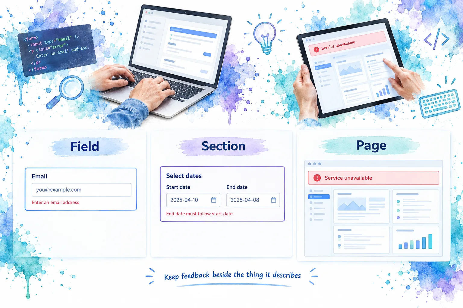
For a single field, keep feedback inside the field’s visual group. For a pair of related controls, put the shared explanation with the group. For a row-specific failure, keep the explanation and recovery action with that row.
A page-wide failure needs a broader surface. Repeating “Service unavailable” beneath every input makes a system problem look like multiple input mistakes. Primer’s placement guidance likewise connects message prominence and position to the affected action, section, or page.
Keep the reading order understandable
A useful default for field feedback is label, necessary hint, control, then error or status. The precise arrangement can vary, but the relationship should remain obvious when someone reads the page in order.
Do not hide essential requirements until validation fails. W3C’s form-instructions guidance explains how labels and associated instructions provide the context needed to complete a field. Placeholder text is not a replacement for that label and disappears as someone types.
When several fields fail after submission, combine local explanations with an overall error summary. The summary helps people locate the problems; the inline messages explain each correction. W3C recommends summaries that identify the affected controls, explain the issue, and link to the relevant fields in its form-notification tutorial.
Preserve the relationship on smaller screens
We recommend letting messages wrap naturally rather than truncating them or forcing every variant onto one line. A message beside a desktop control may need to move below it on a narrow screen.
Review long translations, enlarged text, and feedback containing links. Keep any recovery action close enough that it cannot be mistaken for another row’s action.
Reserve space only when it makes the layout more predictable. Empty message containers beneath every untouched field can create excessive gaps; uncontrolled insertion can push a button away during interaction. Test the transition, not just the finished screenshot.
Write messages that explain the next step
Our preferred content model is simple: describe the relevant outcome or constraint, then give the next action when one is needed.
Avoid “Invalid value” when the interface knows the specific requirement. Avoid blaming people for server failures. W3C’s notification tutorial calls for understandable errors and clear correction instructions.
Consider these examples:
- Validation: Replace “Invalid date” with “Enter a date in MM/DD/YYYY format.” Keep the format requirement visible before submission too.
- Shared constraint: Replace “Date error” with “Choose an end date after the start date.” Place it with the date group.
- Permission guidance: Replace “Not allowed” with “Ask a workspace owner to change this setting.”
- Local failure: Replace “Something went wrong” with “We couldn’t save this row. Try again.” Include a nearby retry action if retry is supported.
- Confirmed completion: Replace “Success!” with “Invitation sent to alex@example.com.”
These examples assume the stated requirements and actions are true for the product. Do not promise a retry, preserved draft, or delivery outcome unless the system actually supports it.
Keep essential recovery instructions visible. A link can explain an unusual restriction, but users should not need to open documentation to discover which field is wrong.
Make the relationship accessible, not just visible
Visual proximity is only one part of the contract. We also need a programmatic association, appropriate announcements, and readable presentation.
Associate field feedback with its control
For custom validation, use a programmatic relationship between the input and its error text. W3C documents aria-describedby for that association and aria-invalid="true" for a field that has failed validation. Do not mark untouched fields invalid before validation occurs. Update the invalid state when the failure is resolved. See W3C’s ARIA21 technique.
Keep the visible label meaningful. An error explains a problem; it does not replace the field’s name. If a hint remains necessary to correct the value, retain that information rather than replacing it with a vague error.
Our review question is concrete: when someone reaches the control with a screen reader, can they identify the field, understand its current problem, and find the correction?
Separate message tone from announcement urgency
A red visual treatment does not automatically require an interruptive announcement. An informational message is not automatically silent either.
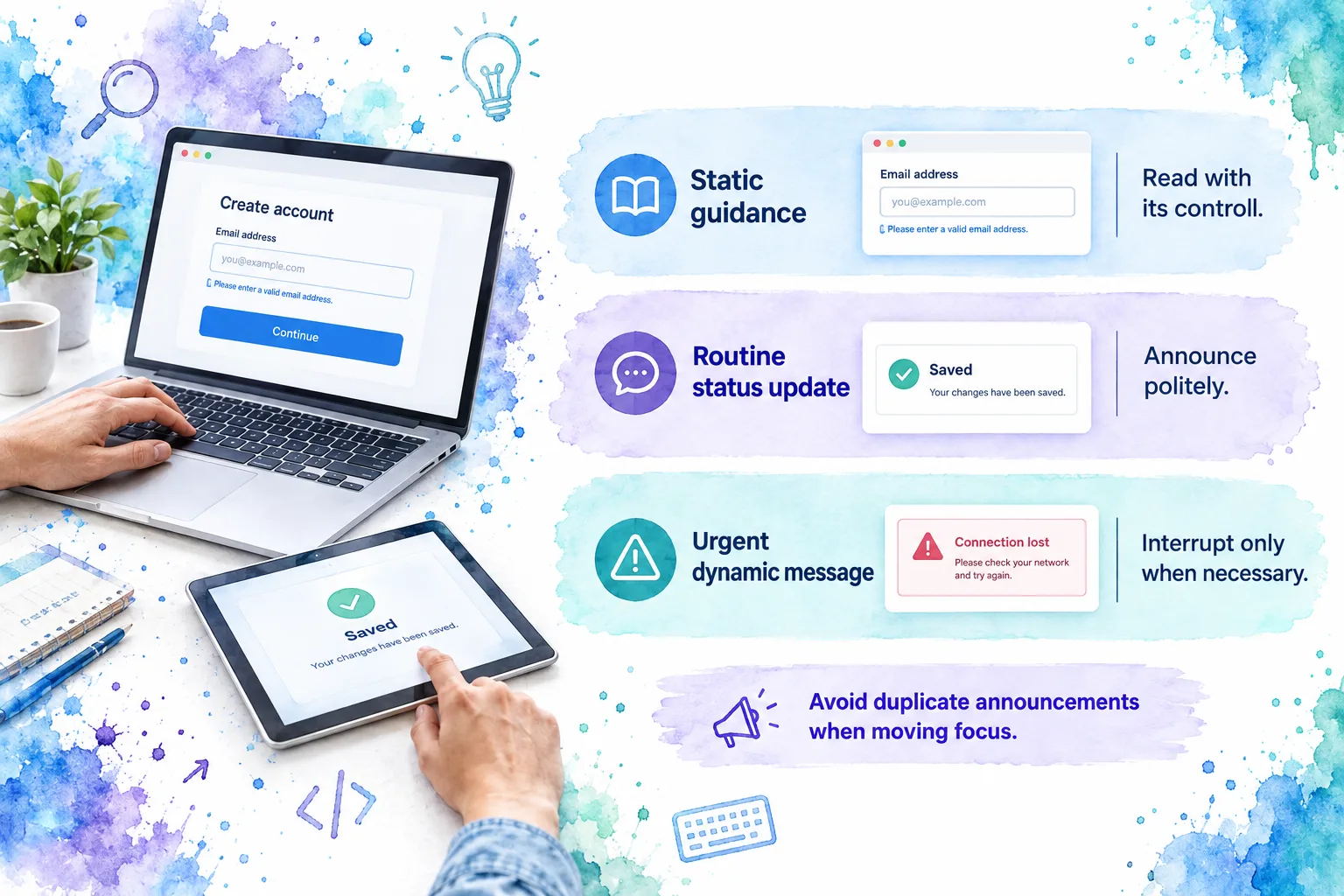
For routine dynamic status, such as a completed save that does not move focus, role="status" provides a polite live-region mechanism. W3C’s ARIA22 technique specifies that the status container should exist before the update occurs. It also discusses making the complete contextual message available, rather than announcing an isolated number or fragment.
Reserve assertive announcements, including role="alert", for important, time-sensitive changes. W3C’s Status Messages guidance warns against unnecessarily chatty interfaces and distinguishes status updates from changes that already take focus.
We recommend these defaults:
- Static instructions: make them available with the associated control, without announcing them repeatedly.
- Routine background completion: provide a concise, contextual status announcement without moving focus.
- Urgent dynamic failure: choose an appropriately prominent announcement and a clear recovery path.
- Submit-time errors: coordinate the summary, focus destination, and announcements so the same error is not spoken several times.
Do not communicate through color alone
Pair the visual treatment with meaningful text. Icons can reinforce the distinction, but a red border or green checkmark should not be the entire explanation. That follows W3C’s Use of Color criterion.
For ordinary-size message text, WCAG’s minimum contrast requirement is 4.5:1 against its background. Large text has a 3:1 threshold. Check the actual message surface, including tinted backgrounds and interactive links, using W3C’s contrast guidance.
W3C’s short video below illustrates why understandable feedback matters. An accessible transcript and explanation are also available.
Document a small, inspectable message contract
A variant gallery shows what messages look like. It does not explain when to use them or how they behave.
We recommend recording the following decisions alongside the component examples:
| Contract area | What to record |
|---|---|
| Purpose and scope | Field, group, object, action, or broader section |
| Meaning | Supported semantic variants and their intended use |
| Content | Whether a title is optional, wording guidance, and supported recovery actions |
| Relationships | Which control or group the message describes |
| Timing | What triggers the message, updates it, and clears it |
| Announcements | Static, polite update, or urgent announcement, with the expected focus behavior |
| Layout | Spacing, icon alignment, wrapping, and narrow-screen behavior |
| Evidence | Canonical examples, relevant tests, owner, and source-file reference |
Keep semantic tone, visibility timing, and announcement behavior as separate decisions, even if a component exposes convenient defaults. A “warning” option should not quietly determine the entire focus policy.
For asynchronous checks, document which value or action the response belongs to. A delayed “available” message must not remain attached to a newer value that has not been checked.
Our design-system metadata guide provides a broader framework for recording public behavior, examples, accessibility expectations, and source relationships. Here, keep that documentation focused on the message contract rather than introducing another metadata architecture.
Review an inline message as an interaction
Before approving a component or product usage, we check:
- Scope: Can someone identify exactly which field, group, object, or action the message describes?
- Necessity: Does the message answer a question the surrounding interface leaves open?
- Timing: Does it avoid presenting an unfinished value as an error prematurely?
- Recovery: Does the text explain what to change or what happens next?
- Association: Is field feedback programmatically connected to the correct control?
- Announcements: Are important updates available without repeated or unnecessary interruptions?
- Presentation: Are meaning, contrast, spacing, and icons consistent across variants?
- Resilience: Do wrapping, enlarged text, long translations, and delayed responses preserve the intended relationship?
- Lifecycle: Does the message clear or change when the underlying condition changes?
Include keyboard and screen-reader checks in the review. A static component preview cannot demonstrate whether a live update arrives at the right time or whether moving focus causes duplicate feedback.
FAQ
Should inline validation happen while someone types?
Not always. W3C’s form-notification tutorial distinguishes useful instant feedback, such as availability checks, from formatted values that may be better checked after leaving the field. We recommend choosing timing by the task and rechecking on submission, rather than applying one trigger to every control.
Should an inline error disappear automatically?
We recommend keeping it available while the problem remains relevant. Clear or replace it when the condition changes, not because an arbitrary timer expires. If a local failure still needs recovery, a disappearing message can leave the interface without an explanation.
Can an inline message replace an error summary?
It serves a different purpose. Local feedback explains a particular correction; a summary helps someone discover multiple errors across a form. For a longer form, use both when necessary, with summary links leading to the affected controls rather than a generic instruction to “check the form.”
Put the explanation beside the decision
A useful inline message makes three things clear: what it describes, what happened, and what someone can do next. Accessibility and lifecycle behavior belong in that same design decision, not in a later styling pass.
Start with one real screen: identify each message’s scope, remove redundant feedback, and test one failure through correction. If your team is mapping feedback into a shared field system, use our form architecture reference as the next point of reference.
Sources
- Primer: Notification messaging
- Newskit: Inline message
- W3C WAI: User Notification
- W3C WAI: Form Instructions
- W3C: ARIA21, indicating an error field
- W3C: ARIA22, presenting status messages
- W3C: Understanding Status Messages
- W3C: Understanding Use of Color
- W3C: Understanding Contrast (Minimum)
- W3C WAI: Notifications and Feedback video and transcript
- DOM Studio: Design System Metadata