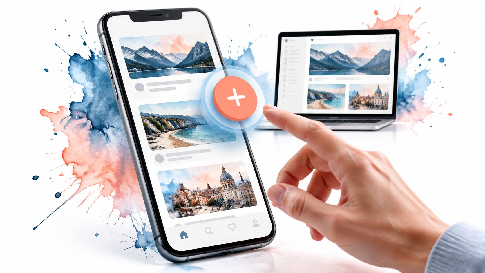
You’ve added a floating button to a busy screen. It looks right in the design file, but on a phone it covers the final list item. With a keyboard, it’s awkward to reach. Then you open its secondary actions and realise nobody has specified where focus should go when they close.
A floating action button is a small component with a substantial interaction contract. Its value depends on whether people can understand, reach and recover from its actions, not whether the circle looks polished. Sometimes the best implementation is a labelled button that doesn’t float.
Table of Contents
- What a Floating Action Button Is and Why It Exists
- When a Floating Button Fits and When to Choose Something Else
- Sizing, Placement and Responsive Behaviour
- Motion, Scroll Behaviour and Reduced Motion
- How to Build an Accessible Floating Action Button
- Handling Expanded, Disabled and Error States
- Headless and Vue Tailwind Implementation Patterns
- Pre-Ship Test and Common Mistakes
What a Floating Action Button Is and Why It Exists
A floating action button, or FAB, is a circular, usually icon-led button that sits above page content and represents the screen’s primary action. Treat it as a stateful control with a contract: it can be enabled, disabled, expanded, loading or wrong for the job, and each state needs the same discipline as any other button.
A toolbar button belongs to a visible group of controls. A FAB sits apart from that structure and usually holds position while the page scrolls beneath it. The action stays available, but the control loses the nearby labels, errors and context that explain what will happen next. On zoomed or reflowed screens that separation gets worse, because the button can cover the very content the user is checking.

Floating changes presentation, not purpose
The Government Project Delivery button guidance recommends concise labels, generally below five words, for actions such as starting processes, confirming decisions and saving progress. Use the same test for a FAB: opening a composer is an action, visiting account settings is navigation, and persistent placement should not disguise a destination as a command.
Visual prominence is both the advantage and the risk. It can make a frequent task easier to find, and it can also pull attention away from reading, validation or a more important decision. If the action needs explanation, belongs to a form, or has consequences that need review, an inline labelled control is usually clearer.
Selection test: There should be a dominant action, a frequent need for it and a name that makes sense without explaining the icon.
Apply that test before choosing artwork. A plus symbol might mean create a folder, upload a file or invite a colleague. Decide which result the user expects, where focus returns after the action, and whether the button still earns its place at high zoom.
When a Floating Button Fits and When to Choose Something Else
| Scenario | Floating button? | Better alternative |
|---|---|---|
| Single create or compose action in a phone feed | Yes | Inline button in the header on desktop |
| Destructive action such as delete | No | Labelled button with a confirmation step |
| Settings or navigation destination | No | Visible navigation item with a text label |
| Several related actions | Only as an expandable group | Toolbar of labelled buttons |
| Long form with a save action | Rarely | Sticky footer save button |
| Dense desktop workspace | Usually no | Inline toolbar button |
Read these verdicts against task frequency, screen size, pointer type and reversibility. A frequent, reversible create action is a stronger candidate than an occasional command with serious consequences. An expandable group is defensible when its actions belong together, not when the team needs somewhere to hide unrelated features.
According to Ofcom’s Online Nation report, smartphones accounted for 77% of UK online adults’ daily online time in 2025, while 49.1 million UK adults accessed the internet through smartphones, tablets or computers during May 2025. Mobile deserves careful attention, but that doesn’t justify carrying a phone-oriented control unchanged onto every screen.
Change the action model with the layout
A fixed button that clears a phone feed can cover a desktop table’s row actions. At increased zoom, it can collide with sticky navigation or sit over a focused field. Mouse users don’t need a control positioned for thumb reach, while keyboard users need a sensible document order.
The practical question is when the button should disappear, become inline or move into a toolbar. On a spacious workspace, the page header may provide a clearer home. In a form, the save action should remain connected to the fields and their validation messages.
If an action becomes irrelevant in a particular view, remove it there. If it remains essential, change its presentation rather than making the circle smaller.
Responsive design should adapt how the action is presented, not merely resize its container.
Avoid separate mobile and desktop controls that both remain focusable. Prefer a shared control whose layout changes, or ensure that only the active presentation is exposed to users and assistive technology.
Before adding a FAB, ask:
- Frequency: How often will someone need this action while reading or scrolling?
- Recovery: Can an accidental activation be undone?
- Obstruction: Does the control hide anything when browser zoom constrains the layout?
If those answers aren’t convincing, start with an inline button. You can justify floating it later with task-based testing.
Sizing, Placement and Responsive Behaviour
| Variant | Diameter | Typical use |
|---|---|---|
| Standard | Primary-action size token | Default single primary action |
| Mini | Compact token with a separately verified interactive target | Dense layouts and secondary contexts |
| Large | Emphasis token that preserves content clearance | Tablets and key emphasis |
| Extended | Consistent height, width fits the label | Action needs a visible text label |
Choose sizes from your component system, then test the rendered target. Variant names don’t establish usability, and a compact visual circle doesn’t have to define the entire clickable area. Avoid treating a larger screen as an automatic reason to enlarge the button.
The NHS Design System’s button guidance explains that mobile buttons stretch across the screen because that makes them easier to press for people holding a phone in the right hand. A floating circle trades away that width and can make an unfamiliar action harder to interpret, particularly for people with motor, visual or cognitive impairments.
Place it against the real viewport
Bottom-right placement is a convention, not a requirement. Account for the home indicator, browser controls, bottom navigation and on-screen keyboard. Use safe-area-aware offsets, and reserve enough scrollable space for the final content item to clear the overlay.
Choose layout transitions from actual collisions rather than device labels. The guide to media query breakpoints helps frame where a floating action should become an inline control. When a support launcher shares the corner, the chat widget icon tips from FOMOchat offer useful context for reviewing competing icons and their presentation.
Finish with these checks:
- Content clearance: Inspect the final list item at the largest supported text setting.
- Focus clearance: Tab through nearby controls and check that their indicators remain visible.
- Error clearance: Trigger validation messages near the viewport edge.
- Target usability: Test the actual interactive area with touch, not just the visible SVG.
- Overlay collisions: Open toasts, drawers and floating controls together.
A layout that works only when every other surface is closed isn’t ready to ship.
Motion, Scroll Behaviour and Reduced Motion
Motion should clarify an interaction without delaying access to it. A restrained entrance can distinguish a newly available action, but repeated sliding whenever reactive content updates makes the control distracting.
Separate availability from animation
Track whether the control is available, whether it’s visually shown and whether its secondary actions are expanded. Combining those concerns into an animation flag makes it easy to leave invisible controls focusable or remove a focused trigger unexpectedly.
Use this sequence:
- Introduce the control subtly. If an entrance effect adds value, use a short fade or restrained slide with an ease-out curve. Keep the action usable without waiting for decorative movement to finish.
- Make scroll behaviour predictable. Hiding during downward scrolling and restoring on upward scrolling can reduce obstruction, but essential actions still need a discoverable route when the FAB is hidden.
- Let focus override hiding. Keep the trigger and its expanded group visible while either contains keyboard focus. Scroll direction must never remove the user’s current interaction point.
- Expand coherent content. Reveal related actions together, with their labels and semantic state synchronised. Don’t make keyboard access depend on staggered animation callbacks.
The CSS slide animation guide can help with the visual effect. Keep the visibility and focus logic independent of that effect so disabling animation doesn’t break the control.
Respect reduced motion without losing state
Use prefers-reduced-motion: reduce to remove sliding, scaling and staggered movement. An instant state change is often the clearest alternative; an opacity change can also work if it doesn’t delay interaction.
An invisible button that still receives keyboard focus is a hidden control, not a useful reveal pattern.
Remember that visibility: hidden removes a control from sequential keyboard navigation. Don’t expect a hidden button to reappear because someone tabs into it. Provide a deliberate restoration mechanism or retain an inline route to the same action.
Enable reduced motion in the operating system, reload the page and exercise scrolling, expansion and dismissal. Confirm that movement isn’t necessary to understand the available actions and that visible focus survives every transition.
How to Build an Accessible Floating Action Button
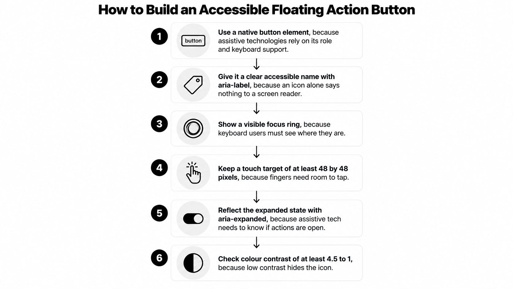
The UK Government accessibility manual states that public-sector websites and mobile applications must meet WCAG 2.2 AA and recommends semantic HTML. Build the interaction contract before adding the floating wrapper, shadow or animation.
Establish the button contract
-
Use a native button element. Assistive technologies depend on a recognised role and predictable interaction model, so render a
<button type="button">rather than a clickable<div>. The explicit type prevents accidental form submission when the component is placed inside a form. -
Give the action a meaningful accessible name. An icon describes appearance, not necessarily intent, so name the result with text such as Create message rather than Plus button or Button at bottom right. Use visible text when the design allows it, otherwise provide
aria-label, and hide decorative SVG content from assistive technology to avoid duplicate announcements. -
Preserve Enter and Space activation. Keyboard users expect native button behaviour, so let the element handle activation instead of layering unnecessary key handlers over its click event. Custom handlers can trigger an action twice or interfere with Space behaviour, particularly when developers implement both keydown and click logic.
Make the surrounding interaction predictable
-
Keep focus visible and logically ordered. Keyboard users need to recognise the active control against both its surface and the surrounding content, so apply a distinct
:focus-visibletreatment that isn’t clipped by the wrapper. Position the button logically in the document and avoid positivetabindexvalues that create a separate, surprising navigation order. -
Connect the trigger to the content it opens. A disclosure, action menu and modal dialog need different keyboard behaviour, so choose the interaction before adding ARIA attributes. Synchronise
aria-expandedandaria-controlsfor an expandable action group, use the appropriate popup and dialog relationships where applicable, and restore focus to the trigger when dismissal would otherwise leave it stranded. -
Provide a conventional alternative to gestures. Some users operate interfaces without swiping, dragging or long-pressing, so expose a normal button for any action otherwise available through a gesture. Make that route part of the normal interface rather than a separate, reduced-capability experience for switch-access or screen-reader users.
The button with icon guide is useful when arranging the visible label and decorative graphic. A tooltip can supplement an icon button for sighted users, but essential instructions shouldn’t depend on hovering or discovering a long press.
A healthy result is straightforward: a keyboard user reaches the action in a sensible sequence, activates it, understands the opened content and dismisses it predictably. A screen reader announces the action name and relevant state without needing any reference to the button’s screen position.
Handling Expanded, Disabled and Error States
| State | What the user sees | What assistive technology exposes | Test |
|---|---|---|---|
| Collapsed | Primary icon only | Action name and collapsed state for an expandable trigger | Tab in, Enter opens |
| Expanded | Close icon and labelled secondary actions | Expanded state and each action name | Escape closes and returns focus |
| Disabled | Prefer an enabled explanatory control with a reason shown | Action name and reason | Reason remains readable when enlarged |
| Loading | Spinner with the label kept | Single progress announcement | No repeated announcements |
| Error | Message beside the button | Error message announced | Focus moves appropriately or message is announced |
| Permission denied | Explanation instead of silence | Reason as text | Screen reader reads the reason |
Collapsed and expanded presentations must agree with the programmatic state. If the trigger becomes a close control, its accessible name should describe that behaviour, and each secondary action needs visible text. Don’t expose an expanded state before its content is available.
The GOV.UK button guidance advises avoiding disabled buttons unless research shows they help users understand the interface, warns against colour-only communication, and specifies a minimum 4.5:1 contrast ratio for button foreground and background colours. Prefer a discoverable explanation of what’s missing rather than a faded button that does nothing.
Keep feedback useful
During loading, retain the action’s identity and prevent duplicate requests without repeatedly announcing progress. Don’t replace the accessible name with changing spinner text. Announce completion or failure through a suitable status message.
An error needs a recovery path: retry the request, correct a field or restore a connection. Move focus when that helps someone act on the problem; otherwise, announce the message without interrupting their current position. If permission is denied, explain the restriction rather than removing the control after activation.
Use the correct focus model
Escape should dismiss transient expanded content and restore focus appropriately. A plain disclosure containing buttons can use normal Tab navigation through the group and onward through the page. A true action menu needs menu-style keyboard handling; a modal dialog needs its own contained focus sequence.
Don’t trap Tab inside a non-modal cluster because its buttons are visually grouped. That turns a shortcut into an obstacle.
Test every state using keyboard-only navigation, a screen reader, enlarged layouts and touch. Record the announcement, focus destination and recovery path. A screenshot showing the correct spinner or warning colour doesn’t prove that the interaction works.
Headless and Vue Tailwind Implementation Patterns
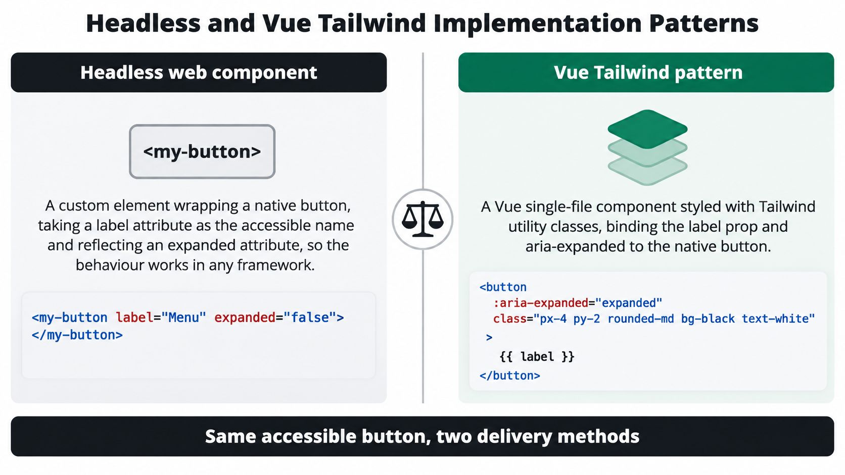
Start with a native button inside a positioning wrapper. The wrapper handles placement and responsive layout; the button handles activation and exposes its name and state. Expanded content needs a stable relationship with that trigger.
A minimal headless custom element
An illustrative API is <dom-fab label='Create message' expanded controls='message-actions'></dom-fab>. This describes a custom element you could implement, not a claim that a library exports that tag. Its label attribute supplies the inner native button’s accessible name, while the presence of expanded maps to aria-expanded="true".
Observe attribute changes so the host and internal button stay synchronised. Treat Boolean attributes by presence rather than string truthiness, and keep request handling in the application rather than embedding task-specific behaviour in the primitive.
If the button lives inside a shadow root, verify the accessibility relationship with any externally rendered popup. Don’t assume an identifier reference crosses a component boundary correctly merely because both nodes appear in the browser inspector.
A controlled Vue component
An illustrative Vue wrapper is <FabButton label='Create message' :expanded='open' controls='message-actions' @click='open = !open' />. Accept the label and expanded state as props, expose an icon slot and emit activation to the parent. Keep open as the source of truth rather than creating an unrelated internal expanded ref.
On the native button, bind :aria-expanded to the expanded prop and :aria-controls to the popup identifier. A direct action that opens no expandable content should omit those attributes entirely.
Use Tailwind utilities for presentation: rounded-full, shadow-lg, a distinct focus-visible ring and fixed positioning when the layout warrants it. Apply project sizing tokens, safe-area-aware offsets and a breakpoint that returns the wrapper to normal flow. Utility classes can cover the presentation without a separate component stylesheet, but they don’t implement the keyboard contract.
Choose the ownership boundary
The headless element centralises behaviour across frameworks. A Vue wrapper offers reactive props and slots for teams already building in Vue, with application state managed through familiar bindings.
- Primitive responsibility: Native semantics, state reflection, event behaviour and the chosen focus contract.
- Wrapper responsibility: Prop forwarding, slots, styling and integration with framework state.
- Application responsibility: Permissions, network requests, confirmation flows and recovery messages.
Either implementation must survive keyboard, zoom and screen-reader testing before adoption. Shared code reduces duplication; it doesn’t validate a floating placement in every page that consumes it.
Pre-Ship Test and Common Mistakes
A familiar shape isn’t evidence of an accessible interaction. The See Me Please review of UK accessibility monitoring reports that a Government Digital Service review of 1,151 public-sector websites found only 10 with no identified accessibility issues. Test the complete state sequence rather than approving the default appearance.
Run a failure-focused routine
- Focus-return mistake: Open the secondary actions with the keyboard, activate a command and dismiss the group with Escape. Record where focus lands after each route.
- Icon-name mistake: Listen without looking at the screen. Reject an announcement that identifies only the symbol or its position.
- Overlay-obstruction mistake: Enlarge narrow and wide layouts, then inspect the final list item, form errors and focused controls beneath the overlay.
- Touch-only mistake: Complete the action without gestures. Test the interactive target on a physical device rather than relying only on the SVG dimensions.
- Colour-only mistake: Review warning, loading and failure presentations without depending on colour. Add meaningful text or another understandable cue where needed.
- Action-contract mistake: Check that navigation remains navigation, destructive changes have suitable confirmation and unavailable actions explain the restriction.
Keep, move or replace
Keep the floating action button when its states work across the intended inputs and layouts. Move it inline when overlay obstruction persists or desktop users have a clearer contextual home for it. Replace it with a labelled button when the consequences need more explanation before activation.
The @getdom/studio package includes a DomButton component you can adapt, but the library choice doesn’t settle the product decision. Log the failing state, viewport, input method and expected behaviour so another developer can reproduce the issue.
DOM Studio offers headless web component primitives, Vue integration and Tailwind styling for building consistent interfaces. Visit DOM Studio to explore a button foundation for your action, then validate its floating placement, expanded behaviour and recovery states in your application.