
You’ve added a drawer to a production interface. It opens, but it feels late. The panel shifts the page while moving, the close button becomes difficult to reach, and users who prefer reduced motion get the same full-distance entrance as everyone else. The CSS is only a few lines, yet the behaviour is a system problem rather than a visual one.
A reliable CSS animation slide has three contracts. It must communicate a state change, stay smooth on real devices, and remain usable when motion is reduced or removed. Animation technologies appear on 16.6% of UK websites, with Lottie holding a 36% share within that category, followed by Animate.css at 29.1% and Animate On Scroll at 16.9%, according to the UK animation technology dataset. Motion is common enough that users expect it, but polished motion still needs disciplined implementation.
Table of Contents
- What a CSS Slide Animation Is Really Doing
- Building Your First Slide with Keyframes
- Picking Timing Functions and Duration
- Keyframes vs Transitions for Slide Effects
- Performance Rules That Keep Slides Smooth
- Accessible Slide Motion and Reduced Fallbacks
- Pre-Ship Checklist for Slide Animations
What a CSS Slide Animation Is Really Doing
A filter drawer usually starts outside the viewport, travels into the application, and stops beside the content it controls. Before writing a selector, name the three decisions that define the behaviour:
- Trigger: What starts the motion? A button toggling an open class, a focus state, a route change, or an intersection with the viewport?
- Distance: How far does the element travel? A panel often uses its own width with
translateX(-100%), while a compact toast might use a smaller relative offset. - Timing: How long does the movement take, and how does it accelerate and settle?
Naming these choices prevents random adjustments to transform values until the result happens to look acceptable in one browser. It also gives the component a clear state contract. You know which class opens it, whether the closed state remains mounted, and which position counts as the final resting state.
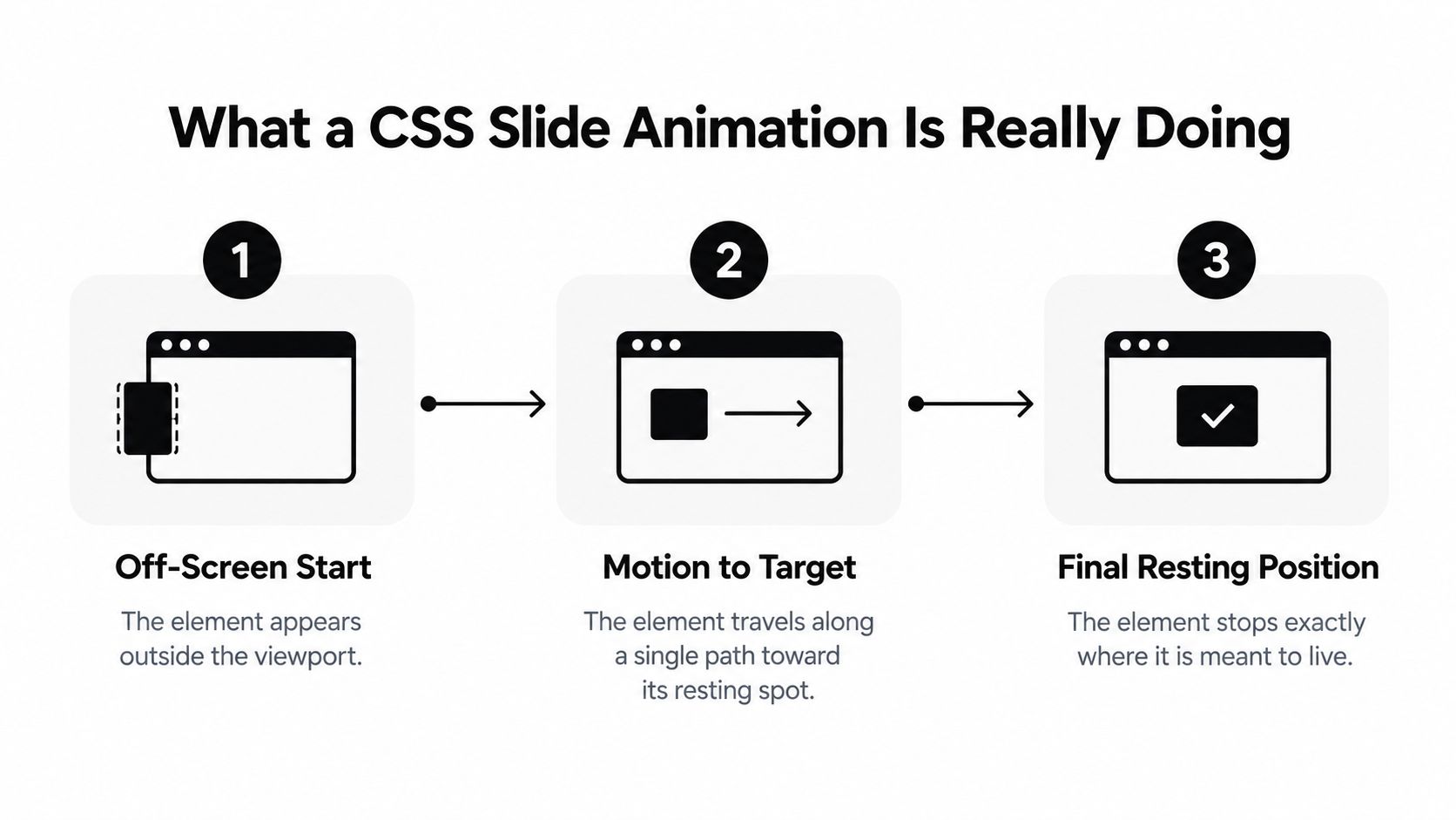
A slide isn’t automatically useful because it moves. It should help someone understand that a drawer has appeared, that navigation has changed, or that a notification belongs to an action they just took. Good motion reinforces a state transition. Decorative motion competing with the primary task usually adds noise.
The resting position matters as much as the entrance. If the panel is visually in place but remains translated, receives focus while hidden, or keeps intercepting pointer input, the animation has exposed a state-management bug. Keep visual state and interaction state aligned.
For related layout techniques, see how to hide overflow without creating unwanted scrolling. For a broader design perspective on perceived speed with motion design, the useful takeaway is that a considered transition can make a state change easier to follow, but it can’t compensate for a slow action or unclear interface.
Building Your First Slide with Keyframes
Start with a button that controls an aside. The panel needs a meaningful accessible name, an open state, and a relationship to its trigger. The visual class should describe the state rather than hide the only copy of the content.
A minimal structure might use <button aria-controls="filters" aria-expanded="false">Filters</button> followed by <aside id="filters" class="panel" hidden>. In a real drawer, JavaScript should update aria-expanded, manage hidden at the correct point, and move focus into the panel when it opens.
For the visual recipe, use transform and opacity. The closed rule can contain opacity: 0 and transform: translateX(-100%). The entry class then applies animation-name: slide-in, an appropriate duration, an easing function, and animation-fill-mode: both. The keyframes need only two meaningful stops:
- Start:
opacity: 0; transform: translateX(-100%); - End:
opacity: 1; transform: translateX(0);
That arrangement lets the panel travel from just outside its own edge to its resting position without changing the document’s layout. animation-fill-mode: both holds the initial state before the animation starts and preserves the final state after it ends.

Avoid adding extra keyframe stops just to make the motion look polished. A simple from and to pair is easier to debug, reverse, and test with different content sizes. If you need a different direction, change the transform axis or sign rather than rebuilding the entire component.
A class toggle is a straightforward trigger. A :focus-within selector can work for small, self-contained disclosure patterns, but it isn’t a replacement for proper dialog behaviour when the panel needs focus trapping, escape handling, backdrop dismissal, or scroll locking.
This short demonstration shows the core keyframe pattern in context:
Don’t animate left, top, width, height, or margin to create the travel. Those properties can force layout work across the page. A panel that changes size during entry may also move surrounding content, which makes the interface feel unstable even when the animation itself appears attractive.
Picking Timing Functions and Duration
A drawer that snaps open feels mechanical; one that eases into place feels deliberate. Choose the timing function based on how the component moves and what the user needs to understand. linear keeps the same speed throughout, which suits continuous indicators better than a one-shot drawer entrance. For a panel that enters and settles, ease-out is a reliable starting point because it slows near the destination.
The generic ease curve works as a balanced default. A custom curve such as cubic-bezier(0.2, 0.8, 0.2, 1) produces a quicker response without overshoot, but test it against the actual component. A curve that feels crisp on a compact notification can feel abrupt on a wide navigation drawer. Travel distance, panel size, and the interruption cost for the user all affect the result.
Duration should support comprehension without making the interface wait. A short interface transition commonly sits around 200–500ms, a range referenced in web.dev’s animation performance guidance. A longer journey may need more time to remain legible, while navigation and controls should remain usable without forcing users to wait for the effect to finish.
| Timing Function | Best For | Typical Duration |
|---|---|---|
linear |
Continuous indicators and uniform looping motion | Short, when movement communicates ongoing progress |
ease-out |
Drawer entrances, menus, dialogs, and toasts | Around 200–500ms for ordinary interface motion |
ease-in |
Exits where the element should leave decisively | Usually shorter than the entrance |
cubic-bezier(...) |
A tuned product interaction with a defined character | Test against the component’s travel distance |
Reduced motion is a separate timing contract, not a request to shorten the same animation. With the system preference enabled, show the panel directly in its final position or use only a minimal opacity change. The user’s preference takes precedence over the designer’s chosen curve, and the open and close states must remain understandable without travel.
Keyframes vs Transitions for Slide Effects
The practical dividing line is state complexity. A drawer that changes from closed to open has two states, so a transition usually expresses the intent more clearly. A hero carousel, staggered entrance, or auto-playing loading rail has a sequence, and keyframes give that sequence a single home.
| State Difference | Animation Rules | Best For |
|---|---|---|
| Two states, such as closed and open | transition: transform ..., opacity ... |
Drawers, menus, toasts, focus states, and hover feedback |
| Several intermediate states | @keyframes with explicit stops |
Staggered lists, staged entrances, and sequenced reveals |
| Repeating movement | @keyframes with an iteration rule |
Loading indicators and continuous decorative motion |
| Appear-on-mount without a state swap | @keyframes attached to an entry class |
Content that arrives as part of rendering |
Transitions win for most state-driven slide effects because the browser already understands the start and end values. Add an open class, and the panel moves. Remove it, and the same rule reverses the movement. The code stays close to the state model, which makes close behaviour easier to inspect.
Keyframes are better when the animation needs delays, multiple stops, or a controlled sequence. They also handle an initial entrance neatly, because the entry class can define the complete run. The cost is extra rule structure and more care when you need to reverse or retrigger the animation.
Practical rule: choose a transition unless you specifically need sequencing, looping, or an entrance that must run independently of a state transition.
A common mistake is using keyframes for a simple open and close, then discovering that the close path needs a second animation or a JavaScript restart. Conversely, forcing a staggered list through several class swaps creates timing logic that belongs in keyframes. Pick the primitive that matches the state model, not the one that happens to appear first in a code search.
Performance Rules That Keep Slides Smooth
A production slide should move as a visual layer, not force the document to rebuild itself on every frame. Keep the animated properties to transform and, when it improves the result, opacity. Layout or paint work can still dominate the cost, so the property choice is only the starting point.
A tempting implementation changes left while transitioning width. That combination makes the browser recalculate the panel’s geometry and may reposition neighbouring content throughout the movement. Keep the panel’s layout fixed instead. Use transform: translateX(...) for the movement, then add opacity only when the fade supports the interaction.
The trade-off becomes visible on busy pages and slower mobile hardware. A width-changing drawer can make siblings relayout and compete for main-thread time. A transform-based drawer can move independently of the surrounding document, but large shadows, filters, and other paint-heavy effects may still make each frame expensive.
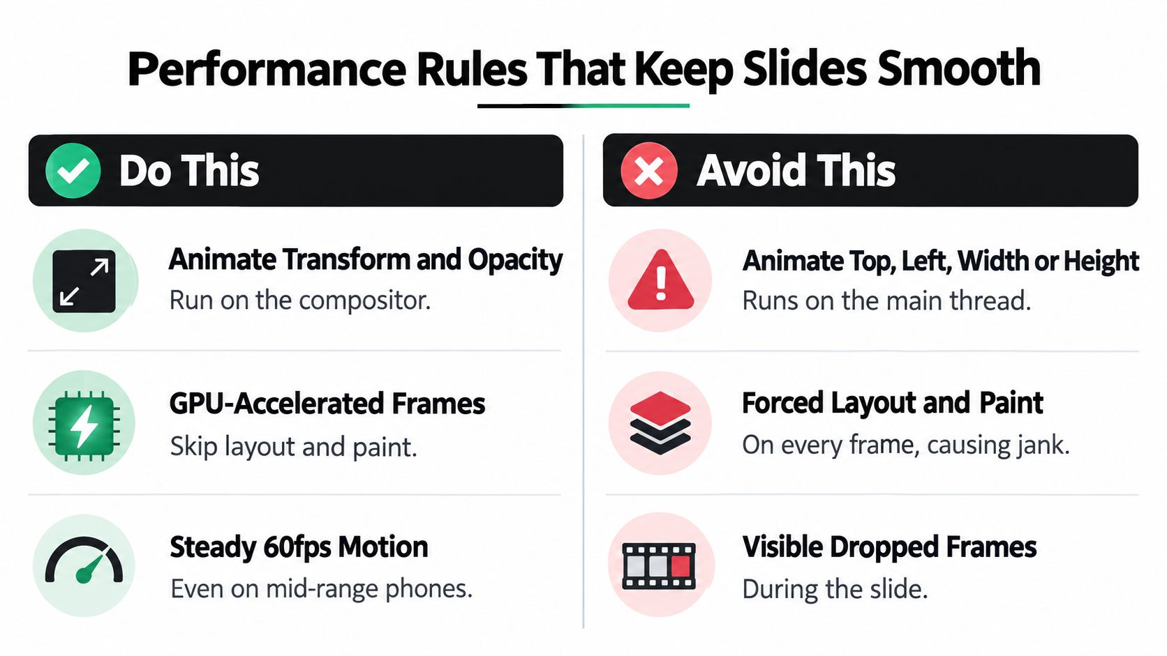
Use performance hints with a specific reason:
- Prefer
transform:translateX()andtranslateY()express movement without changing layout geometry. - Treat
will-changeas temporary: Applywill-change: transformnear an active animation and remove it after the motion ends. Permanent layer promotion consumes memory. - Measure before adding tricks:
translate3d()andtranslateZ(0)can affect compositing, but profiling should decide whether they help. - Watch expensive effects:
box-shadow, blur, and filters can trigger paint work. Keep them out of a slide until testing shows the target device handles them. - Isolate large panels where appropriate:
contain: layoutorcontain: paintcan limit the spread of layout and paint work. Check clipping and stacking behaviour before shipping.
Profile on slower hardware and with surrounding page activity enabled, not only on an idle development machine. DevTools should reveal whether unrelated content is being recalculated, whether paint dominates, and whether the animation remains stable under real interaction.
For implementation guidance, consult this performance optimisation guide for front-end interfaces. A fast slide is a small system: its CSS properties, effects, containment, and testing conditions must work together.
Accessible Slide Motion and Reduced Fallbacks
Accessibility belongs in the slide specification. The panel needs to work when motion is removed, when a keyboard user opens it, and when assistive technology announces its state. A visual entrance is not a substitute for aria-expanded, an accessible name, focus management, or a usable close control.
Scope motion to users who haven’t requested reduced movement. The animated rule can sit inside @media (prefers-reduced-motion: no-preference), while the reduced rule removes both animation and transition and sets the component directly to its visible state. In practice, the fallback includes animation: none, transition: none, and transform: none for an open panel, with opacity set to the final value.
A useful contract looks like this in prose before it becomes CSS:
- Motion preference: users with reduced motion see the panel without a travelling entrance.
- Keyboard access: focus enters the opened panel in a logical place and returns to the trigger when it closes.
- State communication: text, labels, and ARIA state communicate what changed without relying on movement.
- Attention control: automatically moving content can be paused, stopped, or hidden when it runs beyond the limits described by UK accessibility guidance.
The UK Public Sector Bodies Accessibility Regulations guidance ties public-sector services to WCAG 2.1 AA. It says animation should generally be limited to five seconds, moving content should have a way to pause, stop, or hide, and flashing content should not exceed three flashes per second. Those requirements are especially relevant to carousels, automatically appearing alerts, and onboarding sequences, not just decorative drawers.
For persistent motion, expose a real pause or stop button. Bind it to the animation state, give it an accessible name, and make sure it remains reachable while the animation is running. If a shortcut exists, document it visibly and avoid making the shortcut the only way to control motion.
Interaction-triggered motion also needs a non-motion path. UK-focused guidance recommends using prefers-reduced-motion and testing with assistive technologies such as NVDA or JAWS, as described in this UK animation accessibility guidance. Test the panel with a keyboard, a screen reader, zoom, touch input, and reduced-motion enabled. Check that focus doesn’t land behind the backdrop and that important information remains understandable when the slide is removed.
Pre-Ship Checklist for Slide Animations
A production slide animation should pass three tests together: its visual rule, state model, and accessibility fallback must agree. Review the pull request as a release gate, not as a screenshot check.
- Property check: Pass when movement uses
transformand, where useful,opacity. Fail whentop,left,width,height, or margin drives the travel and forces unnecessary layout work. - Timing check: Pass when the duration feels responsive for the control and stays within the 200–500ms range used for simple interface motion. Fail when a routine drawer makes users wait.
- Easing check: Pass when entrances settle with an ease-out character and exits finish cleanly. Fail when
linearmakes a one-shot panel feel mechanical or an exit drags behind the user’s action. - Reduced-motion check: Pass when
prefers-reduced-motion: reduceremoves the travel while keeping the content available. Fail when the panel remains hidden because visibility depends on the animation. - Focus check: Pass when opening places focus inside the panel and closing returns it to the trigger. Fail when keyboard users reach obscured content or lose their place.
- Interaction check: Pass when Escape, backdrop dismissal, close controls, scrolling, and touch input work without waiting for a transition event. Fail when animation completion is the only path to a usable state.
- Profiling check: Pass when DevTools shows compositor-friendly movement with no avoidable layout or paint work. Fail when shadows, filters, or geometry changes consume the available frame time.
- Device check: Pass when the motion remains smooth on slower phones while the surrounding application is active. Fail when it works only on an idle desktop.
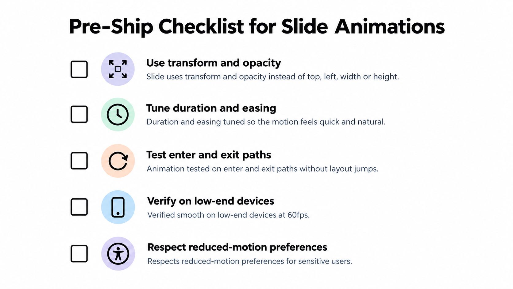
The reliable CSS animation slide is deliberately uneventful. It changes one visual layer, leaves layout stable, respects the user’s motion preference, and keeps focus and state correct before, during, and after movement.
DOM Studio provides drawers and slide-out panels with backdrop dismissal, drag dismissal, scroll locking, focus trapping, framework-agnostic primitives, and Vue integration. Teams standardising production panels can evaluate those components against their own keyboard, reduced-motion, and performance checks at DOM Studio.