
You’ve set overflow: hidden on a card because a badge is spilling outside its border. The badge disappears, but the dropdown inside the card is now clipped, keyboard focus moves into content nobody can see, and a mobile drawer starts behaving like a nested scroll area. The CSS fix worked visually, yet the component became less predictable.
The core challenge behind CSS hide overflow is this. The property is simple, but its side effects reach into accessibility, scrolling, positioning, layout, and interaction design. Production code needs a clearer question than “how do I hide this?” Ask instead: should this content be clipped, scrollable, visually hidden, or removed from the interface altogether?
Table of Contents
- Understanding The Core Overflow Properties
- Meet overflow: clip The Modern Alternative
- Styling Scrollbars and Managing Mobile Overscroll
- Accessible Patterns for Visually Hiding Content
- Preventing Overflow with Modern Layout Techniques
- Troubleshooting Common Overflow Scenarios
Understanding The Core Overflow Properties
The overflow property controls what happens when an element’s content exceeds its padding box. Its four familiar values are useful, but they represent different interaction contracts.

visiblelets content paint outside the element. It’s the initial behaviour and often the right choice for badges, tooltips, and decorative effects that must escape a component boundary.hiddenclips content at the element’s edge. It removes visible spill, but it doesn’t make the content inert or unreachable.scrollcreates scrolling mechanisms even when the content currently fits. Use it when a scrollable region is a deliberate part of the design.autolets the browser provide scrolling when content needs it. This is usually more appropriate for panels with dynamic content.
.card {
  overflow: visible;
}

.media-frame {
  overflow: hidden;
}

.log-panel {
  overflow: scroll;
}

.drawer__body {
  overflow: auto;
}
Use the axis-specific properties when only one direction needs control. For example, a horizontal chip list may need overflow-x: auto while preserving vertical visibility, whereas a modal body may need overflow-y: auto without hiding a shadow along its sides.
.chip-list {
  overflow-x: auto;
  overflow-y: visible;
}

.dialog__content {
  overflow-x: hidden;
  overflow-y: auto;
}
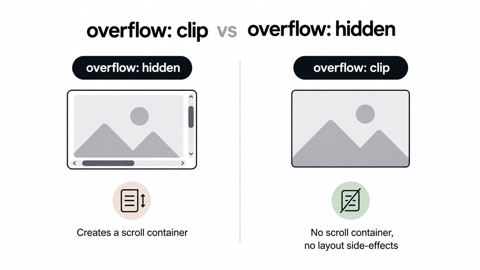
The important trap is overflow: hidden. MDN’s technical reference for overflow notes that an element with hidden overflow becomes a scroll container, even though it shows no scrollbars. Clipped content can still be reached through keyboard tabbing, scrollLeft, or scrollTo(). A focused link or button may therefore sit outside the visible area while remaining interactive.
Practical rule: Use
hiddento control painting, not as a synonym for “this content doesn’t exist”.
That distinction matters for menus, accordions, carousels, and animated panels. If content must be unavailable to assistive technology or keyboard users, use an appropriate semantic state such as the hidden attribute or carefully managed ARIA and focus behaviour. If content should remain available to screen readers while disappearing visually, use a dedicated visually hidden pattern rather than an unqualified overflow rule.
Meet overflow: clip The Modern Alternative
overflow: clip is the more precise choice when you want a hard visual boundary and don’t want a scrolling mechanism. It clips content at the element’s overflow clip edge without allowing the element to be scrolled through script or keyboard interaction in the way hidden permits.
.avatar {
  overflow: clip;
}
That difference makes the intent easier to reason about. A thumbnail, decorative illustration, or tightly bounded visual treatment usually needs clipping, not scrolling. clip avoids turning the element into an accidental scroll container, which reduces surprises when nested components inspect scroll parents or when scripts attempt to position floating UI.
| Requirement | Better starting point |
|---|---|
| Let content paint outside the component | overflow: visible |
| Clip decoration with no scrolling | overflow: clip |
| Clip content while retaining scroll-by-other-means behaviour | overflow: hidden |
| Offer a user-controlled scroll region | overflow: auto |
Don’t treat clip as a universal replacement. It’s unsuitable when users need to access excess content, such as a horizontally scrollable table or a long drawer body. It’s also not an accessibility technique for hiding meaningful text. Choose it because the content is intentionally outside the visible design boundary, not because the content is inconvenient.
A common production mistake involves popovers and tooltips nested inside a clipped card. The parent clips the popup before its positioning logic can make it visible. The right fix may be to remove the clipping ancestor, move the floating element elsewhere in the DOM, or use a positioning system that can escape the component boundary. MDN’s overflow guidance also points towards conditional positioning features such as position-visibility and position-try-fallbacks, which allow positioned elements to respond to available space rather than relying on blanket clipping.
Use clip for predictable visual containment. Use layout and positioning tools for anchored UI. If a tooltip must appear outside a card, clipping the card harder won’t solve the underlying ownership problem.
Styling Scrollbars and Managing Mobile Overscroll
Sometimes the content must remain scrollable, but the default scrollbar doesn’t suit the interface. A horizontally scrolling navigation strip, image rail, or mobile drawer can preserve native scrolling while reducing visual noise.
Start with the scrolling behaviour itself:
.tab-strip {
  overflow-x: auto;
  overflow-y: hidden;
  white-space: nowrap;
  scrollbar-width: none;
}

.tab-strip::-webkit-scrollbar {
  display: none;
}
scrollbar-width: none targets Firefox, while ::-webkit-scrollbar covers browsers that expose the WebKit scrollbar pseudo-elements, including common Chromium-based environments. The content remains scrollable with a trackpad, mouse wheel, touch gesture, keyboard, or script. That last point is why removing the scrollbar shouldn’t be your only affordance. Users need another cue, such as clipped neighbouring content, scroll buttons, or a visible focus treatment.
For a custom scrollbar, avoid making the track so subtle that users lose the existence of the scroll region:
.results {
  overflow: auto;
  scrollbar-width: thin;
  scrollbar-color: currentColor transparent;
}

.results::-webkit-scrollbar {
  width: 0.6rem;
  height: 0.6rem;
}

.results::-webkit-scrollbar-thumb {
  background: currentColor;
  border-radius: 999px;
}

.results::-webkit-scrollbar-track {
  background: transparent;
}
Scrollbar styling remains less uniform than ordinary box styling, so test the actual target browsers rather than assuming one rule will produce identical results everywhere. Don’t hide scrolling controls in a component where keyboard users or low-precision pointer users need an obvious way to discover movement.
Mobile overscroll is a separate concern. overflow defines the scroll region, while overscroll-behaviour controls what happens when a user reaches its boundary:
.mobile-drawer__body {
  overflow-y: auto;
  overscroll-behavior: contain;
}
contain keeps the gesture within the drawer rather than passing it to an ancestor. That’s useful for drawers, sheets, and nested panels where a swipe at the end of the child shouldn’t move the page behind it. Apply it selectively. Preventing every boundary effect can make an interface feel less connected to the browser, and it shouldn’t replace proper focus management or scroll locking when a modal is open.
Accessible Patterns for Visually Hiding Content
overflow: hidden alone doesn’t create an accessible hidden label. It only changes how content is painted. The browser may still expose that content to assistive technology, and keyboard focus may still reach descendants.
The distinction is straightforward:
- Visual hiding keeps content in the semantic and accessibility structure while removing it from ordinary visual display.
- Semantic hiding removes content from the accessibility tree or interaction model, which is appropriate only when the content shouldn’t be announced or reached.
display: none and visibility: hidden are wrong for a label that must remain available to a screen reader. Scottish Government Design System accessibility guidance explicitly advises against those properties when content must remain accessible to assistive technologies. Its visually hidden pattern combines absolute positioning, clipping, hidden overflow, 1-pixel dimensions, and !important on the positioning rule.
A practical version looks like this:
.visually-hidden {
  position: absolute !important;
  width: 1px;
  height: 1px;
  padding: 0;
  margin: -1px;
  overflow: hidden;
  clip: rect(1px, 1px, 1px, 1px);
  white-space: nowrap;
  border: 0;
}
The dimensions and clipping reduce the visual footprint. Absolute positioning takes the element out of normal layout, while white-space: nowrap prevents a long label from creating an unexpected line box. The pattern is for content that remains meaningful, such as an icon-only button’s accessible name, a form label, or supporting text for a control.
A skip link needs one extra behaviour. It should be hidden until keyboard focus reaches it, then restored to a visible position:
.skip-link {
  position: absolute;
  width: 1px;
  height: 1px;
  overflow: hidden;
  clip: rect(1px, 1px, 1px, 1px);
}

.skip-link:focus {
  width: auto;
  height: auto;
  clip: auto;
  overflow: visible;
  inset: 1rem;
  z-index: 1000;
}
Accessibility boundary: Don’t hide a focused element where the user can’t see it. Reveal skip links, focus indicators, and any interactive control when keyboard focus arrives.
Devon County Council documents a similar established pattern using height: 1px, width: 1px, margin: -1px, and overflow: hidden, and contrasts it with display: none, which removes content from both visual output and screen readers. Its guidance was published on 2019-02-14 and identifies the pattern as the current recommended method in that guidance. You can also review accessibility best practices for component work, but always test the resulting component with keyboard navigation and a screen reader.
For content that should be completely unavailable, choose the semantic mechanism deliberately. The hidden attribute removes it from normal rendering and interaction, while aria-hidden="true" affects the accessibility tree but doesn’t automatically prevent keyboard focus or event handling. Never put a focusable control inside an aria-hidden subtree and assume the browser has made it safe.
Preventing Overflow with Modern Layout Techniques
Many overflow bugs are layout bugs wearing an overflow costume. A component that needs overflow: hidden to stop ordinary text escaping often has a missing minimum-size rule, an unbreakable value, or a grid track that refuses to shrink.

Flex items have an automatic minimum size based on their content. That can stop a text column from shrinking beside an icon or action group. Set min-width: 0 on the item that’s allowed to contract:
.card__body {
  display: flex;
  min-width: 0;
  gap: 1rem;
}

.card__title {
  min-width: 0;
  overflow: hidden;
  text-overflow: ellipsis;
  white-space: nowrap;
}
Here, overflow: hidden belongs to the text treatment because truncation is intentional. min-width: 0 belongs to the flex item because it permits the layout to negotiate space correctly. Adding overflow: hidden to the outer card might conceal the symptom while clipping a menu, focus ring, or tooltip later.
Grid has a parallel failure mode. A fractional track can still respect the minimum size of its content unless you explicitly allow it to shrink:
.dashboard {
  display: grid;
  grid-template-columns: minmax(0, 1fr) minmax(12rem, 20rem);
  gap: 1rem;
}
The minmax(0, 1fr) pattern tells the first track that zero is an acceptable minimum. Without it, a long URL, code sample, or large intrinsic child can force the grid wider than its container.
For text that should wrap rather than truncate, prefer content-aware rules:
.prose {
  overflow-wrap: anywhere;
}

.code-line {
  white-space: pre-wrap;
  overflow-wrap: anywhere;
}
Use text-overflow: ellipsis only when losing visible text is acceptable and the full value is available through another accessible route, such as a tooltip, details view, or programmatically associated label. Truncation is a presentation choice, not a replacement for content design.
The same principle applies to drawers and side panels. Define which region owns scrolling, let the header and actions remain stable, and avoid putting a blanket clipping rule on the component shell. A practical drawer component reference can help when the interaction includes focus management, responsive sizing, and nested content.
A visual demonstration of resilient layout decisions is useful when debugging a real interface:
Start with intrinsic sizing, then add clipping only where the design explicitly requires it. That approach preserves focus rings, floating controls, and dynamic content instead of hiding them behind a container edge.
Troubleshooting Common Overflow Scenarios
When an overflow rule fails, inspect the relationship between the clipped element and the content you’re trying to show. The immediate fix depends on whether the content is decoration, layout content, or floating UI.
A child disappears behind its parent
An absolutely positioned dropdown, tooltip, or menu can’t escape an ancestor that clips overflow. Remove the clipping rule, move the floating element outside that ancestor, or render it through a positioning layer attached to the document. Don’t increase z-index, because stacking order can’t override clipping.
A sticky child stops behaving correctly
Sticky positioning depends on scroll containers. An ancestor with overflow: hidden can become the relevant scroll container even when nobody sees a scrollbar, changing the coordinate system that position: sticky uses. Identify the intended scrolling ancestor, remove unnecessary overflow rules between it and the sticky element, and give the intended panel an explicit scrolling responsibility.
Focus moves to invisible content
Tab through the component with the keyboard. If focus lands beyond a clipped edge, either reveal the focused state, remove the element from the tab order while closed, or use a proper disclosure pattern that manages visibility and focus. Hidden overflow isn’t a substitute for hidden, inert, or component state.
A flex item still forces the page wide
Inspect the flex child, not only its parent. Add min-width: 0, check for long unbroken strings, and confirm that images have a responsive maximum:
img,
svg,
video {
  max-inline-size: 100%;
  block-size: auto;
}
A grid column refuses to shrink
Replace a flexible track such as 1fr with minmax(0, 1fr) when its content should be allowed to contract. Then check nested flex containers, because a child’s intrinsic minimum can still propagate through several levels.
A modal clips its own backdrop or popup
Separate the backdrop, dialog surface, and scrollable body into clear layers. A modal backdrop implementation should not rely on a clipped ancestor to control the viewport. Manage body scrolling and focus separately from the dialog’s internal overflow.
Debugging order: Check layout sizing first, clipping second, scroll ownership third, and accessibility state last. A declaration that fixes the screenshot may still be the wrong component behaviour.
Use browser developer tools to inspect scroll containers, focused nodes, containing blocks, and computed overflow values. Test with keyboard navigation, touch scrolling, zoom, and a screen reader before shipping a component whose content can leave its visual boundary.
DOM Studio provides headless web components for production interfaces, including dropdowns, popovers, comboboxes, dialogs, and drawers that can handle floating UI outside overflow-clipped ancestors through documented teleporting and top-layer patterns. Visit DOM Studio to explore accessible primitives and Vue integrations that let your team solve overflow, focus, and positioning concerns without rebuilding each interaction from scratch.