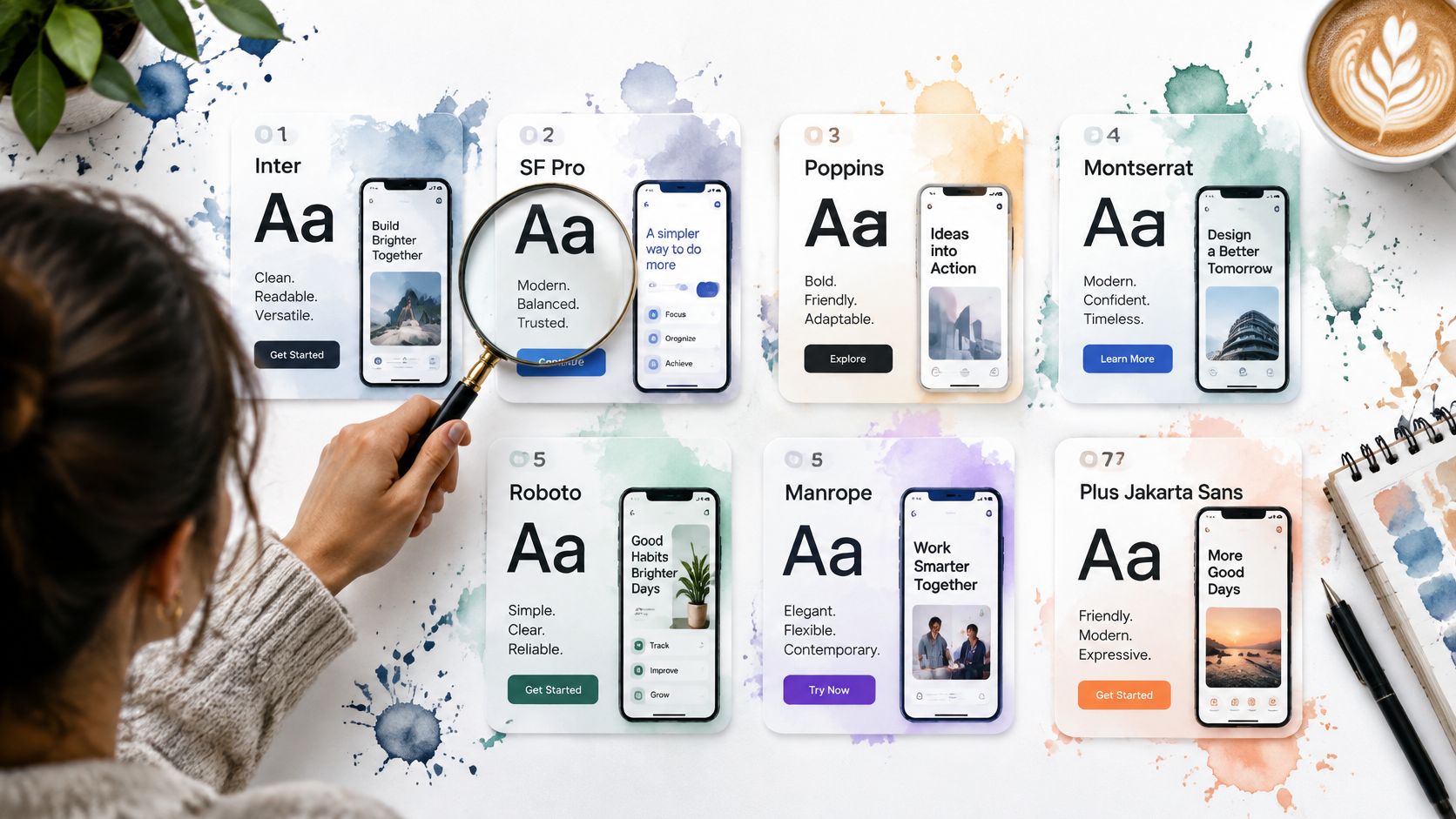
Font choice is a core product decision, not a finishing touch. In a Monotype-commissioned Censuswide survey, 83% of 4,777 design professionals across multiple countries, including the UK, identified font selection as one of the top three components of creative decision-making. For interface teams, that decision extends beyond appearance to readable controls, loading behaviour and a consistent brand voice.
The difficult part isn’t finding an attractive specimen. It’s knowing whether that typeface still works in a crowded settings panel, a translated navigation menu or a dashboard displaying financial figures.
The best modern fonts earn their place through screen legibility, practical licensing, useful pairings and dependable webfont delivery. Variable-font support matters too, but only when the files and weights you ship justify it.
Typography can be one of the cost-effective improvements for business websites, provided you test it in working components rather than judging it from a headline.
Table of Contents
- 1. Inter
- 2. Geist
- 3. IBM Plex
- 4. Manrope
- 5. Söhne
- 6. PP Neue Montreal
- 7. Tiempos Text
- Best modern fonts at a glance
- From Font Choice to Living Theming Making Your Pick Work in Production
1. Inter
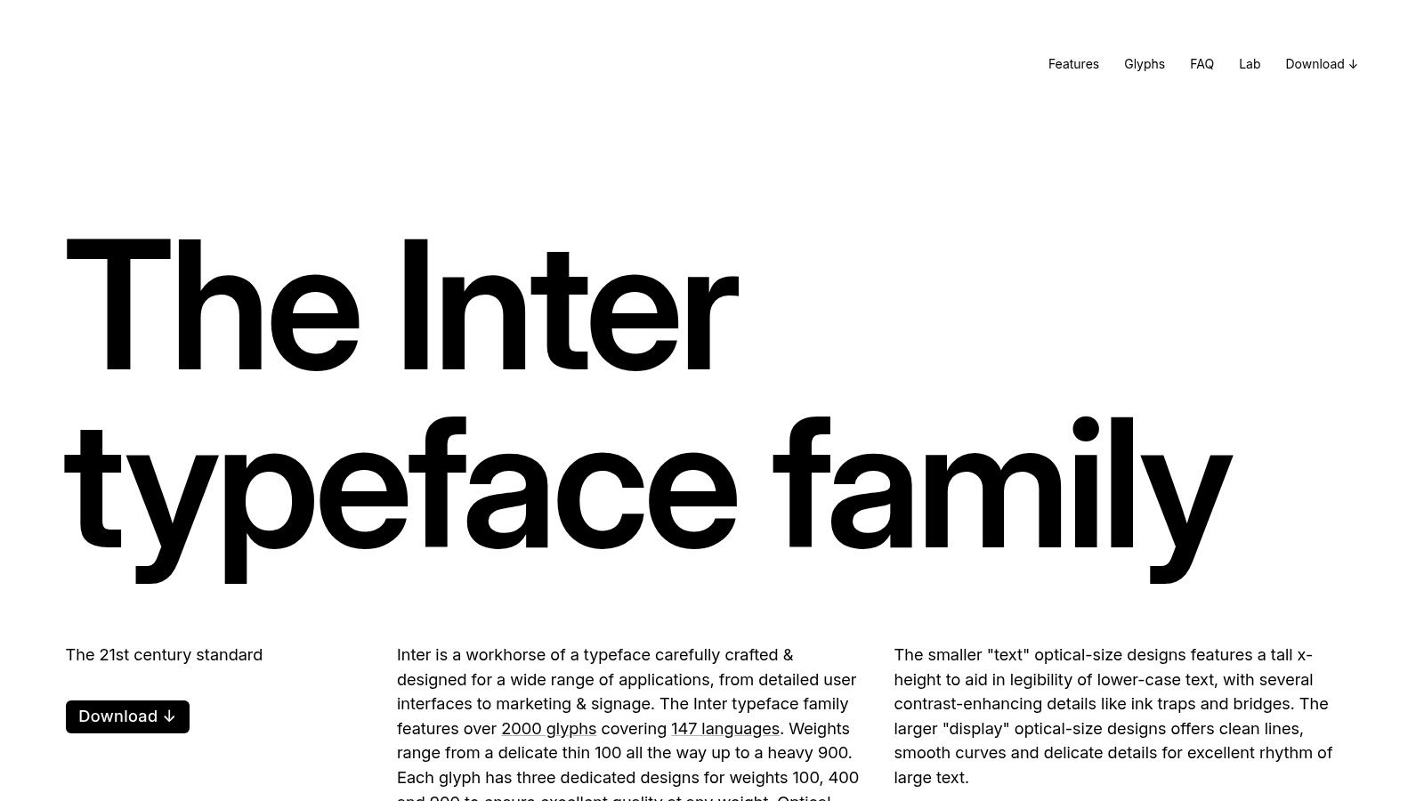
Inter is my default recommendation for a SaaS interface that needs clarity before personality. Its tall lowercase forms work well in settings pages, navigation and data-heavy screens, where users need to recognise labels without inspecting them.
The official Inter distribution offers variable fonts and OpenType features including tabular figures, a slashed zero and contextual alternates under the SIL Open Font License. Tabular figures are particularly useful for changing balances and aligned numerical columns; a slashed zero is worth testing in identifiers where letters and digits appear together.
Where Inter earns its place
- Dense application screens: Use regular text for descriptions and a restrained semibold for labels instead of making every control bold.
- Financial dashboards: Enable tabular figures on numeric cells, not indiscriminately across all prose.
- Token-based libraries: Assign Inter to a semantic
--font-uitoken, then keep size, weight and line-height tokens independent.
The trade-off is familiarity. Inter won’t provide much brand distinction on its own, so establish identity through spacing, colour, illustration and a deliberate heading treatment.
Pair it with IBM Plex Mono for technical content or Tiempos Text for editorial reading. Load only the font resources those roles require, and compare variable delivery with the static weights your interface uses.
For broader alternatives, explore these contemporary free fonts. When working on tight controls, apply the same component-level testing used for choosing fonts for compact app text, rather than shrinking text to rescue an overcrowded layout.
2. Geist
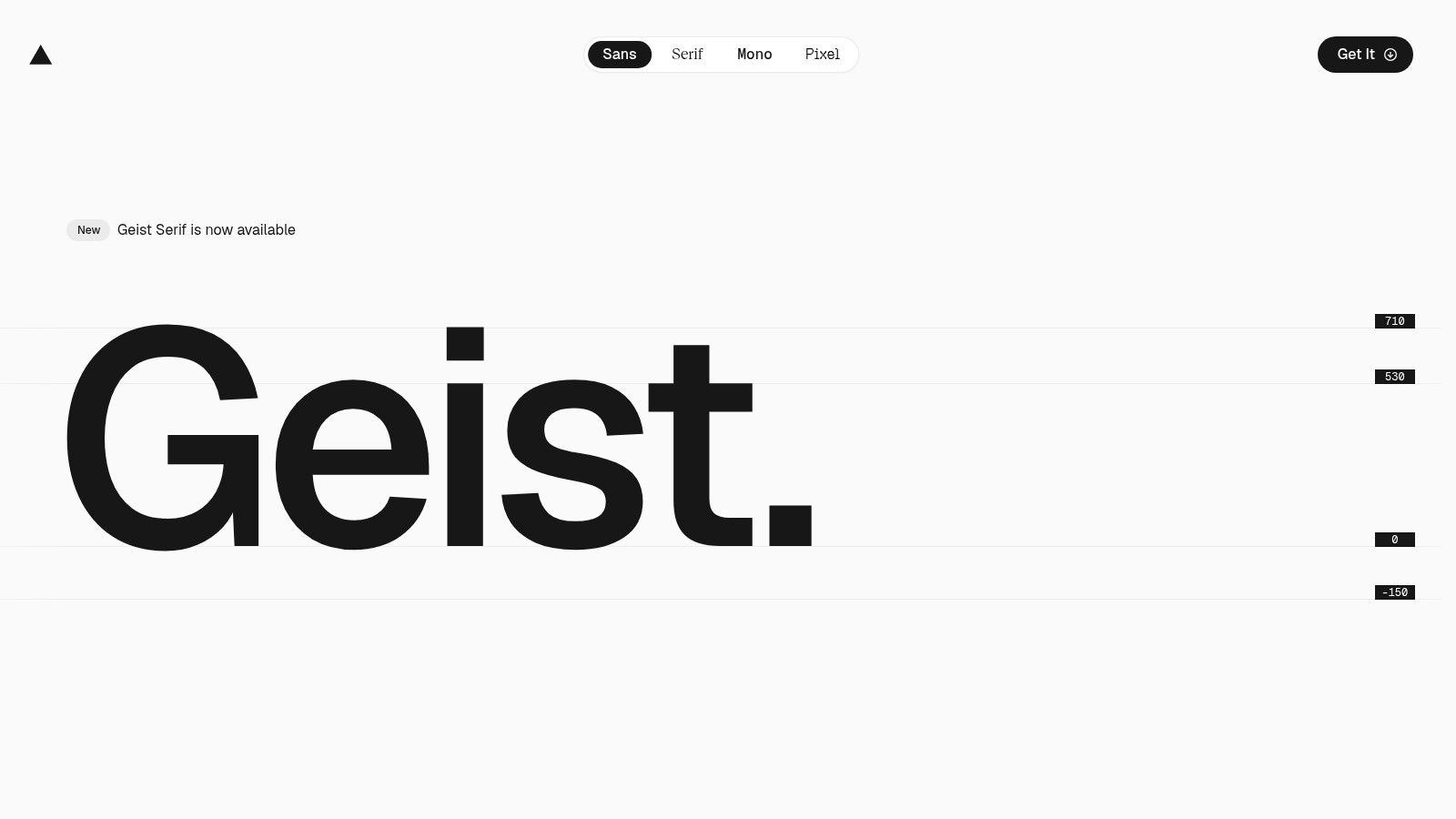
A developer console needs interface labels, code samples and machine-generated values to look related without looking identical. Geist is a strong fit when that sans-and-mono relationship is central to the product.
Vercel’s Geist family includes Sans, Mono and Pixel styles, with downloadable files and an npm distribution under the SIL Open Font License. Sans is the practical application face; Mono provides a coordinated option for code, logs and technical identifiers.
Use monospace where character alignment carries meaning. Don’t make every number monospace just because the product serves developers.
Keep the delivery deliberate
An npm package can simplify integration, but installing it doesn’t establish a sensible loading strategy. Inspect the imported styles, identify whether you’re using variable or static files, and confirm that unused families aren’t being requested.
Set --font-ui to Geist Sans and --font-code to Geist Mono. Keep Pixel outside the everyday component tokens; it’s better reserved for a deliberate display treatment than for form labels or error messages.
Geist’s main trade-off is its association with Vercel’s visual language. I’d choose it for a deployment dashboard or API management product, but test it carefully when a brand needs distance from familiar developer-tool aesthetics.
Check rendering on actual screens before compensating with CSS smoothing. This guide to anti-aliased fonts is useful context, but smoothing settings aren’t a substitute for appropriate weight, contrast and spacing.
3. IBM Plex
IBM Plex makes sense when your product needs a typographic system, not just a UI sans-serif. Consider an enterprise application with operational dashboards, technical documentation and substantial explanatory content. Giving each context a suitable voice is easier when the companion families already belong together.
The IBM Plex family provides Sans, Serif and Mono branches, alongside language-specific options, under an Open Font License included with the files. IBM also directs teams towards its repository for current versions, which makes version control an explicit part of font adoption.
Pair by content role
Use Plex Sans for controls, Plex Mono for code, and Plex Serif for substantial reading passages. Don’t alternate families merely to decorate adjacent cards; each change should tell the reader something about the content.
- Theme architecture: Define separate UI, reading and code family tokens.
- Language coverage: Check the actual scripts and glyphs required by your product before choosing packages.
- File selection: Verify variable availability for the specific branch you intend to use rather than assuming every Plex package behaves identically.
The corporate character is both an advantage and a constraint. Plex can give a complex application a coherent, institutional tone, but it may feel too formal for a playful consumer service.
Its breadth also creates opportunities to over-download. Start with the application sans, then add Serif or Mono only where a real content requirement exists. A coordinated family is useful; shipping every available branch isn’t.
4. Manrope
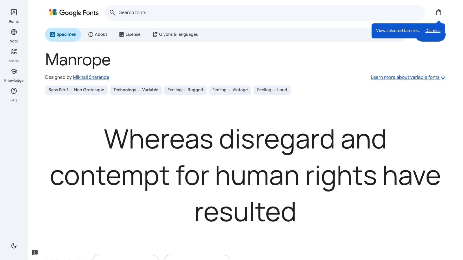
For a product that shares its identity with a marketing website, Manrope offers a more geometric alternative to a neutral interface workhorse. I’d shortlist it for a booking platform, subscription service or early-stage product where the landing page and application should feel related.
Manrope on Google Fonts provides an accessible starting point for evaluating its styles, weights and licence. Its Open Font License makes it a practical candidate for commercial projects, though teams should still retain the licence supplied with their chosen files.
The geometric character is the reason to select it, and the reason to test it carefully. A polished heading doesn’t prove that compact dropdown options or secondary descriptions will remain comfortable.
Test the awkward components first
Build a specimen using a disabled button, an inline validation message, a long account name and a populated table. Compare regular and medium weights at your intended component sizes rather than relying on oversized promotional examples.
The Office for National Statistics typography guidance highlights character distinction through its recommendation for an Open Sans stylistic set with more accessible forms of lowercase “g” and uppercase “I”. Apply that same scrutiny when evaluating Manrope’s characters in your own content.
Pair Manrope with a restrained monospace for code, or use it as the sole family when the interface is straightforward. Confirm the variable file’s available axes before defining weight tokens, and avoid loading extra weights just because the catalogue offers them.
5. Söhne
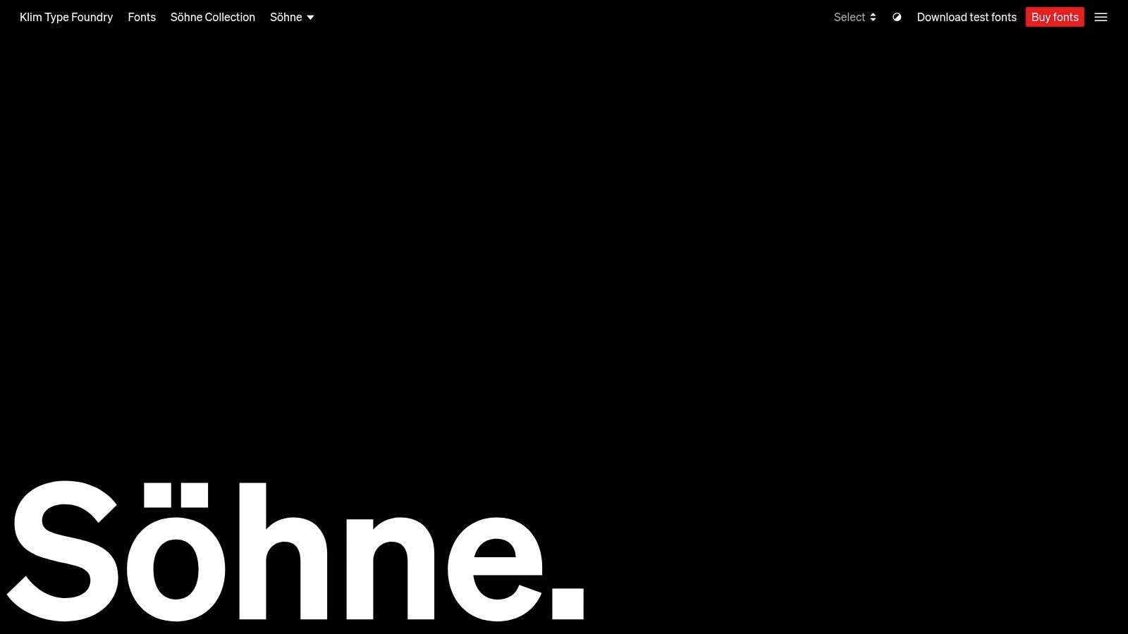
Choose Söhne when a distinctive grotesque is a funded part of the product’s identity. It suits a premium publishing platform, a brand-led commerce experience or a business application whose interface should feel carefully authored without becoming decorative.
Klim’s Söhne catalogue provides specimens, test fonts and licensing options for desktop, web and app use. The family includes italic styles and companions such as Mono, Schmal and Breit, with OpenType options including tabular numerals and alternate letterforms.
The commercial licence is the main operational difference from the open-source candidates. Map your intended usage before purchase: a browser application, installed app and design team’s desktop work are distinct contexts to resolve against the foundry’s terms.
Practical rule: Evaluate a commercial font inside your hardest component before committing to a brand-wide rollout.
Buy for the interface you’re building
Use the main family for application text and consider Söhne Mono for technical values. Treat the narrower and wider companions as specific tools, not automatic additions to every page.
Don’t assume a broad style catalogue guarantees the variable webfont configuration you want. Verify the supplied formats and licence, then compare the files required for your actual hierarchy.
The understated design can be difficult to justify if your project has little budget for typography. I’d choose Inter instead when the commercial purchase would displace usability testing. Söhne is most compelling when the team can evaluate its details, document its usage and maintain the licensed assets properly.
6. PP Neue Montreal
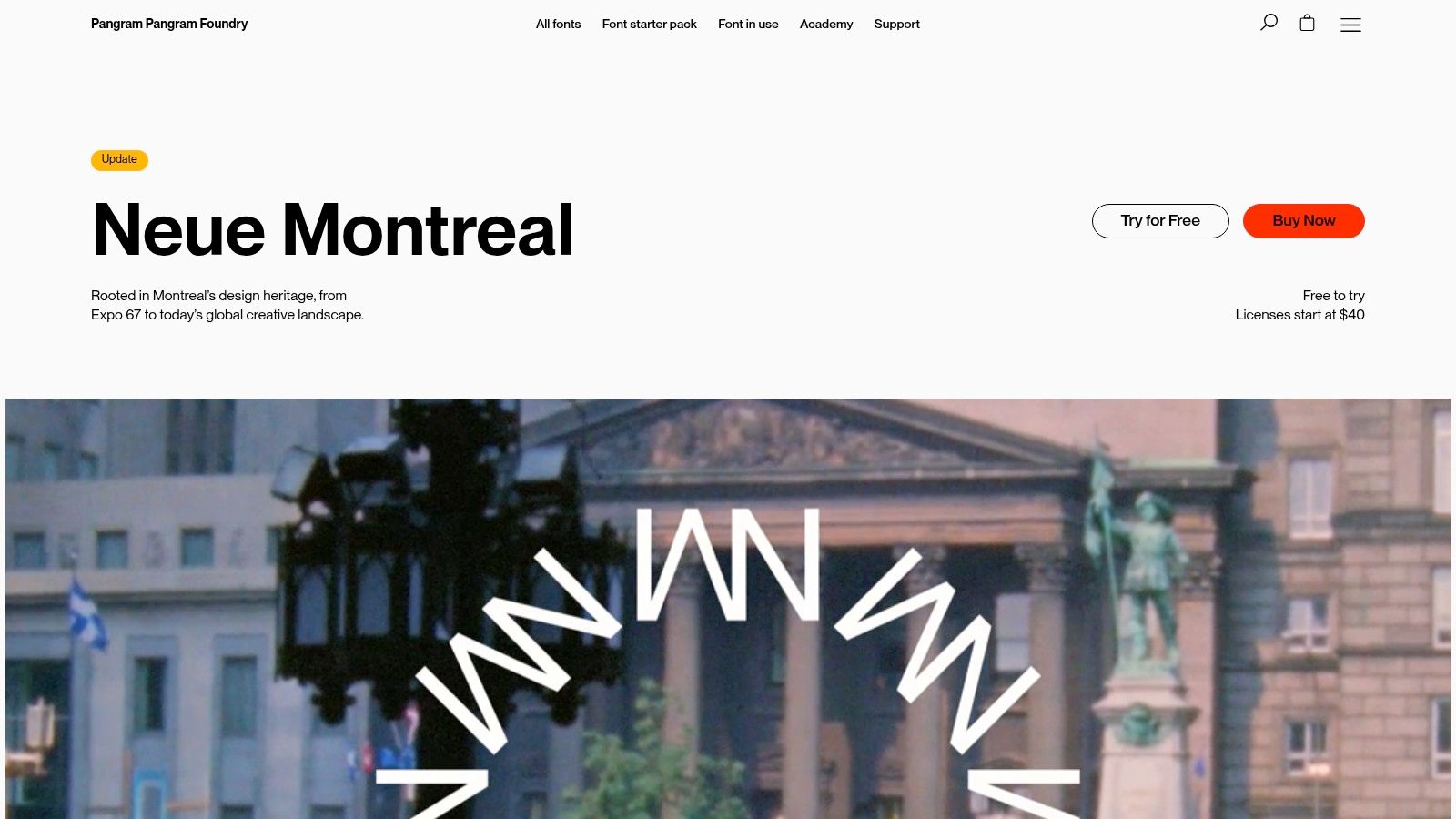
A brand-led application often needs strong headlines without sacrificing smaller interface text. PP Neue Montreal is worth testing when you want that range within a contemporary grotesque family.
Pangram Pangram’s product page lists variable-font support, italics and dedicated Text styles, alongside a try-before-buy option. Those Text styles are the important distinction for product work: evaluate them in descriptions, menus and supporting copy rather than choosing everything from a display specimen.
Separate text and display decisions
- Application text: Start by testing the Text styles in forms, tables and empty states.
- Brand expression: Use the appropriate headline treatment on onboarding and promotional surfaces.
- Companion choice: Pair with IBM Plex Mono for code, while keeping ordinary labels in the sans family.
- Licensing: Confirm production rights for the intended deployment; trial access isn’t permission to ship.
The family’s breadth creates a governance problem if designers choose arbitrary styles for individual screens. Map a small, named selection to semantic tokens so the product doesn’t accumulate subtly different text treatments.
For an accessible implementation, the Home Office layout and typography guidance recommends adaptable typography, relative sizing and layouts that accommodate resizing and reflow. Apply those principles regardless of how refined the font looks.
I’d shortlist Neue Montreal for a commerce dashboard or creative collaboration tool. For a small utility application, its range may add more selection work than useful flexibility.
7. Tiempos Text
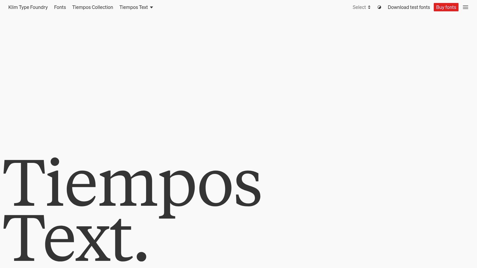
Tiempos Text suits product screens where people read at length, such as editorial pages, explanatory guides and research workspaces. Keep controls in a sans serif, then use the serif to make the reading area distinct.
Klim’s Tiempos Text is the text-focused member of the wider Tiempos family, with roman and italic variable fonts. It requires a commercial licence. Confirm that the licence covers web deployment and the other uses planned for the product.
Pair it with Inter for controls or Söhne for a more brand-led application shell. Assign Tiempos Text to a reading token; keep navigation, compact metadata and action labels in the sans family.
A serif companion should mark a reading context, not become another decorative option in the component picker.
Give reading its own layout rules
Test paragraph width, line height, emphasis and linked text together. A family change won’t fix cramped paragraphs, and a comfortable article layout shouldn’t force oversized spacing into compact controls.
For public-service forms and other information people need to scan quickly, compare serif reading text with the accessible sans-serif UI text. Test both at the sizes and widths the interface supports, and check that links and emphasis remain clear.
Document the boundary between interface and reading typography in your typography system. Include how italic files load and which components inherit the reading family.
Best modern fonts at a glance
| Font | Licence | Style range | Best for | Variable font support |
|---|---|---|---|---|
| Inter | SIL Open Font License | Wide weight range | Screen interfaces, dashboards, and SaaS products | Yes |
| Geist | SIL Open Font License 1.1 | Sans, Mono, and Pixel | Interfaces, developer tools, code, and data | Not specified |
| IBM Plex | Open Font License | Sans, Serif, and Mono | Consistent typography across varied contexts | Not specified |
| Manrope | Open Font License | Multiple weights | Product interfaces and marketing sites | Not specified |
| Söhne | Commercial licence | Multiple styles, including italics; companion families available | Branding and digital work | Not specified |
| PP Neue Montreal | Commercial licence | Multiple styles, including Text styles and italics | Branding, headlines, and smaller digital text | Yes |
| Tiempos Text | Commercial licence | Roman and italic styles | Editorial pages, documentation, and sustained reading | Yes |
From Font Choice to Living Theming Making Your Pick Work in Production
The best modern fonts become dependable only when you implement them as a system. Choose a workhorse for controls, then add a mono or serif companion only where the content needs it. Avoid introducing another family to solve a hierarchy problem that weight, spacing or size could handle.
Define semantic CSS variables such as --font-ui, --font-reading and --font-code, alongside separate tokens for size, weight, line height and tracking. Let components consume those roles rather than embedding font names throughout their styles. In DOM Studio, theme values are CSS variables and the host app owns the final tokens, so typography changes can happen at the theme level rather than through component rewrites.
Check the production details
- Licence: Retain the licence files and confirm that your actual web, app and desktop uses are covered.
- Variable support: Inspect available axes and compare the required variable files with your static alternatives.
- Pairing options: Give each family a defined job and test their apparent sizes together.
- Screen legibility: Review ambiguous characters, error messages, dense tables, enlarged text and narrow layouts.
Self-host permitted webfont files when that suits your deployment, and declare accurate styles and weight ranges in @font-face. Use font-display: swap when immediate fallback text is appropriate, but don’t expect it to prevent layout shift. Match fallback metrics, consider metric overrides, and test the transition under throttled network conditions.
For catalogue-based workflows, these instructions to customize your theme with Google Fonts provide a practical starting point. Keep font selection separate from the decisions about hosting and component inheritance.
Finally, test user overrides. The UK Government accessibility standards emphasise that no single font is universally accessible. A resilient interface must remain usable when readers change text size, spacing or font preferences.
DOM Studio offers Vue components, framework-neutral Web Component primitives and shared semantic theme tokens for building consistent interfaces. Visit DOM Studio to explore the components and connect your chosen UI, reading and code fonts to a theme your application controls.