A contemporary-looking typeface isn’t automatically suitable for product UI. A display face can look sharp in a hero banner and collapse in a form, while a dependable sans can make a brand feel indistinguishable from every other SaaS product. The best contemporary font free choice is the one your interface can sustain across body copy, labels, states, localisation, fallbacks and future components.
This list compares ten free families as working interface and branding decisions. The criteria are practical: screen legibility, personality, variable-font flexibility, language coverage, licensing, pairing potential and the amount of tuning required. Historical precedent matters too. British sans serif typography was already developing before the digital era, from John Soane’s late-18th-century serif-less inscriptions to William Caslon IV’s commercially cut type around 1816, as documented in research on Soane’s serif-less letters.
The shortlist moves from dependable UI workhorses to warmer geometric alternatives and more expressive product faces. Inspect every specimen at real interface sizes before choosing. A font that looks contemporary at display scale may produce poor wrapping, ambiguous symbols or awkward controls at the size your users read.
Table of Contents
- 1. Inter
- 2. IBM Plex Sans
- 3. Source Sans 3
- 4. Public Sans
- 5. Manrope
- 6. Sora
- 7. Urbanist
- 8. Outfit
- 9. Plus Jakarta Sans
- 10. Figtree
- Top 10 Free Contemporary Fonts Comparison
- Turn a Font Shortlist Into a Tested Type System
1. Inter
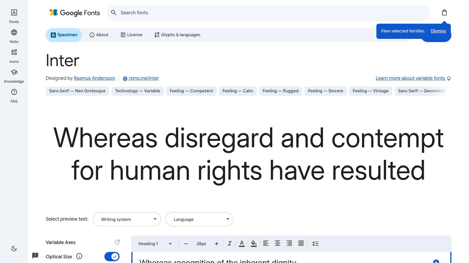
Inter is the safest starting point when the interface has to carry a lot of information without calling attention to itself. Its large x-height and carefully controlled forms make it comfortable in navigation, tables, forms, dashboards and dense product screens. The Inter specimen on Google Fonts is a useful place to inspect its weights, punctuation and language support before downloading the files.
Its variable build gives designers room to create a restrained text style and a stronger display style without switching families. That flexibility is especially useful when a design system needs a compact label, a readable body style and a firm heading hierarchy. OpenType features also help with the less glamorous details, such as numerals, fractions and punctuation.
The trade-off is recognisability. Inter is so common that it can make a new product feel visually familiar before the user has seen the logo. Its rendering can also change subtly with anti-aliasing, browser settings and fallback behaviour, so check it in the environments your audience uses. The guide to anti-aliased fonts is useful when a seemingly correct CSS setup still looks different across screens.
Practical rule: Use Inter for the interface foundation, then create distinction through colour, spacing, shape and a deliberately chosen display companion.
It pairs naturally with a more characterful serif or display face, but don’t add a second typeface just to make a generic hero feel more fashionable. For a dense product UI, Inter remains the strongest all-rounder in this list. See these top picks for small UI fonts when the primary constraint is compact text.
2. IBM Plex Sans
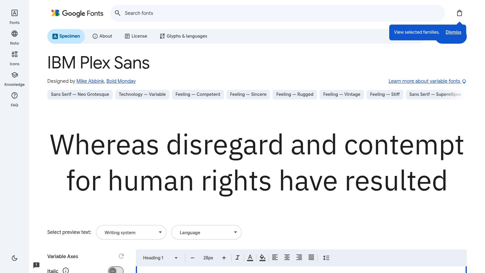
IBM Plex Sans makes a stronger brand statement than Inter without becoming difficult to deploy. It has a technical, engineered voice that suits developer tools, enterprise software, financial products and documentation-heavy services. The IBM Plex Sans family also belongs to a broader Plex system that includes Serif, Mono and Condensed companions.
That family relationship is its main advantage. Product copy can use Sans, code examples can use Mono and a printed report can introduce Serif without the system feeling assembled from unrelated parts. Its OpenType features are valuable for interfaces that display currencies, arrows, fractions or technical notation.
Plex feels more authored than Inter, but that personality has consequences. Some letterforms and spacing choices can feel slightly formal in a consumer product that wants softness. It also isn’t as straightforwardly flexible across every subfamily as a variable-first family, so teams should decide whether they need static files, a variable build or separate Sans and Mono assets.
For implementation, define the family roles before adding every available cut. Sans for interface text, Mono for code and data, and Serif only where editorial contrast improves hierarchy. Don’t use Condensed as a shortcut for a cramped layout. Fix the container, line-height and content length first.
IBM Plex works particularly well when the product needs to connect interface, support documentation and developer-facing material. It feels credible without relying on the visual neutrality that makes many contemporary sans serifs interchangeable.
3. Source Sans 3
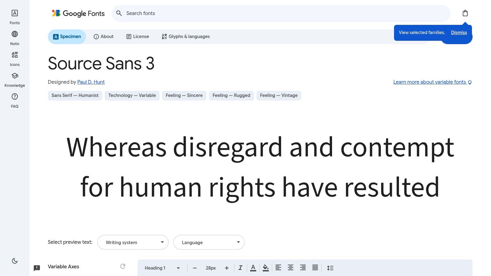
Source Sans 3 is a practical body and interface face for teams that value calm, predictable reading over visual novelty. It was designed for broad digital use and remains a reliable choice for documentation, settings screens, help centres and application UI. The Source Sans 3 specimen lets you examine its upright and italic styles, weight range and supported characters.
Its strength is consistency. The forms don’t demand attention, which gives longer passages a steady texture. A variable build provides useful weight control, while the mature Source family makes pairing simple. Source Serif can introduce editorial contrast, and Source Code can handle technical examples without creating a disconnected visual language.
The weakness is equally clear. Source Sans 3 won’t give a brand a dramatic headline voice by itself. Heavy weights can support headings, but the family is better at trustworthy, readable communication than expressive campaigns. If the product depends on a distinctive wordmark or a high-impact marketing page, use a display companion rather than forcing Source Sans into a role it wasn’t built to own.
A good implementation starts with its text behaviour. Test long labels, error messages, mixed-case buttons and italic emphasis. Then encode those decisions in a typography system, rather than scattering arbitrary font sizes through component styles.
Choose Source Sans 3 when content quality and interface stability matter more than novelty. It is especially effective for products where users spend time reading rather than scanning promotional headlines.
4. Public Sans
Public Sans is the most deliberately neutral option in this selection. It was developed for clear communication in public-facing services, making it a sensible candidate for forms, dashboards, transactional journeys and content-heavy web applications. The Public Sans family on Google Fonts provides the practical starting point for specimen checks and implementation.
Its design doesn’t try to make a service look luxurious or disruptive. That restraint is useful when the interface must support trust, comprehension and consistent hierarchy across many teams. Variable and static builds give implementation teams a choice, while the family’s production-oriented maintenance makes version control easier to discuss with an engineering team.
Accessibility isn’t a property of the font alone. A West Midlands Combined Authority test found that 55.2% of respondents chose Noto Sans as easiest to read, while 24.1% had no preference. The same typography guidance recorded preferences for larger type and increased line spacing, which reinforces a practical point: size, leading, measure and contrast can matter as much as the family.
Public Sans is therefore a good foundation, but it won’t create a memorable identity without support from layout, colour and components. Its neutrality can also feel conservative on a consumer landing page. Use it when the product’s credibility should come from clarity and service quality, not typographic theatre.
For UK public-sector work, test the complete system against the applicable accessibility requirements. Government guidance points teams towards WCAG 2.2 AA for public services, so a contemporary font decision should include zoom, spacing overrides, focus visibility and contrast testing, not only a polished desktop mock-up.
5. Manrope
Manrope sits between a geometric sans and a softer grotesque. It gives a product a warmer, more approachable tone than Inter while retaining enough discipline for navigation, cards, forms and product copy. The Manrope specimen is worth checking with real labels, because its personality becomes more apparent in sentence case than in oversized uppercase samples.
The variable weight axis is useful for systems that need subtle hierarchy. A medium weight can carry navigation without looking heavy, while a stronger cut can establish headings without introducing a separate display face. Its Latin and Cyrillic coverage also makes it a practical option for teams serving more than one script, though every target language still needs direct specimen testing.
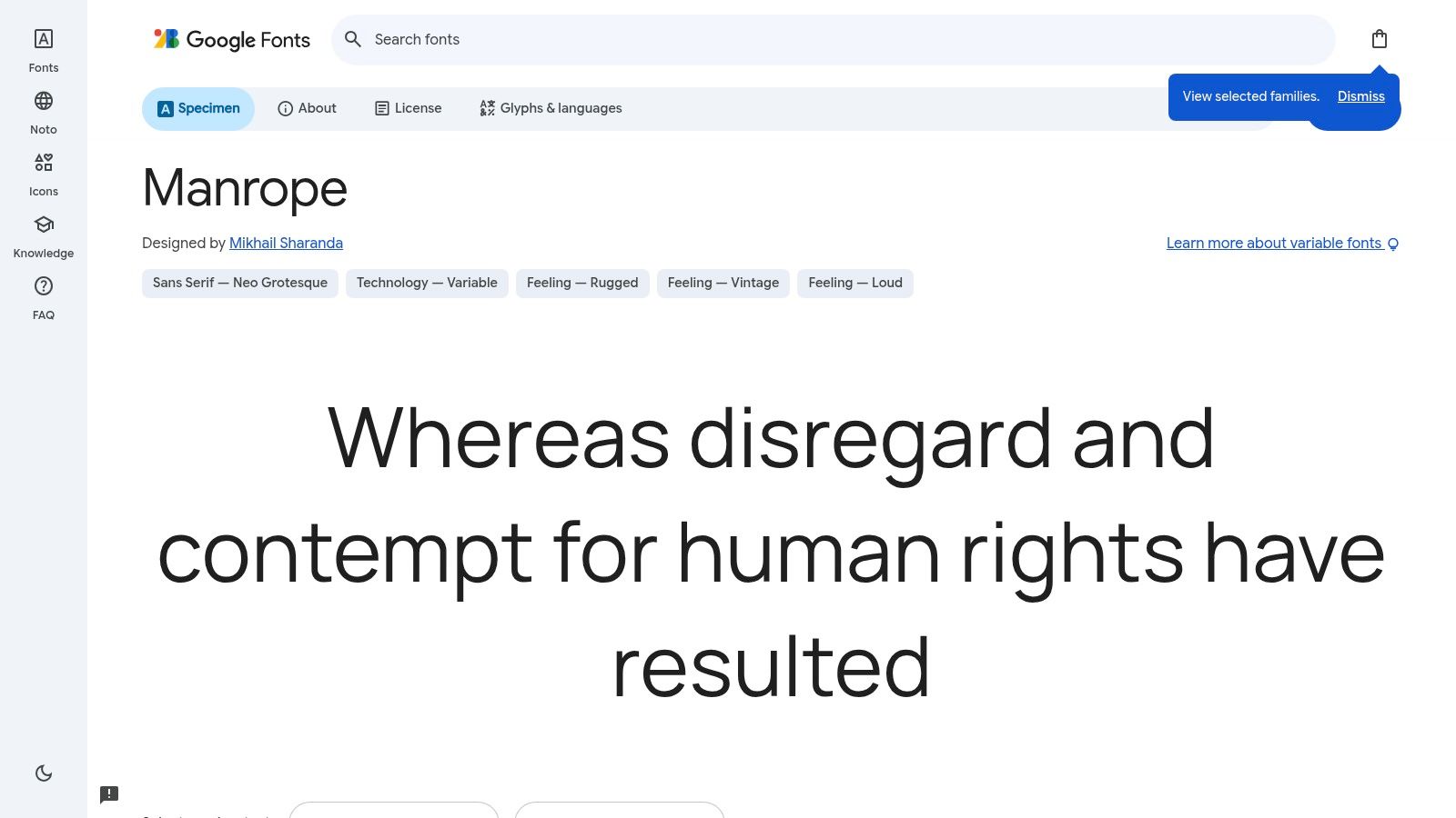
Manrope’s warmth is both its advantage and its limit. The rounded, contemporary feel suits fintech, wellness, productivity and startup products, but it can make a serious institutional service feel less formal than intended. It also pays to compare the Google Fonts build with the designer’s current release when precise spacing or glyph behaviour matters. A hosted library is convenient, but it isn’t automatically the latest source file.
Use Manrope as a complete system when you want one family to cover interface and marketing. For a stronger contrast, pair it with a restrained serif rather than another geometric sans. Two similar geometrics often produce a vague hierarchy and add loading and maintenance overhead without adding much visual information.
Manrope is a good choice for teams that want contemporary character without sacrificing everyday usability. Keep the line-height generous enough for its friendly rhythm, especially in dense cards and multi-line form messages.
6. Sora
Sora has a confident geometric presence that works particularly well for technology, fintech and forward-looking product brands. Its generous spacing helps labels stay legible, while its stronger shapes give display headings more authority than a purely utilitarian UI face. Start with the Sora family and test the actual weights you plan to ship, not only the bold specimen.
The family can serve both interface labels and marketing headings, which reduces the need for an additional font. Its variable availability also makes it suitable for systems where a designer wants controlled adjustments between text and display roles. The result can feel crisp and intentional when the layout gives the letters enough room.
Sora is less proven as a default than Inter, IBM Plex Sans or Source Sans 3. That doesn’t make it a poor choice, but it means your team should test more edge cases instead of assuming that established browser behaviour will cover everything. Check numerals in pricing interfaces, punctuation in validation messages, mixed-case labels and line wrapping in narrow columns.
Its spacing can look excellent in airy layouts and inefficient in compact controls. Avoid solving that tension with aggressive negative tracking. First test a smaller size, a suitable line-height and a slightly wider control. If the type still feels loose, Sora may be better reserved for headings and prominent labels.
Choose Sora when the interface needs a clearer brand voice than a neutral workhorse can provide. Pair it with a quiet body face only when body text testing shows a real gain. Otherwise, one well-tuned family will produce a more coherent result.
7. Urbanist
Urbanist is a refined geometric sans for teams that want a modernist surface without the stiffness of older geometric faces. Its variable design supports weight and italic axes, and its spacing is more accommodating for interface work than many display-led geometrics. The Urbanist specimen should be inspected at small sizes as well as in large campaign headings.
The family has enough structure for a SaaS landing page and enough neutrality for navigation, onboarding and product settings. It can give a brand a considered visual tone without resorting to exaggerated quirks. That makes it useful when the identity needs to feel contemporary but still credible to professional users.
Its limitation is distinctiveness. Urbanist offers a polished geometric language, but it won’t automatically make a product recognisable. If the rest of the system also uses familiar rounded cards, soft gradients and oversized headings, the font may reinforce a category pattern rather than define an identity.
Use the variable axes with restraint. A system with many micro-adjusted weights can become difficult to maintain, particularly when designers and developers name roles differently. Define a small set of semantic roles, then test them in buttons, tabs, alerts, tables and empty states.
Urbanist is a solid middle ground for teams that want a geometric alternative but don’t want a highly experimental face. It works best when the interface has enough whitespace to let its proportions breathe. In dense utility screens, compare it directly with Inter or Public Sans before committing.
8. Outfit
Outfit is a clean geometric sans with enough headline presence to carry a contemporary SaaS or product-marketing page. Its open counters and generous forms make it approachable in hero copy, feature cards and navigation. The Outfit family is simple to obtain, and its variable weight option gives a single-family system useful range.
The case for Outfit is its balance between neutral UI text and visible branding. A medium or semibold cut can give a product more energy than Public Sans without becoming theatrical. It also pairs easily with a restrained serif or a compact mono face when the design needs editorial or technical contrast.
The cost is space. At small sizes, Outfit can feel airier than denser UI faces, which may cause labels to wrap sooner or make compact controls look underfilled. Don’t compensate by squeezing tracking across the entire system. Test the intended size, line-height and horizontal padding together, then create a specific compact role if the product genuinely needs one.
Implementation note: A font’s apparent density is a component decision. Button padding, label length and line-height can change the result more than a one-step weight adjustment.
Outfit works best when the brand wants a friendly, polished presence and the interface isn’t dominated by narrow tables or long administrative labels. For dense dashboards, keep a second test case with realistic data before approving it. A landing-page specimen isn’t enough evidence for a product font.
Use CSS heading design guidance when translating its display personality into responsive heading styles. The font should support the hierarchy, not become the hierarchy.
9. Plus Jakarta Sans
Plus Jakarta Sans is a strong alternative for teams that want the feel of a paid geometric family without adopting a recognisable default. It combines geometric structure with enough softness for product copy, onboarding and consumer-facing interfaces. The Plus Jakarta Sans specimen gives a quick view of its weights, italics and variable builds.
Its default spacing makes it easy to place into a modern product system. The family can handle headlines, body copy and interface labels, although its tighter forms deserve careful testing in smaller text. It has enough character to support a startup identity, but it doesn’t force the brand into a playful or futuristic direction.
The key limitation appears in dense UI. Small text can need adjustments to size and line-height before it feels as open and legible as a more text-focused workhorse. This isn’t a reason to reject it. It is a reason to test error messages, select menus, table cells and two-line buttons before using the same token everywhere.
Plus Jakarta Sans suits products that need warmth and distinction without a decorative display face. Pair it with a serif only when the brand has a clear editorial role for that contrast. A second geometric sans will usually make the system less coherent, not more refined.
Confirm the current licence and source files before shipping, especially if your team is taking files from a repository rather than a hosted font service. The OFL is designed for open font distribution, but teams should still preserve licence notices and check the exact package being used.
10. Figtree
Figtree is a friendly, straightforward geometric sans for everyday product communication. It feels lighter and more personable than a strict grotesque, which makes it effective for onboarding copy, empty states, help text and marketing sections that need approachability. The Figtree family provides a practical starting point for checking its variable build and available styles.
Open counters help it remain clear in small text, while the broader shapes give headings a gentle presence. Figtree can therefore support a minimalist product without making every message feel corporate. It is also a sensible option for teams that want one family across interface and brand touchpoints.
Its track record is less extensive than Inter or IBM Plex Sans, so treat it as a candidate to test rather than an automatic default. Rendering differences become visible in small labels, low-contrast text and unusual punctuation. Check the font on the browsers and operating systems that matter to your audience, then compare screenshots with the intended fallback stack.
Figtree’s personality can soften a product effectively, but it may be too gentle for a technical console or a serious institutional service. Use weight and spacing to establish authority before adding a second face. A strong semibold heading and disciplined layout can do more than a fashionable pairing.
It is a good final shortlist option when readability and friendliness need to coexist. Approve it only after testing realistic content, including long names, translated labels, numbers and error states. The most attractive specimen is rarely the most demanding component.
Top 10 Free Contemporary Fonts Comparison
| Font | Core features ✨ | UI quality ★ | Target audience 👥 | Key strengths 🏆 | Price/value 💰 |
|---|---|---|---|---|---|
| Inter | Variable w/ optical sizing; 2k+ glyphs; broad language support | ★★★★★ | Dense UIs, apps, system UI teams | Proven small-size legibility; huge ecosystem | 💰 Free (OFL 1.1) |
| IBM Plex Sans | Multi-family (Sans/Serif/Mono/Condensed); 8 weights; rich OpenType | ★★★★☆ | Product teams, docs, code samples | Cohesive family across uses; IBM-backed docs | 💰 Free (OFL 1.1) |
| Source Sans 3 | Variable weight + italics; mature GitHub project | ★★★★ | Docs, application UIs | Stable rendering; pairs with Source families | 💰 Free (OFL 1.1) |
| Public Sans | Variable/static builds; USWDS-maintained; accessibility-first | ★★★★ | Government, dashboards, forms | Production-ready tokens & accessibility tuning | 💰 Free (OFL 1.1) |
| Manrope | Variable; Latin/Cyrillic; designer-maintained releases | ★★★★ | Product UIs, brands seeking warmth | Friendly geometric tone without losing professionalism | 💰 Free (OFL) |
| Sora | Variable available; generous spacing; screen-first forms | ★★★★ | Fintech/tech branding; UI labels | Clear small-size readability; confident display presence | 💰 Free (OFL) |
| Urbanist | Variable (weight+italic); 9 weights; refined spacing | ★★★★ | Interfaces & marketing headings | Refined geometric alternative for UI/marketing | 💰 Free (OFL 1.1) |
| Outfit | Full family on Google Fonts; generous counters; variable | ★★★★ | SaaS landing pages, dashboards | Strong headline presence; balanced UI/marketing use | 💰 Free (OFL) |
| Plus Jakarta Sans | Multiple weights + variable; designed for +Jakarta identity | ★★★★ | Startups, product UIs replacing paid geometrics | Versatile swap-in for paid geometric families | 💰 Free (OFL 1.1) |
| Figtree | Variable on Google Fonts; open counters; personable tone | ★★★★ | Product microcopy, minimalist UIs | Readable, approachable tone for UI copy | 💰 Free (OFL 1.1) |
Turn a Font Shortlist Into a Tested Type System
A shortlist isn’t a type system. It becomes one when the team has decided which family serves which role, how it behaves in components and what happens when the preferred font fails to load. Start by reducing the ten candidates to two or three based on interface role. Inter, Source Sans 3 and Public Sans are strong foundations for information-heavy products. IBM Plex Sans adds a technical voice. Manrope, Sora, Urbanist, Outfit, Plus Jakarta Sans and Figtree give branding teams more warmth or geometric character, but they need more deliberate testing in dense UI.
Inspect specimens at the sizes your product uses. Include body copy, navigation labels, button text, captions, form errors, table headings and display headings. Don’t rely on a pangram or a perfect marketing sentence. Use the longest realistic label, the most awkward error message and the punctuation that appears in your product. A typeface that looks excellent in a hero may wrap badly in a filter bar.
Language coverage deserves its own test pass. Check every supported script, accented character, currency sign, quotation mark and numeral style. A family that works for English may expose gaps when a translated label expands or a name uses characters outside the designer’s most familiar set.
Licensing needs the same attention. “Free” can mean free to download, free for personal work or genuinely suitable for commercial web use. Confirm the current OFL terms from the font’s official distribution source, preserve the relevant licence files and verify that self-hosting, embedding, modification and client redistribution fit your delivery model. In the UK, accessibility and licensing belong in the same decision because a font must be both usable and deployable.
Selection rule: Choose the family that survives your worst component, not the one that wins your prettiest specimen.
Compare pairings in real layouts rather than isolated samples. Two sans serifs with similar proportions often create weak hierarchy, while a quiet serif or mono face can provide a clearer role distinction. Keep the number of families low enough that designers and developers can remember the system.
Then test implementation details. Check loading behaviour, fallback metrics, cumulative layout changes, line wrapping, truncation, focus states and contrast. Test browser zoom and increased spacing, because accessible typography depends on the complete system rather than a typeface viewed at one fixed size. UK guidance explicitly frames accessibility as a system responsibility, and accessible communication guidance from the UK Government is a useful reference for teams serving public audiences.
DOM Studio can help teams apply and refine a chosen typography system across accessible, framework-agnostic UI components. Its component approach supports consistent roles and behaviour while teams tune type, spacing and hierarchy in real interface contexts. Details about its typography workflow and component library are available at DOM Studio.
The practical answer to “contemporary font free” isn’t a single winner. It is a tested combination of font files, semantic roles, fallback rules, spacing, contrast and components that remains readable when the ideal conditions disappear.
Use DOM Studio to turn your chosen font into a consistent, accessible interface system with reusable components and typography controls. Visit DOM Studio to explore the library and refine your type hierarchy in production-ready UI.