
A designer opens a Figma export in Chrome and the headline looks perfect on a Retina MacBook. On a colleague’s standard-DPI Windows display, the same text looks thinner, softer, and slightly less confident. The designer blames the browser, the developer checks the CSS reset, and Slack fills with screenshots that appear to contradict one another.
That situation is rarely caused by one broken declaration. Anti aliased fonts are the visible result of a rendering pipeline, where a vector glyph is sampled onto a grid of physical pixels. The browser, operating system, font file, display density, background colour, and available rendering mode all influence the final shape.
For a Vue and Tailwind team, the practical task isn’t to make every device render identical text. That isn’t possible. The task is to understand which part of the pipeline you can control, which CSS switches matter, and which apparent fixes are only placebo.
Table of Contents
- The Headline That Looked Different in the Browser
- How Anti-Aliasing Actually Works
- Grayscale vs Subpixel vs Hinting
- How Operating Systems and Browsers Render Text
- CSS Properties That Control Smoothing
- Vue and Tailwind Recipes That Hold Up
- A Practical QA Workflow for Anti-Aliased Fonts
- Putting It Together and Shipping Cleaner Type
The Headline That Looked Different in the Browser
The first useful question is not “Which anti-aliasing property should I add?” It’s “Where did the difference enter the pipeline?”
A Figma mock-up is viewed through a particular display and rasterisation path. Your Vue page is rendered by a browser using the operating system’s font engine, then composited against its background. Even when the font family, weight, size, and letter spacing match, the physical pixels can receive different amounts of glyph coverage.
On a high-density display, the difference may be almost invisible. The grid is fine enough that a curve has many pixels with which to describe itself. On a lower-density screen, the same curve has fewer available cells, so the renderer’s choices become obvious. A thin stem can look crisp on one screen and anaemic on another without either browser being defective.
Diagnose the mismatch before changing CSS
I start with a controlled comparison:
- Confirm the font file: Check that the browser loaded the intended webfont rather than a fallback with different metrics.
- Confirm the weight: A requested
300may be synthesised or mapped to a nearby available weight. - Check the background: Light text on a dark surface often appears lighter when grayscale smoothing is used.
- Compare physical hardware: DevTools emulation changes viewport and density behaviour, but it doesn’t reproduce every property of a real panel.
- Inspect the computed styles: Look for inherited smoothing, transforms, opacity, and compositing rules.
A browser screenshot is useful evidence, not a final verdict. The developer’s job is to control how the glyph reaches the pixel grid, then decide whether the result is acceptable for the actual devices that matter.
Practical rule: Fix font selection, weight, size, and contrast before reaching for an anti-aliasing override.
The Acorn Archimedes provides an instructive UK computing milestone. A typography reference identifies the British platform, launched with RISC OS in 1987, as the first personal computer to support anti-aliased type natively in this historical account. The important lesson is that smooth text has always been a systems problem, not merely a decorative CSS preference.
How Anti-Aliasing Actually Works
A font begins as an outline. The outline describes curves and straight segments mathematically, independent of the screen’s pixels. The renderer must turn that outline into a bitmap for the requested size, position, colour, and background.
Without anti-aliasing, a diagonal stroke can only occupy whole pixels. A shallow diagonal therefore produces a staircase, with abrupt changes between fully filled and empty cells. Anti-aliasing softens the boundary by assigning partial coverage to edge pixels. Those pixels receive an intermediate shade, which makes the eye perceive a smoother slope.
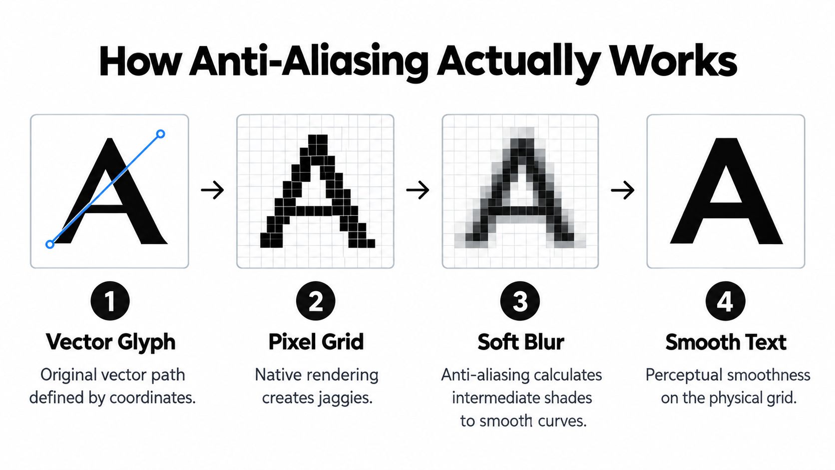
From outline to pixel coverage
The pipeline is easier to understand as a sequence:
- The font supplies a glyph outline. The letterform contains coordinates for stems, bowls, joins, and counters.
- The renderer positions the glyph. Font size, hinting instructions, fractional coordinates, and layout metrics determine where the outline lands.
- Rasterisation samples the outline. The engine calculates how much of each pixel is covered by the glyph.
- Compositing blends the result. Edge pixels are mixed with the background, producing the visible character.
That third step is where most anti-aliasing decisions happen. A pixel covered completely by black text becomes black. A pixel touched only at the edge becomes a darker grey on a white background, or a lighter grey when the text is white on a dark background.
Subpixels and hinting add different information
LCD panels have red, green, and blue components arranged in narrow vertical stripes. Subpixel rendering treats those components separately, effectively gaining more horizontal sampling information. The trade-off is potential colour fringing, especially around high-contrast vertical edges, and poor portability to displays whose stripe layout differs.
Hinting comes from the font and renderer rather than from CSS. It adjusts important features, such as stems and crossbars, so small glyphs align more usefully with the pixel grid. That can preserve apparent weight and spacing when the mathematical outline would otherwise produce uneven strokes.
The trade-off becomes sharper at small sizes. Guidance on screen typography notes that when a stroke falls below roughly 2 pixels, edge softness can reduce clarity, and some font-rendering approaches rasterise outlines at around 2× to 4× the target point size before downsampling as described in this technical reference. Those techniques improve the sampling process, but they can’t create detail that the display doesn’t have.
Grayscale vs Subpixel vs Hinting
These terms often appear together, but they solve different problems. Grayscale anti-aliasing blends edge coverage using luminance. Subpixel rendering uses the physical colour components of an LCD. Hinting changes the glyph’s alignment so critical features survive rasterisation.
| Mode | Edge Handling | Small-Size Legibility | Dark-Mode Behaviour | Best-Fit Device Profile |
|---|---|---|---|---|
| Grayscale | Blends edge pixels without colour separation | Predictable, though very small strokes can soften | Light text can appear lighter on dark backgrounds | High-density displays, varied panels, dark interfaces |
| Subpixel | Uses RGB stripe information for extra horizontal detail | Can look sharper at low density | Can create colour fringes or inconsistent results | Standard-DPI LCDs with stable stripe layouts |
| Hinting | Nudges stems and features towards useful pixel positions | Helps preserve structure at small sizes | Depends on the anti-aliasing mode around it | Small UI labels and low-resolution screens |
Grayscale is the dependable default
Grayscale behaves consistently across LCD, OLED, rotated, scaled, and high-density displays. It doesn’t assume a particular RGB stripe order, so it remains a safer choice for modern responsive interfaces. On a Retina-style panel, subpixel gains are also much less visible because the physical pixel grid is already dense.
The weakness is apparent stroke weight. White text on a dark background can look thinner because partially covered pixels are blended towards the dark surface. A 300 weight display headline may therefore need a heavier font file or a small tracking adjustment, not an aggressive rendering hack.
Subpixel still has a narrow use case
Subpixel rendering can help on a cheap, standard-DPI Windows laptop where text needs extra horizontal precision. It’s less useful when the device scales the page, the panel has an unusual layout, or the browser disables subpixel compositing for a transformed or translucent layer.
Hinting is the safety net for tiny labels. It can make a carefully designed UI font more stable, but it isn’t a universal sharpness switch. A poorly chosen typeface at a size that leaves its stems below the available pixel resolution will remain difficult to read.
How Operating Systems and Browsers Render Text
Text rendering is a negotiation between the browser and the operating system. CSS expresses preferences, but it doesn’t replace the platform’s font engine or force every browser to expose the same rasterisation path.
macOS commonly presents smooth grayscale text, while Chromium can apply platform-specific behaviour in some contexts. Windows uses DirectWrite and ClearType-derived approaches, with subpixel rendering historically playing a larger role on standard-DPI screens. Linux desktops vary with FreeType configuration, distribution defaults, desktop environment, and installed fonts.
iOS uses grayscale rendering on Retina devices regardless of CSS preferences. Android differs between older WebView behaviour and Chromium-based implementations. The exact result also changes when text is composited, transformed, animated, or rendered inside a layer with transparency.
| Platform | Default Mode | Common Override | Notes |
|---|---|---|---|
| macOS | Usually grayscale | Browser or system-specific handling | High-density screens reduce visible subpixel differences |
| Windows | ClearType-derived rendering | System and browser settings | Standard-DPI LCD panels can show stronger subpixel benefits |
| Linux | FreeType-based rendering | Desktop and distribution configuration | Hinting and subpixel settings can vary considerably |
| iOS | Grayscale | CSS has limited practical influence | Retina density makes edge differences less obvious |
| Android | Chromium or WebView dependent | Browser and device implementation | Legacy and current paths may not match |
At 2× and 3× display density, subpixel effects generally become much harder to see. That’s why most production teams should choose a primary target, usually a standard-DPI Windows setup or a Retina macOS setup, then check the other rather than trying to force one universal image.
Browser compatibility work benefits from the same discipline. Keep a rendering decision attached to a documented browser matrix, as you would for any other platform-sensitive feature. A useful companion is this browser compatibility guide, particularly when a design system needs to define what “supported” means across engines.
CSS Properties That Control Smoothing
The first trap is assuming that every typography property named in a browser article controls the pixels you’re looking at. Several declarations are valid CSS, appear in snippets everywhere, and have little or no effect in modern Chromium.
font-smooth
font-smooth is a non-standard property associated mainly with Firefox implementations and platform-specific rendering behaviour. MDN describes it as controlling anti-aliasing when fonts are rendered, but support and effect remain limited, so it isn’t a reliable cross-browser control in the MDN reference.
Treat it as a targeted experiment, not a foundation for a design system. If your Chrome regression remains unchanged after adding it, that’s expected.
-webkit-font-smoothing
This WebKit property is the switch Tailwind exposes through antialiased and subpixel-antialiased.
.headline {
  -webkit-font-smoothing: antialiased;
}

.body-copy {
  -webkit-font-smoothing: subpixel-antialiased;
}
antialiased requests grayscale-style smoothing on supported Apple-derived paths. It can make light text on a dark marketing surface appear thinner, but it may also remove coloured edge artefacts. subpixel-antialiased requests subpixel treatment where the browser and device permit it. On modern Chromium, the browser may ignore the request or use a different pipeline.
The important detail is that Tailwind’s utilities map to this property. They don’t create a new rendering engine, and they don’t guarantee the same result on every operating system.
text-rendering
text-rendering accepts values such as optimizeLegibility, geometricPrecision, and optimizeSpeed, but browser support is uneven. optimizeLegibility historically influenced kerning and ligature decisions, while geometricPrecision can indicate a preference for geometric fidelity. In modern high-density Chromium contexts, these values are increasingly ignored or produce no visible change.
font-synthesis
font-synthesis controls whether the browser invents styles that the font file doesn’t provide. Disable synthetic bold when a design relies on exact weight shapes:
.type-system {
  font-synthesis: none;
}
This matters more than a smoothing switch when a supposedly light or medium heading is a browser-generated approximation. Pair it with genuine font files and appropriate weights. For broader guidance on selecting readable type and evaluating practical trade-offs, these science-based typography tips provide useful context.
The honest verdict: On a modern Retina Chromium setup, most smoothing overrides are aesthetic preferences, not bug fixes.
Start with no override. Add one only after you’ve identified a repeatable issue on a real device, and record the device, browser, background, font, size, and weight alongside the rule.
Vue and Tailwind Recipes That Hold Up
A production recipe should solve a visible problem without pretending to control the entire platform. These examples keep the override local, explain its purpose, and leave room for the browser to ignore unsupported preferences safely.
A thin dark-mode headline
Suppose a dark marketing page uses a light display headline. Chromium’s default result makes a 300 weight look washed out on a particular low-density display. The first fix should be the actual font weight, but if the visual system deliberately uses that weight, a local smoothing preference and restrained tracking adjustment can be reasonable.
<template>
  <h1 class="hero-title text-5xl font-light tracking-tight">
    Build interfaces people can trust
  </h1>
</template>

<style scoped>
.hero-title {
  -webkit-font-smoothing: antialiased;
  letter-spacing: -0.01em;
}
</style>
The Tailwind equivalent is:
<h1 class="text-5xl font-light tracking-tight antialiased">
  Build interfaces people can trust
</h1>
antialiased is the rendering preference. tracking-tight adjusts the spacing, not the edge algorithm. Keep the combination tied to a dark display style rather than applying it globally to every heading.
A mixed-DPI analytics dashboard
Dashboard body copy usually benefits from stable metrics and a real font file. Axis labels may still look clearer with subpixel treatment on a standard-DPI screen, while the same preference offers little practical value on a high-density display.
<template>
  <td class="metric-cell">
    {{ value }}
  </td>

  <span class="axis-label subpixel-antialiased">
    {{ label }}
  </span>
</template>

<style scoped>
.metric-cell {
  text-rendering: optimizeLegibility;
}

.axis-label {
  -webkit-font-smoothing: subpixel-antialiased;
}
</style>
The equivalent utility classes are:
<td class="text-rendering-optimize-legibility">
  {{ value }}
</td>

<span class="subpixel-antialiased">
  {{ label }}
</span>
The custom text-rendering-optimize-legibility class assumes your Tailwind theme defines it. Tailwind’s built-in smoothing utility is available for the -webkit-font-smoothing rule, but text-rendering usually needs a small project-level extension.

A team should capture these decisions as design tokens or component styles, not scatter them across templates. The same principle applies when updating a utility architecture, and this Tailwind CSS 4 guide can help teams keep those conventions organised.
A Practical QA Workflow for Anti-Aliased Fonts
Rendering regressions rarely appear in unit tests. They surface when a font file changes, a browser updates, a dark theme reaches production, or a teammate opens the interface on hardware nobody included in the review.
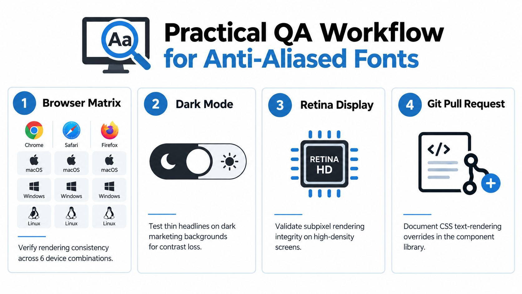
Start with a matrix that covers Chrome, Safari, and Firefox across macOS, Windows, and Linux. You don’t need to photograph every possible device, but you do need a representative standard-DPI screen and a high-density screen. Compare headings, body copy, compact controls, disabled labels, and data-dense tables.
Test the situations that expose softness
- Check density: Review at 1× and 2× device pixel ratios, then confirm the result on a real Retina display. DevTools is useful for responsive checks, but it can’t reproduce every physical-panel characteristic.
- Switch backgrounds: Review light and dark surfaces separately. Thin weights often lose perceived strength when partially covered pixels blend into a dark background.
- Inspect accessibility: Pair smoothing changes with the relevant UK public-sector accessibility standards. Confirm that colour contrast remains compliant for the text styles you ship.
- Test assistive use: Check magnification, browser zoom, and user font preferences. Guidance for visual impairment also discusses font smoothing as a practical setting, while warning implicitly that clarity depends on the complete visual context in this accessibility resource.
- Record the evidence: Save annotated screenshots with browser, operating system, display density, font version, size, weight, and background.
Don’t approve a change because one screenshot looks crisper. Approve it because the same change improves the identified scenario without weakening another supported scenario. Re-run the comparison when the font, operating system, browser, or component-library rendering rule changes.
Putting It Together and Shipping Cleaner Type
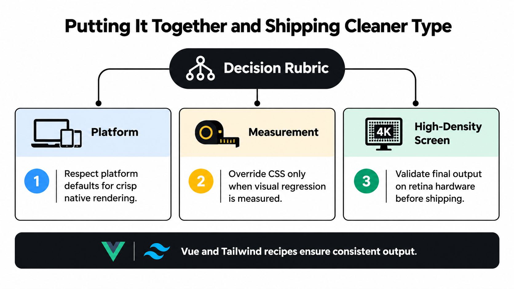
The production decision is conservative:
- Respect platform defaults unless a real device exposes a repeatable problem.
- Override CSS only after measurement, and document the affected component and display context.
- Validate on hardware, especially when a rule targets subpixel behaviour or dark-mode headlines.
- Fix fundamentals first, including font files, weight selection, size, line height, and contrast.
Most Vue and Tailwind interfaces ship better typography by leaving global smoothing untouched. Local overrides can earn their place, but they shouldn’t become ritual classes copied into every layout. A design system should explain why a rule exists, what device exposed the issue, and when a future contributor should remove it.
For teams building that discipline into a reusable interface foundation, this typography system guide is a useful next reference.
If your Vue and Tailwind interfaces need a cleaner, accessible component foundation, explore DOM Studio. Its headless primitives, Vue integration, Tailwind styling, and documented design-system patterns help your team keep typography and rendering decisions consistent as the product grows.