Component
Vue Message Composer Component
<DomTextareaComposer>An autosizing multiline field with attachment content, leading controls, trailing actions, and submit behavior inside one visual input.
Playground
Try the composer live
Textarea composer playground
The text area grows until maxRows, while the submit action remains inside the shared input frame.
Playground.vuevue
Install
npm install @getdom/studiovue
<script setup>
import '@getdom/studio/style.css';
import { reactive } from 'vue';
import { DomTextareaComposer } from '@getdom/studio';

const data = reactive({
		"modelValue": "",
		"id": "",
		"name": "",
		"label": "Message",
		"description": "",
		"placeholder": "Write a message...",
		"required": false,
		"disabled": false,
		"readOnly": false,
		"invalid": false,
		"errors": [],
		"visible": true,
		"validators": [],
		"validateOnBlur": true,
		"chrome": "field",
		"rows": 2,
		"autosize": true,
		"maxRows": 8,
		"ariaLabel": "Message",
		"showSubmit": true,
		"submitLabel": "Send message",
		"submitDisabled": false,
		"submitting": false,
		"submitOnEnter": true,
		"allowEmptySubmit": false
	});
</script>

<template>
	<DomTextareaComposer
		v-bind="data"
		@update:modelValue="data.modelValue = $event"
	/>
</template>
Demo
Composer with attachments and controls
Slots accept application-owned attachment previews, tools, model controls, voice actions, and custom submit UI without imposing an upload data model.
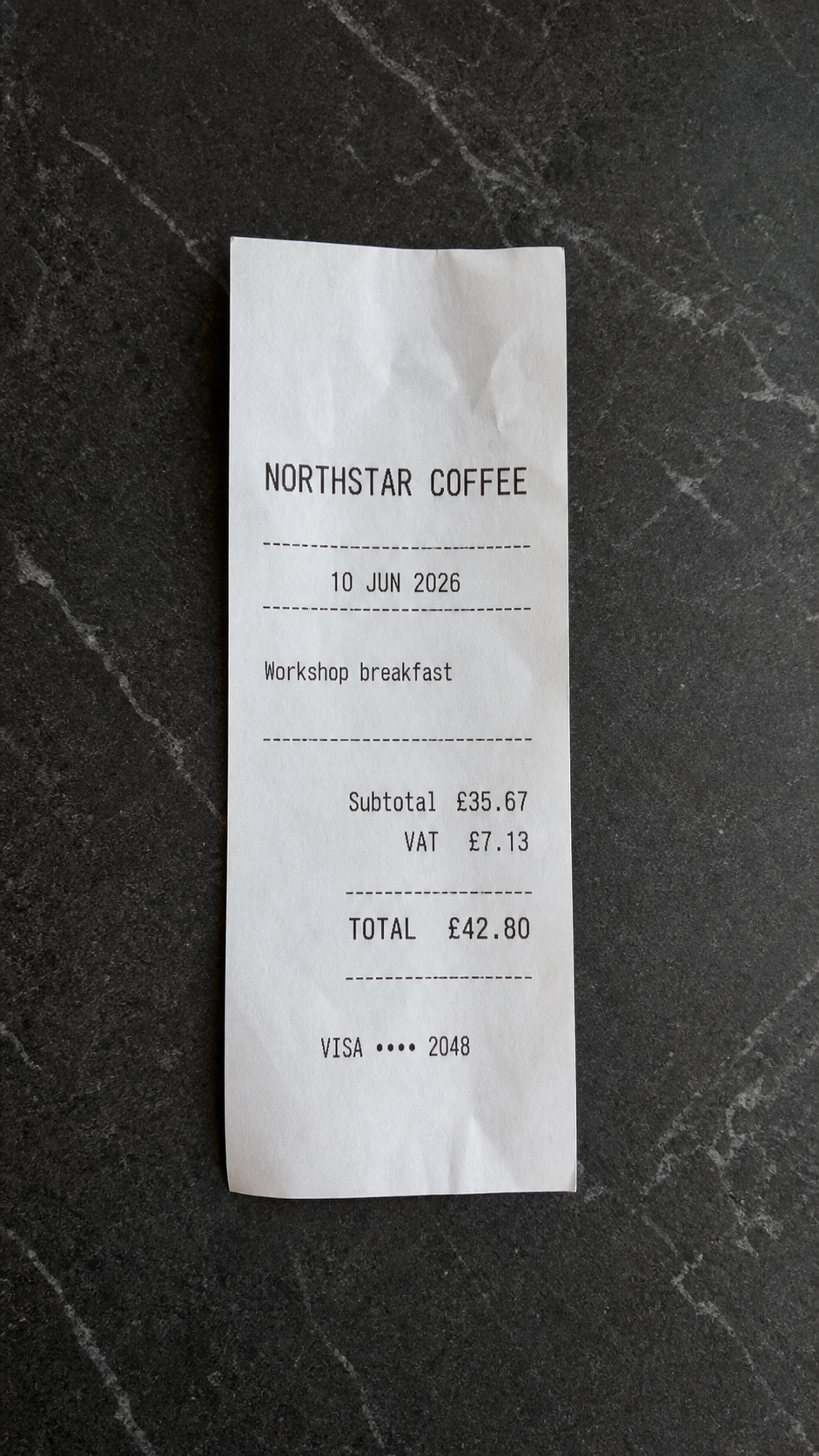 northstar-receipt.png
Install
npm install @getdom/studiovue
<script setup>
import '@getdom/studio/style.css';
import { ref } from 'vue';
import { DomButton, DomIconButton, DomTextareaComposer } from '@getdom/studio';

const message = ref('Compare this receipt with the reimbursement policy and flag anything that needs review.');
const attachments = ref([
	{
		id: 'receipt',
		name: 'northstar-receipt.png',
		preview: '/assets/blocks/expense-capture/receipt-northstar-coffee.png',
	},
]);
const result = ref('');

/**
 * Removes an application-owned attachment from the composer preview.
 *
 * @param {string} id Attachment identifier.
 * @returns {void}
 */
function removeAttachment(id) {
	attachments.value = attachments.value.filter((attachment) => attachment.id !== id);
}

/**
 * Adds the example attachment to demonstrate an application-owned picker.
 *
 * @returns {void}
 */
function addAttachment() {
	if (attachments.value.some((attachment) => attachment.id === 'receipt')) return;
	attachments.value.push({
		id: 'receipt',
		name: 'northstar-receipt.png',
		preview: '/assets/blocks/expense-capture/receipt-northstar-coffee.png',
	});
}

/**
 * Handles the shared composer's submit event and clears the local draft.
 *
 * @param {string} value Submitted composer text.
 * @returns {void}
 */
function sendMessage(value) {
	result.value = value || `${attachments.value.length} attachment sent`;
	message.value = '';
	attachments.value = [];
}
</script>

<template>
	<div class="w-full max-w-3xl space-y-3">
		<DomTextareaComposer
			v-model="message"
			label="Message"
			placeholder="Ask about the attached context..."
			:rows="2"
			:max-rows="7"
			:allow-empty-submit="attachments.length > 0"
			@submit="sendMessage"
		>
			<template #attachments>
				<article
					v-for="attachment in attachments"
					:key="attachment.id"
					class="group relative flex w-48 items-center gap-2 rounded-lg border border-border bg-secondary/40 p-1.5"
				>
					<img :src="attachment.preview" alt="" class="size-12 rounded-md border border-border object-cover" />
					<span class="min-w-0 flex-1 truncate text-xs font-medium text-canvas-fg">{{ attachment.name }}</span>
					<DomIconButton
						label="Remove attachment"
						size="xs"
						icon="M6 6l12 12M18 6 6 18"
						@click="removeAttachment(attachment.id)"
					/>
				</article>
			</template>

			<template #leading>
				<DomIconButton
					label="Attach context"
					size="sm"
					icon="M12 5v14M5 12h14"
					@click="addAttachment"
				/>
				<DomButton size="sm" variant="ghost">Tools</DomButton>
			</template>

			<template #actions>
				<DomButton size="sm" variant="ghost">Fast model</DomButton>
				<DomIconButton
					label="Start voice input"
					size="sm"
					icon="M12 3a3 3 0 0 0-3 3v6a3 3 0 0 0 6 0V6a3 3 0 0 0-3-3Zm-7 9a7 7 0 0 0 14 0M12 19v3M9 22h6"
				/>
			</template>
		</DomTextareaComposer>

		<p v-if="result" class="text-xs text-muted-fg" role="status">Sent: {{ result }}</p>
	</div>
</template>
Reference
Props
Control props
| Name | Type | TS | Default | Description |
|---|---|---|---|---|
rows | number | number | 1 | Minimum visible text rows. |
autosize | boolean | boolean | true | Grow and shrink the text area to match its content. |
maxRows | number | number | 8 | Maximum rows before text scrolls. Use 0 for no maximum. |
ariaLabel | string | string | 'Message' | Accessible textarea label used when no visible field label is supplied. |
Field props
| Name | Type | TS | Default | Description |
|---|---|---|---|---|
modelValue | any | any | '' | Current field value. |
id | string | string | '' | Optional ID override. By default parent forms derive the input ID from the field path using underscores. |
name | string | string | '' | Local field name. Parent forms derive the full field path and native HTML name from the form hierarchy. |
label | string | string | '' | Visible field label. |
description | string | string | '' | Optional helper copy below the field. |
placeholder | string | string | '' | Placeholder shown when the control is empty. |
required | boolean | boolean | false | Mark the field as required. |
disabled | boolean | boolean | false | Disable field interaction. |
readOnly | boolean | boolean | false | Show the value but prevent editing. |
invalid | boolean | boolean | false | Mark the field invalid. |
errorsts | array | object | string | Array< | [] | Validation errors for this field. |
visible | boolean | boolean | true | Show or hide the field. |
validators | array | Array<unknown> | [] | Validators attached to this field. Use functions in Vue code, or serializable records such as { name: "minLength", props: { min: 2 } } in generated schemas. |
validateOnBlur | boolean | boolean | true | Run validators when the field loses focus. |
chrome | 'field' | 'none' | false | string | 'field' | Render default field chrome, or hide chrome while keeping form state wiring. |
Submit props
| Name | Type | TS | Default | Description |
|---|---|---|---|---|
showSubmit | boolean | boolean | true | Show the built-in circular submit action. |
submitLabel | string | string | 'Send message' | Accessible label for the built-in submit action. |
submitDisabled | boolean | boolean | false | Disable submission in addition to field and empty-value checks. |
submitting | boolean | boolean | false | Show progress and block repeated submission. |
submitOnEnter | boolean | boolean | true | When enabled, Enter submits and Shift + Enter adds a new line. When disabled, Enter adds a new line and Shift + Enter submits. |
allowEmptySubmit | boolean | boolean | false | Allow attachment-only or control-defined submission when the text is empty. |
Auto-generated from Textarea composer.props and inline _edit hints.
Events
| Name | Payload | Description |
|---|---|---|
| @update:modelValue | string | Fired when the composer text changes. |
| @submit | string | Fired with the current text when the built-in submit action is used. |
| @keydown | KeyboardEvent | Fired before the built-in Enter key behavior runs. |
| @focus | FocusEvent | Fired when the textarea receives focus. |
| @blur | FocusEvent | Fired when the textarea loses focus. |
Names auto-detected from defineEmits and source emit() calls; payload and description from __doc.events when present.
Keyboard
- EnterSubmit with button press feedback when submitOnEnter is enabled; otherwise insert a new line.
- Shift + EnterInsert a new line when submitOnEnter is enabled; otherwise submit with button press feedback.
Slots
| Name | Scope | Description |
|---|---|---|
| #attachments | { value, disabled, readOnly } | File, image, reference, or context previews shown above the text. |
| #leading | { value, submit, disabled } | Controls at the start of the bottom action row, such as add or tool buttons. |
| #actions | { value, submit, disabled } | Additional controls before the built-in submit action. |
| #submit | { submit, disabled, submitting, label, pressed } | Replace the built-in circular submit button. Bind pressed to DomButton or DomIconButton to retain keyboard submit feedback. |