
You paste a multiline API response into a component, expecting the spacing and line breaks to remain readable. Instead, the browser collapses the gaps, joins separate lines, and turns carefully formatted text into one dense paragraph. Adding <br> elements seems to work, until the content becomes dynamic and every update needs new markup.
white-space: pre-wrap solves that specific problem by preserving meaningful whitespace while still allowing text to wrap inside its container. It’s useful for user-entered notes, captions, logs, poetry, messages, and other content where the original line structure matters. It isn’t a universal formatting fix, though. The property has accessibility and visual-rendering trade-offs that are easy to miss.
Table of Contents
- The Common Formatting Frustration
- How Pre-Wrap Actually Works Under the Hood
- Comparing White-Space Values for Every Use Case
- Practical Code Examples and Visual Outcomes
- Integrating Pre-Wrap in Vue and Tailwind
- Troubleshooting Common Pitfalls and Future Proofing
The Common Formatting Frustration
A customer pastes a support log into a Vue component:
Connection failed
  Retry after checking credentials
  Contact the administrator if the error continues
The source string contains newlines and indentation. The rendered paragraph doesn’t. Standard whitespace handling treats those spaces as ordinary separation and presents the content as a continuous run of text. The information is still technically present, but the visual hierarchy has disappeared.
A common reaction is to edit the HTML manually. You add <br> after every line, replace spaces with non-breaking spaces, or split the string into several elements. That approach ties presentation to content. It becomes fragile when the text comes from a database, an API, a form field, or a translation file.

The small CSS change
.formatted-copy {
  white-space: pre-wrap;
}
Apply that class to the element displaying the string, and the browser keeps the source line breaks and repeated spaces while still finding wrapping points when the container is narrow. You preserve the user’s input without forcing the layout to remain wider than the viewport.
That makes white space pre wrap a better fit than manual markup for dynamic content. It also belongs alongside a wider typography system rather than being sprinkled randomly through components. A documented typography system for interface teams can define where preserved text is appropriate, which font metrics apply, and how long content should behave at smaller widths.
Practical rule: Preserve text through CSS when the content is dynamic. Use structural HTML when the content has a known document meaning, such as a heading, list, paragraph, or table.
The key distinction is simple. pre-wrap preserves the way text was entered, but it doesn’t understand whether that text represents a list, a quote, a code sample, or a decorative alignment pattern. You still need to choose the right HTML element and accessible label.
How Pre-Wrap Actually Works Under the Hood
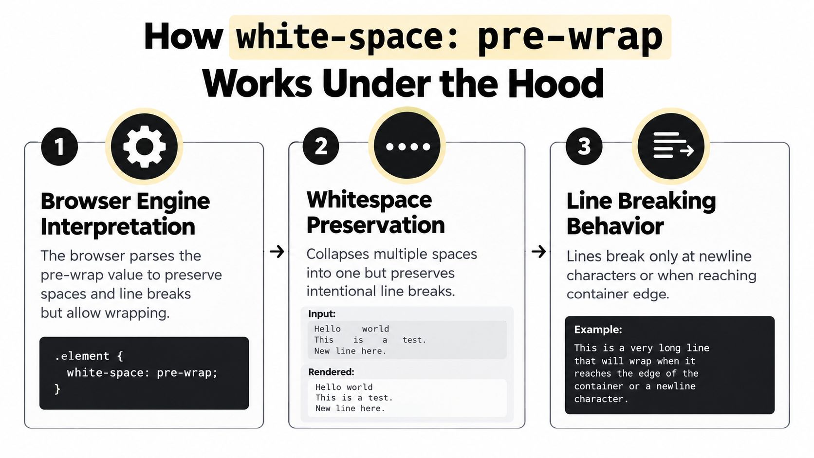
The browser doesn’t treat pre-wrap as a request to display text exactly as a screenshot. It applies a defined set of whitespace and wrapping rules. The CSS Text Module describes white-space: pre-wrap as preserving whitespace while allowing wrapping, with sequences of spaces treated similarly to non-breaking spaces and a soft wrapping opportunity at the end of the sequence (CSS Text Module Level 3).
That distinction explains many surprises. A sequence of spaces remains visually meaningful, but the browser can still use the end of that sequence as a place to wrap. Ordinary words can also wrap when the available line box requires it. The property preserves intent without freezing the element’s width.
What the browser preserves
With pre-wrap, the browser preserves:
- Newline characters, which create visible line breaks.
- Runs of spaces and tabs, which remain part of the rendered text.
- Ordinary wrapping opportunities, which let text fit the containing block.
The browser can wrap at newline characters, <br> elements, and additional soft opportunities needed to fit the line box. The MDN reference for white-space also describes trailing whitespace behaviour: trailing white space is hung rather than being forced to overflow the line.
That last detail matters for logs and captions. A line can contain deliberate indentation without every trailing space becoming a visible extension beyond the container. It doesn’t mean every unusual string is safe, however. Long sequences of intentional spaces can still produce unexpected alignment or overflow, especially inside narrow cards, tooltips, and responsive controls.
What it doesn’t preserve
pre-wrap doesn’t recover formatting that never reached the browser. If a server removes newline characters, or a serialisation step changes tabs into ordinary spaces, CSS can’t reconstruct the original structure. Inspect the actual string in developer tools before changing the stylesheet.
It also doesn’t make content semantically structured. A series of lines that looks like a list remains a text node unless you render a real list. Screen readers and keyboard users benefit more from correct document structure than from visual spacing alone.
Comparing White-Space Values for Every Use Case
The fastest way to choose a value is to ask two questions. Should the browser preserve repeated spaces? Should the text be allowed to wrap?
| Value | Repeated spaces and tabs | Newlines | Wrapping | Suitable use |
|---|---|---|---|---|
normal |
Collapsed | Collapsed visually | Yes | Ordinary paragraphs and labels |
nowrap |
Collapsed | Collapsed visually | No | Short controls or one-line UI text |
pre |
Preserved | Preserved | No | Fixed-format code or text that must retain its line width |
pre-line |
Collapsed | Preserved | Yes | User posts where line breaks matter more than indentation |
pre-wrap |
Preserved | Preserved | Yes | Dynamic formatted text that must remain responsive |
Start with the content, not the property name
Use normal for most prose. It gives the browser freedom to collapse incidental whitespace and wrap text naturally. nowrap is more restrictive and should be reserved for content that must stay on one line, such as a compact status label, provided you have a deliberate overflow strategy.
pre is appropriate when wrapping would change the meaning or appearance of the content. A code block, fixed-column output, or carefully aligned terminal sample may need it. The cost is horizontal overflow, so place it in a container that supports deliberate scrolling rather than letting it break the page.
pre-line works well for a social post, a user note, or a message where authors expect separate lines but don’t expect indentation to carry meaning. It keeps newline characters while treating repeated spaces as ordinary whitespace.
Why pre-wrap is the middle choice
Choose pre-wrap when both line breaks and repeated spaces communicate something. Examples include copied configuration text, customer-entered notes, lyrics, captions, and diagnostic output that needs to remain readable on smaller screens.
Don’t use it to imitate a list with spaces. If the content is a list, render list items. If it needs headings, paragraphs, or emphasis, use those elements and let CSS style them. Preserved whitespace is a presentation behaviour, not a substitute for semantic HTML.
Accessibility check: A visual line break should not carry information that the markup fails to express. Ask whether someone using a screen reader can understand the same content without seeing the spacing.
Practical Code Examples and Visual Outcomes
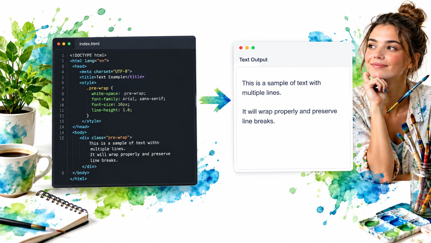
Start with a block element. A <div> or <p> can receive white-space: pre-wrap directly, and its contents will wrap according to the element’s available width.
<p class="message">
First line
  Second line with indentation
Third line
</p>
.message {
  max-width: 32rem;
  white-space: pre-wrap;
  overflow-wrap: anywhere;
}
The browser renders three visible lines and keeps the indentation before the second line. If the text contains a long unbroken token, overflow-wrap: anywhere gives that token another way to fit. Use it selectively, because breaking a value such as a product identifier can affect readability.
Applying the value to <pre>
The <pre> element already carries preformatted behaviour in browsers. You can override its wrapping when you want to retain the element’s semantic meaning but prevent long lines from forcing a wide layout.
<pre class="log-output">Request started
  Reading configuration
Request finished</pre>
.log-output {
  white-space: pre-wrap;
  overflow-wrap: anywhere;
  font-family: ui-monospace, monospace;
}
This preserves the log’s line structure while allowing the block to adapt to its parent. If horizontal scrolling is more useful than breaking long commands, use white-space: pre instead and add controlled overflow to the container.
Inline elements need a deliberate display choice
An inline <span> participates in the surrounding line layout. It can preserve whitespace, but its behaviour may not match what you expect when the content needs to act like an independent multiline block.
<span class="user-note">First line
Second line with more text</span>
.user-note {
  display: inline-block;
  white-space: pre-wrap;
  max-width: 100%;
}
inline-block gives the span a box that can respect a width constraint. If the content is a complete message rather than a phrase within a sentence, a block element is usually clearer and easier to style.
Integrating Pre-Wrap in Vue and Tailwind
In Vue, the property is most useful when the component receives a string through a prop. Render the value as text, not HTML, unless you have a separate sanitisation and trusted-content policy.
<script setup>
defineProps({
  message: {
    type: String,
    default: ''
  }
})
</script>

<template>
  <p class="whitespace-pre-wrap break-words">
    {{ message }}
  </p>
</template>
Tailwind’s whitespace-pre-wrap utility maps directly to the CSS value. break-words adds a fallback for long tokens, which is useful for pasted identifiers, URLs, and diagnostic strings. Keep the utility on the element that owns the text, rather than relying on an unrelated parent whose whitespace rules may be changed later.
Responsive variants need a reason
You can change the behaviour at a breakpoint:
<div class="whitespace-pre-wrap md:whitespace-pre">
  {{ output }}
</div>
This keeps the text responsive by default and switches to non-wrapping output at a wider layout. That choice only makes sense when the wider region has enough room or when horizontal scrolling is intentional. A breakpoint shouldn’t hide an overflow problem. Test the narrowest supported viewport, enlarged text, long words, and translated strings.
<template>
  <output
    class="whitespace-pre-wrap break-all rounded-md p-3"
    aria-live="polite"
  >
    {{ statusText }}
  </output>
</template>
For a changing status message, output can communicate purpose more clearly than a generic container. Add live-region behaviour only when updates should be announced, and avoid making large streams of log output intrusive for screen-reader users.

Component libraries should apply the same discipline to tooltips, popovers, and injected content. A polished primitive can manage focus and interaction, but the text component still needs a suitable width, contrast, overflow rule, and semantic element. Tailwind’s utilities make the local decision explicit, while a shared component API can prevent every team from solving multiline content differently.
Teams already working with utility-first styling may find this Tailwind CSS 4 guide useful when standardising those decisions across components.
Troubleshooting Common Pitfalls and Future Proofing
The most common mistake is assuming that preserved whitespace can never overflow. The CSS Text specification notes that preserved space sequences behave like non-breaking spaces with a soft wrap opportunity at the sequence’s end. A long, carefully spaced string can therefore create awkward gaps, alignment shifts, or overflow inside a constrained component (CSS Text Level 3 working draft).
Test the actual content you expect, not just a short sentence. Check indentation, repeated spaces, tabs, long tokens, empty lines, right-to-left text, zoom, and narrow containers. If the problem is clipping, don’t immediately reach for overflow: hidden. That can remove content from keyboard users and screen magnification users, as discussed in this guide to hiding overflow safely.
Watch the accessibility details
Whitespace can create visible gaps between adjacent caption spans. The BBC subtitle guidance warns that spacing between spans may show as gaps in their backgrounds, while newline characters don’t automatically become visual line breaks without a suitable break element. The practical response is to keep caption structure intentional and test the rendered result, rather than assuming pre-wrap will repair every text-rendering issue.
The newer CSS Text Level 4 model also changes how developers should think about this property. The CSS Text Level 4 specification describes white-space as a shorthand connected to whitespace collapsing, text wrapping, and whitespace trimming. Its mapping for pre-wrap uses preservation with wrapping, while newer controls make those concerns more explicit.
You don’t need to replace stable CSS today. Do avoid building new abstractions around the assumption that white-space is only a two-option switch. Keep structure in HTML, use pre-wrap for genuine preserved text, and isolate wrapping and overflow decisions so they can evolve as browser support and project requirements change.
DOM Studio provides accessible, headless UI primitives with Vue integration and Tailwind CSS styling, so components handling messages, tooltips, popovers, and dynamic content can share consistent interaction and text rules. Explore the DOM Studio library to build production interfaces where readable whitespace, responsive layout, and keyboard-friendly behaviour work together.