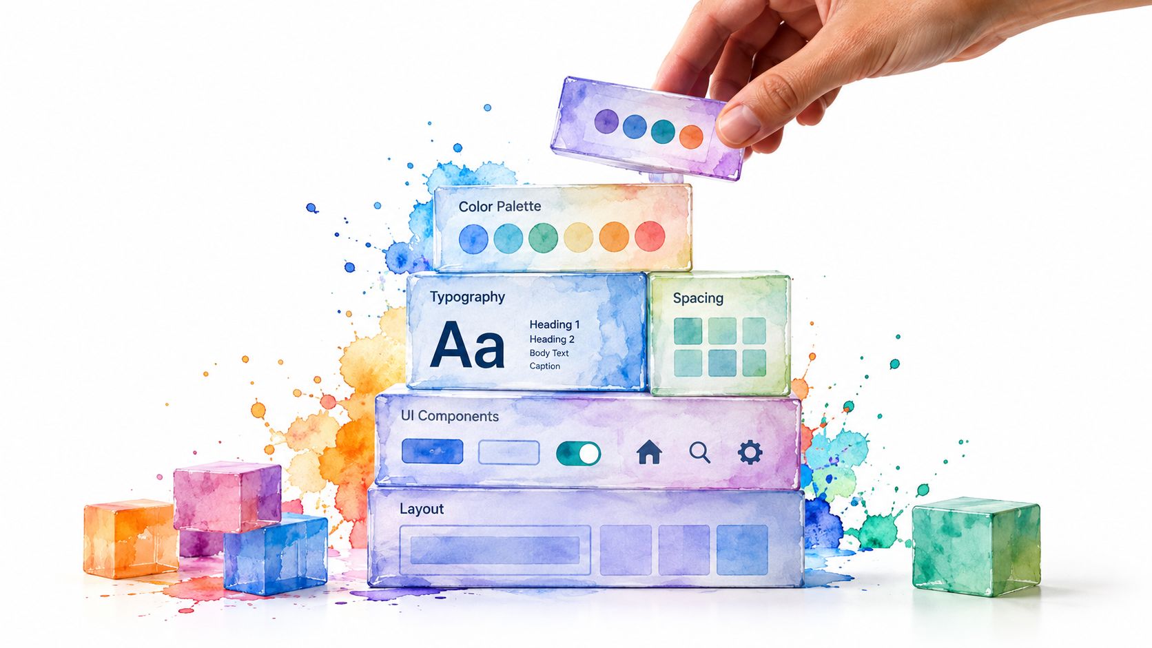
A design system is a shared, maintained set of styles, components, and rules that helps teams build consistent digital products faster. In the UK public sector, the GOV.UK Design System had its code reused more than 3,300 times and its frontend package downloaded over 2.7 million times, showing how a system can become shared infrastructure rather than a static style guide.
You may recognise the problem before you recognise the solution. A developer adds a button to a new feature, then discovers three similar buttons elsewhere in the product. One uses a slightly different blue, another has a larger radius, and a third shows no visible keyboard focus. The differences look minor in isolation, but users experience them as uncertainty and teams experience them as repeated work.
A design system creates a common agreement about how interfaces look, behave, and evolve. The overlooked part is that agreement needs ownership, evidence, contribution rules, and maintenance. Without those organisational foundations, even a polished component catalogue gradually becomes another source of confusion.
Table of Contents
- Why Teams Struggle Without a Design System
- What a Design System Is
- The Four Pillars of a Working Design System
- Accessibility and Governance as Non-Negotiables
- GOV.UK: A Design System as Public Infrastructure
- Design System vs Style Guide vs Component Library
- How to Adopt a Design System Without Overwhelming Your Team
- The Future of Design Systems and AI-Ready Interfaces
Why Teams Struggle Without a Design System
Two developers can work on the same product and make completely reasonable decisions that don’t agree. One builds a primary button with a dark brand colour and a subtle hover state. The other copies a button from an older screen, changes the padding, and adds a different disabled treatment. Both implementations pass a basic review, yet the interface now teaches users that similar actions may behave differently.
The same problem appears in more serious forms. A team may ship a dialog that looks correct but doesn’t manage focus properly, or a dropdown that works with a mouse but not a keyboard. If nobody has documented the expected interaction, each product team must rediscover the solution, and the defects can spread across multiple features.
The hidden cost of small differences
Inconsistent UI creates several kinds of debt at once:
- Duplicated effort: designers and developers recreate controls that already exist in another form.
- Accessibility gaps: keyboard behaviour, semantics, focus management, and error handling vary between implementations.
- Slower onboarding: new team members spend time asking which component, token, or pattern they should use.
- Brand drift: colours, typography, spacing, and interaction details gradually diverge across products.
- Harder change management: a global change requires a search through scattered files rather than an update to a governed source.
The UK public sector offers a useful reminder that consistency is not merely aesthetic. Accessibility regulations create a legal context in which shared, tested behaviours have practical value. Monitoring of public-sector websites between February 2020 and 19 November 2021 found that only 39 sites, or 7%, had a compliant accessibility statement initially, while 319 sites, or 80%, had compliant statements after monitoring and correspondence according to the UK government accessibility monitoring report.

A design system addresses this pattern by moving repeatable decisions into shared assets and documented rules. It doesn’t remove judgement from product teams. It gives them a reliable starting point, so they can spend their time on the parts of a service that are genuinely specific to users and context.
What a Design System Is
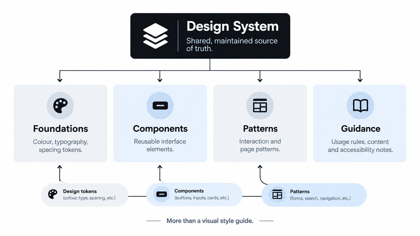
A design system is more than a visual style guide. It is a shared, maintained set of styles, reusable interface components, interaction patterns, and guidance that helps teams build consistent digital services and make shared decisions.
A recipe book offers a useful analogy. It may explain how to make a sauce, but a working kitchen also needs standard ingredients, equipment, preparation methods, quality checks, and someone responsible for updating recipes. A design system works in the same way. It turns design decisions into reusable infrastructure, while giving an organisation a process for agreeing, documenting, and changing those decisions.
Start with foundations
Design tokens are named decisions covering colour, typography, spacing, border radius, and elevation. Instead of scattering raw values through design files and code, teams give those decisions meaningful names. A button can use a semantic token for its background rather than hardcoding a colour value, which makes the choice easier to review, test, and update across products.
Add reusable components
Components are interface building blocks made from those foundations. Buttons, inputs, checkboxes, dialogs, menus, tabs, and navigation elements need defined states and predictable behaviour. A useful component is more than a rectangle in a design tool. It includes its implementation, API, accessibility behaviour, examples, and limits, so teams can use it without reconstructing the same decisions.
Describe recurring interactions
Patterns explain how components work together in common tasks. A form pattern can define validation, error placement, submission feedback, and recovery. A dialog pattern can specify focus movement, keyboard dismissal, accessible naming, and what happens when the user closes it. Patterns connect individual components to real service journeys.
Govern the whole system
Guidance and governance keep the system useful over time. Documentation tells people when to use a component and when another approach is appropriate. Governance sets ownership, contribution rules, review steps, release versioning, and the process for deprecating obsolete patterns. Without those responsibilities, shared assets can become an abandoned catalogue rather than a maintained organisational capability.
The Digital Souls Studios guide to UI UX provides background on the relationship between user experience and interface design.
The GOV.UK Design System shows how this model operates at organisational scale. GOV.UK launched in 2012 alongside government design principles. The Design System began in 2018 and became a live service after passing assessment in 2021. Its styles, components, patterns, code, research, and community processes work together as a delivery system, rather than a gallery of visual examples.
The Four Pillars of a Working Design System
A design system becomes dependable when four layers reinforce one another. Tokens provide stable decisions, components package those decisions, patterns apply them to common tasks, and governance determines how the system changes.
Foundations make decisions reusable
Tokens replace scattered, unexplained values with named decisions. A primitive colour token might describe a palette value, while a semantic token describes its purpose, such as primary text, subtle background, or error border. Components should generally consume semantic decisions because intent remains clearer than appearance.
The same principle applies to spacing and typography. A named spacing scale gives teams a common vocabulary, while type tokens can define font family, size, weight, line height, and letter spacing. The exact values matter less than having a deliberate structure that designers and developers can share.
Components carry behaviour
A coded button should define more than its colour and padding. It needs states for hover, focus, pressed, disabled, and loading conditions. An input needs label association, help text, error messaging, and an appropriate relationship between visual and semantic states.
This is why a component library can be useful without being a complete design system. It may offer reusable code while leaving teams to decide how components should be composed, documented, tested, and changed.
Patterns solve recurring tasks
Patterns sit above individual components. They describe solutions such as account creation, filtering, empty states, confirmation flows, and navigation. A pattern should explain the user problem, the recommended structure, suitable components, content considerations, and accessibility requirements.
Patterns also need boundaries. If every unusual layout becomes a new system pattern, the system becomes difficult to learn. If no unusual case can be supported, teams will create local alternatives.
Governance keeps the system alive
Governance answers operational questions that component catalogues often avoid:
- Who owns the system: a named team or working group responsible for quality and direction.
- Who can contribute: product teams, designers, developers, researchers, and accessibility specialists.
- What evidence is required: research, audits, standards, browser behaviour, or a clear product need.
- How changes ship: review, release notes, versioning, migration guidance, and deprecation.
- How success is measured: adoption, retired duplicates, defects, regressions, and user outcomes.
Teams that want a deeper technical treatment can use this design system architecture guide to examine how tokens, components, patterns, and implementation layers fit together.
Practical rule: If nobody knows who can approve a new component, the organisation doesn’t yet have a governed design system.
Accessibility and Governance as Non-Negotiables
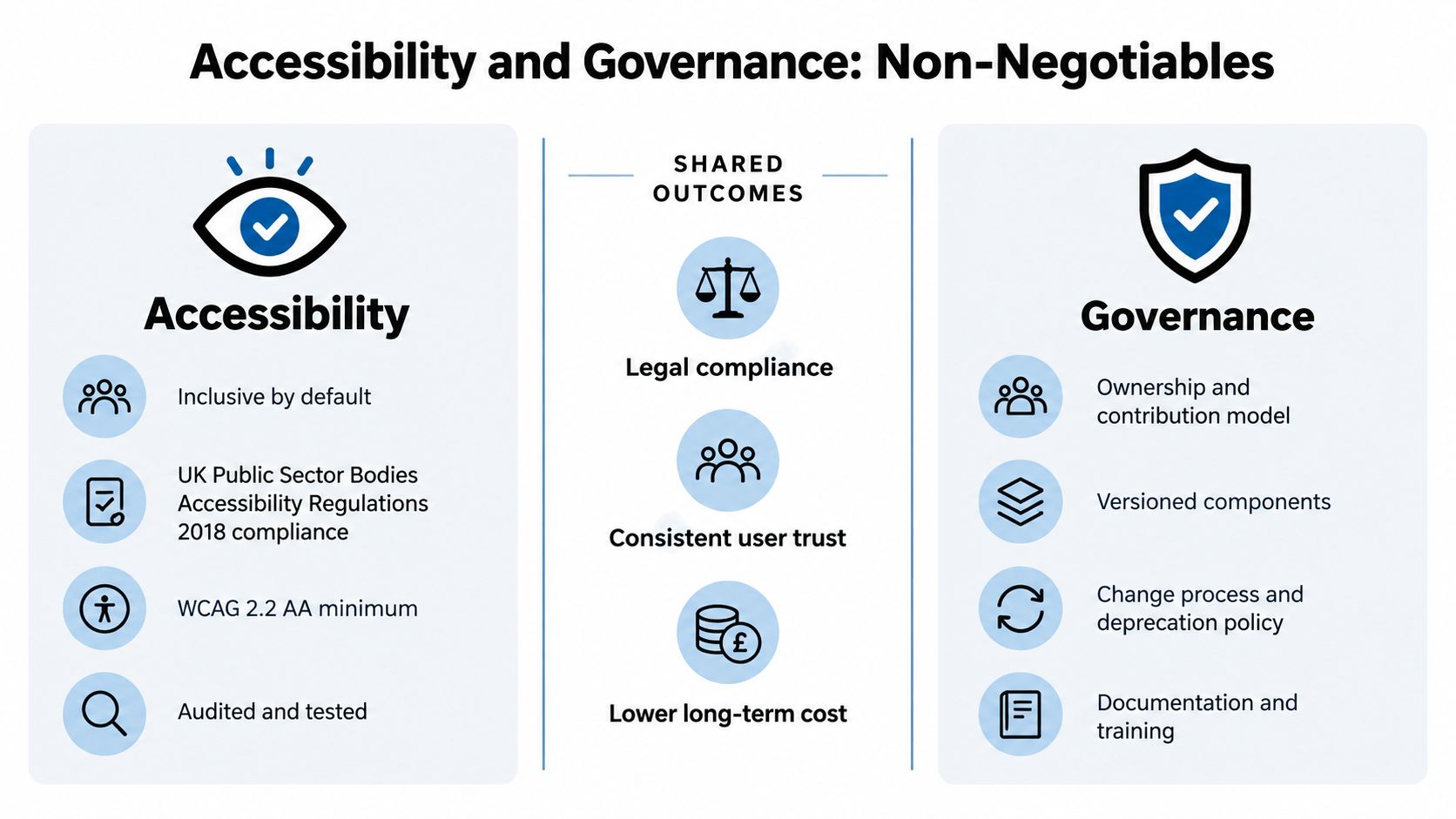
Accessibility belongs inside the system’s engineering contracts, not in a final visual review. The UK’s Public Sector Bodies (Websites and Mobile Applications) Accessibility Regulations 2018 require covered websites and mobile applications to be accessible. UK guidance describes expectations around perceivable, operable, understandable, and reliable experiences, with WCAG 2.2 AA or documented valid exceptions.
That legal context changes the question from “Does this component look right?” to “Can teams reuse this behaviour with confidence?” A menu needs semantic structure and keyboard interaction. A dialog needs focus management and an accessible name. A listbox needs a defined keyboard map and clear state communication. A form control needs reliable labelling and error handling.
Give every component a contract
A useful component contract should cover:
- API and states: supported properties, variants, loading behaviour, disabled behaviour, and error states.
- DOM semantics: native elements where appropriate, plus WAI-ARIA roles and states when needed.
- Keyboard behaviour: focus order, activation keys, escape handling, and navigation rules.
- Visual tokens: approved colour, spacing, typography, focus, and motion decisions.
- Support boundaries: browsers, assistive technologies, responsive conditions, and known limitations.
- Evidence: relevant WCAG criteria, test results, audit findings, and user research.
Teams should test the contract in isolation, then test the component within real product flows. UK government guidance recommends accessibility audits at both Private Beta and Public Beta, while accessibility statements need known issues, alternatives, contact routes, and ongoing updates.
Measure the system, not just the catalogue
Governance becomes practical when teams track whether it changes delivery and user experience. Useful measures include component adoption, duplicated implementations retired, accessibility defects by component, regression rates, and task success for disabled users.
The Kogifi perspective on design system consistency offers further context on why shared rules need organisational ownership rather than passive documentation. For a more detailed treatment of roles, contribution models, and decision-making, see this guide to design system governance.
A system without accessibility is a compliance risk. A system without governance is a component library. A system with both can turn repeated quality decisions into a maintained capability.
GOV.UK: A Design System as Public Infrastructure
The GOV.UK Design System shows how reusable interface assets can become shared public infrastructure. It grew from the Government Digital Service’s wider transformation work, bringing together styles, components, patterns, documentation, research, accessibility practice, and community contribution.
Its value became especially visible during the COVID-19 response. Fifty-two services were built within weeks rather than months, while one emergency support service moved from concept to live delivery in fewer than four days and produced estimated savings of £10.4 million, as documented in the public design evidence review.

The lesson is organisational as much as visual. Teams respond faster when common design and implementation decisions have owners, documentation, and tested reuse paths. Governance gives those shared assets a way to change without fragmenting across departments. The system still allows variation where services require it, while maintaining consistent interaction and accessibility expectations.
DOM Studio demonstrates a different implementation approach. Its headless primitives use standards-based custom elements, while a Vue integration layer provides reactive props, v-model support, and slots. Teams can therefore reuse framework-agnostic behaviour while integrating components naturally into Vue applications.
The library also treats inspectability as part of the system. Embedded documentation, inspector hints, and Studio specs give designers and developers more context about intended usage and possible improvements.
The following video offers another view of how shared component behaviour and design decisions connect in practice:
Together, these examples show why a design system is operational infrastructure. It supports delivery, quality control, learning, and change across teams. Documentation records the agreement, while governance and maintained reuse make that agreement work in production.
Design System vs Style Guide vs Component Library
These terms describe related layers, not interchangeable products. Confusing them leads teams to expect governance from a code package or behaviour from a visual reference.
| Asset | What it contains | What it doesn’t provide by itself |
|---|---|---|
| Style guide | Colour, typography, spacing, imagery, brand, and sometimes content rules | Working components, interaction contracts, implementation, and release governance |
| Component library | Reusable coded interface elements and their APIs | The full design language, contribution model, product guidance, and organisational ownership |
| Design system | Foundations, components, patterns, documentation, accessibility rules, code, and governance | A guarantee that teams will adopt it without support and maintenance |
A style guide can tell a designer which colour to use, but it may not explain how a button behaves while loading or how a dialog manages focus. A component library can provide a dialog implementation, but it may not explain when a confirmation dialog is appropriate or how product content should be written.
The guide to what a style guide is is useful when you need to separate visual identity documentation from broader product-system responsibilities.
A design system is the agreement around the assets, not merely the assets themselves.
The distinction also helps teams choose a sensible starting point. A small product may begin with a style guide and a few coded components. As its teams, surfaces, and requirements grow, it can add patterns, documentation, accessibility contracts, contribution workflows, and release management. The important step is recognising what is missing instead of calling every library a complete system.
How to Adopt a Design System Without Overwhelming Your Team
Don’t begin by trying to document every possible component. Start with the repeated problem that causes the most friction, such as buttons, form fields, dialogs, or a common navigation pattern.
Choose one pilot and make it real. Audit its existing variants, define the tokens and states, document appropriate and inappropriate use, implement the accessibility contract, and use it in a live product flow. A small working example teaches the organisation more than a large catalogue that nobody has adopted.
Establish the minimum operating model
Before adding more components, agree on four practical rules:
- Contribution: anyone can propose a change, but the proposal must explain the user need, affected products, implementation, and evidence.
- Validation: new components pass design review, code review, accessibility checks, and usage testing before inclusion.
- Versioning: every release includes a changelog and explains migration impact.
- Deprecation: older components receive a supported replacement and a clear path away from them.
These rules prevent the library from becoming a collection of personal preferences. They also make disagreement productive because teams can discuss evidence, constraints, and user outcomes rather than defending individual taste.
Allow controlled variation
Standardisation shouldn’t mean forcing every product into one interaction model. If a service has a genuine requirement that the shared component doesn’t meet, let the product team extend or propose a variation through the contribution process.
Standardise foundations and interaction contracts. Allow variation where the user need is real, visible, and documented.
A design system needs protected maintenance time. Without it, documentation becomes stale, releases accumulate breaking changes, and product teams create local workarounds. The system should be treated as a product with users, support requests, a roadmap, and measurable quality goals.
The Future of Design Systems and AI-Ready Interfaces
AI-generated interfaces make governance more important, not less. A tool can assemble a button, dialog, or form quickly, but generated code may still choose the wrong component, ignore a usage constraint, or reproduce an inaccessible interaction. Speed at the first pass doesn’t guarantee a coherent product.
AI-ready systems therefore need explicit metadata. Components should expose their purpose, supported states, accessibility requirements, composition rules, and boundaries in forms that both people and tools can inspect. Embedded docs, inspector hints, examples, and Studio specs can give generated code the context needed for review and refinement.
The engineering workflow also changes. A developer may ask an AI tool to create a settings page, then inspect whether it used the approved tokens, selected the right pattern, preserved semantic structure, and handled keyboard interaction. The system becomes a set of constraints and explanations that help the tool produce a safer first draft.
Keep humans responsible for decisions
AI can assemble known building blocks, but teams still need to decide:
- whether the flow solves the user’s problem;
- whether the content is understandable;
- whether the interaction works for disabled users;
- whether a new variation belongs in the shared system;
- whether evidence supports a change.
UK public-sector monitoring from October 2024 uses WCAG 2.2 and covers 55 Level A and AA success criteria, according to government accessibility requirements for public-sector websites and apps. A design system that evolves with standards, browsers, assistive technology, and service needs gives teams a stronger basis for reviewing both human-written and generated interfaces.
The team struggling with inconsistent buttons can now use AI to assemble screens faster, but only if the system describes what each component means and how it must behave. That is the lasting idea: a design system isn’t finished when the catalogue launches. It’s an ongoing practice of shared decisions, evidence, maintenance, and responsible change.
DOM Studio provides headless web component primitives, a Vue integration layer, semantic tokens, accessibility behaviour, documentation, and inspectable component metadata for teams building governed interfaces. Visit DOM Studio to explore reusable components and see how an AI-ready implementation layer can support a practical design system.