
You’re probably in one of two situations right now. Either your team already has a component library, but every squad still ships slightly different UI, or you’re trying to prevent that drift before it hardens into technical debt. In both cases, the hard part isn’t drawing a better button. It’s deciding how tokens, components, accessibility, release process, and documentation fit together so people can keep building without breaking consistency.
That’s where design system architecture comes in. It’s the part most tutorials skip because it’s less glamorous than a shiny component gallery. But once a product grows beyond one team, architecture becomes the difference between a system people trust and a package they work around.
Table of Contents
- Why Design System Architecture Matters for Growing Teams
- The Core Layers of a Design System Architecture
- Tokens, Themes and the Single Source of Truth
- Component Primitives and Accessible Patterns
- Distribution, Versioning and CI/CD Pipelines
- Accessibility as a System-Level Architectural Constraint
- Designing for AI-Ready and Machine-Readable Components
- A Practical Checklist for Rolling Out Your Architecture
Why Design System Architecture Matters for Growing Teams
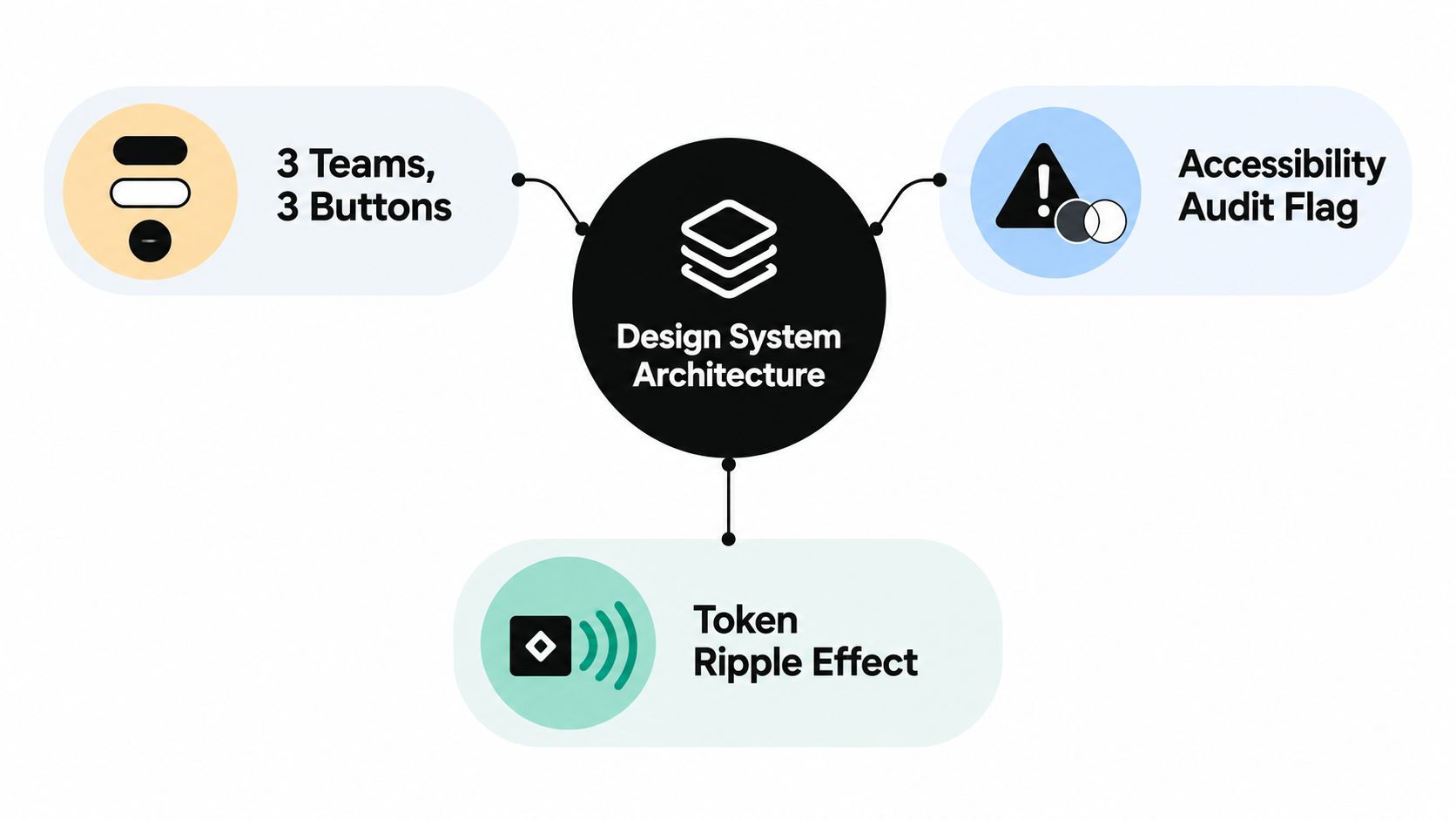
A growing product usually exposes the same pattern again and again. One squad builds a primary button with one focus style. Another adds a loading state differently. A third copies the first version into its own codebase and changes spacing because a deadline is close. A month later, an accessibility audit flags inconsistent contrast and focus treatment, and a simple token change turns into a messy refactor across repos.
That problem isn’t really about buttons. It’s about missing architecture.
A system is more than a library
A component library gives you reusable code. Design system architecture gives you the blueprint that makes that code dependable. It defines how tokens flow into components, how components are versioned, who approves pattern changes, how accessibility gets enforced, and how teams consume updates safely.
A city’s planning code rather than a single building. A nice building can still create chaos if every street uses different rules for access, signage, spacing, and safety. Planning rules make many buildings work together. Architecture does the same for product teams.
Three things usually sit inside that blueprint:
- Contracts: What a token means, what a component guarantees, and what consumers are allowed to override.
- Decision records: Why the team chose headless primitives, semantic tokens, or a specific naming model.
- Distribution rules: How updates move from source to packages, docs, and product teams.
Practical rule: If two teams can implement the same component differently and both think they’re following the system, your architecture is underspecified.
Why scale changes the conversation
Small teams can get away with informal habits for a while. Larger teams can’t. The UK government’s design work shows why institutional structure matters. The Government Digital Service was established in 2011, GOV.UK launched in 2012, Government Design Principles were published that same year, and the GOV.UK Design System was introduced in 2018 as a central place for reusable styles, components, and patterns across departments. The same public design review also notes that UK government design capability has been embedded for over 20 years, with a timeline starting in 2004 across multiple design specialisms (UK public design evidence review).
That history matters because it shows a real shift from isolated interface work to shared governance. Growing teams need the same shift, even at a smaller scale.
The Core Layers of a Design System Architecture
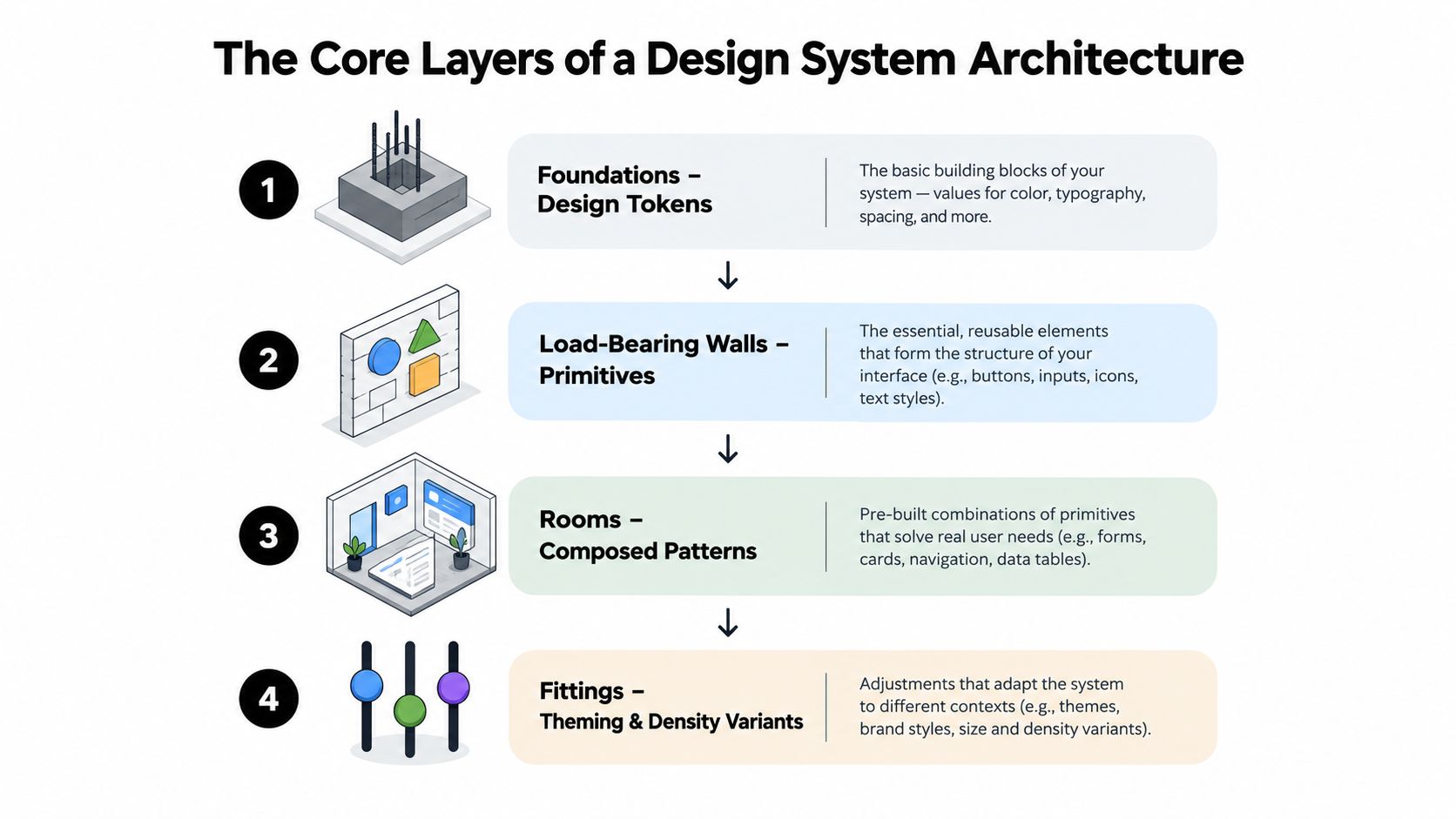
When teams talk about a design system, they often lump everything together. That’s where confusion starts. It helps to think in layers, because each layer has a different job and should depend only on the layer below it.
Foundations, walls, rooms, fittings
A building analogy works well here.
- Foundations are tokens. These hold raw values and semantic decisions for colour, spacing, type, motion, radius, shadow, and focus treatment.
- Load-bearing walls are primitives. These are the stable behavioural units such as button, input, dialog, menu, listbox, or checkbox.
- Rooms are composed patterns. These combine primitives into usable solutions like search forms, filter panels, checkout steps, or account navigation.
- Fittings are theming and density variants. These adapt the same core parts for brands, product areas, or compact and comfortable layouts.
Most systems also need two cross-cutting layers:
- Documentation: Usage guidance, accessibility notes, examples, and migration advice.
- Distribution: Packages, build outputs, releases, changelogs, and registry publishing.
The dependency rule that stops sprawl
A healthy architecture follows one simple rule. Each layer may consume the layer below it, but not the one above it.
That means a primitive can use tokens, but tokens can’t reference a button component. A pattern can use a dialog primitive, but a dialog primitive shouldn’t import a page template. This sounds obvious until teams start adding “just one exception” and end up with circular dependencies, duplicated styles, and components that only work in one product context.
Here’s a useful way to map responsibilities:
| Layer | Primary responsibility | Typical examples |
|---|---|---|
| Tokens | Encode values and intent | colour roles, spacing scale, focus ring variables |
| Primitives | Own behaviour and semantics | keyboard handling, ARIA roles, dismiss logic |
| Components and patterns | Combine primitives into product-ready UI | forms, navigation groups, empty states |
| Theming surfaces | Adapt look without changing behaviour | brand palettes, density modes, dark theme |
| Docs and distribution | Make the system usable and safe to adopt | examples, package releases, migration notes |
In regulated or high-stakes interfaces, this layering becomes even more important. If you work in sectors with strict usability demands, resources on UX design strategies for healthcare are helpful because they show how interaction decisions often carry domain consequences beyond visual polish.
The layer model is an ownership model first. Don’t mistake it for a folder structure.
Tokens, Themes and the Single Source of Truth
Teams often say “tokens” when they really mean three different things. If you don’t separate those tiers, theming becomes brittle and naming turns into guesswork.
The three token tiers
A mature token model usually has reference tokens, semantic tokens, and component tokens.
Reference tokens hold raw values. They describe the palette, spacing scale, typography scale, radius set, or motion durations. Semantic tokens give those values intent. Component tokens bind that intent to a specific UI element.
Here’s the model in a compact view.
| Tier | Purpose | Example | Consumers |
|---|---|---|---|
| Reference tokens | Store raw values | colour.blue.600, space.16 |
token transforms, theming layer |
| Semantic tokens | Express meaning | colour.surface.primary, space.stack.md |
components, patterns |
| Component tokens | Bind values to a component need | button.primary.background |
individual component styles |
Why one source matters
The reason people push for a single source of truth isn’t fashion. It’s drift control. If design files, CSS variables, Tailwind config, and mobile styles all define values separately, they won’t stay aligned for long.
A single token source, often JSON or YAML, lets teams generate the formats each platform needs. Web might receive CSS custom properties. Tailwind might consume a generated theme object. Mobile might receive platform-specific constants. The important bit isn’t the file format. It’s that the meaning originates in one place.
A component that directly uses a hex value or fixed spacing number has bypassed the system. Many teams get trapped by hard-coded values. It might look correct today, but it won’t respond cleanly to a rebrand, contrast adjustment, or theme swap.
For a useful example of how teams approach adaptable theme layers, this guide to theme customisation patterns is a strong companion read.
The trade-off most teams discover late
Semantic naming sounds simple until you write the names.
If aliases are too generic, they stop communicating intent. A token called primary can mean almost anything. If they’re too specific, they become impossible to reuse. A token called marketing-homepage-hero-button-blue isn’t a system token. It’s a frozen implementation detail.
A better test is this: can another team read the name and understand why it exists, without needing to know where it was first used? Good token architecture sits in that middle ground.
Component Primitives and Accessible Patterns
Primitives are where a design system stops being a style kit and becomes an interaction system. They’re the small, repeated building blocks that nearly every screen needs, but they carry a lot more than visual treatment. A button isn’t just colour and padding. It has focus behaviour, disabled behaviour, pressed states, loading rules, and often keyboard interaction expectations in context.
Behaviour first, styling second
The cleanest primitive architecture separates behaviour from presentation. In practice, that often means a headless primitive or composable owns the state machine and accessibility semantics, while a consumer or wrapper decides how it looks.
In a Vue 3 setup, a listbox is a good example. The primitive should manage active option state, selected value, keyboard navigation, typeahead if supported, focus movement, and the relevant ARIA relationships. A Tailwind-styled wrapper should decide whether the trigger has rounded corners, a border, a dense layout, or a branded hover state.
That split keeps design choices from leaking into interaction logic.
| Concern | Belongs in Primitive | Belongs in Consumer |
|---|---|---|
| Open and close behaviour | Yes | No |
| Keyboard handling | Yes | No |
| ARIA roles and relationships | Yes | No |
| Selected and active state logic | Yes | No |
| Spacing, colour, border radius | No | Yes |
| Brand-specific icons | No | Yes |
| Layout inside a page section | No | Yes |
A Vue example teams can reason about
In a headless Vue pattern, you might expose a useListbox() composable that returns things like isOpen, activeIndex, selectedValue, open(), close(), selectOption(), and prop helpers for trigger and option elements. Then a component wrapper applies token-backed classes through CSS variables or Tailwind utilities.
That means you can restyle the listbox later without rewriting the keyboard model. It also means a team can swap visual systems while preserving semantics and behaviour.
If you want to compare approaches to this pattern, the discussion in this headless UI component library guide is useful.
Build primitives around user interactions, not around screenshots.
What a primitive must guarantee before release
Before a primitive ships, a team should be able to answer a few plain questions:
- Can a keyboard user complete the interaction? Not just enter it, complete it.
- Is focus visible in every state? Including hover, active, disabled-adjacent, and error states where relevant.
- Do screen reader relationships hold up? Labels, descriptions, expanded state, selected state, and announcements need to make sense.
- Are escape routes defined? Dialogs, menus, popovers, and listboxes need predictable close behaviour.
- Can styling change without breaking semantics? If not, behaviour and presentation are still tangled.
This is also where tool choice matters. Some teams use Radix, Ariakit, Headless UI, React Aria, or custom web component primitives. Others use systems such as DOM Studio, which provides headless web component primitives with Vue wrappers and baked-in ARIA and keyboard behaviour. The architectural question is the same in every case. Does the primitive own the hard interaction rules so product teams don’t have to reinvent them?
Distribution, Versioning and CI/CD Pipelines
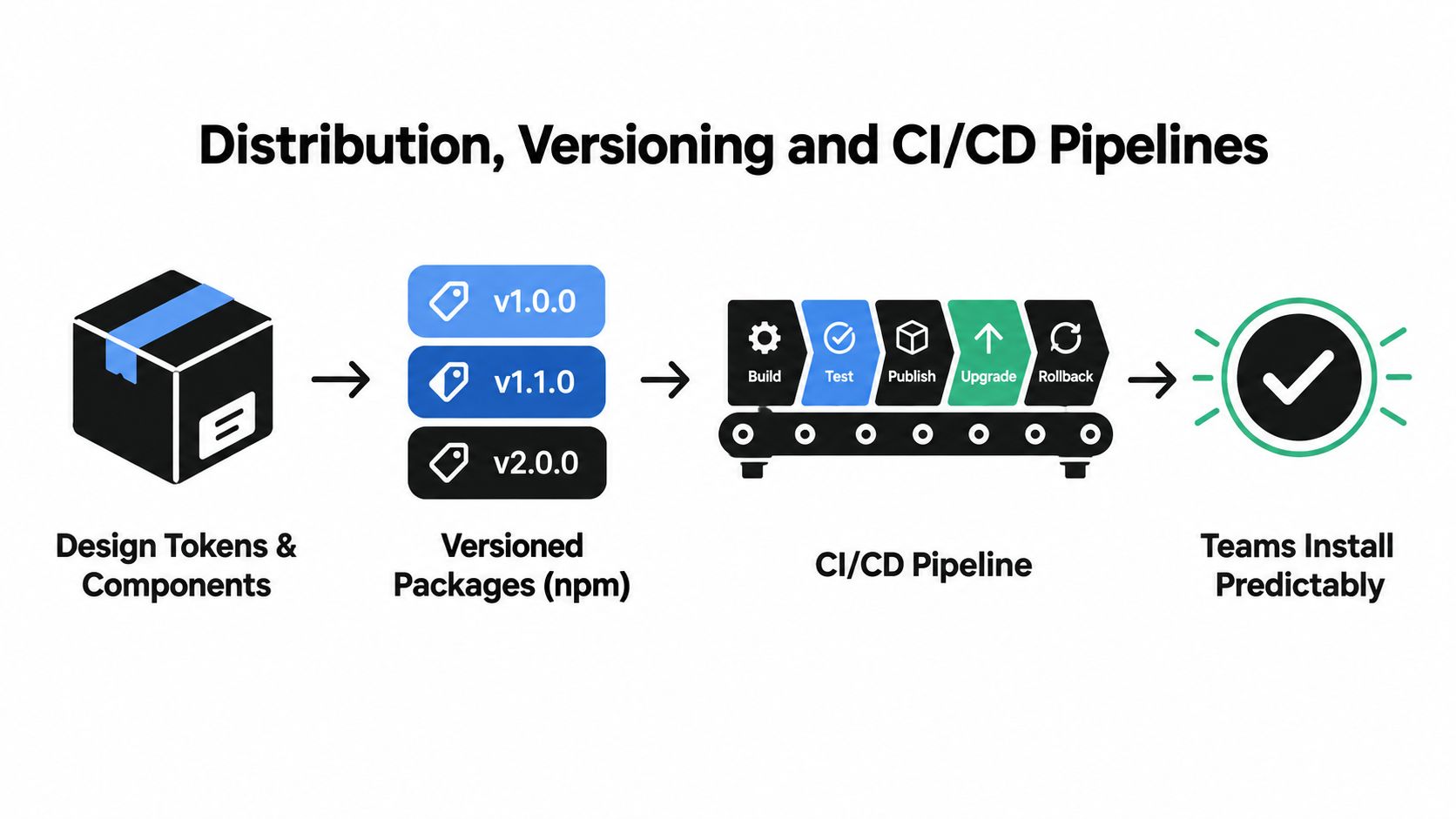
A design system stops being trustworthy the moment upgrades feel risky. Teams won’t adopt a package they can’t install, test, rollback, or understand. That’s why distribution and release process are architectural concerns, not admin work left for later.
What a dependable release pipeline looks like
The practical model is familiar. Tokens and components live in source control. CI runs validation on every pull request. Approved changes publish to a package registry and update docs from the same source.
Useful checks often include:
- Unit coverage: Primitive behaviour, prop handling, event emission, and state transitions.
- Accessibility checks: Tools such as axe-core or Pa11y catch regressions early, especially around roles, labels, and focus order.
- Token validation: Schema checks and diffs stop accidental renames or destructive value changes.
- Visual regression: Chromatic, Percy, or BackstopJS can flag state-level rendering drift before release.
- Canary publishing: Teams can test a pre-release package in a real app before tagging a wider release.
For release workflow habits that map well to system maintenance, these PullNotifier CI best practices are worth reviewing.
A short walkthrough helps here:
Versioning is part of the product contract
Versioning only works if teams agree what counts as breaking. In a design system, that usually includes more than API changes. A visual change can be breaking if it alters spacing, hierarchy, or states in ways consuming apps must account for.
A simple working policy looks like this:
- Major versions for breaking API or behavioural changes, and for visual shifts that require consumer review.
- Minor versions for new components, new variants, or additive token exports.
- Patch versions for safe fixes, documentation corrections, and non-breaking implementation repairs.
Release mindset: your docs site is part of the package. If the code changed and the examples didn’t, you shipped an incomplete release.
The docs site itself should be generated from the same repository, often through Storybook or Histoire. That makes it a contract surface rather than a separate marketing layer. Teams need installation instructions, migration notes, deprecation warnings, and examples they can trust.
Accessibility as a System-Level Architectural Constraint
Fewer teams build their system so that accessibility survives deadlines, staff changes, and parallel product work. That’s the architectural gap.
A checklist attached to a component review isn’t enough. Accessibility needs to sit lower in the stack, inside tokens, primitives, docs, governance, and CI. Otherwise each squad reinterprets the rules, and the system slowly fragments.
What public-sector practice makes clear
GOV.UK’s design system frames accessibility around the four WCAG principles: Perceivable, Operable, Understandable, and Robust, and it explicitly states that the design system alone does not make a service accessible without further research, design, development, and testing (GOV.UK accessibility strategy). That’s an important architectural lesson. Reusable components reduce variance, but service-level accessibility still depends on context.
There’s also a compliance reality for UK teams. WCAG 2.2 AA became the minimum accessibility standard for government websites and mobile apps, with compliance monitoring starting in October 2024. GOV.UK also says its design system website, frontend documentation site, and frontend codebase are compliant with WCAG 2.2 AA, and its 2024 update included code changes plus more than 50 new guidance pages (WCAG 2.2 update guidance from GOV.UK).
That’s not a component checklist. That’s ongoing system maintenance.
Where the constraint should live
Accessibility belongs in several places at once:
- Token layer: focus-ring variables, contrast-safe colour pairings, motion-aware choices.
- Primitive layer: keyboard support, ARIA relationships, visible state changes, sensible announcements.
- Pipeline layer: automated checks that fail builds before regressions merge.
- Governance layer: issue intake, auditing, accessibility statements, and change management.
If your team needs a practical way to inspect where regressions are entering the system, an accessibility audit workflow can help structure that review.
Removing a careful engineer from the loop shouldn’t collapse accessibility. The architecture should carry as much of that burden as possible.
The wider UK guidance makes the same point in process terms. Accessibility work is continuous and iterative, with support processes and ongoing maintenance rather than one-off implementation (UK guidance and tools for digital accessibility).
Designing for AI-Ready and Machine-Readable Components
AI-assisted interface generation changes one assumption many teams didn’t know they were making. For years, design systems were written primarily for humans. A designer read documentation. A developer checked a Storybook page. An architect reviewed the output. Now tools also need to parse the system.
That doesn’t mean adding a chatbot to your docs. It means making your architecture legible to machines.
Start with metadata, not generated UI
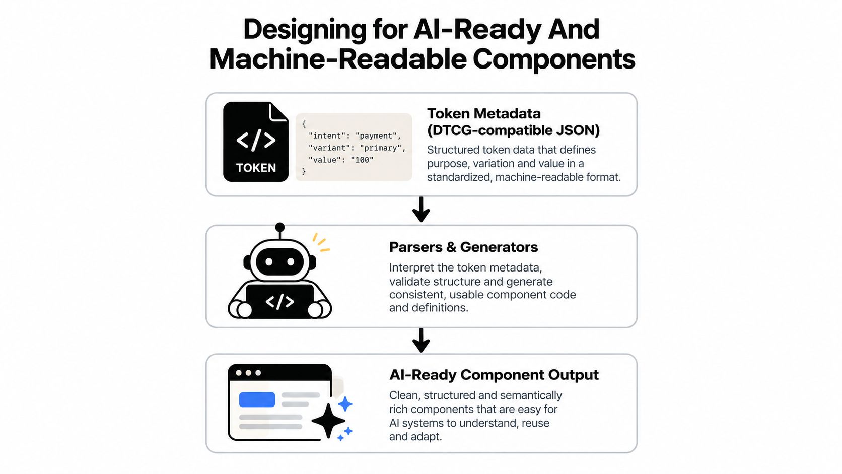
The strongest place to begin is the token layer. If tokens are stored in structured formats with clear names, intent, and variant information, generators don’t have to infer meaning from raw values. A colour token described by role is much more useful than a bag of hex codes.
The same is true for components. Machines need to understand props, slots, states, ARIA roles, constraints, and valid combinations. Typed schemas, generated docs, and explicit examples give tools something inspectable to work with.
Useful machine-readable signals include:
- Token metadata: intent, category, usage context, theme scope
- Component specs: prop types, slot contracts, state variants, role mappings
- Inspection hooks: stable test selectors, deterministic IDs where appropriate, structured changelogs
- Pipeline artefacts: story snapshots, test results, release notes, package manifests
Why this matters now
There’s a UK signal here, even if it comes from another design discipline. RIBA’s 2026 UK survey found AI usage among architecture practices rose from 59% in 2025 to 74% in 2026, with over 1,100 respondents (referenced trend note). You shouldn’t read that as direct evidence about software design systems, but it does show rapid adoption of AI-assisted workflows in a UK design context.
The practical takeaway is simple. If teams increasingly generate first drafts with AI, your system needs to be readable by those tools, not just by humans who already know the house rules.
Machine readability isn’t a parallel design system. It’s the same system, expressed with enough structure that software can inspect, generate, and revise against it safely.
That’s why AI-readiness belongs in architecture. If metadata, schemas, and audit hooks are bolted on late, they tend to drift from the actual components. When they come from the same pipeline, humans and machines read the same source of truth.
A Practical Checklist for Rolling Out Your Architecture
Teams usually struggle most at the start because the work feels broad. It helps to turn architecture into a sequence of decisions you can audit in a sprint or two. Not everything has to be perfect before release, but the core contracts do need to exist.
Foundation checks
- Define your token taxonomy. Separate reference, semantic, and component tokens. If names are inconsistent now, they’ll spread into every component.
- Choose one source of truth. Keep token definitions in a structured format and generate downstream outputs from it.
- Set naming rules. Write down how tokens, components, variants, and states are named. Enforce this in review.
- Map your accessibility baseline. Align the system to WCAG 2.2 AA expectations and record where tokens and primitives carry those requirements.
Component maturity checks
- Audit primitive boundaries. Confirm behaviour and semantics live in primitives, while product styling stays in wrappers or consumers.
- Document every state. Hover, focus, disabled, error, loading, selected, open, closed. If a state exists in production, it belongs in docs and tests.
- Test keyboard journeys. Don’t stop at isolated key presses. Validate complete interactions.
- Capture visual baselines. Add regression coverage for the states most likely to drift.
Operational checks
- Adopt a versioning policy. Be explicit about what counts as major, minor, and patch in your system.
- Pick a distribution channel. Public npm, private registry, monorepo packages, or internal artefact store. What matters is consistency.
- Create a breaking-change process. An RFC or design review path prevents surprise removals and conflicting decisions.
- Assign ownership. Someone must own tokens, primitive behaviour, docs, release approvals, and accessibility issue triage.
Future-proofing checks
- Add machine-readable metadata. Start with tokens and component prop definitions.
- Write contribution guidance. New engineers need clear rules for adding variants, patterns, or tokens.
- Review governance on a cadence. Revisit drift, adoption friction, and accessibility issues on a regular schedule.
- Check your docs against your code. If examples, package exports, and usage guidance disagree, teams will trust local workarounds instead of the system.
A design system architecture is working when teams can answer basic questions quickly. Which token should I use? Where does this interaction logic belong? Is this change breaking? How do we test it? Can another team adopt it without a meeting? If those answers live only in one senior engineer’s head, the architecture still isn’t finished.
If you’re building a system that needs headless primitives, accessible interaction patterns, and machine-readable component structure, DOM Studio is built for that kind of work. It gives teams standards-based UI primitives with Vue integration, theming surfaces, and AI-editable metadata so the architecture stays usable in both human and AI-assisted workflows.