
TL;DR
Use web radio buttons when a user needs one answer from a mutually exclusive set and benefits from seeing the alternatives. Use checkboxes for independent choices, consider a select when listing everything takes too much space, and distinguish answering a form question from switching a view. The U.S. Web Design System’s radio guidance supports these selection and space trade-offs. Decide whether an explicit answer is necessary before choosing a default.
A delivery question, a notification preference, and a dashboard view switch can all look like “pick one” interactions. They do not necessarily need the same control.
I recommend deciding what the choice means before choosing its appearance. For a Vue application, that gives designers and developers a shared decision brief instead of a component selected because it fits the mockup. This guide works through that brief; our HTML radio button group guide is the next step when you are ready for implementation.
Table of contents
- Before you start
- 1. Define the decision before selecting a component
- 2. Decide whether users need to see the alternatives
- 3. Separate form answers from view switching
- 4. Choose the initial state deliberately
- 5. Try the decision with realistic content and constraints
- 6. Hand off a single-choice contract to your Vue implementation
- Build the control you have specified
- Sources
- Recommended Reads
Before you start
Bring one real interface decision, its proposed answers, and a narrow-screen layout. You also need to know whether the user is creating a new answer or editing an existing one, whether answering is required, and what happens after selection.
No package installation is needed for this planning exercise. A sketch or prototype is enough. By the end, you should have a chosen control, an initial-state rule, and acceptance checks that a Vue developer can implement without guessing the product behavior.
1. Define the decision before selecting a component
Write the question in ordinary language, then ask: Can two answers legitimately be true at the same time?
For “How should we deliver this order?”, Standard delivery, Express delivery, and Collect in store can be mutually exclusive. For “Which order updates do you want?”, Dispatch updates and Delivery updates can both apply. The first suggests radios; the second suggests independently selectable checkboxes.
MDN’s radio reference describes the underlying distinction: a radio group permits at most one selected option, while checkboxes let users turn individual options on and off. “At most one” matters because a radio group can initially have no answer.
Do not combine different decisions just because their controls fit in one panel. “Express delivery” and “Add gift wrapping” are not competing answers. Separate the delivery method from the optional extra.
Use this decision map to form a starting hypothesis, then test it against your actual question and available space.
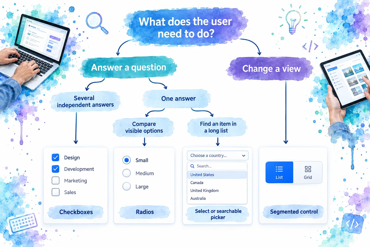
Check the result: describe the valid combinations without referring to circles or squares. If the team cannot agree whether two options may coexist, resolve the question before implementing selection behavior. A control cannot repair an ambiguous decision model.
2. Decide whether users need to see the alternatives
Once the answer is single-choice, compare radios with a single-select menu. I would start with visible options when people need to weigh differences, not simply locate an item they already know.
Consider an illustrative delivery question:
- Standard delivery: arrives in 3–5 days.
- Express delivery: arrives tomorrow.
- Collect in store: requires choosing a pickup location.
These answers have different consequences. Visible radio rows can present those differences together. A collapsed select saves space, but the alternatives are not visible until someone opens it.
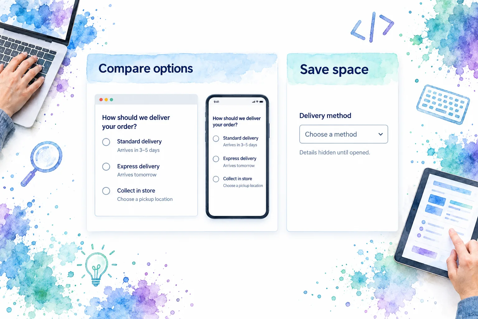
The images above are conceptual examples, not screenshots of a shipped product.
Use consistent criteria when comparing controls:
| Control | Selection model | Visibility and space | A suitable example |
|---|---|---|---|
| Radio group | One answer from related alternatives | Shows alternatives together; uses more page space | Compare delivery methods |
| Checkbox group | Independent answers | Shows each option and its selected state | Choose several update types |
| Single-select menu | One answer from a list | Compact when closed; conceals alternatives | Choose a known department |
| Segmented control | Depends on the interaction it represents | Keeps short alternatives visible in a compact row | Switch between List and Grid views |
These are starting points, not a universal option-count rule. Four unfamiliar answers with explanations can demand more comparison than a longer list of familiar names. Label length, user knowledge, screen width, and the importance of the differences all matter.
A select is not automatically the right answer to a crowded layout. GOV.UK’s select guidance treats selects as a last resort for public-facing services and recommends first exploring questions that reduce the list. That advice comes from its service context, but it is a useful challenge for an application team: can you simplify the decision rather than merely compress it?
Try both presentations with the same realistic labels. If users must repeatedly reopen the menu to compare what they have forgotten, keep the alternatives visible or reconsider how the question is structured.
3. Separate form answers from view switching
A segmented control can look like a radio group with rectangular options. Appearance alone does not tell you what the interaction means.
Ask what changes when a user selects an option. “List” versus “Grid” may change the presentation of the same records. “Standard” versus “Express” supplies an answer that will become part of an order. Those are different contracts, even though both permit one active choice.
Carbon’s content-switcher guidance uses grid and table views as examples of switching between related presentations. It distinguishes this from tabs for separate content areas and from binary input controls. The useful lesson is to choose by purpose, not by the outline of the buttons.
For an editable UI system, record that purpose alongside the design. A button-shaped form choice still needs to behave as a single-choice form control. Calling it “segmented” does not settle its accessibility or submission requirements.
Verify the distinction by completing this sentence: “Selecting this changes the ___.” If the answer is a saved form value, define its answer and save behavior. If it is the current view, define the content that changes. If different options do different kinds of work, split them into separate controls.
For a visual refresher on the underlying radio-versus-checkbox distinction, watch this educational comparison:
4. Choose the initial state deliberately
Decide whether the page is asking a new question or displaying an answer that already exists. I would not treat those as the same initialization problem.
Editing an existing answer: show the previously saved choice. If a user saved Standard delivery, displaying it again represents their recorded answer, not a new assumption about their preference. Include a reopen-and-review check in your acceptance criteria.
Asking a new question: leave the group unanswered when the person needs to make an explicit decision. For example, a question about who should receive a report should not silently assume an audience simply because one option appears first.
Providing a reversible preference: a default may be appropriate if there is evidence for it and the user can understand and change it. Document the reason rather than allowing the first item in an array to become the default accidentally.
Official guidance puts different emphasis on defaults. GOV.UK advises against preselecting radio answers because users may miss a question or submit the wrong answer. USWDS allows defaults cautiously when supported by data. Neither position justifies choosing an answer merely to avoid handling an empty state.
Also decide what “no answer” means. Is the question unfinished, optional, or legitimately answered by “None of these”? GOV.UK notes that users cannot ordinarily return a radio group to its unanswered state by selecting the chosen option again. Include an explicit neutral answer when it is genuinely valid, not as filler.
Verify: open the question as a new user, with an existing saved answer, and after changing that answer. Each state should match a written rule. If two states look identical but mean different things, make the distinction clear before implementation.
5. Try the decision with realistic content and constraints
Replace placeholder labels before approving the control. “Option A” and “Option B” conceal the problems that longer, less familiar answers reveal.
Start with your longest realistic label and any explanation needed to distinguish it. Then narrow the layout and increase text size. Can someone still compare the choices without clipped wording, a hidden selected indicator, or a description that appears to belong to another option?
USWDS recommends vertical radio lists for readability and clearer label association. If the answers need descriptions, I would try stacked rows before squeezing them into a horizontal segment.
Next, try an unavailable answer. Suppose Express delivery is unavailable for the chosen address. Write the explanation users need, and decide how the screen should respond if that was their previous selection. Do not quietly substitute another delivery method in your prototype without an agreed product rule.
Finally, ask someone to complete the task rather than identify the control. “Choose a delivery method that works for tomorrow” is a better check than “Can you see the radios?” If they cannot explain the selected option’s consequence, improve the answer wording or comparison before polishing the component.
6. Hand off a single-choice contract to your Vue implementation
The output of this process is a small specification, not just a component name. For the delivery example, write down:
- Question: How should we deliver your order?
- Answer model: one delivery-method value, rather than independent delivery booleans.
- Allowed answers: Standard delivery, Express delivery, or Collect in store.
- Initial state: unanswered for a new order; restore the recorded answer when editing.
- Completion rule: require an answer before continuing.
- Change behavior: update the draft answer; do not place the order merely because a different option was selected.
- Unavailable-answer rule: explain the issue and ask for a valid replacement.
This specification is application guidance, not a DOM Studio component API or schema format. Connect it to the documented interface of the component you actually use.
Preserve the question-and-answer relationship during implementation. The W3C forms tutorial on grouping controls explains how a fieldset and legend identify related controls. Styling the options as cards or placing them inside a Vue wrapper does not remove the need for meaningful grouping and option names.
Keep the handoff testable:
- Selecting one answer replaces the previous answer, rather than creating a second selection.
- Changing the layout does not change the answer.
- Reopening an edit screen displays the recorded choice.
- An unavailable saved answer follows the agreed recovery rule.
- Keyboard and assistive-technology checks cover the rendered control, not just the design file.
- An unanswered required question produces an understandable recovery path.
If the visual selection and application value disagree, resolve that integration problem before changing styles. A convincing selected border is not evidence that the correct answer will be saved.
Build the control you have specified
You now have a reasoned control choice, an initial-state policy, and acceptance criteria. Take that brief into our accessible HTML radio button group guide to build the group. Keep the decision brief beside the implementation so later visual edits preserve what the choice means.
Sources
- MDN: HTML radio inputs
- U.S. Web Design System: Radio buttons
- GOV.UK Design System: Radios
- GOV.UK Design System: Select
- Carbon Design System: Content switcher
- W3C WAI: Grouping controls