
A Vue mobile app shell is the persistent frame around a phone-first interface: top bar, content region, primary navigation, and temporary overlays. The best stack is not necessarily the one with the most components. We choose it based on how much control we need over the UI, whether we need native device APIs, how much routing behavior we own, and whether browser installation is enough.
This practical collection is for Vue teams building a mobile web app, an installed PWA, or a Capacitor-packaged app. We prioritize resources that solve distinct parts of the shell rather than offering several interchangeable UI kits. Before committing, we recommend testing a real route with a long list, a form near the software keyboard, a bottom navigation state, and an action sheet.
Table of contents
- How we choose a Vue mobile app shell
- 1. DOM Studio: Editable Vue primitives for the shell itself
- 2. Ionic Vue: Mobile-first components and navigation conventions
- 3. Capacitor: The native runtime layer for a web-first shell
- 4. Quasar: An all-in-one Vue application platform
- 5. Vue Router: Route-driven navigation and scroll behavior
- 6. Vite PWA: Installation and offline delivery after the shell is stable
- A practical stack decision
- Build the first real flow before expanding the stack
How we choose a Vue mobile app shell
A dependable shell has four deliberate layers:
- Persistent chrome: a safe-area-aware top bar and bottom navigation.
- One content scroller: the route view owns the screen content, rather than creating competing page and panel scroll areas.
- Navigation state: the active destination follows the URL and browser history.
- Delivery features: native APIs and offline behavior are added only when the product needs them.

Use the resources below to fill the layer you actually need. A small internal tool may only need DOM Studio and Vue Router. A customer-facing app that uses camera, sharing, or push notifications may add Capacitor. A PWA can add offline behavior separately, after the UI is stable.
1. DOM Studio: Editable Vue primitives for the shell itself
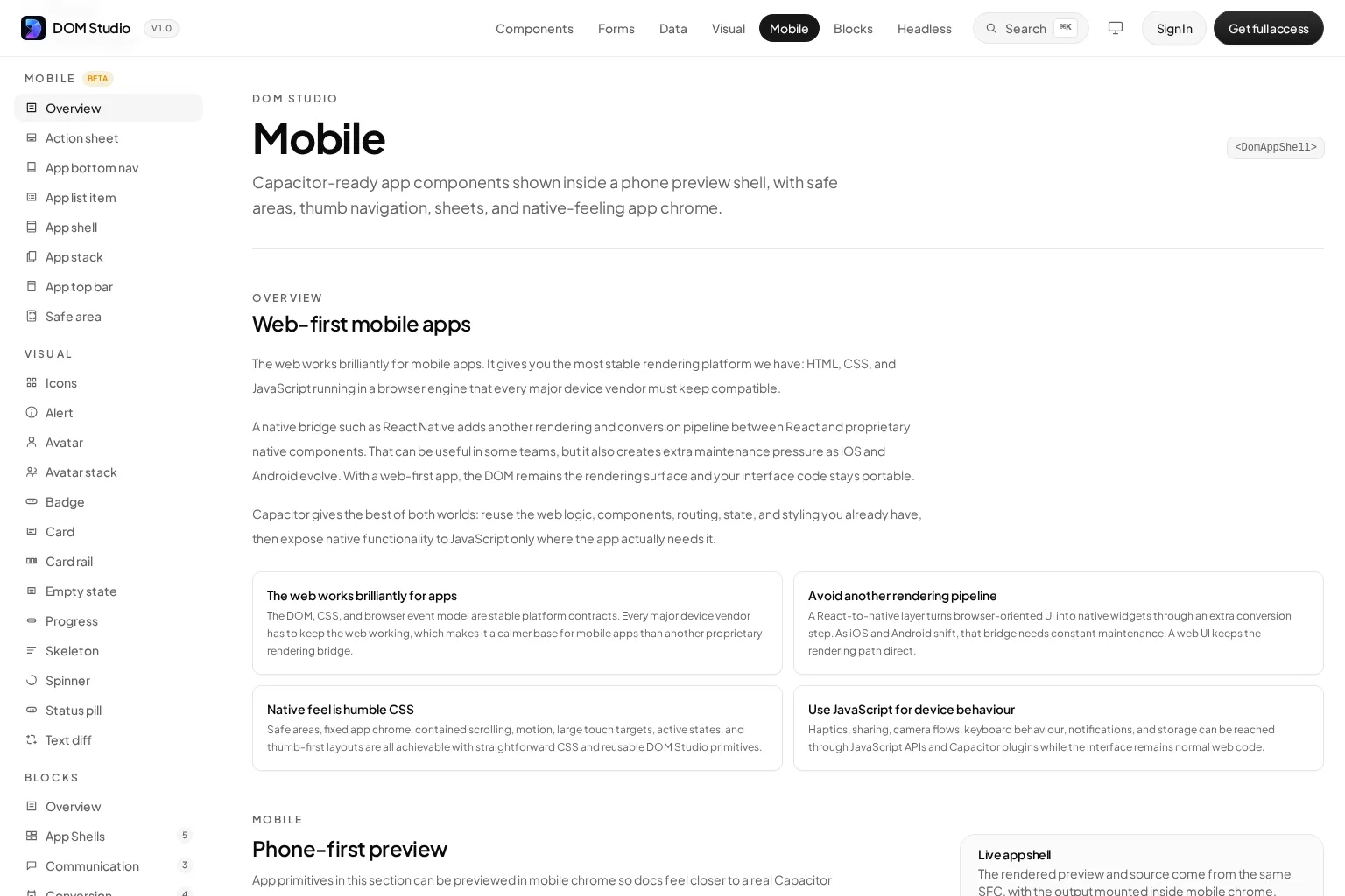
DOM Studio’s Mobile documentation is a web-first collection of Vue-ready app primitives for phone interfaces. It includes an app shell, top bar, bottom navigation, list items, safe-area support, an app stack, and action sheets.
What it helps with
We use DOM Studio when we want the mobile shell to remain part of our Vue and DOM codebase. Its model suits teams that need to adapt the composition, styling, and source-level behavior of persistent app chrome instead of accepting a locked layout convention.
Notable strengths
- The mobile collection centers on the shell concerns that matter most: safe areas, thumb-oriented navigation, one content region, and overlays.
- The App Shell reference provides a focused starting point for the persistent frame.
- The documentation shows a phone-first preview and components such as
DomAppShell,DomAppTopBar,DomAppBottomNav, andDomActionSheetworking together. - It aligns well with a web-first approach, then leaves room to use Capacitor only for device behavior.
Limitations
DOM Studio is a strong choice when we want editable UI primitives, but it is not a substitute for a native runtime, app-store build pipeline, or offline caching strategy. We still need to decide how routes, data, permissions, and packaging work.
Best-fit reader
Vue product teams building custom internal tools, SaaS workspaces, field apps, or customer portals that need mobile app structure without giving up control of the interface.
2. Ionic Vue: Mobile-first components and navigation conventions
Ionic Vue combines Vue tooling with Ionic’s mobile-oriented component library, gestures, and APIs. It is designed to ship the same application across iOS, Android, web, and PWA targets.
What it helps with
We reach for Ionic Vue when mobile patterns should arrive largely precomposed. Its tabs, lists, action sheets, and page transitions help teams establish a platform-aware app feel quickly.
Notable strengths
- Ionic documents more than 100 Vue-optimized components, including common mobile surfaces such as cards, lists, and action sheets.
- Its sample apps give teams an immediate way to study navigation and device workflows.
- It pairs naturally with Capacitor for access to camera, notifications, geolocation, and other device features.
Limitations
Ionic brings its own component and navigation conventions. If our product already has a strongly defined custom design system, adapting those conventions may take more effort than composing a shell from smaller primitives.
Best-fit reader
Teams that value a comprehensive, mobile-first UI system and want a fast route to a consistent cross-platform experience.
3. Capacitor: The native runtime layer for a web-first shell
Capacitor is a cross-platform native runtime for web applications. It can be added to an existing JavaScript project and exposes native device capabilities through web-focused APIs and plugins.
What it helps with
Capacitor solves packaging and native capability access, not the visual shell itself. We add it when the Vue app needs app-store distribution or features such as camera, notifications, sharing, geolocation, haptics, keyboard controls, or device storage.
Notable strengths
- It allows us to keep Vue, HTML, CSS, routing, and application logic in the web stack.
- It supports iOS, Android, and web targets from a shared project.
- Its plugin model lets us add native behavior selectively instead of rebuilding every screen in a different UI technology.
Limitations
Capacitor does not fix unsafe layout, nested scrolling, inaccessible dialogs, or weak navigation architecture. We still need to build and test the mobile shell carefully, particularly around safe areas and keyboard behavior.
Best-fit reader
Vue teams with an existing web app that need native distribution or a small, specific set of device integrations.
For a concise walkthrough of turning a Vite and Vue project into a mobile app with Capacitor, watch this independent tutorial:
4. Quasar: An all-in-one Vue application platform
Quasar’s Capacitor mode documentation shows how Quasar projects can add a Capacitor target, generate a native project, and run a development workflow for Android or iOS.
What it helps with
Quasar is useful when we want a cohesive framework that covers UI components, layouts, build tooling, and multiple delivery modes in one Vue-centered environment.
Notable strengths
- Its Capacitor mode gives a direct path from a Quasar app to a mobile build target.
- The framework can reduce configuration overhead for teams that prefer one opinionated platform over individually selected tools.
- It supports a unified workflow for web and mobile delivery.
Limitations
Quasar is a broad platform choice, not a small add-on. Adopting it for only one navigation component or a single shell feature can introduce more convention than an established codebase needs.
Best-fit reader
New Vue application teams that want an integrated framework and expect to deliver across browser and mobile targets.
5. Vue Router: Route-driven navigation and scroll behavior
Vue Router is Vue’s official client-side routing solution. It maps URL paths to components and renders the active screen through RouterView.
What it helps with
A mobile shell needs navigation that remains correct when users tap a bottom tab, press Back, open a deep link, or return to a long screen. Vue Router provides the route model that should drive active navigation state and the content rendered inside the shell.
Notable strengths
- It is the official router for Vue and is designed around Vue components.
RouterLink,RouterView, route metadata, navigation guards, and scroll control help us make navigation behavior explicit.- It lets the persistent shell stay mounted while route content changes in the central region.
Limitations
Vue Router deliberately does not provide mobile visual patterns. We still need a top bar, navigation controls, accessible overlays, and a route-to-tab mapping that reflects the product’s information architecture.
Best-fit reader
Every Vue app with multiple destinations, especially products where the current route must determine bottom navigation state, back behavior, or protected flows.
For an accessible route-aware menu pattern that can complement an app shell, see our Vue mobile navigation guide.
6. Vite PWA: Installation and offline delivery after the shell is stable
Vite PWA adds Progressive Web App capabilities to Vite projects, including service-worker registration support. It is a delivery resource, not a visual UI library.
What it helps with
We use Vite PWA when the finished Vue shell should be installable and needs a purposeful offline strategy. This can be an excellent alternative to native packaging when browser delivery, fast iteration, and linkability matter more than device-only APIs.
Notable strengths
- It is designed for Vite-based projects, a common setup for Vue applications.
- It can handle service-worker registration through plugin configuration.
- It keeps PWA behavior separate from the visual app shell, which helps us avoid mixing caching decisions into layout components.
Limitations
A service worker requires deliberate cache rules, update behavior, and failure testing. Installing a PWA plugin does not make every route or API response safe to use offline.
Best-fit reader
Vue teams that want an installed, app-like browser experience and are ready to define offline behavior as a product requirement.
A practical stack decision
If we are starting from scratch, we use this decision path:
- Need a custom, editable interface? Start with DOM Studio and Vue Router.
- Need a large set of mobile UI conventions immediately? Evaluate Ionic Vue or Quasar instead of mixing several UI frameworks.
- Need device APIs or app-store delivery? Add Capacitor after the web shell works on a physical phone.
- Need installation and offline access in the browser? Add Vite PWA after we define which content, requests, and updates should work offline.
A useful rule is to choose one resource for the visual shell, one for routing, and one delivery layer. Adding two competing UI libraries creates duplicate styling, overlay, focus, and navigation behavior, which is exactly what a mobile shell should prevent.
If the same product also needs a desktop workspace, use a responsive pattern rather than forcing the phone shell onto larger screens. Our responsive dashboard app shell is a helpful reference for pairing desktop navigation with a mobile fallback.
Build the first real flow before expanding the stack
The most valuable test is not a component gallery. We build one end-to-end task inside the shell, such as triaging an inbox item, changing a setting, or completing a form. Then we test it on a physical phone with a long screen, a bottom navigation state, an action sheet, and the on-screen keyboard.
Start with the smallest set of resources that gives us a safe-area-aware frame, one dependable scrolling region, route-driven navigation, and accessible overlays. Once that foundation works, we can add native capabilities or offline delivery without rewriting the interface.
Ready to build? Start with DOM Studio’s mobile primitives, create one production flow, and make the app shell the shared foundation for every route that follows.