
A Vue design system is more than a folder of shared buttons. It is a documented, testable set of tokens, component contracts, patterns, and rules that lets us build consistent product interfaces without rebuilding the same decisions for every screen.
In this guide, we will create a practical Vue 3 design system foundation that can grow with a product. We will define tokens, build a component contract, establish layers, document usage, and verify that the system is truly reusable.
Table of contents
- Before you start
- 1. Define the system boundary and ownership
- 2. Create tokens before component variants
- 3. Build primitives with explicit Vue contracts
- 4. Organize the Vue design system into predictable layers
- 5. Add patterns only after a primitive is proven
- 6. Make documentation part of the component contract
- 7. Test reuse, accessibility, and dependency direction
- 8. Choose the right starting point for your team
- Build the next feature from the system
Before you start
We need:
- A Vue 3 application using Single-File Components
- TypeScript, recommended for public component APIs
- A CSS strategy, such as plain CSS, CSS Modules, Tailwind, or a token pipeline
- A component test runner, such as Vitest with Vue Test Utils
- One existing product screen with repeated UI, such as a settings form or dashboard
Start with one repeated workflow rather than attempting to migrate the entire application. Our success criterion is simple: we should be able to use the same field, button, card, and dialog pattern in two different product contexts without adding product-specific conditionals to the shared components.
1. Define the system boundary and ownership
Action: Decide what belongs to the design system before writing components.
A useful Vue design system has four responsibilities:
- It defines visual decisions, such as color, spacing, type, radii, elevation, and motion.
- It provides reusable interaction primitives, such as buttons, fields, menus, dialogs, tabs, and feedback.
- It documents how product teams compose those pieces into patterns.
- It verifies that behavior, accessibility expectations, and APIs remain stable as the library changes.
Write a short system charter before creating code. For example: “Our system provides accessible application UI and shared patterns. It does not own billing rules, customer permissions, or route-specific data fetching.”
Expected result: We can explain why a component belongs in the system in one sentence.
Troubleshooting: If a proposed component has a product noun in its name, such as InvoiceApprovalDialog, keep it in the feature layer. Extract the generic AppDialog or ConfirmDialog only when its behavior has a stable, cross-feature purpose.
2. Create tokens before component variants
Action: Put repeatable visual decisions in semantic CSS custom properties.
Tokens prevent every component from inventing its own near-identical blue, padding value, or border radius. Begin with a small semantic set. Avoid exposing raw palette names as the primary API when the product needs meaning instead.
/* src/styles/tokens.css */
:root {
  --color-surface: #ffffff;
  --color-surface-muted: #f5f7fb;
  --color-text: #172033;
  --color-text-muted: #5f6b7a;
  --color-action: #315efb;
  --color-danger: #c93636;
  --color-border: #d9dfeb;

  --space-1: 0.25rem;
  --space-2: 0.5rem;
  --space-3: 0.75rem;
  --space-4: 1rem;
  --space-6: 1.5rem;
  --space-8: 2rem;

  --radius-sm: 0.375rem;
  --radius-md: 0.625rem;
  --shadow-card: 0 8px 24px rgb(23 32 51 / 0.08);
}
Use the tokens from components rather than hard-coding values:
.app-card {
  background: var(--color-surface);
  border: 1px solid var(--color-border);
  border-radius: var(--radius-md);
  box-shadow: var(--shadow-card);
  padding: var(--space-6);
}
Expected result: A visual change, such as adjusting the standard card radius, is made once and reaches every component using that token.
Troubleshooting: Do not create a token for every one-off value. Promote a value into a token when it represents a recurring design decision, not merely because it appears in CSS.
3. Build primitives with explicit Vue contracts
Action: Create generic, composable components with typed props, emitted events, and slots.
Vue asks components to declare their props explicitly, which makes a public API inspectable and helps catch inappropriate values. Slots let callers provide markup where the component should remain structurally flexible. Use props for values and behaviors the component owns, events for user intent, and slots for caller-owned content.
Here is a small button primitive:
<!-- src/components/ui/AppButton.vue -->
<script setup lang="ts">
withDefaults(defineProps<{
  variant?: 'primary' | 'secondary' | 'danger'
  loading?: boolean
  disabled?: boolean
  type?: 'button' | 'submit' | 'reset'
}>(), {
  variant: 'primary',
  type: 'button',
})

const emit = defineEmits<{
  click: [event: MouseEvent]
}>()
</script>

<template>
  <button
    class="app-button"
    :class="`app-button--${variant}`"
    :type="type"
    :disabled="disabled || loading"
    :aria-busy="loading || undefined"
    @click="emit('click', $event)"
  >
    <span v-if="loading" class="app-button__spinner" aria-hidden="true" />
    <slot />
  </button>
</template>
Keep the button unaware of API calls, stores, invoice state, and navigation. A feature component can provide those concerns and pass loading or disabled down as focused inputs.
Expected result: We can render this button in a save flow, destructive confirmation, or filter toolbar without adding feature-specific props.
Troubleshooting: If AppButton starts collecting props such as customerId, redirectTo, or approvalState, move those decisions back to the consuming feature component.

4. Organize the Vue design system into predictable layers
Action: Separate generic UI, reusable compositions, feature UI, and pages by responsibility.
We recommend this shallow structure:
src/
  components/
    ui/          # primitive interface elements
    patterns/    # reusable compositions of primitives
    features/    # product-specific workflows
  composables/   # reusable stateful logic
  pages/         # route composition
  styles/
    tokens.css
ui/contains primitives such asAppButton,AppField,AppDialog, andAppCard.patterns/contains stable compositions such asConfirmDialog,FilterBar,EmptyState, andDataTableToolbar.features/owns product concepts, services, permissions, and domain language.pages/compose features into a route-level experience.
This layering keeps dependencies flowing in one direction: pages use features, features use patterns and primitives, and primitives do not import pages or features. Put reusable state and side effects in composables. Vue describes composables as functions that encapsulate and reuse stateful logic, which makes them a better home for shared behavior than an overloaded visual component.
Expected result: A new contributor can predict where a component belongs and shared primitives remain free of domain dependencies.
Troubleshooting: Avoid a catch-all shared/ directory. It usually becomes a second junk drawer. Classify a component by its responsibility instead.

5. Add patterns only after a primitive is proven
Action: Create a pattern when multiple features need the same composition, not when one screen needs a convenient wrapper.
For example, a PanelCard can provide a stable layout with named regions while allowing features to supply their own content:
<!-- src/components/patterns/PanelCard.vue -->
<script setup lang="ts">
withDefaults(defineProps<{ padded?: boolean }>(), {
  padded: true,
})
</script>

<template>
  <section :class="['panel-card', { 'panel-card--padded': padded }]">
    <header v-if="$slots.header" class="panel-card__header">
      <slot name="header" />
    </header>

    <div class="panel-card__body">
      <slot />
    </div>

    <footer v-if="$slots.actions" class="panel-card__actions">
      <slot name="actions" />
    </footer>
  </section>
</template>
A customer-health feature and an account-settings feature can both use PanelCard, but neither should force customer or settings terminology into the shared pattern.
Expected result: We reuse a meaningful structure without erasing the difference between generic UI and product workflows.
Troubleshooting: If the second consumer needs several special props that only make sense for its feature, keep the pattern generic and wrap it in a feature component instead.
For a fuller implementation model, see our guide to organizing Vue application components into reusable UI systems. It shows the same progression from primitives to patterns, features, and route composition.
6. Make documentation part of the component contract
Action: Document purpose, props, events, slots, states, and examples next to the component.
The minimum documentation for a shared component should answer these questions:
- What problem does it solve?
- What props can callers control?
- Which events communicate user intent?
- Which slots change structure or content?
- What are the keyboard, focus, loading, error, and disabled expectations?
- What should callers not use the component for?
- Which two real examples prove it is reusable?
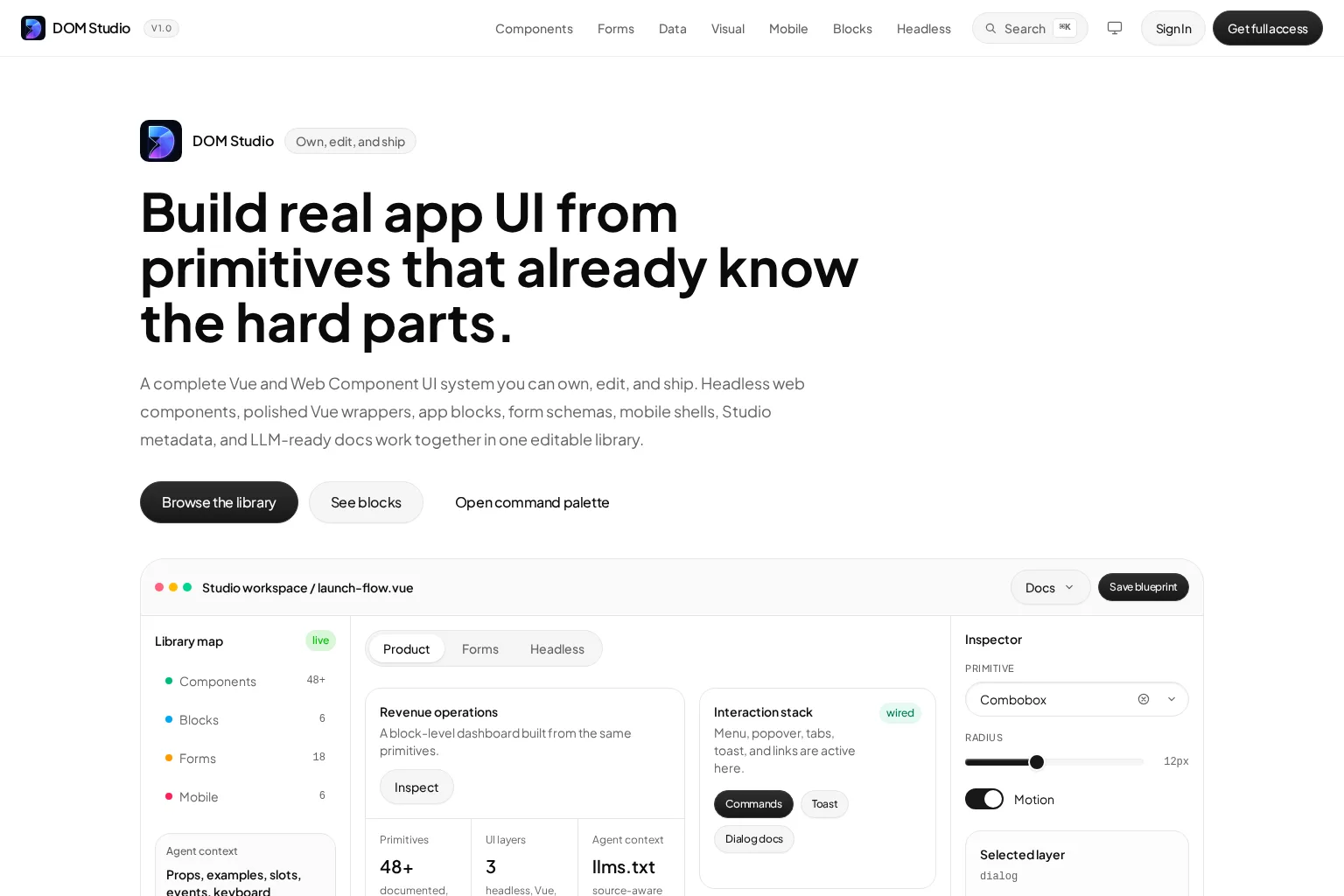
We should not maintain a separate documentation backlog if we can avoid it. A stronger approach is to derive a reference page from the component’s own metadata and runtime API, then add authored guidance only where a complex component needs it. DOM Studio follows this source-local documentation model: its component metadata can drive generated documentation, navigation, playground controls, and editor context.
Explore the DOM Studio component specification for an example of keeping discovery, Vue metadata, props, slots, and events in a shared contract. The component playground is also useful for seeing why live prop controls make an API easier to inspect.
Expected result: A developer can discover an existing component, understand its contract, and try its states without reading the full source first.
Troubleshooting: Do not duplicate generated prop tables in hand-written documentation. Reuse the same source-derived data so the API reference does not drift.
7. Test reuse, accessibility, and dependency direction
Action: Treat a component as reusable only after it passes acceptance checks in more than one context.
Vue’s testing guidance recommends component tests that cover concerns such as props, events, slots, styles, classes, and lifecycle behavior. For each primitive or pattern, test the contract rather than only its visual appearance.
Use this acceptance checklist:
- Render the default state.
- Render every meaningful variant, including disabled, loading, error, and empty states where applicable.
- Verify accessible names and keyboard behavior for interactive components.
- Verify emitted events and payloads.
- Render the component in two different features with different content or layout needs.
- Confirm that
ui/andpatterns/do not import a feature, page, route, or product store.
A focused test might look like this:
import { mount } from '@vue/test-utils'
import AppButton from '@/components/ui/AppButton.vue'

it('emits click when enabled', async () => {
  const wrapper = mount(AppButton, {
    slots: { default: 'Save changes' },
  })

  await wrapper.get('button').trigger('click')

  expect(wrapper.emitted('click')).toHaveLength(1)
})

it('does not emit click while loading', async () => {
  const wrapper = mount(AppButton, {
    props: { loading: true },
  })

  await wrapper.get('button').trigger('click')

  expect(wrapper.emitted('click')).toBeUndefined()
})
Expected result: A shared component has evidence that its API works across intended contexts and does not leak product dependencies.
Troubleshooting: Do not add a permanent shared prop to satisfy one exceptional screen. Prefer a feature wrapper or composition point when the requirement is not broadly reusable.
Watch: agile design systems in Vue
This conference talk is a useful companion for teams that want to connect design decisions, meaningful code patterns, and automated living documentation.
8. Choose the right starting point for your team
Action: Decide whether to build every layer, adopt an editable UI system, or combine a library with your own product patterns.
A custom system gives us maximum control, but it requires sustained ownership of accessibility behavior, documentation, tests, upgrades, and examples. Existing Vue libraries can accelerate the visual foundation, while headless component tools can give us more control over styling and composition. Tools such as Vuetify, PrimeVue, shadcn-vue, Storybook, and Histoire can each fit different delivery and documentation needs.
If we want editable source, Vue wrappers, headless elements, form tools, application blocks, and component metadata in one system, DOM Studio’s component library provides an owned, editable foundation. Its form system is especially relevant when shared validation and schema-driven layout are part of the product: explore the DOM Studio form components for that layer.
Expected result: We choose a path that matches our team’s ability to own implementation details over time, not simply the fastest first demo.
Troubleshooting: Do not replace one undocumented component collection with another. Whatever foundation we choose, retain ownership of tokens, composition rules, examples, and acceptance criteria.
Build the next feature from the system
We now have a Vue design system foundation that is intentional rather than accidental: semantic tokens, explicit component APIs, clear layers, tested patterns, and documentation that stays close to source.
Our next step is to select one repeated production screen and rebuild only its smallest proven primitives first. Once two features use the same primitive without special-case behavior, document it and promote the composition pattern that follows. If you want to move faster with editable Vue and Web Component primitives, forms, blocks, and inspectable metadata, explore DOM Studio and start with the pieces your product already repeats.