
You’ve wired up Save, the request succeeds, and a small message appears in the corner. It looks finished until you try it with a keyboard or screen reader: did anyone hear the confirmation, did it disappear too quickly, and should it have disappeared at all?
A useful toast message example answers those questions together. The wording tells the user what happened, the timing determines whether they can read it, and the announcement behaviour determines whether they receive it without losing their place.
Table of Contents
- Toast Message Examples for Common Outcomes
- Timing and Duration for Each Toast
- Making Toast Announcements Work for Screen Readers
- How to Build a Toast Message Step by Step
- When a Toast Is the Wrong Choice
- Check Toast Messages Before Release
Toast Message Examples for Common Outcomes
A toast is a short, usually temporary message that appears over the page to confirm an action or report a status, without taking keyboard focus. It supplements the interface rather than becoming the only place a user can understand what happened.
Say a user archives an email. The email leaves the inbox, and a corner message displays Email archived. The changed inbox already communicates the result; the toast adds reassurance.
Adding Undo changes the design decision. The message now contains a control someone may need time to find and operate, so it shouldn’t disappear on a timer.
Toast message examples by outcome
| Message type | Example copy | Live region | Dismissal |
|---|---|---|---|
| Success confirmation | Saved successfully | Polite | Auto-dismisses after a short pause |
| Background update | 3 search results loaded | Polite | Auto-dismisses after a short pause |
| Reversible action | Email archived. Undo | Polite | Stays until the user acts |
| Urgent failure | Payment failed. Try again | Dialog, not a toast | Stays until the user acts |
The search-result count is example interface copy, not a research finding. In a working application, insert the actual count returned by the search.
Write the outcome before the next step
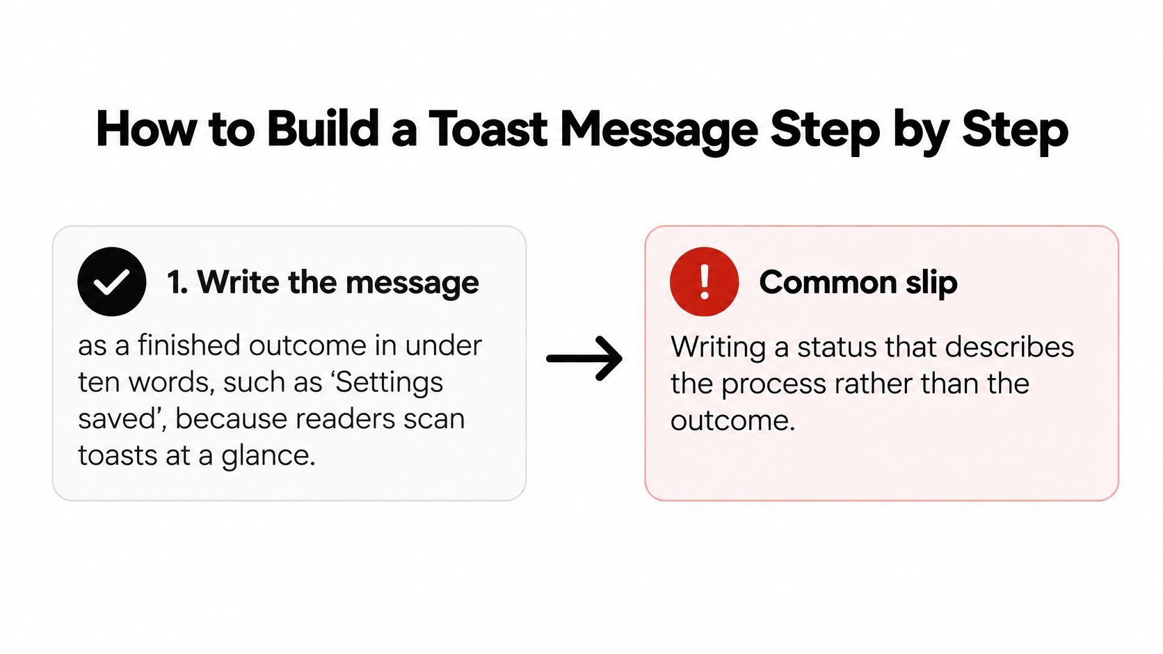
Use a short, finished statement that a reader can understand at a glance. Settings saved describes a completed outcome; Processing settings describes work still happening and belongs with the relevant loading state.
Keep any next step last. In Email archived. Undo, the reader learns what happened before deciding whether to reverse it. Render Undo as a real button, not styled text with a click handler.
Practical rule: If removing the toast would remove the user’s only recovery route, choose a persistent component instead.
Payment failed. Try again is therefore a contrast case, not ordinary toast copy. Choose the dismissal policy from the timing guidance and the announcement behaviour from the screen-reader guidance before implementing the component.
Timing and Duration for Each Toast
Set the duration according to what someone must notice, read and do, not according to how quickly the animation looks tidy. A short confirmation and an interactive message need different dismissal policies.
Visible time by message length
The following is an illustrative configuration for a prototype, not a measured reading-speed standard or an accessibility guarantee. Validate these example settings with users before shipping.
| Message length | Visible time | Notes |
|---|---|---|
| 1–4 words | Example setting of 4 seconds | Confirmations such as Saved successfully |
| 5–10 words | Example setting of 6 seconds | Status with a detail, such as search results loaded |
| 11–20 words | Example setting of 8 seconds | Message with a reason, shown only when essential |
| Any action or link | Stays until the user acts | Undo, retry or view-details messages |
Don’t treat word count as a complete timing formula. Someone using screen magnification may need to locate the message before reading it, while someone following a screen-reader announcement may still be listening to other content.
There’s also a reason to keep feedback restrained: Ofcom’s 2024 Adults’ Media Use and Attitudes report found that 26% of UK adult internet users disabled notifications on their devices or used Do Not Disturb settings. That finding concerns notification management, not toast timing, but it provides useful context for avoiding unnecessary interruptions.
Test whether disappearance is safe
Ask a slow reader or a person with low vision to complete a realistic task, without telling them where the notification will appear. Check whether they notice the message, understand it and finish reading before it leaves.
- Extend when missed: Increase the visible time or offer a persistent alternative when testing reveals a problem.
- Keep the stack small: Prefer a single visible message, merging related updates instead of building a column of interruptions.
- Suppress repetition: Don’t repeatedly announce an unchanged status during the same session.
- Keep errors available: Never auto-dismiss information someone needs to recover from a failure.
Safe candidates for disappearance include redundant success confirmations, background completion updates and passive counts. Their underlying results should remain available on the page.
Making Toast Announcements Work for Screen Readers
A visible notification doesn’t automatically become a useful screen-reader announcement. Expose its text through a live region, a part of the page that assistive technology can monitor for updates.
The visual message and the non-visual announcement need to communicate the same outcome.

Default to polite announcements
With aria-live="polite", assistive technology can announce an update at an appropriate opportunity, rather than deliberately interrupting current speech. It doesn’t mean waiting until the user has finished an entire task.
An assertive announcement signals greater urgency and may interrupt speech. Don’t choose it just because the toast has a red background or an error icon.
The Home Office notification guidance recommends a polite live region for notifications, leaving visual and keyboard focus in place and allowing enough time to locate and read the message. For routine outcomes such as Profile updated, that makes polite behaviour the appropriate default.
- Routine feedback: Announce completion without moving the user away from their current control.
- Urgent non-interactive status: Consider an assertive announcement only when interruption is necessary.
- Required interaction: Use the appropriate persistent interface rather than trying to make a fleeting alert carry a recovery workflow.
Keep the live-region container present before inserting its message. Avoid exposing the same text through overlapping live regions, which can produce duplicate announcements.
Verify the experience, not just the attributes
Use DOM Studio’s screen-reader testing guidance to organise checks around actions and expected announcements. For an ecommerce implementation, Grumspot’s guide to test screen readers on Shopify provides store-specific testing context.
Use the following video alongside hands-on testing, not as a replacement for operating your own interface.
Trigger Save while a screen reader is running. Confirm that the outcome is announced once, after the relevant action, without an unexpected change to keyboard focus or reading position.
Also check the visible experience with magnification. A notification should occupy a consistent location without covering controls, and readers who can’t finish before dismissal need a way to extend its duration or access equivalent persistent feedback.
How to Build a Toast Message Step by Step
Build the behaviour around a completed user action, not around the moment a component happens to render. Keep the announcement mechanism stable while the visible content changes.
Start with the outcome rather than the animation.
Connect the message to the actual result
-
Write a finished outcome. Use Settings saved when persistence succeeds, rather than Saving settings. A common slip is reporting the request’s start as though it were its result.
-
Classify the feedback. Decide whether the message is passive confirmation, a background update or something requiring interaction. Don’t let a library’s success or error colour determine its dismissal policy.
-
Create a stable announcement container. Put the live region in the initial page structure and leave it empty. Creating both the region and its populated message together can make announcement detection less reliable.
-
Update after the outcome. Insert the text when the save operation resolves successfully. Avoid firing the announcement from a general mount hook, which can produce unrelated feedback during navigation or rerendering.
Manage the complete lifecycle
-
Apply the dismissal policy. For passive feedback, use the tested duration and pause any running timer while the user hovers over or focuses the notification. Don’t assume pointer hover covers keyboard users, and don’t use a timer for an action-bearing message.
-
Provide deliberate dismissal. Give persistent feedback a clearly named close control and keep its placement predictable. Avoid an icon-only control without an accessible name, or a corner position that obscures the next action.
-
Clear stale text. When dismissal completes, empty the announcement container but keep the container itself mounted. Otherwise, assigning identical text after a later action may not create a detectable update.
The minimal initial markup is:
<div id="toast-status" aria-live="polite" aria-atomic="true"></div>
After the successful outcome, update it with:
document.getElementById('toast-status').textContent = 'Settings saved';
After dismissal, clear it with:
document.getElementById('toast-status').textContent = '';
These snippets illustrate the announcement lifecycle, not a complete toast manager. Your application still needs visible styling, timer cancellation, dismissal handling and protection against unrelated events overwriting each other.
Keep the announcement region stable. Change its message when the application has a new outcome to report.
For an urgent, non-interactive status, an existing empty container could instead use <div id="urgent-status" role="alert" aria-atomic="true"></div>. Don’t put retry buttons into that example: Payment failed. Try again needs a persistent dialog with an actionable recovery path.
Finish by editing a field, triggering a save and continuing to type. The confirmation should be heard once, leave according to its policy and never pull focus away from the field.
When a Toast Is the Wrong Choice
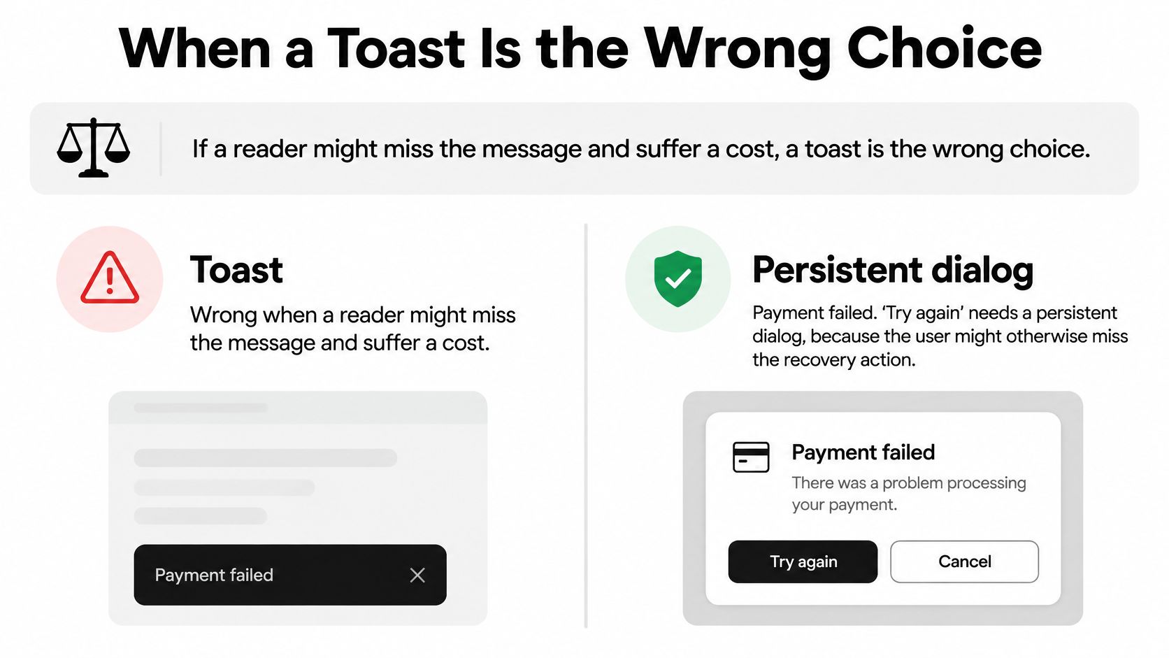
Apply a simple test: if a reader could miss the message and suffer a cost, a disappearing toast is the wrong choice. Choose the component according to what the user needs to do, rather than how compact the notification looks.
This comparison captures the payment-recovery case.
Match the component to the consequence
| Situation | Example copy | Better presentation |
|---|---|---|
| Payment needs recovery | Payment failed. Try again | Persistent dialog with a retry control |
| Field needs correction | Enter an email address | Inline error associated with the field |
| Destructive decision | Delete this project permanently? | Confirmation dialog |
| Outcome remains unresolved | Import paused. Review the file errors | Dedicated page state |
Inline validation keeps the problem beside the control someone must fix. The inline-message guide is useful when deciding how to keep explanations within the task.
A destructive decision needs an explicit choice before the operation proceeds. A long-running or unresolved outcome needs a stable place users can revisit, rather than a notification they must remember.
Treat dialogs as a different interaction
The UK Intelligence Community Design System’s toast accessibility guidance says auto-dismissed content must be safe to miss and action-bearing messages should remain until the user acts. Its pattern permits role="alert" for auto-dismissed messages and uses dialog semantics for persistent interactive messages, including focus entry, focus containment, Escape dismissal and focus restoration.
That alert option isn’t a reason to make every routine confirmation assertive. Follow a coherent announcement policy, and treat a modal dialog as a deliberate interruption with complete keyboard behaviour.
Closing a recovery dialog also mustn’t erase the underlying failure. The payment page should still show that payment hasn’t completed.
For product teams documenting these decisions before implementation, Digital Souls Studios LTD’s UI workflow for non-technical founders provides broader planning context.
Choose a toast for low-risk feedback, a dialog for a decision, inline text for a field problem and a page state for an ongoing outcome.
Check Toast Messages Before Release
Treat notifications as release-critical interaction behaviour, not decorative polish. A component can look correct while remaining silent to assistive technology or covering the button someone needs next.
The Government Digital Service accessibility monitoring report identified 29,787 accessibility issues across 1,203 public-sector websites and 21 mobile apps monitored between January 2022 and September 2024. The report isn’t a toast audit, but it establishes why accessibility checks belong in production release work.
Run a focused release audit
-
Inventory the triggers. List the notifications a user can encounter and remove those that merely repeat obvious page content. Include background jobs and failure paths, not just the success demo.
-
Check when they fire. Save and submit are committed actions; individual keystrokes usually aren’t. Replace noisy typing feedback with local validation or an appropriate field state.
-
Inspect placement. Try narrow layouts and browser zoom. Move any toast that hides Save, navigation or the field currently being edited.
-
Exercise bursts. Trigger several related events quickly and check deduplication. Merge equivalent outcomes instead of showing a stack of near-identical messages.
-
Operate dismissal. Reach each persistent message’s close control using the keyboard. Confirm that closing it doesn’t remove essential instructions or leave focus stranded.
-
Listen during real work. Run a keyboard and screen-reader pass while editing, saving and recovering from failure. Check announcement order, duplicates and the active element after dismissal.
Make the application responsible for the final result
Use component-testing guidance to turn the expected behaviour into repeatable checks. Include the audit in the wider release process; Magnitude Marketing’s go-live guide for operations directors provides context for coordinating that handover.
In DOM Studio, theme values are CSS variables, and the host app owns the final tokens rather than the package. Test the final application theme, including message text, focus indicators and close controls, rather than assuming the component preview proves readability.
Run these checks on your most frequent toast messages this week. Record each message’s trigger, announcement, dismissal policy and persistent fallback so the team can review the behaviour alongside the copy.
DOM Studio offers headless component primitives and a Vue integration layer for building interfaces with accessible interaction behaviour. Visit DOM Studio to explore the components, then apply these wording, timing and keyboard checks to your application’s feedback patterns.