
Before you add another ARIA attribute to your tab component, answer one question. When did you last move through the tab strip with the keyboard alone, listen to it with a screen reader on a phone, and open a shared link that should have landed on the third panel?
It’s hard to answer. Tabs UI design gets treated as a styling exercise, with roles and attributes bolted on at the end and a quick look in a browser counted as proof. Then a keyboard user tabs in and the focus ring is invisible, a VoiceOver user hears the panel before she has heard its name, and the deep link a support agent sent opens the first tab every time.
A tab strip is a small design decision that behaves like a contract. Readers get sibling views of one object, switched in place, with everything else hidden. The hiding is the point and the risk, which is why the behaviour has to be agreed across keyboard, screen reader and phone long before anyone picks a border radius.
Table of Contents
- When Tabs Work and When They Fail
- Anatomy of a Tab Bar and Its Labels
- Organising Content Inside Each Panel
- Responsive Tabs from Phone to Desktop
- Keyboard, Focus and Activation Models
- Testing Tabs with Screen Readers and Real Users
- Choose Your Tab Pattern and Build It
When Tabs Work and When They Fail
One line settles most tab arguments. Tabs group sibling views of a single object that a reader switches between, and they hide every view except the current one.
Hold that sentence against the content you’re about to put behind tabs. If the views aren’t siblings of the same thing, tabs mislead before anyone touches the CSS. If a reader has to consume the content in order, or compare two views at once, hiding is damage rather than convenience. The instant switching that makes tabs feel quick is the same mechanism that buries a delivery date, a price or a warning behind a label nobody clicks.
| Content case | Tabs fit? | Reason | Better pattern |
|---|---|---|---|
| Sibling views of one product (details, specifications, reviews) | Yes | Readers switch between parallel views of the same object | Not needed |
| Categories within one settings screen | Yes | Short, parallel labels and a small set of views | Side navigation once there are many categories |
| Ordered steps in a form | No | Order matters and tabs let users skip ahead | Stepper or numbered progress |
| Long article read from start to finish | No | Hidden text is easily missed and breaks reading flow | One page with in-page anchors |
| Filters that change one shared list | Sometimes | Works only with few, mutually exclusive options | Segmented control or dropdown |
| Primary site navigation | No | Tabs read as content grouping, not as site structure | Primary navigation menu |
Ordered content is where tabs go wrong most publicly. A five-step application split into tabs lets someone jump straight to step four, skip the eligibility check on step two, and finish without ever seeing it. A long article split across tabs breaks the reading thread, and it hides whole paragraphs from anyone who prints the page or listens to a screen reader following source order.
The stakes are measurable. Between January 2022 and September 2024, the Government Digital Service monitored 1,203 public-sector websites and 21 mobile apps and identified 29,787 accessibility issues (GDS accessibility monitoring 2022 to 2024). Lack of visible keyboard focus accounted for 13.3% of recorded issues, insufficient colour contrast 13.0%, keyboard-operability problems 10.8% and inadequate responsive reflow 9.2%. The same monitoring puts the audience at 16.1 million disabled people in the UK.
All four of those categories land on a tablist, because a tablist is an interactive navigation pattern. Run this check on your own screen before anything else:
- Are the panels parallel? If panel two only makes sense after panel one, tabs are the wrong shape.
- Are the labels short and distinct? “Details”, “Specs”, “Reviews” work; “Everything you need to know about delivery” doesn’t.
- Would a reader miss something important by not clicking? Prices, warnings and primary actions belong above the tab set.
- Does the component still make sense without JavaScript? If not, the fallback is missing, not the tabs.
If you’re weighing tabs against other structures, the wider UI design pattern catalogue is a useful second opinion before you commit.
Anatomy of a Tab Bar and Its Labels
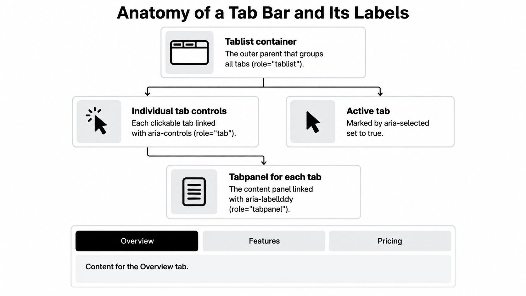
Four parts carry the whole component, and each one has a job in the accessibility tree. Get the names and the links right first, because styling a structure that assistive technology can’t read just produces a prettier failure.
- The tablist container. The parent that groups the tabs and marks the whole strip as one control rather than a random row of buttons.
- The individual tab controls. Each takes its name from its visible text, points at its panel with aria-controls, and reports aria-selected as true only while it is the active view.
- The tabpanel for each tab. Labelled by its own tab through aria-labelledby, so the panel is announced in the same words the reader just heard.
- The active tab. The one marked selected. Screen readers announce that state, and sighted users need to see it without guessing.
The diagram below shows how those levels connect.
Labels do more work than people expect. Aim for one to three words, nouns rather than sentences, short enough to sit on one line at phone width: Overview, Specifications, Reviews. Against that set, “Frequently asked questions about delivery” wraps to two or three lines, truncates on narrow screens, and tells a screen reader user nothing useful about the difference between it and the tab beside it.
Label rule: if a tab label needs a comma, it’s a heading that wandered into the wrong component.
Placement follows count. Horizontal tabs across the top suit two to six views and scanning left to right. Vertical side tabs suit settings screens with longer labels and a natural top-to-bottom order. Past about seven tabs, stop adjusting the design and reconsider the pattern.
The selected state can’t rely on colour alone. Combine a heavier underline, a background change and a bolder weight, and make sure the indicator stays clearly distinct from the surrounding surface in a high-contrast theme. Keep counts and badges out of the label itself or render them as secondary text, so the accessible name stays “Reviews” and not “Reviews 43”.
Organising Content Inside Each Panel
Write the page without tabs first. The GOV.UK Design System tabs guidance recommends testing the content without tabs because tabs hide content and some users won’t notice or understand them, and it advises against tabs when the content would make the page slow to load. Keep the tabbed version only if the grouped page still reads better than the flat one.
Group by task, not by data model
Each panel should answer one question completely. On a product page, Overview explains what the item is and who it suits, Specifications holds the measurements and compatibility table, and Reviews collects what buyers said after living with it. That order follows the reader’s questions, which is why the labels stay short and predictable.
Give every panel a heading that repeats its tab label in the same words, so someone navigating by headings on a narrow screen meets the same names in the same sequence. Critical content never goes behind a tab you can’t guarantee will be opened. A price, a delivery warning, an eligibility rule or the primary call to action belongs above the tab set or repeated inside every panel.
Rule of thumb: if a panel would fit on the page without pushing anything important down, it shouldn’t be a tab.
Panels aren’t equal either. The specifications table is the strongest case for tabs, because its length would otherwise push everything below it off the first screen. A three-line Overview doesn’t need a tab, it needs to be visible. Load a heavy panel’s data the first time that tab is selected rather than on page load, and update the URL fragment when selection changes, so a shared link opens the right view and Back and Forward restore the previous one. GOV.UK removed Up and Down arrow bindings from its frontend in 2024 after identifying potential conflicts with screen-reader navigation, which is the useful warning here: keyboard behaviour is chosen deliberately and tested, not copied from a generic example.
Plan the no-JavaScript path as part of the design, not after it. When scripts fail, every panel should appear as stacked, readable content in source order, each with its heading, so the page degrades into an article instead of a blank frame.
Responsive Tabs from Phone to Desktop
The phone layout is usually the main layout, so design it first and let the desktop version grow out of it. Ofcom reported that 49.1 million UK adults accessed the internet through smartphones, tablets or computers in May 2025, spending an average of 4 hours and 30 minutes online each day, and that smartphones accounted for 77% of all time spent online on an average day, rising to 85% among adults aged 25 to 34 (Ofcom Online Nation 2025). The same report found that 18% of UK adults who go online use only a smartphone, with no other device, so a cramped strip of tabs isn’t an edge case for anyone with a narrow screen.
Here’s how the strip behaves at each width.

| Viewport | Tab layout | Overflow cue | Touch target |
|---|---|---|---|
| Under 400px | Horizontal scrolling row | Next tab partly visible at the edge | At least 44 by 44 CSS pixels |
| 400px to 768px | Full row with shortened labels | Edge fade once the row overflows | At least 44 by 44 CSS pixels |
| Above 768px | All labels visible | None needed | Standard control size |
| Seven or more tabs, any width | Convert to select or accordion | Visible count of views | Standard control size |
Three overflow patterns that cover almost every case
Horizontal scroll with a clear cue. Keep the next tab partly visible at the edge so the reader can see there’s more, and check that the swipe doesn’t hijack the page’s vertical scroll. A row that looks finished but hides two tabs is worse than a visible pile-up.
Wrapping to two rows. Worth it only when there are very few tabs and each label is short. A wrapped row of six long labels reads as two unrelated menus.
Conversion to a select or accordion. Past about six tabs, the compact control beats a scrolling strip because the full list of views is visible at once.
Touch sizing does most of the quiet work on phones. Keep each tab at least 44 by 44 CSS pixels on touch devices, and give the row enough horizontal padding that the first and last tabs aren’t wedged against the screen edge. Then run the reflow checks at 320 CSS pixels and at 200% zoom, where no tab should disappear, overlap its neighbour or force two-directional scrolling to reach a panel. Choosing where those widths fall is a decision worth making deliberately, and the media query breakpoints guide sets out how to pick them without inventing device categories.
Keyboard, Focus and Activation Models
The Tab key can mean two different things inside a tab strip, and the team needs to agree on which one before the CSS starts.
In the roving model, the Tab key lands on the active tab only, and Left and Right arrows move between tabs. In the every-tab model, each tab is a stop in the page’s normal tab order, so a five-tab strip adds five key presses between the content above and the panel below.
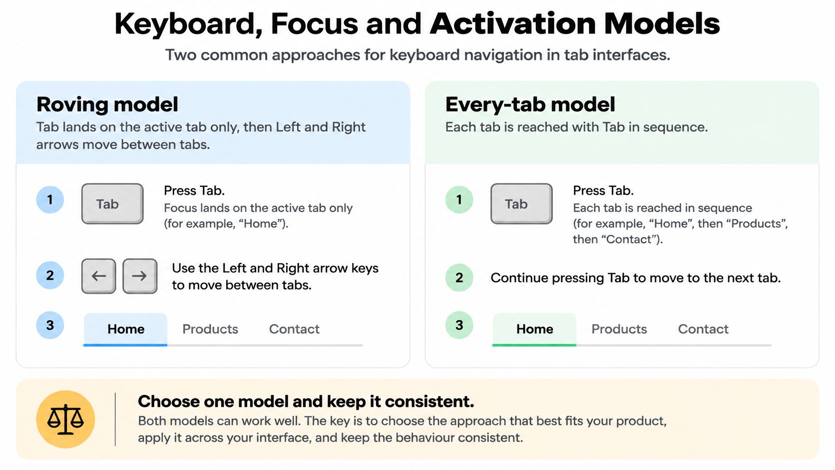
Layer activation on top and you get the combinations that matter in practice.
| Model | Tab key lands on | Arrow keys | Activation | Best for |
|---|---|---|---|---|
| Roving focus, automatic activation | Active tab only | Left and Right move and show the panel | On focus | Small sets of light panels |
| Roving focus, manual activation | Active tab only | Left and Right move focus | Enter or Space | Panels that are slow or costly to load |
| Every tab reachable with Tab | Each tab in turn | Optional, not required | Enter or Space | Simpler testing, but more tab stops |
Automatic activation feels immediate with a short panel and hostile with a panel that fires three network requests, because arrowing past it starts the load whether the reader wanted it or not. Manual activation costs one extra key press and buys control.
The focus rules that hold whatever model you pick
Government guidance requires that keyboard users can reach and operate every interactive element, move focus away without a trap, follow a logical focus order and always see the focused control. Home Office guidance adds a minimum 3:1 contrast ratio between the focus indicator and both the surrounding content and the control’s previous appearance (Home Office keyboard guidance).
Focus should stay on the tab after activation, not jump into the panel, so the reader can switch again without hunting for the strip. The exception is a tab whose only job is to open a single field the reader came to fill.
Choosing a model takes four steps:
- Count the tabs. Two to six views with short labels is comfortable territory.
- Weigh the panels. Network-heavy panels argue for manual activation.
- Pick activation, then write it down. One model per product, documented.
- Test with the keyboard alone. Tab in, arrow across, Enter to activate, Shift+Tab out. If you can’t leave, you’ve built a trap.
Testing Tabs with Screen Readers and Real Users
Markup that passes an audit can still fail a person. Public-sector guidance in the SIS design system tabs accessibility page describes testing against WCAG 2.2 AA with NVDA and VoiceOver, and repeats GOV.UK’s warning that using an accessible component doesn’t automatically make the wider service accessible. Conformance and usability are separate checks, and tabs often pass the first while failing the second.
What survives after the roles are correct: whether inactive panels stay discoverable, where focus lands after a panel changes, how the state change is announced, and whether Back feels like it undid the last thing or something else entirely. None of that shows up in a markup validator.
The cost of getting it wrong reaches past the tab strip. In 2024, 75% of disabled people were reported to have left a UK store or website without completing their intended task, according to MemberWise. A tab that announces the wrong state or swallows focus is one of the small frictions that builds to that.
| Test | Method | Pass condition |
|---|---|---|
| Keyboard-only run | Use Tab, arrows, Enter, Space, Home and End only | Every tab reachable and focus always visible |
| Focus visibility | Inspect the focus ring on active and inactive tabs | At least 3:1 contrast against adjacent colours |
| Screen reader | Test with NVDA and VoiceOver | Tab name, selected state and panel announced |
| Zoom and reflow | Browser zoom to 200% and a 320 CSS pixel viewport | No hidden tabs and no two-direction scrolling |
| Deep links | Load a URL with a tab fragment, then use Back and Forward | Correct tab restored each time |
| Reduced motion | Enable the reduce motion setting | Panel changes without animation |
| Touch | Test on a real phone | Targets are large enough and swipes do not fight page scroll |
Agreeing pass conditions in advance is what turns this from an argument into a checklist. Pair it with a proper screen reader testing routine rather than a single pass in one browser, then sit with disabled users on their own devices and record where they hesitate, not just whether the tabs technically operated.
Choose Your Tab Pattern and Build It
Five questions, answered in order, settle the pattern. Answer them against real content, because placeholder text hides the label wrapping and panel length problems that decide the answer. A no at any point sends you back to the first table for a different component.
- Are the views parallel siblings of one object? If not, tabs hide more than they organise.
- Do the labels fit on one line at phone width? If not, you need fewer tabs or a different pattern.
- Can every panel be read with JavaScript off? Stacked panels in source order is the fallback.
- Does the keyboard model pass the focus and arrow checks? One model, proven with the keyboard alone.
- Is there a plan past six or seven tabs? A select, an accordion or side navigation, chosen deliberately.
Then build a prototype with one real content set. Run the test matrix in order: keyboard first, then screen reader, then reflow and touch on a real phone. Fix every failure before the design is signed off, because each row is part of the behaviour contract the tabs owe every user, not a polish pass you can defer. Starting in plain HTML proves the markup, the fallback and the keyboard behaviour before any styling can disguise a problem. Our component set covers menus, dialogs, tabs, visual cards, badges, avatars, mobile app shells, code blocks, JSON viewers and an icon set, built with Vue 3, Web Components and Tailwind CSS, so the tab primitive arrives with WAI-ARIA roles and focus handling already in place.
The behaviour is easier to absorb once you watch it happen than when you read it.
DOM Studio builds the primitives that make this contract the default rather than a retrofit, with tabs, menus, dialogs and app shells that ship WAI-ARIA roles, focus management and keyboard handling, so your team spends its time on content and behaviour instead of re-implementing ARIA patterns. Browse the components, blueprints and Pro templates at DOM Studio and build your tab set on primitives that include the roles and focus management the matrix tests for.