
You’ve probably rebuilt the same interaction more than once. The first version of a confirmation dialog lives in a billing flow, the second appears in account settings, and the third arrives in an admin tool with slightly different buttons, spacing, focus behaviour, and escape handling. Each implementation looks reasonable in isolation, yet users learn three versions of the same task and your team inherits three places where a small accessibility defect can hide.
A UI design pattern gives that interaction a shared operational definition. It describes what the interface looks like, how it behaves, which states it exposes, how people operate it with a keyboard or assistive technology, and what evidence is required before release. The useful question isn’t “Which component should we import?” It’s “What promise does this interaction make to every user, and how will we keep that promise wherever it appears?”
Table of Contents
- The Third Modal Problem and Why Patterns Exist
- What a UI Design Pattern Actually Is
- The Core Pattern Families Every Interface Reuses
- Common Patterns Walked Through One by One
- Accessibility Obligations Patterns Must Carry by Default
- Mapping Patterns to Headless Component Libraries
- Best Practices for Choosing and Customising Patterns
- Patterns as Shared Infrastructure, Not Decoration
The Third Modal Problem and Why Patterns Exist
The third modal usually starts innocently. A developer copies an existing dialog, changes the copy, adds a destructive button, and adjusts the width to fit a longer warning. The product ships, but the new version closes when a user clicks outside it, while the old one requires an explicit action. One returns focus to the launch button. Another leaves focus at the top of the document.
Six months later, someone reports that keyboard users can open the dialog but can’t reach the cancel action. The team fixes that instance, then discovers that the same markup exists in two other products. The bug isn’t difficult because a dialog is visually complicated. It’s difficult because the team treated each copy as a small visual surface instead of a repeated interaction with shared obligations.
A pattern changes the unit of work. Rather than documenting only a screenshot, the team records the trigger, open state, accessible name, focus entry point, keyboard exits, dismissal rules, restoration target, loading state, error state, and mobile layout. Developers can then implement the same contract in different visual themes without altering the experience.
Practical rule: If an interaction appears in more than one product area, define its behaviour before you duplicate its markup.
The UK Government Digital Service offers a useful precedent. When it launched the GOV.UK Design System in 2017, it institutionalised reusable controls including radios, checkboxes, form controls, navigation, and error messaging across government services. The system evolved beyond visual consistency, because interaction behaviour and accessibility needed the same level of reuse as colours and spacing. GDS describes how its accessibility capability developed through shared patterns, specialist testing, and service requirements.
That’s the promise for the developer facing the third modal: fewer independent decisions, fewer divergent fixes, and a clearer release checklist. A pattern doesn’t remove judgement. It makes the important judgement visible and repeatable.
What a UI Design Pattern Actually Is
A practical definition is:
A UI design pattern is a repeatable solution to a recurring user task, expressed as structure, behaviour, accessibility requirements, states, and visual guidance.
Think of a pattern as a recipe. The recipe tells a cook what the dish is for, which ingredients it needs, what order to combine them in, how to handle variations, and how to tell when the result is ready. A component is one prepared dish, such as a dialog rendered in a billing screen. Design tokens are the measured ingredients, such as colour values, spacing units, border radii, type sizes, and motion durations.
This distinction prevents a common design-system mistake. A button with a shared background colour is a component. A rule explaining when to use a primary action, how to label it, what happens during submission, how disabled and busy states are announced, and how focus remains visible is a pattern specification. Tokens help the button look consistent, but they don’t explain the interaction.
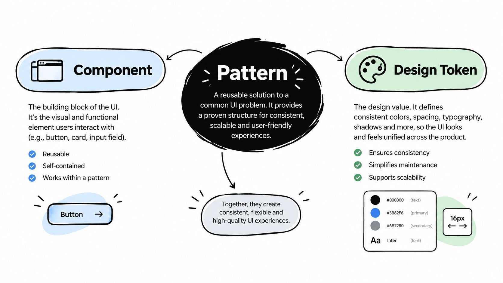
Separate the layers before you build
A pattern normally contains several connected layers:
- Intent: The user goal, such as choosing one option, confirming a risky action, or moving between related views.
- Structure: The semantic elements and relationships, such as a labelled form field, a dialog with a title, or tabs connected to tab panels.
- Behaviour: The state transitions, including opening, closing, selecting, loading, validation, failure, and recovery.
- Accessibility: Names, roles, values, keyboard paths, focus movement, status announcements, and support for zoom and reflow.
- Visual guidance: Hierarchy, affordance, emphasis, spacing, colour, and responsive presentation.
- Acceptance evidence: The tests or review records that show the implementation meets the contract.
A component library may provide the structure and behaviour in code, while your design system supplies tokens and your product supplies content. The pattern remains the shared agreement that connects them.
Recognise what isn’t a pattern
A screenshot isn’t a pattern because it doesn’t explain what happens when the user presses Escape, submits invalid data, loses network access, or moves without a pointer. A CSS class isn’t a pattern because it styles an element without defining its purpose. A component name such as Modal isn’t enough either. Names describe implementation; patterns describe user-facing responsibility.
When a junior developer asks whether a combobox and autocomplete are different components, start with intent. If both let users type into a field and choose from suggestions, they may share a behavioural foundation. If one permits arbitrary text and the other requires a valid option, their contracts diverge at validation, value representation, and announcement. That difference matters more than whether the team uses React, Vue, or custom elements.
The Core Pattern Families Every Interface Reuses
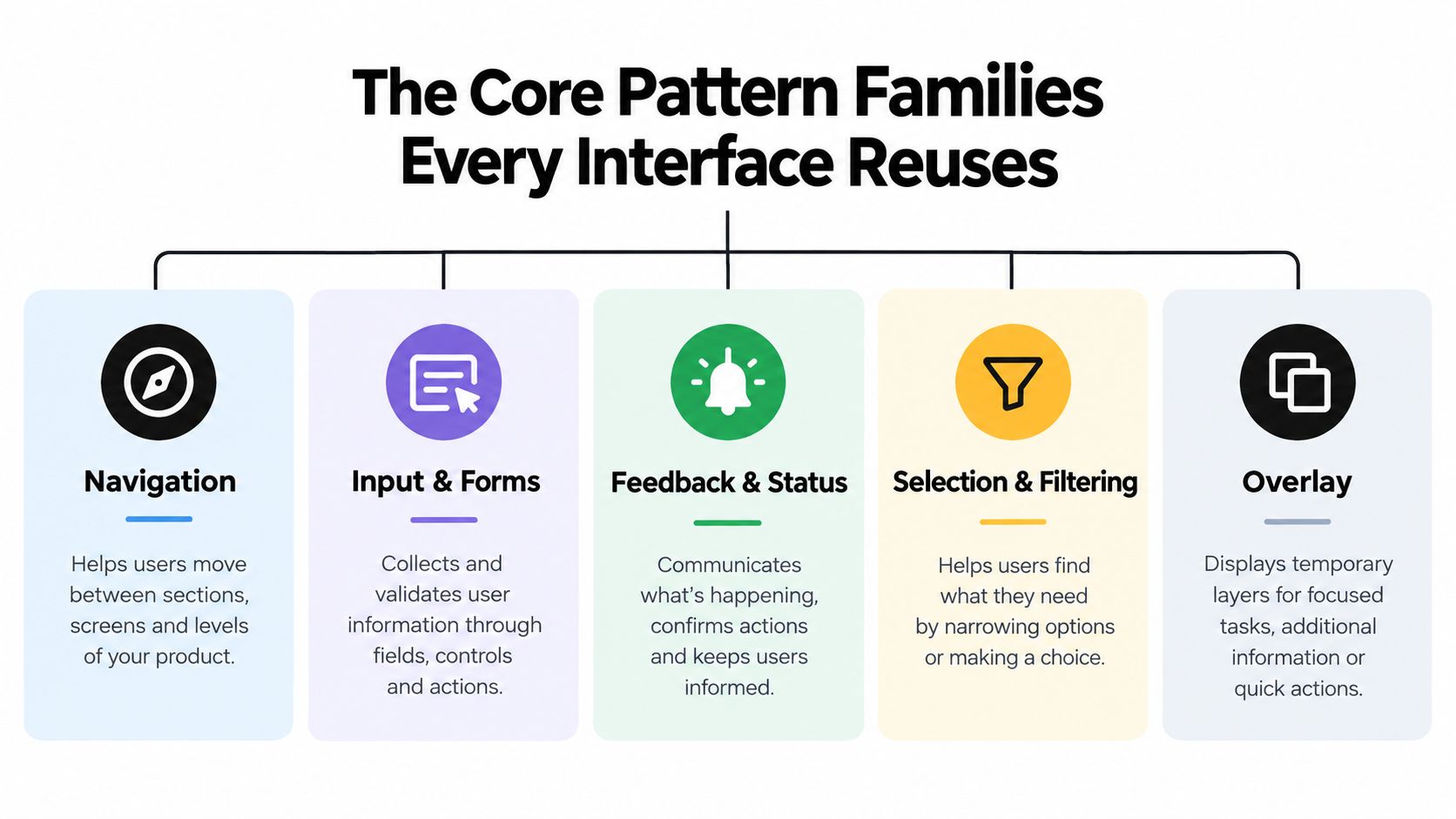
A checkout flow, account screen, or admin dashboard may look different, yet its interactions usually fit five behavioural families. This classification gives a team a working map before it selects a framework component. It starts with the user’s task and the interface’s obligations, then connects those obligations to code, tests, and monitoring.
Navigation
Navigation patterns help users establish their current location and choose a destination. Global navigation, sidebars, breadcrumbs, tabs, pagination, and step indicators fit this family. Their contract includes current-location state, meaningful accessible names, predictable keyboard movement, and an alternative presentation when the viewport becomes narrow.
A sidebar might expose several levels of hierarchy, while a breadcrumb exposes ancestry. Review find sidebar options against your product’s information structure instead of copying a layout designed only for a wide desktop screen.
Input and forms
Input patterns convert an intention into data. Text fields, checkboxes, radio buttons, switches, date controls, validation messages, and multi-step forms must define labels, instructions, error relationships, and submission behaviour. The implementation should make the expected value clear and let users correct an error without discarding valid work.
Feedback and status
Feedback communicates what the system is doing and what it has completed. Toasts, banners, inline errors, progress indicators, skeletons, empty states, and success messages belong here. A status change needs more than a visual treatment. It may need persistence, proximity to the affected control, and an announcement that assistive technology can detect.
Selection and filtering
Selection patterns help users choose from, or reduce, a set of options. Listboxes, menus, comboboxes, autocompletes, filter panels, segmented controls, and sort controls connect a current value with available choices. Their contract should distinguish moving through options from committing a value, expose selection state, and provide a usable keyboard path.
Overlay and container
Overlay and container patterns change what is visible or receives attention without necessarily changing the underlying page. Dialogs, drawers, popovers, tooltips, command palettes, and accordions require explicit rules for focus ownership, dismissal, background availability, and constrained space. A modal that opens correctly but leaves focus behind it has not met its interaction contract.
These families overlap in real interfaces. A filter drawer combines a container, selection controls, input fields, and feedback. The useful question is therefore not which label wins, but which contracts must be implemented and observed. That same breakdown can become a component mapping table, with each family linked to DOM Studio primitives, accessibility checks, and product-specific states.
Common Patterns Walked Through One by One
A pattern family gives you a map. The implementation becomes easier when you inspect the individual interactions and ask what each one promises.

Navigation patterns
A navigation bar exposes destinations and indicates the current location. A sidebar can carry the same responsibility while offering more room for hierarchy. Breadcrumbs show ancestry, so each item should be a real navigable location rather than decorative text.
Tabs are often misused as navigation bars. A tab switches between panels within the same context, while a link takes the user to another resource. If changing a tab changes the URL or loads a separate page, consider whether links would communicate the model more clearly.
Input and selection patterns
A text input is simple only until you add help text, required state, validation, asynchronous checks, and a value that must survive rerendering. Associate the label and error with the control in the DOM, not just visually. Keep the error near the field and explain how to correct it.
A combobox combines editable text with a controlled set of suggestions. The user needs to know whether typing filters options, creates a new value, or both. Arrow keys should move through suggestions, the active option should be exposed, and selection should be announced without unexpectedly moving focus.
An autocomplete often fails when the list appears visually but isn’t connected semantically to the input. It also fails when a network response replaces the list while the user is navigating it. Treat loading, no results, errors, and stale responses as states in the pattern, not as incidental implementation details.
Feedback patterns
Toasts suit brief, non-blocking confirmation, but they shouldn’t be the only place a critical error appears. Inline validation works better when the error belongs to a specific field and persists until correction. For asynchronous work, expose a status that explains whether the request is in progress, succeeded, or failed.
Small transitions can clarify state changes, but motion can’t replace information architecture. Guidance on best practices for micro interactions is useful when you’re deciding how feedback should feel without allowing animation to hide the underlying state.
Overlay patterns
A modal dialog interrupts the current task and requires a deliberate return path. A drawer keeps more of the current context visible but still needs a clear close control and a predictable focus boundary. An accordion changes visibility without necessarily taking ownership of focus, so its trigger must expose expanded state and remain usable after content changes.
Command palettes are selection and overlay patterns at once. They provide fast access to actions, but they must support a visible trigger, text filtering, keyboard navigation, disabled or unavailable commands, and a result announcement. Their speed should come from fewer steps, not from making the interface mysterious.
The practical cost of getting these details wrong is visible in UK monitoring. Between 2022 and 2024, the Government assessed 1,203 websites and 21 mobile applications and identified 29,787 accessibility issues, with recurring failures in visible focus, colour contrast, keyboard operation, and responsive reflow. The monitoring findings connect these failures to interface behaviour.
A pattern review should therefore ask what happens at every state, not only whether the default screenshot looks polished.
Accessibility Obligations Patterns Must Carry by Default
Accessibility becomes reliable when the pattern owns the behaviour. Developers shouldn’t have to rediscover focus management every time they build a dialog or infer keyboard semantics from a visual mock-up.
Start with a dialog. When it opens, move focus to a meaningful control or the dialog container, give it an accessible name, keep keyboard focus within the active modal context, and return focus to the trigger when it closes. Escape should follow a documented dismissal rule. If the action can fail, the failure must be exposed without destroying the user’s place.
A combobox carries a different contract. The input needs a relationship with its popup, the active option needs to be identifiable, arrow keys need a consistent navigation model, and the selected value must be communicated. A menu should use menu semantics only when it represents commands, not as a generic container for links. Its keyboard model must be deliberate, including how focus moves between items and how the menu closes.
Turn obligations into tests
Write acceptance criteria beside the component API. For example:
- Focus entry: Opening a dialog places focus at a documented target.
- Focus restoration: Closing it returns focus to the trigger unless that trigger no longer exists.
- Keyboard path: Every actionable control can be reached and operated without a pointer.
- Names and states: Controls expose accessible names, selected values, expanded state, and errors.
- Visual resilience: Focus remains visible, contrast remains sufficient, and content reflows at high zoom.
- Announcements: Loading, success, and failure states reach users who don’t perceive visual changes.
Earlier UK monitoring found 2,691 issues across 421 tests, with missing visible focus, low colour contrast, and parsing problems among the common categories. After organisations received findings and typically had 12 weeks to respond, 59% had fixed the issues or established short-term remediation timelines. The monitoring report documents those findings and responses.
The lesson isn’t that a library makes accessibility automatic. A library gives the team a place to encode tested behaviour once, while product teams still need to supply correct labels, content, validation rules, and context. This accessibility guidance for DOM Studio provides a practical reference for treating those responsibilities as part of component delivery.
Mapping Patterns to Headless Component Libraries
A fully styled component library gives you visual defaults quickly. That can be valuable when a product needs a coherent interface with minimal configuration, but teams may have to override its markup, tokens, and state styling when the brand or layout changes.
A headless library makes a different trade-off. It supplies behaviour and semantic structure while leaving presentation to the consuming product. You gain control over themes and composition, but your team must define visual states and verify that custom styling doesn’t hide focus, reduce contrast, or break responsive behaviour.
Map the family to the primitive
A useful mapping looks like this:
| Pattern family | Typical primitives | Main implementation question |
|---|---|---|
| Navigation | Menus, tabs, navigation groups | How is location or selection exposed? |
| Input and forms | Buttons, toggles, form controls | How are names, values, errors, and busy states connected? |
| Feedback and status | Toasts, alerts, empty states | How does the user receive status without relying on sight? |
| Selection and filtering | Listboxes, dropdowns, comboboxes, autocompletes | How does focus move through available values? |
| Overlay and container | Dialogs, drawers, tooltips, accordions, command palettes | Who owns focus, and how does the user leave? |
DOM Studio provides standards-based custom-element primitives and a thin Vue integration layer for these kinds of interactions. Its individual modules average under 2 kb gzipped, according to the product reference supplied for this article, while the implementation still needs product-level testing and content decisions. The UK monitoring discussion on reusable accessibility responsibilities reinforces why ARIA semantics, keyboard handling, focus management, and screen-reader behaviour belong with the component contract.
The headless approach works best when a team separates primitive behaviour from composition. A dialog primitive can manage focus and dismissal, while a product-specific confirmation pattern adds copy, destructive-action rules, loading feedback, and analytics. The result is not a generic box. It’s a reusable contract assembled from smaller responsibilities. This guide to headless UI component libraries covers that separation in more detail.
Best Practices for Choosing and Customising Patterns
Adopt an existing pattern unchanged when the user intent and interaction model already match. Extend it when the new requirement preserves the same model, such as adding a validation state to an established text field. Create a new pattern when the user’s goal, risk, or state machine changes enough that the old name would hide important behaviour.
Keep the governance lightweight. AbilityNet’s 2025 UK survey found 53% of respondents named competing priorities as a leading accessibility barrier, 50% cited insufficient knowledge, and 45% cited limited internal skills or experience. Only 55% reported accessibility embedded in development processes, and 36% reported testing with disabled people. The survey findings support a process that fits delivery pressure rather than depending on ideal conditions.
Use a short pattern record with:
- Purpose: The task and the situations where the pattern applies.
- States: Default, focus, busy, success, error, empty, disabled, and responsive variants.
- Keyboard path: Every movement, activation, dismissal, and restoration rule.
- Content rules: Labels, instructions, errors, confirmation copy, and localisation constraints.
- Release evidence: Automated checks, manual keyboard review, zoom and contrast checks, and any disabled-user research.
Track real usage and failure reports after release, then use SigOS data driven design as a reference for connecting interface decisions with observed product evidence. Retire patterns when their intent is obsolete, not merely because a newer visual style has appeared.
Patterns as Shared Infrastructure, Not Decoration
Return to the third modal. The team didn’t save time because someone wrote a clever abstraction. They saved time because everyone agreed what a confirmation dialog must do, and the implementation carried that agreement wherever the pattern appeared.
That’s the difference between component reusability and copy-and-paste. Find one interaction in your product that exists in three inconsistent forms, write its operational contract, and test the highest-risk states first.
DOM Studio provides headless, standards-based primitives and Vue integrations for reusable interactions such as dialogs, menus, tabs, comboboxes, drawers, toasts, and command palettes. Use DOM Studio to explore a component foundation that keeps behaviour separate from styling, then apply your own pattern rules, content, and release checks.