
TL;DR
Choose the interaction before the Vue component. Use a numeric slider for adjusting a bounded value, a carousel for browsing a visual sequence, and visible options for choosing a mode. Use tabs to switch between related content panels. If exact numbers or side-by-side comparisons matter, consider direct entry or a grid instead. Evaluate component behavior only after that decision is clear.
Searching for slider vue can lead to very different components. The useful question is not which one has the smoothest animation. It is what the person using your application needs to accomplish.
I start with a sentence: “The user needs to change ___ so they can ___.” Adjusting image opacity, inspecting product photographs, and selecting an export format may all appear in one editor, but they should not share an interaction simply because each can be drawn as a sliding element.
Table of contents
- Start with the task, not the component name
- Use a numeric slider when adjustment is the task
- Use a carousel when browsing a sequence is the task
- Keep discrete choices visible, and distinguish them from tabs
- Match a Vue implementation to the chosen interaction
- A short requirements checklist for your component review
- Make the component follow the decision
- Sources
- Recommended Reads
Start with the task, not the component name
Before comparing packages, identify what changes when someone operates the control. Is it a numeric setting, the item being viewed, a selected option, or the visible section?
| User task | Starting pattern | Question that could change the choice |
|---|---|---|
| Adjust opacity or audio volume | Single-value range slider | Must people enter an exact figure? |
| Set minimum and maximum prices | Two-value range control or paired numeric fields | Must both endpoints be precise? |
| Inspect photographs of one product | Carousel with explicit navigation | Would simultaneous comparison be more useful? |
| Choose Compact, Comfortable, or Spacious density | Visible single-choice options | Do the labels still fit on small screens? |
| Move between Preview, Details, and History | Tabs | Are these local panels or separate destinations? |
These are starting points, not mandatory mappings. A price filter can reasonably use two fields without a shared track. A gallery can be a grid without any sliding behavior.
The distinction is semantic: the W3C slider pattern describes choosing a value within a range, while its carousel tutorial describes moving through a collection of content. Similar motion does not make those interactions interchangeable.
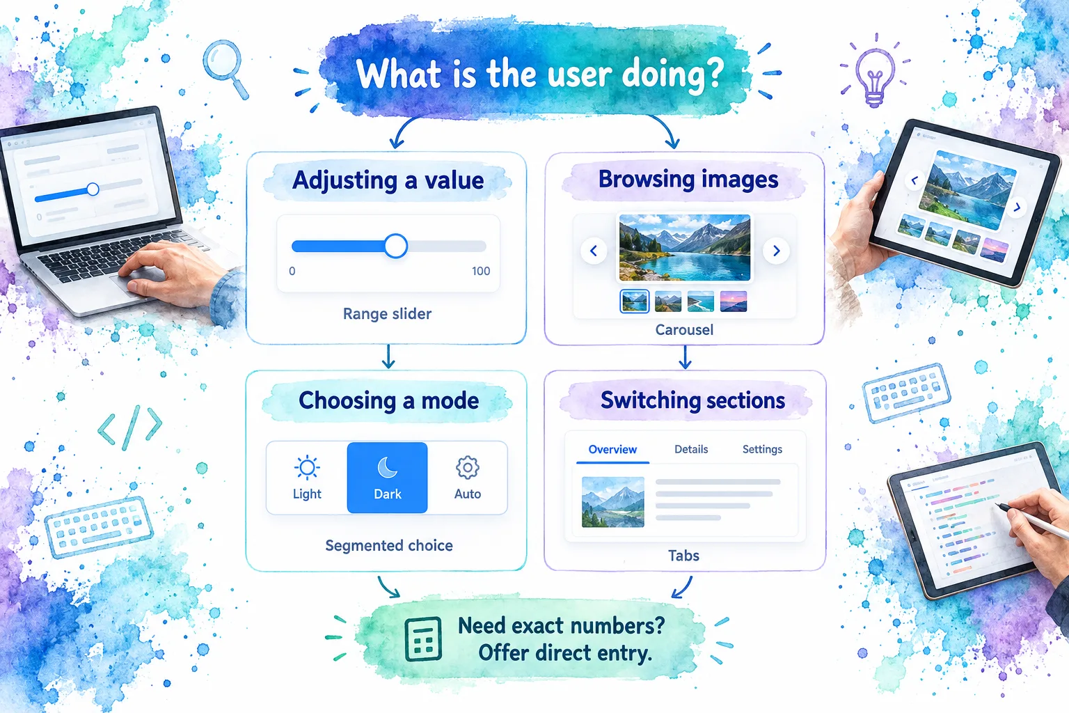
Write the task sentence in your component ticket. It gives design, engineering, and review a common criterion that is more useful than “make it slide.”
Use a numeric slider when adjustment is the task
A numeric slider earns its place when users benefit from exploring a bounded scale. Imagine an image editor: moving an opacity control while watching the canvas makes the relationship between gesture and result visible.
For an exact invoice quantity, that same interaction is a poor starting point. I would offer direct numeric entry rather than require repeated dragging to find a specific amount. MDN’s range-input reference positions the native range control around cases where the precise number is less important than its position between bounds.
Precision changes the surrounding interface
Do not make the thumb communicate everything. Specify the unit, meaningful limits, allowed increments, and visible current value. When exact adjustment is also needed, pair the slider with an editable numeric field or choose the field alone.
Consider an AI review threshold. A percentage slider communicates “more restrictive” only if the product explains what the threshold controls. It does not explain the consequences of choosing 80 instead of 60. Add that context before polishing the track.
Also decide whether an unanswered state is necessary. A native range input always has a value; an initial thumb position does not establish that someone deliberately made a choice. MDN documents that nonempty value behavior.
An interval is a separate requirement
A price window has two related values, not one value with extra decoration. Decide whether endpoints can meet, whether a minimum separation is required, and how people enter precise limits.
For a shared-track design, the W3C multi-thumb pattern requires independently operable thumbs and stable tab order. It also describes updating a thumb’s programmatic bounds when another thumb constrains it. Treat that as a component-selection requirement rather than a styling detail.
Use a carousel when browsing a sequence is the task
A carousel is a candidate when users need a substantial view of one image while retaining access to neighboring items. A product gallery is a useful example: the main photograph shows detail, while thumbnails can expose the available views.
The tradeoff is discoverability. Content outside the current view is less immediately visible. W3C explicitly notes that carousel content can be hard to discover in its accessibility tutorial. I would therefore avoid making an essential requirement or the only route to a critical action depend on finding a later slide.
Decide whether people are browsing or comparing
An asset picker illustrates the difference. If the task is “inspect this photograph closely,” a large image with previous and next controls may fit. If the task is “choose the best of these six images,” I would start with a grid so the alternatives remain available together.
For a carousel, specify orientation cues: recognizable thumbnails, a meaningful position indicator, or clear slide labels. Do not assume that a clipped edge or a swipe gesture tells every user what is available.
W3C’s carousel guidance calls for keyboard-operable functionality, understandable focus management, communication of item changes, and the ability to pause movement. A swipe gesture can complement navigation, but it cannot be the only way to operate the gallery.
My default for an application gallery is manual navigation. If automatic rotation serves a real requirement, define its pause and resume behavior explicitly rather than treating autoplay as harmless decoration.
For a visual implementation companion, John Komarnicki’s Vue 3 carousel tutorial explores a reusable carousel using the Composition API. Treat it as a structural example, not an accessibility audit or a replacement for documentation matching your installed dependencies.
Keep discrete choices visible, and distinguish them from tabs
Not every ordered set needs a track. Suppose a dashboard offers three density modes: Compact, Comfortable, and Spacious. Users are choosing named alternatives, not estimating a numeric amount. I would present the labels as visible choices rather than hide them behind positions on a slider.
For a single selected setting, radio-group semantics are a useful baseline. The W3C radio-group pattern defines a group where no more than one option is checked. Styling those choices as segments does not remove the need for a clear group label, selected state, and keyboard operation.
Tabs solve a different problem. Preview, Details, and History can label related content panels, with one panel displayed at a time. That relationship between tabs and panels is central to the W3C tabs pattern.
An animated indicator underneath a tab does not make it a numeric slider. Likewise, a row of pill-shaped buttons does not prove that a control implements tab semantics.
There is a space tradeoff too. Short labels may work well as segments, but long translations and narrow containers can make them awkward. Evaluate real labels at the smallest supported width. If choices no longer remain understandable, consider a vertical option list or a select rather than forcing the original silhouette.
Match a Vue implementation to the chosen interaction
Once the task is settled, choose the smallest implementation that satisfies the contract. There is no reason to compare a photo-carousel package with a numeric input library as if they were substitutes.
One bounded value
For a simple numeric setting, start by evaluating native <input type="range">. Its bounds and increments are documented in MDN’s range reference. Move beyond that baseline when you can name the missing requirement, not merely because a package demo looks more elaborate.
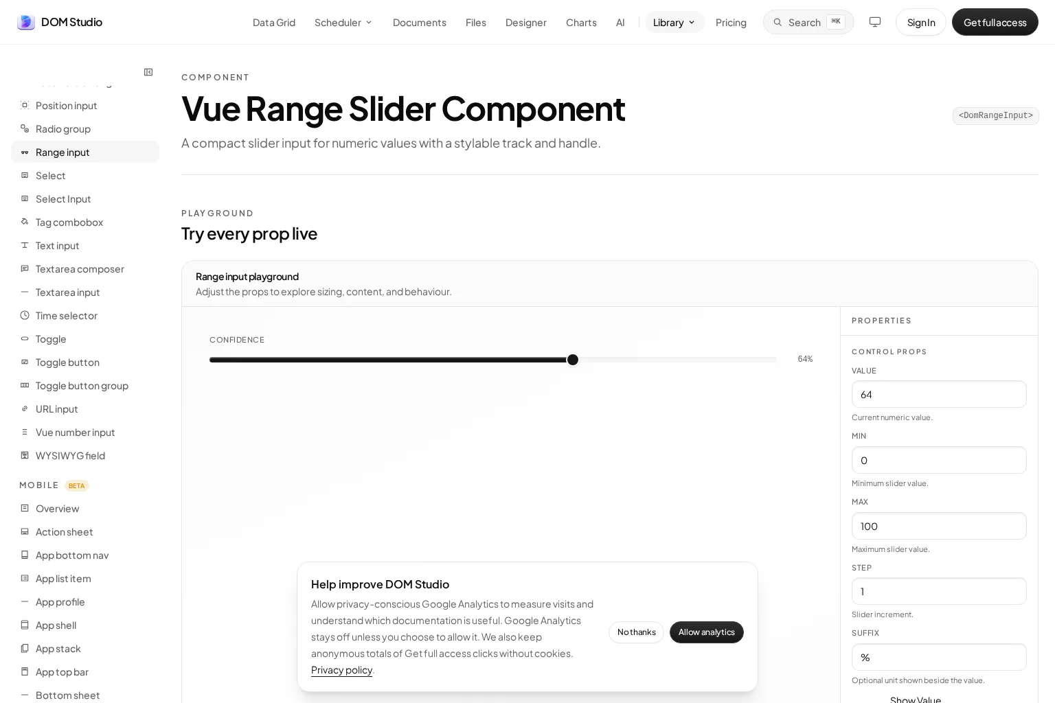
For a configurable Vue control, inspect our Range Input playground and reference. It documents one current numeric value, minimum and maximum bounds, increments, a unit suffix, visible-value display, and styling surfaces. Use the playground to judge the fit for your setting; do not infer two-thumb support from the component’s name.
A two-ended numeric interval
If the requirement is a shared track with two endpoints, shortlist a component that documents that mode. For example, PrimeVue’s Slider documentation describes a two-handle range mode. This makes it a candidate for further evaluation, not an automatic reason to add another library to an application that already has a suitable interval control.
A browsable image sequence
For a gallery, Swiper’s Vue documentation provides Vue carousel components and documents navigation, pagination, keyboard, accessibility, and thumbnail modules. Determine which capabilities your gallery actually needs, then consult the documentation for the version you install. A feature list is not evidence that your configured gallery meets every accessibility requirement.
Named, discrete alternatives
For visible option selection, compare native radio controls with our Segmented Select Input playground, which documents options rendered as buttons and a selected value. Inspect the rendered semantics and interaction in context rather than assuming accessibility behavior from the visual treatment.
A short requirements checklist for your component review
Bring the same questions to every candidate, but make the expected answers specific to the interaction.
- State contract: Is the application storing one number, two endpoints, a selected option, or a visible item? Name the owner of that state and how external changes reach the component.
- Input methods: Can people complete the task with keyboard, pointer, touch, and the assistive technologies your product supports? The W3C slider pattern specifically warns about touch-assistive-technology limitations and calls for device testing.
- Feedback: Can users identify the current value, selected alternative, or gallery position without relying only on color or animation? Include units or meaningful names where a bare number is ambiguous.
- Update timing: Separate temporary exploration from a committed action. Decide whether dragging previews a result, triggers a search, or saves a preference. For asynchronous work, specify pending, rejected, and out-of-order response behavior.
- Layout and content: Check real labels, translated text, narrow widths, and the empty and single-item gallery cases. Do not limit evaluation to a polished default demo.
- Integration and ownership: Confirm Vue-version compatibility, installed-package documentation, styling boundaries, and server-rendering requirements if applicable. For an editable inspector, identify which values are safe to configure and which are application rules.
Turn these into observable acceptance criteria. “A user can choose a price interval” is too broad. “A user can type both endpoints, revise either one with the keyboard, and understand a rejected interval without losing their entries” gives a reviewer something concrete to evaluate.
Do the same for a gallery: specify how users find the next image, understand their position, and return to a previous item. Different interactions need different checks, even when they share a visual design language.
Make the component follow the decision
The best Vue slider choice may be a range control, a carousel, or no slider at all. Define the task, precision, visible alternatives, and update behavior first. Then select a component whose documented contract fits.
If your task is numeric adjustment, explore our Range Input playground. If it is choosing a named mode, start with the Segmented Select Input. Bring the requirements checklist into that evaluation before committing to the visual design.
Sources
- W3C WAI: Slider Pattern
- W3C WAI: Multi-Thumb Slider Pattern
- W3C WAI: Carousels Tutorial
- W3C WAI: Radio Group Pattern
- W3C WAI: Tabs Pattern
- MDN: HTML Range Input
- DOM Studio: Range Input
- DOM Studio: Segmented Select Input
- PrimeVue: Slider
- Swiper: Vue Components
- John Komarnicki: Reusable Vue 3 Carousel Tutorial
Recommended Reads
- Vue JS Slider: Build an Accessible Range Control in Vue 3 for implementation after selecting a numeric control.
- Inspectable UI Components: A Practical Guide to Editable Interfaces for reviewing component contracts and supported states.
- Editable Vue Components: A Practical Guide to Live UI Editing for exposing safe configuration in application inspectors.