
You’re polishing a settings panel, and the slider looks finished. Then someone tries to set an exact price without dragging, or adjust the volume using only a keyboard, and the interaction falls apart. The thumb moves beautifully, but the user can’t complete the task.
A reliable slider user interface starts with a product decision, not a gradient. Decide whether users need exploration, precision or a deliberate commitment, then build the markup, styling and fallback around that task.
Table of Contents
- When a Slider Is the Right Control
- Keyboard, ARIA and Focus Rules That Matter
- How to Build a Responsive Slider Step by Step
- Making Sliders Work Without Precise Dragging
- Touch Target Sizes and How to Test Them
- Theming and Performance Fixes for Production
- Test Your Slider With Keyboard and Touch Before Release
When a Slider Is the Right Control
Say a shopper needs a minimum price of exactly £250, but the thumb keeps landing either side of it. Meanwhile, a keyboard user wants the volume at forty per cent, but the developer has made only the draggable handle interactive. Neither problem can be fixed by making the track prettier.
Sliders suit adjustment by feel. Brightness, volume and visual zoom offer immediate feedback, so users can stop when the result feels right. Exact quantities, financial limits and other consequential values need a more dependable entry method.
Control type by task
| Task | Recommended control | Why it fits |
|---|---|---|
| Continuous volume or brightness | Range slider with step buttons | Users adjust by feel and need fine steps |
| Bounded quantity, such as basket items | Stepper with numeric input | Exact values matter more than motion |
| Price range filter | Dual-range slider with minimum and maximum inputs | Users need approximate dragging and exact entry |
| Video playback position | Slider with short and longer skip buttons, for example five and ten seconds | Seeking needs precision and a fallback |
| High-consequence setting, such as a spending limit | Numeric input with confirmation | Dragging too far is costly and hard to undo |
Those example skip intervals are product choices, not accessibility requirements. Pick intervals that make sense for the media and label the buttons with their actual behaviour.
Before styling anything, answer these questions:
- Precision: Does the user need a particular value, or merely a comfortable setting?
- Consequence: What happens if the user selects the wrong value?
- Recovery: Can they recognise and reverse an overshoot?
For exact quantities, start with the behaviour of a numeric input, including validation, allowed increments and empty states. Adding a slider later is easier than repairing a workflow that assumes everybody can drag accurately.
Treat control selection as an accessibility decision
The UK Government’s public-sector accessibility guidance explains that the accessibility regulations came into force on 23 September 2018, establishing requirements for public-sector websites and mobile applications and for publishing an accessibility statement. A slider in those services is an interactive control, not an exemption because it looks bespoke.
Build keyboard operation, meaningful value feedback and visible focus into the component contract. Don’t leave them as optional enhancements after visual approval.
Practical rule: If the task requires a precise value, a slider on its own is the wrong control.
Keyboard, ARIA and Focus Rules That Matter
Start with input type="range". The browser supplies slider semantics and keyboard behaviour, leaving you to provide a useful label, sensible bounds and clear feedback.
A custom element with role="slider" is a different commitment. You’re responsible for focusability, keyboard interaction, value constraints and accessibility state, not just drawing a handle.
The NHS accessibility testing guidance explicitly includes the location slider among media controls that must work for keyboard and screen-reader users. It also explains why keyboard access matters beyond keyboards, supporting alternative input methods such as switches and speech input.
Define the semantic contract
For a native range input, associate a visible label using matching for and id values. Set min, max, step and the initial value explicitly so the browser doesn’t choose defaults that conflict with your product.
For a custom slider, provide:
- An accessible name: Prefer visible text referenced by
aria-labelledby; usearia-labelwhen there’s no suitable visible label. - Range state: Keep
aria-valuemin,aria-valuemaxandaria-valuenowsynchronised with the actual value. - Meaningful value text: Use
aria-valuetextwhen a bare number doesn’t explain the setting, such as a duration or a named intensity. - Orientation: Expose
aria-orientationwhen the custom control is vertical.
Don’t duplicate the native range input’s implicit role and numeric state unnecessarily. Add value text only when it improves what assistive technology communicates.
Keyboard behaviour for a single-thumb slider
| Key | Expected behaviour | Note |
|---|---|---|
| Right Arrow or Up Arrow | Increase by a single step | Native range inputs provide standard arrow handling |
| Left Arrow or Down Arrow | Decrease by a single step | Native range inputs provide standard arrow handling |
| Page Up | Increase by a larger step | Define the increment if supported; native support needs testing |
| Page Down | Decrease by a larger step | Mirror Page Up |
| Home | Jump to the minimum | Particularly useful on long ranges |
| End | Jump to the maximum | Particularly useful on long ranges |
A single step represents the smallest meaningful adjustment. A page step moves through the range more quickly, but shouldn’t be an unexplained jump. For native controls, test the browsers you support before promising identical behaviour for optional keys.
Keep focus on the same element during updates. Replacing the input after every reactive render can interrupt a keyboard interaction even when the replacement looks identical.
Use a clearly visible :focus-visible treatment that remains distinguishable against the track, page background and selected fill. Turn that into a documented check in your WCAG compliance checklist, rather than relying on a screenshot of the default state.
For product teams explaining why these details deserve release attention, Raze’s discussion of the link between accessibility and buyer trust provides useful context. The engineering acceptance test is more concrete: tab to the control, adjust it with arrows, and confirm that the spoken value matches the displayed value without losing focus.
How to Build a Responsive Slider Step by Step
Build the native control first, then layer on visual styling and framework integration. This keeps browser behaviour available while you work through the parts that differ between rendering engines.
The implementation sequence starts with the control’s structure, not its framework wrapper.
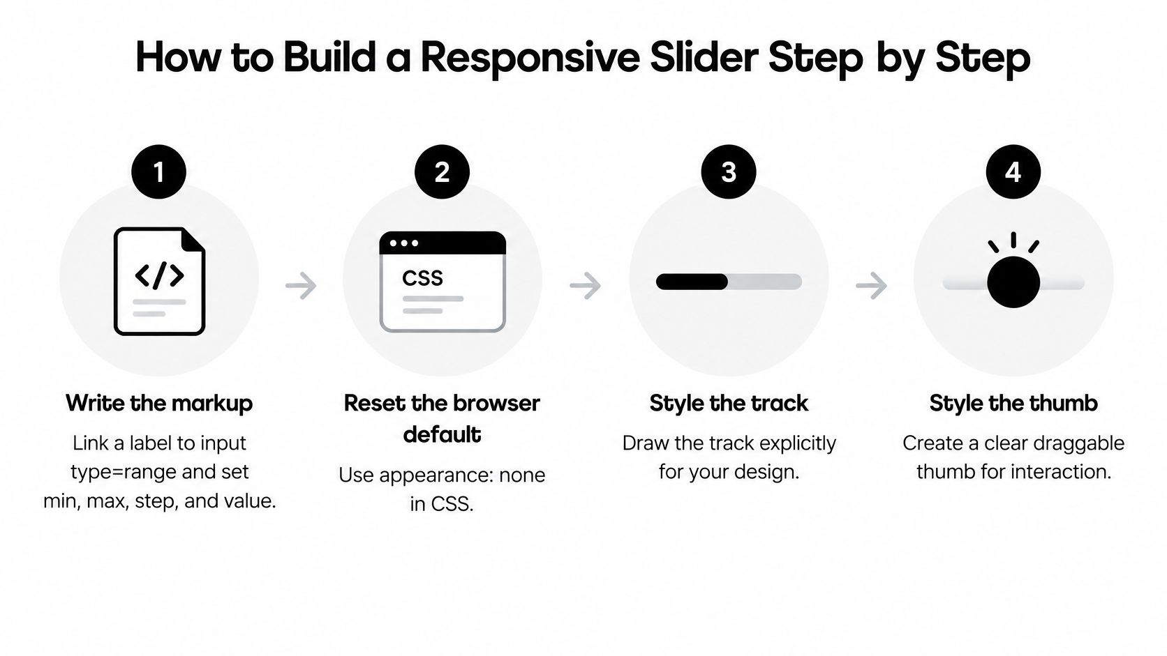
Build the native baseline
-
Write the markup. Connect a visible label to the range input, then set its bounds, increment and initial value. Keep a readable output beside it so users don’t have to infer the setting from thumb position.
-
Reset deliberately. Apply
appearance: noneand the WebKit-prefixed equivalent where needed. Once you remove native appearance, explicitly restore the track, thumb and focus treatment rather than assuming browser defaults will fill the gaps. -
Style each engine separately. Use
::-webkit-slider-runnable-trackand::-webkit-slider-thumbfor WebKit-style controls, and::-moz-range-trackand::-moz-range-thumbfor Firefox. Keep these selectors in separate rules because an unsupported pseudo-element can invalidate a combined selector. -
Calculate the fill from the actual range. Subtract the minimum from the current value, divide by the available span, then convert the result to a percentage. Guard against equal bounds so an invalid configuration doesn’t produce an unusable CSS value.
Here’s a compact baseline with illustrative bounds and values. The listener updates both the visible output and a CSS custom property.
<label for="volume">Volume</label>
<input
  id="volume"
  type="range"
  min="0"
  max="100"
  step="1"
  value="40"
  style="--fill: 40%"
>
<output id="volume-value" for="volume">40%</output>

<style>
  input[type="range"] {
    appearance: none;
    -webkit-appearance: none;
    width: 100%;
    min-width: 0;
    background: transparent;
  }

  input[type="range"]::-webkit-slider-runnable-track {
    background: linear-gradient(
      to right,
      var(--slider-active, black) var(--fill),
      var(--slider-track, silver) var(--fill)
    );
    height: 0.5rem;
    border-radius: 1rem;
  }

  input[type="range"]::-moz-range-track {
    background: linear-gradient(
      to right,
      var(--slider-active, black) var(--fill),
      var(--slider-track, silver) var(--fill)
    );
    height: 0.5rem;
    border-radius: 1rem;
  }

  input[type="range"]::-webkit-slider-thumb {
    appearance: none;
    -webkit-appearance: none;
    width: 2rem;
    height: 2rem;
    margin-top: -0.75rem;
    border: 0.125rem solid black;
    border-radius: 50%;
    background: white;
  }

  input[type="range"]::-moz-range-thumb {
    width: 2rem;
    height: 2rem;
    box-sizing: border-box;
    border: 0.125rem solid black;
    border-radius: 50%;
    background: white;
  }

  input[type="range"]:focus-visible {
    outline: solid Highlight;
    outline-offset: 0.25rem;
  }
</style>

<script>
  const slider = document.querySelector("#volume");
  const output = document.querySelector("#volume-value");

  function update() {
    const min = Number(slider.min);
    const max = Number(slider.max);
    const value = slider.valueAsNumber;
    const fill = max > min
      ? ((value - min) / (max - min)) * 100
      : 0;

    slider.style.setProperty("--fill", `${fill}%`);
    output.value = `${value}%`;
    slider.setAttribute("aria-valuetext", `${value} per cent`);
  }

  slider.addEventListener("input", update);
  update();
</script>
Add layout and framework behaviour
-
Separate geometry from decoration. Give the input enough block space for its thumb and focus outline, and check the actual interactive area before shrinking the visible handle. Padding on a wrapper doesn’t automatically become a draggable target.
-
Use theme tokens. With Tailwind CSS, place the reusable slider rules in a components layer and define track, active, thumb and focus colours as shared tokens. Switch token values for dark mode instead of maintaining a second set of pseudo-element rules.
-
Update local feedback on
input. The displayed value should move during interaction, not wait forchange. Keep expensive application work separate from this immediate feedback so the thumb doesn’t feel delayed. -
Wrap the stable behaviour in Vue. Accept
modelValue, bounds and step as props, bind the input’s value, and emit a numericupdate:modelValuefrom its input handler. Derive the fill from the prop so external updates, resets and direct-entry controls stay synchronised.
Keep the wrapper full width and allow flex or grid children to shrink with min-width: 0. Test the output beside long labels and translated text, not just a short English label.
For a visual comparison before committing to your skin, browse the slider UI component from ogBlocks. Use it to evaluate presentation choices, then verify interaction against your own task and browser support requirements.
Making Sliders Work Without Precise Dragging
Dragging fails when the user can’t reliably keep a pointer on a moving target. Tremor, touch imprecision and magnification can turn a short adjustment into repeated corrections, especially when the user can’t see the whole track.
The contrast between a tiny touch control and a magnified interface makes the problem tangible.
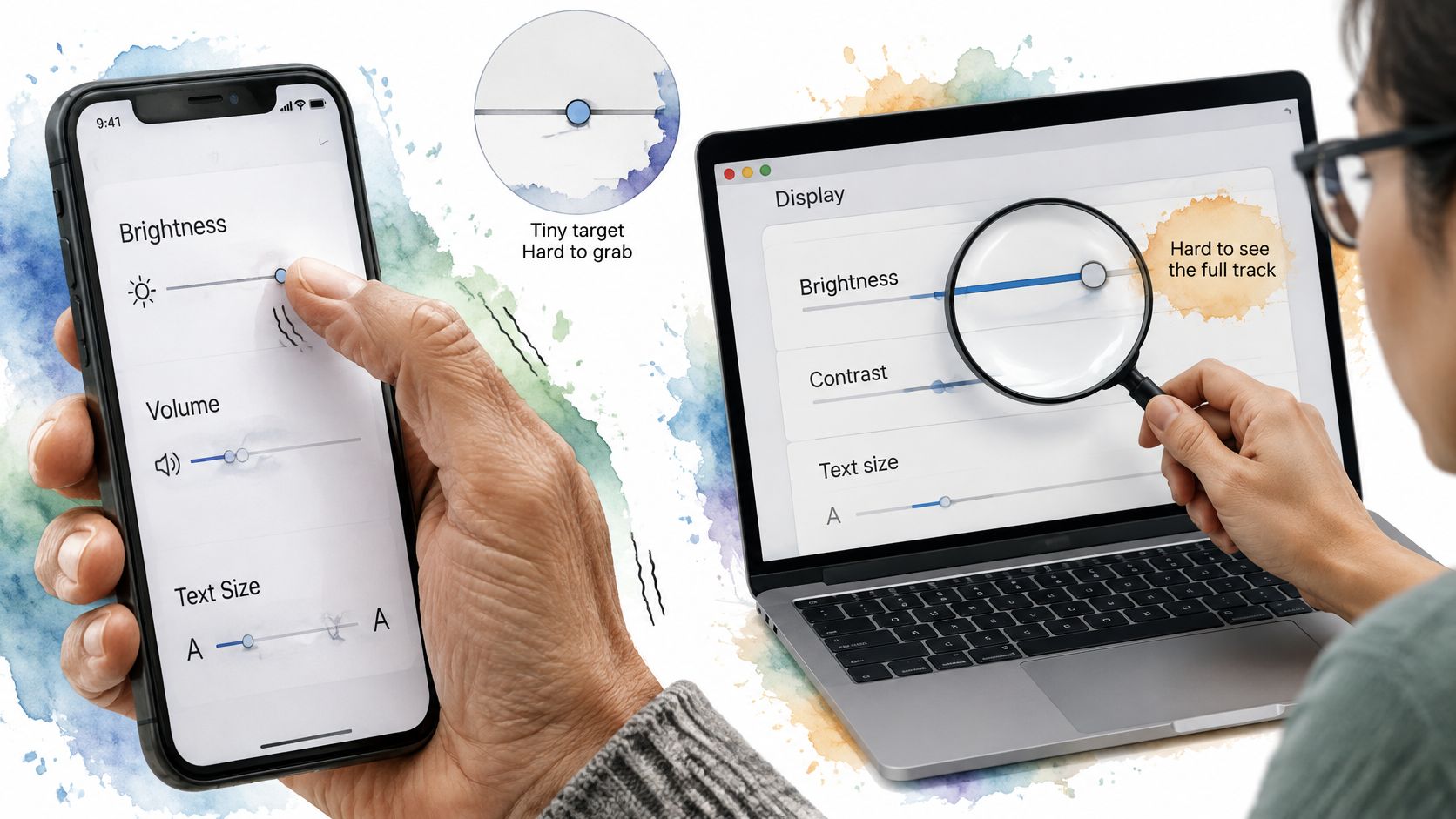
The Home Office guidance on gestures and motion identifies sliders as path-based gestures and recommends alternatives such as buttons or direct number entry. It also says touch or mouse actions should be cancellable before release.
Keyboard support alone isn’t a complete touch alternative. A person using a phone shouldn’t have to connect a keyboard to avoid dragging.
Make the alternative part of the control
Use a forgiving track, clearly labelled decrement and increment buttons, and a numeric field when exact entry matters. Show the allowed minimum, maximum and increment near the controls, rather than revealing the rules through validation errors.
For example, a shopper types 250 into a minimum-price field. After validation, the application updates the shared numeric state, moves the minimum thumb and refreshes its accessible value; it doesn’t maintain a separate slider value that can drift out of sync.
- Handle incomplete typing: Let the user temporarily clear the field without immediately replacing it with a boundary value.
- Explain invalid ranges: If the minimum exceeds the maximum, show an actionable message rather than automatically exchanging the values.
- Preserve intent: Don’t round a typed amount unexpectedly unless the permitted increment is visible and the adjustment is explained.
Give users a way to state the value they want, not just a different way to move towards it.
Separate preview from commitment
A changing label is a preview. Applying a filter, saving a limit or triggering a request is a separate action, and should have an appropriate cancellation or recovery path.
For a filter drawer, an explicit Apply button can preserve the current results while users experiment. For an immediate setting, retain the previous value and provide a dependable way to revert; waiting for pointer release doesn’t, by itself, make an action cancellable.
Use this video alongside hands-on interaction checks, rather than treating a demonstration as a substitute for testing.
For continuous adjustment, step buttons may be sufficient. For bounded numeric entry and dual-range filtering, make direct entry part of the default pattern; for high-consequence settings, make numeric entry and deliberate confirmation the primary interaction.
Touch Target Sizes and How to Test Them
| Platform or standard | Minimum target | What to check |
|---|---|---|
| WCAG 2.2 AA | 24 × 24 CSS pixels | Exceptions exist, so confirm applicable spacing rules |
| iOS guidance | 44 × 44 points | Apply to the effective target, not just the drawn thumb |
| Android guidance | 48 × 48 density-independent pixels | Check on a small-screen device |
| Adjacent step buttons | Follow the applicable platform target above | Keep inactive space between targets |
| Thumb under magnification | Retain the applicable target and usable layout | Confirm the thumb stays reachable and labelled |
These references use different units and aren’t interchangeable: GOV.UK’s guide to understanding WCAG sets WCAG 2.2 AA as the government-service baseline, while the associated target-size references distinguish the 24 × 24 CSS-pixel web minimum, subject to exceptions, from BBC guidance recommending 44 × 44 points on iOS and 48 × 48 density-independent pixels on Android. Treat platform recommendations as design references, not additional statutory web thresholds.
Measure the effective target
The visible circle isn’t necessarily the interactive area. A custom control can use a larger transparent hit region, but that region only helps if pointer events reach the control.
Inspect the element in browser developer tools, then verify its clickable boundaries with real taps. A large wrapper with a small interactive child can look generous in the box model while leaving the original usability problem untouched.
Spacing matters too. Adjacent minus and plus buttons need inactive space so an imprecise touch doesn’t select the opposite action; don’t assume that passing a size check proves the arrangement is usable.
Run a task-based audit
Record pass or fail, along with the browser, input method and control state.
- Keyboard movement: Check arrows, Home and End, including behaviour at each boundary.
- Touch recovery: Start an adjustment, move away and cancel or revert it through the intended interaction.
- Zoom and reflow: Magnify the page and narrow the viewport until labels wrap; check for clipped outputs and unreachable controls.
- Screen-reader feedback: Confirm that the focused control exposes its name, current value and useful units.
- Direct entry: Type a valid value, an empty value and an invalid range, then check synchronisation and errors.
- Obstruction: Scroll beneath sticky headers, toolbars and filter actions to check that they don’t cover the thumb or focus indicator.
Don’t rely solely on desktop emulation for touch behaviour. Test a real phone, including the numeric keyboard opening and changing the available viewport.
For a reproducible test record, measure the effective target in CSS pixels, capture the layout state and attach the pass/fail checklist to the ticket. That gives another engineer enough information to repeat the test after a styling change.
Theming and Performance Fixes for Production
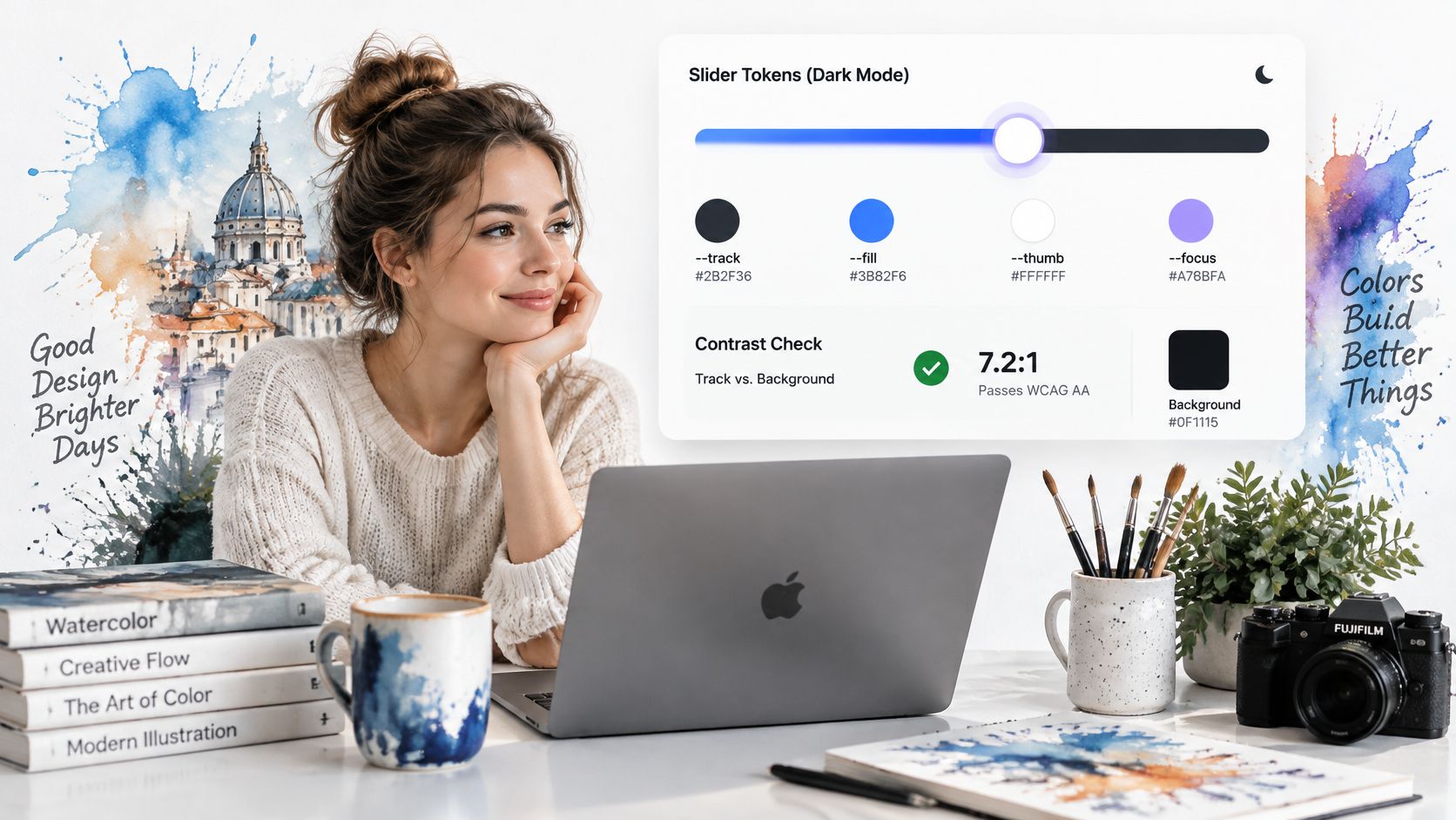
A production slider needs predictable styling under interaction, not just a polished default state. Inspect focus, disabled controls, overlapping thumbs and long values in every supported theme.
Use the mockup as a presentation reference, then test the actual rendered component.
Tune the work performed during interaction
- Keep colour tokens separate from position: Use names such as
--slider-track,--slider-active,--slider-thumband--slider-focus. Reserve--fillfor the percentage so a theme change can’t accidentally replace the position value. - Batch visual work when necessary: If input handling performs multiple visual writes, coalesce them with
requestAnimationFrame. Don’t add scheduling complexity to a cheap update without profiling it first. - Keep the DOM stable: Update values and styles instead of rebuilding the component. For a custom thumb, prefer transforms for movement rather than repeatedly changing layout-dependent positioning.
- Separate requests from feedback: Update the local label immediately, but debounce or explicitly apply network-backed filters. Cancel obsolete requests or ignore stale responses so old results don’t replace newer selections.
For dual-range controls, stacking native inputs can work, but it needs careful hit testing. Disabling pointer events on the inputs and restoring them on the thumbs can remove track-click behaviour, so test that trade-off rather than copying it blindly.
Keep each thumb’s identity and tab order stable. Enforce minimum not exceeding maximum in the shared state, and provide a way to reach both thumbs when they overlap.
Fix the common visual faults
- Drifting thumb: Reconcile thumb diameter, track geometry and WebKit’s vertical offset. Avoid arbitrary offsets that only match one browser.
- Unclear value: Format the output with its unit or meaning, not a raw internal number.
- Missing Safari fill: Inspect the WebKit track rule and custom-property inheritance instead of assuming Firefox styling will transfer.
- Clipped focus: Remove inappropriate
overflow: hiddenor provide enough interior space for the outline.
Use a documented theme customisation approach so fixes apply across skins. Don’t hide an interaction defect behind a theme-specific override.
Test Your Slider With Keyboard and Touch Before Release
Run the keyboard, touch and screen-reader checks on the real control in its real layout before merging. An isolated playground won’t reveal a sticky toolbar covering the handle or a filter drawer trapping focus.
Make failures traceable
- Record the task: Identify whether the failure affects volume adjustment, exact entry, seeking or another named activity.
- Record the interaction: Include the key, gesture or assistive-technology action that failed.
- Record the expected result: Describe the correct value, announcement, cancellation or focus destination.
Include magnification, narrow layouts and direct entry in the release ticket. When participants struggle despite technically correct behaviour, Bruce and Eddy’s guidance on analyzing usability test feedback can help turn observations into actionable changes.
Keep the slider reusable, but don’t share keyboard logic indiscriminately between control types. Our Vue Menu Component uses roving focus for command lists, settings panels and skinned menus; that’s a different interaction contract from adjusting a range value.
Before development starts, copy the control-selection table into the ticket and mark the fallback for every proposed slider. Resolve that decision before anyone spends time styling the thumb.
DOM Studio combines headless web component primitives, Vue integration and Tailwind CSS styling for building consistent interfaces. Visit DOM Studio to explore the component approach and theming tools, then use the task and fallback checks above when assembling your next settings panel or filter interface.