
The usual advice, use input type="number" whenever a field contains digits, is a poor starting point for production forms. A guest count is a number. An NHS number is an identifier. Giving both the same control can introduce unwanted stepping, reject useful formatting, and make errors harder to explain.
A better input type number guide starts with the meaning of the value, not the keyboard you’d like a phone to display. Choose the right semantics first, then configure validation, accessibility, formatting and component behaviour around that choice.
Table of Contents
- When a Field Should Be a Number Input
- Attributes That Define the Number State
- Browser Quirks That Change the Value
- Accessible Names Roles and Error Text
- Keyboard Focus and Stepper Behaviour
- Formatting Units and the Submitted Value
- Headless Primitives and Vue Wrappers
- Ship the Right Number Field
When a Field Should Be a Number Input
Use a number input when arithmetic makes sense for the value. You can increase a quantity, compare a weight against a limit, or calculate a percentage. You don’t increase someone’s telephone number to obtain a more valid telephone number.
That distinction also separates data entry from keyboard hints. type defines the control’s behaviour and semantics; inputmode suggests a suitable virtual keyboard. A text field can request a numeric keyboard without becoming a spinbutton.
The NHS design system’s guidance on NHS numbers recommends type="text" with inputmode="numeric" and allowing at least 12 characters, so spaces fit. The spaces aren’t part of the identifier’s eventual canonical representation, but accepting them helps people enter the value they recognise.
UK fields and the right control
| Field | Control | Keyboard hint | Must preserve | Spinbutton |
|---|---|---|---|---|
| Age in whole years | number |
numeric |
Digits only | Yes, if stepped |
| Item or guest quantity | number |
numeric |
Digits only | Yes |
| Weight in kilograms | number |
decimal |
Decimal point | Optional |
| Price in pounds | number, units outside |
decimal |
No £ or grouping commas in the value | No visible stepper needed |
| Percentage | number |
decimal |
Digits and decimal point | Optional |
| NHS number | text |
numeric |
Spaces, then normalise | No |
| National Insurance number | text |
text |
Letters and spaces | No |
| UK telephone | text |
tel |
Leading zero, spaces and international prefix | No |
| Postcode | text |
text |
Letters and spaces | No |
| Sort code or account reference | text |
numeric for digit-only references |
Leading zeroes and spaces; letters in alphanumeric references | No |
| One-time passcode | text |
numeric for digit-only codes |
Leading zeroes | No |
| Date of birth | Separate text fields or date |
numeric for text parts |
Separators in text; date structure in a date control | No numeric spinbutton |
Treat the table as a semantic decision, not permission to impose a character filter. Account references can contain letters, and an international telephone number needs more than digits. If those characters are valid for your service, your keyboard hint must not make them difficult to enter.
Decide what survives submission
For quantities, validate the numerical range and granularity in the browser, then repeat those checks on the server. For identifiers, preserve the entered text until you’ve checked its structure and applied a field-specific normalisation rule. Removing recognised spaces is different from stripping every non-digit character indiscriminately.
A stepper suits a hypothetical small guest range, such as choosing between one and twenty guests. It’s less useful for a salary, where repeated increments aren’t a practical interaction, and inappropriate for a postcode.
Selection rule: If removing a leading zero or changing spacing could alter the value’s meaning, don’t use numerical conversion as your storage strategy.
For the alternative component, the free text field guide provides useful context for keeping entry separate from validation. In shopping journeys, CIQRA’s resource on designing intuitive ecommerce interfaces is a complementary way to consider field choices within the wider purchase experience, rather than treating each input as an isolated widget.
Attributes That Define the Number State
A native number input still exposes a string value. The difference from a text input is that the string must represent a number, with browser rules governing validity and stepping.
The W3C number-state specification defines this numerical control and its range and step constraints. It doesn’t encode British currency, measurement units or presentation conventions. Those remain application decisions.
Number input attributes
| Attribute | Purpose | Example | Watch for |
|---|---|---|---|
value |
Current numeric string | value='1' |
Empty string is allowed; the attribute supplies the initial value |
min |
Inclusive lower bound | min='0' |
Doesn’t necessarily stop typing; affects validity |
max |
Inclusive upper bound | max='120' |
Same distinction between editing and validity |
step |
Allowed interval | step='0.01' |
A step mismatch is invalid |
step with any |
Remove step restrictions | step='any' |
Don’t assume native stepping methods work with this setting |
required |
Disallow an empty value | required |
Omit it for optional fields |
readonly |
Visible, not editable | readonly |
Still submitted |
disabled |
Inactive control | disabled |
Omitted from submission and sequential keyboard focus |
placeholder |
Temporary hint | placeholder='0' |
Not a label or default value |
list |
Suggested values | list='qty' |
Suggestions don’t replace numeric validation |
name |
Submitted key | name='guests' |
Doesn’t supply an accessible label |
autocomplete |
Autofill behaviour hint | autocomplete='off' |
Often unnecessary for quantities |
The numerical values in these examples are illustrative application settings, not recommended limits for every service.
Start with value. In JavaScript, input.value reads the current string, while the HTML value attribute establishes the initial/default value. Don’t convert an untouched optional field into a default quantity unless that’s an explicit product decision.
Next, choose inclusive bounds. For a hypothetical age field, min='0' and max='120' would make a value outside that interval invalid, but they aren’t a reliable keystroke filter. Users may still type an out-of-range value before receiving feedback.
Step defines valid increments
Use step='1' for whole items, step='0.01' for a pounds-and-pence example, or step='any' when arbitrary decimal granularity is acceptable. Step is a validity rule, not just a spinner preference.
The step grid has a base, normally min when supplied, otherwise the value attribute when appropriate, otherwise zero. A value can therefore be within range but fail stepMismatch. If your allowed sequence starts at a fractional value, test the sequence you intend.
A minimal illustrative guest field is:
<label for="guests">Guests</label>
<input type="number" id="guests" name="guests" min="1" max="20" step="1" required>
Finish the configuration deliberately:
- Presence: Add
requiredonly when omission prevents the service from proceeding. - Editability: Choose
readonlyfor a submitted value users can’t edit, ordisabledfor an inactive control. - Suggestions: Use
listfor convenient choices, not an exclusive set of permitted values. - Submission: Give the field a stable
name; useautocomplete='off'only when there’s a reason to discourage autofill.
Browser validation improves feedback. It doesn’t establish that an incoming request is trustworthy.
Browser Quirks That Change the Value
The text someone attempts to enter, the text the browser displays and the value your application reads aren’t always identical. That matters most when a developer chooses a number control for data that needs faithful text preservation.
The GOV.UK Design System team’s investigation into number inputs reported that Chrome and Android Chrome discarded most letters without notification, that Dragon NaturallySpeaking could be unusable with the control, and that NVDA could expose it ambiguously as a spin button or an unlabelled field. These are documented findings, not a claim that every current browser and assistive-technology combination still behaves identically.
What users can lose
Letters can disappear before validation explains anything. If someone enters an identifier containing letters into a number field, your application may never receive the original attempted value. You can’t reliably repair that mistake with a better error message after sanitisation.
Leading zeroes aren’t meaningful numerical information. A browser may retain them during some editing states, but conversion to a number won’t preserve them as identifier text. Don’t rely on a particular browser’s temporary display.
Commas require a localisation decision. The underlying numerical value uses a decimal point, not a grouping comma. Browsers may accept or translate localised entry differently, so it’s too broad to claim that a comma is rejected in every environment.
Scientific notation adds another surprise. A hypothetical entry such as 1e2 represents a number even though a product team may expect guests to type ordinary whole-number notation. Decide whether your service cares only about the resulting quantity or also about the accepted notation.
Don’t confuse a browser accepting a number with your service accepting the user’s intended format.
Focus can introduce accidental edits
Wheel behaviour varies by browser and configuration. Test whether scrolling while the field has focus changes its value, especially on long forms where someone may be trying to reach the next question. Don’t assume a behaviour observed in one desktop browser is universal.
Native arrows also differ in visibility and availability. A phone may offer a keyboard without any visible stepper, while desktop controls may reveal arrows only during interaction.
For a practical testing workflow, Faberwork’s Wallaby testing project offers complementary context for browser-testing work. Your own matrix should still exercise Chrome, Firefox and Safari, physical keyboards, phone keyboards, and the assistive technologies your service supports.
If you remove native arrows, treat that as a presentation change:
- WebKit-style controls: Target
input[type="number"]::-webkit-inner-spin-buttonandinput[type="number"]::-webkit-outer-spin-buttonwith-webkit-appearance: none. - Text-field appearance: Apply
appearance: textfieldwhere supported. - Retained behaviour: Verify that the control still exposes appropriate semantics and that keyboard stepping remains usable.
Hiding arrows doesn’t turn a number input into a text input. If stepping itself is wrong for the field, change the control rather than concealing its most obvious affordance.
Accessible Names Roles and Error Text
Make the number control understandable before styling its border, prefix or buttons. The Office for National Statistics’ exploration of the UK digital divide provides wider context for inclusive digital services, but it isn’t a test of number-input accessibility.
The practical relationships between the label, control and feedback are summarised below.
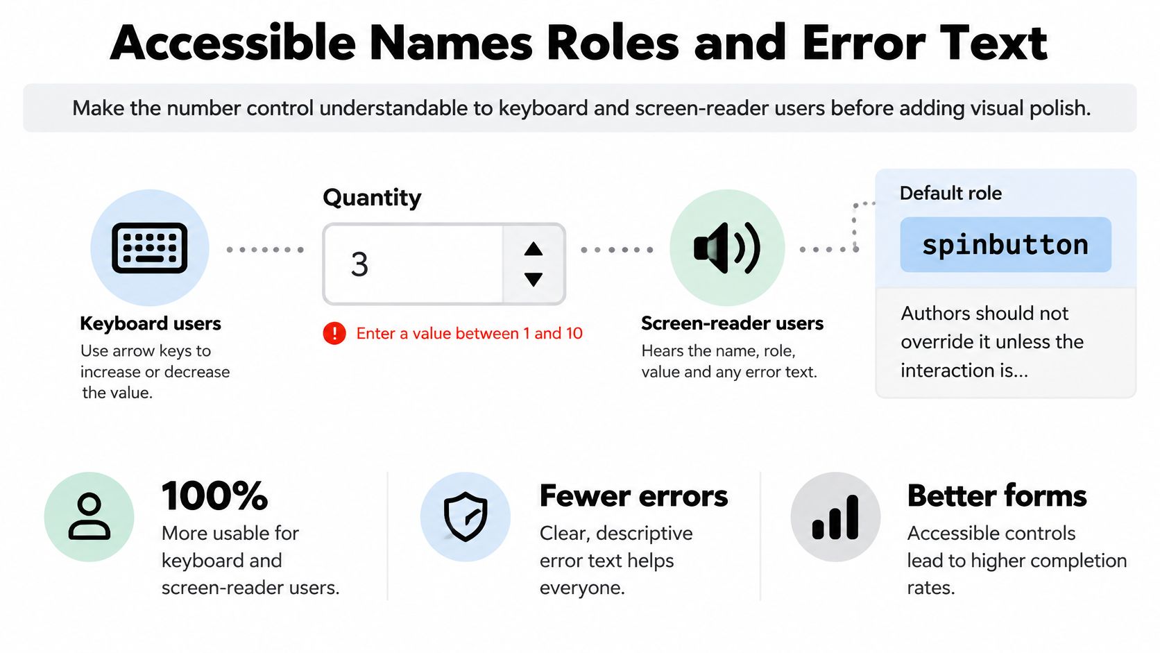
Build the accessible field in order
-
Give it a visible name. Connect
<label for="weight">Weight in kilograms</label>to an input withid="weight". A placeholder disappears during entry and must not carry the only explanation. -
Expose the unit. Put kilograms or pounds in the label, or reference adjacent explanatory text with
aria-describedby. A decorative currency prefix alone may not communicate the unit reliably. -
Describe meaningful constraints. If the field accepts only whole items within an application-defined range, say so before someone makes an error. Write instructions in ordinary language rather than exposing attribute names.
-
Connect the error. Show a text message naming the failed rule, reference its ID from
aria-describedby, and applyaria-invalid="true"when appropriate. When both help and error text apply, preserve both ID references. -
Make feedback perceivable. Don’t rely only on a red outline. Maintain suitable contrast for text, focus indicators and interactive icons, and ensure custom stepper buttons remain distinguishable.
-
Preserve keyboard operation. Users must be able to reach the field, edit it and recover from an error without a mouse. A visible plus button that only responds to pointer events is incomplete.
Announce errors without overwhelming users
Choose a coherent feedback strategy. Native validation bubbles can provide immediate browser feedback; custom messages give you control over wording and placement. An error summary after submission can help users find affected fields.
Avoid announcing an error on every partial edit. Someone typing a decimal value may temporarily produce an incomplete string, and interrupting each keystroke makes correction harder. Use a live region selectively rather than adding competing announcements to every field.
This video provides an additional accessibility reference.
Use the accessibility best-practices guide to consider the surrounding form as well as the individual control. A labelled input can still be difficult to use if a dialog traps focus incorrectly or submission moves focus unpredictably.
The component contract is straightforward: native semantics, a programmatic name, a stated unit and a connected text error. Visual polish should preserve those relationships.
Keyboard Focus and Stepper Behaviour
A native number field normally occupies a single position in the tab sequence. Once focused, users can edit the value directly or use supported stepping interactions.
The W3C definition of the number input describes a numerical control that permits an empty value, can expose a numeric-selection interface, and has the default accessibility role spinbutton. Keep that role unless you’re deliberately building a different interaction model.
Understand the native keyboard contract
Arrow Up and Arrow Down normally request upward and downward steps. Bounds constrain stepping, although a user can still type a value that fails validation. Holding a key may repeat the action according to the browser and operating system.
Don’t assume the native spinner’s individual arrows are separate tab stops. The input itself provides the keyboard route; browser-rendered buttons are part of the native control’s interface.
Read valueAsNumber when you need a numeric result, but check for an unavailable reading. An empty optional input produces NaN, not an intentional zero. Keep absence separate from a quantity that happens to be zero.
Interaction check: A keyboard user should be able to understand and complete the field without discovering a hidden pointer-only action.
Add custom buttons without changing the contract
If you place minus and plus buttons beside the native field, keep the input as the spinbutton. Don’t add another role="spinbutton" to its wrapper, which would create competing semantics.
Use the following implementation rules:
- Button type: Set
type="button"so an increment doesn’t accidentally submit the form. - Accessible names: Use names such as Increase quantity and Decrease quantity, not unexplained symbols alone.
- Shared stepping: Call
stepUp()andstepDown()when a finite step is configured, then synchronise application state. - Event handling: Don’t assume programmatic stepping dispatches the same events as direct typing. Update the model and notify consumers deliberately.
- Keyboard reachability: Prefer ordinary keyboard-focusable buttons. If redundant buttons are intentionally excluded from sequential focus, document and test the equivalent input-key interaction.
Don’t intercept Escape to clear the value unexpectedly. Don’t repurpose Enter as an increment command when users expect normal form submission.
Composite widgets need particular care. A grid or menu may already use arrow keys for navigation, so embedding an editable number field requires an explicit editing mode and a tested focus contract. Avoid casually overriding either the composite’s keys or the input’s semantics.
Before release, tab into the field, step with arrows, activate any custom buttons, clear an optional value and submit. Repeat with a required field and an out-of-range entry. The server must enforce the same business constraints regardless of how the request was created.
Formatting Units and the Submitted Value
A price has several representations, and each serves a different purpose. The editing value supports entry, the display value supports reading, and the payload follows your API contract.
For a hypothetical price whose numerical value is 1234.5, keep those representations explicit:
| Layer | Illustrative representation | Responsibility |
|---|---|---|
| Input value | 1234.5 |
Editable numeric string |
| Formatted display | £1,234.50 |
British currency presentation |
| API amount in pounds | 1234.5 |
Numerical amount under a documented contract |
| API amount in pence | 123450 |
Integer minor units under a different contract |
These are alternative payload conventions, not interchangeable fields. A server expecting pence must not receive the pounds value without conversion.
Put units around the control
Keep the pound sign outside the input’s value. You can place a prefix inside a shared visual border, but it remains a separate element with deliberate accessible treatment. Label the field so users know whether they’re entering pounds, pence or another unit.
For a hypothetical whole-pounds field, use step="1" and explain that pence aren’t collected. For pounds and pence, step="0.01" establishes the intended increment, but it doesn’t promise that the browser will display trailing zeroes.
Use Intl.NumberFormat with a British locale for read-only output. Don’t write formatted currency text back into the number input after every keystroke, which can disrupt editing and produce an invalid numerical value.
Parse deliberately and round once
valueAsNumber is useful for numerical calculations. The string value provides the browser’s current serialisable representation, not a guaranteed record of every character the user attempted to type.
For money, define rounding and minor-unit conversion centrally. A hypothetical decimal such as 1.005 illustrates why multiplying a binary floating-point value and casually rounding it isn’t a complete financial policy. Use a decimal-aware calculation strategy or validated decimal-string conversion where exact minor units matter.
If your product must accept formatted pastes, a text-based amount field may be the better choice. Its parser can follow an explicit sequence:
- Whitespace: Remove only the spacing your documented input format permits.
- Characters: Reject unexpected letters and unsupported symbols rather than deleting them.
- Decimal syntax: Validate the complete decimal string before conversion.
- Business rules: Check the resulting range, allowed precision and increment.
- Payload: Convert to the API’s agreed unit only after validation succeeds.
A number field may discard unsupported pasted characters before your application can explain them. If preserving and discussing the original entry is important, choose text entry intentionally.
Finally, validate notation and value separately on the server. A hypothetical payload of "1e6" can represent a whole number and therefore satisfy a whole-number step, yet still violate your maximum or your plain-decimal syntax policy. Step is not a notation filter.
Headless Primitives and Vue Wrappers
A useful wrapper improves composition without replacing the browser’s input model. Keep the native <input type="number"> in the light DOM, then add labels, descriptions, error placement and optional unit decorations around it.
The boundary should remain visible in the component design.
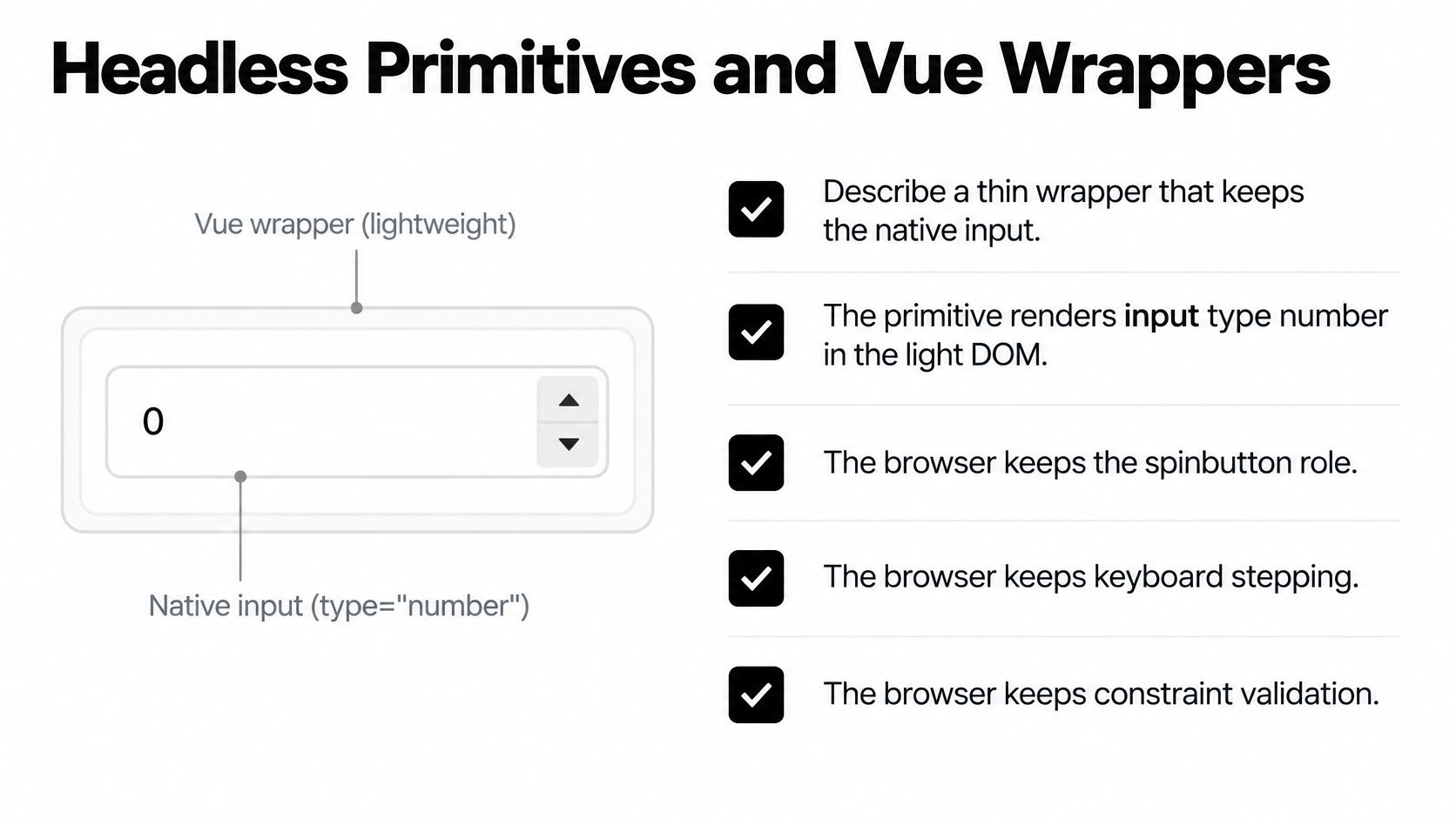
Define the wrapper contract
A headless UI component library is useful here when it separates behaviour from presentation rather than creating an entirely new numerical editor. Consumers should be able to inspect the rendered input and recognise its constraints.
Expose these responsibilities explicitly:
- Native attributes: Forward
min,max,step,required,readonlyanddisabledto the actual input, not merely to a JavaScript configuration object. - String model: Preserve the empty string and the browser-exposed numeric string.
- Numeric reading: Offer a separate result that is
nullwhen the input is empty, unparsable or invalid under the component’s documented rules. - Unit slots: Provide prefix and suffix slots without inserting their content into the submitted value.
- Description wiring: Connect help and error elements to the input even when consumers customise their presentation.
Specify whether the numeric reading requires full constraint validity. A parseable number outside the allowed range is different from an unparseable value; consumers may need both a numeric candidate and validity details.
Handle Vue coercion explicitly
Vue introduces an important trap: removing .number isn’t enough to guarantee a string model on a native number input. Vue automatically applies number-style conversion when v-model is used with type="number".
For a strict string contract, bind :value="modelValue" and handle @input explicitly, reading the target input’s .value. Emit that string through the wrapper’s model-update event. Derive the separate numerical reading from the input and its validity state.
Don’t use parseFloat as complete validation. With a hypothetical text value such as 12abc, it can return the numeric prefix rather than rejecting the whole string. A native number input may sanitise such an attempted entry first, so this is primarily a warning about generic parsers and shared wrapper code, not a promise that the raw string will reach your handler.
Let users complete intermediate edits. Avoid writing a reformatted result back on every input event or refusing every temporarily invalid state.
For cross-field business rules, clear an old message with setCustomValidity(''), evaluate the current rule, and set a new message only if it still fails. Call reportValidity() at a deliberate validation point, not reflexively during every keystroke.
Emit input-related updates during editing and a documented commit event when editing commits. If custom buttons change the value, synchronise those events consistently. Keep identifier masks in a text-field component, and leave native arrow-key handling intact.
Ship the Right Number Field
Choose a field that already exists in your application and review its meaning before changing its styling. A migration is useful when it removes a concrete risk, not merely when it replaces one component tag with another.
If the field holds an identifier, move it to text entry with the appropriate keyboard hint. Preserve legitimate formatting, define normalisation on the server and remove numerical stepping. Add an example containing a leading zero to the component’s tests.
Make a bounded migration
For a genuine quantity, write down the unit, permitted range and granularity before touching the wrapper. Those decisions give reviewers something more precise than a screenshot to approve.
Use a short acceptance list:
- Meaning: The value represents a quantity or measurement.
- Entry: Users can type, paste and correct it with their expected devices.
- Feedback: The label, unit and failure message explain the same rule.
- Integration: The payload uses an agreed representation, including the treatment of absence.
- Resilience: The server rejects invalid requests without relying on browser enforcement.
For a hand-built control, keep the native input and make supplementary buttons mirror its intended stepping behaviour. For a Vue wrapper, verify the string-model contract rather than assuming a model modifier provides it.
DOM Studio’s Primitives include Forms with inputs, pickers and schema-driven forms. Evaluate the rendered field against these acceptance criteria before adoption, and review generated markup just as you would review handwritten markup.
Finish with evidence
Test the migrated field with a keyboard, a screen reader and a phone. Record what each combination exposes, including the label, description, error announcement and available editing actions.
Then document the rejected use cases alongside the component. Explicitly naming NHS numbers, account references and passcodes helps the next developer avoid repeating the original mistake. The outcome should be a tested field and a clearer component boundary, not a different-looking input.
DOM Studio offers form primitives with inputs, pickers and schema-driven forms for teams building consistent interfaces. Visit DOM Studio to evaluate its form building blocks against your quantity, accessibility and validation requirements, then trial them on a field with a clearly defined unit and server-side contract.