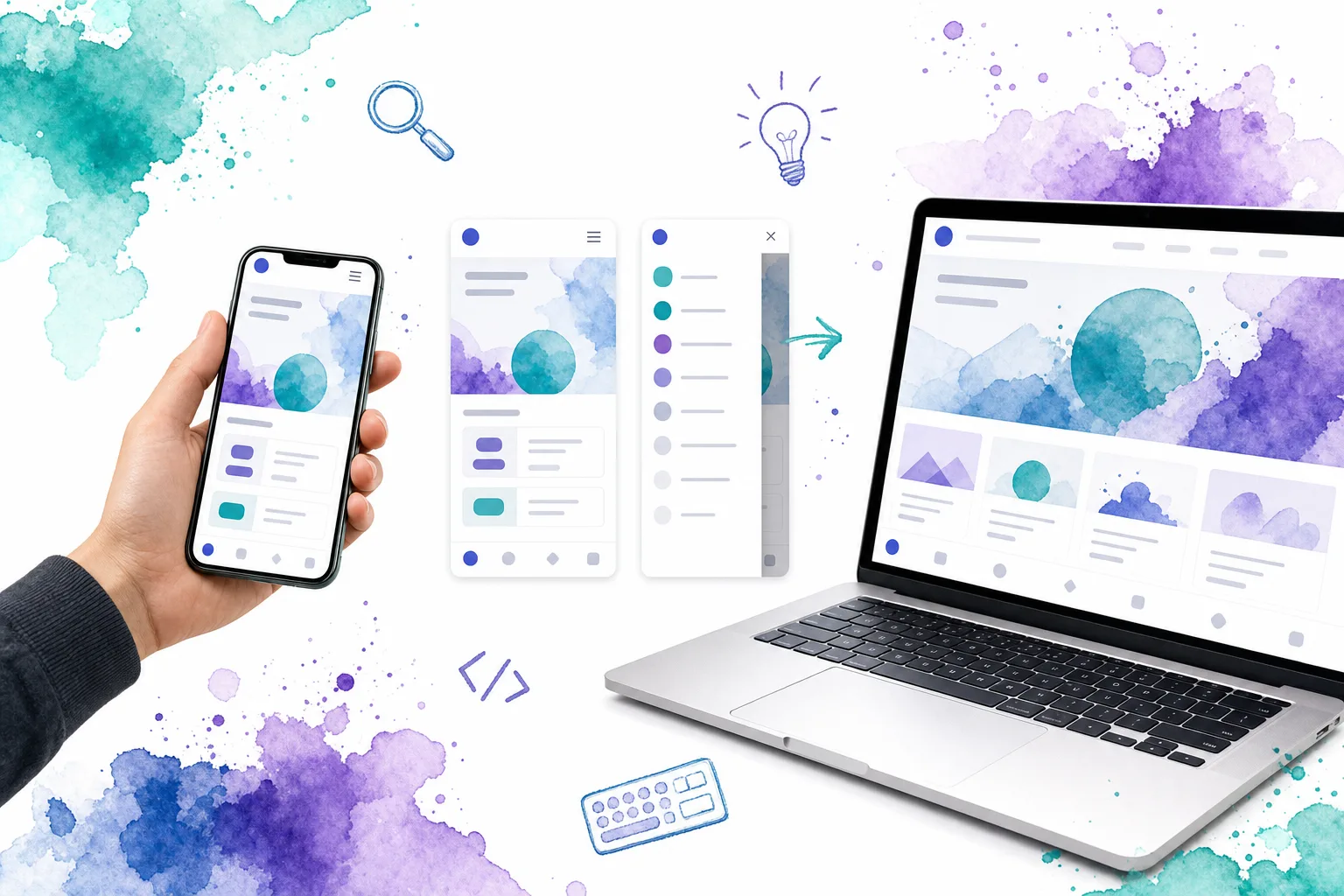
Mobile web navigation is the system that helps people move between the most important destinations on a site or web app from a small screen. Good mobile navigation is not defined by a hamburger icon or a bottom bar. It makes the next destination easy to find, keeps the current location clear, and works reliably with touch, keyboard, zoom, and assistive technology.
For most teams, the right pattern follows the information architecture. We use a compact top-menu disclosure for a short set of site links, a drawer for a deeper hierarchy or account actions, and bottom navigation for a small set of primary destinations people switch between often. The goal is to reduce navigation decisions, not simply hide more links.
Table of contents
- What mobile web navigation needs to accomplish
- The main mobile navigation patterns
- Choose the pattern from route behavior, not fashion
- Accessibility is behavior, not an ARIA layer
- Watch a responsive navigation build
- Common mobile web navigation mistakes
- A practical validation pass
- Build navigation as an editable system
What mobile web navigation needs to accomplish
A mobile viewport creates two pressures at once: there is less room for persistent controls, and a person may be using one hand, a keyboard, voice control, or a screen reader. Navigation must therefore do more than fit.
A dependable system answers four questions quickly:
- Where am I? The active route has a visible state and a programmatic current-page indicator.
- Where can I go next? Primary destinations are clearly named and grouped by purpose.
- How do I open or close this? Disclosures and overlays use familiar controls, clear states, and predictable dismissal.
- Can I activate it accurately? Links and buttons have adequate target size, spacing, contrast, and focus treatment.
We treat navigation as part of the application architecture. Route labels, active state, and the visual pattern should come from the same source of truth. When desktop and mobile versions each maintain separate labels or routing logic, they eventually drift apart.
The main mobile navigation patterns
Top-menu disclosure
A top-menu disclosure keeps the header compact until someone activates a real Menu button. It is a strong fit for marketing sites, documentation, and small products with a concise route list. The interaction should reveal a clearly labelled navigation region, not a collection of unexplained icon actions.
For a responsive site header, keep the layout change in CSS and let application state manage only whether the menu is open. Our Vue mobile navigation guide shows this division in practice: desktop links become a mobile menu at the point where the links no longer fit, while the menu state closes after route changes, Escape, or backdrop interaction.
Side drawer
A side drawer gives a longer route list, secondary destinations, account controls, and grouped navigation more room without permanently occupying the screen. It works best when the information architecture has real depth. It is not a remedy for a disorganized route map.
A drawer should have an obvious trigger, a title or clear context, a close action, and an intentional dismissal model. The DOM Studio Drawer supports controlled state with v-model, Escape dismissal, focus containment, and configurable backdrop behavior. Those details matter because an overlay that opens visually but does not return people cleanly to their task is not dependable navigation.
Bottom navigation
Bottom navigation keeps a few high-frequency, top-level destinations in persistent thumb reach. It is particularly useful for web apps where people repeatedly switch among areas such as Home, Inbox, Search, and Settings. It becomes harder to scan and less useful when it is asked to contain every route in the product.
Use labels with icons whenever possible, make the active destination unmistakable, and keep the items at one hierarchy level. For a compact primary tab set, review the DOM Studio Bottom Nav alongside the surrounding app shell rather than treating it as an isolated strip of controls.

Choose the pattern from route behavior, not fashion
The fastest way to choose a pattern is to classify destinations by frequency and hierarchy.
- Choose a top-menu disclosure when the primary list is short and visitors mainly explore a site or documentation structure.
- Choose a drawer when the product has sections, secondary destinations, profile actions, or grouped routes that should not compete for permanent screen space.
- Choose bottom navigation when three to five primary destinations need fast, repeated switching.
- Use tabs for peer views within one context, such as an account page, a dashboard panel, or a product detail page. Tabs are not a substitute for the whole product’s global navigation.
- Use back navigation, breadcrumbs, or a stack to communicate movement through a hierarchy. Do not make people infer parent-child relationships from animations alone.
The pattern can change between breakpoints, but the mental model should remain stable. If desktop has a left rail with nested sections, mobile users still need a clear way to reach those same groups. A responsive dashboard app shell is a useful reference point: persistent desktop navigation can contract into a mobile fallback without changing the product’s route structure.

Accessibility is behavior, not an ARIA layer
Mobile navigation is accessible when the whole interaction is operable and understandable. Adding ARIA attributes to an otherwise fragile overlay does not solve focus, dismissal, route changes, or pointer accuracy.
Start with semantic controls. A navigation landmark contains navigation links. A menu trigger is a native <button>, not a clickable div. When the button controls a collapsible region, its aria-expanded value should match the actual state, and aria-controls should reference the region it controls. The current route should use aria-current="page" in addition to its visual active state.
Touch comfort has a standards baseline. WCAG 2.2 Success Criterion 2.5.8 sets a 24 by 24 CSS pixel minimum target size, subject to specific exceptions such as adequate spacing. For major navigation controls, we generally design more generously than the minimum, then test with real device handling and zoom.
For drawers, sheets, and expanded menus, confirm these interaction outcomes:
- The trigger receives focus and reports whether the controlled region is open.
- Opening the layer does not leave keyboard focus behind it.
- Escape closes the layer when appropriate.
- A visible close control and a backdrop policy are available.
- Closing returns focus to a sensible place, usually the trigger.
- Selecting a destination closes the temporary layer before or as navigation completes.
- Focus remains visible at every zoom level and against every background state.
Watch a responsive navigation build
This video is a practical companion for teams implementing a responsive header navigation in HTML and CSS. We recommend comparing its layout decisions with the accessibility and route-state checks in this guide.
Common mobile web navigation mistakes
Hiding important routes with no signposts
A compact header is valuable, but a generic icon-only trigger can make a site’s structure harder to discover. Use a recognisable control, a clear accessible name, and enough nearby context that people understand what it opens.
Treating every destination as primary
When bottom navigation contains too many items, the labels shrink, scanning slows, and the hierarchy disappears. Keep frequent top-level destinations visible. Move infrequent, administrative, or contextual actions into a drawer, a profile area, or the screen itself.
Duplicating navigation data
Separate desktop and mobile arrays create mismatched labels, inconsistent active states, and links that are added in only one place. We prefer a shared route model rendered in different layouts. The presentation can change, but the route data should not.
Using JavaScript to decide the layout
Viewport listeners are sometimes necessary for specialized behavior, but the basic choice between desktop and mobile layout belongs in CSS. Let CSS respond to available space. Use JavaScript or framework state for interaction, route awareness, and focus management.
Making overlays look finished before testing them
A drawer can appear polished while trapping focus incorrectly, covering the wrong scroll container, or staying open after route navigation. Test the operational path first: open, tab, activate a link, use Escape, close, and return to the underlying page.
A practical validation pass
Before shipping, we test navigation at the exact layout transition, just below it, and just above it. We also check browser zoom, increased text size, keyboard-only operation, a screen reader pass, and at least one physical phone.
Use this review list:
- Is the primary navigation pattern appropriate for the number and frequency of destinations?
- Can people identify the current route visually and programmatically?
- Does every temporary navigation layer open, close, and restore focus predictably?
- Are labels concise, specific, and consistent with page headings?
- Are targets large enough or sufficiently spaced to avoid accidental activation?
- Does the layout remain usable when text wraps or zoom changes the effective width?
- Do desktop and mobile presentations use the same route data and active-state logic?
Build navigation as an editable system
Mobile web navigation is easiest to maintain when it is made from reusable, inspectable primitives rather than one-off headers and overlays. We can start with a shared route model, then select a top menu, drawer, bottom navigation, or tabs based on the task and hierarchy.
DOM Studio gives us editable Vue and web component primitives for that work, including responsive app shells, drawers, bottom navigation, and mobile-oriented surfaces. Build the route structure first, validate the interaction behavior next, and refine the visual treatment once the navigation is genuinely easy to use.