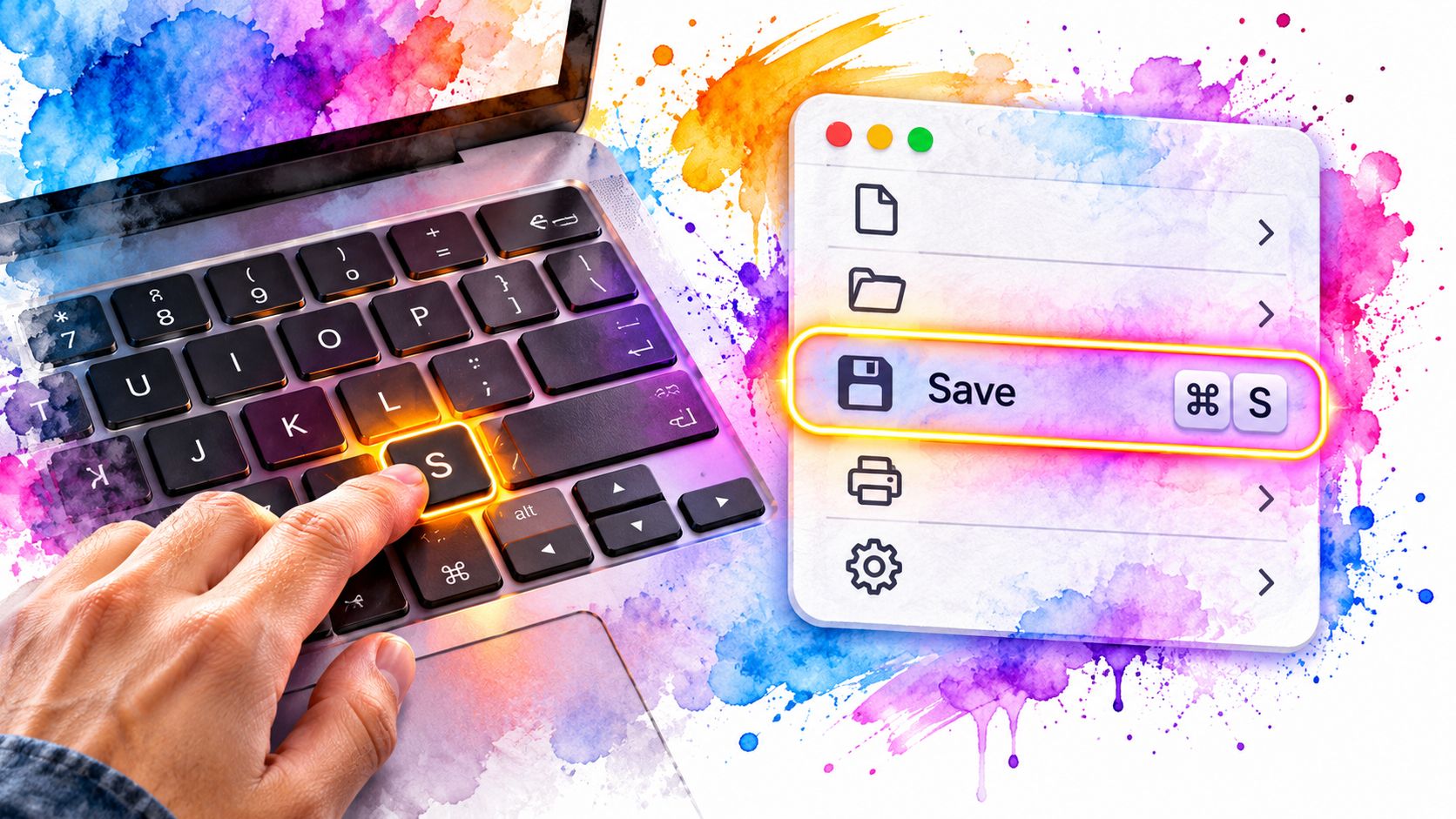
You’re tabbing through a document editor, trying to save your work. The Save button is easy to find, but its shortcut appears only when someone hovers over it with a mouse. You can activate the command, yet the interface never teaches you a quicker route.
A useful keyboard shortcut highlight does more than display a key combination. It helps people discover a command, see where keyboard focus has moved and understand whether an action is available. Treat the hint as part of the interface, not decoration added after the keyboard handling works.
Table of Contents
- Where Shortcut Hints Belong in Your Interface
- Writing Shortcut Labels for Windows and macOS
- Making the Highlight Visible When Focus Moves
- Keeping Single-Key Shortcuts From Clashing
- Browser, Screen Reader and UK Layout Conflicts
- Highlighting Shortcuts in a Context Menu
- Diagnosing Highlight Faults Before Release
Where Shortcut Hints Belong in Your Interface
In that document editor, putting Ctrl+S beside Save solves a different problem from adding it to a help page. The inline hint reaches users while they’re choosing the command. Documentation requires them to stop working and look elsewhere.
Choose placement according to how often people need the command and where they’ll encounter it.
Where to show a shortcut hint
| Placement | Best for | When it is visible | Keyboard access |
|---|---|---|---|
| Inline badge beside a menu item | Frequent commands in menus | Always | Yes, read as text |
| Tooltip on the control | Occasional commands | On hover and on focus | Only if it also appears on focus |
| Command palette row | Large command sets | In search results | Yes, navigated with arrow keys |
| Shortcut reference dialog | Full list of commands | When opened by a documented key or menu item | Yes, with focus trapped and Esc to close |
Always visible means whenever the containing menu or control is displayed. It doesn’t mean keeping every command permanently on screen.
For toolbars, attach the tooltip to the actual focusable button, not a surrounding wrapper that never receives focus. Keep its text available long enough to read, and let users dismiss it without activating the command.
Put the hint in the reading path
In menus and palettes, place the command name first and the shortcut after it. A keyboard-accessible command palette is particularly useful when users know what they want to do but don’t know which menu contains it.
Make shortcut text available to screen-reader users through the control’s accessible description or another deliberate reading path. Don’t assume that text positioned beside a button automatically becomes part of its accessible name.
The distinction matters: in a sample of website tests, the UK Government’s accessibility monitoring report attributed 8% of recorded accessibility issues to keyboard accessibility and 12% to focus visibility. Providing a command isn’t enough if users can’t discover or track it.
Placement rule: Give frequent commands permanent badges, occasional commands focus-triggered hints, and the complete list an accessible reference dialog.
For a modal reference dialog, keep focus inside while it’s open and return focus to its opener when it closes. Apply the same placement logic across menus, toolbars, palettes and dialogs: show the hint where a keyboard user will read it.
Writing Shortcut Labels for Windows and macOS
Start with the user’s keyboard, not the developer’s machine. Windows and Linux commonly use Ctrl for the primary application modifier; macOS commonly uses Command.
Platform labels for common keys
| Key | Windows and Linux label | macOS label | Notes |
|---|---|---|---|
| Primary modifier | Ctrl | ⌘ Command | Use the platform’s own primary key |
| Alt or Option | Alt | ⌥ Option | Same general modifier role, different label |
| Shift | Shift | ⇧ Shift | Written the same on both platforms |
| Enter | Enter | Return | macOS labels the key Return |
| Escape | Escape | Escape | Closes menus and dialogs |
| Delete | Delete or Backspace | Delete (⌫) | On a Mac keyboard the Delete key deletes backwards |
Delete and Backspace aren’t interchangeable actions on Windows. Map the intended operation before choosing the label, especially when distinguishing backwards deletion from forwards deletion.
Generate labels from command definitions
- Identify the platform. Use platform information to choose a sensible default, with an override when detection is wrong.
- Map the modifiers. Resolve the application’s primary modifier to Ctrl or Command.
- Render from shared definitions. Generate the label and register the handler from the same command configuration.
- Test physical keyboards. Check the displayed combination on both a Mac keyboard and a Windows keyboard.
Use a consistent symbol style, and put modifiers before the character, as in Ctrl+Shift+P. Spell out Escape, Enter and Delete in reference material; reserve Esc for compact menus where the full word won’t fit.
Full names reduce ambiguity, but symbols still need screen-reader testing. Provide a readable accessible description rather than relying on a speech engine to interpret every glyph correctly.
A hard-coded Ctrl+S label on a Mac undermines confidence in nearby hints. The checkpoint is simple: every visible shortcut must match the keys that invoke its command.
Making the Highlight Visible When Focus Moves
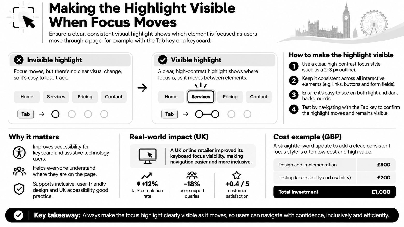
A command can run perfectly and still feel broken when the highlight does not move. The palette opens, a result is chosen, yet the next keystroke has no obvious target.
The focus indicator is the interface element that closes that gap. A brief flash can acknowledge an action; a persistent indicator must show where Enter, Space, arrows and typed characters will land. For screen-reader users the same relationship has to exist programmatically: the item that looks active must be the item exposed as focused or selected.
Accessibility monitoring keeps returning to the same pairing: keyboard operation and visible focus. When either one fails, speed turns into guesswork.
Keep visual and programmatic focus aligned
Style the control’s :focus-visible state so the indicator remains while that control has keyboard focus. Do not clear it just because a pointer drifts across another row; hover styling is a hint, focus is the current insertion point.
Composite widgets need extra care:
- Roving focus: move actual focus between items while keeping the intended item in the Tab sequence.
- Active descendant: keep DOM focus on the container or input, identify the active option programmatically, and style that same option.
- Scrolling: bring the active item into view without hiding it under sticky headers, floating toolbars or the edge of a clipped container.
Presentation effects are a separate problem. For recorded demos or slides, Tutorial AI’s highlight effects overview covers visual emphasis; in the live interface, the focus style must track real interaction state rather than decorate it.
Also distinguish text selection from focus. Selection marks content for an operation; focus marks the control receiving input. If a formatting dialog opens from an editor selection, keep the range intact and return the editing position afterwards.
Test Tab and Shift+Tab between controls, then each widget’s arrow keys inside menus, dialogs, comboboxes and palettes. Repeat at zoom and in a high-contrast theme, with a screen reader when possible, because a ring that survives a screenshot can still vanish under clipping, contrast or virtual cursor movement.
Choose one component this week and log every stop where the highlight disappears, is clipped, or is announced differently from what is shown.
Keeping Single-Key Shortcuts From Clashing
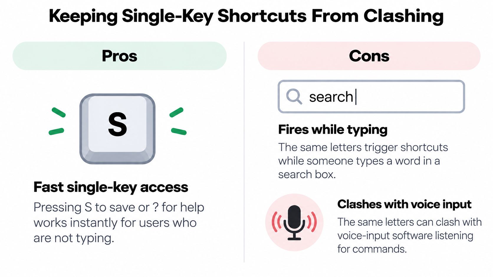
A user starts typing the into a search field. Your global T handler opens a dialog, interrupts the search and, in a poorly managed implementation, discards the query. The shortcut is fast only for someone who wasn’t trying to type.
Printable characters can also collide with voice input and assistive-technology commands. The NHS accessibility testing guidance recommends disabling single-character shortcuts or allowing users to remap them with a non-printing modifier; the relevant accessibility approach also permits shortcuts restricted to the component that has focus.
This diagram shows the trade-off between immediate access and accidental activation.
Do
- Show the actual binding. Put modifier-based combinations such as Ctrl+K beside their commands when those bindings are available.
- Respect editing contexts. Ignore application shortcuts in inputs, textareas and editable regions unless the command explicitly belongs there.
- Offer control. Put disable and remap options in an identifiable keyboard settings area.
Don’t
- Bind letters globally without safeguards. A handler on the document can intercept typing far beyond the intended widget.
- Advertise inactive commands as available. Explain unavailable states instead of letting users repeatedly try an inert shortcut.
- Hide recovery options. Users shouldn’t need the problematic shortcut to reach its settings.
A modifier alone doesn’t guarantee safety. Check the chosen combination against browser, operating-system and assistive-technology behaviour before treating it as available.
A shortcut should accelerate an intentional action, not make ordinary typing risky.
For every binding, check its modifier or component scope, editing-field behaviour, remapping option and disable option. These controls can provide more flexibility than the minimum alternative your implementation uses.
List every single-key binding in your product, then deliberately keep, scope, remap or remove it. Don’t leave old experimental handlers active because their hints disappeared.
Browser, Screen Reader and UK Layout Conflicts
Some key events never reach your page. Browsers commonly reserve Ctrl+T, Ctrl+W and Ctrl+N for browser actions, so don’t promise that your application can reliably replace them. Mark a conflicting binding unavailable and provide another route.
Screen readers use their own reading and navigation commands. Sticky Keys can change how users enter modifier combinations, while Filter Keys can affect which keystrokes the system accepts.
UK layouts also deserve physical testing. Symbols such as £ and @ differ across UK, US and platform-specific layouts, and punctuation may require Shift. Prefer letters and named keys where practical, and decide whether your handler targets a character or a physical key position.
Test the whole route
- Try supported browsers. Exercise the binding in Chrome, Edge and Safari where available.
- Enable a screen reader. Check interception and feedback, using a screen-reader compatibility checklist.
- Use the fallback. Confirm the same command remains reachable through a menu or palette search.
For a broader review, Helbling Digital Media’s accessibility audit service can help you find accessibility issues on your site, alongside your own interaction tests.
Record shared bindings and mark their fallback routes. A shortcut reference dialog documents commands; it shouldn’t be the only place users can learn how to reach them.
Highlighting Shortcuts in a Context Menu
Consider a document’s context menu containing Copy, Paste, Rename, Share and Delete. A mouse user opens it with a right-click; a keyboard user needs a supported context-menu key, Shift+F10 where applicable, or an explicit menu button.
The same menu should present recognisable commands regardless of how it opens.
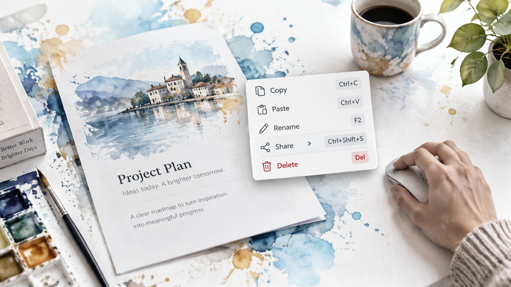
Our DOM Studio context menus use the shared DomMenu item model. Setting item.slot renders custom per-item markup, while the item-row slot supports leading icons, shortcut hints, disabled rows and icon-bearing submenus.
Follow the active row
As the user moves to Copy, highlight the entire row without dimming the shortcut into unreadability. Keep the label left-aligned and the hint right-aligned in a dedicated layout column. With CSS Grid, let the label column shrink while the shortcut retains its width.
Long labels should wrap or truncate according to a deliberate policy, not push the hint outside the menu. Keep the full accessible command name available when the visible label is shortened.
Paste might be unavailable in the current context. Preserve its hint where useful, expose its disabled state, and provide an understandable reason without requiring users to activate it. Whether disabled items remain arrow-focusable should follow the menu pattern consistently.
For a moving demonstration, watch how the menu’s active row and nested levels behave.
Handle nested and destructive actions
Share opens a child list on hover, ArrowRight, Enter or Space. ArrowLeft or Escape returns to the parent. If Share has a direct command shortcut, show it on the parent row; keep the submenu indicator separate so users don’t mistake an arrow for a binding.
Menu orientation can be vertical or horizontal and sets the arrow-key direction. For this document menu, choose vertical navigation and verify that the visual arrangement agrees with the keyboard behaviour.
Delete needs a visible label and accessible name, not just red text or a bin icon. Choose a modifier-based shortcut deliberately and provide suitable confirmation or undo behaviour for the consequence.
When an action operates on selected document text, preserve that selection while the menu has focus. After completion, return users to a meaningful editing position rather than the page body.
Each row needs a clear label, an accurate hint when applicable, and an unambiguous state.
Diagnosing Highlight Faults Before Release
Shortcut highlight symptoms, causes and fixes
| Symptom | Likely cause | Fix |
|---|---|---|
| Shortcut works but users never find it | Hint shown only in documentation | Show an inline badge beside the command |
| Focused item disappears on dark backgrounds | Default outline removed for looks | Restore a styled :focus-visible ring |
| Mac users see Ctrl labels | Hard-coded label text | Render labels from the same definition as the handler |
| Hint vanishes when focus moves | Tooltip shown on hover only | Show the tooltip on focus as well as hover |
| Letter key fires while typing | Single-key shortcut bound globally | Scope the shortcut to the focused component or add a modifier |
For the missing-ring fault, the UK Home Office focus guidance recommends at least 3:1 contrast against surrounding content and the component’s unfocused appearance. Check both light and dark surfaces.
For incorrect platform labels, repair the shared command definition rather than patching individual strings. In transactional interfaces, apply the same scrutiny to order and payment actions; Wecomeet’s discussion of UX UI design for ecommerce checkout provides related design context.
Run the release check
- Inventory bindings. List commands and mark single-key shortcuts.
- Inspect labels. Compare Windows and macOS rendering.
- Traverse widgets. Check visible focus and logical order.
- Type in fields. Confirm unrelated handlers stay inactive.
- Complete actions. Move and select using only the keyboard, then repeat with a screen reader.
Pass when users can find, see and safely use every advertised shortcut. Assign each failure an owner and release priority; don’t defer a fault that blocks essential keyboard access.
DOM Studio offers keyboard-managed menu components and a profile menu playground for testing navigation and item selection. Visit DOM Studio to try those interactions, then use the checks above to validate shortcut hints in your own interface.