
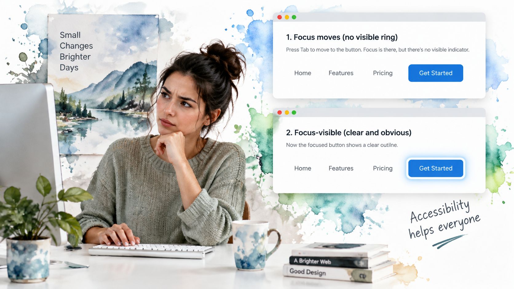
You press Tab, the button takes focus, and the page looks exactly the same. The browser has moved the caret of keyboard attention, yet nothing on screen tells you which control will fire if you press Enter. That gap is what focus visible CSS is for: a contract that every button, link, field and custom control shows a ring when a keyboard user needs it, and keeps that ring readable against rounded corners, clipped cards, sticky bars and forced-colours mode.
Table of Contents
- What Focus Visible Changes for Keyboard Users
- Copy-Ready Focus Styles for Buttons and Links
- Browser Support and Fallbacks for Older Browsers
- Keeping the Focus Ring Visible in Edge Cases
- Writing Focus Styles with Tailwind Utilities
- Focus Styles Inside Shadow DOM and Custom Elements
- Focus Behaviour and Release Checks for DOM Studio
What Focus Visible Changes for Keyboard Users
Say you are filling a checkout with the keyboard. Tab lands on Pay, the control is focused, and the yellow ring you expected never appears. You cannot tell whether focus is on the button, the link beside it, or somewhere off screen. Sighted keyboard users, and anyone using a switch that behaves like a keyboard, stall at that moment.
:focus-visible is the selector that matches when the browser decides a focus indicator would help. That is usually keyboard navigation and text entry. A mouse click on a button usually does not match, because the pointer already showed you where you were. Think of it as a name badge you wear while you are working the room, not every time you walk past the coffee machine.
The three hooks are easy to mix up. Use the right one for the job.
| Selector | Matches when | Mouse click on a button | Keyboard Tab focus |
|---|---|---|---|
:focus |
the element holds focus for any reason | yes in most browsers | yes |
:focus-visible |
the browser decides a focus indicator helps | usually no | yes |
:focus-within |
any descendant holds focus | yes on the container | yes on the container |
:focus fires for any cause, so it suits logic such as marking a field that failed validation. :focus-visible suits the painted indicator. :focus-within paints a parent when a child holds focus, which is useful for a search group, not for the ring on the control itself.
Why the missing ring still shows up in audits
From January 2022 to September 2024, the UK Government Digital Service monitored 1,203 public-sector websites and 21 mobile apps, and reported lack of visible focus as a major accessibility problem. Browser defaults are not a design system. Chrome, Firefox and Safari draw different outlines, and a reset that sets outline: none wipes all of them.
Practical rule: Keep a ring on every focusable control, and let
:focus-visibledecide when it appears.
If you are auditing a marketing site before a redesign, a website accessibility checklist for small businesses is a useful pass over links, forms and focus order before you touch component CSS.
Copy-Ready Focus Styles for Buttons and Links
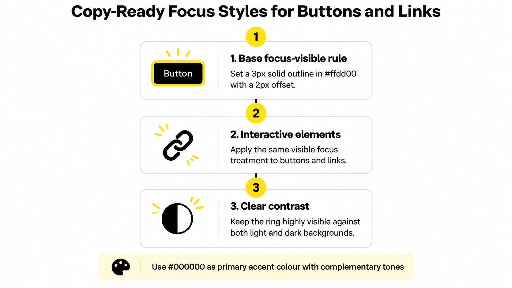
A primary button on a rounded card, tucked under a sticky header, is where one outline selector usually fails. The ring clips at the radius, slides under the bar, or vanishes on a matching banner. Ship the pair of rules as a component contract before you debate colour theory. This is the base-layer default I would start from.
- Declare a base
:focus-visiblerule with a 3px solid outline in a high-contrast colour such as#ffdd00, and a 2pxoutline-offset. - Add
:focus:not(:focus-visible) { outline: none; }so a mouse click stops drawing a ring while keyboard focus keeps one. - Apply that same pair to buttons, links, text inputs and custom controls, so the indicator does not change shape from one widget to the next.
- Check the colour against the surface behind it. A yellow ring on white reads at a glance. A yellow ring on a yellow banner disappears.
The GOV.UK service manual treats visible active focus as necessary for keyboard users, and UK government testing audits whether the focus surrounding an element is visible under WCAG 2.4.7. Aim for at least a 3:1 contrast ratio between the indicator and the colours beside it, and keep the focused state distinct from the unfocused state.
| Property | Starting value | Why it matters |
|---|---|---|
| Outline width | 2px to 3px | thin enough to keep the control shape, thick enough to read |
| Outline offset | 2px | separates the ring from the control edge |
| Colour contrast | at least 3:1 against adjacent colours | meets the non-text contrast target |
| Colour pairing | a dark ring on light surfaces, a light ring on dark surfaces | stays visible in light and dark themes |
| Pointer suppression | outline none only under :focus:not(:focus-visible) |
keeps mouse clicks clean without losing keyboard focus |
Two errors that fail a keyboard pass
Removing the outline with no replacement still ships in production resets. outline: none on * leaves keyboard users with no position marker. A thick brand colour beats a tidy blank.
A ring that is too thin, or flush with the edge, fails in a different way. One pixel of grey against a grey border does not read while someone is tabbing quickly. Offset pulls the stroke off the control so the shape stays distinct on a pill button as well as a square one.
Why outline beats a border
Use outline rather than a border where you can. Outlines do not change layout dimensions, so they avoid reflow and keep hit areas stable in dense menus, dialogs, tabs and form rows. A border that grows on focus shoves the next item down by a few pixels, which is enough to miss a click in a tight toolbar.
That stroke also has to survive the layout around the control. A 2px offset keeps the ring outside a large border radius instead of hugging a curve that eats the corners. Do not park the indicator only inside a clipped box. overflow: hidden on a card slices the ring, and a sticky header covers a ring that sits on the top edge. In forced-colours mode, keep the outline and let the system colour replace a hard-coded yellow, or the indicator disappears when high contrast is on.
The single check worth running before you merge: press Tab from the top of the page and confirm each control shows the ring at a glance, including controls under sticky bars and inside rounded, overflow-clipped cards.
A short walk-through of the same pattern is easier to follow on screen than in a diff.
Browser Support and Fallbacks for Older Browsers
Current Chrome, Edge, Firefox, Safari and Opera understand :focus-visible. The risk is not the latest desktop release. It is a legacy build, an old embedded webview, or Internet Explorer still sitting in a locked-down intranet.
| Browser | Fallback needed? |
|---|---|
| Chrome | only for legacy builds |
| Edge | only for legacy builds |
| Firefox | only for legacy builds |
| Safari | only for legacy builds |
| Opera | only for legacy builds |
| Internet Explorer | yes, use a plain :focus ring |
The fallback that never drops the ring
- Write a plain
:focusrule with a visible outline first, so every browser shows a ring. - Wrap the pointer-hiding rule in
@supports selector(:focus-visible), so only a browser that understands the selector drops the ring on a mouse click. - Test that path in a legacy build, or with the feature turned off in a test browser, and confirm Tab still paints the ring.
A plain :focus ring is noisier for mouse users. That noise is the correct trade-off. Tidiness is worthless if a browser that lacks the selector also lacks any indicator.
@supports selector() is the test I trust, because it asks the engine what it implements instead of guessing from a user-agent string. User-agent checks go stale the week a vendor ships a fix.
Never ship a state in which a browser that lacks
:focus-visiblealso lacks any ring.
If you are deciding whether the extra rule is worth the bytes, the Otter A/B design hypothesis tool is a clean way to write the hypothesis before you A/B the ring against a quieter hover state. The accessible version should win that test on keyboard completion, not on how calm a mouse click looks.
Keeping the Focus Ring Visible in Edge Cases
The failure people report is not a missing selector. It is a ring that vanishes at the edge of a card, or inside a scrolling table with overflow: hidden. The control is focused. The stroke is painted. An ancestor clips it.
| Technique | Follows rounded corners | Survives overflow hidden | Forced colours mode |
|---|---|---|---|
| outline | yes in modern browsers | no, clipped by the ancestor | kept |
| outline-offset | yes | no, clipped if the ancestor clips | kept |
| inset box-shadow | yes | yes, drawn inside the box | removed unless a fallback outline is added |
| pseudo-element ring | yes with matching border-radius | depends on the container | removed unless a fallback outline is added |
:has() parent styling |
yes | yes, the ring is on the parent | depends on the parent’s outline |
What I would ship as the default
Outline is the default. In modern browsers it sits outside the box and follows border-radius, so a pill button keeps a pill ring. The moment an ancestor uses overflow: hidden, that outside stroke is cut. Add padding inside the scrolling container so the ring has room, or move the stroke onto a parent that is not clipped.
Inset box-shadow survives the clip because it is drawn inside the padding box. Forced-colours mode throws it away. Pair it with a real outline, or the high-contrast user sees nothing. The same trap hits a pseudo-element ring: it can match a radius, then disappear when the OS replaces author colours. Read how high contrast mode treats author styles before you rely on a shadow alone.
Cards, sticky bars and the screen edge
Full-bleed cards. Stretch the link’s hit area with a pseudo-element, then put the ring on the card with :has(:focus-visible), or on the link itself if the link fills the card. A ring on a 12px text link inside a large card tells the user the wrong target is active.
Sticky headers. A focused control can slide under a fixed bar. scroll-padding-top on the scrolling root, set to the header height plus a few pixels, keeps the control and its ring in view.
Viewport edge. A large offset shoves the ring off the screen on the first and last items in a row. Keep the offset around 2px unless you have tested the control inset from the edge.
WCAG 2.2 Focus Visible is the AA baseline: a keyboard user can see where focus is. The stricter Focus Appearance criterion sits at AAA. Treat a two-colour ring, extra thickness, or a minimum area as a design choice, not as the legal minimum for an AA release.
Writing Focus Styles with Tailwind Utilities
Tailwind does not change the contract. It changes where the values live. Two decisions matter: which focus colour sits in the theme, and which utilities sit on the base control.
Define the colour once in @theme, for example --color-focus: #ffdd00. Every button, link and field then reads the same token. Hard-coding #ffdd00 on twenty components is how one screen ends up with a gold ring and the next with browser blue.
- On the base button class, add
focus-visible:outline-2,focus-visible:outline-offset-2andfocus-visible:outline-(--color-focus). - When you must clear the browser ring, use
outline-hiddenrather thanoutline-none.outline-hiddenstill leaves a stroke in forced-colours mode.outline-nonedoes not. - Use
not-focus-visible:outline-noneonly where the visible ring already lives underfocus-visible, so a pointer click stays clean. - Add a
dark:variant with a lighter colour so the stroke stays readable on dark surfaces. A yellow that works on white can fail on a near-black panel, and the reverse is just as common.
Keep the classes in one component
A shared class string is easy to copy, and just as easy to copy with outline-none stuck on the end. I would move the focus utilities into the base button, link, and input components, then stop repeating them on each page. A page-level override is how a campaign landing page drops the ring.
Theme values in a system like this are CSS variables the host app owns. Put the focus colour next to your other semantic tokens so a brand pass changes one variable, not a hunt through templates.
Focus Styles Inside Shadow DOM and Custom Elements
A :focus-visible rule in the page stylesheet does not cross a shadow root. A button inside a custom element can be focused and still draw nothing, because the ring rule never reached it. That is the bug I would look for first when a headless widget “ignores” global CSS.
- Put the focus rule in the component’s shadow stylesheet, so the inner button paints its own
:focus-visibleoutline, offset and colour. - Style the host with
:host(:focus-visible)when the custom element itself is the focus target, such as a card or a composite control that takestabindex. - Set
delegatesFocus: trueinattachShadowwhen a click or Tab on the host should move focus to the first focusable inner control. Then confirm the ring appears on that inner control, not as a second ring on the host.
Expose a ::part(focus-ring) only when the team must restyle the stroke from outside. Document the part name, the colour token and the offset as part of the component contract. An undocumented part becomes a breaking change the first time someone overrides it.
The shadow rule still has to survive forced-colours mode, so the same fallback outline belongs inside the root, not only on the light DOM. If you are choosing between styling the host and styling the inner control, accessible web components are clearer when the ring sits on the element that holds focus.
Tab into each custom element and stop on the first one whose ring is missing or doubled. Fix that component before you restyle the catalogue.
Focus Behaviour and Release Checks for DOM Studio
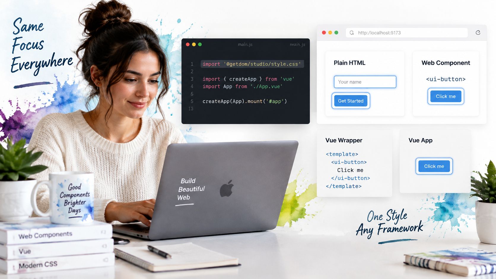
A dialog opens under a sticky header, the trigger sits inside a rounded card, and the ring clips at overflow: hidden. That is a broken component contract, not a missing outline. Import the package stylesheet with @getdom/studio/style.css. The headless library provides framework-neutral custom elements, so the same focus rules apply in Vue wrappers and in plain HTML. A selector that only lives in a Vue single-file style block will miss the custom element used from a static page.
The DWP accessibility manual expects keyboard-operable interactions, a logical focus order, a visible indicator, and focus that stays inside modals and pop-ups. WCAG 2.4.7 is an assessed AA criterion for public websites and mobile apps. A dialog that opens while focus stays on the page behind it fails that criterion, even when the button outline looks fine on its own.
What each widget owes the keyboard
Dialogs move focus to an appropriate control when they open, keep Tab inside while they are modal, and restore focus to the invoking element on close. Leave enough offset that a rounded dialog border does not cover the stroke.
A listbox, combobox or command palette exposes one predictable active item. The ring sits on that item, not on a vague container.
A menu that uses roving focus styles the active item. Painting the menu panel makes every item look chosen.
A two-colour focus ring, such as a dark outer stroke with a light inner stroke, keeps contrast stable across mixed backgrounds, and a larger clickable parent such as a card can carry the indicator when the link fills it. Own one focus token and apply it to buttons, menus, dialogs and tabs. That token is the contract. Separate colours per widget are how a tab looks focused and a dialog does not. The same token still has to show when overflow clips a corner, a sticky header covers the control, or forced-colours mode replaces the palette.
Release checks and the result you should see
Run these on a real page, not only in a storybook canvas. A WCAG compliance checklist is the wider pass. These nine items are the focus slice.
- Press Tab from the top of the page. Every control shows the ring.
- Press Shift+Tab. The order reverses with no skipped control.
- Open each dialog, press Escape, and confirm focus returns to the opener.
- Use the arrow keys in every listbox, combobox and menu. Exactly one item shows the ring.
- Click a button with a mouse and confirm no ring appears, then Tab to it and confirm the ring returns.
- Zoom to 200 per cent and confirm the ring is not cut off by rounded corners or clipped overflow.
- Switch on forced-colours mode and confirm the ring is still visible.
- Check the ring against its background in light and dark themes.
- Scroll under a sticky header and confirm the focused control stays in view.
Also try touch activation once. A control that only reveals focus after a mouse hover will fail a keyboard user who never hovers.
Fix the first failure you find, then add this list to the pull request template so the next widget cannot ship without it.
Run the list on one real page this week. Teams building on these components can repeat the same checks before release.
DOM Studio ships headless custom elements, Vue wrappers and Tailwind styling with focus management already wired into dialogs, menus, listboxes and tabs, so you are not reinventing keyboard behaviour for each widget. Pair that behaviour with one focus token and the checks above, and keyboard users can see where they are. Browse the catalogue and try a component on DOM Studio.