
TL;DR
To arrange horizontal radio buttons, put each native radio and its label in one choice unit, then apply display: flex, flex-wrap: wrap, and gap to the options container. In Vue, bind every radio to the same selected value with v-model. Keep a shared name, unique IDs, explicit labels, and a fieldset with a legend. Allow choices to wrap instead of forcing one unbroken row, and prefer a vertical list when labels become difficult to scan.
A horizontal radio group is a layout decision, not a different kind of input. I recommend keeping the browser’s native controls and changing the container around them. That separates the styling problem from selection and keyboard behavior.
This guide builds one Vue example, adds responsive CSS, and gives you concrete checks for labels, state, narrow containers, and keyboard navigation.
Table of contents
- Before you start
- 1. Build the radio group with a question and explicit labels
- 2. Arrange complete choices horizontally with flexbox
- 3. Keep Vue selection state separate from presentation
- 4. Check wrapping with real labels, narrow containers, and zoom
- 5. Verify keyboard navigation, click targets, and visible states
- 6. Decide whether horizontal placement still helps
- Put the finished group into your form
- Sources
- Recommended Reads
Before you start
You need an existing Vue 3 application with single-file components and <script setup> support, a loaded stylesheet, and a browser for manual checks. No additional component package is needed for this example.
We will ask for a preferred contact method using three short choices: Email, Phone, and Post. The example manages local selection only. Your application must supply persistence, submission, and any required-field error handling. Start with one instance of this group; repeated instances need distinct identifiers and appropriately separated radio names.
The instructions follow the current official Vue 3 documentation. They do not depend on a DOM Studio-specific component API.
1. Build the radio group with a question and explicit labels
Create a component such as ContactPreference.vue with this script and template. The fieldset contains the question and answers, while the inner container will handle their horizontal arrangement.
W3C’s grouping guidance recommends fieldset and legend for related radio buttons. Keep the question visible rather than replacing it with a heading that is only visually adjacent.
<script setup>
import { ref } from 'vue'

const selectedContact = ref('')

const options = [
  { value: 'email', label: 'Email' },
  { value: 'phone', label: 'Phone' },
  { value: 'post', label: 'Post' }
]
</script>

<template>
  <fieldset class="contact-group">
    <legend>Preferred contact method</legend>

    <div class="contact-options">
      <label
        v-for="option in options"
        :key="option.value"
        :for="`profile-contact-${option.value}`"
        class="contact-option"
      >
        <input
          :id="`profile-contact-${option.value}`"
          v-model="selectedContact"
          type="radio"
          name="profile-contact"
          :value="option.value"
        />
        <span>{{ option.label }}</span>
      </label>
    </div>
  </fieldset>

  <p>Selected value: {{ selectedContact || 'No selection yet' }}</p>
</template>
Three attributes do different jobs:
nameconnects the choices. Every option in this question usesprofile-contact.ididentifies one input. Each option gets its own identifier.valueidentifies the answer. The application receivesphone, not the visible wording “Phone”.
The label’s for matches its input’s id, even though the input is also nested inside that label. This lets the whole label unit act as the target. MDN’s radio reference explains the shared-name behavior and label activation.
Vue’s reactivity guide documents the ref import and template access used here. The stable string key follows Vue’s list-rendering guidance, which matters for lists containing form controls.
Verify the structure: select Phone and confirm the displayed value becomes phone. Click the word Email rather than its circle. If another question loses its selection, check whether the two questions accidentally share a radio name within the same form. Before rendering this component twice, change or parameterize both the name and ID prefix.
2. Arrange complete choices horizontally with flexbox
Add the following CSS to your component stylesheet or inside a <style> block in the same single-file component. The important distinction is that .contact-options arranges choices, while .contact-option aligns a circle and its text.
.contact-group {
  min-inline-size: 0;
  margin: 0;
  padding: 0;
  border: 0;
}

.contact-group legend {
  margin-block-end: 0.5rem;
  font-weight: 700;
}

.contact-options {
  display: flex;
  flex-direction: row;
  flex-wrap: wrap;
  align-items: flex-start;
  gap: 0.5rem 1.5rem;
}

.contact-option {
  display: inline-flex;
  align-items: flex-start;
  gap: 0.5rem;
  box-sizing: border-box;
  min-inline-size: 0;
  max-inline-size: 100%;
  padding: 0.5rem;
  line-height: 1.5;
  cursor: pointer;
}

.contact-option input {
  flex: 0 0 auto;
  margin: 0.25rem 0 0;
}

.contact-option span {
  min-inline-size: 0;
  overflow-wrap: anywhere;
}

.contact-option:focus-within {
  outline: 2px solid #174eaa;
  outline-offset: 2px;
}
In a horizontal writing mode, a row flex container places its children side by side. Wrapping permits another row when they no longer fit. These behaviors are described in MDN’s flexbox guide.
The outer gap deliberately separates complete choices more than the inner gap separates a radio from its label. With this row direction, gap: 0.5rem 1.5rem sets the gap between rows first and between items second, as documented in the CSS gap reference.
Keep the extra options wrapper rather than making the legend participate in the same layout. The fieldset also gets min-inline-size: 0 because its browser default is min-content, a special sizing detail documented in MDN’s fieldset reference.
Expected result: the three choices sit together when space permits and move onto additional rows when necessary. Each circle stays attached to its own text, as illustrated below.
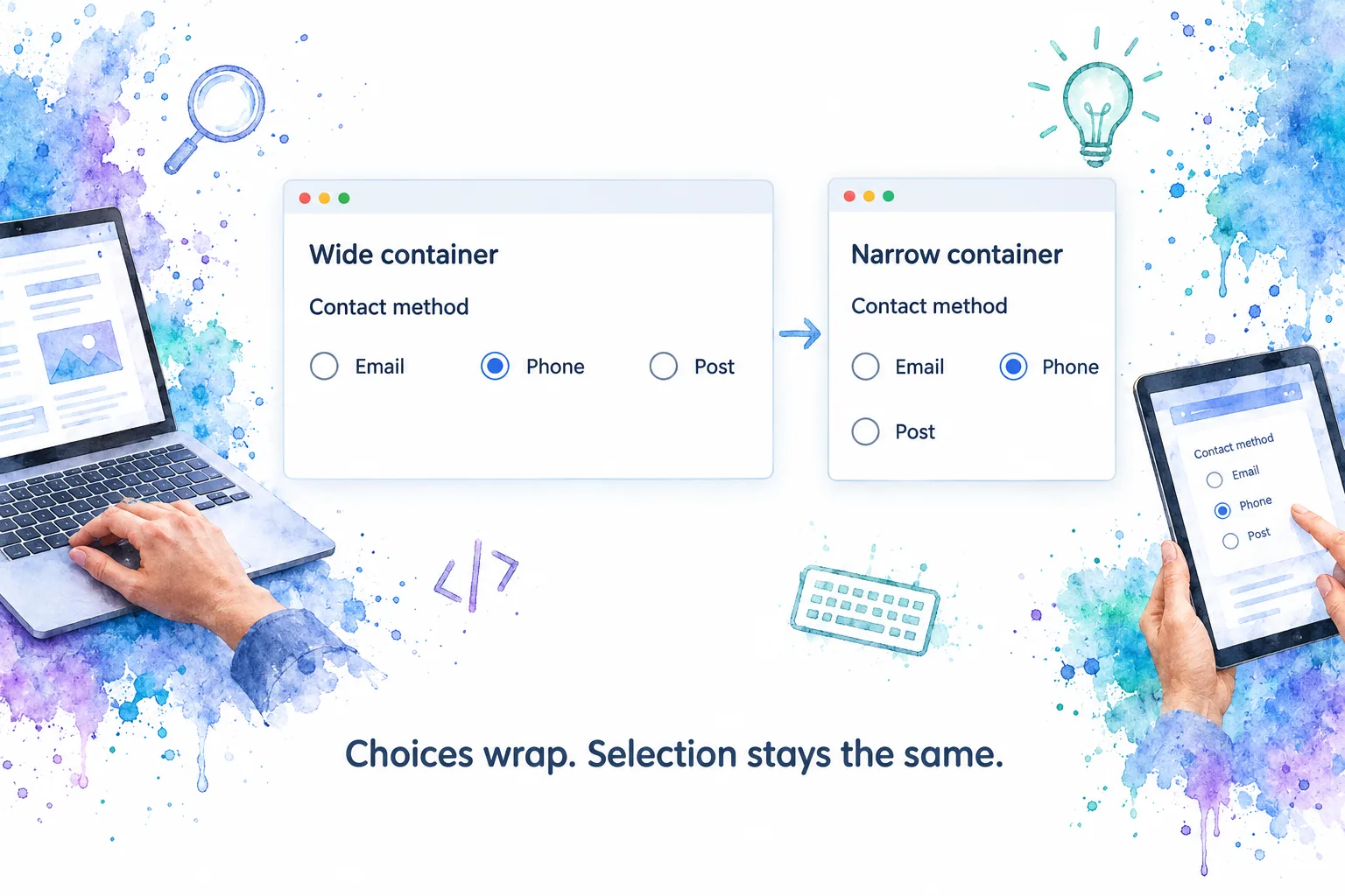
If the choices still stack in a wide container, inspect the computed styles on .contact-options and look for an overriding column direction or full-width labels. Do not remove wrapping just to force a desktop screenshot to match a mockup.
3. Keep Vue selection state separate from presentation
Every input binds to selectedContact, but each has a different option value. Choosing one updates that single value. You do not need three booleans or click handlers that manually uncheck neighboring inputs.
Vue’s form input documentation establishes two important details: radio v-model uses the checked property and change event, and bound JavaScript state is the source of truth. To start with Email selected, initialize selectedContact with ref('email') rather than adding a competing checked attribute.
I leave the initial value empty here so the user can make an explicit choice. Choose a default only when it fits the actual product decision. The debug paragraph is useful during implementation; remove it when the production interface has its own review or save feedback.
Resizing should not change the answer. Select Phone, narrow the container until Post wraps, and check that selectedContact remains phone. If it resets, investigate component remounting or application state changes rather than changing the flex rules.
For a supplementary explanation of static versus data-driven radio options, Thomas Blum’s video below covers both approaches. Its Vue syntax may differ from this guide’s Composition API example; use the official Vue 3 references for the implementation above.
4. Check wrapping with real labels, narrow containers, and zoom
A layout that fits three short English words is only a starting point. Replace Post temporarily with “Postal delivery to my registered address” and test the group inside the narrowest panel where your application actually uses it.
There are two distinct kinds of wrapping: complete choices can move to another row, and text can wrap inside an individual choice. The CSS allows both. overflow-wrap: anywhere is an additional safeguard for otherwise unbreakable strings, not a reason to write unnecessarily long labels. See MDN’s overflow-wrap documentation.
| Check | Expected result | Investigate if it fails |
|---|---|---|
| Narrow sidebar or dialog | Complete choices wrap without clipping | Fixed widths on the group or its ancestors |
| Long option label | Text wraps beside its own circle | white-space: nowrap or a fixed label height |
| Several wrapped rows | Option order remains understandable | Excessive choices or ambiguous spacing |
| Increased browser zoom | Labels, controls, and focus remain available | Clipped overflow and rigid container sizing |
| Long translated wording | Choices remain distinguishable | A layout designed only around short English labels |
For a reflow check, test at an effective width of 320 CSS pixels. W3C explains that a 1280 CSS-pixel starting viewport at 400% zoom is one equivalent setup in its Understanding Reflow guidance. This is one layout check, not a complete accessibility assessment.
Avoid fixed heights and ellipsized option text in this pattern. If the full answer is hidden, a neat row is not a useful result. Also inspect the group inside its actual application shell: a wide browser window can still contain a very narrow form panel.
If overflow persists, trace the available width outward through parent flex or grid items. A correctly wrapping options container cannot compensate for an ancestor that refuses to shrink.
5. Verify keyboard navigation, click targets, and visible states
Horizontal placement does not require replacing native radio behavior with a custom keyboard handler. For an ordinary form group outside a toolbar, the W3C radio-group pattern describes Tab entry and exit, arrow-key selection, and Space activation. It also notes native-browser differences when entering an entirely unselected group with Shift+Tab.
Run this check without a mouse:
- Tab into the group. Confirm you can identify the focused choice.
- Use the arrow keys. Confirm selection moves through the options and the debug value changes.
- Press Space when needed. A focused, unchecked option should become checked.
- Tab onward. Confirm focus can leave the group and continue through the form.
- Repeat after wrapping. The choices should still form one group, not a set of unrelated controls.
The filled radio indicates selection. The surrounding outline indicates focus. Our CSS uses :focus-within, which matches the label when its descendant input has focus; it does not remove the browser’s own focus treatment.

Do not interpret wrapped rows as a two-dimensional keyboard grid. Keep source order stable and avoid visually rearranging choices with reverse directions or individual order rules. Check the actual behavior in your supported browser and operating-system combinations.
Then click or tap the padded space inside each label, not just the circle. Confirm that it selects the intended answer. With a screen reader, verify that the question, option name, and selected state remain understandable; exact announcement wording can vary.
Keep the native control visible. This layout does not need display: none, a decorative replacement circle, or custom role="radio" elements. Also check your application’s high-contrast presentation and ensure the focus outline is not clipped by a parent container.
6. Decide whether horizontal placement still helps
Horizontal radio buttons are most convincing when the labels are short, the set is small, and the relationship between every circle and label is obvious. I would consider them for a compact contact preference, then compare the same question vertically before deciding.
The U.S. Web Design System’s radio guidance recommends vertical lists because horizontal arrangements can make label associations harder to read. Treat that as a meaningful design constraint, not something flexbox automatically resolves.
Move to a vertical layout when:
- Options need descriptions, eligibility explanations, or several lines of text.
- Wrapping creates several uneven rows that are difficult to scan.
- Users must compare nuanced alternatives rather than recognize a short label.
- The component usually appears in a narrow panel anyway.
There is no useful universal maximum number of horizontal choices. The actual wording, available width, and interaction matter more than a fixed count. Three short labels can be clearer than two paragraph-length answers, while a longer set may deserve a different control entirely.
When stacking is the better outcome, use our vertical radio button implementation guide rather than rebuilding the group’s semantics. Changing the arrangement should not change what question the user is answering.
Put the finished group into your form
You now have the pieces for a native, Vue-bound radio group whose layout can adapt without replacing its inputs. Your next action is to put it inside the real form, substitute production copy, and repeat the narrow-width and keyboard checks there.
Before wiring persistence, decide whether an unanswered group is valid and how submission errors will be communicated. Keep those requirements separate from the horizontal CSS.
If you use DOM Studio, open the Radio Group playground and apply the same checks to the rendered component. Compare behavior and layout deliberately rather than assuming every component shares the native example’s implementation.
Sources
- Vue 3: Form Input Bindings, Reactivity Fundamentals, and List Rendering.
- MDN HTML: Radio inputs and fieldset.
- MDN CSS: Flexbox basics, gap, overflow-wrap, and :focus-within.
- W3C: Grouping Controls, Radio Group Pattern, and Understanding Reflow.
- U.S. Web Design System: Radio buttons.