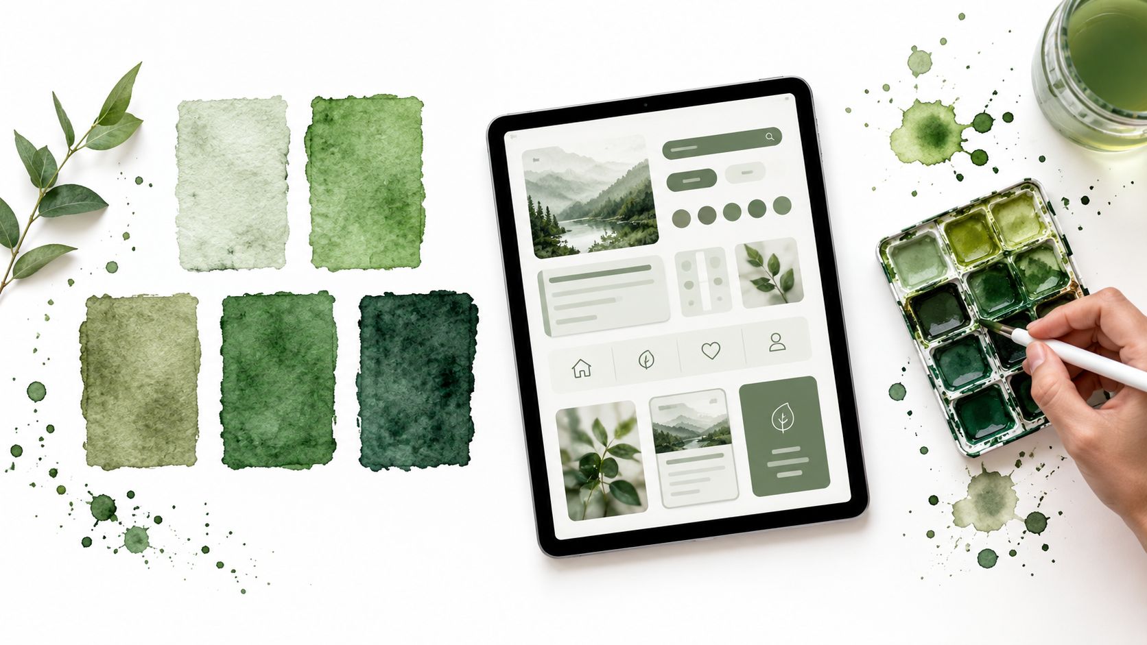
A green palette can look excellent in a swatch and fail the moment it meets a button label, disabled state, chart, or dark theme. The popular advice is to choose a colour that matches the brand mood, but mood alone doesn’t assign responsibility. Strong green color combos give separate roles to primary actions, accents, surfaces, text, borders, and status states. This roundup organises ten palettes by interface job, then compares their mood, contrast risk, dark-mode behaviour, Tailwind CSS 4 mapping, and practical Vue implementation. DOM Studio is a relevant environment for carrying those decisions across reusable, accessible primitives instead of tuning every component in isolation.
Green also carries context. In Britain, the House of Commons has used green furnishings and fabrics for more than 300 years, with shades ranging from pale sage to deep malachite rather than one fixed standard, as documented in the historical Commons colour reference. British racing green adds a separate association with heritage and performance, rooted in British motorsport during 1902–1903, as described by John Smedley’s history of British colours. The right choice depends on what users need to do, not just what the colour suggests.
Table of Contents
- 1. Sage and Neutral Green for Accessible UI Interfaces
- 2. Emerald and Deep Green for Premium Brand Identity
- 3. Mint and Aqua for Modern Tech-Forward Applications
- 4. Olive and Khaki for Warm Organic Design Systems
- 5. Forest and Charcoal for High-Contrast Dark-Mode Excellence
- 6. Lime and Neon Green for High-Energy Attention-Driven UI
- 7. Teal and Slate for Tech-Professional Balance
- 8. Pistachio and Cream for Soft Approachable Modern Design
- 9. Jade and Bronze for Luxe Heritage Brand Positioning
- 10. Mossy and Warm Gray for Balanced Professionalism
- Top 10 Green Color Combos Comparison
- Turn a Palette into a Reliable UI Theme
1. Sage and Neutral Green for Accessible UI Interfaces
Sage works best where users spend time reading, comparing, and returning to the same workspace. Use #9CAF88 as a restrained primary accent, #6B7280 for supporting text and controls, and a warm cream such as #FFFBF0 for the page background. White component surfaces create enough separation for cards, sidebars, tables, and long-form content without making the interface feel stark.
This palette suits a content editor, analytics workspace, documentation tool, or calm productivity application. A dashboard with a sage navigation rail, white cards, and warm-grey labels feels less aggressive than one built around saturated green. The trade-off is obvious: muted sage can disappear beside cream, especially in borders, placeholder text, and inactive controls.
Define the roles before choosing the shade
Keep sage away from small text unless testing proves that the pairing is readable. Use a darker neutral for body copy, and reserve a stronger green for links, selected tabs, primary buttons, and success states. In Tailwind CSS 4, map semantic tokens rather than scattering the hex value through classes, for example --color-brand-sage, --color-surface-warm, and --color-content-muted.
- Primary: Sage for selected navigation and low-pressure actions.
- Accent: A deeper green for links, focus rings, and confirmation states.
- Background: Cream for the application shell, with white for raised surfaces.
Accessibility rule: Never let a pale green carry meaning by hue alone. Pair status with text, an icon, or a pattern.
Test actual labels and controls with DOM Studio’s colour contrast accessibility guidance, then check the resulting Vue components with axe DevTools or WAVE. UK public-sector guidance recommends 4.5:1 for normal text and 3:1 for large text or non-text elements, so a visually gentle palette still needs deliberate foreground choices.
2. Emerald and Deep Green for Premium Brand Identity
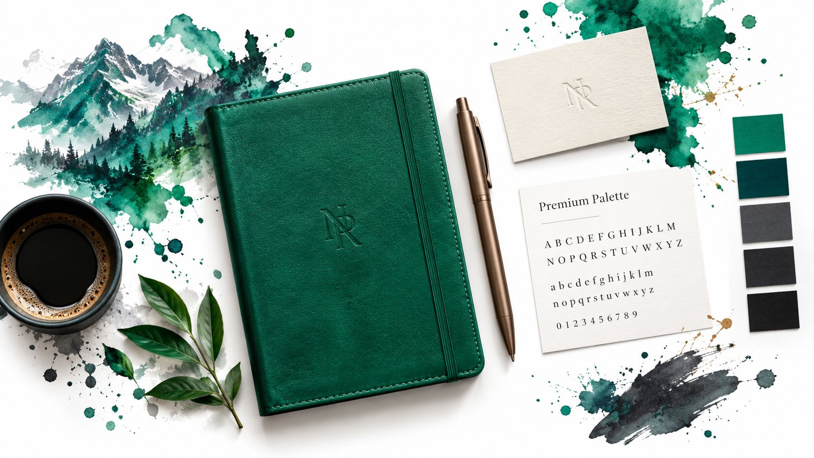
Emerald gives an interface a clear point of attention. Start with #10B981 for primary actions, use #065F46 for navigation or high-emphasis surfaces, and place both against white or a very light neutral. Charcoal text can support the palette without competing with the emerald action colour.
This combination fits a premium reporting product, finance workflow, subscription upgrade path, or enterprise command centre. A “Create report” button in emerald feels more decisive than the same control in sage, while a deep-green sidebar gives the application a stronger branded frame. The risk is saturation. If emerald appears on every badge, icon, link, and chart, users lose the visual hierarchy that made the palette feel premium.
Keep emerald out of the wrong roles
Use deep green for hover and active states only when it remains distinguishable from the default state. On a dark theme, the same deep green may become too close to the background, so switch to a lighter foreground treatment rather than just reusing the light-theme token.
In Tailwind, map primary to emerald, primary-strong to deep green, and surface to white or a near-white neutral. Vue components can consume those tokens through CSS custom properties, allowing light and dark themes to change roles without changing component markup. DOM Studio’s command palette can use the same hierarchy: a restrained green for the selected command, neutral rows for everything else, and a visible focus treatment that doesn’t depend on colour alone.
3. Mint and Aqua for Modern Tech-Forward Applications
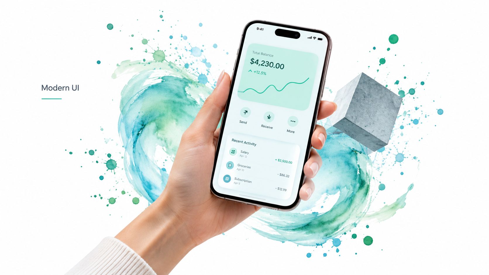
Mint and aqua create motion and freshness, which makes them useful for collaborative tools, AI workflows, live status panels, and product tours. Use #14B8A6 as the primary interactive colour, #06B6D4 as the secondary accent, and cool white or deep charcoal as the text and surface counterweight. Mint handles buttons and selected controls, while aqua is better for secondary emphasis, links, visual markers, and animated transitions.
The strongest use case is an interface with a lot of changing state. A deployment panel might use mint for a successful action, aqua for an in-progress operation, and neutral surfaces for everything that isn’t active. That separation prevents the palette from becoming a decorative gradient spread across the entire screen.
Use bright colour where change happens
Mint and aqua are not ideal for long paragraphs or dense table text. Their value is in interaction, not endurance. In Tailwind CSS 4, define separate tokens for action, accent, action-hover, and focus, then use those tokens consistently across buttons, tabs, toggles, and progress indicators.
For a Vue application, DOM Studio Visual Blocks can provide a useful place to apply the same theme to menus, dialogs, toasts, and form controls. Test animation states as well as static states. A loading shimmer or hover transition should preserve readable labels and a visible focus indicator at every point, including when the accent moves from mint towards aqua.
4. Olive and Khaki for Warm Organic Design Systems
Olive and khaki work when a product needs to feel grounded rather than clinical. Set #84A866 as the primary brand or onboarding accent, use #D4A574 sparingly for secondary highlights, and place content on cream with white surfaces for cards and forms. The result is warm, approachable, and suitable for wellness, sustainability, food, outdoor, or education products.
A sustainability onboarding flow is a good scenario. Olive can frame the progress indicator and selected option, khaki can highlight an explanatory illustration or secondary call to action, and cream can keep the page calm. A product catalogue can use the same system, but should avoid putting khaki behind small text. Warm, muted colours often have less separation than their appearance suggests.
Warm doesn’t mean low contrast
Use olive for large regions only if its text pairing has been tested. Khaki is usually safer as a decorative accent, border, icon background, or illustration colour than as a text colour. In Tailwind, create named utilities such as bg-olive-brand, bg-khaki-accent, and text-olive-strong, rather than relying on arbitrary values throughout templates.
A design system also needs rules for disabled and selected states. Don’t make disabled controls lighter khaki if that removes their boundary. Keep the text and control structure clear, then apply the palette to the roles that reinforce the experience. DOM Studio’s design system architecture guidance is relevant when these decisions need to live in shared primitives rather than individual page designs.
5. Forest and Charcoal for High-Contrast Dark-Mode Excellence
Dark interfaces need more than a dark green background. Use a charcoal base such as #111827, a forest-leaning surface such as #1F2937, and a bright green accent such as #10B981 for actions and focus states. Keep the darkest colour for the application shell, lift cards and panels with the forest surface, and reserve bright green for controls that need immediate attention.
This combination fits a developer console, monitoring dashboard, command centre, or media workspace. A charcoal page with slightly lighter forest panels creates depth without introducing too many unrelated greys. The main failure mode is insufficient separation between adjacent surfaces. If a modal, card, and page background all sit at nearly the same value, users lose structure even when the green accent is attractive.
Build light and dark roles separately
Tailwind’s dark-mode utilities can switch semantic tokens, but they shouldn’t merely invert every colour. A light-theme sage surface may become a charcoal surface, while the primary green may need a brighter variant to remain visible. In Vue, let the same button component consume --primary, --primary-foreground, --surface, and --focus-ring values in each theme.
Test dialogs, dropdowns, tooltips, tables, and toasts, not only the main page. The UK Government Analysis Function chart colour guidance uses a green system including #0F7A52, lighter tints, and darker shades, and requires chart elements to maintain 3:1 contrast against adjacent colours in applicable cases. DOM Studio’s tree-shakeable component approach can keep the implementation focused, while its dark colour scheme guidance helps teams treat dark mode as a designed system.
For teams reviewing brand assets across shops and product pages, a logo colour changer for e-commerce can also support early visual comparison before the final tokens reach the interface.
6. Lime and Neon Green for High-Energy Attention-Driven UI
Lime is a signal, not a background system. Use #84CC16 or a brighter neon variant for a primary action, urgent notification, online indicator, or performance state, then place it against charcoal or another dark surface. Keep the rest of the interface quiet so the bright green has a job rather than becoming visual noise.
A gaming lobby, live operations panel, or notification centre can use lime effectively. A green “Live” indicator beside a clear label works better than a pulsing green dot by itself. Likewise, a “Start match” button can be vivid while navigation and secondary actions remain neutral. The trade-off is fatigue. Repeated neon accents can make routine actions feel urgent and can reduce the perceived importance of critical states.
Make the signal redundant
Don’t encode success, availability, or urgency through lime alone. Add labels, icons, shape, position, or a change in content. This matters especially in dashboards and charts because green and red combinations can be difficult to read for some users, a concern highlighted in UK accessibility standards guidance.
In Tailwind, define a dedicated energy variant rather than making neon the default primary. DOM Studio button variants can then reserve the treatment for high-priority actions. In Vue, state-based colour logic should also control text labels and icons. Test hover, focus, pressed, disabled, and animated states, and check whether motion makes the bright colour harder to interpret.
7. Teal and Slate for Tech-Professional Balance
Teal and slate provide a practical middle ground for business software. Use #0D9488 for primary interactive elements, #64748B for supporting text and secondary controls, and white or a soft neutral for content surfaces. Teal feels more current than a conventional navy while slate keeps the overall system disciplined.
This palette suits navigation, tabs, filters, account settings, analytics, and forms. A B2B SaaS dashboard might use teal for the active tab and submit button, slate for helper text and inactive tabs, and white cards over a pale neutral shell. The system works because the colours have different responsibilities. Problems start when slate becomes too light for body text or teal is used for every visual marker.
Create a controlled tonal scale
Give teal distinct values for default, hover, active, and focus states. Don’t choose those variants by eye alone. Check the label inside a button, the icon beside a tab, the border around a selected field, and the contrast between adjacent chart series.
Tailwind named utilities make the system easier to audit than page-specific values. A component can consume text-teal-action, border-slate-subtle, and bg-surface while the theme file controls the actual values. DOM Studio’s menus, listboxes, tabs, and command palette are natural candidates for this palette because they need clear active states without the visual intensity of neon green.
8. Pistachio and Cream for Soft Approachable Modern Design
Pistachio and cream are well suited to first-run experiences. Use #C4DE7C as a welcoming background or illustration accent, #6B9E6C for interactive elements, and #FFFBF0 for cards and content surfaces. Soft grey can support secondary text, but it must be dark enough to remain readable against cream.
A personal finance onboarding flow could use pistachio behind the welcome panel, deeper green for “Continue”, and cream cards for questions and explanations. The palette lowers the emotional temperature of a form without making the product look generic. Its weakness is contrast ambiguity. Light pistachio may look prominent in a brand board but become almost invisible as a border, focus ring, or selected table row.
Give friendly interfaces firm controls
Use the deeper green for links, buttons, confirmations, and selected options. Keep pistachio as a surface or decorative colour unless testing supports a more functional role. Rounded typography and gentle motion can reinforce the mood, but neither should replace a clear focus state or an explicit success message.
Tailwind tokens might include bg-pistachio-soft, bg-cream, text-green-action, and text-neutral-strong. In Vue, this palette works particularly well for success states and onboarding sequences when the component also exposes text and icon cues. A DOM Studio form can keep keyboard behaviour and ARIA patterns consistent while the theme supplies the softer visual language.
9. Jade and Bronze for Luxe Heritage Brand Positioning
Jade and bronze create a premium palette through restraint. Use #0D5C54 as the primary brand colour, #B8860B for a limited accent, and ivory for backgrounds and raised surfaces. Jade should carry the interface identity, while bronze marks a premium feature, a selected plan, a featured product, or a small decorative detail.
A luxury hospitality booking flow might use jade for the header and booking action, ivory for room details, and bronze for a “Signature suite” label. A jewellery storefront could use bronze around product metadata, but should avoid turning every price, icon, and button gold. Too much metallic colour quickly feels promotional rather than refined.
Let whitespace carry the hierarchy
The palette needs room around it. Use larger surface areas of ivory, strong alignment, and a limited number of jade controls. Bronze text requires particular caution because the colour may be attractive on a brand card but weak at small sizes on ivory. Use a darker brown or jade for readable copy and keep bronze for accents that don’t carry essential information.
In Tailwind, define brand-jade, accent-bronze, surface-ivory, and a separate readable foreground token. DOM Studio can apply those CSS custom properties across dialogs, menus, cards, and buttons so the premium treatment doesn’t drift between components. A consistent theme also prevents one team from using bronze as a warning colour while another uses it as a decorative highlight.
10. Mossy and Warm Gray for Balanced Professionalism
Mossy green and warm grey suit products that need authority without looking cold. Use #6B8E6F for primary accents and interactive elements, #6B7280 for strong supporting text, #9CA3AF for quieter structure, and soft white for content surfaces. The palette feels established, but the green gives it more character than a purely monochrome system.
This is a strong scenario for consulting, legal, property, investment, and insurance interfaces. In a data table, mossy green can mark a selected row or positive movement, while warm grey controls column labels, secondary metadata, and inactive filters. The risk is low contrast through excessive layering. Warm grey on soft white can become indistinct, and moss can look like a status colour even when it only represents the brand.
Use semantic meaning consistently
Decide whether green means brand, success, or both. If it serves both roles, add a separate success token or use a label and icon so users don’t have to infer meaning from the hue. A form should still say “Verified” or “Complete”, rather than relying on a mossy border alone.
Map the palette to semantic Tailwind utilities instead of naming every value after its visual colour. text-primary, bg-muted, border-subtle, and text-foreground make future theme changes safer. DOM Studio’s enterprise and professional service templates can then use the same Vue components for forms, tables, tabs, and validation messages without copying colour decisions into each screen.
Top 10 Green Color Combos Comparison
| Palette | 🔄 Implementation complexity (Implementation complexity) | ⚡ Resource requirements (Resource requirements) | 📊 Expected outcomes (Expected outcomes) | 💡 Ideal use cases (Ideal use cases) | ⭐ Key advantages (Key advantages) |
|---|---|---|---|---|---|
| Sage & Neutral Green for Accessible UI Interfaces | Low, simple tokens, WCAG checks | Low, color tokens + accessibility testing | Calm, highly readable UI; AA-compliant contrast | Healthcare, fintech, productivity, component libraries | Excellent readability; calming, timeless, inclusive |
| Emerald & Deep Green for Premium Brand Identity | Medium, brand guidelines & theme management | Medium, photography, tokens, contrast QA | Premium, trustworthy brand presence; strong hierarchy | SaaS, finance, enterprise, high-end CTAs | Strong brand recognition; premium, authoritative |
| Mint & Aqua for Modern, Tech-Forward Applications | Medium, motion, glassmorphism, contrast tuning | Medium, animations, micro-interactions, testing | Energetic, modern UI that signals innovation | Startups, AI/ML platforms, analytics dashboards | Contemporary, attention-grabbing; great for visuals |
| Olive & Khaki for Warm, Organic Design Systems | Low–Medium, imagery pairing, contrast adjustments | Low, natural imagery and token setup | Warm, approachable experience with organic tone | Wellness, sustainability brands, lifestyle apps | Welcoming, timeless; pairs well with photography |
| Forest & Charcoal for High-Contrast, Dark-Mode Excellence | Medium, robust dark/light theming & QA | Medium, dark-mode assets, accessibility testing | Comfortable low-light UX; premium dark interface | Dev tools, monitoring dashboards, code editors | Superior night comfort; power-efficient and accessible |
| Lime & Neon Green for High-Energy, Attention-Driven UI | Medium, strict usage rules + accessibility focus | Low–Medium, highlight assets, performance testing | Max visibility for CTAs, alerts when used sparingly | Gaming, notifications, real-time monitoring, CTAs | Extremely attention-grabbing; ideal for urgency |
| Teal & Slate for Tech-Professional Balance | Low, balanced tokens, works both modes | Low, standard tokens, light theming | Professional, versatile look with strong readability | B2B SaaS, fintech, enterprise applications | Trusted, readable, flexible across components |
| Pistachio & Cream for Soft, Approachable Modern Design | Low, background-focused, WCAG checks | Low, light assets, onboarding visuals | Friendly onboarding and calming user journeys | Consumer apps, onboarding flows, wellness tools | Approachable, low-friction; great for onboarding |
| Jade & Bronze for Luxe, Heritage Brand Positioning | Medium–High, curated brand system & imagery | High, premium photography, refined assets | Exclusive, memorable luxury brand perception | Luxury e‑commerce, hospitality, jewelry, premium services | Communicates exclusivity and timeless quality |
| Mossy & Warm Gray for Balanced, Sophisticated Professionalism | Medium, design craft to avoid dated feel | Medium, typography, layered grays, imagery | Stable, professional UX for content-heavy products | Legal, consulting, finance, institutional platforms | Conveys trust, stability; well-suited for content |
Turn a Palette into a Reliable UI Theme
A palette becomes useful only after you assign it to an interface job. Start by naming the job, such as calm reading, premium conversion, dark monitoring, urgent notification, or professional data entry. Then choose the palette whose behaviour supports that job. Sage and pistachio are better for surfaces and onboarding than for dense status dashboards. Lime is effective for a high-priority signal but weak as a default brand colour. Forest and charcoal support dark interfaces, but only when their surfaces have enough separation.
Define tokens before writing component classes. At minimum, create values for primary, primary foreground, accent, background, surface, muted, foreground, border, focus, success, and disabled. A green system should also distinguish brand green from semantic success. Otherwise, a green logo, a selected tab, and a completed task may all look identical even though they communicate different things.
Tailwind CSS 4 mapping should expose those roles through named utilities or CSS variables. Avoid embedding #10B981 or #0D9488 directly into several templates. A semantic token lets the team change the shade once, preserve the component API, and create a related dark theme without rewriting markup. It also makes design review more concrete. Reviewers can ask whether bg-primary works for a button and whether text-muted remains readable on bg-surface, rather than debating isolated swatches.
Test real states, not just colour chips
Check the combinations users encounter:
- Normal: Read labels, helper text, table values, and navigation items.
- Hover and active: Confirm that the state is visible without becoming a contrast failure.
- Focus: Check keyboard focus against every background and adjacent border.
- Disabled: Keep disabled controls distinguishable without making them appear available.
- Light and dark: Recheck surfaces, overlays, menus, dialogs, and toasts in both themes.
- Data visualisation: Add labels, icons, patterns, or direct annotations where colour alone could confuse.
UK guidance recommends 4.5:1 for normal text and 3:1 for large text and non-text elements. The Analysis Function also publishes a stepped green palette, including #0F7A52, #4B9B7D, #87BCA8, #CFE4DC, and #0B5C3E, which is useful benchmark material when building tonal scales. These values aren’t a substitute for testing your own labels, fonts, borders, and backgrounds. Test the rendered component, not the colour token in isolation.
A reliable theme also has a component strategy. Put the tokens in one theme layer, pass them through Vue components, and keep interaction logic separate from visual decoration. Headless primitives are useful here because buttons, menus, listboxes, dialogs, tabs, toggles, and command palettes can preserve focus management and keyboard behaviour while the theme changes the appearance. DOM Studio combines framework-agnostic custom-element primitives with a Vue integration layer and Tailwind CSS 4 styling, so teams can apply the same semantic green system across reusable controls. Its user interface guide is also a useful reference for reviewing hierarchy, spacing, and interaction clarity alongside colour.
Choose one palette, implement its roles, and test the hardest screen first. If the darkest dashboard, busiest table, or most form-heavy workflow works with the theme, the simpler screens will usually need fewer exceptions. Adjust the tokens based on observed failures, document why each role exists, and keep the final system small enough that designers and developers can use it without guessing.
DOM Studio gives Vue teams reusable accessible primitives, Tailwind CSS 4 theming, semantic colour tokens, and Visual Blocks for applying green palettes consistently across production interfaces. Choose a palette from this guide, map its primary, accent, surface, and foreground roles, then build and test the theme in DOM Studio.