
An 82% digital completion rate is a service outcome, not a count of blocked submissions: that’s the measure HM Courts and Tribunals Service recorded between January and March 2024. It’s a useful distinction for developers building forms with validation. Rejecting an answer tells you that a rule ran; it doesn’t tell you whether someone could understand the problem, correct it and finish.
Production validation needs to work as a recovery system. That means clear ownership of rules, predictable error timing and a route forward when the browser, network or user’s first attempt doesn’t behave as expected.
Table of Contents
- Validation Layers and When Each One Runs
- How to Recover from a Failed Submit
- Wire Reactive Fields with Vue Wrappers
- Keep Messages Tolerant and Consistent
- Measure Recovery Not Just Blocked Errors
- Ship the Next Form with DOM Studio
Validation Layers and When Each One Runs
In February 2018, the Government Digital Service’s GOV.UK Elements accessibility review reported that 24 of the 38 issues identified concerned forms, approximately 63.2%. The team assessed prototype pages against every WCAG success criterion, rather than reviewing visual presentation alone. Forms weren’t a minor finishing concern within that review.
For a production team, the practical lesson is to assign validation responsibilities before styling error borders. Browser constraints, reactive checks and server rules solve different problems. Treating them as interchangeable creates gaps, particularly when JavaScript fails or someone submits directly to the API.
What each validation layer is for
| Layer | Runs when | Owns | Must not |
|---|---|---|---|
| HTML5 constraint validation | Browser, before submit | Required, type, min, max, pattern | Be the only error when wording or placement cannot be controlled |
| Client-side checks | Blur or submit, while still on the page | Repair hints and cross-field warnings in the UI | Replace or skip server rules |
| Server validation | Every POST, including no-JavaScript submits | Syntax, requiredness, ranges, cross-field rules, canonical value | Trust the client or wipe valid answers |
| Schema | Design time and again at runtime | One canonical shape shared by UI and API | Reject harmless spacing or punctuation before normalisation |
HTML attributes remain useful, even when you replace browser-controlled validation messages. Choose meaningful input types, labels and autocomplete attributes; don’t discard useful semantics just because you need a consistent error interface. If your form uses novalidate, your application takes responsibility for presenting the validation result.
Client-side checks should reduce unnecessary effort. They can explain a missing answer or a date conflict without navigating away, but a successful browser check isn’t permission to save. The server must assess the actual request, including omitted fields, unexpected values and relationships between answers.
Give the schema a clear boundary
A schema should describe the accepted structure and produce stable rule identifiers. The UI can translate those identifiers into messages without maintaining a separate interpretation of the business rules. A schema-driven form approach is particularly useful when several screens submit to the same API.
Keep canonical values distinct from display values. An input string is what the user is editing; the canonical value is what your application can safely compare and store. Don’t force every intermediate keystroke into that final representation.
Email illustrates another boundary: valid syntax doesn’t establish that a mailbox can receive a message. Mailbeam’s guide to prevent undeliverable signup emails is useful when deciding which checks belong in browser feedback and which need a separate verification workflow.
Trust boundary: A client can suggest that an answer looks acceptable. Only the server can decide whether the submitted request is acceptable.
How to Recover from a Failed Submit
Say a form collects contact details and a National Insurance number. The user submits a completed contact field alongside an invalid identifier. The response should help them repair that identifier, not make them reconstruct the whole submission.
The GOV.UK validation pattern recommends returning the same page with retained answers, an error-prefixed title, a focused error summary and messages beside the affected fields. That combination gives users both orientation and a specific correction.
The recovery path should remain understandable from submission through correction.
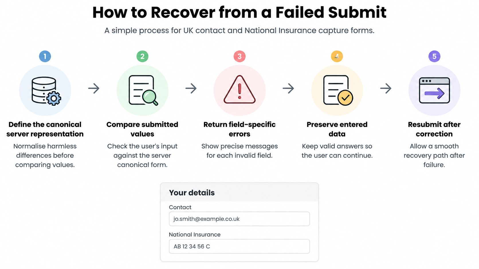
Build the failed-submit response
-
Define the server representation before comparing values. Keep the submitted text available for redisplay and create a separate normalised value for validation. Apply only transformations that preserve meaning, not speculative corrections to someone’s answer.
-
Run client checks as feedback, then submit the complete payload for authoritative validation. In an enhanced form, don’t let a locally successful check bypass the server or omit fields the server needs for cross-field rules without notification.
-
Return the same form when validation fails. Retain valid answers and, where safe, retain invalid text too, because users need to see what they’re correcting. Handle secrets such as passwords separately rather than blindly echoing every submitted value.
-
Prepend
Error:to the document title. This gives users a failure cue after a full navigation and makes an updated client-rendered page identifiable beyond its visible content. -
Render an error summary near the top of the main content. Give it a stable identifier such as
error-summary, a clear heading and links to the affected controls. Each entry should identify the field and explain the repair, rather than merely reporting that submission failed. -
Move keyboard focus to the summary after the updated DOM exists. Make the container programmatically focusable with
tabindex="-1"; don’t add it to the ordinary tab sequence with a positive tabindex. -
Associate each inline error with its control. Set
aria-invalid="true"after validation has failed and include the error message ID inaria-describedby. If the field already has a hint, retain that hint ID as well, so the error doesn’t erase useful instructions. -
Keep the user’s work available during correction and resubmission. Don’t reset the form as part of a generic request-complete handler, and don’t replace a recoverable validation response with an empty initial state.
-
Retest the recovery, not just the validator. Exercise valid, invalid, boundary, pasted and keyboard-entered answers, then repeat the journey using a screen reader. Confirm that summary links reach the intended controls and that the correction can be completed without a pointer.
Make the summary and field agree
Use the same message content in the summary and beside the field. A summary that requests a missing answer while the inline message complains about formatting leaves the user choosing between conflicting instructions.
For grouped controls, such as a date assembled from separate inputs, give the group a meaningful fieldset and legend. Choose a deliberate focus target for its summary link, usually the first input that needs attention, rather than linking to a non-interactive wrapper.
Avoid combining a focused summary with several competing live announcements. Moving focus already changes what a screen reader encounters; adding assertive announcements to every error can produce duplicate or interrupted speech.
A passed retest has a concrete result: the user encounters the summary, reaches the affected field, understands the correction and submits successfully without re-entering unrelated answers. A red border appearing is not a passed recovery test.
Wire Reactive Fields with Vue Wrappers
Keep a Vue wrapper thin. Its job is to connect the parent’s state to input behaviour, not to introduce a second, competing validation system.
The wrapper boundary should be visible in the component’s bindings.
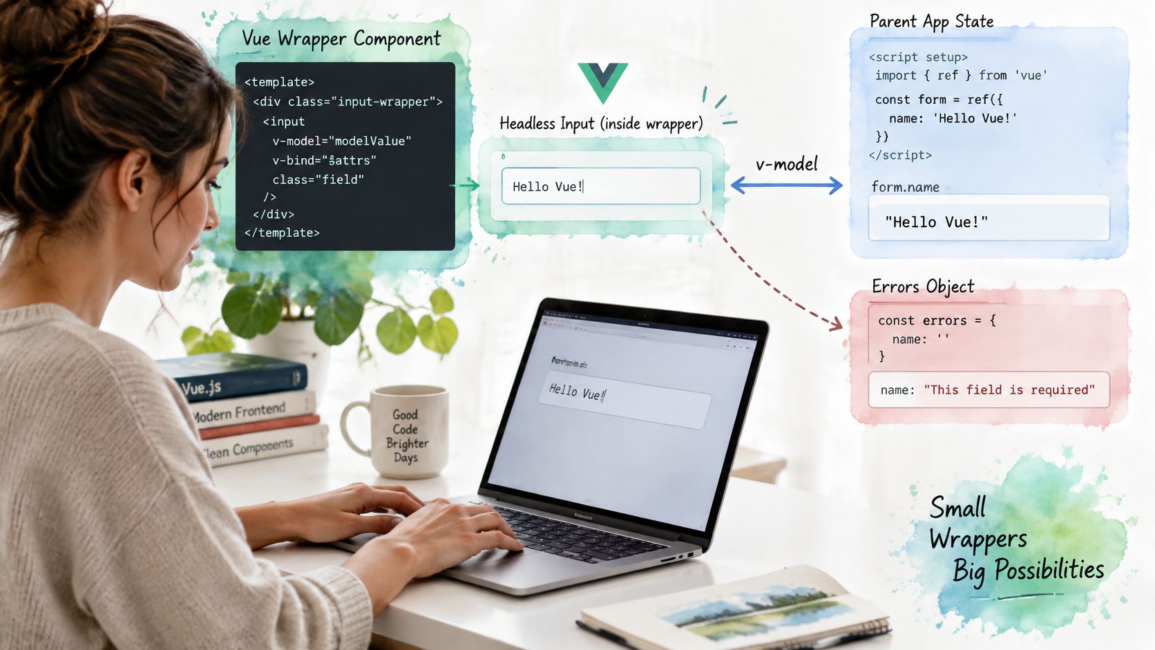
Separate editing state from error state
Bind the editable string through v-model, with the parent owning the value. Maintain a separate errors object keyed by field name, populated after a failed submit or an intentional blur check. A value changing shouldn’t automatically mean that a new error must be announced.
The controlled-components pattern helps make that ownership explicit. Pass the error ID through to the actual focusable input, not just the wrapper element, and derive aria-invalid from the presence of a displayed field error.
Use a slot for supporting content so the wrapper can render a hint, a repair instruction or both without hard-coding business wording. Preserve stable IDs across those changes. For multiple rules on a field, store rule identifiers alongside messages rather than letting whichever validator finishes last overwrite the others.
Three field cases that break reactive state
| Field case | Symptom when naive | Fix |
|---|---|---|
| Select with option value differing from label | Error shows the stored code instead of the choice the user saw | Bind the value, render the label, validate against the value set |
| Money input showing pounds but storing pence | Decimal editing is truncated or the amount is converted twice | Keep the display string in state and convert to integer pence on submit |
| Combobox while the list is open | Field is marked invalid mid-selection | Set aria-invalid only after a failed submit and once the list is closed |
A money input needs a decimal-aware conversion, not an unconditional floating-point multiplication. Preserve incomplete editing states until submission, then reject unsupported precision explicitly rather than rounding an amount.
A combobox needs a distinction between query text and a committed selection. Closing the list, selecting an option and leaving the control aren’t interchangeable events.
For a visual companion to the wrapper discussion, use the following video.
A small parent-component sketch can stay framework-specific without assuming a particular input API:
- State: Initialise
state = reactive({ values: initialValues, errors: {} })andsummary = ref(null). - Submission: Have
submit()send a snapshot ofstate.valuesthrough your request adapter. Handle transport failures separately from field-validation responses. - Commit: On a validation response, use
Object.assign(state, { values: result.values, errors: result.errors })without an interveningawait. - Focus: Run
await nextTick()and thensummary.value?.focus()when the committed error map is non-empty.
That sketch assumes result.values contains safe display strings and result.errors contains field-keyed errors. If requests can overlap, also reject stale responses so an earlier request can’t overwrite newer edits.
Keep Messages Tolerant and Consistent
Announcing an error while someone is still typing a telephone number mistakes an unfinished answer for a wrong one. It also asks the person to process feedback before they’ve finished the task that could resolve it. Prefer submit-time validation, with selective blur checks where early feedback helps.
The GOV.UK guidance on designing good questions recommends accepting reasonable input variants and helping people fix specific problems. For a National Insurance number, that means accepting input with or without spaces, then normalising it before backend checks.
Use tolerant entry rules without making the stored representation ambiguous.
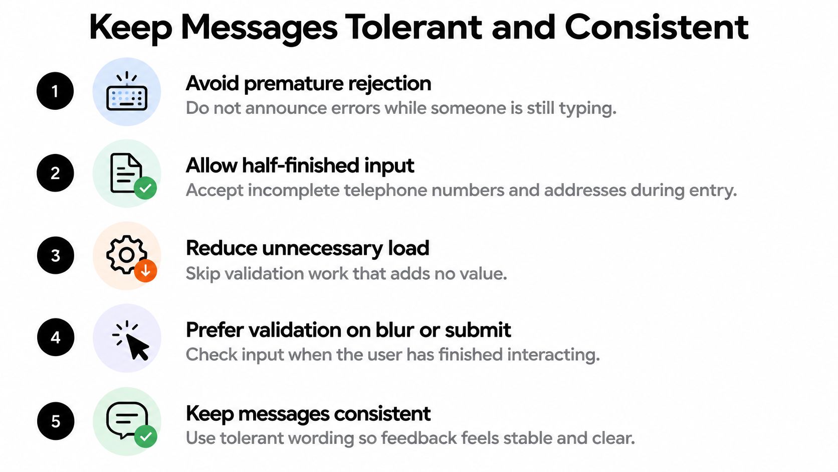
Write for the correction someone needs
Show the accepted format before entry. If spaces are allowed, say so; don’t present an example that suggests a stricter rule than the application requires.
Split validation into requiredness, syntax, permitted ranges and cross-field constraints. An empty date needs a request to enter a date, not an explanation of date ordering. A complete date that precedes a related start date needs a relationship-specific instruction.
For example, a date-range message can ask the user to enter an end date on or after the start date. An address message should identify the missing information rather than insisting that every legitimate address fits the same layout.
A message should describe the next useful action, not expose the name of the validator that failed.
Keep a shared message catalogue keyed by rule ID. The Vue interface and server-rendered response should resolve the same failure to the same wording, including field labels that users recognise.
Standardise behaviour before adding more checks
In November 2024, the GOV.UK Forms programme reported 87 published forms and more than 1,200 government users, with built-in validation helping users identify problems with their answers. That’s a practical reason to standardise error behaviour across services rather than designing each form independently.
Keep keystroke work local and cheap. If an already-failed field is being corrected, recheck that field rather than rerunning unrelated validators. Remote postcode or uniqueness lookups should wait until input settles, cancel obsolete requests and ignore stale results.
A lookup outage isn’t proof that the answer is invalid. Give users an appropriate retry or manual-entry route instead of displaying a misleading format error.
- Do show expectations early: Put essential format instructions beside the label or in a connected hint.
- Do retain answers: Treat correcting a field as editing, not restarting.
- Avoid colour-only feedback: Include readable messages and programmatic associations.
- Avoid browser-only authority: A pleasant client interaction doesn’t remove the server’s responsibility.
Measure Recovery Not Just Blocked Errors
People who struggle to get online aren’t an edge case your JavaScript can dismiss. Ofcom’s 2025 adults’ media use and attitudes report reports that 21% of people aged over 65 have no internet access at home. An online form can’t solve that exclusion, but a service team can avoid adding unnecessary barriers and provide another route.
Test degraded conditions deliberately: JavaScript never loads, a session expires, the user zooms text, or an error is announced without its field name. A failed lookup on a poor connection should not become a permanent judgement about someone’s address.
Validation recovery scorecard
| Measure | Healthy signal | First change if it fails |
|---|---|---|
| Time to correction | User fixes the field without leaving the page | Shorten the message and link it from the summary |
| Recovery after an error | Most people who see an error still submit successfully | Check false positives on UK formats before tightening the rule |
| Data loss on failure | No valid answer is cleared | Return the same safe display payload and repopulate ordinary fields |
| Error recurrence | The same rule rarely fails twice for one user | Show an example of an accepted value before the field |
| Keyboard and screen-reader discovery | Focus lands on the summary and each error names its control | Fix heading, focus and aria-describedby before restyling |
| Completion by device and group | Rates stay close across phone, desktop and known user groups | Add a simpler path or non-digital alternative for the group that drops |
These are diagnostic signals, not universal performance targets. Define a successful correction as a field passing the relevant rule, and successful recovery as the user reaching the accepted submission outcome after encountering an error.
Choose denominators before interpreting results
For recovery rate, use people who encountered a validation error as the denominator, not everyone who visited the page. For overall completion, state whether you’re measuring form starters or page visitors. Otherwise, a change in traffic mix can look like a validation improvement.
Record field names, stable rule IDs and relevant event times. Don’t put National Insurance numbers, full addresses or other raw answers into analytics events. Assess user-group differences through consented research and appropriate service data rather than guessing disability from browser behaviour.
Use screen-reader testing alongside telemetry. Analytics can show repeated attempts, but it won’t explain whether someone heard a useful field description or an isolated error message.
Fewer recorded errors can mean clearer questions. They can also mean that users stopped trying.
Compare false positives with false negatives. A strict address rule may keep records tidy while excluding valid addresses; an overly permissive payment-amount rule can create a different kind of harm. Set strictness according to the consequence of accepting the value, not the convenience of writing a regular expression.
When correction is slow, inspect wording and navigation before adding another check. When valid answers disappear, fix state restoration immediately. When a group can’t complete the digital route, provide a practical assisted or non-digital alternative rather than treating the abandonment chart as the end of the investigation.
Ship the Next Form with DOM Studio
Choose a small, existing form with a known recovery problem. If your team already maintains a server schema, keep that as the source of truth rather than replacing it during a component migration. Add client hints only where the scorecard identifies a useful intervention.
For a new Vue screen, our Forms product offers inputs, pickers and schema-driven forms, with headless behaviour beneath a thin Vue integration layer. Use that separation to avoid rebuilding field interaction patterns while keeping application-specific validation under your team’s control. Component accessibility still needs testing within the complete page, especially when conditional fields and server responses change the interaction.
Make the first change measurable
-
Map an existing form onto the recovery contract. Check its summary target, field-message associations and post-response focus. Include a failed request and a failed validation result, because they need different explanations.
-
Instrument the recovery scorecard by field and rule. Start with enough detail to distinguish a confusing instruction from an overly restrictive rule, without collecting the submitted personal information.
-
Add inline checks only to a demonstrated problem field. Compare correction and completion after the change. Remove the check if it interrupts entry without helping users finish.
Keep review boundaries clear. The front-end reviewer should inspect labels, interaction timing and state updates; the backend reviewer should inspect normalisation, rule enforcement and safe redisplay. Include keyboard and assistive-technology testing in acceptance, not as a styling follow-up.
Evaluate locally before committing to rollout
The public package is available for local evaluation. Production, deployed, distributed and paid client use requires an appropriate commercial licence. Distribution is permitted as part of a larger end product with substantial functionality beyond the library, not as a standalone UI kit.
Use the evaluation to test your hardest field, not just the easiest text input. A money editor, conditional date range or searchable selection will reveal whether your state model and recovery contract fit together. Keep the rollout narrow until a user can deliberately make a mistake, understand the response and complete the task.
DOM Studio offers inputs, pickers and schema-driven forms for building a consistent form interface without recreating every interaction. Visit DOM Studio to inspect the form primitives, evaluate a difficult field locally and connect it to your server-backed recovery workflow.