
You add justify-content: center to a flex row, refresh the browser, and nothing moves. The buttons stay where they were, the navigation still hugs the same edge, and the inspector offers no obvious clue. Most developers then try another value, add a margin, or start changing widths without first asking what space the browser has available to distribute.
That reaction is understandable, but flexbox justify content becomes much easier once you stop treating it as a general spacing switch. It works on the flex container, operates along the main axis, and distributes only the leftover space that remains after sizing and auto margins have been resolved. The practical result is important: if there’s no free space, several different values can look identical.
Table of Contents
- The Moment justify-content Does Not Behave the Way You Expect
- Understanding the Main Axis and the Cross Axis
- The Core Values of justify-content With Examples
- Quick Reference for Choosing the Right Value
- Common Layout Patterns Solved With justify-content
- Why justify-content Sometimes Has No Visible Effect
- justify-content Compared With align-items and justify-items
- Applying justify-content Safely in Production Interfaces
The Moment justify-content Does Not Behave the Way You Expect
Start with the parent, not the children. justify-content has no effect unless the element receiving it establishes a flex or grid alignment context. For a flex layout, that normally means:
.toolbar {
  display: flex;
  justify-content: center;
}
If .toolbar is still a block element, the declaration isn’t controlling the children as flex items. A wrapper can cause the same confusion: you may be styling an element that looks like the visual container, while its direct children belong to a different layout context.
Assume the parent is correctly set to display: flex. The next question is whether leftover main-axis space exists. The CSS Flexible Box Layout specification defines justify-content as alignment of flex items on the main axis after flexible lengths and auto margins have been resolved. If the children already occupy the available width, there’s nothing for center, space-around, or space-evenly to distribute.
That explains a common debugging sequence:
- The parent is a flex container.
- The items have fixed or constrained widths.
- Their combined size fills the available main-axis space.
justify-contentappears to do nothing.
space-between can also seem different because it distributes gaps between items, but it still needs free space. With no free space, its gaps can’t grow.
Practical rule: Before changing the value, inspect the parent, identify the main axis, and check which declaration consumed the available space.
The rest of the diagnosis follows that order. First establish the axis, then understand the value you need, then inspect sizing when the result looks unchanged. That approach is faster than cycling through alignment properties by instinct.
Understanding the Main Axis and the Cross Axis
A flex container has two directions. The main axis is the direction in which its items are laid out. The cross axis runs perpendicular to it. flex-direction chooses the main axis, so justify-content doesn’t always mean horizontal alignment.
Keep this sentence beside your keyboard:
Main axis equals
justify-content. Cross axis equalsalign-items.
With the default flex-direction: row, items run horizontally. justify-content: flex-start packs them at the main-start edge, usually the left edge in a left-to-right interface. justify-content: flex-end packs them at the opposite edge, while center places the group in the middle of the row.
Change the direction and the property follows it:
flex-direction |
Main-axis direction | What justify-content: center centres |
|---|---|---|
row |
Horizontal | The items across the row |
row-reverse |
Horizontal, reversed | The group across the reversed row |
column |
Vertical | The items from top to bottom |
column-reverse |
Vertical, reversed | The group along the reversed column |
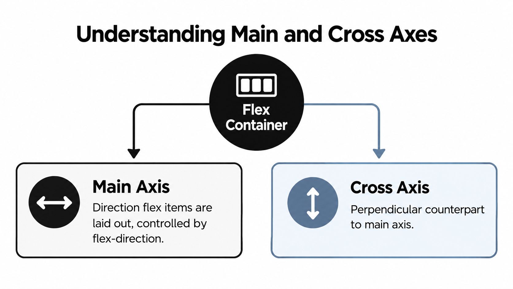
For a horizontal row, imagine a line drawn from main start at the left edge to main end at the right edge. The items sit on that line, and justify-content decides how any unused length between the item group and those edges is allocated. The cross axis runs vertically from cross-start to cross-end, which is where align-items acts.
For a column, rotate the drawing. Main start is at the top, main end is at the bottom, and justify-content: center centres the group vertically. If you wanted horizontal centring in that column, you’d normally inspect align-items instead.
Writing modes and direction add another layer. Logical values such as start and end refer to the relevant writing direction, not a permanent physical left or right. That matters for right-to-left interfaces and vertical writing systems. If you’re organising reusable styles, the same axis discipline also helps when defining CSS variables for maintainable interfaces.
The Core Values of justify-content With Examples
The value describes how the item group uses available space on the main axis. The examples below assume a horizontal row with a container wider than its children.
The familiar packing values
flex-start packs items at the start of the flex direction. It suits a standard toolbar where the first control should remain flush with the leading edge.
.toolbar {
  display: flex;
  justify-content: flex-start;
}
flex-end packs the group at the end of the flex direction. It works well for action buttons in a footer when the actions belong on the right in a left-to-right layout.
.actions {
  display: flex;
  justify-content: flex-end;
}
center places the complete group in the middle of the available main-axis space. A login card’s internal action row or a compact empty-state control group may use it when the group should remain visually centred.
.login-actions {
  display: flex;
  justify-content: center;
}
The distributed-space values
space-between puts the first item at main-start and the last item at main-end, distributing the remaining space between the items. It’s a natural fit for a navigation bar with a logo on one side and account actions on the other.
.site-nav {
  display: flex;
  justify-content: space-between;
}
space-around gives every item equal space around itself. Because adjacent items share the space between them, the visible outer gap is smaller than the gap between neighbouring items. It can suit a cluster of pill buttons where balanced breathing room matters more than flush edges.
.filter-pills {
  display: flex;
  justify-content: space-around;
}
space-evenly makes the gaps between items and the container edges equal. Use it for a status bar or icon toolbar where each control should feel equally separated, even when the contents change.
.status-bar {
  display: flex;
  justify-content: space-evenly;
}
These distributed values don’t manufacture room. If item widths, flex growth, auto margins, or maximum sizes consume the available length, the browser has little or nothing to distribute. That is why a value can be valid while producing no visible difference.
Logical and overflow-aware values
start and end align to the start and end of the writing mode. They’re useful when a component must respect document direction rather than assume that the leading edge is physically left.
.language-aware-actions {
  display: flex;
  justify-content: start;
}
left and right express physical edges where that makes sense. They can be less adaptable than logical values because an interface may change direction or writing mode.
safe center asks the browser to centre the content without allowing that alignment to push content into an inaccessible overflow position. The MDN flexbox box-alignment guide describes the key constraint behind these choices: free space is distributed only after flex lengths and auto margins have been resolved.
.dialog-actions {
  display: flex;
  justify-content: safe center;
}
The MDN justify-content reference documents the broader set of positional, distributed, overflow-safe, and logical values. Support and behaviour can vary by browser and layout context, so verify the values your support matrix requires.
| Value | Behaviour | Best for |
|---|---|---|
flex-start |
Packs items at the start of the flex direction | Left-aligned toolbars and ordinary flows |
flex-end |
Packs items at the end of the flex direction | Action groups aligned to the trailing edge |
center |
Centres the item group on the main axis | Compact centred controls |
space-between |
Places outer items at the edges and distributes inner gaps | Logo-and-actions navigation |
space-around |
Gives each item equal surrounding space | Pill clusters and loose control groups |
space-evenly |
Makes inner and outer gaps equal | Status bars and evenly spaced toolbars |
start |
Packs items at logical main-start | Internationalised layouts |
end |
Packs items at logical main-end | Direction-aware trailing actions |
safe center |
Centres where possible while avoiding unsafe overflow | Dialog and narrow responsive controls |
Quick Reference for Choosing the Right Value
Use the visual outcome as your first filter, then confirm that the container has free space. The table is most useful when you already know the direction of the main axis.
| Value | Visual effect | Best used for |
|---|---|---|
flex-start |
Group stays at main-start | The first item must remain flush with the leading edge |
flex-end |
Group stays at main-end | Actions belong against the trailing edge |
center |
Group sits in the middle | A compact group needs balanced outer space |
space-between |
Outer items touch opposite edges, inner gaps expand | Two anchors such as brand and profile actions |
space-around |
Each item receives equal surrounding space | Loose clusters where edge gaps can differ visually |
space-evenly |
Every gap, including edge gaps, matches | Controls should feel equidistant from one another and the container |
start |
Group follows logical start | Components must adapt to writing direction |
end |
Group follows logical end | Direction-aware trailing controls |
left |
Group targets the physical left edge where applicable | Physical positioning is intentional |
right |
Group targets the physical right edge where applicable | Physical positioning is intentional |
stretch |
Alignment can expand auto-sized items in applicable contexts | Layouts using the alignment specification’s stretch behaviour |
A useful warning belongs beside this table: the space-* values require free space. If children fill the row, they collapse visually towards the same packed result. Likewise, flex-start and start aren’t interchangeable in every writing-mode or direction combination. Choose flex-start when you mean the flex direction’s start, and choose start when you mean the logical writing direction’s start.
Common Layout Patterns Solved With justify-content
The property becomes clearer when it solves a specific component rather than an abstract row.
Centre a login card in a modal
Here the main axis is vertical because the modal uses a column. The container needs a height, or at least a minimum height, for vertical centring to have room to operate.
<div class="modal">
  <form class="login-card">
    <h2>Sign in</h2>
    <label>
      Email
      <input type="email">
    </label>
    <button type="submit">Continue</button>
  </form>
</div>
.modal {
  display: flex;
  flex-direction: column;
  justify-content: center;
  min-height: 100vh;
  padding: 2rem;
}

.login-card {
  width: min(100%, 28rem);
  margin-inline: auto;
}

align-items would address the horizontal cross axis in this column, not the vertical placement. Grid could also solve the composition, but flexbox communicates that this is a single column whose contents need main-axis distribution.
Separate navigation anchors
A navigation bar often has a brand at one end and actions at the other. Keep those elements in source order and let presentation handle the spacing.
<nav class="site-nav">
  <a class="brand" href="/">Acme</a>
  <div class="nav-links">
    <a href="/products">Products</a>
    <a href="/docs">Docs</a>
  </div>
  <a class="account" href="/account">Account</a>
</nav>
.site-nav {
  display: flex;
  flex-wrap: wrap;
  align-items: center;
  justify-content: space-between;
  gap: 1rem;
}

.nav-links {
  display: flex;
  gap: 1rem;
}

@media (max-width: 48rem) {
  .site-nav {
    justify-content: center;
  }

  .nav-links {
    width: 100%;
    justify-content: center;
    flex-wrap: wrap;
  }
}
The media query changes the distribution when the wide layout no longer suits the available space. For larger page compositions, compare this approach with CSS Grid template areas, especially when the layout has distinct rows and columns rather than one flexible line.
Space an icon toolbar evenly
space-evenly is useful when adding or removing a control shouldn’t require hand-tuning the outer margins.
<div class="icon-toolbar" aria-label="Document actions">
  <button type="button">Undo</button>
  <button type="button">Redo</button>
  <button type="button">Share</button>
</div>
.icon-toolbar {
  display: flex;
  justify-content: space-evenly;
  align-items: center;
  min-height: 3rem;
  padding-inline: 0.5rem;
}
gap is usually the clearer choice when you want a fixed gutter between items. space-evenly is the better expression when the edges should participate in the same distribution as the internal gaps. margin: auto would solve a different problem by absorbing free space around particular children, and align-items would move the controls on the cross axis rather than spread them along the toolbar.
The same principle applies to accessible controls: keep their semantic order in the HTML, then use alignment for presentation. UK public-sector guidance from the Home Office accessibility design guidance favours preserving reading and interaction order rather than relying on visual rearrangement.
Why justify-content Sometimes Has No Visible Effect
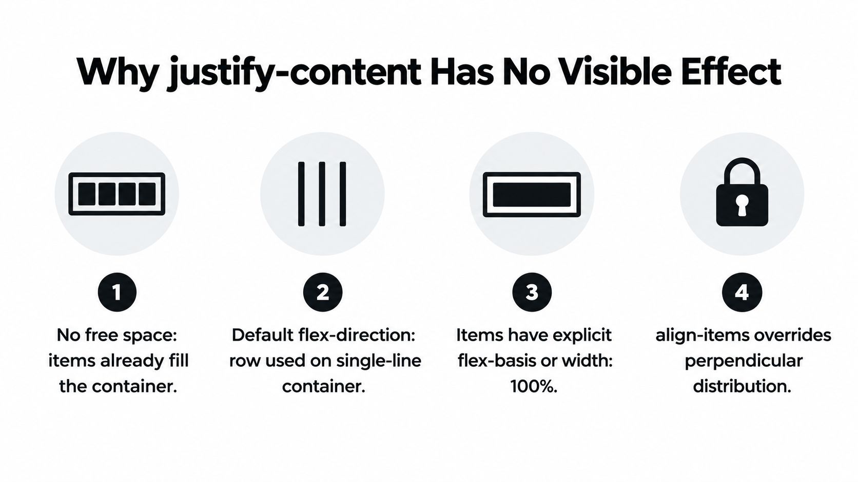
When justify-content appears broken, inspect these four failure points before rewriting the component.
The items have consumed the space
A row containing children with width: 100%, large flex bases, or growth rules may already occupy the entire main axis. Maximum-size constraints can also change the amount of free space left for distribution. The declaration still applies, but its calculated result has no visible room to express itself.
Use the browser’s layout inspector to compare the container’s content box with the children’s outer sizes. Temporarily add an outline and remove fixed widths. If the group suddenly moves, the issue was sizing rather than alignment.
You’re watching the wrong axis
A column makes justify-content vertical. Developers often add it while looking for horizontal centring, then conclude that the property is unreliable. Check flex-direction and ask whether the movement you want belongs to the main axis or the cross axis.
The children aren’t direct flex items
Only direct children of a flex container become flex items. An extra wrapper can intercept the relationship, and unusual display: contents usage can make the box tree harder to reason about. Inspect the parent-child structure instead of assuming that a visually adjacent element participates in the same flex formatting context.
Direction or writing mode changed the result
direction: rtl and non-horizontal writing modes can alter which edge represents start and end. The property name doesn’t change, but the visual result can look mirrored. Test the component with the actual document direction and translated content, not only with an English left-to-right sample.
Modern values can make the intent clearer. start and end respect logical direction, while safe center helps prevent a centred group from becoming inaccessible when its content cannot fit safely. Use normal where the layout mode’s normal alignment is the right fallback, and test stretch only where the relevant alignment context supports it and the children can stretch.
justify-content Compared With align-items and justify-items
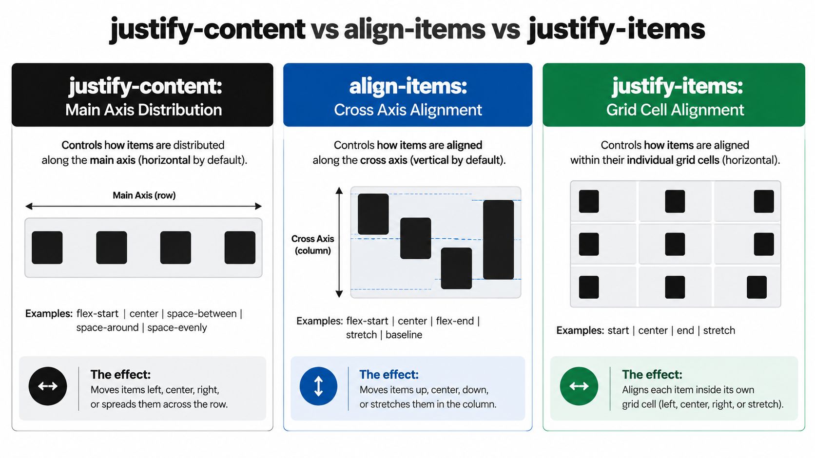
Treat alignment properties as addresses. justify-content chooses how the group sits along the container’s main axis. align-items positions every flex item on the cross axis of its line. justify-items is primarily a grid concept, where it aligns each item inside its own grid cell on the inline axis.
Consider a toolbar containing a logo, three links, and a profile chip:
.toolbar {
  display: flex;
  justify-content: space-between;
  align-items: center;
}
justify-content spreads the children horizontally when the toolbar is a row. align-items: center lines them up vertically, so different control heights share a visual centre. Setting justify-items on that flex container won’t replace either operation.
Grid gives justify-items a clear job:
.sidebar {
  display: grid;
  justify-items: start;
}

.sidebar-card {
  width: 100%;
}
Each grid item can align within its own cell while the grid tracks remain in place. For individual overrides, flexbox provides align-self, and grid provides justify-self where supported by the layout context. align-content is different again. It distributes flex lines on the cross axis when wrapping creates multiple lines, not the individual items in a single unwrapped row.
Applying justify-content Safely in Production Interfaces
Before shipping a component, run this short check:
- Confirm the context: The parent has
display: flex, and the intended children are direct flex items. - Name the axis: Check
flex-directionbefore deciding whether the desired movement is horizontal or vertical. - Find the free space: Inspect widths, flex bases, growth, maximum sizes, auto margins, and wrapping.
- Match the intent: Use
flex-startorflex-endfor explicit flows,space-betweenfor two anchors,space-evenlyfor equal edge and internal gaps, andcenterfor a properly centred group. - Respect direction: Prefer logical
startandend, or a safe alignment value, when the component serves multiple languages. - Test real content: Longer labels and translated text can remove the free space that made the original demo look correct.
Treat justify-content as a precise alignment tool, not a first response to every spacing problem. Audit sizing and margins first, then add the declaration with a comment that names the axis and the intended distribution. For responsive components, keep the breakpoint logic explicit, using a documented approach such as the one described in this media query breakpoint guide.
DOM Studio provides headless web component primitives and Vue integration for production interfaces, including accessible behaviour and reusable layout-ready components. If you want predictable alignment decisions to live inside a consistent component system rather than scattered one-off fixes, explore DOM Studio and start building from its documented primitives.