
You’ve probably had this moment already. The layout in your head is clean and obvious: header across the top, sidebar on the left, content in the middle, footer at the bottom. Then you start writing CSS Grid with line numbers, add a breakpoint, shift one panel, and suddenly the layout reads like coordinates from a spreadsheet.
That’s where Grid template areas become useful.
Instead of placing everything by numbered lines, you sketch the layout as a small ASCII map inside your CSS. You can look at it and instantly see the page structure. That’s why so many developers find it easier to reason about than grid-column: 2 / 4 and grid-row: 1 / 3, especially when a layout has named regions that stay conceptually stable while the screen size changes.
For modern production work, this matters because grid-template-areas became broadly available across browsers in October 2017, and MDN describes it as well established and supported across many devices and browser versions in its grid-template-areas reference. That stability is a big reason it’s become such a practical layout tool.
Table of Contents
- Introduction to Visual Layout Mapping
- What Grid Template Areas Actually Do
- Syntax and Naming Rules You Must Follow
- Choosing Between Named Areas and Line Placement
- Practical Layout Examples From Simple to Complex
- Responsive Behaviour and Accessibility Guardrails
- Shipping Reliable Layouts With Browser Support and Tooling
Introduction to Visual Layout Mapping
A lot of CSS Grid frustration comes from a mismatch between how people see layout and how they first learn to code it.
Developers don’t picture a page as “column line 1 to 4, row line 2 to 5”. They picture named zones. A top bar. A sidebar. A main panel. A footer. grid-template-areas lets you write CSS in that same mental shape, so the stylesheet starts looking more like a floor plan than a math problem.
Why the ASCII map clicks faster
When you write this:
grid-template-areas:
  "header header"
  "sidebar main"
  "footer footer";
you aren’t just assigning positions. You’re drawing a blueprint.
That blueprint is easy to scan in code review. It’s easy to revisit after a month away from the project. It’s easy to explain to a teammate who didn’t build the original layout. That’s the win. Not cleverness, but readability.
Practical rule: If your layout has stable, named regions that you can describe in plain English, grid template areas are usually worth trying first.
Where beginners usually get stuck
The confusing part is that the map looks simple, but it still follows strict rules. Every quoted string is a row. Every word inside that string is a cell. Repeating a name makes one larger area, but only if it forms a rectangle.
Beginners also misread the ASCII map as if it moves content logically through the page. It doesn’t. It only changes the visual placement. That distinction matters later when responsive layouts and accessibility enter the picture.
When this guide will help most
This approach is especially good when you’re building:
- Application shells with a header, nav, content, and footer
- Marketing pages with hero, features, sidebar, and callout sections
- Dashboards with named panels that should stay understandable in code
- Design system examples where layout intent should be obvious at a glance
You’ll see short examples, the common mistakes that break the map, and the decision rules for when named areas are a better fit than line-based placement.
What Grid Template Areas Actually Do
CSS Grid becomes much easier when you stop thinking about it as item positioning and start thinking about it as container mapping.
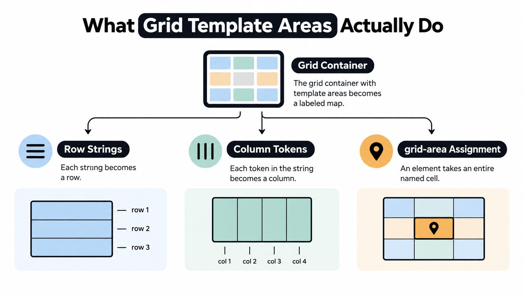
A grid container can define named regions. Grid items can then opt into those regions. The names belong to the layout map, not to the elements themselves. That sounds subtle, but it’s the key idea.
Think like a floor plan
A simple container might look like this:
.page {
  display: grid;
  grid-template-columns: 240px 1fr;
  grid-template-areas:
    "header header"
    "sidebar main"
    "footer footer";
}
Read that like a building plan:
- first row: header spans both columns
- second row: sidebar sits next to main
- third row: footer spans both columns
Then individual items choose an area:
.header { grid-area: header; }
.sidebar { grid-area: sidebar; }
.main { grid-area: main; }
.footer { grid-area: footer; }
That’s the whole model. The map defines the named spaces. The items step into those spaces.
How rows and columns are created
The map follows a strict grammar that MDN documents in its guide to Grid template areas:
- Each quoted string creates a row
- Each token inside the string creates a column
- Repeated tokens merge into one rectangular area
So this:
grid-template-areas:
  "hero hero side"
  "hero hero side";
creates a large hero block on the left and a tall side block on the right.
That repeated-name behaviour is what makes the syntax feel visual. You can “draw” bigger areas just by repeating the same label across neighbouring cells.
What the names don’t do
The names don’t bind themselves to specific elements automatically. They only define slots. The CSS Grid specification notes that named grid areas are separate from the grid items placed into them, which is why this approach stays maintainable when markup changes or components swap around in a layout shell, as described in the CSS Grid Layout Module Level 2 specification.
The map is for presentation. It isn’t a content-ordering system.
That sentence saves people a lot of trouble. If you remember one thing from this section, keep that.
Syntax and Naming Rules You Must Follow
grid-template-areas looks forgiving. It isn’t. The browser expects a valid rectangular map, and tiny mistakes can make the whole thing fail or behave in ways you didn’t intend.
The syntax checklist
Use this as your fast mental linting pass:
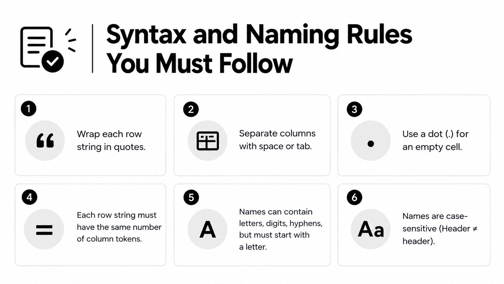
- Quote each row: Every row must be wrapped in quotes.
- Separate each cell with whitespace: Spaces or tabs divide the tokens into columns.
- Use
.for an empty cell: A dot means “leave this grid cell unnamed”. - Keep row widths consistent: Every row must describe the same number of columns.
- Repeat names only in rectangles: A named area can grow, but it must stay rectangular.
- Assign items separately: Elements still need
grid-areato occupy a named slot.
Example:
.layout {
  display: grid;
  grid-template-columns: 200px 1fr 1fr;
  grid-template-areas:
    "header header header"
    "sidebar main main"
    "sidebar promo promo"
    "footer footer footer";
}
And the items:
header { grid-area: header; }
aside { grid-area: sidebar; }
main { grid-area: main; }
.promo { grid-area: promo; }
footer { grid-area: footer; }
The rectangle rule trips people up most
This works:
grid-template-areas:
  "nav main main"
  "nav main main";
This doesn’t describe a valid named area shape:
grid-template-areas:
  "nav main ."
  "nav main main";
Why? Because main no longer forms a clean rectangle. It becomes an L-shape.
That’s one of the core rules MDN calls out: repeated cells merge into one area only when the result is rectangular. If not, the map is invalid.
Quick debug habit: Read the map row by row and trace each repeated word with your finger. If the outline bends, the area is wrong.
Empty cells and mixed density
Dots are useful when a layout needs breathing space or asymmetry:
grid-template-areas:
  "header header header"
  "main main aside"
  "footer . .";
That’s valid as long as the row widths match. The dots act as placeholders so the grid stays rectangular even when parts of the design are intentionally empty.
Names, pairing, and small gotchas
MDN’s reference records the initial value of grid-template-areas as none and notes that it applies only to grid containers, not arbitrary elements, in the property reference. In practice, that means two things:
- the property does nothing unless
display: gridordisplay: inline-gridis set - you’ll almost always pair it with
grid-template-columnsand sometimesgrid-template-rows
A sensible pattern looks like this:
.wrapper {
  display: grid;
  grid-template-columns: 18rem 1fr;
  grid-template-rows: auto 1fr auto;
  grid-template-areas:
    "header header"
    "sidebar main"
    "footer footer";
}
If the ASCII map is the blueprint, grid-template-columns and grid-template-rows are the measurements.
Choosing Between Named Areas and Line Placement
Some layouts become clearer with named areas. Others become clumsy. You don’t need to treat this as a loyalty test between two Grid techniques.
Use the one that makes the next developer understand the layout fastest.
Where named areas shine
Named areas are strongest when the layout has stable regions with meaningful names. Page scaffolds are the classic example:
- header
- sidebar
- main
- aside
- footer
That kind of layout reads beautifully as a map. Refactoring is often simpler too, because changing the arrangement means editing the blueprint rather than recalculating several line positions.
Where line placement wins
Line-based placement is better when the layout is more mechanical than semantic.
Examples:
- a product card grid where items span different tracks based on content
- a tightly controlled data widget layout inside one panel
- auto-placed repeated items generated from data
- designs where the positions don’t map cleanly to a few reusable named regions
If you’re constantly inventing awkward area names like box1, box2, tileWide, tileTall, line placement is usually cleaner.
Named Areas vs Line-Based Placement
| Criterion | Grid Template Areas | Line-Based Placement |
|---|---|---|
| Readability | Excellent for page-level scaffolds and named regions | Clear when you need precise track control |
| Refactoring | Easy to reshape by editing the ASCII map | Often requires updating multiple placements |
| Granularity | Less convenient for many small unique items | Strong for detailed component layouts |
| Semantics | Encourages meaningful layout names | Focuses on coordinates rather than named regions |
| Dynamic content | Can feel rigid if items vary a lot | More flexible for irregular item spans |
| Team communication | Very easy to discuss in reviews | Better for advanced Grid users who think in tracks |
You can mix both
A container can use grid-template-areas at the top level, while items inside one area use line-based placement for internal detail.
That hybrid approach is often the sweet spot. Use named areas for the page skeleton, then use lines where precision matters more than readability.
Practical Layout Examples From Simple to Complex
The best way to learn grid template areas is to read the map first and the CSS second. If the map looks sensible, the rest usually falls into place.
Holy grail layout
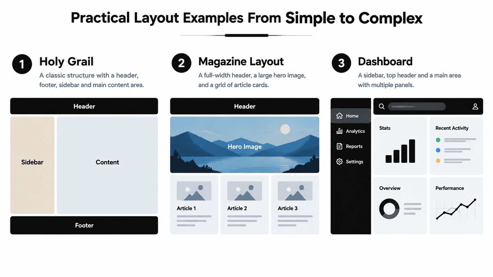
This is the classic application shell.
.shell {
  display: grid;
  min-height: 100vh;
  grid-template-columns: 16rem 1fr;
  grid-template-rows: auto 1fr auto;
  grid-template-areas:
    "header header"
    "sidebar main"
    "footer footer";
  gap: 1rem;
}

.header { grid-area: header; }
.sidebar { grid-area: sidebar; }
.main { grid-area: main; }
.footer { grid-area: footer; }
<div class="shell">
  <header class="header">Header</header>
  <aside class="sidebar">Sidebar</aside>
  <main class="main">Main content</main>
  <footer class="footer">Footer</footer>
</div>
Each named area feels almost too natural. Each region has a semantic name, and the map is instantly readable.
For a real app-shell pattern, it helps to study examples that already separate navigation, chrome, and content clearly, such as these application layout patterns.
Magazine-style layout
Now let’s make one area span more visual space.
.magazine {
  display: grid;
  grid-template-columns: 2fr 2fr 1fr;
  grid-template-areas:
    "header header header"
    "hero hero aside"
    "story1 story2 aside"
    "footer footer footer";
  gap: 1rem;
}

.header { grid-area: header; }
.hero { grid-area: hero; }
.aside { grid-area: aside; }
.story1 { grid-area: story1; }
.story2 { grid-area: story2; }
.footer { grid-area: footer; }
<div class="magazine">
  <header class="header">Section header</header>
  <section class="hero">Hero feature</section>
  <aside class="aside">Trending</aside>
  <article class="story1">Story one</article>
  <article class="story2">Story two</article>
  <footer class="footer">Footer</footer>
</div>
The map tells the whole story. Hero dominates. Sidebar stays tall. Stories sit below.
That’s much easier to reason about than several line spans sprinkled across many class rules.
A short visual walkthrough helps if you want to see the pattern being built in motion:
Dashboard with asymmetry and empty cells
Empty cells are useful when not every slot should be filled.
.dashboard {
  display: grid;
  grid-template-columns: 18rem 2fr 1fr;
  grid-template-rows: auto 1fr 1fr;
  grid-template-areas:
    "sidebar header header"
    "sidebar chart stats"
    "sidebar table .";
  gap: 1rem;
}

.sidebar { grid-area: sidebar; }
.header { grid-area: header; }
.chart { grid-area: chart; }
.stats { grid-area: stats; }
.table { grid-area: table; }
<div class="dashboard">
  <aside class="sidebar">Filters</aside>
  <header class="header">Dashboard header</header>
  <section class="chart">Chart</section>
  <section class="stats">Stats</section>
  <section class="table">Table</section>
</div>
The . in the bottom-right cell leaves deliberate open space. That can be useful when a design needs visual pause, or when one panel shouldn’t stretch awkwardly just to fill every track.
Naming advice: Use area names that describe page roles, not styling.
sidebarbeatsleft-panel.herobeatsbig-box.
How to adapt these safely
When the map is clear, your size decisions become easier:
- Adjust columns first if the relationship between regions stays the same
- Adjust the map second if the visual structure changes at a breakpoint
- Rename areas rarely because stable names make maintenance easier
That’s the hidden strength of grid template areas. The code communicates intent before it communicates mechanics.
Responsive Behaviour and Accessibility Guardrails
Responsive grid template areas are where the feature feels magical. They’re also where developers can accidentally create an accessibility mismatch if they only test visually.
Redefining the map at a breakpoint
You can keep the same HTML and swap the layout blueprint.
Mobile-first example:
.layout {
  display: grid;
  gap: 1rem;
  grid-template-columns: 1fr;
  grid-template-areas:
    "header"
    "main"
    "sidebar"
    "footer";
}

@media (min-width: 48rem) {
  .layout {
    grid-template-columns: 18rem 1fr;
    grid-template-areas:
      "header header"
      "sidebar main"
      "footer footer";
  }
}
That works well because the mobile and larger-screen maps are both easy to read. If breakpoint decisions are giving you trouble, it helps to think in layout intent rather than device labels. This guide to media query breakpoints is useful for that mindset.
The accessibility rule people miss
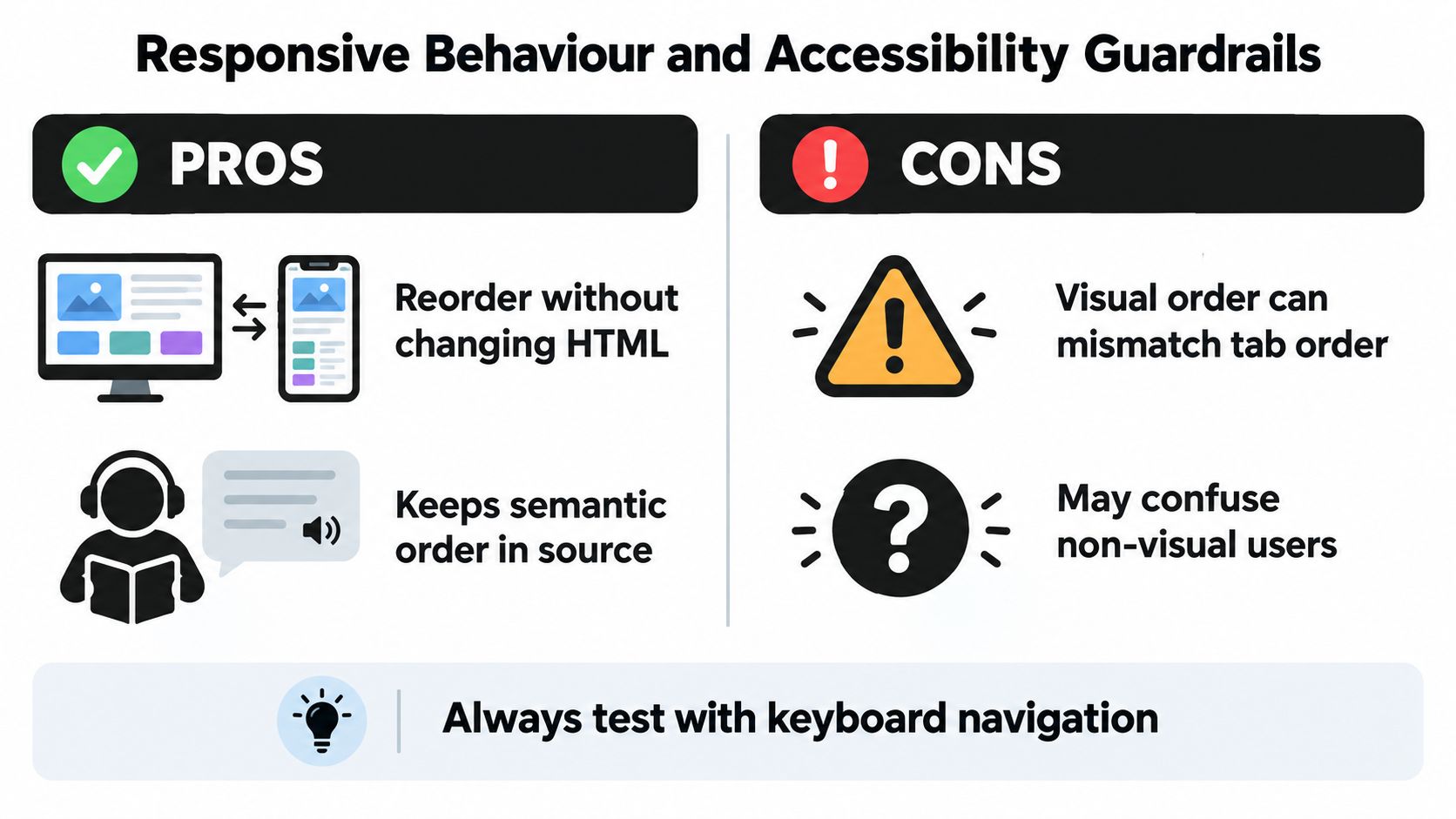
MDN and the CSS Grid guidance are explicit about this in the Grid accessibility guide: visual reordering does not change document order, keyboard tab order, or screen reader reading order.
That means you can move a sidebar below main content visually, but if the sidebar appears first in the HTML, many users will still encounter it first when navigating non-visually.
This is not a bug. It’s how the platform preserves logical source order.
Keep the HTML in the order you want people to read, tab through, and hear. Use Grid to change appearance, not meaning.
Safe and unsafe reordering scenarios
A few practical decision rules help:
- Usually safe: Moving decorative or low-priority complementary regions, such as a non-essential promo block, while the source order still makes sense.
- Use caution: Swapping a sidebar and main column when the source order already puts the main content first.
- Avoid: Moving navigation, forms, error summaries, or step-based content into a visual order that disagrees with the DOM order.
A test routine worth keeping
Before shipping a reordered layout, check it in this order:
- Keyboard first: Tab through the page and see whether focus jumps around in a way that feels visually confusing.
- Reading order next: Inspect the HTML order and ask whether it still tells a coherent story without CSS.
- Screen reader pass: Confirm that announcements follow the same logical sequence you intended.
- Breakpoint review: Repeat the checks at the layouts where the map changes.
That last step matters because a layout can be perfectly logical on desktop and confusing on mobile, or the other way round.
Shipping Reliable Layouts With Browser Support and Tooling
At this point, grid template areas should feel less like a niche convenience and more like a dependable part of your layout toolkit.
Browser support is a big reason. MDN records grid-template-areas as established across browsers since October 2017 in its browser compatibility overview for modern CSS layout features. For most production web apps, that means you can treat it as a normal option rather than an experiment.
Practical fallback thinking
You probably won’t need a fallback for most projects, but when you do, keep it boring:
- Use a simple single-column flow first so content still works without Grid
- Add Grid as enhancement for the richer layout
- Keep a Flexbox fallback only if the project has a genuine legacy requirement
Feature queries can help if your support matrix demands a controlled upgrade path. If not, a clean source order and sensible default flow already do a lot of the work.
A short shipping checklist
Before you merge:
- Check the map visually: The ASCII layout should be readable without hunting.
- Verify rectangle validity: No L-shaped named areas.
- Match names exactly:
mainandMainare different names in practice, so inconsistency breaks placement. - Test each breakpoint: Especially where the area map changes.
- Confirm logical source order: Don’t rely on visual moves to fix content hierarchy.
- Keep naming semantic: Prefer
header,nav,content,sidebar,footer.
Grid template areas are best when they communicate structure clearly. If the map starts looking cryptic, that’s your cue to simplify the layout or switch part of it to line-based placement.
If you’re building layouts like these into a reusable interface system, DOM Studio gives you accessible UI primitives and polished app-building patterns that pair well with CSS Grid scaffolds. It’s a good fit when you want the layout freedom of Grid template areas without re-implementing keyboard handling, focus behaviour, and component structure from scratch.