
Most picker guides start with the calendar. Pick two pretty months, add hover states, wire up Apply, and you’re done. That advice is backwards for a large share of UK forms. If a user already knows the dates, forcing them through month navigation is slower, harder to use with a keyboard, and more likely to produce a reversed interval. I would build a date range picker typed first, then add the calendar as an enhancement for people who are exploring.
Table of Contents
- Date Range Picker Patterns Compared
- UK Date Formats and Month Names
- Typed Entry or Calendar First
- Keyboard and Screen Reader Behaviour
- Timezones, Limits and Validation Edge Cases
- Wire the Picker in Vue with DOM Studio
Date Range Picker Patterns Compared
A date range picker lets a user choose two dates, a start and an end, that together form one interval. Picking check-in and check-out on a hotel booking is the familiar version. The control isn’t two unrelated dates. It’s one period, and every design choice should protect that relationship.
| Pattern | Best for | Main strength | Main weakness | Keyboard effort |
|---|---|---|---|---|
| Calendar popover, two months | Booking and travel dates | Familiar and visual | Month navigation is slow | Medium |
| Dual calendar, side by side | Long ranges across months | Shows the whole range at once | Wide on mobile screens | High |
| Preset sidebar with calendar | Reporting dashboards | One-click common periods | Custom ranges need extra steps | Low |
| Typed start and end fields with calendar fallback | Known dates such as claim or contract periods | Fastest entry for known dates | Needs clear format guidance | Low |
| Inline always-visible calendar | Scheduling views | No hidden state to manage | Takes up page space | Medium |
Why calendar first isn’t always right
The Ministry of Justice date picker guidance notes that calendar pickers are fully keyboard-navigable yet can be slow for keyboard-only and screen-reader users, while separate date inputs suit people who already know the date, such as a date of birth. Visual ease doesn’t guarantee accessible interaction, either. Calendar output can be announced in ways that confuse screen reader users, including unintuitive announcements of years.
A smaller pattern often wins. Typed day, month and year fields support direct entry, paste, and quick correction. The calendar then helps users who need context, such as which weekday a date falls on, without becoming a toll gate for everyone else.
Decision rule: use presets for reporting, typed fields for known dates, and a calendar for exploring dates.
Choose presets such as Last 7 days, This month, or Last quarter when analysts repeat the same periods. Choose typed fields for a claim period, contract term, or booking a user has on paper. Choose a two-month popover when weekday, weekends, and blackout dates shape the choice. If you can’t name which job your users have, default to typed entry with a calendar fallback. You’ll serve the known-date majority without removing visual help.
UK Date Formats and Month Names
For a known date, a clear written format matters more than a calendar view. In UK interfaces, put the day before the month: reversing the order can turn a two-week booking into a two-month one.
The Ministry of Justice content style guide recommends writing dates in full as 14 January 2025 and warns that truncating dates can create accessibility problems. For compact controls, it gives 14/5/2024, where the day is greater than 12 and cannot be mistaken for the month.
Where each format belongs
| Format | Example | Use it for | Risk |
|---|---|---|---|
| Full UK date | 14 January 2025 | Labels, summaries and confirmation text | Takes more width on small screens |
| Compact numeric, day above 12 | 14/5/2024 | Examples and dense booking grids | Only safe when the day is clearly above 12 |
| Compact numeric, day 12 or lower | 5/4/2024 | Avoid in UK interfaces | US users read it as 4 May while UK users read 5 April |
Use full dates wherever users review a decision. In summaries, confirmation panels and error messages, write 14 January 2025 to 20 January 2025. Reserve compact numeric dates for dense tables and booking grids, and use an example with a day above 12 when teaching the format.
Label the fields Start date and End date. A DD/MM/YYYY placeholder is not a reliable instruction: it disappears during typing and may not serve as an accessible label. Keep a persistent hint beside the fields.
Use an example such as 27 March 2007 in the hint. The day above 12 makes the order clear.
Keep display and transport separate
Format dates for people in the interface and send date-only ISO values to the server, such as 2024-05-14. Avoid sending a localised display string or adding a time to a date-only value. For example, 5/4/2024 can be interpreted differently across locales; 2024-04-05 has an unambiguous year-month-day order.
Make the locale explicit in the component contract. With en-GB, fields should put the day first, weeks should start on Monday, and month names should follow the English locale. If the product supports another locale, configure that deliberately rather than letting the browser automatically change the format.
Typed Entry or Calendar First
A calendar is the wrong starting point when someone already knows both dates. Make typed day, month and year fields the primary path, with the calendar available for browsing or correcting a selection. Someone copying a contract end date from a letter should not have to click through eleven months.
Travel planning shows the distinction: some guests know their dates, while others are still choosing them.

The GOV.UK Design System research on number inputs found that users entered months as full or abbreviated names and received validation errors. Accepting month names reduced those errors. A range gives users two opportunities to encounter a rejected format, so use text inputs with numeric input mode rather than number inputs.
Any date picker should support typed day, month and year entry. DOM Studio’s Forms product offers inputs, pickers and schema-driven forms.
- Accept month names: Treat March, Mar, 3 and 03 as the same month, then normalise on blur.
- Accept pasted dates: Split 1 January 2026 or 01/01/2026 across the fields rather than leaving the full value in the day field.
- Show the format first: Put an example in the hint before typing, not only in an error message.
- Keep typed values: Opening the calendar should not clear or overwrite entered dates.
For rental bookings, hosts may need to understand Miami vacation rental regulations while entering permit and booking periods from documents. Typed fields make those known dates quicker to enter; the calendar remains useful when dates are uncertain.
Keep both values visible when validation fails. If the end date is before the start date, mark the End date field and explain what needs changing. Do not swap the dates without notice. The user may have entered the start date incorrectly, and an unannounced correction makes the form harder to trust.
Keyboard and Screen Reader Behaviour
A calendar isn’t a styled grid. It’s an interaction model with focus rules, announcements, and a defined way out. If you only build the visual layer, keyboard users will discover the gaps one trapped Tab at a time.
The UK Intelligence Community Design System date picker accessibility guidance specifies three focus regions, covering month/year controls, the calendar grid, and actions such as “Go to today” and “Clear”, with focus constrained in the open picker and a full announcement such as “Choose Wednesday, 8 November 2023”. That weekday plus date label matters. Hearing only 8 tells a screen reader user almost nothing about the period they’re building.
The key map to test against
| Key | Expected action | Test note |
|---|---|---|
| Tab and Shift+Tab | Move between month and year controls, grid and actions | Focus must not leave the open picker |
| Arrow keys | Move focus one day left or right, one week up or down | Each move announces the full weekday and date |
| Page Up and Page Down | Move to the previous or next month | Check that the month name is announced |
| Shift+Page Up and Shift+Page Down | Move by one year | Often missing in custom pickers |
| Home and End | Move to the start or end of the week | Confirm the week starts on Monday in UK layouts |
| Enter or Space | Select the focused date | Confirms the start or end date in turn |
| Escape | Close the picker and return focus to the input | The typed value must be kept |
Use the WAI-ARIA Authoring Practices date picker pattern as your reference for this key map, then run the table as a literal test script. A broader WCAG compliance checklist helps catch the surrounding issues, such as visible focus and error identification, that a picker test alone can miss.
Announce range state, not just dates. After the first selection, a live region should convey start date selected, choose end date, and cells before that start should be described as unavailable for the end. When the picker closes, return focus to the trigger that opened it. Losing focus to the top of the document forces keyboard users to tab through the page again to correct a simple mistake.
If closing the calendar erases effort or drops focus, users will avoid opening it, and they’ll be right to.
Unavailable dates need more than colour
Don’t communicate availability through colour alone. Pair a muted style with text in the accessible name, a semantic disabled state where appropriate, or another visible cue. Avoid dense strikethrough grids as the only indicator, because they create readability problems for users with dyscalculia who already face a wall of numbers.
Keep direct text entry available throughout. Even a well built grid is slow for keyboard-only users who need a date eight months away. Arrow keys are for adjusting and exploring. Typing is for going straight there, and both routes must arrive at the same validated value.
Timezones, Limits and Validation Edge Cases
A date-only value stored as midnight UTC can become the previous evening in another zone. Format that timestamp locally and your 14 May check-in renders as 13 May. Nothing in the picker looks broken, which is why this bug survives demos and reaches customers.
Store and compare the range as calendar dates, not timestamps. Keep start and end as 2024-05-14 style strings, compare them as calendar values, and only convert to a timestamp if a downstream system needs an instant. Our notes on adding time to a date picker cover the point where time becomes a separate concern rather than a hidden side effect.
The visual summary below collects the traps to check before release.
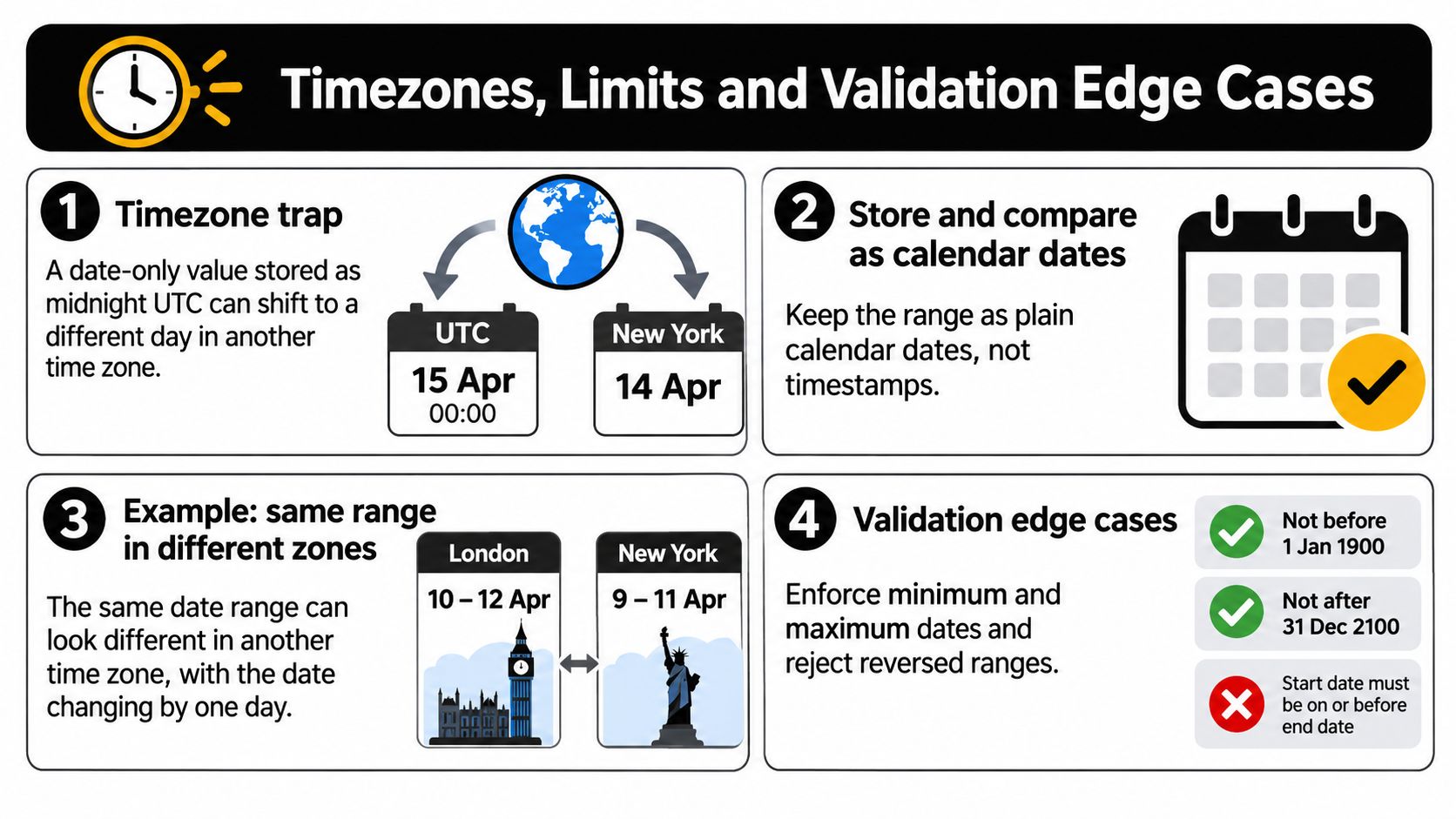
Europe/London is a useful test case. The clocks change on the last Sunday of March, so arithmetic built on 24 hour timestamp increments can land an end date on the wrong calendar day around the spring transition. Calendar arithmetic adds a day to the date. Timestamp arithmetic adds hours to an instant and hopes the local date follows. Test a range spanning that Sunday before you ship.
Decide the rules, then label them
- Inclusive or exclusive end: hotel check-out is usually exclusive, while a reporting period is usually inclusive, so state which rule applies in the label or hint.
- Single-day range: decide whether start equals end is valid, because it is for a one day report but not for a stay priced by the night.
- Minimum and maximum dates: apply minDate and maxDate in the calendar, in client validation, and again on the server, since users can type dates the grid disables.
- Maximum span: if a report can only run for a limited period, name that limit in the error message instead of saying the range is invalid.
- Reversed range: validate on the server that the end doesn’t precede the start, and return a message naming the field to fix.
Release check: set the browser and test data to a UK locale, confirm weeks start on Monday, and read every date aloud in day, month, year order.
One more trap sits between preset and custom modes. If a user picks Last 7 days, then edits the start by hand, the preset label must stop claiming Last 7 days. Either switch the control to a custom state or clear the preset highlight. A stale label over an edited range is a quiet data error, because the user exports one period while believing they exported another.
Wire the Picker in Vue with DOM Studio
Build in an order that protects the value first and the visuals last. If you start with the popover, you’ll spend the project retrofitting parsing, validation, and focus rules around a pretty grid. The sequence below works with DOM Studio, another component library, or native inputs, because the discipline matters more than the package.
The GOV.UK date input component guidance recommends a three-field input when users know a date, grouped in a fieldset with a legend, with two independently labelled inputs for a range and server-side checks that the end doesn’t precede the start. Its example 27 3 2007 uses a day of 13 or higher and a month of 9 or lower to reduce reversal errors. That’s the foundation to build on.
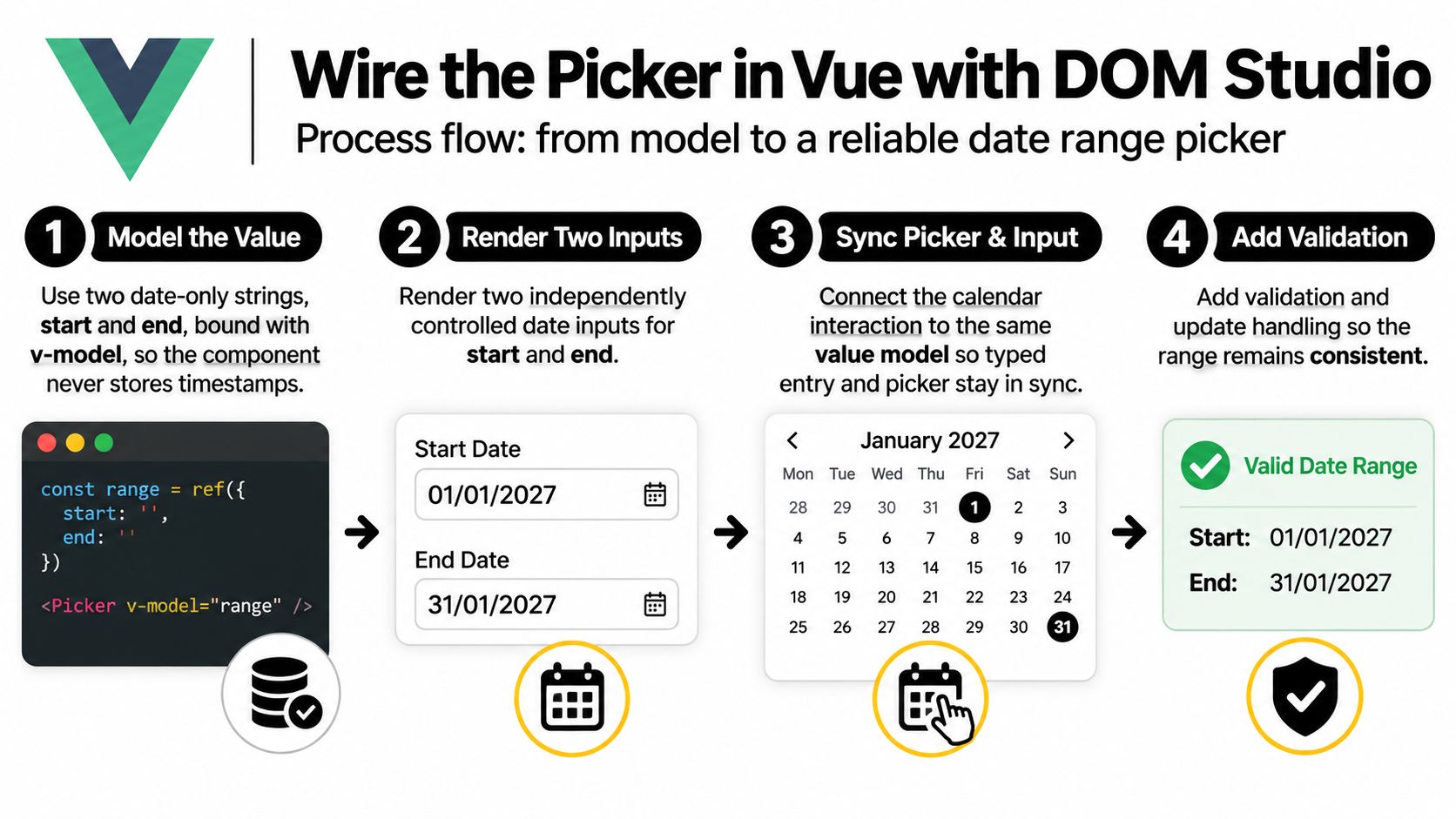
Steps 1 to 3 cover value, fields, and calendar
Step 1, model two date-only strings. In a script setup block, use defineModel to expose start and end as strings such as 2026-01-01, bound with v-model. No Date objects in the public model, no timestamps, nothing that carries a timezone into the parent. A computed flag can report whether the end falls on or after the start, and the parent can disable submission based on that flag without knowing how the picker works internally. Keep empty states explicit too. An empty string means not chosen yet, which is different from an invalid date the user typed badly, and your error messages should reflect that difference.
Step 2, render two labelled fieldsets. Wrap each date in its own fieldset with a legend reading Start date and End date, then render day, month, and year inputs inside. Screen readers then hear the question as one coherent unit instead of three orphaned boxes.
- Set inputmode numeric: mobile users get a number pad while the field stays a text input for voice and screen reader compatibility.
- Accept month names: parse March and Mar in the month field, then normalise to the numeric value on blur.
- Size fields appropriately: two character widths for day and month, four for year, so the layout teaches the expected entry.
- Use autocomplete where it fits: known personal dates can take standard autocomplete values, although booking and reporting dates usually shouldn’t.
Step 3, attach the calendar to the same model. The popover reads start and end, writes start and end, and holds no private copy of the range. That single rule prevents the classic defect where typed entry says one period and the highlighted calendar band shows another. When the user clicks a first date, write start and wait. When they click a second date earlier than the first, don’t swap in the calendar without notice either. Treat the first click as the new start only if the design states that behaviour and announces it, because consistent rules between typing and clicking are what make the component learnable.
For DOM Studio, the headless custom element primitives supply behaviour and ARIA handling, the Vue wrappers add reactive props, v-model, and slots, and Tailwind CSS 4 styling covers the look. DOM Studio’s Data Visualisation set includes a date range picker alongside area chart, bar chart, donut chart, line chart, metric card, and sparkline components, which suits reporting screens where the picker drives charts. Its Forms product offers inputs, pickers, and schema-driven forms for the form-led version of the same job.
Steps 4 to 7 cover limits, errors, styling, and tests
Step 4, apply limits in both layers. Pass minDate and maxDate as date-only strings, disable out of range calendar cells, and enforce the same bounds in validation. Disabled cells are guidance, not security. A typed date outside the limits should produce a specific message naming the earliest or latest allowed date in full UK format.
Step 5, validate the relationship twice. Check on blur that the end falls on or after the start, show the error against the End date fieldset, and keep both values intact. Repeat the check on the server, because client validation is a convenience, and return the same wording so support staff and users describe the problem identically. Validate each date’s own completeness first. Telling a user their end precedes their start when the actual fault is a missing year sends them fixing the wrong field.
Step 6, style states with more than colour. Tailwind utility classes make it easy to add a background for the selected band and stronger endpoints, but pair every colour with something else. Selected endpoints can carry bold text and an accessible name that says selected. Unavailable dates can use reduced contrast within legal limits plus not available in the label. Hover previews should remain visual only and never change the committed model, because keyboard users can’t reproduce a hover state and shouldn’t need to.
Step 7, test the way users arrive. Run the full task keyboard only, then with a screen reader, then with paste from a document. Try a month name in the start, a numeric date in the end, a reversed range, and a range spanning the March clock change. Check that Escape keeps typed values and returns focus, that weeks start on Monday, and that the closed control summarises the period in full. If any of those fail, the picker isn’t finished, however good the calendar looks in a screenshot.
One final judgement. Resist adding features the task doesn’t need. Comparison periods, dual calendars, and preset sidebars each add state, announcements, and test surface. Add them when reporting users ask for them by name, not because a competitor’s screenshot looks richer. A lean date range picker that types fast, validates clearly, and behaves predictably with a keyboard will outperform an elaborate one in production, because users finish the form instead of fighting it.
Build your next reporting or booking flow with DOM Studio’s Vue date range picker, typed entry and calendar sharing one accessible model, then style it with Tailwind CSS 4 without rebuilding focus management. Browse the components and start wiring your picker today at DOM Studio.