
Component metadata tools help us turn a component’s public contract into structured information that documentation sites, live playgrounds, visual editors, tests, and AI assistants can use consistently.
The practical goal is not to buy or assemble the biggest catalog. It is to establish one authoritative component record close to source code, then use the right tool to expose each consumer view. In this guide, we will create that contract, connect it to the tools that benefit from it, and validate it before scaling.
Table of contents
- Before we start: prerequisites and the tool boundary
- 1. Inventory the consumers before selecting a tool
- 2. Match component metadata tools to the job
- 3. Define a minimum component contract
- 4. Colocate human guidance and machine-readable facts
- 5. Generate the right views from the contract
- 6. Validate public behavior in CI
- 7. Expand by adapter, not by duplication
- Your completed outcome
Before we start: prerequisites and the tool boundary
Prepare these inputs before changing a component library:
- Three pilot components: one simple control, one form field, and one composite or interactive component.
- Access to component source, a documentation or preview environment, and CI.
- An agreed owner for each pilot component.
- A short list of consumers: docs, navigation, testing, visual editing, package distribution, or AI-assisted development.
We also need a clear boundary. Component metadata explains public component behavior and intended use. Design tokens describe reusable visual decisions such as color, type, spacing, and motion. Keep those records connected, but do not force them into one schema.
1. Inventory the consumers before selecting a tool
List every place that needs to understand a component, then write the question that place must answer. This turns a vague search for component metadata tools into an implementation decision.
For example:
- Documentation: What problem does the component solve, and when should we use it?
- Interactive preview: Which props, slots, states, and events can a developer explore?
- Visual editor: Which props are safely editable, and which control should edit each one?
- Testing: What public states and accessibility behaviors should be verified?
- AI workflow: Which component is appropriate, which values are allowed, and what is the preferred example?
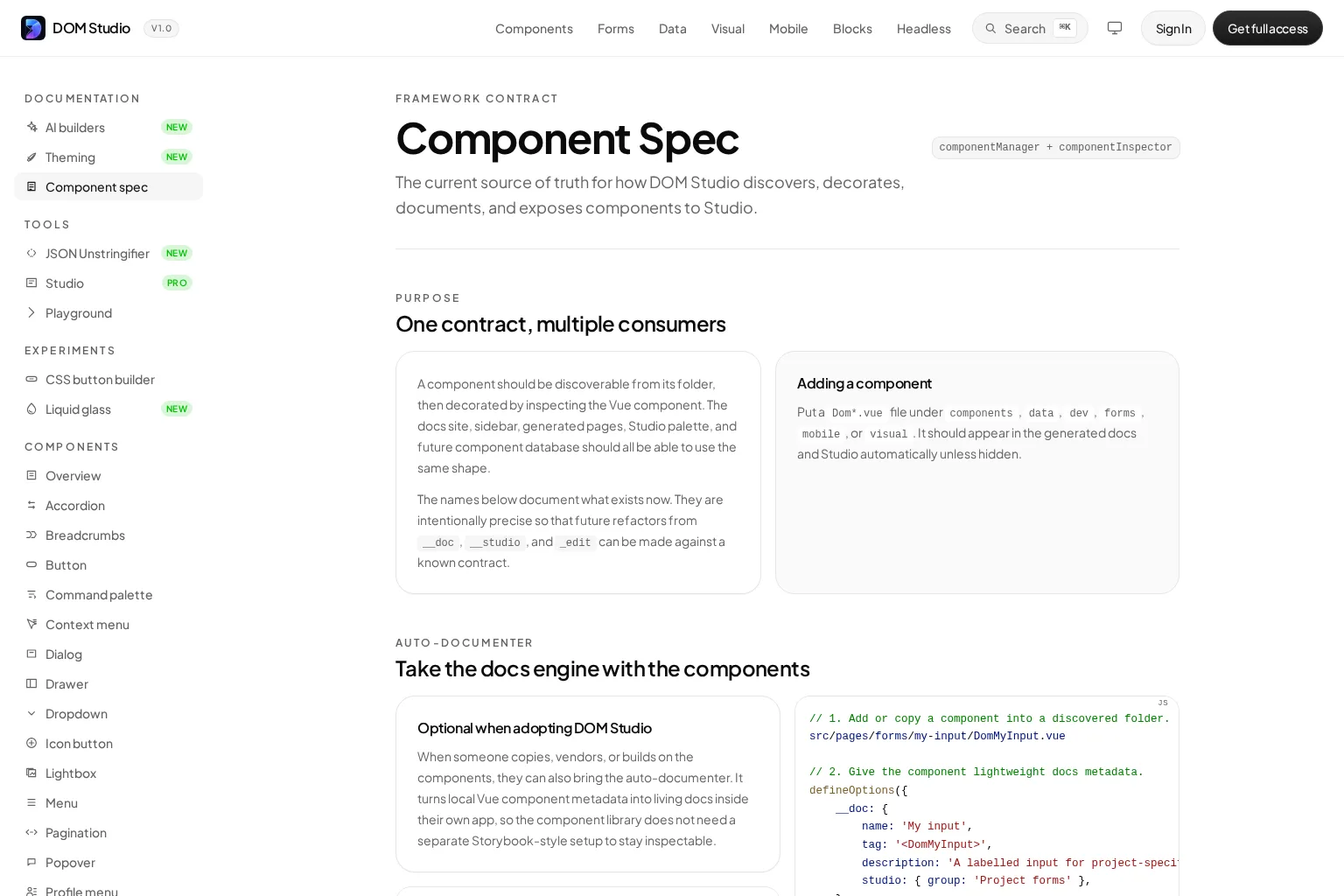
At DOM Studio, the component specification models this as one discovered component record that is decorated with documentation, navigation, inspector, and Studio-specific information. That approach prevents a sidebar label, an API reference, and a visual-editor control from becoming separate sources of truth.
Expected result: Every field in the future schema has a named consumer.
Troubleshooting: If a proposed field has no consumer, do not add it yet. Empty metadata is harder to govern than missing metadata.

2. Match component metadata tools to the job
Most teams benefit from a small toolchain, not a single tool that tries to solve every metadata problem. Use the source of truth as the center, then choose focused adapters.
- DOM Studio for Vue components and editable application UI. DOM Studio can discover local Vue components, inspect prop definitions, and use nearby metadata for generated documentation, navigation, component playgrounds, and Studio controls. Its progressive model lets us start with a normal component and add
__docor prop-level_edithints only where the generated defaults need refinement. - Storybook for isolated states and generated component docs. Storybook Autodocs can generate a component documentation page from story metadata, including args, arg types, and parameters. It is a strong fit when stories are already part of the delivery workflow and the team needs an interactive catalog of states.
- Custom Elements Manifest for distributed Web Components. The Custom Elements Manifest analyzer scans source to produce a machine-readable manifest of component classes, attributes, events, and related API details. Choose it when a package of custom elements must be understood by downstream tools and IDEs.
- DTCG-compatible token tooling for visual decisions. The Design Tokens Community Group format helps tools exchange tokens. It complements component metadata but should not be expected to document slots, events, composition rules, or component accessibility behavior.
A Vue product team can use DOM Studio as the colocated contract and add Storybook only when the team needs a separate story-driven workflow. A package team delivering framework-neutral custom elements will often make Custom Elements Manifest the distribution artifact. These tools are complementary, not interchangeable.
For a short refresher on the browser building block behind custom elements, watch this video before evaluating a Web Components manifest workflow.
Expected result: We can explain why every tool exists and which system owns each kind of data.
Troubleshooting: Do not copy the same prop descriptions, state labels, and deprecation details into several tools. Choose one owner, then generate or synchronize the rest.
3. Define a minimum component contract
Start with a schema small enough to review in a pull request. We need stable identity, public API facts, human guidance, lifecycle status, and observable accessibility expectations.
export const buttonMeta = {
  id: 'actions/button',
  name: 'Button',
  description: 'Triggers a user action.',
  status: 'stable',
  owner: 'design-systems',
  tags: ['action', 'form'],
  props: {
    tone: {
      type: 'string',
      default: 'primary',
      options: ['primary', 'secondary', 'danger'],
      description: 'Sets the visual intent.',
    },
    loading: {
      type: 'boolean',
      default: false,
      description: 'Blocks activation while work is in progress.',
    },
  },
  slots: [
    { name: 'default', description: 'Visible button label or content.' },
  ],
  events: [
    { name: 'click', payload: 'MouseEvent', description: 'Fired on activation.' },
  ],
  accessibility: {
    role: 'button',
    keyboard: ['Enter', 'Space'],
    expectations: ['Provide an accessible name.'],
  },
  examples: ['basic', 'loading', 'destructive-action'],
};
Keep values normalized. For instance, use a controlled status set such as draft, beta, stable, deprecated, and retired. A visual editor may need extra hints, but those should be an extension layer, not a replacement for the public component contract.
Verification check: Generate a short reference from one pilot component. A teammate who has not read its source should be able to identify the purpose, API, states, and primary accessibility expectations.
Troubleshooting: Avoid an unstructured options object that accepts arbitrary fields. Explicit metadata is easier to type, validate, search, and retire.
4. Colocate human guidance and machine-readable facts
The most reliable component metadata tools keep the contract in the same review boundary as the component. Let code provide native facts such as prop types and defaults. Add authored metadata only for information code cannot safely infer: intent, slots, event payload descriptions, owner, status, examples, and editor behavior.
For example, DOM Studio can read a Vue component’s props while defineOptions() supplies lightweight __doc information. The _edit object on a prop can add editor-specific choices without changing the runtime API.
<script setup lang="ts">
defineOptions({
  __doc: {
    name: 'Status pill',
    tag: '<DomStatusPill>',
    description: 'A compact label for workflow state.',
    order: 40,
    studio: { group: 'Feedback', icon: 'Circle' },
    slots: [
      { name: 'default', description: 'Status label content.' },
    ],
  },
});

const props = defineProps({
  tone: {
    type: String,
    default: 'neutral',
    _edit: {
      options: ['neutral', 'success', 'warning', 'danger'],
      description: 'Visual state shown by the pill.',
    },
  },
});
</script>
This keeps the public component API and the richer authoring context together, while allowing a docs page or editor to consume only the layer it needs. For a deeper explanation of the model, see our design system metadata guide.
Expected result: A component change and its contract update appear in the same pull request.
Troubleshooting: Generated references are useful, but they are not a substitute for authored guidance. Add nearby examples when composition rules, responsive behavior, or product decisions need explanation.
5. Generate the right views from the contract
Once the contract is available, use each tool for the view it performs best:
- Generate prop tables, defaults, slots, events, source location, and status for the reference page.
- Render a playground that binds editable props to a live component instance.
- Create navigation labels, groups, ordering, and searchable tags from presentation metadata.
- Provide a compact machine-readable view to AI tools: stable ID, component name, valid props, allowed values, constraints, and approved examples.
- Produce an adapter for package metadata when the component must travel outside the application.
DOM Studio’s live Playground shows the value of this approach: it can infer an editing schema from component props, then let a developer edit values and see the selected component update on the stage. A generated view is especially valuable when a default changes, because the reference can change with the source rather than waiting for a manual documentation edit.
Verification check: Change a prop default in source. Confirm that the generated reference and playground use the new default, while the authored usage notes remain intact.
Troubleshooting: If a tool needs prose to determine a select list or validation rule, move that fact into structured metadata. Prose should explain judgment and context, not carry machine-critical constraints.
6. Validate public behavior in CI
Metadata becomes trustworthy when invalid contracts fail early. Add lightweight checks before adding every possible field.
Start with rules such as:
- Every public component has an ID, description, status, and owner.
- Every documented prop has a type and a default when one exists.
- Every event includes a payload shape or an explicit statement that it has none.
- Deprecated components and props name a replacement.
- Interactive components include testable keyboard, focus, and accessible-name expectations.
- Editor options are compatible with the component’s allowed values.
Run the checks against the three pilot components first. Then wire the validator into CI, alongside component tests. When the system is mature, a metadata diff can become part of pull request review, making API changes, new states, and deprecations easier to spot.
Expected result: A missing or contradictory public fact is reported with the affected component and remediation.
Troubleshooting: Do not make every field required on day one. Start with fields that prevent real failures, then raise the standard as the library becomes more consistent.

7. Expand by adapter, not by duplication
After the pilot succeeds, expand the contract to new consumers through adapters. The core record should stay focused on component semantics and public behavior. Tool-specific extensions can remain namespaced or colocated.
For example, a form component may need field-level metadata that maps a semantic data type to a renderer, validation, and display hints. DOM Studio’s form schema reference separates the portable data contract from UI-specific decoration, so JSON Schema can describe data while UI metadata selects an appropriate component or editor.
Use the same separation for tokens. Keep a token reference or alias in component metadata when it helps explain a variant, but retain the token definition in a token system that supports exchange and theming. This lets us update a theme without pretending that a token format can define component behavior.
Verification check: Add a second consumer, such as a new docs surface or an AI component picker, without copying core prop data into a new repository.
Troubleshooting: If each adapter requires a different version of the same description or prop list, stop and repair the source contract before scaling further.
Your completed outcome
We now have a practical way to evaluate and implement component metadata tools: define the consumers, select a source of truth, model the minimum public contract, colocate authored guidance with component source, generate focused views, validate the contract, and extend it through adapters.
Our next useful action is to choose three representative components and make description, status, owner, and one observable accessibility expectation required this week. If we want an editable Vue and Web Component foundation that keeps component details close to source, explore DOM Studio’s component specification and begin with the component that appears across the most product surfaces.